Nearly every designer working with type has a strong opinion on the right way to combine letterforms and pair fonts. Like most things in visual communication, the best solutions are both subjectively and objectively formed, pairing what we prefer with what is most appropriate for any given use or context. Therefore, it is important to note: type-pairing ‘rules’, like all design guidelines, exist within specific cultural contexts, and are made to be practiced and challenged—as all advice cannot apply universally to all projects or scenarios.
This being said: in this article, you’ll learn important considerations to take before you begin pairing type, as well as helpful methods and useful tips for choosing and combining fonts!
A Basic Typographic Refresher
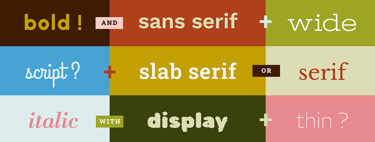
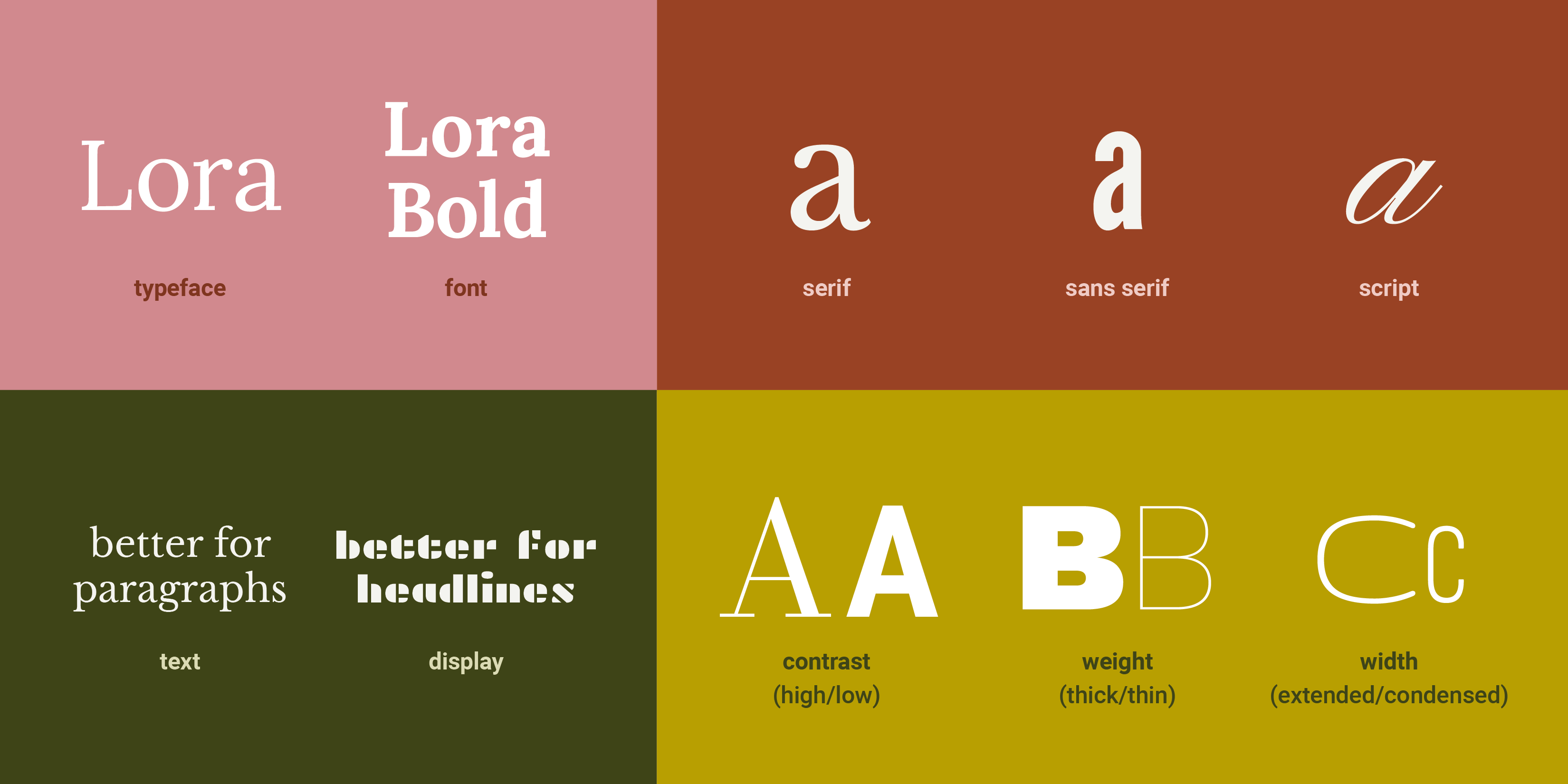
If you're reading this article, chances are you already know these terms, but in case you are new to typography, or would like a refresher: A typeface is a collection of letterforms which belong together; a font is the delivery mechanism for them—if Merriweather is a typeface, Merriweather Bold is a font. Some letterforms have serifs (tiny feet, or flanges), while some do not (these are sans serifs), and some emulate cursive as scripts, whose letterforms flow seamlessly into one another. Some typefaces are designed to be used in large amounts of text—for reading, and use at smaller sizes—while decorative display typefaces work better for grabbing attention at larger sizes. Additionally, all letterforms have differing characteristics, like their contrast (the visual relationship between the thickest and thinnest part of the letterform) weight (how thick or thin they are) or width (how condensed or wide they are).
© Mia Cinelli. CC BY-NC-ND
Before You Begin: Context and Content
The most important factor in font pairing is context. Before you begin, it’s essential to consider: in what context will this type be used? What are you designing, who will use it, and in what way? Because of differing messages, spaces, media, and interactions, the typography of a dating app will differ from the typography of a hospital website, printed novel, or hotel signage. Therefore, their respective type pairings will differ, also.
Additionally, letterforms convey social meanings through their visual qualities, social affiliations, and placement, which serve as their typographic tone or ‘visual inflection.’ Does something feel professional, campy, academic, or jarring? These connotations and meanings should always be considered first when determining type pairing.
© Mia Cinelli. CC BY-NC-ND
Most visual information is best presented through differing levels of hierarchy, such as headlines (headers), subheaders (subheading), body copy (text), and caption text, which appropriately group information. Type choice (and consequent pairing) should be determined and prioritized by content—how much text is being set, and at what size it will live. Therefore, as a general rule, high-contrast, display, or very delicate typefaces generally do not work well at small sizes, as their legibility and readability can become easily obscured.
© Mia Cinelli. CC BY-NC-ND
Best Methods of Type Pairing
Once you’ve determined the context, content, and intended visual inflection of your typography—let the type-pairing begin! As you consider your options, keep in mind these helpful tips for successful type pairing:
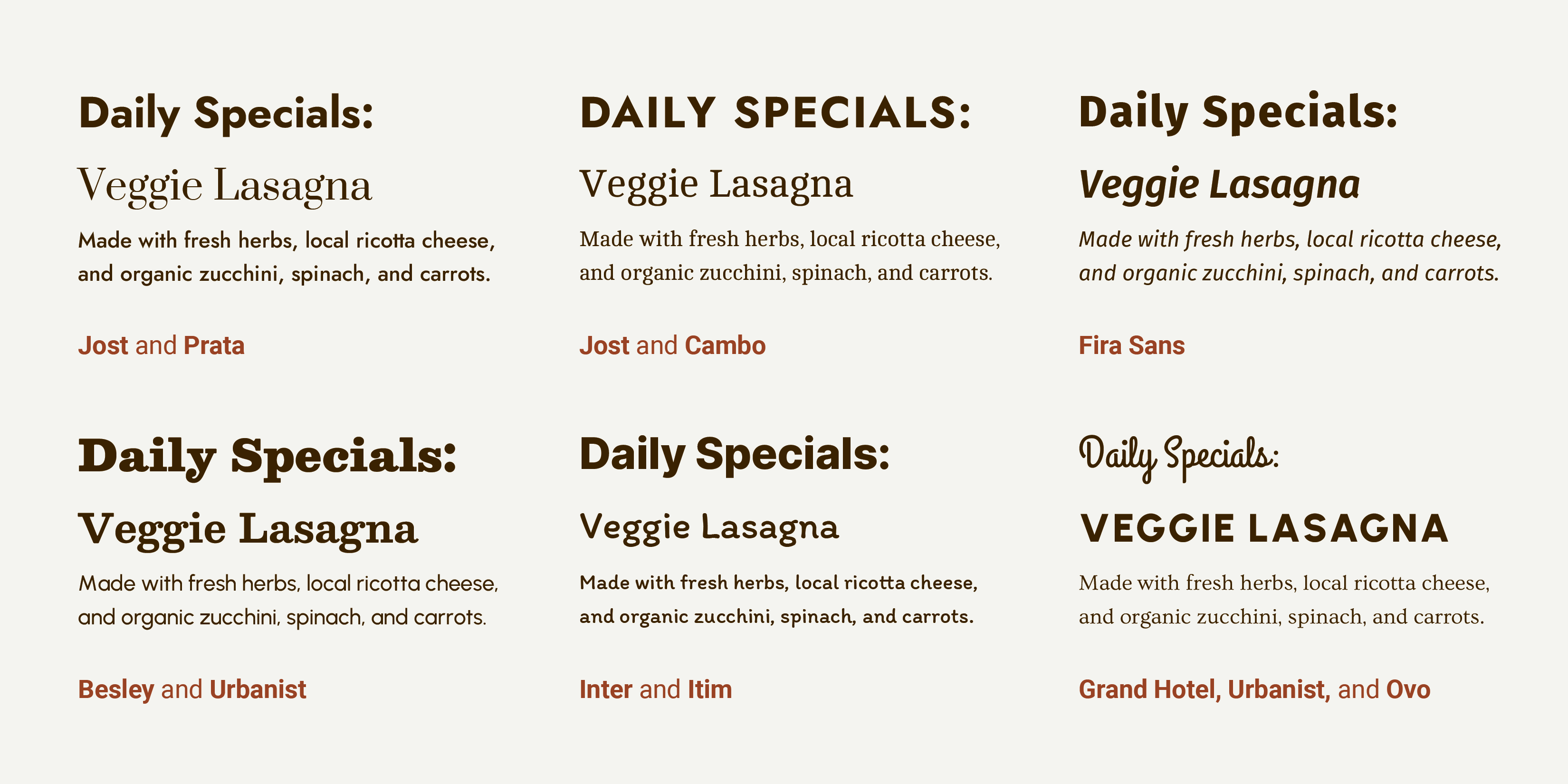
Limit the Number of Typefaces or Fonts You Choose
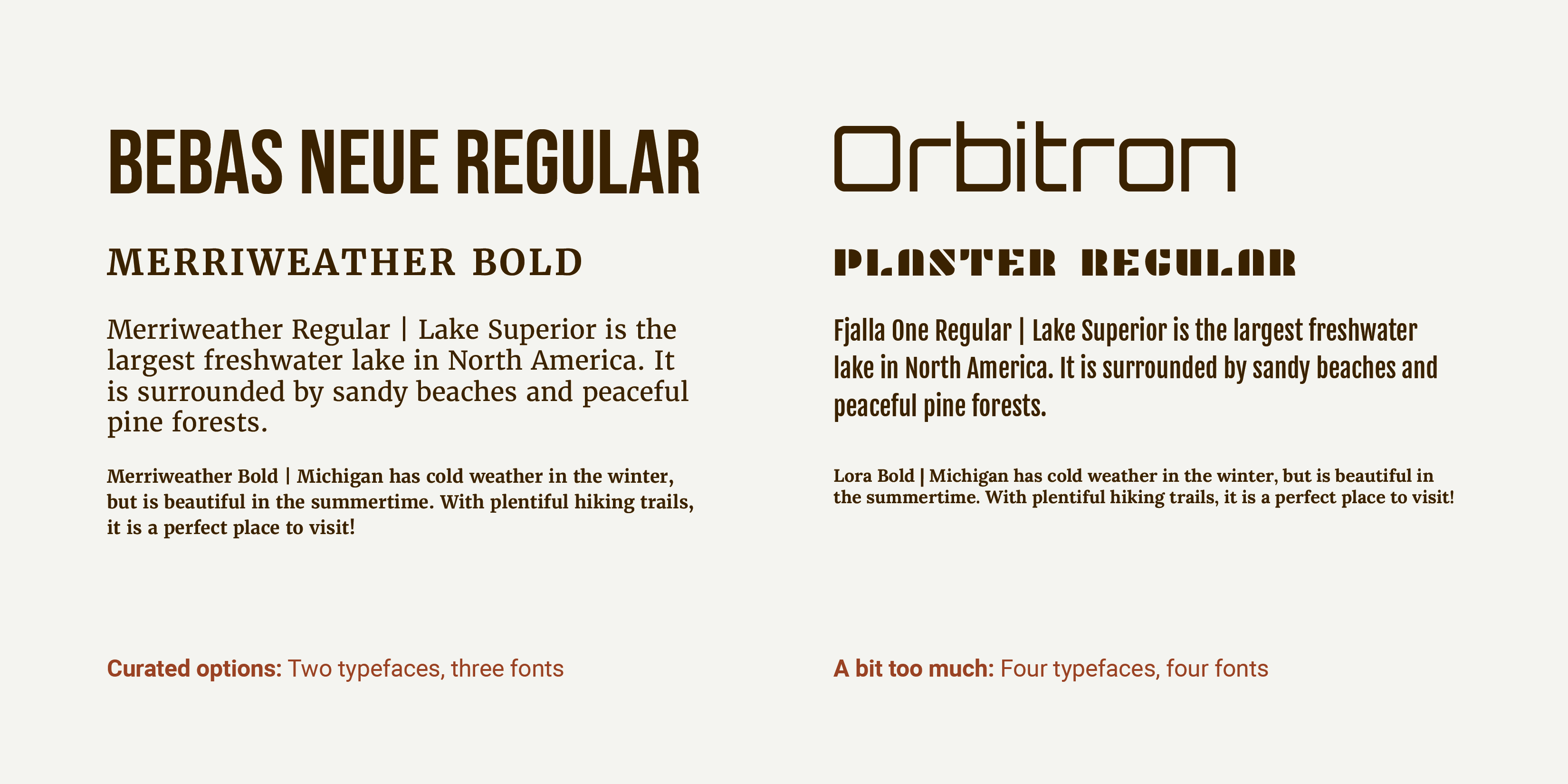
While there are thousands of great typefaces to choose for any one project, it is generally best practice to limit the number of typefaces or fonts you combine: two to three is usually sufficient. Why is this? Using too many letterform styles can easily become cluttered or visually confusing, disrupting the meaning of what you are trying to effectively communicate.
However—this recommendation will inherently vary from application to application. Even with limited typeface choices, numerous font options within said typefaces can provide enough options for hierarchy and expression by using different sizes, weights, colors and styles for headlines, captions, navigation, etc. Sometimes using a plethora of typefaces and/or fonts is the right choice in the right context. However, choosing 2–3—as necessitated by context of use—is a helpful place to start.
Do: curate your typeface/font choices (based on the context of use) | Don’t: use too many variations or styles in one composition
© Mia Cinelli. CC BY-NC-ND
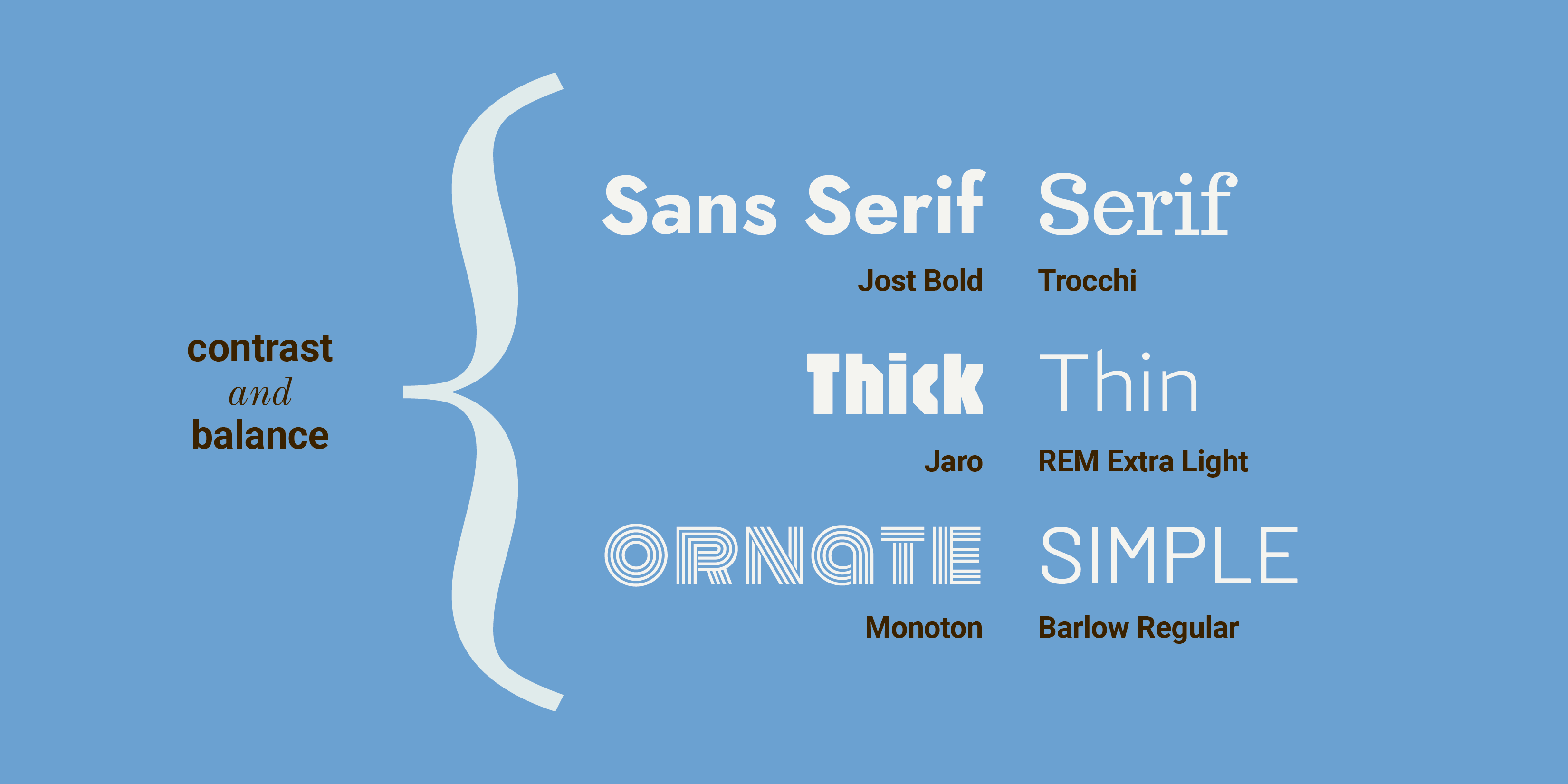
Use Contrasting Type
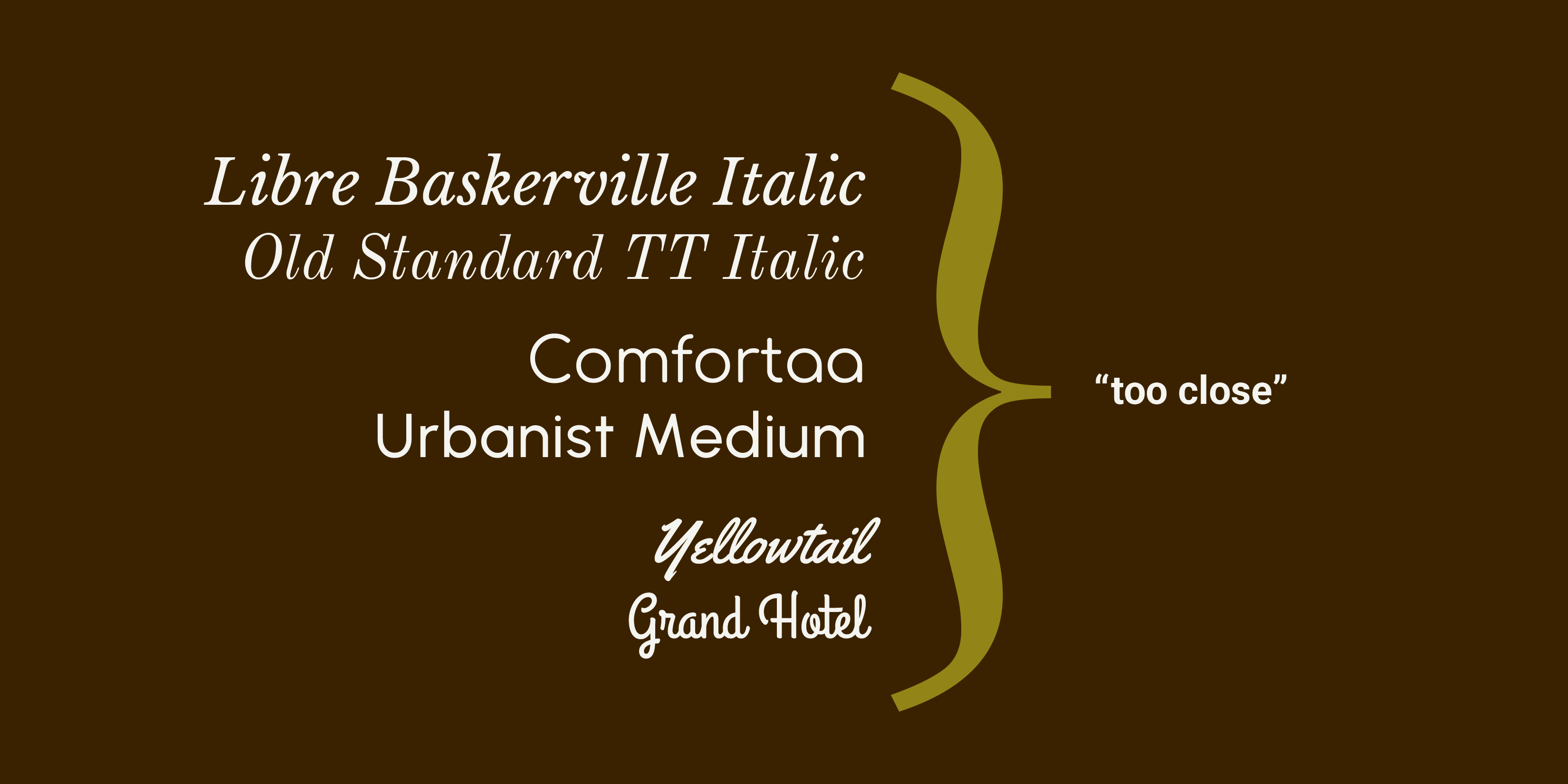
Mixing type? Contrast is key. In her book Thinking with Type, acclaimed typographer, educator, and author Ellen Lupton aptly identifies specific contrast issues in type pairing in the succinct phrase “too close for comfort.” What does this mean? For best typeface pairing, consider having ample difference or contrast between weight, width, style, or size of type. This creates both visual variety and clear typographic distinction. When two styles are paired that are almost the same— but not quite— they begin to clash, like wearing two slightly different plaid patterns at once.
Successful type pairing may be achieved by combining contrasting styles of type, such as thick with thin, ornate with simple, or sans serif with serif.
© Mia Cinelli. CC BY-NC-ND
Contrast is important to consider regardless of the type’s classification— serif or sans serif, text or display— because in many instances, too much is too much. Multiple display typefaces used together can mix messages, while too many similar letterforms or weights together become a visually homogeneous soup.
Do: choose contrasting typefaces or styles | Don’t: pair letterforms that are too similar
© Mia Cinelli. CC BY-NC-ND
Choosing great typefaces is important, but it is essential that those typefaces pair well together. Even beautifully designed, well-crafted typefaces may feel odd if poorly set, mismatched, or used in the wrong context.
© Mia Cinelli. CC BY-NC-ND
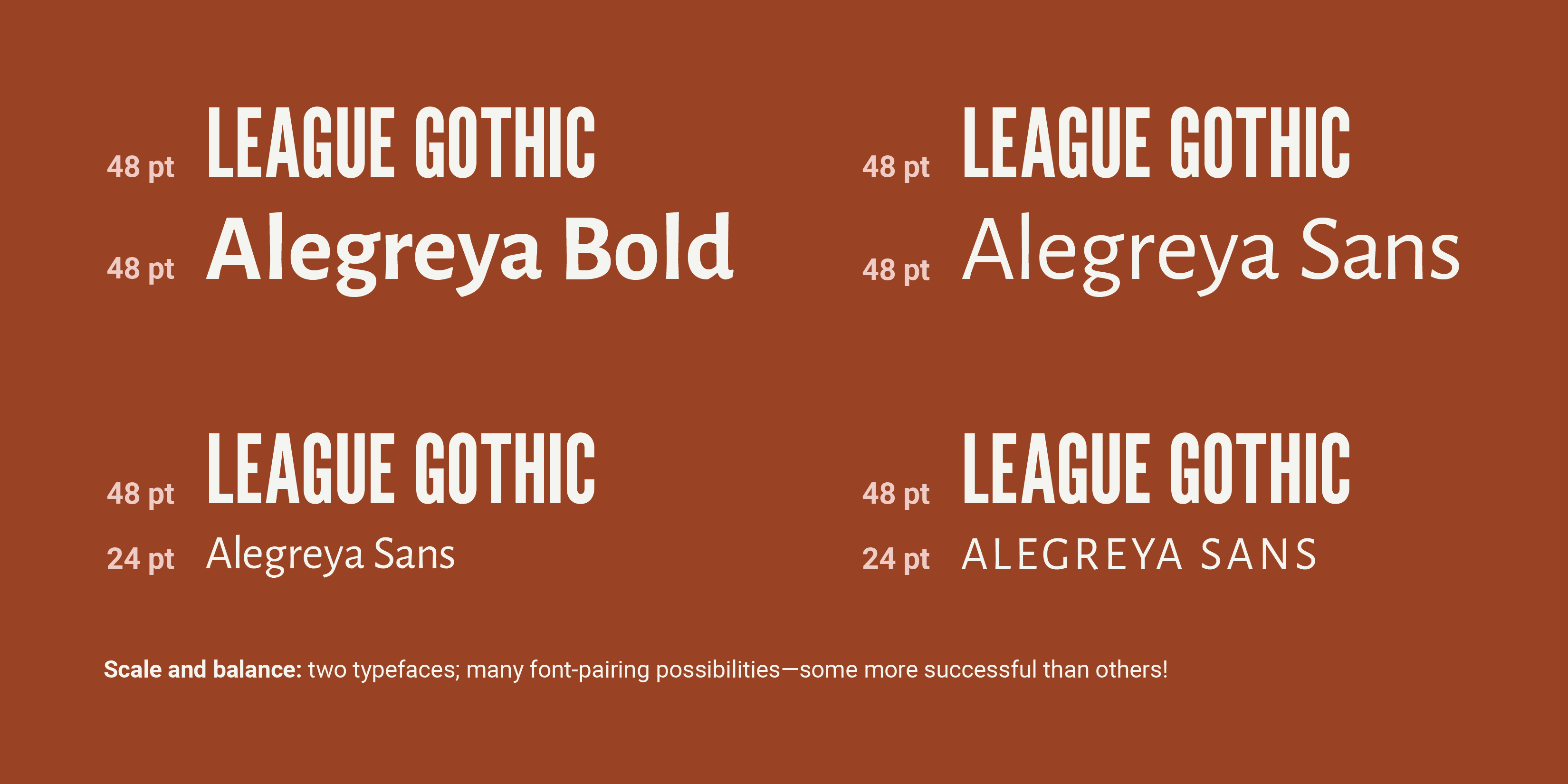
Utilize Scale and Balance
Scale and balance play an essential role in type pairing, too. Scale is essential for visual balance, hierarchy, and readability: adjusting the visual weight of headlines vs. body copy helps direct a reader’s eye towards which information they should engage with, first.
Consider: two typefaces which might not work well together at the same point size may pair beautifully at contrasting sizes—or by selecting different fonts with enough contrast, creating a visual balance. Additionally, appropriate hierarchy and visual balance can be achieved by changing the tracking of the letterforms (the space between a group of letters), or the case of the letters—such as all lowercase or all-caps, as appropriate to the respective text.
Do: consider scale, balance, and hierarchy | Don’t: assume all pairings work at all sizes
© Mia Cinelli. CC BY-NC-ND
Additional Options for Type Pairing
If you find yourself endlessly scrolling through your available typefaces—pause and try one of these options instead!
Match Within a Family
Sometimes the best pairing options can be found within a single font family—a collection of typefaces sharing a single aesthetic through-line, with many font variations. Here, bold text might work well with a text or book weight—or an extended letterform may pair well with narrower proportions. Here, variable typefaces—or typefaces whose visual qualities can be adjusted on a sliding scale—can offer great options for typeface pairing within a family.
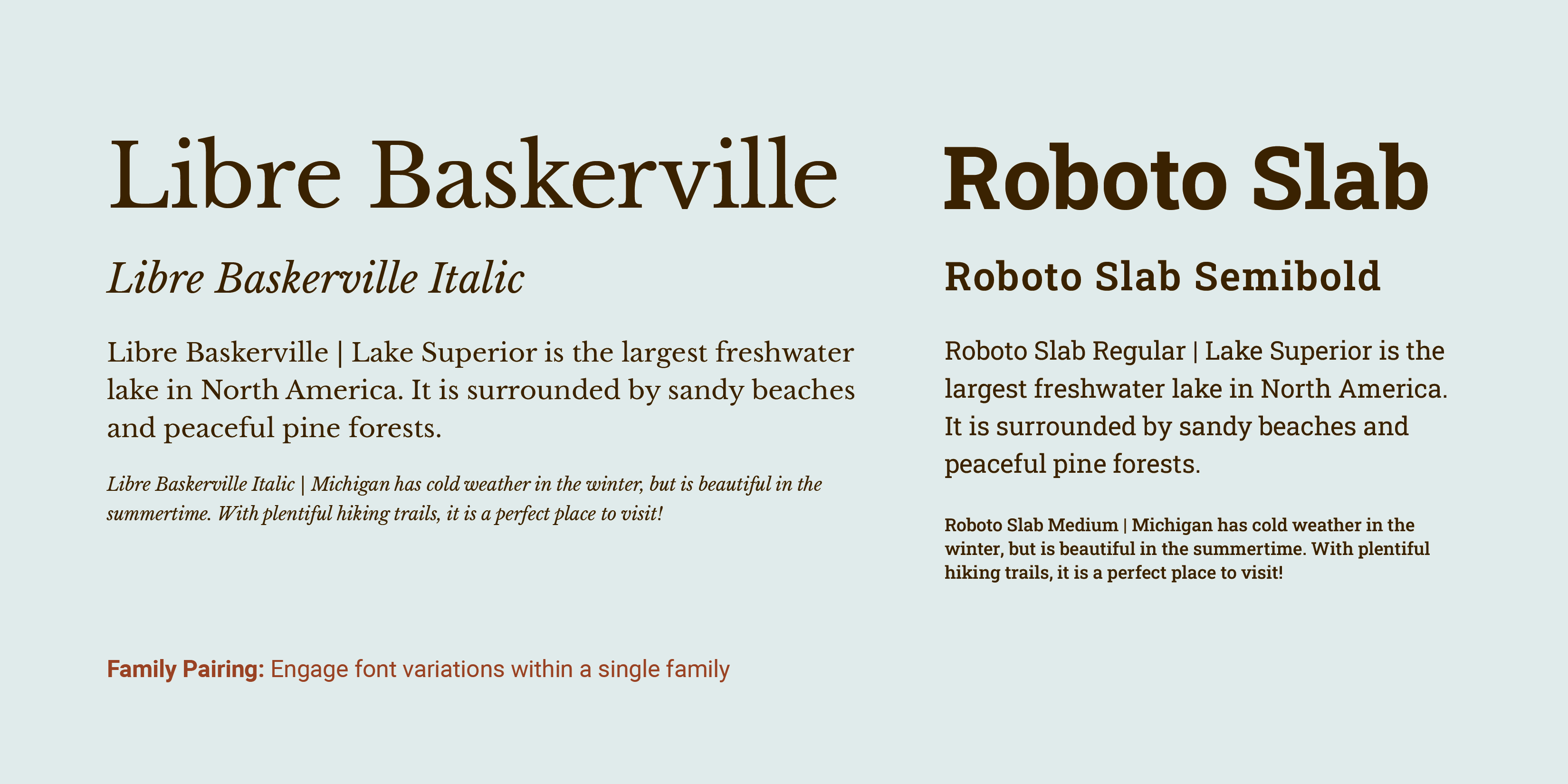
© Mia Cinelli. CC BY-NC-ND
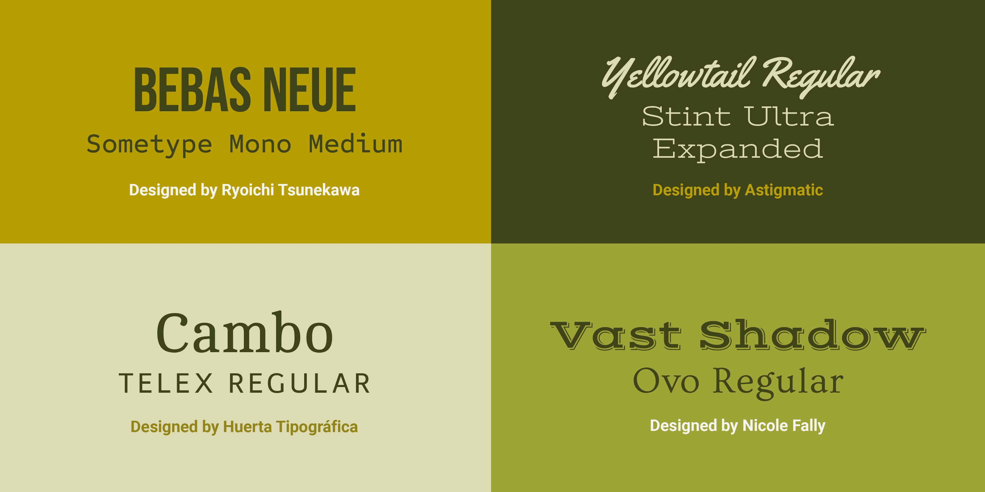
Choose The Work of One Designer or Foundry
In the same ways that paintings, songs, or movies may have a similar look or feel if produced by the same artist, songwriter, or director—so do typefaces! Typefaces created by the same typeface designer or foundry may have similar inherent visual qualities and provide harmonious opportunities for type pairings. Some foundries even provide successful example pairings of typefaces and fonts from their collection!
© Mia Cinelli. CC BY-NC-ND
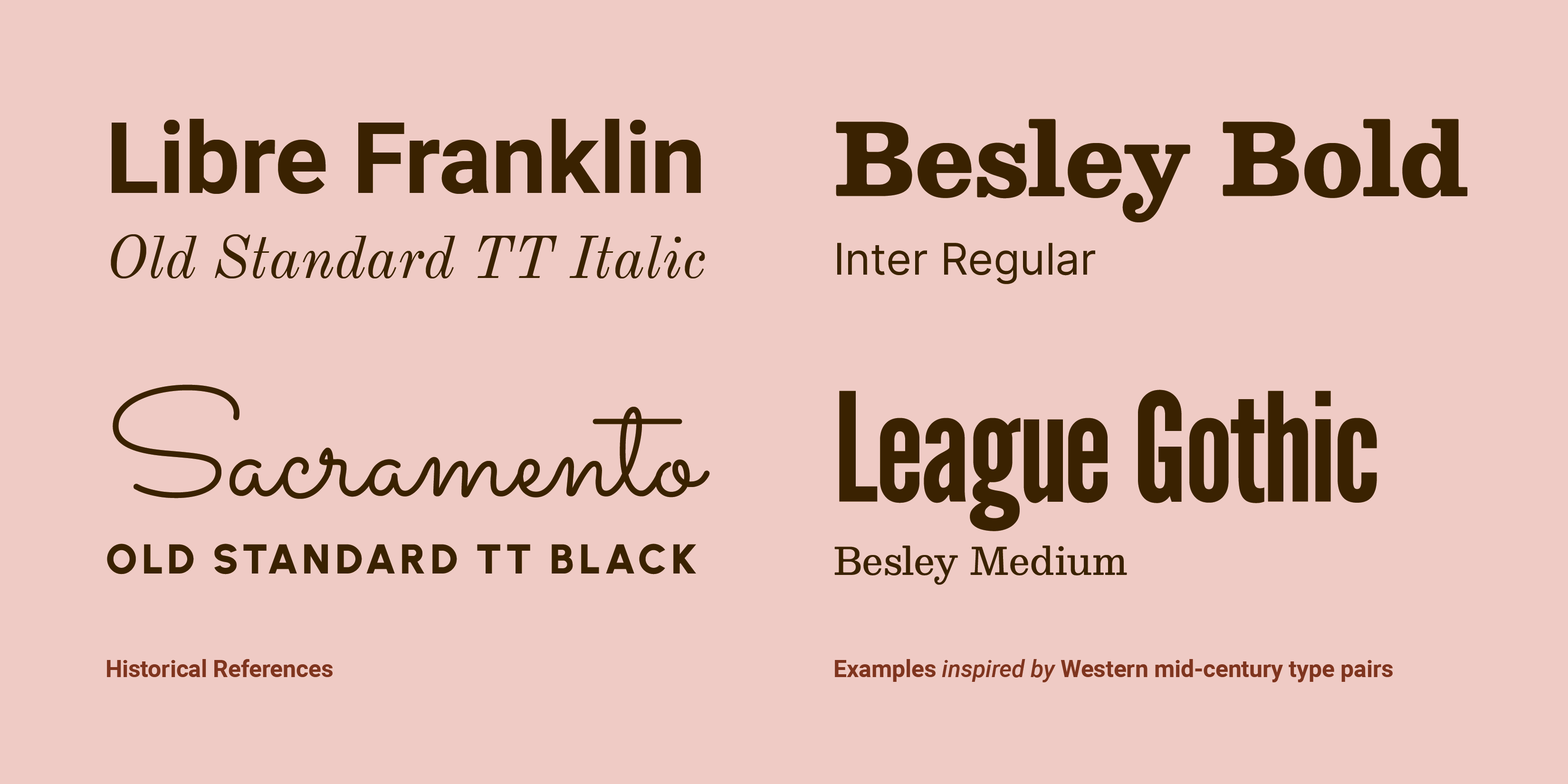
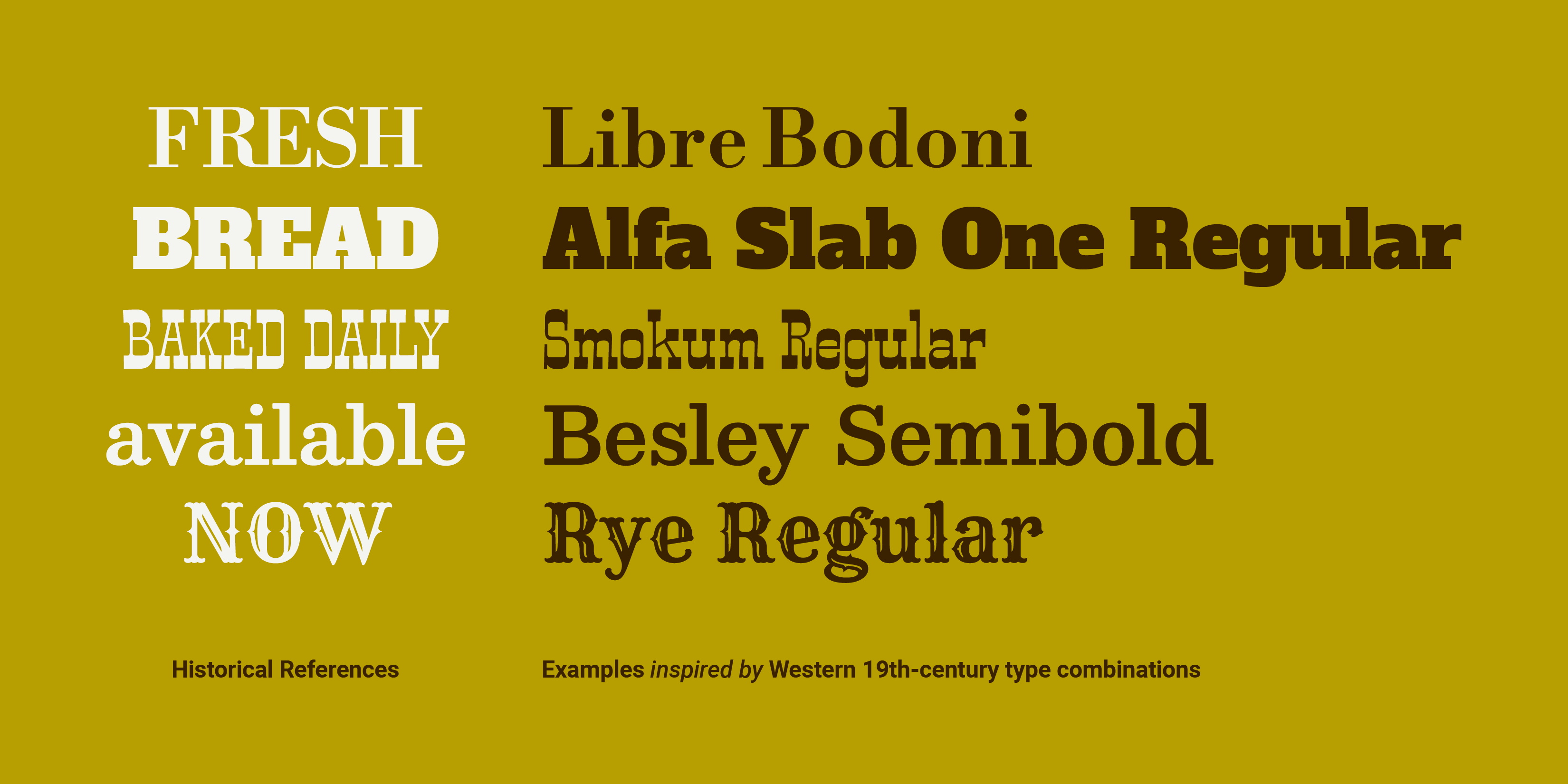
Seek Examples from History
Searching for inspiration, or hoping to make a historical reference? Look at historical type pairings. Certain faces or type styles have become emblematic of particular decades—what type reminds you of the 1980s or early 2000s?—creating intentional (or unintentional) historical connotations. Additionally, historical references can be a useful way to find “classic” combinations, like pairing bold, tall sans serifs with thinner, academic serifs, or expressive brush scripts with geometric sans serifs.
© Mia Cinelli. CC BY-NC-ND
Of course, “classic” typographic combinations are subjective, and vary by culture and decade. In Western contexts using Latin text, much of the 19th century was marked by many combinations of decorative fonts—which look quite different from typographic trends we see today.
© Mia Cinelli. CC BY-NC-ND
Last Considerations
Do You Have The Rights to Use It?
Generally speaking, each typeface you use comes with an EULA, or “End-User License Agreement,” outlining how you may use the particular fonts therein. Before you commit to using a particular typeface in your work, ensure you have procured it properly— and have the rights to use it as outlined in its EULA.
Do Type Tests!
The best design solutions are the product of iteration, revision, and reflection—and type pairing is no exception. As you weight your options, set your text—or sample text—in different typefaces first, then compare them side-by-side. These type tests will give you a practical way to gauge which options look and work best for your specific project. When in doubt; try it out!
© Mia Cinelli. CC BY-NC-ND
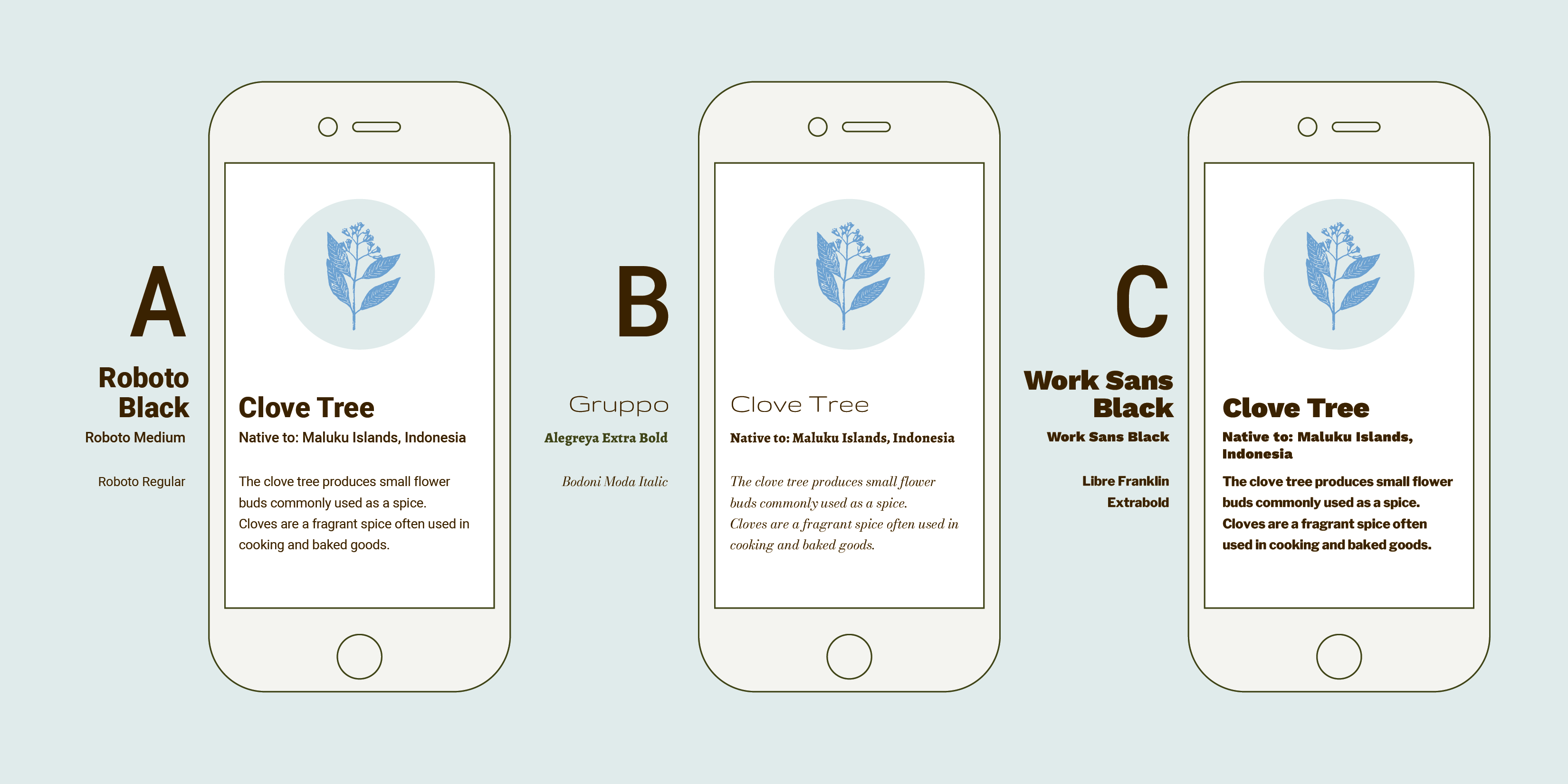
A Practice Round
Imagine you’ve been asked to design an informational app identifying trees at a local Arboretum. In these examples, text has been set at the same point size across examples for the headline, subheader, and body copy, respectively. Considering context, visual inflection, and the above methods of type pairing: which option below do you think would work best, and why? Scroll down for the author’s choice and reasoning:
© Mia Cinelli. CC BY-NC-ND
In these examples, option A has the most successful type pairing. Why?
Context: These paired typefaces need to be easy to read at a small size on a phone or tablet, making Choice B less than ideal, given the very delicate nature of the headline and smallest text.
Visual Inflection: The visual inflection of any of these examples could work well, ranging from distinct to literary, creating different approaches to conveying this information. However, their combinations don’t all work successfully.
Contrast: Choice B features a very light headline text, moving the attention to the bolder subheader first— disrupting its intended hierarchy. Choice C features bold text at every size—with two typefaces which are a bit too similar to each other—lacking variation and creating a ‘one note’ visual ground. Choice A features a pairing which facilitates clear hierarchy, is easy to read, and has a balanced composition.
Which option did you choose, and why? How might this influence your future type-pairing decisions?
The Take Away
Consider these factors before you start pairing type:
Choose type informed by content and context.
Match your typeface’s visual inflection to your intended message.
Curate/limit the number of letterform styles you use.
Use ample contrast between weight, width, style, or size of type.
Consider scale and balance for hierarchy and legibility.
Try family matching, foundry/designer matching, or find inspiration from historical examples.
Ensure you have the rights to use the typefaces you’ve chosen.
Iterate and do type tests to compare and contrast options.
Making effective visual decisions is essential for clarity of information and interaction— but should also be fun! As you design, try novel options, engage with new typefaces, and seek feedback from users, clients, and fellow designers. There are many great combinations waiting to be discovered!
References and Where To Learn More
Interested in learning more? Mia Cinelli’s new book Giving Type Meaning: Context and Craft in Typography explores how and what type communicates through social, spatial, and temporal contexts of visual language.
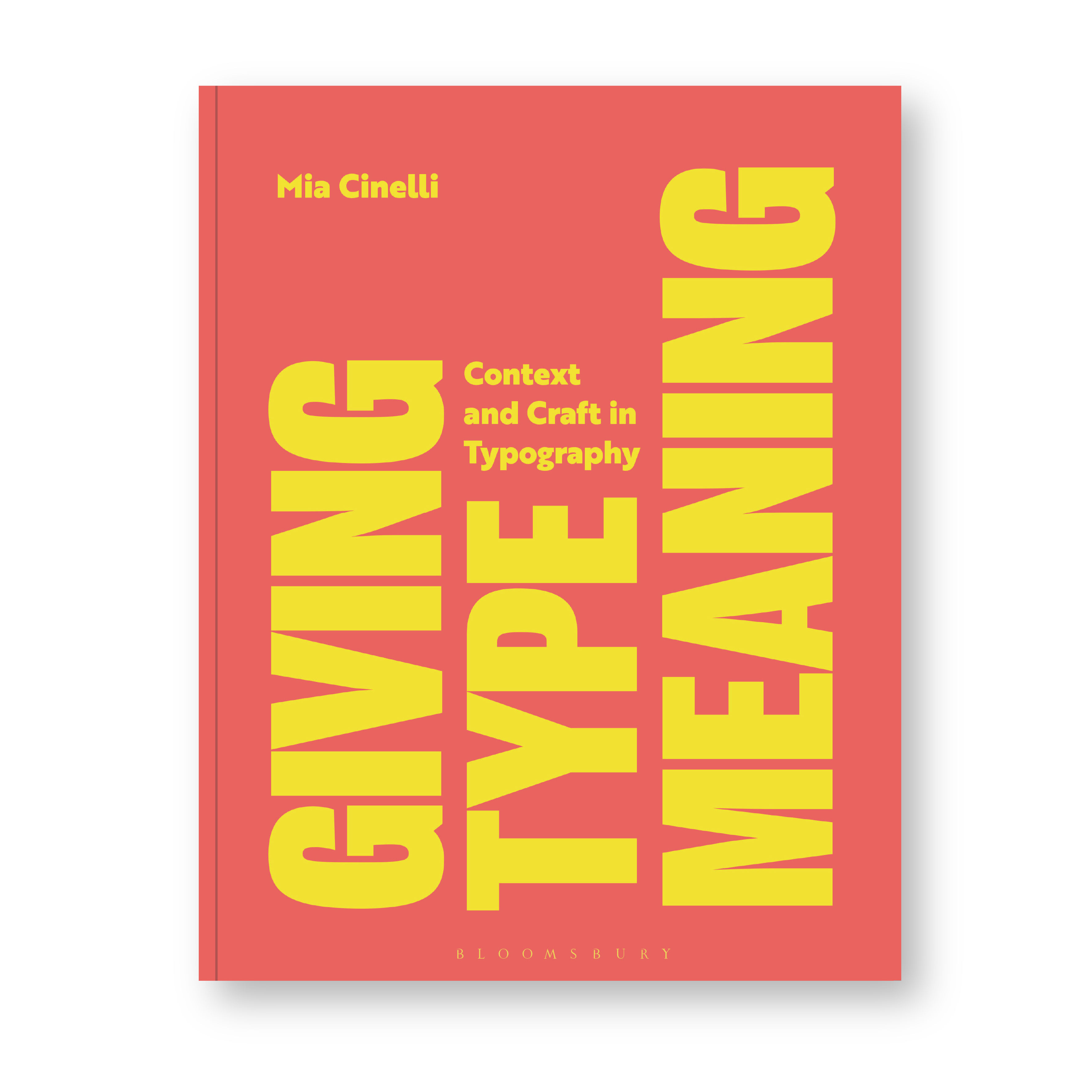
© Bloomsbury, 2024. Cover design by Louise Dugdale.
Lupton, Ellen. (2024). Thinking with Type: A Critical Guide for Designers, Writers, Editors, and Students (3rd Edition, Revised and Expanded). United States: Chronicle Books LLC.
Hunt, Richard. (2020). Advanced Typography: From Knowledge to Mastery. United Kingdom: Bloomsbury Publishing.
Typefaces
All typefaces showcased in this article’s images are available via Google Fonts. They include:
Alegreya and Alegreya Sans by Juan Pablo del Peral and Huerta Tipográfica
Alfa Slab One by JM Solé
Barlow by Jeremy Tribby
Bebas Neue and Sometype Mono Medium by Ryoichi Tsunekawa
Besley, Bodoni Moda, and Jost by Owen Earl
Big Shoulders Stencil Display by Patric King
Cambo and Telex by Huerta Tipográfica
Comfortaa by Johan Aakerlund
Dela Gothic One by artakana
Fira Sans by Carrois Apostrophe
Fjalla One by Sorkin Type, Irina Smirnova
Grand Hotel, Sacramento, Smokum, Stint Ultra Expanded, and Yellowtail by Astigmatic
Gruppo, Monoton, and Trocchi by Vernon Adams
Inter by Rasmus Andersson
Itim by Cadson Demak
Jaro by Agyei Archer, Celine Hurka, and Mirko Velimirović
League Gothic by Tyler Finck, Caroline Hadilaksono, and Micah Rich
Libre Bodoni by Pablo Impallari and Rodrigo Fuenzalida
Libre Franklin and Libre Baskerville by Impallari Type
Lora and Prata by Cyreal
Merriweather and Plaster by Sorkin Type
Old Standard TT by Alexey Kryukov
Orbitron by Matt McInerney
Pathway Gothic One by Eduardo Tunni
Pinyon Script, Rye, Ovo, and Vast Shadow by Nicole Fally
REM by Octavio Pardo
Roboto, Roboto Mono and Roboto Slab, by Christian Robertson
Rubik Bubbles by NaN, Luke Prowse
Sofia Sans by Lettersoup, Botio Nikoltchev, and Ani Petrova
Teko by Indian Type Foundry
Urbanist by Corey Hu
Work Sans by Wei Huang
Historical Type References:
https://peoplesgdarchive.org/
https://fontsinuse.com/
https://letterformarchive.org/
https://woodtype.org/
Images
Images designed by Mia Cinelli. © Mia Cinelli. CC BY-NC-ND (Attribution-NonCommercial-NoDerivs) This license enables reusers to copy and distribute the material in any medium or format in unadapted form only, for noncommercial purposes only, and only so long as attribution is given to the creator.