Your constantly-updated definition of Type in UX/UI Design and
collection of videos and articles. Be a conversation starter: Share this page and inspire others!
177shares
What is Type in UX/UI Design?
Type is the appearance or style of printed text. It also refers to the process of working with text to create a legible, readable and visually appealing experience. Designers choose appropriate typefaces and use elements of design including hierarchy, alignment, spacing and more to convey their message.
As designers, we select typefaces (a grouping of fonts including bold, regular and light) to match the context and make easy-to-read and pleasing text for users. We choose fonts that accentuate and match the spirit of our messages. For example, the Chiller font helps cast an atmosphere for the users of a horror-themed movie poster. The multitude of available fonts are variations of weights within typefaces, and the vast array of styles we can select have a long heritage.
Type classifications are a basic system for classifying typefaces devised in the 19th century. Humanist letterforms are closely related to calligraphy and hand movement, while transitional and modern typefaces are less organic. These three main groups correspond roughly to the Renaissance, Baroque and Enlightenment periods in art and literature, and modern designers have progressed with new styles based on historic characteristics. There are five basic type classifications, each showing unique forms in the anatomy of type. (Some notable characteristics appear below each subsection.)
Serif
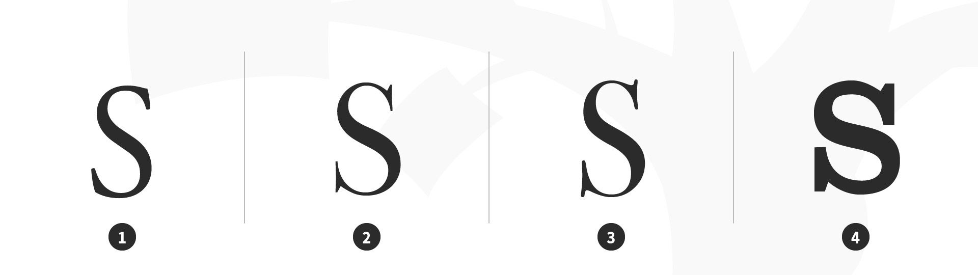
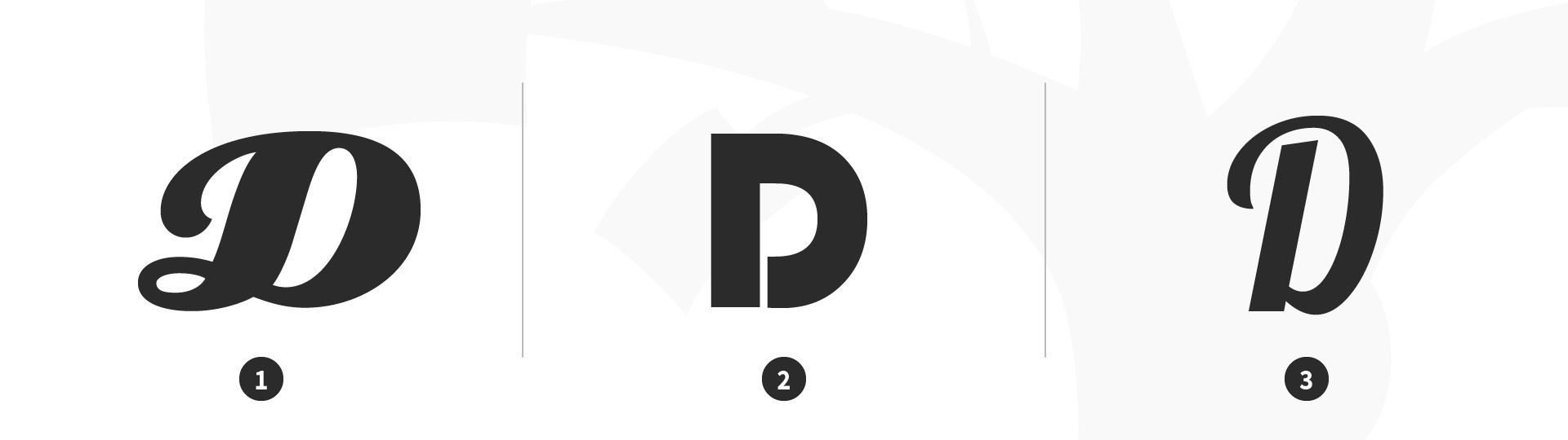
A serif is a stroke added to the beginning or end of one of the main strokes of a letter. A typeface with serifs is called a serif typeface. Serifs can be classified as Old-Style, Transitional, Modern and Slab.
Have a low contrast between thick and thin strokes
Have a diagonal stress in the strokes
Have slanted serifs on lower-case ascenders
Transitional
Have a high contrast between thick and thin strokes
Have a medium-high x-height
Have vertical stress in the strokes
Have bracketed serifs
Modern (Didone, Neoclassical)
Have a high contrast between thick and thin strokes
Have a medium-high x-height
Have vertical stress in the strokes
Have bracketed serifs
Slab
Are heavy serifs with subtle differences between the stroke weight
Usually have minimal or no bracketing
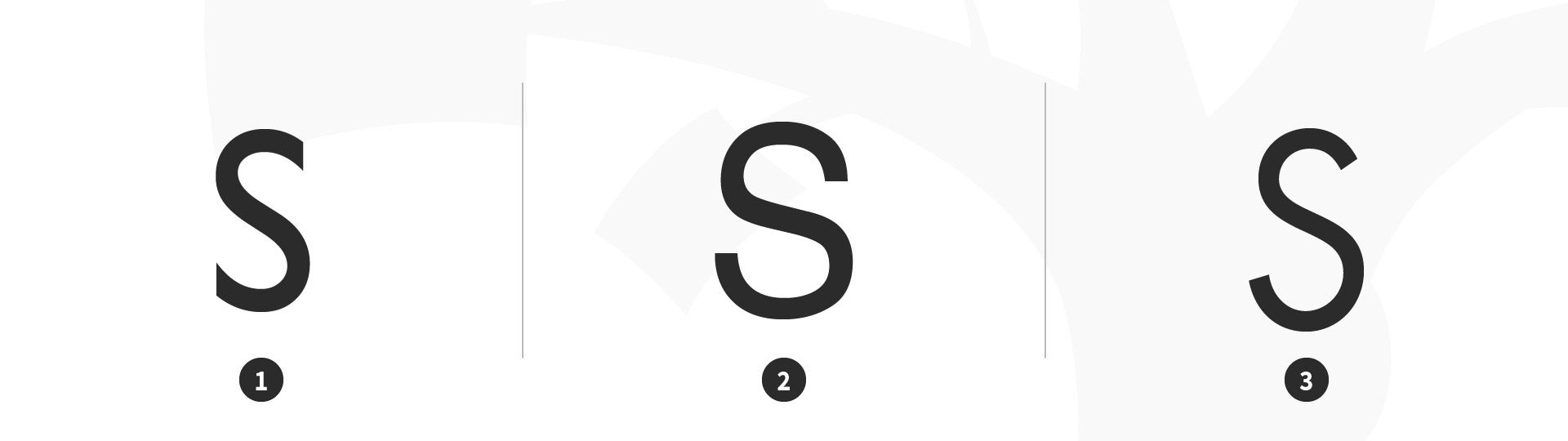
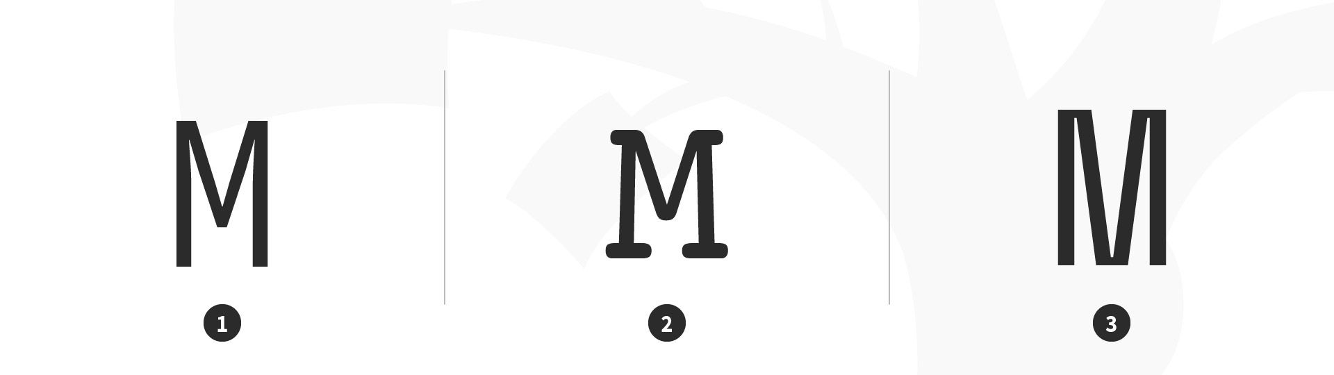
Sans Serif
A typeface without serifs is called a sans serif typeface, from the French word “sans” that means "without." Sans serifs can be classified as Transitional, Humanist and Geometric.
Sans serif type classifications. 1 Transitional: Gill Sans, 2 Humanist: Helvetica, 3 Geometric: Futura.
Have a high contrast between thick and thin strokes
Are narrow with straight lines and angular curves
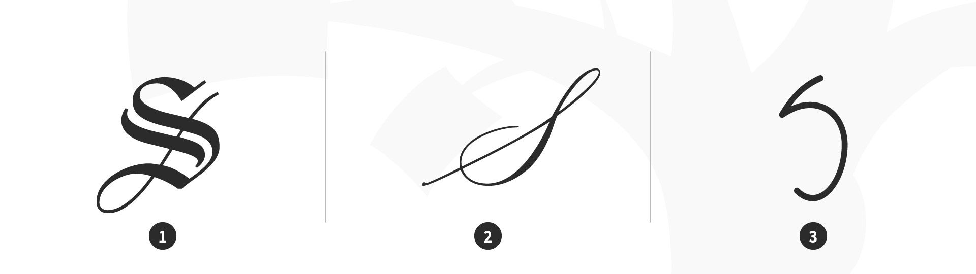
Calligraphic
Are replications of calligraphic styles of writing (formal)
Handwriting
Are replications of handwriting (casual)
Display (Decorative)
Display typefaces, also known as decorative, are a broad category of typefaces that do not fit into the preceding classifications. They are typically suited for large point sizes and primarily used for display.
In the 16th century, printers began organizing roman and italic typefaces into matched type families. The concept was formalized in the early 20th century to include styles such as bold, semibold and small caps. A traditional roman book face typically has a small family, an intimate group that comprises roman, italic, small caps, and possibly bold and semibold (each with an italic variant) styles. Sans-serif families often feature many more weights and sizes (e.g., thin, light, black, compressed and condensed).
A superfamily comprises dozens of related fonts in multiple weights and/or widths, often with both sans-serif and serif versions. Small capitals and non-lining numerals (formerly only in serif fonts) appear in the sans-serif versions of Thesis, Scala Pro and other contemporary superfamilies. Some type families evolve over time. An exception is Univers, designed by Swiss typographer Adrian Frutiger, in 1957. Frutiger designed 21 versions of Univers, thereby conceiving an entire system of it.
Choose Your Type Wisely
Here are some helpful tips and best practices for designing with type (the art of arranging type). While these best practices are appropriate in most situations, it’s important that you always consider the cultural context of your user.
Keep it simple; stick to two typefaces, preferably different-enough-looking ones. Try pairing a serif typeface with a sans serif.
Ensure it’s appropriate for the application/occasion. If in doubt, choose from Baskerville, Bodoni, Caslon, Century, Futura, Garamond, Gotham, Helvetica, Minion, Optima, Source Sans and Univers.
Left align your type to create a strong vertical threshold and reduce eye fatigue for users.
Limit your word count to10–12 words per line of text, to further minimize eye fatigue.
Align groupings of text (e.g., headlines and body copy) with design elements (e.g., images and logos).
Skip a weight; use multiple font weights within a typeface to differentiate text, so adding contrast between your headlines, body copy and call-to-actions.
How does type influence how users feel and behave?
Type influences how users feel and behave more than most people may realize. Fonts set the tone right away. Clean, modern typefaces tend to feel trustworthy and professional, while playful or handwritten fonts can feel casual or fun.
Size and spacingmatter, too. Large, bold headlines draw attention and guide users through the page. Tight spacing or cramped lines can feel overwhelming. Meanwhile, generous negative space—or white space—makes content feel open and easier to read.
Alignment and hierarchy shape behavior, too. Clear text structure helps users scan faster and find what they need. However, messy typography creates confusion and slows them down.
Good typography feels invisible—it supports the message without getting in the way. When done right, it builds trust, keeps users engaged, and encourages them to explore or take action. Type isn’t just about looks—it’s about how users think, feel, and move through a design.
Watch as Associate Professor of Art Studio and Digital Design at The University of Kentucky, Mia Cinelli explains important points about type:
What’s the difference between a font and a typeface?
A typeface is the design of the letters—for example, Helvetica or Times New Roman—while a font is a specific style and size of that typeface—for example, Helvetica Bold 12pt. From that, you can think of the typeface as the “family” with fonts being the individual “members.”
In everyday use, many people say “font” when they really mean “typeface.” However, designers should know the difference—especially when they’re talking about style choices or setting up a layout. So, the typeface is the big picture, the font is the specific tool you use to make it real.
Watch as Associate Professor of Art Studio and Digital Design at The University of Kentucky, Mia Cinelli explains important points about type:
What font sizes work best for web and mobile interfaces?
For web and mobile interfaces, stick to font sizes that balance clarity and comfort. On desktop, 16px is a solid starting point for body text. It’s easy to read without feeling too large. For headlines, go bigger—anywhere from 24px to 32px, depending on the layout and importance.
On mobile, bump things up a bit. Smaller screens need slightly larger text to stay readable. Body text around 17–18px usually feels right. Buttons and links should use at least 16px to avoid frustrating taps.
Don’t rely on a one-size-fits-all approach. Use a scale—larger sizes for headings, medium for subheadings, and standard for paragraphs. Keep enough space between lines too. Line height around 1.4 to 1.6 helps prevent the text from feeling cramped.
Overall, go for readable, touch-friendly sizes. Always test on real devices and screens to make sure everything feels natural and easy to use.
Watch as Mia Cinelli explains important points about type:
How many typefaces should I use in a single interface?
Stick to two typefaces in a single interface—one for headings and one for body text. That keeps things clean, readable, and easy to manage. If you mix in too many, the design can start to feel messy or unprofessional.
Choose typefaces that pair well. For example, use a bold, attention-grabbing typeface for headlines and a simpler one for longer text. Or stick with a single typeface family that offers different weights and styles. That gives you variety without losing consistency. You can find tools for choosing typefaces that pair well, such as Monotype’s Font Pairing Generator and Fontpair.
You can also play with size, weight, and color to create contrast without switching typefaces. Just make sure the styles work together and don’t fight for attention.
The goal is clarity. Too many typefaces distract users and break flow. So, keep it simple, stay consistent, and let your content lead the design—not a jumble of competing typefaces.
Watch as Associate Professor of Art Studio and Digital Design at The University of Kentucky, Mia Cinelli explains important points about type:
Should I use serif or sans-serif fonts in digital design?
In most digital designs, it’s better to go with sans-serif fonts. They look clean and sharp on screens, especially at smaller sizes. Sans-serifs like Inter, Roboto, or SF Pro stay readable on both desktop and mobile—which makes them a solid default choice.
Serif fonts can work too, but use them with care. They add a touch of elegance or tradition, which suits editorial sites, portfolios, or high-end brands. Just make sure they don’t feel cramped or fuzzy—some serif details don’t render well on smaller screens.
If you want to mix the two, try using a serif for headlines and a sans-serif for body text. That creates contrast while keeping everything readable.
So, start with sans-serif for usability. Bring in serifs if they fit your brand and still look good across devices. As always, test to see what feels right to your users and in context.
Watch as Mia Cinelli explains important points about type:
This article by Paul Kahn and Krzysztof Lenk explores how typography shapes the presentation and functionality of user interfaces in digital environments. Rather than focusing on typographic minutiae, the authors advocate for a design philosophy that prioritizes clarity, hierarchy, and visual structure. They emphasize the role of typography in guiding user interaction and creating coherent visual language in UI design. Drawing from traditional print design principles, the article illustrates how designers can achieve effective information architecture in digital media. It remains a foundational piece in understanding the intersection of typographic practice and digital interface design, contributing significantly to the evolution of UX and UI thinking.
Ian Christopher Dyer’s paper critically examines the evolution and current relevance of typographic standards within web and application design. Amid technological advances enabling extensive font customization, Dyer highlights the emerging challenge of device fragmentation and the scarcity of recent research on readability and typographic perception. The study underscores a communication gap between graphic designers and researchers, leading to inconsistent practices despite the rising importance of user-centered design. This work is important as it synthesizes historical, technical, and practical aspects of typography and outlines a roadmap for future interdisciplinary research in HCI and UX, advocating for standardization in digital typography for enhanced user comprehension and usability.
What are some popular and respected books about type in UX and UI design?
Giving Type Meaning by Mia Cinelli explores typography as a dynamic cultural and communicative force that goes beyond aesthetics. Bridging historical perspectives with contemporary practice, the book addresses how typographic choices convey context, emotion, and intent. Cinelli examines how designers give type “voice,” emphasizing the semantic, experiential, and social dimensions of letterforms. Case studies, interviews, and design exercises enrich the discussion, making this book both a theoretical exploration and a hands-on guide. It is particularly important for designers seeking to move beyond surface-level styling and create typographic work that communicates with nuance, purpose, and cultural sensitivity in both digital and print environments.
Ellen Lupton’s Thinking with Type is a foundational and best-selling typography guide, now in its revised and expanded third edition. This edition adds 32 pages of new content, including updated typeface selections, guidance on variable fonts and responsive layouts, and contributions on diverse global writing systems. It covers typographic fundamentals such as spacing, alignment, grids, and design principles like Gestalt theory. Designed for professionals and students alike, the book empowers readers to understand and innovate within the visual systems that govern written communication. Its clarity, depth, and rich visuals make it essential for anyone shaping digital or print experiences with typography.
How do I choose the right typeface for a digital product?
To choose the right typeface for a digital product, start with clarity. If users can’t read it easily, they won’t stick around. Pick one that looks clean on all screen sizes—from phones to desktops. Sans-serif typefaces like Roboto, Inter, or Helvetica Neue work well because they stay sharp and simple.
Next, match the typeface’s personality to your product and brand. A finance app might need something modern and trustworthy. A kids’ game could use something playful and fun. Think about the feeling you want to create.
Also, check if it comes in different weights—like bold, regular, or light. That gives you flexibility when you’re building hierarchy. And don’t forget licensing—some typefaces are free; others require payment.
Lastly, test it. Try it with real text in your design—not “lorem ipsum” placeholder text. Make sure it feels right, not just looks good. The best typeface supports your content and helps users feel at home.
Watch as Mia Cinelli explains important points about type:
The best typefaces for UI design are the ones that stay clear, readable, and consistent across all screen sizes. Ones like Roboto, Inter, SF Pro, and Helvetica Neue have become go-to choices for a reason—they’re modern, flexible, and built for screens.
Roboto is great for Android apps and works well in both small and large text. Inter was made specifically for digital interfaces—with clean shapes and strong contrast. SF Pro is Apple’s system font, designed to look sharp on all their devices. Meanwhile, Helvetica Neue still feels timeless—simple, professional, and versatile.
These come with multiple weights, which helps create hierarchy and structure in your design. Also, they’re well-tested, so you know they’ll perform across devices.
In short, choose typefaces that do their job quietly. They should support the design—not steal the spotlight. Clarity always wins.
Watch as Mia Cinelli explains important points about type:
Common typography mistakes in UX design usually involve problems with clarity and consistency. A big mistake is using fonts that are hard to read—either too thin, too fancy, or just too small. If users have to squint, they won’t stick around.
Another issue is poor color contrast. Light gray text on a white background might look sleek, but it’s tough to read, especially for users with low vision. Always check color contrast to make sure text stands out clearly. For example, you can use WebAIM to find contrast accessibility issues. Accessibility is a vital consideration in design, anyway, so ensure you help users with visual—and other—disabilities. An added benefit is that you’ll help all users—including those with better eyesight but who might be reading the screen in strong sunlight, for example.
Inconsistent styles can also confuse users. Mixing too many typefaces, sizes, or weights makes the interface feel chaotic. So, stick to a clear hierarchy and a limited set of styles.
Don’t forget spacing. Cramped lines or awkward gaps make reading harder. So, use proper line height and padding to keep things easy on the eyes.
Overall, focus on readability, contrast, and consistency. Typography should guide users—not get in their way.
Learn why accessibility is a vital consideration:
ShowHide
video transcript
00:00:00 --> 00:00:30
Accessibility ensures that digital products, websites, applications, services and other interactive interfaces are designed and developed to be easy to use and understand by people with disabilities. 1.85 billion folks around the world who live with a disability or might live with more than one and are navigating the world through assistive technology or other augmentations to kind of assist with that with your interactions with the world around you. Meaning folks who live with disability, but also their caretakers,
00:00:30 --> 00:01:01
their loved ones, their friends. All of this relates to the purchasing power of this community. Disability isn't a stagnant thing. We all have our life cycle. As you age, things change, your eyesight adjusts. All of these relate to disability. Designing accessibility is also designing for your future self. People with disabilities want beautiful designs as well. They want a slick interface. They want it to be smooth and an enjoyable experience. And so if you feel like
00:01:01 --> 00:01:30
your design has gotten worse after you've included accessibility, it's time to start actually iterating and think, How do I actually make this an enjoyable interface to interact with while also making sure it's sets expectations and it actually gives people the amount of information they need. And in a way that they can digest it just as everyone else wants to digest that information for screen reader users a lot of it boils down to making sure you're always labeling
00:01:30 --> 00:02:02
your interactive elements, whether it be buttons, links, slider components. Just making sure that you're giving enough information that people know how to interact with your website, with your design, with whatever that interaction looks like. Also, dark mode is something that came out of this community. So if you're someone who leverages that quite frequently. Font is a huge kind of aspect to think about in your design. A thin font that meets color contrast
00:02:02 --> 00:02:20
can still be a really poor readability experience because of that pixelation aspect or because of how your eye actually perceives the text. What are some tangible things you can start doing to help this user group? Create inclusive and user-friendly experiences for all individuals.
In this course, you will gain a holistic understanding of visual design and increase your knowledge of visual principles, color theory, typography, grid systems and history. You’ll also learn why visual design is so important, how history influences the present, and practical applications to improve your own work. These insights will help you to achieve the best possible user experience.
In the first lesson, you’ll learn the difference between visual design elements and visual design principles. You’ll also learn how to effectively use visual design elements and principles by deconstructing several well-known designs.
In the second lesson, you’ll learn about the science and importance of color. You’ll gain a better understanding of color modes, color schemes and color systems. You’ll also learn how to confidently use color by understanding its cultural symbolism and context of use.
In the third lesson, you’ll learn best practices for designing with type and how to effectively use type for communication. We’ll provide you with a basic understanding of the anatomy of type, type classifications, type styles and typographic terms. You’ll also learn practical tips for selecting a typeface, when to mix typefaces and how to talk type with fellow designers.
In the final lesson, you’ll learn about grid systems and their importance in providing structure within design. You’ll also learn about the types of grid systems and how to effectively use grids to improve your work.
You’ll be taught by some of the world’s leading experts. The experts we’ve handpicked for you are the Vignelli Distinguished Professor of Design Emeritus at RIT R. Roger Remington, author of “American Modernism: Graphic Design, 1920 to 1960”; Co-founder of The Book Doctors Arielle Eckstut and leading color consultant Joann Eckstut, co-authors of “What Is Color?” and “The Secret Language of Color”; Award-winning designer and educator Mia Cinelli, TEDx speaker of “The Power of Typography”; Betty Cooke and William O. Steinmetz Design Chair at MICA Ellen Lupton, author of “Thinking with Type”; Chair of the Graphic + Interactive communication department at the Ringling School of Art and Design Kimberly Elam, author of "Grid Systems: Principles of Organizing Type.”
Throughout the course, we’ll supply you with lots of templates and step-by-step guides so you can go right out and use what you learn in your everyday practice.
In the “Build Your Portfolio Project: Redesign,” you’ll find a series of fun exercises that build upon one another and cover the visual design topics discussed. If you want to complete these optional exercises, you will get hands-on experience with the methods you learn and in the process you’ll create a case study for your portfolio which you can show your future employer or freelance customers.
You can also learn with your fellow course-takers and use the discussion forums to get feedback and inspire other people who are learning alongside you. You and your fellow course-takers have a huge knowledge and experience base between you, so we think you should take advantage of it whenever possible.
You earn a verifiable and industry-trusted Course Certificate once you’ve completed the course. You can highlight it on your resume, your LinkedIn profile or your website.
Typography can make or break the success of a site or app. It’s a cornerstone of UX design; more than 90% of online info
851 shares
3 years ago
Open Access—Link to us!
We believe in Open Access and the democratization of knowledge. Unfortunately, world-class educational materials such as this page are normally hidden behind paywalls or in expensive textbooks.

