Searching for a particular piece of content online can be just as challenging as going to a supermarket and looking for a specific type of food coloring for a rainbow cake you’re planning to bake for your nephew’s birthday. Imagine the time it would save when you could narrow the search actions down to a single category. In this example, it would mean limiting your search to the baking goods aisle. In the digital world, this solution translates to the refined search design pattern, used successfully by companies such as Flickr, Vimeo, and the TED organization. So, let’s get down to business with finding out how to teleport your users to where they really want to get to in any website you create.
The Design Problem
When searching for a particular item, piece of information, or body of content within a complex user interface—one that has a number of different pages and levels—users might find the going hard. The process might take a long time, especially if there is no way of searching a specific category or section of the user interface. Users do not want search results to appear from sections of the user interface where they know for certain their target item or piece of information does not reside. Therefore, they need some means of constraining the search engine, so results are specific to the area of the user interface they are interested in. They want precision and convenience, not an avalanche of irrelevant pieces.
The Design Solution
When dealing with a user interface with clear sections or levels, allowing users to refine their searches according to these specific regions can help to reduce the number of irrelevant items or options they must consider, saving them much time in the process. As you can see from the example below, the user is able to select one of three different search refinement categories: “This Mac,” “IxDF Course – UI Design Patterns,” and “Shared.”

Author/Copyright holder: Apple. Copyright terms and license: Fair Use.
Searching for a file on your computer may take a long time, due to the large number of documents you will have collected over the years. Refining your search to a folder in which the file is most likely located, however, saves a lot of time. In this case, the search is refined to the folder “IxDF Course – UI Design Patterns.”
Why Choose a Refined Search Design Pattern?
As stated, by including a refined search option, the users can zero in on their desired content with greater speed than if the search engine produced results from all levels and categories within the user interface. If results from every category and section were displayed at once, there would, more likely than not, be a large number of irrelevant options to consider, options slowing the user down and which might be very frustrating. To bring this matter into perspective, let’s imagine a little scenario. Let’s say you’ve just accidentally turned the tap on your kitchen sink off a little too forcefully. In fact, you’ve succeeded remarkably in snapping something inside the core – you heard and felt something give inside the base of the tap. The lever of the tap itself isn’t broken, and it’s in the ‘off’ position as normal; yet, lo and behold, water is dribbling out of the faucet. You had better do something, and very soon. Yes, you could call a plumber right away, or... you think – you race to your computer and enter “broken faucet” in your search engine. Your eyes devour the first page of search results. Many of them seem to be about broken handles, not the insides. So, you try putting “inside” after “broken faucet”; suddenly, you’ve got a string of results about strange things called shower cartridges and broken pipes in the wall. Luckily, you’ve got an Advanced Search feature in your settings – so, you go there and enter “broken faucet” on the search but type in “pipe” and “cartridge” in the terms you do not want it to look for. Thanks to that, you work out what’s wrong – that’s the good news. The bad news is – you’ll still probably need a plumber.
The simple inclusion of the refined search option increases the users’ sense of control of events in the user interface, ensuring the options are more and more specific to their current aims and objectives. If the users feel they have control over the things that happen when interacting with the system, they will feel supported, which will benefit their productivity and user experience as a direct result. These positive experiences will encourage users to continue using your design, rather than abandoning it for a design that does allow them to perform tasks in the shortest time possible.
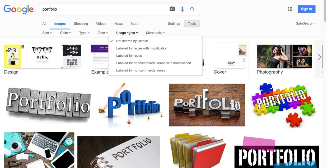
Author/Copyright holder: Google. Copyright terms and license: Fair Use.
Searching images with Google allows users to refine their search based on size, color, type, usage rights, and more. A dropdown menu is used to offer the options to the user without taking up too much space.
Best Practice: How to Implement Refined Search
Provide the users with an input field in which to enter their search term.
Identify the different categories of contents the users can use to refine their search. Assign logical names to these categories, so the users are in no doubt which section of the user interface search results will be generated from.
Put these different 'refine search' categories into another user interface design pattern; typically, a dropdown menu is used for this purpose (see the example above). As a default search option, you can select 'all', or simply leave the default option blank in the menu so the search is not refined at first.
Allow the users to select an option in the ‘refine search’ menu using the mouse and keyboard. Once an option has been selected, the users should be able to move back to the input field by using the shift key or clicking on any area within the input field.
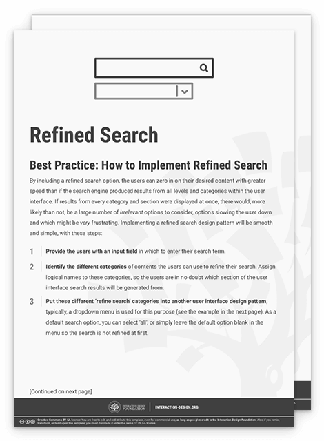
To help you get started implementing a refined search, you can download and print our “Refined Search” template:

Potential Problems with Refined Search
“She wasn’t looking for a knight. She was looking for a sword.”
—Atticus, Classical Greek philosopher
If you are dealing with a website, application, or system with many different levels, it is best to use search refinement options that avoid having to list every different section of the user interface. If all sections were represented in the refine search list, the users would have to scan and consider a large number of different options before making their selection, adding an unwelcome extra step and slowing the process down in turn.
Therefore, it is important to choose refine search options that allow the users to narrow their search focus without having to consider lots of possibilities first. For example, you may wish to allow the user to search by the date information was added to the application, rather than represent all of the broadest categories, as they will likely present the largest number of possible options. In addition, if you allow users to refine their search within a particular section—to drill ever deeper into the contents—then the refinement options should again be limited, and clearly state how the search will be refined to avoid any confusion.
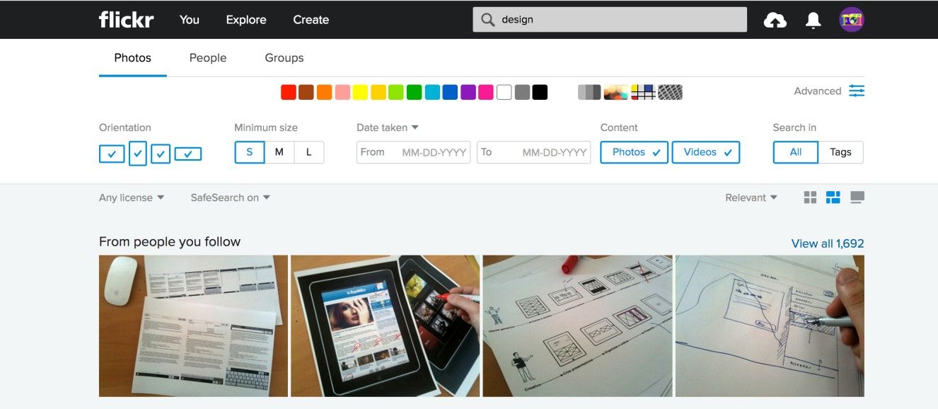
Author/Copyright holder: Flickr. Copyright terms and license: Fair Use.
To prevent the interface from getting cluttered and the process of searching from getting too complicated, the refined search options on the Flickr webpage are mostly hidden under the ‘Advanced’ icon.
The Take Away
The refined search design pattern is highly recommended when your user is searching for a particular item in a complex user interface, or in a large body of content. Consider a haystack and a needle, and look on a refined search as the metal detector. Providing users with categories they can use to filter the search results will help them accomplish their goals faster and with less effort, resulting in improved user experiences. However, when implementing the refined search pattern, finding the right balance in the amount of refining categories they can choose from is certainly important. The purpose of a filter, after all, is to let what you want get through while keeping back what you don’t want.
References & Where to Learn More
Hero Image: Author/Copyright holder: Nicholas Eckhart. Copyright terms and license: CC BY-NC-SA 2.0.
Jenifer Tidwell, Designing Interfaces: Patterns for Effective Interaction Design, 2010
Martijn van Welie, Pattern Library, 2008

