Design plays a role that’s utterly crucial in our daily lives—it bridges functionality with aesthetics to meet user needs. In product development, it’s design that determines how user-friendly and appealing a product is. The field of human-computer interaction (HCI) is foundational to UX design. To excel as a UX Designer, you need to understand HCI. Learn the core principles and main highlights of HCI in the IxDF Human-Computer Interaction: The Foundations of UX Design course.
What if technology could adapt perfectly to the personal needs and preferences of a user? Think about how you interact with your computer or smartphone every day. These interactions are what lie at the core of Human-Computer Interaction (HCI)—a field that can help you make technology more user-friendly and accessible.
HCI strives to tailor digital experiences to individual users, and it combines computer science, psychology and design elements to create better interfaces. The goal is to make technology easy to use, efficient and—of course—enjoyable. This field studies how people use computers in various contexts. It uses this information to improve current technologies and develop new ones with the aim to help users accomplish tasks faster and more effectively.
Whether you have a simple app or a complex database system, HCI principles guide the design to meet user needs. HCI is essential because it influences the usability of every digital device and software you use.
If you want to understand the concept of HCI, learn these 11 things.
The Basics of Human-Computer Interaction (HCI)
Human-computer interaction (HCI) is about how people use computers. It helps us design computers and technology users find easy and enjoyable to use. Initially, HCI focused on traditional computers, but now it helps us design across devices.
HCI integrates theories and practices from various fields.
© Interaction Design Foundation, CC BY-SA 4.0
HCI consists of three main parts:
User: The person who uses the computer.
Computer: Any device, from a simple phone to a big system.
Interaction: How people and computers interact, whether directly or indirectly. HCI makes this smoother.
Direct interaction: The computer responds quickly, like when you play a game.
Indirect interaction: The computer works on tasks independently, like a software update.
The goal is for users to interact with computers to achieve specific tasks.
1. The Increased Role of Technology in Our Lives
Technology is constantly changing the way we live. It started with computers helping us with specific jobs—and now it's everywhere! Think about how video games have gone from simple blips on a screen to whole worlds we can explore. Technology even changes the little things in our lives—our homes are filled with smart devices that help us in so many ways. What’s more, technology will shape our future even more.
2. The Need to Understand HCI
The need for HCI becomes clear when we examine cases like the Citigroup incident. A U.S. judge ruled that Citigroup couldn’t recover the nearly $900 million mistakenly sent due to a software error. This mistake wasn’t just a human error but a failure of the software interface. It presented choices to the operator in a poor, confusing manner.
Most HCI failures might not be as costly individually. Even so, they likely cost the economy around a billion dollars each year. Such incidents show you how important it is to design intuitive and error-free interfaces. Effective HCI can prevent costly mistakes and enhance overall economic efficiency.
How to Create Systems That People Can Use
A key focus of Human-Computer Interaction (HCI) is to help you create systems that people can use with ease. From the HCI perspective, you must understand user needs, behaviors and environments well to design these systems. Learn what you need to know if you want to create these systems.
1. Focus on Interaction Design
Interaction design focuses on how people use apps, websites and other digital products. It aims to make these products easy to use and understand.
This broad field includes elements like aesthetics, motion, sound and space. Each aspect helps enhance user interaction with products. The five dimensions of interaction design offer a framework to understand its components. Gillian Crampton Smith introduced the first four dimensions and Kevin Silver added a fifth.
1D: Words should be clear and simple. They must convey essential information without overwhelming the user.
2D: Visual representations include images, typography and icons that complement the words.
3D: Physical objects or space involves the hardware through which users interact with the product, such as a laptop or smartphone. The user's environment also affects interaction, whether on a crowded train or at a desk.
4D: Time refers to elements that change—such as animations and sounds. It provides feedback on user interactions. What’s more, it considers the duration of interaction, which lets users track progress or pause and resume later.
5D: Behavior covers how users engage with a product, and it includes the actions performed and their responses. This dimension examines how the previous dimensions shape the product's interactions—and it includes the emotional feedback from users.
2. User-Centric Design: Understand the Purpose and Process
Whenever we think about what we are designing, we focus on more than just interfaces; we design interactions and interventions. These interactions meaningfully connect users with technology. They help users accomplish tasks so much more effectively and enjoyably.
We keep users at the heart of every interaction we design. Watch Alan Dix, Professor and Expert in Human-Computer Interaction, discuss why user experience is important.
What is design, then? Design is about setting goals within the constraints of technology, budget and user needs. You craft something functional and enjoyable for the users when you design. It can make a website look better or software easier to use. To design well, you’ve got to understand what you're working with. This might mean physical tools like wood or metal or digital tools like software and websites.
You put the user at the core of successful design. It means you understand their needs, behaviors and environments. A design that resonates with users has got to consider these elements for it to be successful. For example, if you create video editing software, you’ve got to balance the ease of use with the capability to produce high-quality outputs. That often requires choices that favor one aspect over another, but always with the user's experience in mind.
Many problems get blamed on "human error." Often, though, the real issue is bad design. It's important—if not the most pivotal thing—to remember that people are the heart of the design process. They're not just another piece to work with.
3. Make Personas to Understand the Users Better
© Interaction Design Foundation, CC BY-SA 4.0
Personas help you understand your target audience and they hold a lot of importance. Watch Alan Dix discuss personas in detail in this video.
Personas are fictional characters you create from research. They represent users who might similarly use your service, product or brand. You gain insights into your users' needs, behaviors and goals through personas. This method helps you step outside their perspectives to understand that different users have diverse needs and expectations.
Rather than designing based on the preferences of the design team, many human-centered design disciplines now develop personas. These personas, which you base on user data, add a human element to your research.
Lene Nielsen, a specialist in personas, identifies four types of personas that add value to design projects:
Goal-directed personas focus on what users want to achieve with your product. They help understand user workflows.
Role-based personas incorporate extensive data and focus on the user’s role within their organization or life. You reflect on how this influences their interaction with the product.
Engaging personas aim to create a deep, realistic connection with the user through emotional dimensions and psychological ones. This type encourages designers to visualize the user as a real person.
Fictional personas are born from the UX team's assumptions rather than direct user research. These are initial sketches of user needs. They are helpful early in the design process but need careful consideration and validation.
You can create personas in 10 easy steps. Here’s how:
Collect data: Gather extensive data about your target users through research methods like interviews, surveys and observation.
Form hypothesis: Based on your research, develop ideas about different types of users you might have.
Validate hypotheses: See if your ideas match what you already know. Talk to project stakeholders on your team for their input too.
Determine the number of personas: Decide the number of personas that make sense for the project. Try to create a few detailed ones.
Develop persona descriptions: Write down everything about them: who they are, their goals, what they do and how they might use your product.
Develop scenarios: Create scenarios that put personas in realistic contexts where they interact with the product or service. Highlight potential issues and needs.
Organizational acceptance: Ensure all project participants agree with the personas and understand their use in the project.
Disseminate personas: Give the persona descriptions to everyone involved in the project.
Prepare usage scenarios: Develop detailed stories about how personas interact with the product. Highlight the value and functionality of the design.
Constant adjustment: Regularly update and refine personas based on new research and feedback—it helps you keep them relevant throughout the design process.
4. Use Cultural and Technology Probes to Understand Your Users
You must understand users in design but direct observation in their daily environments is not always possible. This is where cultural and technology probes help. These tools help you gather insights into user behaviors, needs and desires without being physically present.
© Interaction Design Foundation, CC BY-SA 4.0
Cultural probes capture the subjective experiences of users. You send a pack of tools to users. It may include items like a disposable camera, a diary and other interactive objects. Users use these tools to document their daily lives, feelings and surroundings.
For example, users might describe the sounds they hear at home or capture moments that move them throughout the day. This method lets them express what’s meaningful to them in their natural settings. And it provides you with rich data that goes beyond simple questionnaire responses.
Technology probes explore how users interact with new technologies. They’re not complete products but simplified versions that test specific aspects of a concept—and you can use them to understand how users might use a new technology or feature.
5. Help Users with Navigation Design
Navigation design is like making a map for your website or app. It helps people find their way around easily to do what they’ve got to do. Good navigation design includes elements like:
Menus: Clear lists of options or sections.
Search bars: A way for people to find exactly what they want.
Links: Words or buttons that take you to different pages.
Breadcrumbs: A trail that shows users where they are on the site and how to return.
Consider an e-commerce website. A well-designed navigation system will help customers in the following manner:
The customers can find products quickly.
They can filter through categories.
They can check out with ease.
Poor navigation could lead to frustration, abandoned carts and lost sales. Follow the best practices for navigation design to avoid these losses:
Same place, every page: People expect to find your menu in the same spot on each page.
Use simple words: Choose labels that tell people what a button or link does.
Prioritize accessibility: Make sure people with disabilities can easily use your navigation too.
Offer feedback: Give feedback when someone clicks (like a button that changes color).
Test it: Ask real people to use your website to find any parts that may confuse them.
Keep it short: Help people reach important pages without too many clicks.
How to Create Screens That Fulfill User Requirements
To create user interfaces people love, you’ve got to design screens that work for them. This means you’ve got to understand design principles that match what users want and need—and here's a brief overview of these key principles:
1. Understand Screen Design
Screen design focuses on the graphic layout and user interfaces on displays—and it aims to simplify how people interact with devices. Screen design is different from web design as it centers purely on the user interface. It doesn't consider underlying functions. Key principles of good screen design include:
User focus: Effective screen design puts user needs first. Make elements like text, icons and buttons easy to find and use.
Familiarity: People feel comfortable with designs they recognize. Many organizations use standard templates for consistency and to speed up the design process.
Simplicity: Create clear and uncluttered designs—and this approach calls for strategic use of color and layout. It helps you organize information and enhance user interaction.
Accessibility: Make sure people with disabilities can use your screens with ease. This means good color contrast and making things work with assistive technology.
Use Grouping to Structure Screen Design
Grouping puts similar items together on a screen. This makes websites and apps simpler to understand. For example, a weather app might group today's temperature with the high and low for the day—something that helps users find the information they want at a glance.
You can apply grouping to any project. It proves effective across a wide range of interface types—from complex dashboard designs to simple mobile apps.
Watch Alan Dix discuss how Gmail uses various visual elements to group crucial elements.
2. Utilize White Space and Redundant Coding in Design
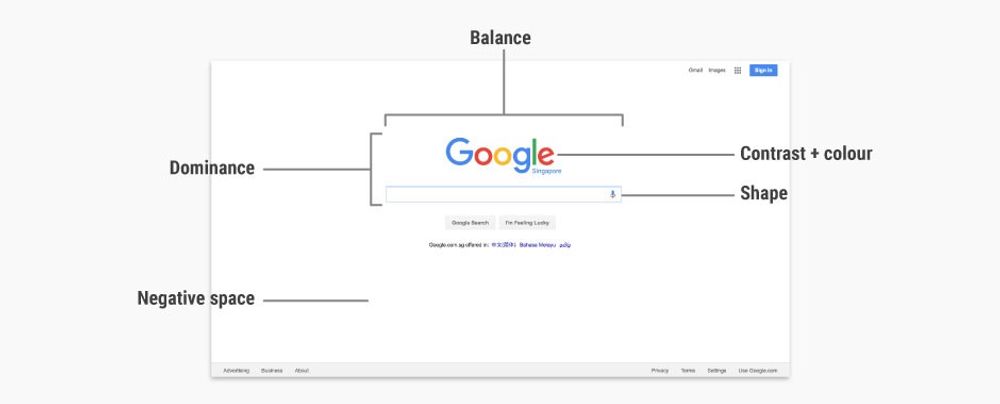
White space—often called negative space—is the space between text, graphics, images and blocks. It’s not just a 'blank' space—it’s an important element of design that enables its objects to exist. The balance of white space enhances legibility and navigability. It gives users a clear path to navigate through content and focuses attention on the most important elements.
Redundant coding means you use multiple ways to present information, not rely solely on one method such as color. This approach is crucial when color alone might not convey information for various reasons. These include:
The use of similar colors makes it difficult for people to differentiate.
Different items being too small.
If you use redundant coding, you ensure that all users, regardless of their ability to perceive color, can understand the content.
Application of White Space and Redundant Coding
White space helps avoid clutter and makes the content more accessible. It provides a visual rest for the eyes and helps you define the elements better with the screen. On the other hand, redundant coding makes data interpretation more accessible and inclusive for everyone. It ensures that information is available through multiple channels, such as text labels, patterns, shapes and colors.
3. Use Aesthetic Elements in Design
Aesthetics is a fundamental design principle—and one that enhances a design's visual appeal. It includes balance, color, movement, pattern, scale, shape and visual weight. Designers use these elements to improve their designs' look and functionality.
Aesthetics helps make designs more attractive and usable. For example, a well-crafted website uses aesthetic elements to grab attention. This instant appeal can encourage users to engage so much more with the site—and it can increase time spent on the site and reduce how quickly they leave.
Even so, aesthetics do more—as in, they need to do more—than beautify a product. They should work hand in hand with the product's functionality. A practical design uses aesthetic elements that focus on essential features while they keep the interface user-friendly, and it helps users navigate the product with ease.
4. Don't Always Rely on Iterative Prototyping
Iterative prototyping is a common method in design and development to take things forward. You use it to refine a product through multiple cycles. However, it isn't always the best approach. Here's why:
Resource intensive: This method can take time, effort and money. Each cycle might need detailed testing and changes. It can make projects longer and more expensive.
Diminishing returns: The benefits of more prototypes can decrease after several cycles. Each new prototype might bring minor improvements but still use up resources.
Scope creep: Projects can grow beyond their original plans in this process. If things swell in this sense, the project can drift from its initial goals as people add new ideas and feedback.
Over-optimization: You may spend too much time to perfect minor features that mightn’t have much value. This is something that can shift focus away from more critical issues.
Stakeholder fatigue: Continuous changes can tire out the team and stakeholders—and constant updates and long decision processes can reduce motivation and slow progress.
Market timing: Iterative prototyping can delay a product's release. It may be harmful to market late, especially if competitors launch similar products faster.
The Take Away
The IxDF Human-Computer Interaction: The Foundations of UX Design Course is a 5-week course that will help you further understand and build upon the topics we discussed. This course covers the principles of human-computer interaction (HCI) and teaches you how to create intuitive user experiences that delight users and enhance customer loyalty and brand value.
You will learn the essential design processes involved in interaction design, navigation design and screen design. The course equips you with the skills to design relationships between humans and digital products. It will help you make these interactions as natural as conversations between two people.
This comprehensive, video-based course features Alan Dix, a leading authority in HCI. Alan Dix is the co-author of the internationally best-selling textbook Human-Computer Interaction and serves as a professor and Director of the Computational Foundry at Swansea University. His expertise will guide you through the complexities of HCI and provide practical and theoretical insights.
This course is ideal for you if you are:
UX designer seeking in-depth theoretical knowledge to complement their practical experience.
Project manager who needs to understand how to create intuitive products.
Software engineer wanting a solid foundation in HCI and UX design.
Entrepreneur aiming to design standout products.
Marketer looking to deeply understand customer interactions.
Newcomer to design considering a career switch to HCI or UX design.
In the Build Your Portfolio: Interaction Design Project segment of the course, you will engage in practical exercises that give you hands-on experience with the methods taught. These optional exercises will allow you to create a series of case studies for your portfolio. This way, you can showcase your skills to potential employers or clients. This project reinforces your learning and enhances your professional profile with work you can showcase.
References and Where to Learn More
Enroll in the IxDF Human-Computer Interaction: The Foundations of UX Design course. It's included in an IxDF membership. To become a member, sign up here.
Read our topic definition on Human-Computer Interaction.
Read why Citigroup cannot recoup Revlon payouts after nearly $900 million gaffe.
Read the Forbes article on The Price Of Software Errors.
A large part of HCI relies on perception and memory. Enhance your HCI skills with the course Perception and Memory in HCI and UX.


