Your constantly-updated definition of UX Design Processes and
collection of videos and articles. Be a conversation starter: Share this page and inspire others!
674shares
What are UX Design Processes?
User experience (UX) design processes are systematic approaches to create meaningful and relevant experiences for users. They usually involve research, ideation, prototyping, testing and implementation. Designers seek to understand user needs and behaviors—and craft intuitive and user-friendly interfaces that enhance user satisfaction and loyalty via optimal usability, accessibility and more.
An effective UX design process isn’t just a sequence of steps to create an appealing interface of visual design. It’s a comprehensive approach that makes sure that the final product is user-centric and functional—and that it’s successful in the market. And when designers and design teams follow a structured series of steps, they can:
Create successful interfaces that meet organizational quality standards.
Integrate prototyping with UI components.
Ensure that the design process remains focused and efficient.
What’s so vital about the essence of a UX design process is its adaptability across projects. Design teams use varied research methods, define a project’s scope and get to work with prototyping tools to refine their solutions.
Here are several reasons why it’s so critically important to follow a well-defined UX design process:
1. User-Centric Solutions
At the heart of UX design is empathy—that’s how designers understand and address the real needs and problems of users. And in a robust UX process, designers and design teams commit to thorough research and solid testing. Designers and design teams depend on these to collect deep insights into user behaviors and preferences. It’s this close examination of users—as they move through their user flows and journeys—that helps expose accurate scenarios and problem statements. Teams can then use these as a kind of compass to guide the design of solutions that aren’t just aesthetically pleasing but functional and easy to use, too.
This video explains why empathy must be at the heart of all design:
ShowHide
video transcript
Transcript loading…
2. Quality and Consistency
A standardized UX design process is something that helps keep the quality high and keep things consistent across a product's interface. This uniformity is essential—and it’s vital not just for the user's intuitive interaction with the product but to reinforce the brand's identity and reliability, too.
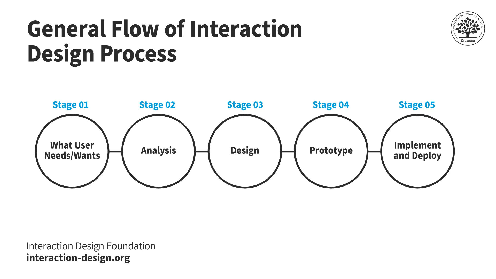
This is the Interaction Design Process, as Professor Alan Dix explained.
A good UX design process nurtures strong collaboration among various teams—and these include design, development and marketing. As teams work together from the early stages of a design process, this cross-functional approach is a major plus. It’s something that can make sure that the product really aligns with business goals and user expectations.
UX Designer and Author of Build Better Products and UX for Lean Startups, Laura Klein explains the value of cross-functional teams:
ShowHide
video transcript
Transcript loading…
4. Economic Efficiency
As organizations integrate UX design early—and throughout the project lifecycle—they can find potential usability issues before these grow into expensive problems. So, brands and project managers can cut down on the risk of costly revisions and rework later in the development cycle—and so save on future redesign and development costs.
5. Risk Reduction
UX design process steps include rigorous usability testing and feedback loops—vital items that help refine the product iteratively. This makes sure that the final version meets user needs—and effectively so—and lessens how likely it will be that the product fails post-launch.
6. Enhanced User Satisfaction and Engagement
It may sound obvious, but a well-designed, user-friendly interface means higher levels of user engagement—and satisfaction. They’re crucial metrics for the success of any digital product.
7. Brand Loyalty and Trust
Positive user experiences that are consistent really build trust and loyalty towards the brand. Good experiences encourage repeat business and word-of-mouth recommendations—and they’re invaluable for long-term business success. This applies to products that UX design teams create, but it’s just as valid for services as well.
AI Product Designer, Ioana Teleanu explains important points about how to design for trust with AI in this video:
ShowHide
video transcript
Transcript loading…
8. Increased Conversion Rates
Effective UX design simplifies user interactions, and it’s what’s behind how easy it is for users to navigate and perform desired actions. Such interactions include making a purchase or signing up for a newsletter—things that translate to higher conversion rates.
9. SEO and Visibility
Search engines favor websites that offer a good user experience—and that includes fast load times, mobile responsiveness and easy navigation. A meticulous UX design process helps teams tick all these boxes. What’s more, it improves search engine rankings and visibility, too.
10. Inclusive and Accessible Design
A comprehensive UX design process helps keep brands, designers and design teams on track regarding considerations for accessibility—and it’s a vital aspect of modern and responsible design. When they follow a solid design process, brands can make sure their products really are usable for people with a wide range of disabilities—and abilities. This inclusivity doesn’t just expand the market reach; it’s something that complies with legal standards and ethical practices in many regions, too.
Watch this video to understand the need for accessibility in design:
ShowHide
video transcript
Transcript loading…
When designers and design teams start a UX design process, they make a strategic investment—one that pays dividends in customer satisfaction, brand loyalty and overall business success. Whether it’s to revisit existing products so they can add the best improvements or to start from scratch in the problem and solution space, teams rely on their design process to structure the way forward.
This is an overview of what a UX design process involves.
It’s common to find mention of the UX/UI design process, product design UX process, UX design process for websites, or mobile app UX design process—for example. Similarly, an end-to-end UX design process tends to include four, five or six steps, such as: understand, define, create, prototype, test and implement.
However, there’s more than just a single UX design process. Several common processes are widely recognizable—and they feature consistently across the industry. The process of UX design can vary a great deal. It’s something that depends on the project, the team and the goals of the design initiative. Here—in no particular order—are some of the most notable processes:
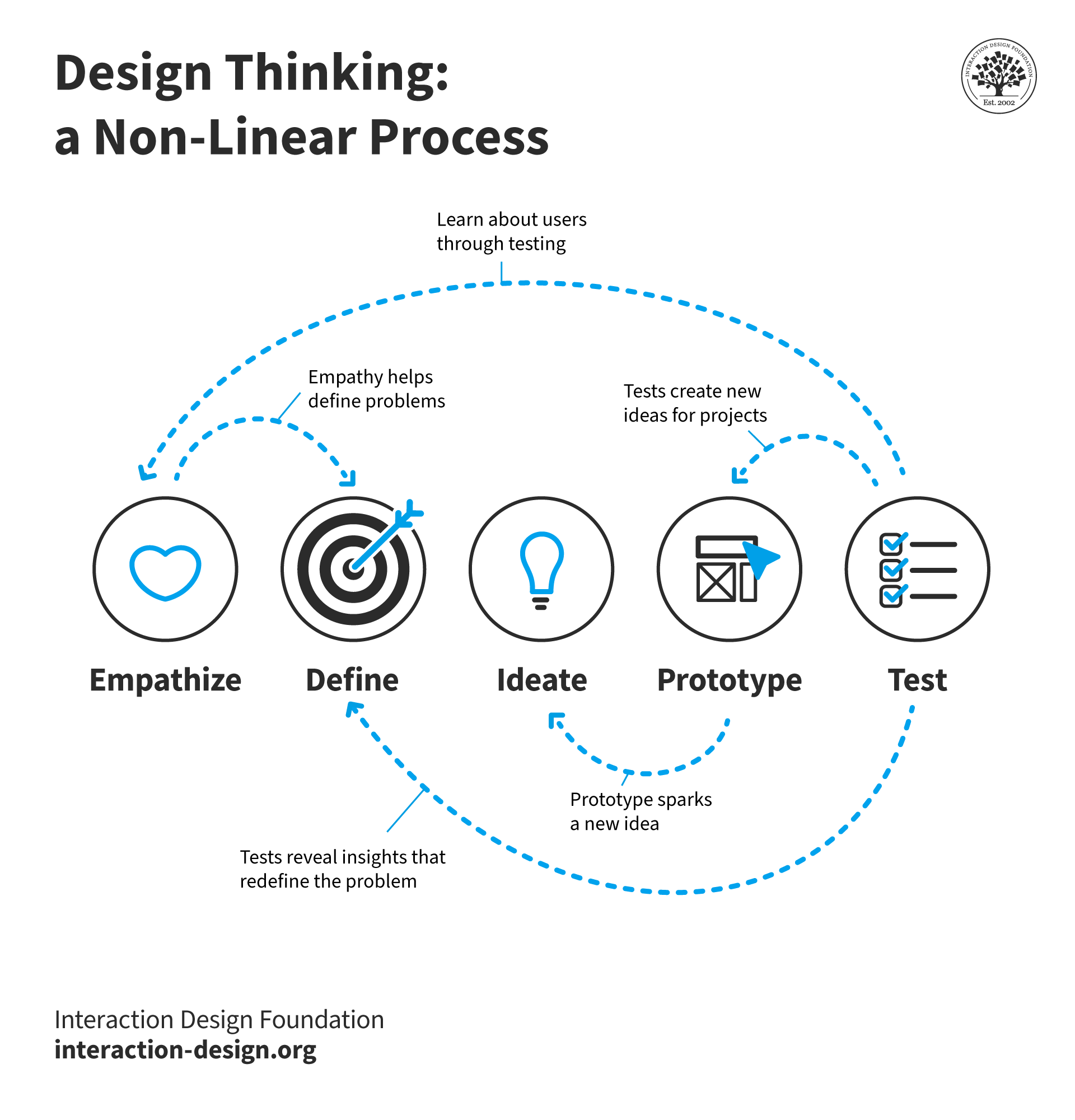
Design Thinking is a user-centered approach—and it’s a well-known one that emphasizes understanding the user's needs, ideating solutions, prototyping, testing and implementing solutions. The design thinking process for UX has five phases in it, where designers:
● Empathize: Understand the users and their problems deeply—through research.
● Define: Clearly articulate what the users’ needs and problems are.
● Ideate: Brainstorm a range of creative solutions to these.
● Prototype: Build a version of the solutions—going from paper prototyping to high-fidelity versions.
● Test: Test the solutions with users and tweak and refine them.
Watch this video on Design Thinking for more insights into this process:
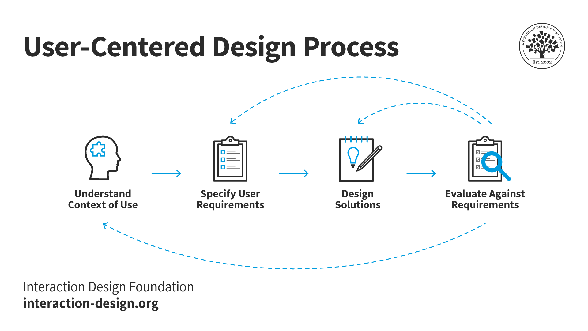
User-centered design is a framework of processes in which design teams give usability goals, user characteristics, environment, tasks, and workflow of a product, service or process extensive attention at each stage of the design process. UCD follows several steps—and in it, design teams:
● Establish the context of use: Understand the users, their tasks and the environments users are in.
● Gather requirements: Define the actual users’ needs and requirements.
● Design solutions: Develop design solutions for them.
● Evaluate: Test the designs with users—real users.
Don Norman, often known as the Father of UX Design, explains user-centered design:
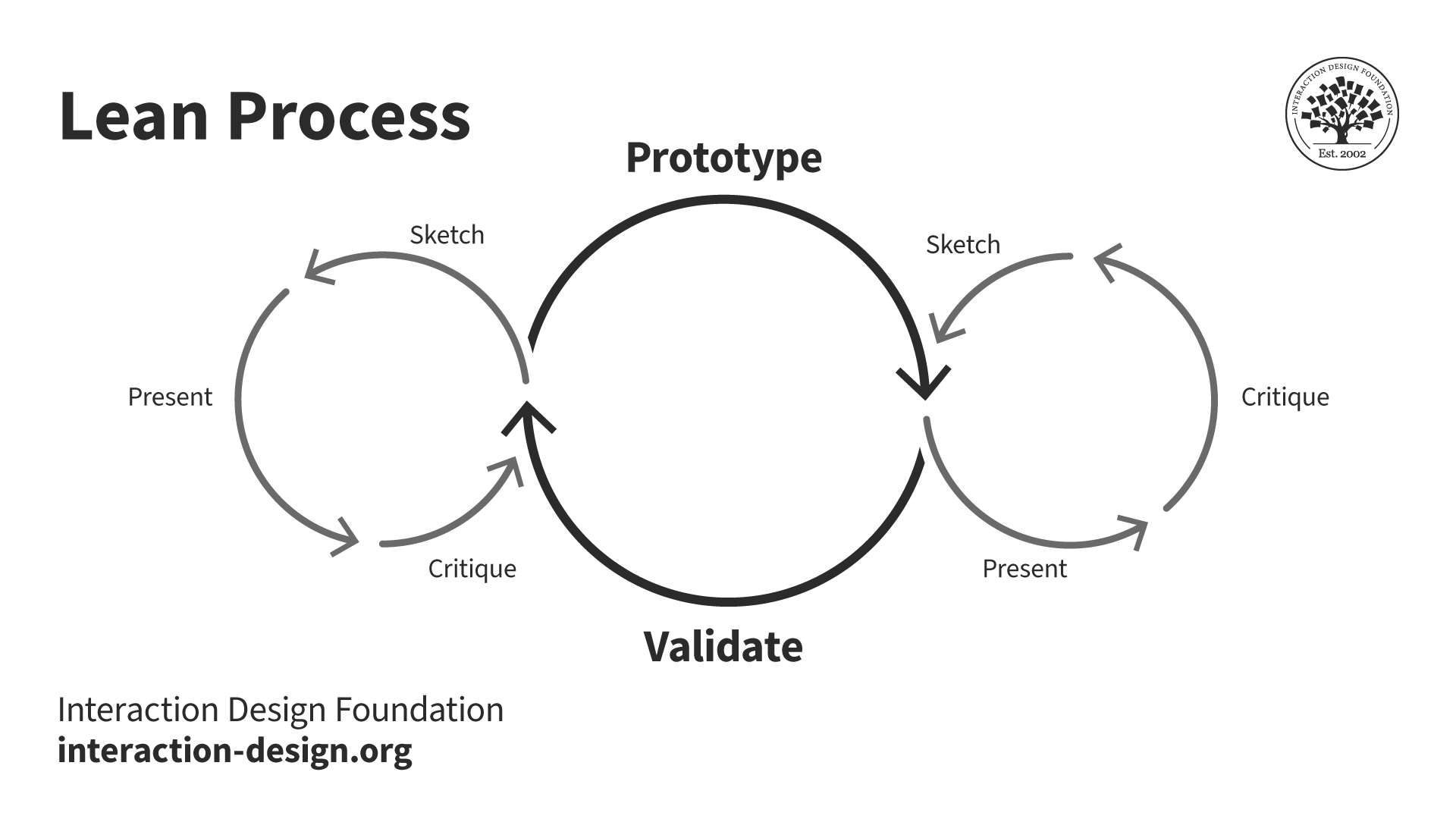
The Lean UX design process focuses on a rapid cycle of design iteration on the basis of user feedback and minimal design to test concepts—and the emphasis here is that designers:
● Build a Minimum Viable Product (MVP): It’s the simplest version of a product that they can release.
CEO of Experience Dynamics, Frank Spillers explains points about an MVP in this video:
ShowHide
video transcript
Transcript loading…
● Learn: Collect data and insights from how users interact with the MVP.
● Build: Make improvements based on users’ feedback.
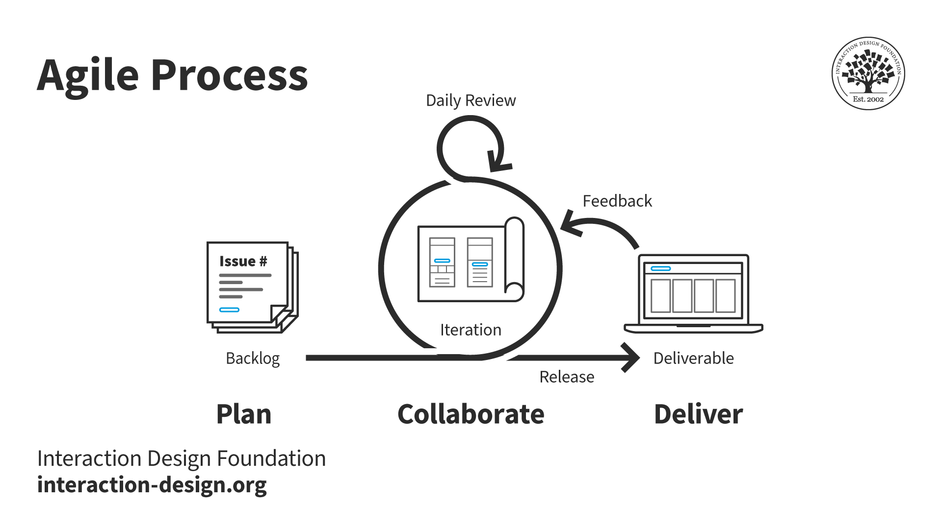
Agile UX integrates UX design into Agile methodologies—which typically feature in software development. In the Agile UX design process, design teams tend to:
● Collaborate: Among cross-functional teams.
● Do iterative design: Short, iterative cycles of design and feedback.
● Gather user feedback: Constant collection of user feedback to guide design decisions.
UX Designer and Author of Build Better Products and UX for Lean Startups, Laura Klein explains the nature of Agile UX:
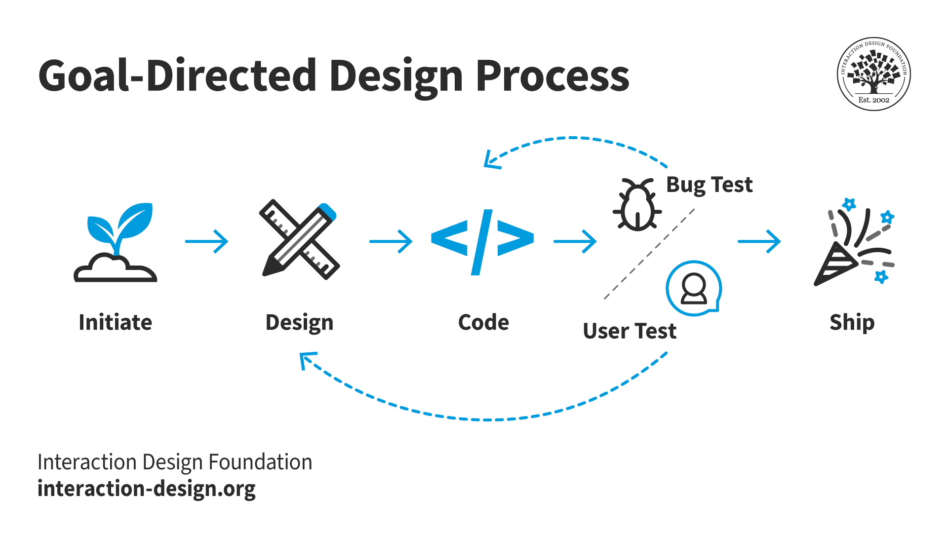
Goal-directed design—as put forward by Alan Cooper, the “Father of Visual Basic”—focuses on satisfying specific needs and desires of the end-user. It involves:
● Create personas: Develop detailed personas that represent user types.
● Develop scenarios: Make scenarios that outline how personas interact with the solutions.
● Do prototyping and validation: Develop prototypes—and then validate them with target users.
Each UX design process has its own unique approach—but there’s a common goal in all of them: to put the user's needs and experiences at the forefront of the design effort. The choice of process often depends on what the specific requirements of the project are, the team's working style and the project timeline.
The Steps in a Typical UX Design Process
Any UX design process is a meticulous journey that goes through several stages. Each stage is a crucial thing for teams to deliver a user-centric product. The first step of a UX design process tends to be all about discovery, understanding or research. Likewise, iterative UX design processes indicate how important continued improvements are.
Brands or design teams may select which process they’ll follow, and processes vary as to where and how they start, the order of the steps they take and which steps they include. Even so, here are generally fundamental design process steps—they’re typically common to UX projects:
Step 1: Define Project and Scope
● Objective: Establish the project's goals and boundaries.
● Activities:
Engage stakeholders from business, design, product and technical teams.
Find what the problem, project scope, deliverables and timeline are.
Conduct stakeholder meetings and create the initial low-fidelity concept sketches.
Step 2: Perform UX Research
● Objective: Understand the users and the market environment.
● Activities:
Do comprehensive user research—using interviews, surveys and focus groups.
Perform market analysis—and that includes industry trends and competitive landscape.
Analyze user behavior, needs and motivations—items to process through ethnographic studies.
Watch as UX Strategist and Consultant, William Hudsonexplains the importance of UX research:
ShowHide
video transcript
Transcript loading…
Step 3: Analyze & Plan
● Objective: Plan the approach to meet user needs effectively.
● Activities:
Develop user personas and user stories to capture the essence of the target audience.
Create wireframes and high-level project roadmaps.
Outline the user journey to envision the complete user experience.
Watch as Professor Alan Dix explains user personas and why they’re important:
ShowHide
video transcript
Transcript loading…
Step 4: Design
● Objective: Design the interface—and keep a tight focus on user interaction.
● Activities:
Sketch interface layouts—including information architecture and navigation plans.
Design detailed UI elements like microcopy, color schemes and typography.
Make sure that accessibility and usability are integral parts of the designs—or wireframes at this stage.
William Hudson explains wireframing in this video:
ShowHide
video transcript
Transcript loading…
Step 5: Prototype
● Objective: Transform designs into interactive prototypes.
● Activities:
Develop both low-fidelity and high-fidelity prototypes—using various tools.
Prototypes should enable stakeholders and testers to review the look and feel of the product.
Watch as Professor Alan Dix explains prototyping:
ShowHide
video transcript
Transcript loading…
Step 6: Test
● Objective: Validate the design—and its functionality—with real users.
● Activities:
Do usability testing to get feedback in and spot pain points.
Perform iterative tests to refine interfaces based on the user feedback.
Make absolutely sure that the product does meet the required accessibility standards.
William Hudson explains valuable aspects about user testing:
ShowHide
video transcript
Transcript loading…
Step 7: Launch
● Objective: Deploy the product to the market.
● Activities:
Collaborate with the development team to make sure that it’s an accurate implementation.
Monitor the launch process—being ready to address any immediate issues.
Co-founder of Hype4, Szymon Adamiak explains how designers can communicate better with developers:
ShowHide
video transcript
Transcript loading…
Step 8: Iterate
● Objective: Improve the product post-launch—and continuously.
● Activities:
Collect and analyze user data and feedback.
Make incremental changes to improve the product’s functionality and its user experience.
Each of these steps reflects a phase that’s critical in the UX design process. And every step helps make sure that the final product doesn’t just meet user expectations but exceeds them, too. If teams stick to this structured approach, they’ll be able to deliver high-quality user interfaces that are both functional and appealing—time and again.
Laura Klein explains how Agile teams iterate:
ShowHide
video transcript
Transcript loading…
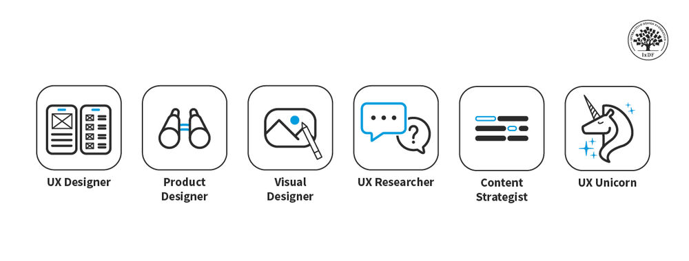
Who Does What in a UX Design Process?
If empathy is the heart of UX design, collaboration—quite simply—is the lifeblood. The number of roles and departments will vary between brands and across industries. This also applies to the scopes and sizes of these roles and departments.
Outside of stakeholders and non-design-related areas, such as marketing, these are the roles that larger brands with more resources might have on board:
UX designers make low- and high-fidelity prototypes, wireframes, mockups and more. They’re also responsible for the user flows and layout of the finished product.
UX researchers conduct user testing, analyze data and communicate findings. They create user personas, journey maps and affinity diagrams. Researchers also test prototypes and live products that require improvement.
UX writers make sure the UI says the right things in the right way to users. They’re in charge of microcopy—the text that features in menus, error messages, buttons and more.
UI designers (along with web developers) transform prototypes into the final products users will encounter. The people—who typically come from technical backgrounds—leverage their expertise to maintain the live product after release.
Note: UX designers who work for smaller brands and startups will be more likely to perform some—or even all—of these functions.
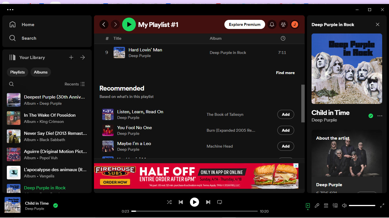
For example, Spotify's UX design process features the use of personalized content recommendations ("Recommended" in the center of this screenshot).
It takes a series of best practices for designers—and design teams—to implement a successful step-by-step UX design process. These can help make sure that the design doesn’t just meet the users’ needs but aligns with business objectives, too. Here are some practices that are vital:
1. Apply User-Centric Thinking and Empathy
● Do user research well: Conduct thorough research—it’s the only way to understand the users deeply. This includes their behavior and preferences—and the challenges they face. Use quantitative and qualitative research methods—like interviews, surveys and usability testing.
● Design with empathy: Understand and address the actual needs of users. It’s something that might involve creating personas and empathy maps to better represent and address the user's perspective. Design thinking is particularly useful here—it’s because empathize is the first step of the UX design thinking process.
2. Build and Maintain a Design System
● Consistency: Establish—and follow or use—design patterns and use consistent branding elements—like typography, color schemes and UI components—across all platforms. This helps with keeping the “magic” of a seamless user experience.
● Design libraries: Develop—and maintain—comprehensive libraries and pattern systems that are reusable. This doesn’t just speed up the design process—but makes sure that consistency and reliability are in place across different parts of the product as well.
Watch this video to learn more about UI design patterns:
ShowHide
video transcript
Transcript loading…
3. Have Effective Communication and Collaboration
● Work in cross-functional teams: Collaborate with developers, marketers and other stakeholders throughout the design process—and work closely together with them. This makes sure that everyone who’s involved in production can think about—as well as integrate—all aspects of the user experience into the final product.
● Incorporate regular feedback: Work with regular feedback loops with stakeholders and users—and continually tweak and improve the design. This collaboration should be an ongoing part of the design process—and it shouldn’t just happen at set milestones.
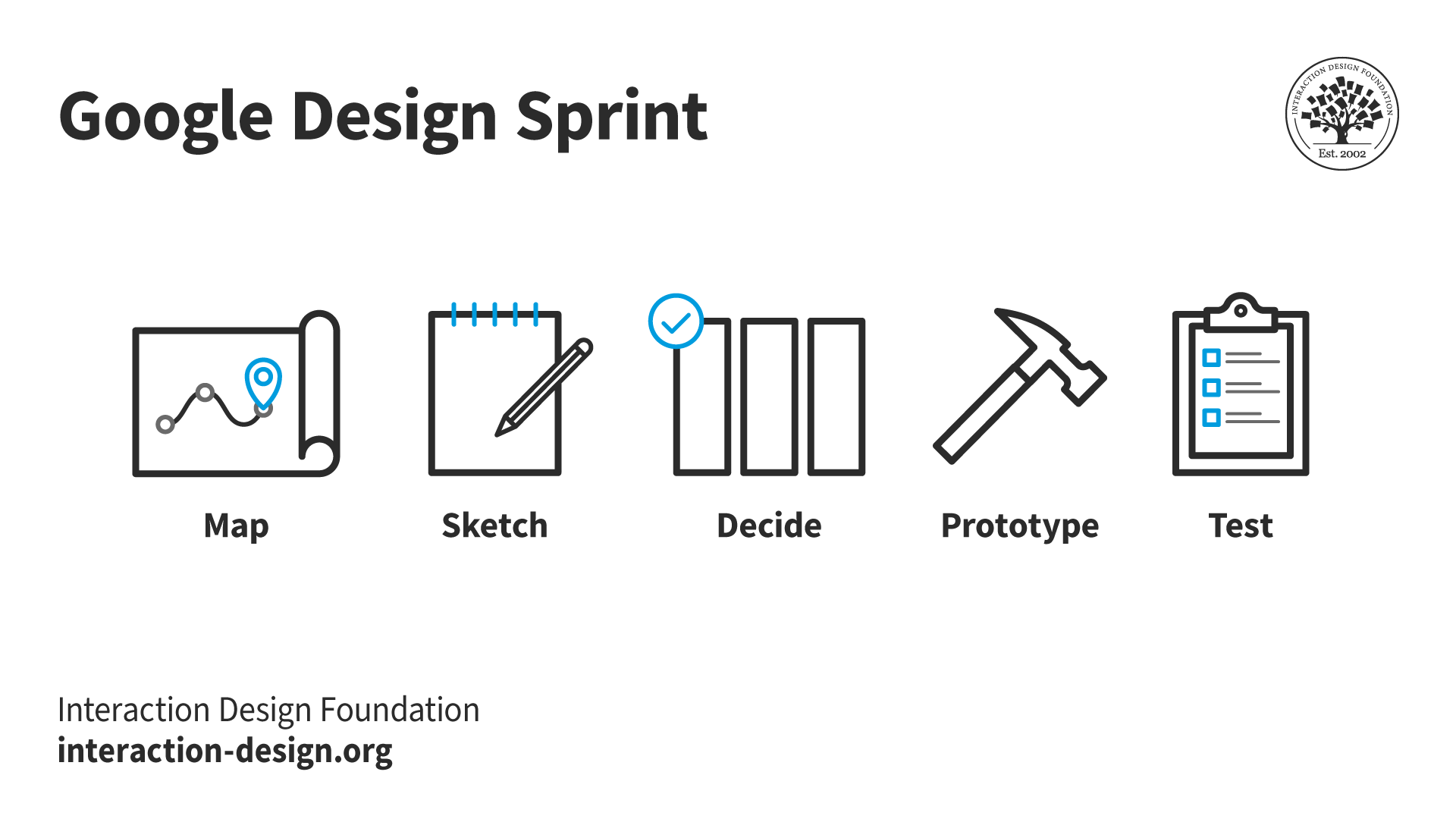
Google’s Design Sprint captures a highly successful approach.
● Progressive disclosure: Use progressive disclosure to reveal information progressively—and keep the user's cognitive load low and encourage continued interaction without overwhelming them.
● Simplified interfaces: Design interfaces that cut down on the number of elements—with a focus on core functionalities to boost the usability and reduce clutter.
● Accessibility and inclusivity: Make sure that all users—including those with disabilities—can use the product effectively. This means to adhere to accessibility standards like WCAG, too, and integrate features that enhance usability—for everyone.
Vitaly Friedman, Senior UX Consultant, European Parliament, and Creative Lead, Smashing Magazine explains progressive disclosure in this video:
ShowHide
video transcript
Transcript loading…
5. Test and Iterate
● Usability testing: Do extensive usability testing during—and after—the design process. This will find any issues with the design that users might run into—and it’ll allow for adjustments before the final release.
● Design iteratively: UX design should mean that there’s an iterative design process that’s dynamic. And—after launching—continue to test and refine the product, from what the user feedback and behavior indicate.
What are Additional Practical Tips to Implement UX Design?
● Ensure clear and intuitive navigation and layout: Users should be able to easily understand how to navigate the site or app—with clear paths to follow. So, it’s ultra-important to apply UI patterns and design principles in the best ways.
● Optimize for mobile: An extremely large proportion of web traffic comes from mobile devices—that’s why it's crucial to make sure that UX design is fully optimized for mobile usage.
Frank Spillers delivers some helpful tips about mobile UI patterns in this video:
ShowHide
video transcript
Transcript loading…
● Seek engagement through gamification: Work elements of gamification into the design to make the interaction more engaging. This can include rewards, leaderboards or interactive elements—all of which can encourage user participation and retention.
The key is to remain focused on the user's needs—while balancing technical constraints and business goals. It’s a holistic approach that doesn’t just enhance the user experience but contributes to the overall success of the product in the market, too.
How a brand approaches a project—and which design process it uses—can depend on various factors. So, it’s vital to leverage the chosen design process to the best advantage and reveal unknown considerations early on.
Which is the Best UX Design Process for which Project?
Many organizations will be familiar with a favored design process. Still, to select the most suitable UX design process for a project depends heavily on how well designers or design teams understand the project's unique context, goals, user needs and constraints.
Budget plays a crucial role as to how to determine the extent—and depth—of which UX design process a brand uses. A larger budget naturally will permit for more extensive user research and testing; meanwhile, a tighter budget might call for teams to focus on core functionalities—with limited user testing.
An important point is that designers should be aware of the gulf there can be between stakeholders and design team members. And a brand’s level of UX maturity can have a big bearing on what a designer does—and how—within a design process. Sometimes, a designer might even be the entire design team, in that their role is a UI-UX designer and they have more to do from a design perspective than they would in a larger organization.
It’s important to be able to advocate for users and explain points about design to other project personnel, some of whom may need to understand what UX design involves.
Design Director at Societe Generale, Morgane Peng explains some of the issues that designers can face when they work with people who don’t understand the intricacies of design:
ShowHide
video transcript
Transcript loading…
By understanding these aspects, teams can choose a UX design process that best fits their specific project, and ensure the design is effective, user-friendly and successful in achieving its intended goals.
Overall, it’s important for designers to think about the benefits of each type of process—rather than approach a generic or basic “UX design process” and methodology. The decision can have a massive impact on exactly what they manage to achieve—as they strive to solve problems best, plus realize the key factors of UX for their users and their brand.
What common challenges arise in UX design processes, and how can you address them?
Here are several common ones that might come up, and how to work with them.
First, make sure there’s consistent user involvement throughout the design process. Have regular testing sessions and get in the feedback to understand user needs and preferences.
Second, prioritize comprehensive research. Before you begin designing or defining the problem, get extensive data on the user environment, behaviors and expectations.
Third, align the UX design process with broader business objectives. Communicate regularly with stakeholders to make sure that the design really does run in line with business goals.
Last—but not least—manage scope creep proactively. Define clear project boundaries and deliverables from the start. Regularly review project progress and adjust as necessary—and make sure that changes don’t derail the project's timeline or budget.
How does UX design integrate with Agile methodologies?
UX design effectively integrates with Agile methodologies—by focusing on user needs and rapid iteration. Agile methodologies prioritize flexible planning, early delivery and continuous improvement—items that align it closely with the iterative nature of UX design. In this integration, UX designers work in sprints—similar to software developers—to continuously refine and evolve design elements based on the user feedback and testing results.
For practical application, UX teams can start each sprint by focusing on user stories that define target user needs and expected functionalities. Regular stand-up meetings and collaborative sessions between UX designers and developers help maintain a unified vision, streamline communication, and adapt quickly to any changes or new insights.
What distinguishes UX from UI in the design process?
The key distinction lies in their scope.
UX designers look at the bigger picture: how all elements of the product work together to deliver a seamless user experience. UI design, though, is more focused on the aesthetics and the interactive elements of a product's interface. UI designers make sure that the interface is visually appealing—and that each visual element gets the right message across to the user. They also focus on making sure that users can actually interact with the product intuitively. And while UX is about the overall feel of the experience, UI is about how the product's surfaces look and function. Both roles are essential—and they often overlap; great product design really depends on both seamless UX and appealing UI.
Our video explains the differences between UX and UI design:
● Use accessible color schemes: Make sure text contrasts well with background colors—and tools such as the Web Content Accessibility Guidelines (WCAG) provide standards for visual contrast.
● Enable keyboard navigation: Design your interface so that users can navigate it using a keyboard.
● Provide text alternatives for non-text content: Offer captions or descriptions for images, videos and other visual content.
● Ensure your design works with screen readers: Use semantic HTML and ARIA labels to help screen reader software interpret the elements of your interface right.
● Create content that’s easy to understand: Use clear, simple language and provide explanations for complex terms.
The UX design process typically involves five main stages:
● Research: Understand user needs, motivations and behaviors through interviews and surveys—and observing potential users. This stage is what helps spot the problems that need solving.
● Define: Synthesize the research data to define the core user problems. Designers often create personas, user stories, and scenarios to keep the users' needs at the forefront.
● Ideate: Generate a range of creative ideas to solve the defined user problems—and techniques like brainstorming, sketching and ideation workshops are common.
● Prototype: Build a testable version of the product—and this can range from paper sketches to interactive digital prototypes. Prototyping is a crucial part of testing design concepts without committing to final development.
● Test: Evaluate the prototype with real users to collect their feedback. Testing can show up usability problems—or areas for improvement. Iterative testing allows designers to refine the product until it meets user needs effectively.
Wireframes really serve as a blueprint for the layout and functionality of a website—or application. Designers create wireframes in the early stages—typically during or right after the ideation phase—and these give a clear, visual structure of the user interface, before any detailed design or development begins.
Wireframes focus on what elements will appear on key pages and how users will interact with them. They’re usually without stylistic choices—such as color and typography—to concentrate on usability and function.
Wireframes are—therefore—essential tools, and ones that help bridge the gap between conceptual design and actual user experience. They’re a big part of ensuring the final product is both user-friendly and aligned with the project's goals.
William Hudson explains wireframing in this video:
Several metrics are particularly useful to evaluate UX:
Usability: This includes success rate, error rate and the time it takes to complete tasks—they’re metrics that help work out how easily users can interact with a product and complete their intended tasks.
User satisfaction: Surveys and feedback forms measure how satisfied users are with a product—and tools like the System Usability Scale (SUS) give a standardized way to assess how satisfied users are.
Engagement: Metrics such as the number of user sessions, session duration and frequency of use indicate how engaging a product is.
Conversion rates: This measures how effectively the design leads users to take desired actions—like signing up, purchasing or subscribing.
Retention rate: It’s the percentage of users who return to a product over time.
These metrics—when teams monitor them regularly—give valuable insights into user behavior and preferences, and help UX designers improve the product iteratively.
Watch our video on usability for a better understanding of what it involves:
What is the relationship between service design and UX?
Service design and UX design share a close relationship—that’s because both focus on optimizing and enhancing user interactions.
The main goal of service design is to make sure that service interfaces are efficient and usable—and that they meet user needs. It involves mapping out the entire journey of a user, considering every interaction they might have with a service—from start to finish. This could include visiting a website, interacting with staff or using a product directly.
UX design—on the other hand—often dives deeper into the specifics of user interaction with a particular interface, and it focuses on elements like usability, accessibility and how engaging the interface is.
CEO of Experience Dynamics, Frank Spillers explains the service design process in this video:
How can you tailor a UX design process to different types of products?
Try taking some steps:
Define the product's goals and the target audience: A tech gadget aimed at young adults will have different user expectations than a healthcare app for seniors—for example.
Adapt your research methods based on the product type: For physical products, you might focus more on ergonomics and user interactions with the product. For digital products—though—usability and interface design become more critical. Choose research techniques that’ll give you deep insights into how users will interact with the product.
Adjust the prototyping phase to suit the product: For software, you can use wireframes and interactive digital prototypes. And for hardware, you may need 3D models or physical mockups to evaluate the design's practical aspects.
Customize the testing phase to the product's nature: Make sure that the testing environment mimics real-world use cases—and as closely as possible—so you spot any design flaws or user experience issues before the final product actually gets into the marketplace.
Watch our video on product design for valuable insights:
ShowHide
video transcript
Transcript loading…
How can remote teams collaborate effectively on UX design projects?
First, use collaboration tools such as Slack for communication, Figma or Adobe XD for design sharing, and Asana or Trello for project management. They’re tools that let team members communicate in real-time, share progress and track tasks efficiently.
Second, establish regular check-ins and updates. Daily or weekly meetings via video conferencing platforms—like Zoom—can help team members discuss their progress, brainstorm ideas and address challenges. These regular interactions really build a sense of team unity—and keep everyone aligned with the project goals.
Third, create shared documentation. Google Drive or Confluence can host project files where all team members can access and contribute to UX research, design specifications and user feedback. This shared resource makes sure that everyone’s got the latest information at their fingertips.
Last—but not least—embrace asynchronous communication. Since team members may be in different time zones, it's important to keep a workflow going where individuals can contribute at their own pace—without delaying the project. Clear documentation and updates in shared tools help greatly with this asynchronous work.
When remote UX design teams integrate these strategies, they can maintain productivity, foster collaboration and deliver successful projects.
How do UX designers collaborate with developers and product managers?
The collaboration starts with a shared understanding of the user needs and business objectives. UX designers often lead this discussion by presenting research findings that highlight user behaviors and needs—and the problem areas that the product aims to address, too.
Throughout the design process, UX designers work closely with product managers to keep the design well in line with overall product strategies and timelines—and make sure that each design decision supports the product's goals and delivers real value to users.
With developers, UX designers make sure that their designs are technically feasible. They give detailed design specifications and work alongside developers to translate these designs into functional software. Regular meetings between UX designers and developers help address any technical challenges that may arise, too.
Feedback plays a crucial role in this collaboration—and UX designers bring feedback on board from both product managers and developers to refine the product. This iterative process of testing and feedback helps improve the design—continuously—until it meets all functional requirements and user expectations.
UX Designer and Author of Build Better Products and UX for Lean Startups, Laura Klein explains the value of cross-functional teams and Agile collaboraton:
What does user testing involve, and how do you integrate it into the UX process?
To do user testing well, UX designers or researchers have got to evaluate a product by observing real users as they interact with it.
Begin by defining some clear objectives. Decide what aspects of the product you’ll need to test—such as the effectiveness of its navigation or the clarity of its content.
Next, recruit participants—participants that represent your target audience. They’ll use the product while you watch their interactions and listen to their feedback. Prepare tasks for the users to complete while the testing session’s going on. These tasks should reflect common actions users would perform with the product. And—as users engage with the product—take notes on their behavior, any difficulties they encounter and their feedback.
Work user testing into the UX process at multiple stages. Initially, test early prototypes to catch major usability issues early on. This preliminary testing prevents costly redesigns later. Keep on testing throughout the development cycle—bringing insights in from earlier tests to refine the design.
Finally, conduct tests on the near-complete product—to make sure it really does meet all user needs and expectations.
How do you evaluate the success of a UX design process?
First, measure user satisfaction through surveys and feedback tools immediately after they interact with the product—and ask specific questions about the ease of use, aesthetic appeal and overall satisfaction with the product.
Second, analyze user behavior data—and metrics like time on task, error rates and completion rates for key actions provide insight into how well users can navigate and use the product.
Third, do usability tests at various stages of the design process—and watch users as they interact with different versions of the product.
Fourth, consider the achievement of business objectives—and if the UX design runs in line with and supports broader business goals like increased sales and more.
Last—but not least—ongoing feedback from real-world use after the product launches can give you even more insights.
When you use these methods, you can accurately assess the effectiveness of a UX design process.
Also, users can sometimes reveal additional important insights. Watch as Product Design Lead at Netflix, Niwal Sheikh discusses some valuable dimensions of discoverability:
ShowHide
video transcript
Transcript loading…
What are some highly cited scientific articles about UX design processes?
This publication is highly influential—and it introduced the concept of contextual inquiry, a user-centered design method that involves observing and interviewing users in their natural environment. It’s become a cornerstone of the UX design process, helping teams develop a deep understanding of user needs and behaviors.
This paper has been influential in highlighting the importance of user involvement throughout the UX design process. It reviews the benefits of involving users—such as improved usability and user satisfaction—as well as the challenges—such as the time and resources required. The insights from this publication have shaped best practices in user-centered design.
This publication is influential for its early recognition of the importance of usability in the design process. It outlines three key principles of user-centered design: early focus on users and tasks, empirical measurement and iterative design. These principles have become foundational to the UX design process.
What are some highly regarded books about UX design processes?
This book provides a comprehensive, practical guide to the UX design process. It distills human-computer interaction techniques into an easy-to-understand format—equipping readers with a solid understanding of UX methods and principles. The book covers the entire UX life cycle, from research and ideation to prototyping and testing. It serves as an invaluable resource for UX and interaction designers at all experience levels, and helps them create engaging and user-friendly digital experiences.
This book introduces a Lean UX framework that encourages a more iterative, outcomes-focused approach to UX design. It explains how to apply Lean principles, such as removing waste, improving team efficiency and shifting away from relying on a single expert. The book equips designers with the tools and strategies to create effective user experiences while optimizing their design process for speed and flexibility.
This book presents a collection of key psychological principles that UX designers can leverage to create more intuitive, user-centered products and services. It covers foundational concepts like Fitts' Law, Hick's Law, and the Pareto Principle, providing both the theory and practical applications of these principles. By understanding the underlying human psychology, designers can make more informed decisions and build experiences that better meet the needs and expectations of their users.
This book serves as an excellent introduction to user experience design, providing a solid outline of popular UX processes, tools and techniques. It guides readers through the entire design life cycle, from research and ideation to prototyping and testing. The book features real-life project examples—helping novice designers understand how to apply UX principles in practical, meaningful ways. It is a valuable resource for anyone new to the field of UX design.
This book helps designers transition from a traditional waterfall approach to an agile project workflow. It outlines strategies for integrating UX design into an agile process, making sure that user needs and experiences do remain a top priority. The book equips designers with the tools and techniques to collaborate effectively with cross-functional teams, iterate quickly, and deliver user-centric digital products in an Agile environment.
This influential book explores how design shapes our interactions with the world around us, providing insights that are applicable to digital product design as well. It examines the psychology of everyday objects and experiences, and highlights the importance of user-centered design. When UX professionals understand how people perceive and engage with the designed world, they can create more intuitive, meaningful and satisfying digital experiences.
Earn a Gift, Answer a Short Quiz!
Question 1
Question 2
Question 3
Get Your Gift
Try Again! IxDF Cheers For You!
0 out of 3 questions answered correctly
Remember, the more you learn about design, the more you make yourself valuable.
It's Easy to Fast-Track Your Career with the World's Best Experts
Master complex skills effortlessly with proven best practices and toolkits directly from the world's top design experts. Meet your experts for this course:
Don Norman: Father of User Experience (UX) design, author of the legendary book “The Design of Everyday Things,” and co-founder of the Nielsen Norman Group.
Rikke Friis Dam and Mads Soegaard: Co-Founders and Co-CEOs of IxDF.
Mike Rohde: Experience and Interface Designer, author of the bestselling “The Sketchnote Handbook.”
Stephen Gay: User Experience leader with 20+ years of experience in digital innovation and coaching teams across five continents.
Alan Dix: Author of the bestselling book “Human-Computer Interaction” and Director of the Computational Foundry at Swansea University.
Ann Blandford: Professor of Human-Computer Interaction at University College London.
Cory Lebson: Principal User Experience Researcher with 20+ years of experience and author of “The UX Careers Handbook.”
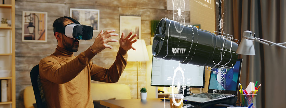
VR’s design process isn’t that far off from a typical user-centered design approach. It’s all about continuous discovery
554 shares
11 mths ago
Open Access—Link to us!
We believe in Open Access and the democratization of knowledge. Unfortunately, world-class educational materials such as this page are normally hidden behind paywalls or in expensive textbooks.