Let’s look at a story from a Manhattan restaurant to understand the relevance of what Google calls “micro-moments.” Context awareness and the ability to identify micro-moments help us deliver the best user experiences. Here, you’ll learn how to design for those micro-moments.
Mobile devices have changed our lives in many more ways than we can realize. They are an integral part of us now, so we may have lost sight of how we behaved before. Therefore, as UX designers (especially ones stepping into mobile user experience (UX) design), we have to play the part of anthropologists to understand our target users’ culture.
Do You Really Need a Phone to Eat in a Restaurant?
In the early 2010s, a story appeared about a Midtown Manhattan restaurant.
The restaurant had received complaints on Craigslist about slow service, so they compared security recordings from ten years earlier.
From this “contextual inquiry” based on camera recordings, the restaurant discovered that an average mealtime in 2004 lasted 65 minutes. In 2014, it had increased to 115 minutes.
So who or what was to blame? The restaurant noticed that the customers’ obsessive use of mobile phones had lengthened mealtimes (the text in the table below is a summary of the rant on Craigslist):
2004 |
Average time from start to finish: 65 minutes. |
2014 |
Average time from start to finish: 115 minutes. |
Does this sound like a familiar experience? Think about the last time you went to a bar or restaurant with friends. Or, even better, the next time you go out, put on your anthropologist hat on, and check out what other people are doing. Where is their focus? What is in front of them?
How do We Chop Reality into Micro-Moments?
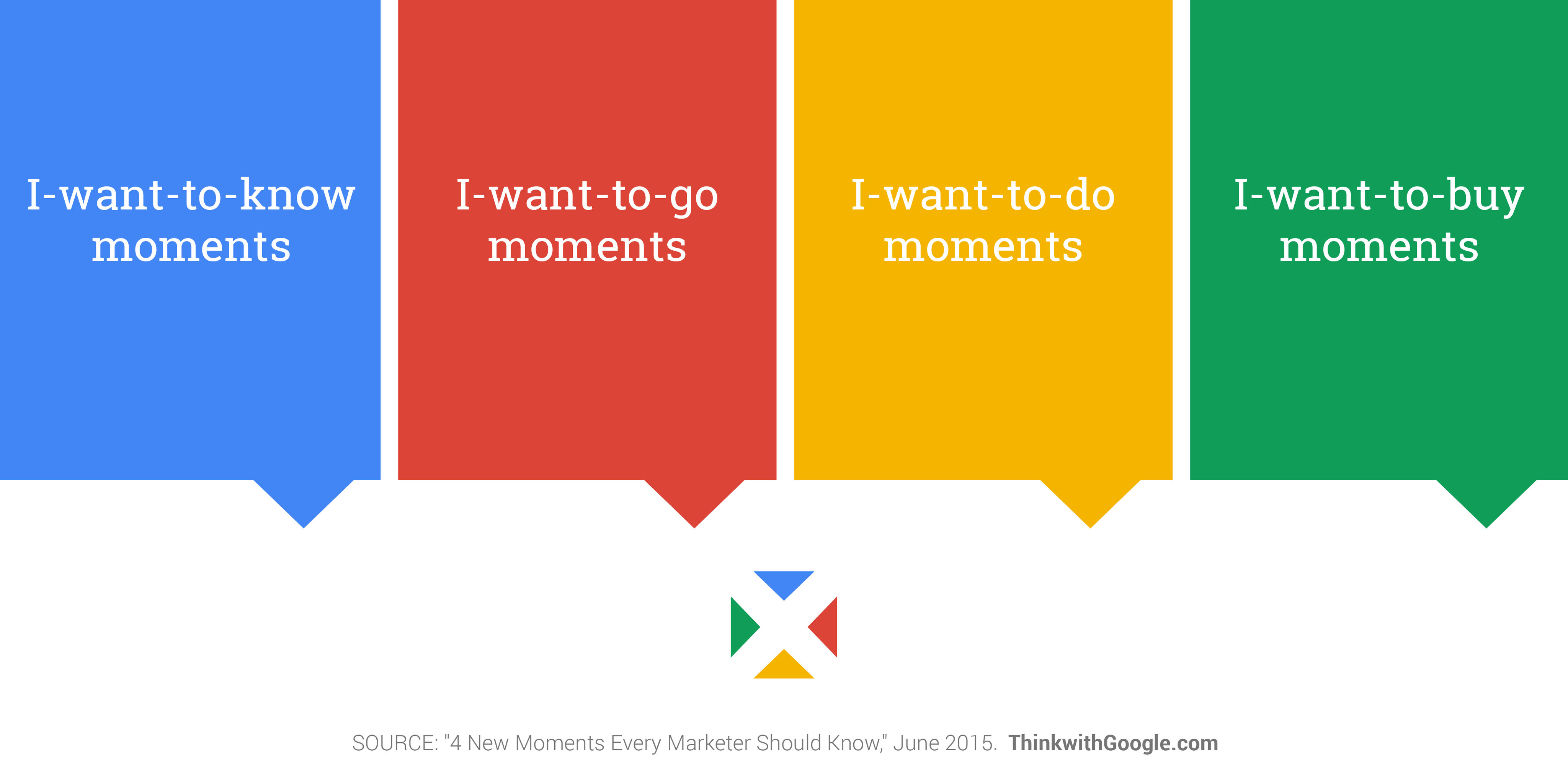
Early in 2015, Google released a set of articles on what they call “micro-moments.” The restaurant story is full of micro-moments where users get hold of their phones to accomplish a specific task. Most of these micro-moments fit in the “I-want-to-share”category. Let’s look at the categories of micro-moments defined by Google, even if (like we have just seen), as a product or service designer, you’ll probably be able to add new types.
© Google, Fair Use (Link)
I-want-to-know moments | You’re at home with a nice free evening, and you feel like watching something. But first, you have to choose which movie to watch. You’re searching or browsing to find out what’s good and what’s not-so-good as you look at reviews. You want to know which movie would be the best fit tonight. |
I-want-to-go moments | You’ve decided on seeing the latest action blockbuster movie, but where? This is when you want to see what’s “Near me.” |
I-want-to-do moments | You may want to learn about a process, service, or product. You may go on YouTube to see what others say about products, or want to see how to do a project yourself. For example, if your motorcycle won’t start and you “sort of” know what’s wrong, a video can show you how to fix it. |
I-want-to-buy moments | Your “final micro-moment” might start by watching YouTube videos to zero-in on which motorcycle part is the most reliable or has the best value before deciding. This is the instance where you decide on the product you want and start your purchase. |
On a similar note, Josh Clark, the author of Tapworthy: Designing Great iPhone Apps, put forward three categories for mobile web access, which we covered separately. To refresh your memory, they are:
“I’m Microtasking”: When the user interacts with their device for brief but frenzied periods of activity.
“I’m Local”: When the user wants to know what’s going on around them.
“I’m Bored”: When the user has nothing better to do and is looking to be entertained or otherwise diverted.
There is a nice overlap with both classifications, even if Google focuses more on the intent of the task and Josh Clark on the context.
When UX Becomes Even More Relevant
As UX designers, we try to connect the goals of the target users with those of the business, using technology. We need to look at both sides of the screen: at what users are doing and what the company wants to offer them. The idea of micro-moments is to consider new touchpoints and contexts of use in the customer journey. Let’s look at an example of these micro-moments in action:
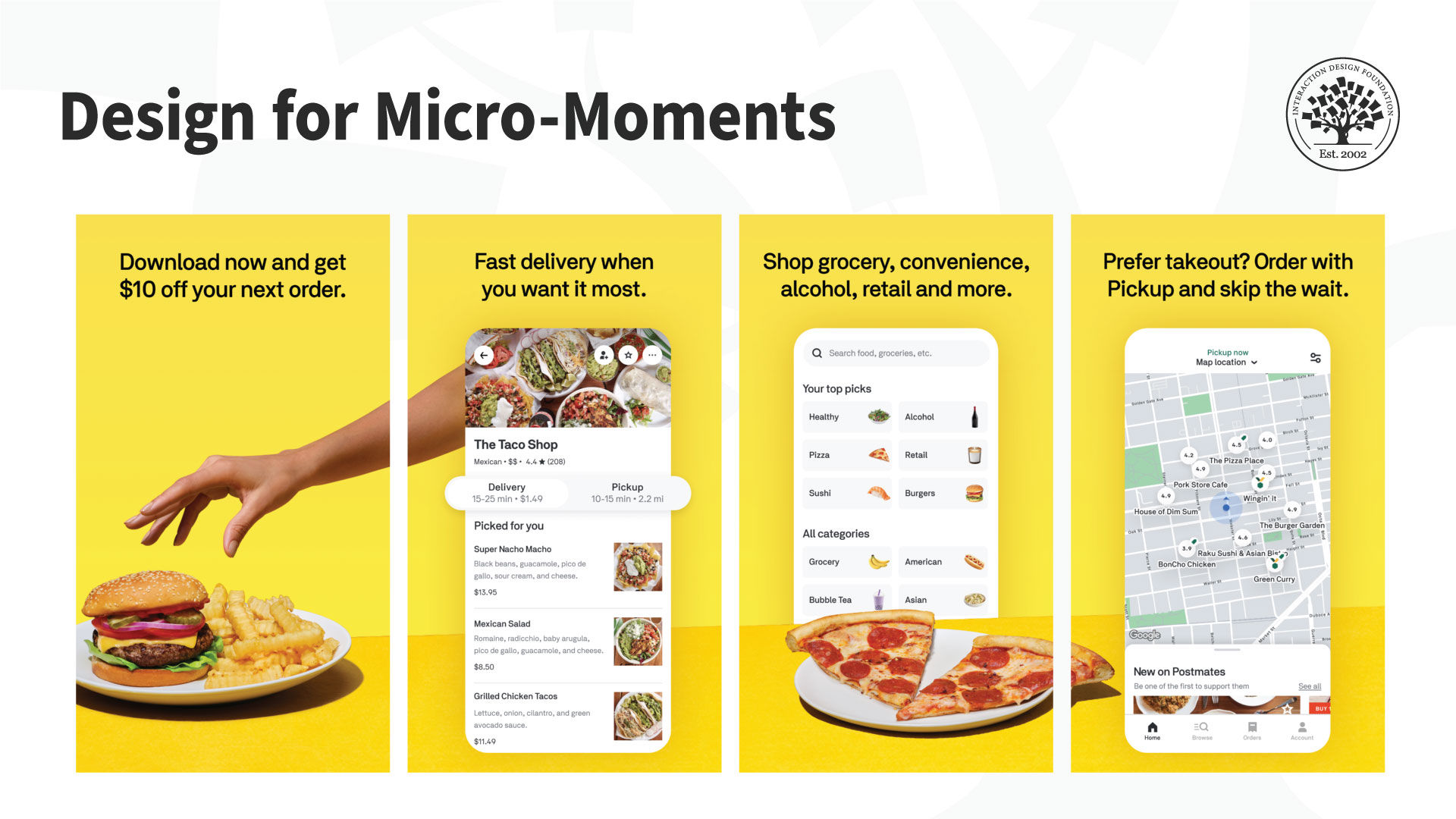
The Postmates delivery app shows users a list of things people can buy (“I want to know” / “I’m bored”). It shows local places that people can order and pick up takeout from (“I want to go” / “I’m local”) and allows people to shop/place their order for groceries and more (“I want to buy” / “I’m microtasking”).
© Postmates, Fair Use (Link)
The user journey usually starts at the moment the user starts to consider a category or a product. This earliest stage determines what the user wants or needs. Perhaps they’re hungry and ask themselves if it’s a pizza night. Perhaps they’ve heard about a sale and wonder if it includes luxury scent plug-ins.
Then, the users evaluate and make comparisons among the available options.
The third stage is when users actually buy something.
Last comes the after-purchase period, which some call the Ultimate Moment Of Truth. This moment is when a customer creates content based on their experience with a product or service and publishes it within their community for others to find.
Throughout this journey, there are lots of touchpoints that we can translate as micro-moments. If we as designers can identify them, we will cater for the particular types of needs of our users. It's about how we create the content or tools to enable people to accomplish whatever they want in that particular moment. To do so, Google suggests the following activities:
Make a moments map.
Understand customer needs in-the-moment.
Use context to deliver the right experience.
Optimize across the journey.
Measure every moment that matters.
What do these suggestions recall for you? As always, it’s about prioritizing user experience approaches in the business strategy. We start with the users’ needs and contexts and move from there, iteratively and always with “reality checks.”
Let’s see the moments map in action with a hypothetical mobile application that people can use to learn a new language.
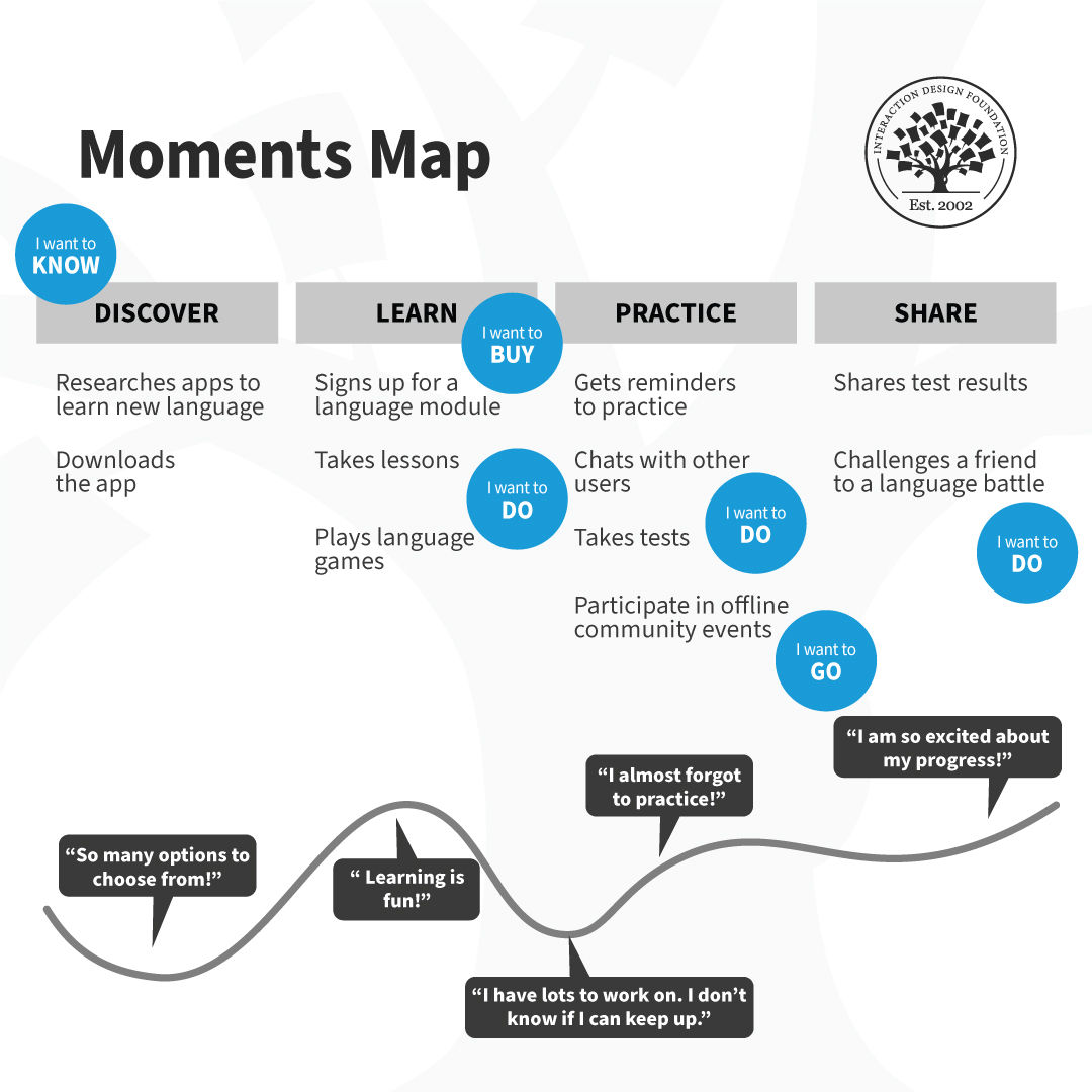
Begin with a customer journey map and layer the moments map on top of it. Identify all the potential micro-moments and plot them on the map. Prioritize and design, measure and then iterate. Revisit the moments map regularly with your team to see what worked and how you can improve the users’ journey.
© Interaction Design Foundation, CC BY-SA 4.0
The Take Away
Smartphones have changed how we process reality. We have shorter attention spans, which we can break into micro-moments or fast, task-oriented engagements with reality.
Google identified the concept of micro-moments early in 2015. They pinpointed that smartphones are most often the “first-screen-at-hand” that users turn to.
We need to consider how micro-moments play a role in user experiences.
Use customer journey maps to achieve this: understand your users, their needs in each moment, and the context of use to deliver the right experience.
The goal is to make every part of the user’s journey the best it can be, and measure every important moment.
Download the customer journey map template and start mapping these moments with your team:

References and Where to Learn More
Get practical tips on how to create journey maps in the Customer Journey Mapping Course (included in the IxDF membership).
Zurcher, A. (2014). “Smartphone use in restaurants prompts Craigslist rant,” Echo Chambers Blog for BBC News.
Ramaswamy, S. (2015). “Outside Voices: Why Mobile Advertising May Be All About Micro-Targeting Moments”. CMO Blog – The Wall Street Journal.
Micro-moments, according to Google.
Think with Google’s article on how to identify micro-moments in the customer journey.
The IxDF chapter on Contextual Design.
Hero Image: © Marc Muller, CC BY-SA 3.0


