If you’re involved in the user experience of selling or persuading and let’s be fair, most UX designers are, then you want to be able to use as many tools as possible to drive decisions in your direction. Of course, you could head for the dark side and cheat, extort and mislead your users but the problem is that this doesn’t generate lasting relationships and real UX professionals want to keep their users not just empty their pockets as fast as possible.
Of course, you already know about the idea that scarcity (letting people know that something will soon no longer be available), exclusivity (hey – if your name’s not down, you’re not coming in) and social proof (doesn’t everyone want to keep up with the Joneses?) can work but we’ve found some other techniques that you might not have heard of yet too:
The Easier Instructions are To Read – The Easier they Are to Carry Out
If you put two identical sets of instructions in front of someone; the first in a standard and easy to read font and the second in say… Comic Sans; people will tell you that they expect that the ones in an easy to read font will be easier to carry out that the ones in Comic Sans. Easy to read text isn’t just an issue that affects “usability”, it actually encourages people to do what you ask them to because they perceive it to be easier to do.

Author/Copyright holder: Ken-ichi Ueda. Copyright terms and licence: CC BY-NC 2.0
Progress Leads to Perseverance
If you’ve ever got stuck into binge watching a TV series, you’ll understand this. The closer you get to bedtime, the easier it is to watch; “just one more episode” which inevitably leads to another because “there’s not much left to go”.
It turns out that people are more motivated to finish things when they think they’re closer to finishing them than they are at the start of the process. Binge watching is a self-fulfilling prophecy as is staying up late to read just one more chapter of a book… we can see our progress towards the end.
You can tap into this by providing a countdown to completion in a process rather than counting up all the prior steps… show how close someone is to the end of the process. It will motivate them to finish.
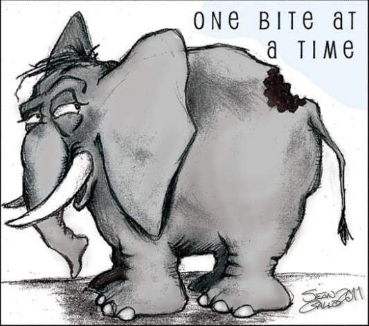
We Really Do Eat an Elephant One Bite at a Time
It’s more likely that someone will finish a big project if they can see it as a series of easily completed steps. Marathon runners do this by focusing on the next mile marker rather than the whole 27 miles. Project workers do this every day at work – focusing on milestones rather than the final output. And so on… we’re actually OK with eating elephants if we just take that single bite and focus on finishing it rather than the whole darn thing.
This is useful in complex checkout processes and the like. If you need someone to do a lot of things for you… present it in a series of small, easy to complete steps and ideally, combine it with the previous idea of a countdown to the end to get people to the finish line.
Author/Copyright holder: Sean Gallo. Copyright terms and licence: All rights reserved Img source
The Fewer the Digits in a Price Tag – The Less it Costs in Your Head
Everyone’s familiar with the $X.99 rule which says that consumers see $9.99 as less than $10.00 even though the difference is so miniscule that it barely matters to their bank manager. It’s such a staple of the retail environment that we encounter pricing like this every time we step out of the front door.
However, many folks aren’t aware that there’s a corollary to this idea. The fewer digits used to display a price… the less the item is perceived to cost – even when the prices are the same.
So $7,500.00 is seen to be more than $7,500 which is seen to be more than $7.5K. Strange but true and easy to incorporate into the way you display prices to your users.
People’s Innate Laziness Can Be Your Ally
We are all lazy about things that aren’t much fun. We will avoid filling in a form to the last minute if we can. We’ll sit down and watch a film rather than a book. If you can give people an easy option and a hard option; it’s human nature for people to take the path of least resistance.
So, for example, you want to sell your users something and you want them to create an account so you can sell them more stuff next time round. Break it down, make the sales process effortless and simple… then require them to sign up for the account. Making the first task pain-free makes it much more likely that you’ll get them all the way through your process.
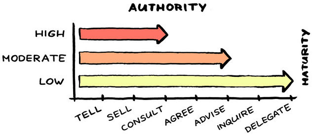
People Want to Obey Authority Figures
Conformity experiments show that people will do just about anything if a man in a white coat tells them to. In fact, in one famous experiment, researchers showed that a very high percentage of people would be willing to apply a fatal electric shock to another person if a man in a white coat told them to. (Note: This also applies to women in white coats – we’re not sexist about authority figures).
If you want to take advantage of this, you can use an image of someone in authority (think toothpaste commercials for an example) and deliver a message of “take action” based on that authority.
Author/Copyright holder: Jurgen Appelo. Copyright terms and licence: CC BY 2.0
If In Doubt Go For B
If you’ve ever been in a multiple choice quiz and you haven’t got a clue which option to go for – you’ll go for one in the middle most of the time. There’s some feeling of safety in this. The same is true for pricing options. If you offer a choice of a.) Cheapest (and no frills), b.) Mid-Price (some frills) and c.) High Price (all the frills) - most people will take the middle option.
Summary
All of these persuasive UX techniques are ethical alternatives to Dark UX and they’ve all been observed to work well. So why not try one today?
Header Image: Author/Copyright holder: Unknown. Copyright terms and licence: Unknown. Img

