Safety is one of our basic, evolutionary needs. Most of our decisions and actions are based on sustaining or improving our circumstances. While we may not be in constant danger like early man, we are no less driven by the need for safety for us and our loved ones. This drive is carried over into user and consumer behavior. For this reason, products must not only be sold to us with strong indications that they will protect us from potential threats, but they must back these claims up with clear evidence that they do, in fact, offer some protection and/or 'shelter', too. Let’s see how it works, and how to tap into this in our own designs.
The picture above shows Google’s implementation of emergency information details about a mobile phone’s user, which can be accessed directly from paramedics or passers-by, bypassing the lock screen of a device, in case of an emergency. When we use products, no matter what they are, we want to feel safe and secure, and the example above is a useful addition to the mobile device functionality, which is squarely aimed at this human need. Accessing this information from the lock screen requires five steps (clicks) so that someone must really spend the time to do that, minimizing the chances that this personal information can be seen by a prying third party with a short glance. If we are concerned that our details might be swapped around between various groups like a game of pass the parcel, we will feel nervous and uneasy using the service or product. For example, consider the checkout procedure on any trustworthy eCommerce website. If the user was told their details would automatically be placed into the hands of some unknown third party, the alarm bells would start ringing in our minds. Designers must ensure users feel comfortable and safe, confident that they will come to no harm physically, psychologically or financially, by interacting with the products.
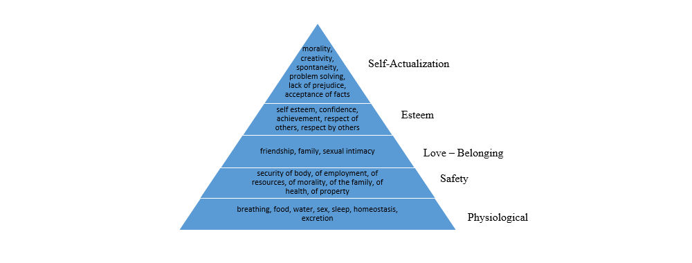
The need for safety was acknowledged as a basic human need by Abraham Maslow in his 'Hierarchy of Needs'. Safety needs represent the second tier in Maslow's hierarchy and these needs include the security of body, of employment, of resources, of morality of family, and of health. The need for safety is present in all animals, but unlike other animals and early man, we no longer seek shelter from predators hunting us down for food; however, safety is still essential, and our actions are no less engineered to ensuring our survival. For example, when we are buying a car, if we read reviews that the air bag fails to deploy during a crash or that the seatbelts are faulty, we will steer clear (pardon the pun).
Safety: An Evolutionary Carryover
Safety is an evolutionary need, which is often manifested in what we refer to as the “fight or flight” response. Environmental information is used to determine whether we are safe – in which case, we will usually stay – or unsafe – which will typically encourage us to leave (i.e. flight) or attempt to change our current circumstance (i.e. fight). When environmental information suggests there is some potential threat to us, our family, loved ones, our property, or something else we hold dear, we experience an emotional response, which sensitizes so we are ready for action. While the stakes might not be as high, we are no different from early man in this respect.
In the average day, we have to make lots of decisions: what to wear (according to the weather), what to eat (according to our health), where to go (according to our personal and physical interests), and whom to see (family, friends, colleagues etc.). All of these decisions are based on maintaining or improving our physical and psychological well-being. Even when we do things for other people, we are tending to some personal need, either to ensure the safety of others close to us or to make us feel safe in our environment (we generally avoid confrontation, even with people that drive us mad).
Taking advantage of the safety needs
Products do not necessarily have to satisfy this need directly in order to influence our drive for safety. Countless products are advertised using imagery that plays on our safety needs. For example, financial products are often sold to us with images and scenes depicting a safe, secure and happy family settling into their new home, after taking out a mortgage or investing their savings. These images capture the lifestyle(s) we associate with safety: clean, fashionable homes, 2.4 children, well-dressed and happy parents, and a cat/dog in tow. The connections you draw between the products you are designing/selling and the safety-providing qualities they might or might not possess are what help to secure the consumer's attention. By suggesting your products will satisfy one or more of the safety needs (e.g., make the users happy, provide comfort to them and their friends/family, and/or ensure their security – personal, financial or otherwise), you are allaying their fears and moving a step closer to gaining their trust. Trust is one of the most important aspects of e-commerce, especially; without trust, the users are not prepared to enter their details, let alone make a purchase. Therefore, images or text and any other elements that suggest or guarantee safety encourage the users to trust you and complete purchases as a direct result.
Author/Copyright holder: the Author. Copyright terms and licence: Public Domain.
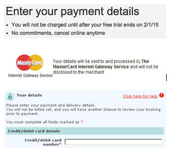
Examples of text messages during online shopping, aimed at instilling confidence and trust to the buyer.
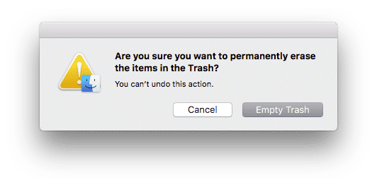
Ensure during the design of your products also that you protect users from unintended actions that may have irreversible (or unpleasant) consequences for them. A prime example in digital products is the design of appropriate warnings prior to an irreversible action (for example, deleting a file or factory-resetting a phone). In the screenshot below, safety can be improved because, as you can see, the button leading to the irreversible action is pre-selected at the time of issuing the dialog; so, if a user inadvertently presses “return”, then the trash bin gets emptied and data is lost. Also, because it is highlighted, attention is guided towards this button and not the “Cancel” button, which is a safer outcome. In physical products, safety features can be built into parts of the product to prevent unwanted effects (for example, hoodie cords that come with pre-tied knots or cord stops, to prevent the cord from sliding into the holes while pulling – isn’t this a nice touch?).
Author/Copyright holder: the Author. Copyright terms and licence: Public Domain.
The OSX “empty trash” warning dialog protects the user from an irreversible action. Copyright: the Author.
The Take Away
Safety is one of our basic, evolutionary needs. Most of our decisions and actions are based on sustaining or improving our circumstances. While we may not be in constant danger like early man, we are no less driven by the need for safety for us and our loved ones. This drive is carried over into user and consumer behavior. For this reason, products must not only be sold to us with strong indications that they will protect us from potential threats, but they must also back these claims up with clear evidence that they do, in fact, offer some protection and/or 'shelter'. Consequently, what we do as designers in this regard is vital.
References and where to find out more
Hero Image: Copyright Holder: the Author, Copyright License and Terms: Public Domain
McKay, E. (2010). Are you sure? How to write effective confirmations

