When we create graphical user interfaces (GUIs) that mimic the physical world our users can easily understand and use them—simply by predicting how the GUI will behave based upon their (and our) common experiences in the physical world. One way to mimic the physical world is to use animations to show how objects change and move on the GUI. Here, we’ll show you the basic cognitive science behind how people understand the physical world and give you examples of how software giant Google applies cognitive science in their Material Design. Grasping this knowledge means you’ll be able to design GUI animations that are equally easy to understand because they correspond with the laws of physics that govern the phenomena around us. That way, your user will know what to expect from your GUI, whatever its theme or the nature of the business.
When you have a fundamental grasp of what makes animations easy to understand, you can make better design choices in situations where design guidelines do not cover the idea you want to realise. This means—as long as you keep a firm hold of the discipline while casting a careful eye over even the smallest details of how you want your design concept to appear—you can really reach for the sky here. There should be no reason you can’t produce truly innovative animations that grab users’ attention on many levels.
Table of contents
Animations and the Physical World – Mimicking Movement
Users have an inherent understanding of the properties of physical objects; so, whenever we make GUIs mimic the physical world, users will find them easy to understand. One of the properties of objects in the physical world is that they can be moved in three-dimensional space. On GUIs, we use animations to show the user how objects move or can be moved. We also use movements—sequences showing change—to give the user information about what is happening to a GUI object. As an example, think of the movement you see when you minimize or close a window in many user interfaces. The window becomes gradually smaller until it disappears at the dock or taskbar where you first opened it. On a PC, when you have numerous windows open and start closing them, one by one, you’ll notice the width of the remaining window tabs increasing—until you’re down to about five open windows. This effect mirrors the real-world phenomenon of items’ spreading out or squeezing together so as to make use of (or ‘enjoy’, even) the available space.
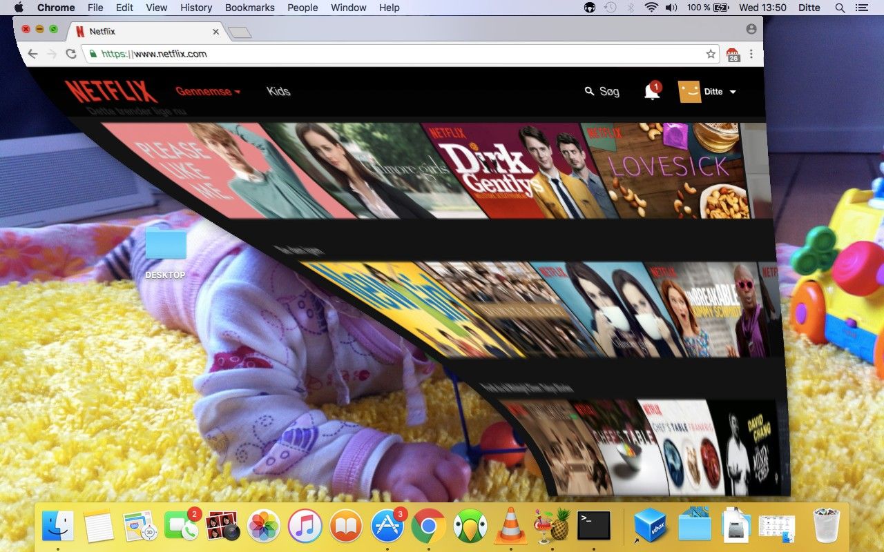
When you minimize a window on an Apple MacBook, a brief animation shows the window minimize to the dock.
Even though the movement is quick, it gives you an instant, basic understanding of the action that just took place. From a technical point of view, minimizing a window does not require making a movement; you are not making a physical object smaller. However, from the user’s point of view, the idea of an object’s becoming smaller before disappearing is very easy to understand. Mimicking the behaviour of physical objects means that the user knows what to expect from the GUI because he/she can rely on his/her experience with the physical world.
“As babies we learn and build models about the physics of the world. And what happens, when we start touching the pixels in software, is that those same parts of your brain are engaged in trying to understand: 'What are the physics of this world?’. First off, there's nothing worse than the physics of a world being inconsistent, because it means you're constantly learning—constantly a child and constantly learning because everything is new and a surprise and it's inconsistent and you can never settle down into being efficient and optimizing.”
— Matias Duarte, VP of Material Design at Google
Here, you will learn the fundamental cognitive science of how your users (provided they’re humans) understand physical objects, so you can design GUI animations that are equally easy to understand because they correspond with the physics of the world. We will also give you some examples of how Google use our understanding of the physical world in their Material Design guidelines. Before we get into the cognitive science, though, let’s start with a few words of caution on using animations.
Rules of Thumb for Using Animations
If we use animations badly, they’ll become a nuisance rather than a help. They will take up too much of the user’s time and attention. This may seem commonsensical, but you might be surprised at how easily getting carried away with or caught up in what seems like a fantastic idea can happen. To avoid that, you need to take a couple of steps back and look at the big picture as you go. Namely, always consider the following rules of thumb inspired by Google’s animation guidelines:
Always start by considering what the user is trying to achieve, and then help him/her do it.
Use animations when they can help the user and provide information; 99% of the time, you should not use animations just because they look nice.
The animated movement should make sense. Think about what you are trying to tell the user by using an animation, and design the movement accordingly.
Animations should be subtle and not take up more time than necessary. Less really is more, and users’ time is as precious to them as yours is to you.
Now that we have got that out of the way, let’s look at how users understand the properties of physical objects and how you can use their understanding to create great animations.
How do Users Understand Physical Objects?
Object knowledge is a fundamental part of how humans understand the world. Years of meticulous investigation by researchers such as Elizabeth Spelke, Renée Baillargeon and a number of others have shown that we have a rudimentary core knowledge of physical objects and their properties from when we are infants.
 Author/Copyright holder: lavaki. Copyright terms and licence: CC0.
From infancy, we form expectations of the properties of physical objects and how we can interact with them.
Babies expect objects to behave in a certain way and become surprised when they do something different from what they expect. Some of the things we understand are:
Objects can be covered up—but they still exist.
Objects can be moved—but they do not move without the influence of outside force.
Objects do not suddenly disappear and re-appear somewhere else; instead, they move in unobstructed paths.
Objects move when they come into contact. One object can make another object move if they bump into one another, but they do not impact each other from a distance.
An object will fall if released in mid-air.
Smaller objects may fit inside larger objects, but not the other way around.
If an object moves on its own, it has some form of internal energy or intentions, in which case the behaviour might deviate from the behaviour of inert physical objects.
As you can see, the principles in the list closely resemble basic physics; even so, think of it more in terms of how people experience object behaviour when we interact with objects, rather than as actual physics. You don’t need to understand the physics behind gravity to know that when you drop your phone it falls to the ground.
Our experience with objects is deeply ingrained and has a profound influence on how we interpret and predict the world as adults. Having this understanding hardwired into our minds is vital; imagine how terrifying the world would be if objects didn’t conform to these laws—or if we, for whatever reason, had to keep relearning what to expect. Most GUIs are designed as a system of objects. GUI objects are easy to understand, as we can use our expectations of physical objects when we interact with them. When we see an app icon that looks like a physical object, we expect it to behave like a physical object. The point that we can drag and drop GUI objects makes sense to us—because that is how physical objects behave. If I drop an app on top of another app on my Apple iPhone, I expect the other apps to move aside, just as physical objects move when they bump into each other. We can design some of the object properties as static graphics, but a lot of the object behaviours and interactions are things we can enhance through animations.
 Author/Copyright holder: Steven Worster. Copyright terms and licence: CC BY-ND 2.0
A lot of GUIs are inspired by physical objects and the way they relate to each other.
To make interaction with GUI objects easy to understand, you should ensure that your animation follows the users’ expectations of physical objects as closely as possible. Now, you can go through the list above of how we understand the physical world and turn that into a recommendation for how a GUI object should behave. Many of Google’s Material Design recommendations for using movements in GUIs also follow the same premise. Google introduced their Material Design guidelines in 2014 and as the name suggests, mimicking the physical world is one of the core ideas of the design guidelines.
Google’s Material Design Guidelines
Motion, or animations, is an important aspect of Google’s material design guidelines. In fact, it is one of their three core principles for material design:
Material is the metaphor (that is, grounded in the reality of physical objects).
Bold, graphic, intentional (interface objects should create meaning, as well as look good).
Motion provides meaning.
Below, we will go into a more detailed description of how Google harness the users’ expectations of the physical world in their guidelines for designing motion in Material Design GUIs.
Motion in Google Material Design
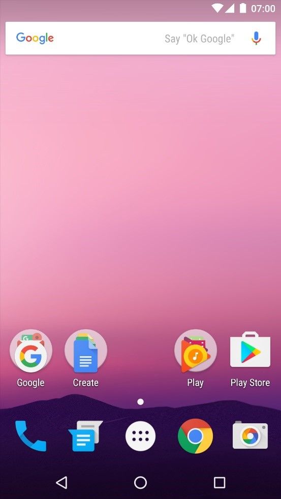
Google Material Design is heavily inspired by the properties of material in the physical world. Google states that GUI objects should feel like things in the real world. So as to achieve this, the GUI is built up as a three-dimensional space using layers and shadows.
Author/Copyright holder: AOSP. Copyright terms and licence: Apache Licence 2.0
The Android interface is built up as a 3-dimensional space.
Movements are also an important part of Material Design—in particular, movements that are inspired by how objects behave in the physical world.
“We wanted the world that we built to be continuous and have physics and motion just like the world around us. When we push something it slides and it has momentum then it stops, right? When we drop something it accelerates. If I push, motion radiates outward, when I clap the sound radiates outward. We wanted our world to have continuity of motion as well. Just enough for it make sense. Not, you know, grand zooming motion just for motion's sake. We didn't want you to be flying through the world, we wanted the world to be moving just enough around you for things to make sense.”
—Matias Duarte, VP of Material Design at Google
The way that Material Design imitates the physical world should not be confused with Skeuomorphism, where GUI objects are designed to look like objects from the physical world. An example is designing the icon for the recycle bin so it resembles a physical recycle bin (incidentally, it used to be a trash can). Rather than looking at different cultural objects, Material Design looks at the more basic, natural attributes of the physical world and what we expect from it, and tries to mimic those attributes.
Watch this video to see how animations in Google Material Design are inspired by the way physical objects move.
Below are three examples of how Material Design mimic the attributes of physical objects in their guidelines for using animations.
1.Easing Animation
In Material Design, as well as most other GUIs, objects ease in and out when they move from one place to another on the GUI. This gives the user a clear idea of what is happening to a GUI object, and it mimics the fact that objects in the physical world always move in an unobstructed path. They do not disappear and reappear somewhere else. In the physical world, objects also move along a nonlinear curve where they accelerate and decelerate at the beginning and end of movements; consequently, easing makes the movement look more natural.
This is an example of an animation that uses ease-in, ease-out to create a more natural movement.
2.Cause and Effect
In Material Design, objects respond to user touch input by moving, either up or down, on the z-axis so as to simulate pressure or on the x/y-axis if the user moves the object somewhere else. This mirrors the real-world actions of pressing and swiping, respectively. GUI objects also move when they touch other GUI objects—e.g., if the user places an object in the middle of a list of objects, the surrounding objects move to the side. Similarly, in the physical world, objects move when pushed by an outside force (but never on their own, unpowered). Think of a bin full of footballs at a sports store and what happens if you lift one out and then drop it back in.
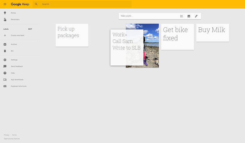 Author/Copyright holder: Google Incorporated. Copyright terms and licence: Fair Use.
When you move GUI objects in the Google Keep app, that action moves the surrounding objects aside similarly to physical objects being pushed by an outside force.
3.Gravity
The Material Design guidelines suggest that GUI objects should move along a curve when moved diagonally up or down. Objects should also move faster when moving from the top to the bottom of the GUI than when moving from the bottom to the top. This imitates the effect that gravity has on movements in the physical world. Our world is not upside down; so, climbing or lifting tend to take effort and time.
This video shows examples of how curves make a movement look more natural.
The Take Away
GUI animations work well when we design them to mimic not just the laws of physics but users’ expectations of the physical world, too. Research has shown that we already have clear expectations from the time we are infants as to how objects should move in the physical world. Objects conform to laws—they exist when hidden; they can’t move without help; they can’t vanish and reappear elsewhere; they have to knock against one another so as to move each other; they fall from mid-air; only smaller ones can fit inside larger ones; and only those objects that have internal energy or intentions (as in the case of animals or motorized/computerized vehicles) can move on their own.
When movements in GUIs behave according to our expectations, users can apply the same fundamental expectations of the physical world so as to understand how to interact with the GUI. As a designer, you can use the seven-item list governing how we understand the physical world to ensure that users will always find your animations equally easy to understand.
References & Where to Learn More
Read Google’s introduction to Material Design here.
To learn more about how infants learn about objects, you can read this paper, which sums up a lot of the research:
Renée Baillargeon & Susan Carey, Core Cognition and Beyond: The Acquisition of Physical and Numerical Knowledge. In Early Childhood Development and Later Outcome, 2012
Alternatively, watch this presentation by Professor Renee Baillargeon.
Hero Image: Author/Copyright holder: Alok Sharma. Copyright terms and licence: CC0


