In a world where Apple has become synonymous with great design; is it true that users are always looking for the simplest possible user experiences? That’s Apple’s forte after all – taking complexity and making it strikingly simple to manage.
Cultures of Complexity
User experience designers have rightly focused on delivering simplicity because that’s what many Western consumers desire. The easier something is to use – the better. Yet, that’s not entirely true as we move around the globe (and it’s not always true close to home either).
In places like China or Korea complexity is a valued attribute of electrical items, for example, that’s because the more complex something is to use, the more that it appears to be sophisticated – owning a washing machine with 20 controls to master is seen, by others, to be more impressive than owning a washing machine with a single control.

Author/Copyright holder: Unknown. Copyright terms and licence: Unknown Img source
It’s true in India when it comes to marketing – the Indian consumer likes lots of facts and figures at their fingertips and many of the countries marketing efforts appear overwhelming to the Western consumer because they try to stuff as much data into a single space as possible. The Indian consumer wants to feel informed when they make a decision and that, often, means comparing all that data and not just the headlines as Westerners do.
Even at home there’s not always a demand for total simplicity. Whilst Google’s search engine may embody simplicity if you land on the MSN or Yahoo homepages the contrast couldn’t be more striking. There’s a huge amount of information packed into the space. The complexity of these spaces actually makes life easier for their users because they can quickly track down the information they want on the landing page and then move on to achieving their goals.
What Do Your Users Want?
And that’s the real key to the simplicity vs. complexity debate – what does the user want to achieve? The controls on the command deck of an aircraft carrier are incredibly complex but so are the facilities available to the commander of an aircraft carrier. If you simplified the controls, you would have a less valuable weapon of war – it might be easier to use but that’s probably not much consolation when your aircraft carrier is decorating the bottom of the ocean because it couldn’t deliver what was needed during a battle.
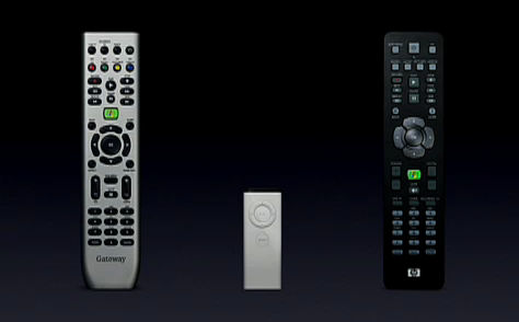
Author/Copyright holder: Global Nerdy. Copyright terms and licence: All rights reserved Img source
It’s certainly true that if potential users perceive something as complex then they are less likely to want to understand it but that’s almost certainly true when they want to do something fairly simple. Adobe Photoshop isn’t all that simple, in fact the learning curve is truly terrifying in some respects, but people accept that because they know that they need huge amounts of flexibility and a near infinite set of approaches to getting their images right.
As UX designers, simplicity is a laudable objective but it is important to understand what our users really want before we focus too heavily on simplicity. Sometimes it’s complexity that makes all the difference in the long-term.
Header Image: Author/Copyright holder: UX Magazine. Copyright terms and licence: All rights reserved. Img


