Users typically take just 50 milliseconds to assess the visual appeal of a website. The UI of your website has a massive impact on whether they choose to stay or depart—and it acts as the bridge between users and technology. Beyond visual appeal, its design and functionality often determine a platform’s overall success.
Table of contents
- Why is User Interface Design Important?
- What are Some Excellent User Interface Examples?
- 1. Spotify's Harmonious User Flow
- 2. Discord’s Intuitive Discover Feature
- 3. Blinkist's Descriptive Iconography
- 4. Netflix Personalization
- 5. Zoom’s Streamlined Solutions for Every Sector
- 6. Zara's Seamless Shopping Experience
- 7. Webflow's Signature Interface
- 8. Bumble's Swipe Right Revolution
- 9. Monzo's Real-Time Financial Insight
- 10. Bear's Engaging UI Explanations
- So, What Makes a UI Design Amazing?
- The Take Away
- References and Where to Learn More
Why is User Interface Design Important?
User interface (UI) design goes far beyond the mechanics of interaction; it’s about:
Holistic user experiences
Emotional connections
With brands competing for user-friendly digital experiences, it’s no wonder how vital it is to understand the intricacies of UI design and what to do for the best results.
Now, what sets a good web UI design apart from the mediocre?
The answer lies in:
Its ability to seamlessly merge aesthetics with efficiency.
Microscopic details that enhance navigability.
Color palettes that evoke specific emotions.
Intuitive layouts that guide the user.
What are Some Excellent User Interface Examples?
Stay tuned as we take you through 10 outstanding UI examples that symbolize design excellence and push the boundaries of user interaction.
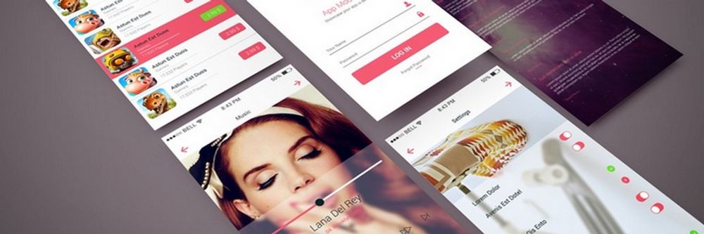
1. Spotify's Harmonious User Flow
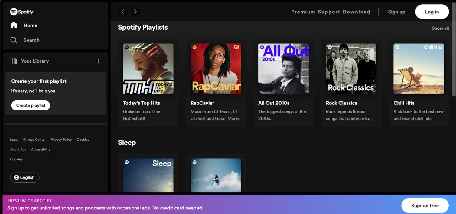
© Spotify, Fair use
The first design on our UI examples list that caught—well, grabbed—our attention is Spotify’s immersive user interface. Spotify has well and truly established itself as a global titan in the music streaming industry—pretty much synonymous with the word “music.” A considerable share of its success is due to its well-crafted user interface.
This platform blends aesthetics with functionality. It offers both a visual treat and a seamless user experience.
What Sets It Apart?
Dynamic content presentation: Unlike static interfaces, Spotify uses vibrant playlist covers to engage users. They also offer dynamic content updates.
Tailored experience: The application’s algorithm introduces new genres and artists according to the user’s preferences—people love personalization.
Intuitive layout: Even first-time users can navigate and understand Spotify’s features without instructions—ideal for when they’ve got to hear that song or album they’ve been thinking about.
Strengths of Spotify's UI
Consistency: Despite vast content, Spotify maintains a cohesive look throughout its platform.
Responsive design: Spotify provides a uniform experience across mobile, desktop, or tablet—you know where you are with them whatever you’re using to enjoy that seamless experience they provide.
Efficient navigation: Key features and functions are just a click or tap away—perfect when you’re into the music and want to find something fast.
Distinguishing itself from the competition, Spotify’s design extends from aesthetics to understanding the user, unlike its competitors’ UI designs. The dark-themed background with contrasting vibrant playlist images minimizes eye strain during prolonged usage.
2. Discord’s Intuitive Discover Feature
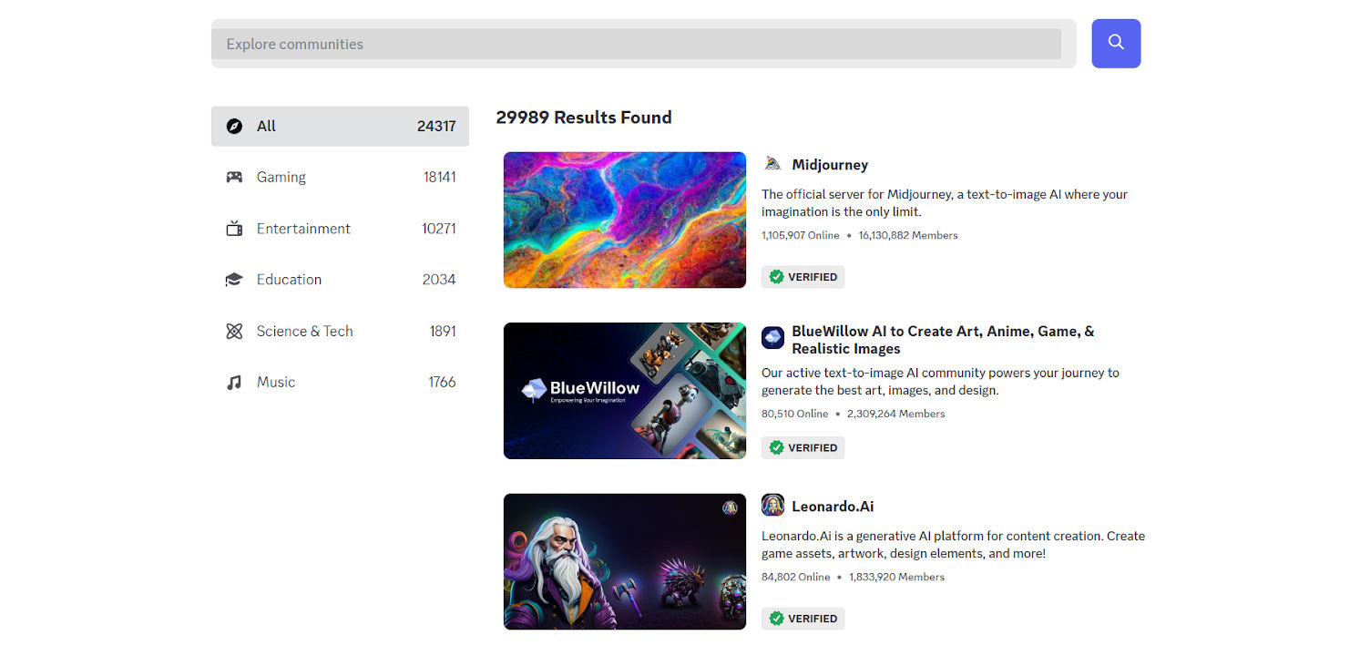
© Discord, Fair use
Second on our UI examples list is Discord’s Discover feature, which does a great job of exemplifying the essence of intuitive and modern design. The feature allows users to find and join diverse communities tailored to their interests. The vibrant and clean aesthetic sets it apart. Combined with efficient categorization, it becomes a unique website with a superb user interface—neat.
What Sets It Apart?
Cohesive visual theme: The use of playful graphics provides a visual representation of the diverse communities. What’s more, a harmonious color palette further enhances this representation.
Efficient categorization: With clear and concise categories like “Gaming,” “Entertainment,” and “Education,” users can easily navigate. They can find communities that resonate with their interests and feel closer to what’s going on.
Live community highlights: By showcasing trending servers, the platform allows users to get a glimpse of active communities.
Strengths of Discord's UI
Clutter-free UI and interactive design: Discord prioritizes a blend of simplicity and functionality.
Community-centric: The platform focuses on community-driven content, an important feature that’s often lacking in other platforms.
Transparent metrics: Discord shows real-time data—such as the number of active members—for transparency and authenticity.
What’s compelling about Discord’s UI is its attention to detail. The choice of typography, the subtle animations, and the strategic placement of search functions demonstrate a deep understanding of user experience. What’s more, the layout’s fluidity ensures that users can easily consume content without feeling overwhelmed by it.
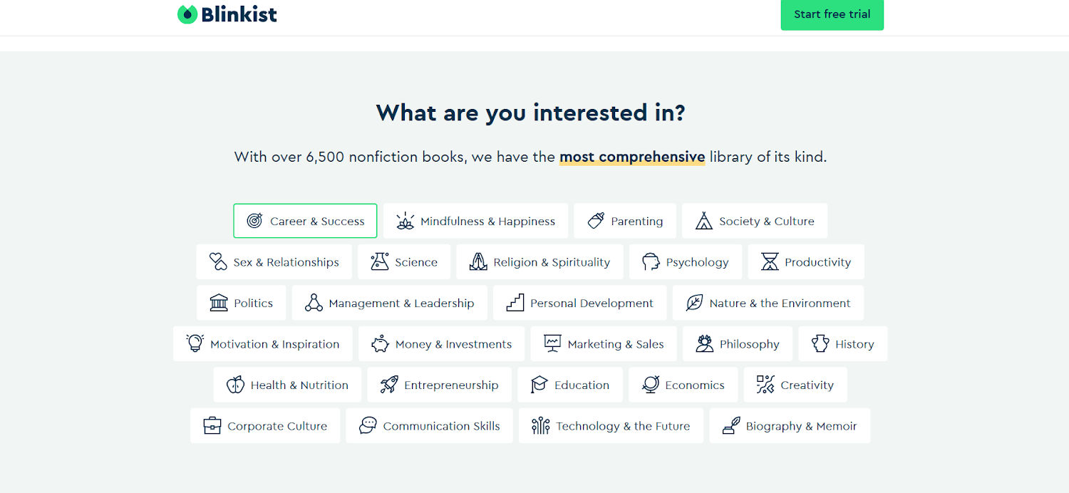
3. Blinkist's Descriptive Iconography
© Blinkist, Fair use
Blinkist’s excellent functionality and aesthetic grace make it stand out and then some. While other platforms offer similar categorizations, Blinkist’s clear visual language facilitates quicker user decision-making.
What Sets It Apart?
Iconographic clarity: Each icon translates abstract concepts into engaging symbols.
Consistent visual alignment: Blinkist unifies its best UI design across icons to ensure there’s a cohesive look.
Balanced minimalism: The uncluttered layout makes consuming information nice and easy and enjoyable.
Strengths of Blinkist's UI
Color cohesiveness: The consistent use of color across icons and backgrounds creates a harmonious visual experience.
Responsive interactivity: Hover animations provide immediate feedback and an enhanced interactive experience.
Scalable design: The grid system allows for easy expansion, and it can accommodate more categories as the platform grows.
While other platforms offer similar categorizations, Blinkist’s clear visual language facilitates quicker user decision-making.
4. Netflix Personalization
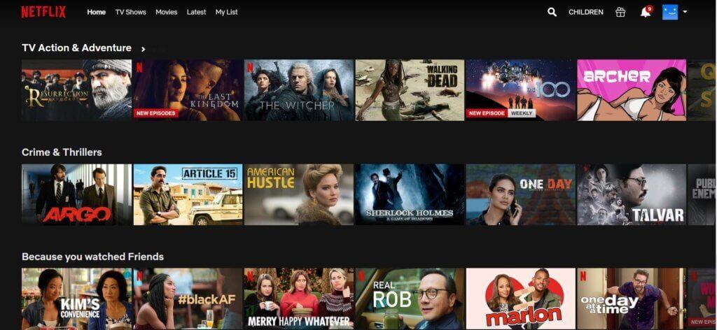
© Netflix, Fair use
Netflix sets the gold standard for personalization in UI design. Iconic and an industry heavyweight, they excel with their personalized recommendations. Their precision-tuned algorithm is remarkable—it keeps users engaged by presenting content that aligns with their unique preferences.
By analyzing user behavior and preferences, Netflix creates a unique viewing experience for each individual to enjoy. This approach tailors content to the viewer’s taste, and they can relish what they see. The modern user interface design maximizes user retention by introducing them to new shows.
A study of mobile users highlights the power of personalization: brands that send tailored in-app messages retain between 61% and 74% of their users in the subsequent 28 days.
What Sets It Apart?
User-centered design: Netflix places its users at the forefront. The interface adapts based on individual preferences.
Seamless integration: The recommendations blend with the user interface, and it makes navigation intuitive.
Diverse content presentation: By showcasing a range of genres, Netflix ensures users discover content outside their usual viewing habits and so they can enjoy and explore.
Strengths of Netflix's UI
Data-driven decisions: Netflix utilizes vast amounts of user data to refine its suggestions, ensuring high accuracy.
Engaging visuals: High-quality thumbnails and teasers pique user interest immediately.
Continuous evolution: The platform updates based on feedback and changing viewer habits.
While many streaming platforms offer recommendations, Netflix’s system is in a league of its own. It ensures that users spend less time searching and more time enjoying content—just what viewers want when, for example, they’re putting their feet up and are about to enjoy pizza. The strategic placement of recommendations creates a cohesive experience, and the consistent color scheme and typography further enhance this cohesion.
5. Zoom’s Streamlined Solutions for Every Sector
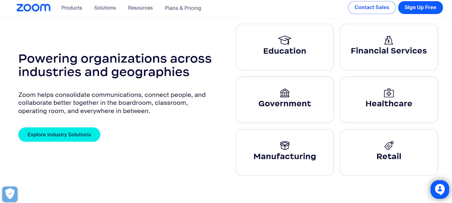
© Zoom, Fair use
Zoom’s industry solutions interface is a prime example of amazing user interface design. It organizes information tailored to various sectors. The platform shows a clear dedication to simplifying communication and connecting people whatever the distance. Users can easily navigate and pinpoint solutions specific to their industry.
They provide a website with a superb user interface to offer targeted value. Segmenting solutions according to sectors facilitates quicker decision-making for visitors—and it saves them the hassle of sifting through irrelevant content.
What Sets It Apart?
User-centered navigation: Visitors can find suitable products or solutions in several different ways, all of which are clearly signposted.
Minimalistic design: The clean yet minimal layout emphasizes essential content without overwhelming the user.
Unified color palette: The consistent use of colors reinforces brand identity and offers a seamless browsing experience—seamless being a huge part of what goes into connection, brand trust, and more.
Strengths of Zoom's UI
Adaptive layout: The design adapts across devices, ensuring a consistent user experience.
Clear call-to-action: The well-placed “Explore Industry Solutions” button encourages users to explore more.
While competitors often group by features alone, Zoom opts for various views: products, industries and audiences—just to name a few. This approach makes sure users find what they need more quickly, and—as a result—user satisfaction increases and bounce rates decrease. The well-spaced elements, combined with the intuitive icons, guide the user’s journey. Zoom focuses on clarity and avoids unnecessary embellishments to offer a refined, user-centered design—neat.
6. Zara's Seamless Shopping Experience
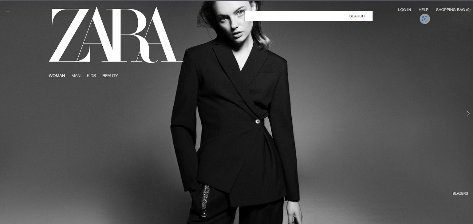
© Zara, Fair use
Amidst overwhelming digital noise, Zara’s online store refines elegance and functionality. Its minimalist design and high-definition visuals mirror the brand’s commitment to quality, style, and modernism. More than a store, it’s a virtual boutique that provides users with an immersive fashion experience right from the comforts of their homes.
What Sets It Apart?
High-resolution imagery: Captivating visuals enhance product appeal.
Streamlined navigation: The intuitive layout ensures effortless browsing and searching.
Brand consistency: The interface mirrors Zara’s brand ethos of modern luxury.
Strengths of Zara's UI
Adaptive design: A responsive UI ensures optimal viewing across devices.
Focused content: Fewer distractions allow products to shine.
Efficient check-out Process: Simplified steps lead to a smoother transaction experience.
Where many e-commerce platforms bombard users with excessive information, Zara’s UI adopts a refreshing “less is more” philosophy. The website focuses on the products to create an uninterrupted shopping journey. Every design choice—from the muted color palette to the strategic use of whitespace—showcases a deep understanding. It reflects the brand’s target audience and their preferences.
7. Webflow's Signature Interface
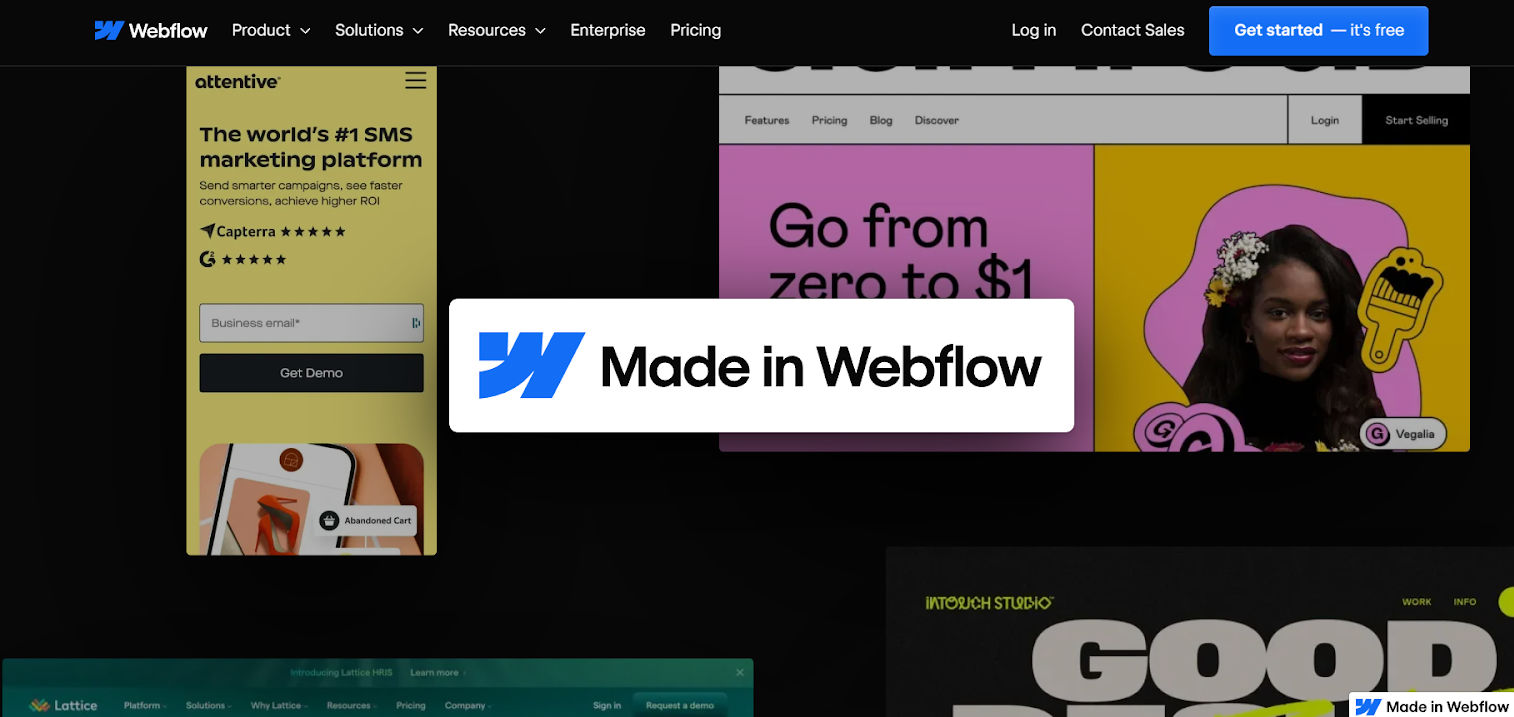
© Webflow, Fair use
Webflow’s UI example embodies the evolution of modern web design. It creates a seamless and visually striking experience. Among many web design platforms, Webflow stands tall because of its intricate design and user-centricity. Its harmonious blend of superb visual elements and great web design for usability makes it a go-to example of what UI should aim to achieve.
What sets it apart?
Intuitive navigation: Webflow simplifies complex web designs for effortless user interactions.
Dynamic visuals: The visuals offer captivating color schemes and geometric patterns to hold the user’s attention.
Responsiveness: The interface adapts to different screen sizes and devices without compromising the design quality—helping make the “magic” of a seamless experience that smart brands set as one of their most precious goals.
Strengths of Webflow's UI
Seamless interactivity: Webflow reduces the learning curve for new users with intuitive design choices.
Adaptive elements: The components dynamically adjust to create a consistent experience across various scenarios.
Where many platforms opt for simple or intricate design, Webflow’s innovative UI designs blend these two aspects. It provides an intuitive and aesthetically superior interface, setting it leagues apart from its competitors. This harmonization of form and function encapsulates the essence of professional UI design. It showcases the potential of where web interfaces can venture.
8. Bumble's Swipe Right Revolution
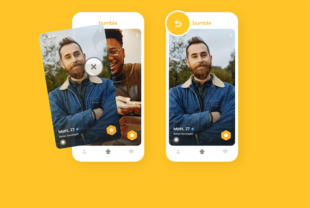
© Bumble, Fair use
The core of Bumble’s transformation lies in its “swipe right” functionality. It’s a symbol of modern dating that goes beyond mere aesthetics—it’s a celebration of choice, connection, and empowerment. “Swipe right” represents hope, possibility, and the excitement of what could follow. Each swipe becomes a personalized journey—and it’s something that makes it a website with an excellent user interface.
What sets it apart?
Bizz & BFF Modes: Unique swiping modes for business networking and friend-finding differentiate it from typical dating apps.
Simplicity at its best: Bumble has mastered the art of minimalism. The swipe-right recommended UI action is effortless, smooth, and recognizable.
Emotionally engaging: The positive reinforcement—through vibrant colors and graphics—makes users feel good about their choices.
Strengths of Bumble's UI
User-centric approach: Bumble’s mobile app design has turned the tables by emphasizing user empowerment.
Fluid & interesting: The tactile feel of swiping right makes the user experience smooth and enjoyable.
Reinforced positivity: The affirmative graphics and vibrant colors accompanying a right swipe inject a dose of positivity. It encourages users to engage more.
While many apps have adopted the swipe mechanism, Bumble’s “swipe right” has a unique philosophy. It focuses on encouraging genuine connections, promoting safety, and reshaping online dating norms. Every card design element—from the color palette to the tactile feedback—makes users feel positive, in control, and eager for more.
9. Monzo's Real-Time Financial Insight
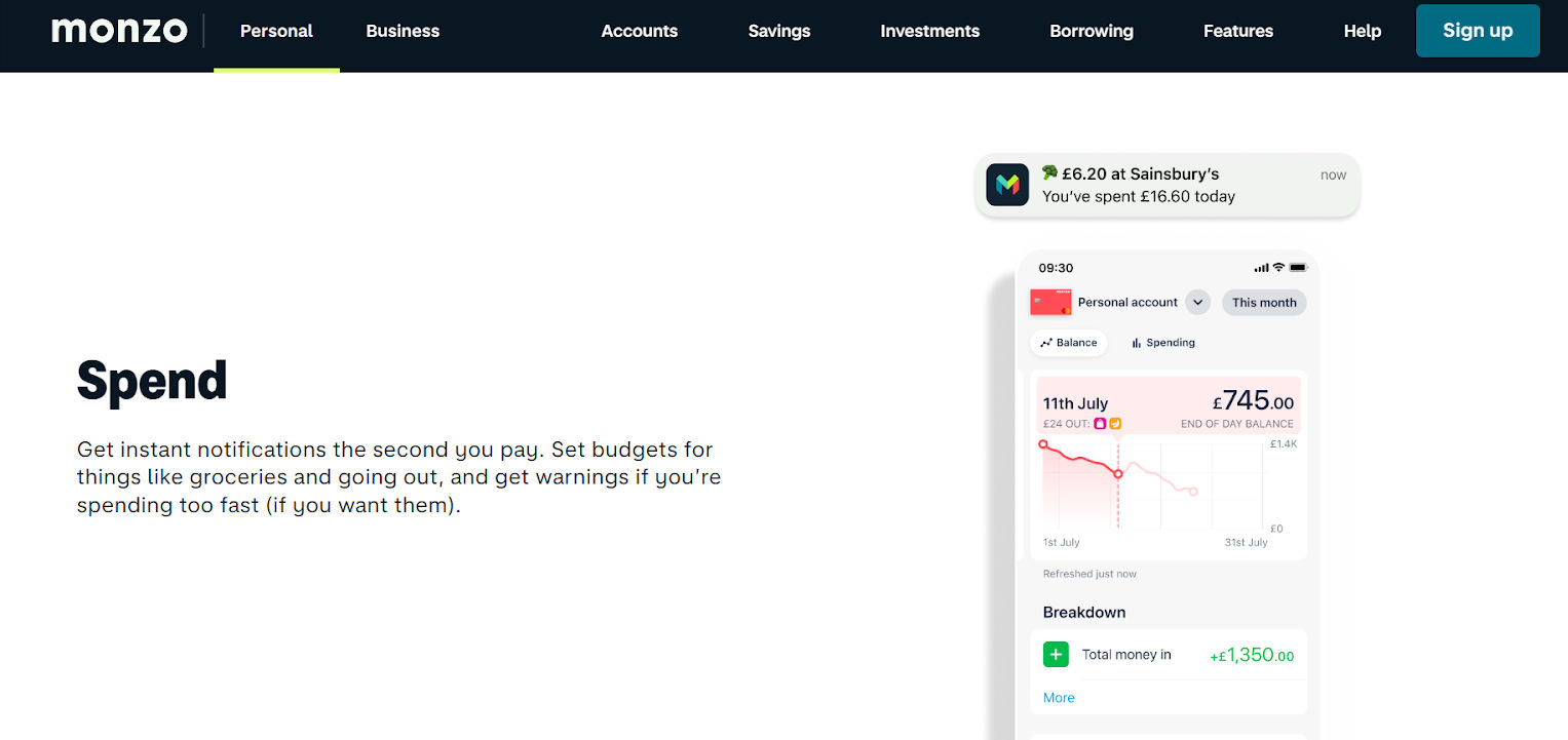
© Monzo, Fair use
Monzo, an online-only bank, merges classic functions with a flair that transforms contemporary banking. It elevates banking to an experience, not something that’s just about transactions. Features like instant payment notifications enhance user security and awareness. With clear spending insights, users no longer have to play the guessing game. They get a clear snapshot of their finances, and that fosters responsible financial behavior—the kind that helps pay well.
What sets it apart?
Dynamic financial overview: Monzo provides a living financial overview instead of static account statements, adjusting in real-time.
Embedded financial wellness: Beyond mere banking, Monzo promotes economic well-being through tailored budgeting tools for wise spending.
Community-driven features: Monzo often integrates features based on community feedback for a user-focused banking experience.
Strengths of Monzo's UI
Predictive analysis: Leveraging AI, Monzo offers predictive financial insights to help users foresee potential economic challenges or opportunities.
Micro-interactions: Subtle animations and feedback mechanisms enrich user experience.
Unified aesthetics: Consistent use of colors, typography, and layout across all screens ensures a visually pleasing experience.
Where others provide statements, Monzo’s recommended UI provides instant insights. This proactive approach gives users a sense of empowerment and control over their finances. Monzo’s design is a masterclass in balancing form and function. The interface integrates advanced features without overwhelming the user.
10. Bear's Engaging UI Explanations
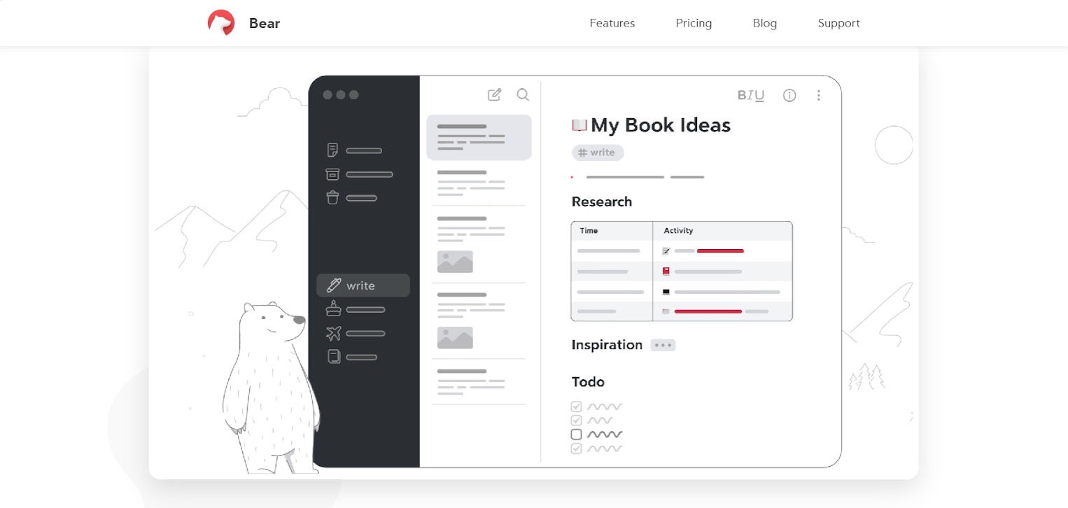
© Bear, Fair use
What sets Bear’s beautiful UI design apart is its thoughtful explainer video that guides users through its features. It’s a neat proactive approach, and it ensures that functionalities don’t confuse users. It provides a smooth and intuitive onboarding process, too. The platform ensures that its users don’t spend unnecessary minutes figuring out the platform—instead, they can dive right into productivity.
What sets Bear apart?
User-centric approach: Bear prioritizes user comfort by foreseeing potential challenges, ensuring they feel supported.
Interactive learning: Instead of static help pages, the video offers dynamic, step-by-step guidance.
Consistent branding: The explainer video aligns with Bear’s overall design ethos, maintaining brand consistency.
Strengths of Bear's UI
Engaging visuals: The video uses compelling animations that capture attention.
Clear narration: They convey the information concisely, avoiding information overload.
Intuitive flow: The video follows a logical progression, mirroring typical user queries.
While many apps offer help guides or FAQs, Bear takes a proactive approach. This foresight demonstrates an understanding of modern users’ preferences for visual learning, setting Bear apart in the crowded note-taking app market. Instead of overloading with features, it breaks down processes into digestible steps aided by visual cues. This approach epitomizes what UI designers aim for—clarity, coherence, and a seamless user journey.
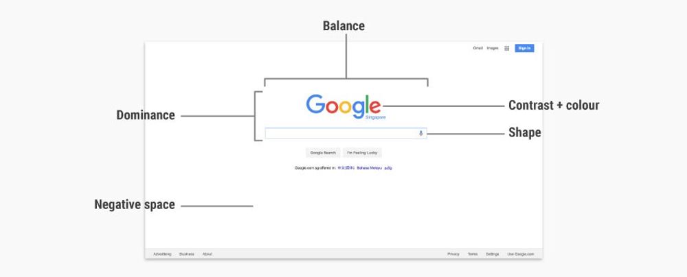
So, What Makes a UI Design Amazing?
Modern user interface (UI) design isn’t about making an app or website look pretty. It’s about creating intuitive and cool user interfaces with efficient user experience. A web design that centers on user experience (UX) can lower the chances of visitors bouncing due to design issues. But which of the following are examples of general UI metrics? Let’s find out:
Criteria That Make UI Examples Good
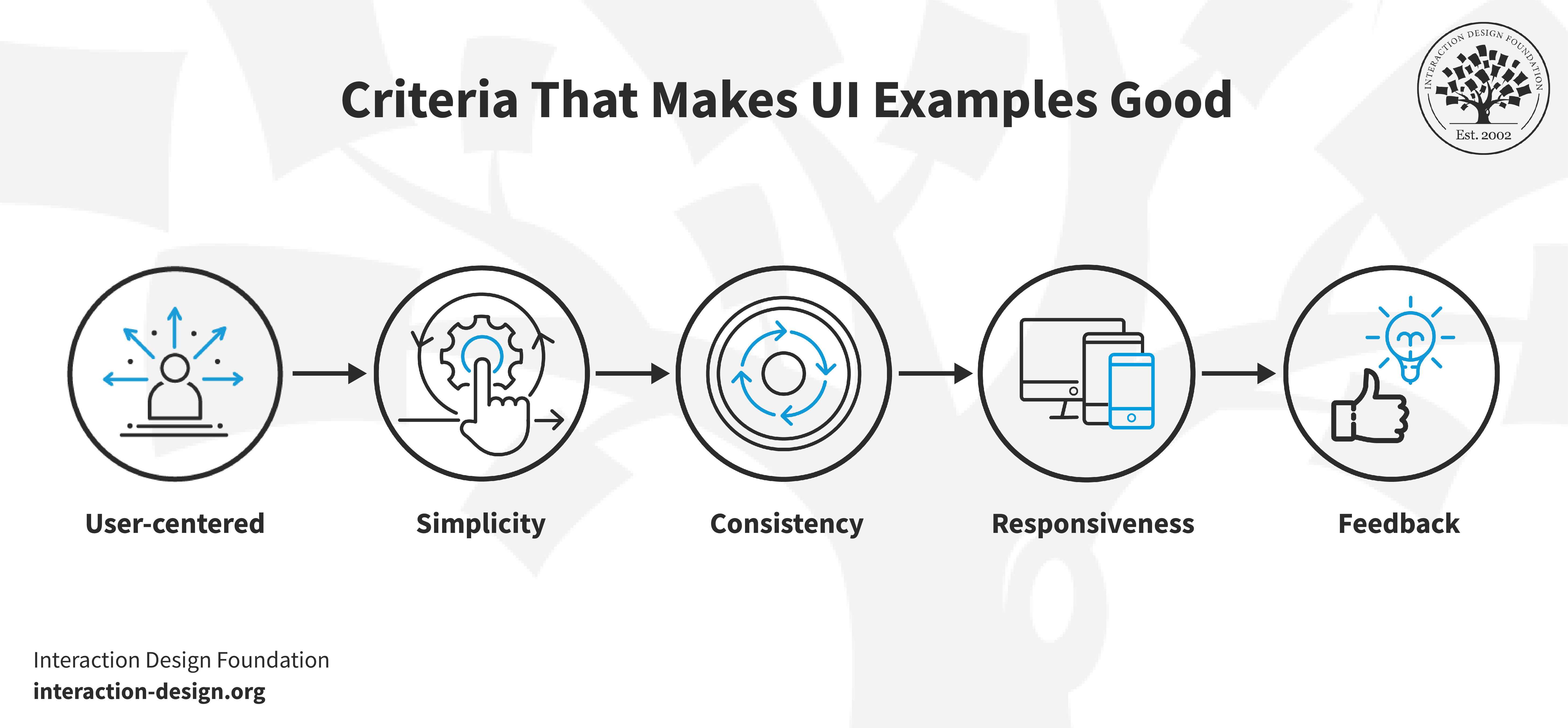
© Interaction Design Foundation, CC BY-SA 4.0
User-centered: The design has got to prioritize the needs and preferences of the target audience.
Simplicity: A clutter-free design ensures that users can find what they’re looking for—and quickly.
Consistency: We have seen examples of good UI design with uniform design language across all pages or screens.
Responsiveness: The design should adapt across various devices and screen sizes.
Feedback: Users should receive clear feedback on their actions, be it through animations, messages, or other cues.
Key Elements in Exceptional UI Design System Examples
Typography: Font, size, and spacing can impact readability and user experience.
Color scheme: Colors can evoke emotions, highlight important elements, and guide user attention.
Navigation: Intuitive navigation—such as clear menus and breadcrumbs—ensures users can find their way.
![Diagram detailing the key elements in exceptional UI examples: micro interactions, typography, navigation, icons and buttons, and color scheme.]()
© Interaction Design Foundation, CC BY-SA 4.0
Icons and buttons: Visually appealing and self-explanatory icons or buttons reduce cognitive load and show a level of care that users can appreciate.

Microinteractions: Our UI design layout examples show that small animations or design elements that respond to user actions can elevate the overall experience.
How, Why, and When to Implement Them
How: Begin with a deep understanding of your user demographics, needs, and pain points. Use wireframes and prototypes to visualize the design before finalizing it.
Why: Implementing these elements ensures users have a smooth and enjoyable experience. They lead to higher user retention and satisfaction.
When: Consider these elements from the earliest stages of the design process. Refine them through user testing and update them based on user feedback you get.
Best Practices for Exceptional UI Examples
Prioritize readability: Avoid fancy fonts that are hard to read and ensure contrast between text and background. Be sure to consider older users.
Limit choices: Too many options can overwhelm users—as counterintuitive as that might seem at first glance. Still, they won’t enjoy the analysis paralysis that can come from too much to choose from. So, stick to essential features or actions.
![List with some Best Practices for Exceptional UI Examples.]()
© Interaction Design Foundation, CC BY-SA 4.0
Use familiar patterns: Use design patterns that users are familiar with to promote faster adaptability.

Minimize load times: Ensure your design doesn’t rely on elements that can slow down page or app loading times.
Test and iterate: Collect user feedback and be open to making necessary design adjustments.
An amazing UI design melds aesthetics with functionality. It provides a pleasant visual experience with an intuitive user journey.
The Take Away
Gone are the days when designers prioritized aesthetics over functionality. Today, a successful UI design melds the two and does it well. It ensures that users find the interface both attractive and functional.
Keeping the user at the forefront of every design decision is key to crafting an impeccable UI and getting your brand noticed for the right reasons. By emphasizing intuitive layouts, these designs ensure that users can navigate easily, regardless of the complexity of the task at hand.
We’ve seen some superb UI/UX design examples of good UI website design, and there’s a great deal to think about for designing effective UIs. For one thing, there’s a surge in designs prioritizing user feedback for more intuitive interfaces. What’s more, microinteractions have risen in prominence—and they play a key role in enhancing user experience. And then, there’s the point that responsive designs have become non-negotiable. They ensure usability and consistency across a diverse range of devices, so it’s vital for designers to respond by making things responsive.
Another point to consider is how minimalistic designs with bold visual elements are making a significant impact. Less is more with power, and they hold the power to streamline user navigation. Last, but not least, the shift towards emotional design is gaining more and more traction. It creates a deeper user connection and fosters brand loyalty—and users’ feelings are a vital ingredient to consider, for sure. After all, how users feel about a brand goes a long way to deciding how well it does and how iconic it might become, maybe even as an essential part of twenty-first-century living.
References and Where to Learn More
Examples of best UI on Dribbble
Watch Michał Malewicz’s Master Class Beyond Interfaces: The UI Design Skills You Need to Know


