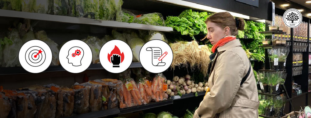
Human action represents intention. Even mistakes indicate an underlying aim or goal; just that we have happened to choose the wrong action, or, for some reason, failed to execute the appropriate action correctly. These actions are guided by information from our environment. We identify and pursue specific routes on the basis of environmental cues. When the available cues give strong suggestion that a certain path will lead us to our goal, we are likely to pick up on them quickly.
We are sensitised by our intentions. This means human perception is skewed to detect information that is related to our goals. If you are looking for a friend in a restaurant or bar, you will filter out all of the people that do not bear any resemblance, and direct attention to the most similar people (and finally identify your friend in the crowd with any luck).
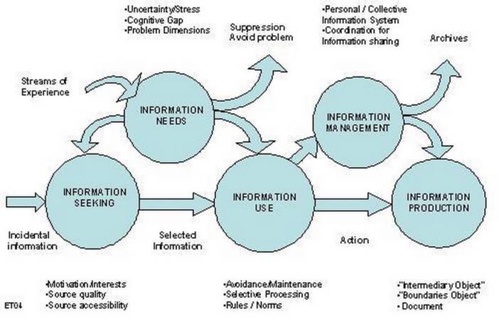
Author/Copyright holder: Eric Thivant. Copyright terms and licence: All rights reserved Img source
The nature of human information processing is based on maximising gain for the minimum expenditure of cognitive effort. The harder things make us work, the more of a deterrent there is for us to continue or return to them in future. Obviously, there are exceptions, such as games and puzzles, but when the cognitive effort isn't meant to be part of the exercise, it is rarely appreciated.
Information Scent
Humans are constantly seeking, gathering, consuming and sharing information from their environment in an attempt to make sense of the world and achieve their goals. When navigating through the virtual world, people display a similar approach to information gathering as they do in the physical world. The information search process is often referred to as 'foraging' or following the 'information scent'.

Author/Copyright holder: Unknown. Copyright terms and licence: Unknown.
The information foraging theory, developed by anthropologists and ecologists, was applied to the design of user interfaces by Stuart Card and Peter Pirolli at PARC. At the core of their proposal was the belief that web user behaviour is representative of the information gathering approach adopted by our ancestors when hunting for food.
Card, Pirolli, and other team members, including Ed Chi, enlisted the help of psychologists in analysing users' behaviour when navigating user interfaces. They found similar actions were demonstrated by users to those displayed by animals seeking food; giving rise to the term 'informavores', which encapsulates the nature of human information consumption to reach a desired end point.
The PARC team coined the term 'information scent', which refers to the strength of a cue or series of cues which lead to a point within a website. A strong information scent is found when a element within the design suggests the user is moving nearer to their goal. For example, if an e-Commerce site user wants to save an item to their basket they will look for something in the display that explicitly says 'save to basket' or a command button with an image of a basket/trolley. These visual cues give off a scent and we follow them if they are associated with what we are trying to do in the website.
Web users now make thousands of instant connections between elements and their results. They are capable of unconsciously picking up on subtle cues and they act on them accordingly. Designers use conventions and standardised practices to capitalise on our information foraging approach to web use. Borrowing images, styles and representations from our everyday lives also helps to increase the information scent in web user interfaces.
The Basic Information Foraging Web Experience
Information foraging is based on the strength of cues provided in a website design. Most website user experiences can be summarised as follows:
- The user arrives at the homepage, or another page deeper in a site after following a link or entering a specific search term.
- They search for obvious cues to determine whether the information they need is on the site, and they are then guided to their next step if there is a significantly strong cue or scent.
- If there are no strongly scented cues the user will likely abandon the site.
- If there is a strong cue(s) the user will follow this path.
- If the scent gets weaker as they follow the cues, they might seek an alternative path, which could involve back steps to reach their starting point.
- Alternatively, the user might abandon the site at any one point along the search process if the effort and time expended seems unreasonable.
- At each stage the user performs an instant evaluation to determine whether the strength of the information scent is sufficient for them to continue. This is the heart of information foraging behaviour; the user is constantly seeking to maximise pay-out for the minimum expenditure.
- If the scent gets stronger the user will almost certainly continue on this path.
- If there are a reasonable number of steps (i.e. not excessive for the potential pay-off) the user should reach their desired point. However, if the search process is a lengthy one, even if the scent gets progressively stronger, the user may still cease following an information scent.
Information Scent Consideration
In 'Designing for the Scent of Information', Jared Spool, Christine Perfetti and David Brittan (2004) identified a number of design features that weaken or completely block the information scent, which are as follows:
- Iceberg Syndrome = The user assumes a product or piece of information is not available on a site as it is not in view when they arrive. They assume the content lower down on the screen is merely the same as the content at the top, so they don't scroll to see what more is available. Therefore, wherever possible, you must avoid placing important information in the lower part of a webpage, or, at the very least, provide strong suggestion at the top of the screen of what the user will find further down.
- Camouflaged Links = Eye-tracking studies have shown users tend to direct their attention straight to inline links. However, if the links appear as images or other non-traditional elements they are often overlooked. Therefore, when using links it is best to conform to the general practice of using blue text with a dotted line underneath.
- Banner Blindness = Eye-tracking studies, such as those conducted by the Nielsen/Norman Group, have shown users tend to ignore certain areas of the screen due to the knowledge that large advertisements or filler content tend to be placed in specific regions. Therefore, over time users come to disregard whole regions of a webpage as they unconsciously anticipate they contain no personally relevant information. Thus, you should avoid placing important information within the web banner or in the same region of space occupied by an advertisement.
- Links That Lie = If the user clicks on a link and they are navigated to a page that seems to bear no relation to the information within the link text or imagery they will lose confidence in the information scent. Therefore, even if the scent is strong on future occasions the user might think the information is a red herring and ignore it, or try other options first. There must be a strong relationship between the information scent strength and the resulting contents of a link; otherwise, the user may completely abandon the site, especially if they feel they are being tricked into clicking links.
- Missing Words = The user clicks a link which suggests the user will be taken to a certain body of content; instead when they arrive at the new page there seems to be little connection. Following further investigation the user might find the desired content on the page but the relationship between the link and corresponding page lacks clarity on arrival. Therefore, the contents of a link must contain the same key words within view on arrival; otherwise, the user might lose confidence in the information scent being given off. Additionally, the user has to invest more time searching for the desired content on the page, when you should ensure it is immediately visible.
- Cute Link Names = Sometimes designers are tempted to flex their creative muscles and assign fun or playful names to links; however, if these link names lack clarity and transparency the user will likely ignore them completely, or view them as suspicious. Therefore, always aim to make links as explicit and revealing as possible, rather than giving in to the seductive power of using cute link names.
- Misplaced Links = When the user is scanning for cues strongly scented information will catch their attention. If these cues actually direct the user to unrelated content they will lose confidence in the information scent, and the website as a result. This is a two-fold problem: firstly, if the desired information is out of sight or hidden the user must invest more time in the search process, secondly, if there are misplaced links with similar names to the desired content the user could be navigated away from the site or taken to an unwanted page within the site. Therefore, ensure the appropriate links are clearly labelled and apparent within the display, whilst ensuring alternative links are sufficiently distinguished to avoid confusion.
Applying the Information Scent
There are lots of different ways to lead the user along their desired goal path, but there are also many ways to crush their confidence in the information scent. To ensure the user does not lose confidence or patience, it is important to provide informative links that are clearly visible at the appropriate stage of a task.
For an obvious example, when a user is navigating an e-Commerce site they will need ready access to their shopping basket at all times, so they can determine how many items they have, which items they have and how much they will cost individually and in total. Also when they are reading product information the "Buy" button should be prominent, so the user does not have to invest any extra time or effort before they can make a purchase.
In Summary
The information foraging theory may have originally been developed to explain how people detect and use information to guide their behaviour in everyday life, but it is no less applicable to web user behaviour. We actively look for and unconsciously detect cues in our environment to ensure we are always moving closer to our current goal.
The information scent is an essential consideration for designers; do your designs lead users with clear signposts and subtle features? Do these signs and features actually lead the users to where they want to go or are they misleading? Try to increase users' confidence in your websites by ensuring the elements that guide behaviour are unambiguous and work according to expectation.
Information Foraging in Information Access Environments, Pirolli, P. & Card, S.
Information Foraging: Why Google Makes People Leave Your Site Faster, Jakob Nielsen
Information Foraging Theory, David Trepess
Carol Collier Kuhlthau, article list on Information Search Process
Information seeking and use behaviour of economists and business analysts, Eric Thivant
Heather Image: Author/Copyright holder: icrossing. Copyright terms and licence: All rights reserved. Img
