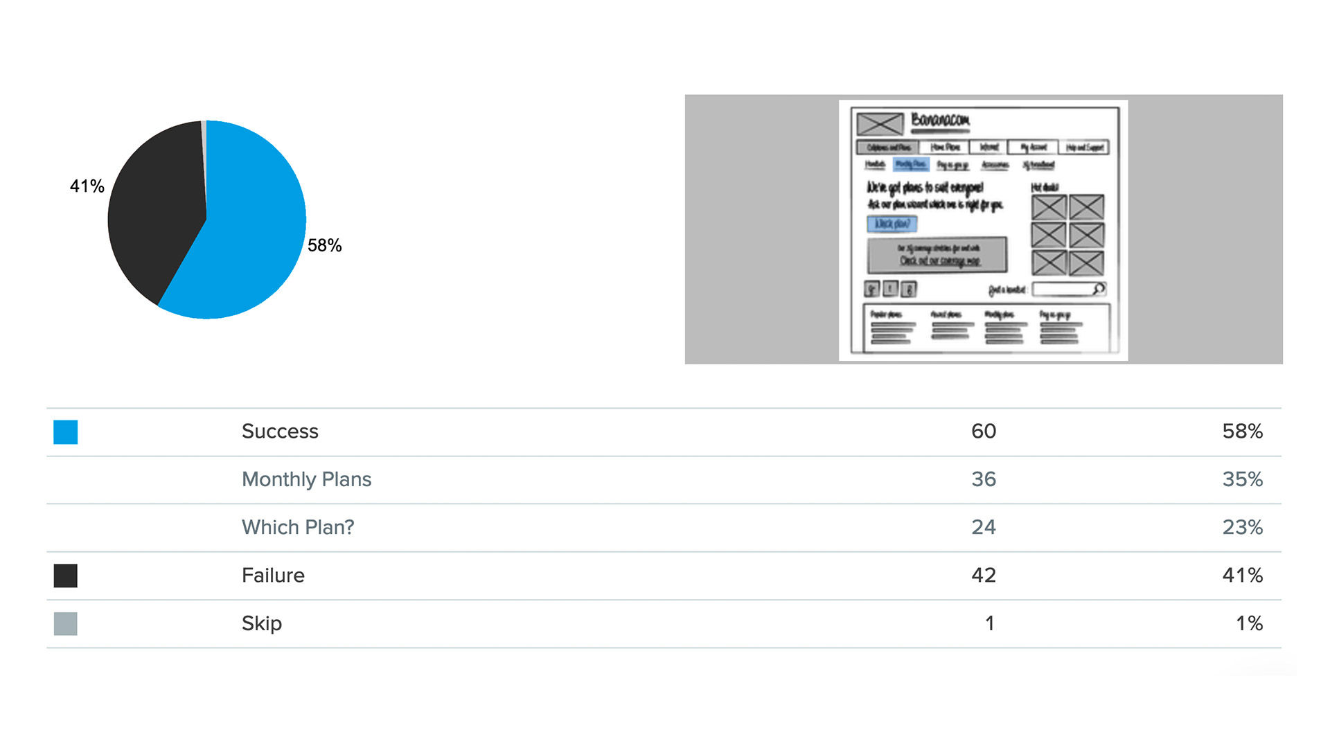
 The categorical data depicts the success and failure rate of the low-fidelity wireframe above. There is not a large enough difference between the two to determine if the designs were successful.
There is an element of error involved in measuring anything. So, when we want to compare measurements, how do we decide whether any difference is due to the things being measured or due to error? In this video you will be introduced to the term “statistical significance” and why it’s important to know whether a difference is large enough to be meaningful or simply random chance.
Show
Hide
video transcript
-
00:00:00 --> 00:00:34
One of the main issues that we do need to focus on is this question of the term *statistical significance*. Basically, all that means is that if we have two different groups and we've shown them different designs or they're in two different categories – these people converted; these people didn't convert, or these people saw design A; these people saw design B – and we get *different counts* as a result, are those counts statistically significant?
-
00:00:34 --> 00:01:01
If we were to do this all over again with a different set of participants, would we see similar results? Now, the example of people who converted and people who didn't convert – that doesn't usually need statistical significance or separate testing because you'd be lucky to get more than about 5% of visitors converting. But take design A versus design B. We might see two different figures for conversion from *that* lot.
-
00:01:01 --> 00:01:31
And we'd want to know, well, is that meaningful? Was that a really successful design or are we just barking up the tree in statistical terms? So, the whole question is whether we would get these kinds of results again or whether these results are the product of chance. So, we have to understand a bit about statistics in order to be able to know how to test this and to know what the results actually mean in terms of significance. Here's an example.
-
00:01:31 --> 00:02:03
So, this actually is taken straight from an example on Optimal Workshop's Chalkmark. So, Chalkmark is Optimal Workshop's version of first-click testing. And that little wireframey thing right in the middle of the screen is the thing being tested. You don't need much in terms of visual design in order to be able to do first-click testing, which this is an example of. And in this particular case – this is using their own figures – they had 60 people who clicked in what we thought was the right place.
-
00:02:03 --> 00:02:32
So, in these early-design tests, you're often allowed to state what is considered to be success and what isn't – which is great because it means you can actually get some overall validation of what it is you're trying to do. We had, I think, a little bit more than 100 participants. We had 60 people click in the right place, and we had 42 people click in the wrong place. So, those are just shown on the slide as success and failure.
-
00:02:32 --> 00:03:03
And we had one person skip, who we're going to ignore. Now, 60 is bigger than 42, but is it very much bigger? They're both numbers that are quite close to the middle. And if you look at the pie chart, it's clearly in favor of the successful side. There's more green than red, but it isn't exactly an overwhelming result. So, we need to run a test of statistical significance. Now, this is what's called *categorical data*. We have two counts: one of 16 and one of 42.
-
00:03:03 --> 00:03:31
And, for that, we have a very well-understood and popular test called *chi square*. And we can do this very simple test even with just Excel, or lots and lots of online websites that will offer to do chi-square tests for you. And all we have to do is put in our counts what we were expecting and what we got. Now, in terms of what we were expecting if it was *random* selection, if we simply flipped a coin for every participant taking part in this,
-
00:03:31 --> 00:04:03
we would expect a 50/50 ratio. So, that would be 102 total. So, 51 get it right and 51 get it wrong. But we've got the actual figures of 60 and 42. And it turns out that there is a 7% chance of this result occurring *randomly*. And that really isn't good enough. We tend to use in user experience, as in a lot of social research, a figure of 95%, leaving a 5% chance of random occurrence.
-
00:04:03 --> 00:04:32
Here, we're only 93% certain that this is not random. And so, we would actually say this is not statistically significant. And that's the kind of thing that we need to do with a very large amount of the results that we're looking at in all kinds of tools, if not all of them. In some cases – you know – if you've got "90% of users did this", then you probably can get away without running a separate significance test. But that's the kind of thing that we need to do, and we'll be talking about how to do these things.
-
00:04:32 --> 00:05:00
So, what conclusions can we reach with this particular result? Is the wireframe a poor design? Well, probably – people really aren't doing terribly well; we're not doing really significantly better than random; just flipping a coin. So, there isn't a large enough difference between the people who got it right and the people who got it wrong. And one of the things that we need to be concerned about is *how engaged users were*. Were they actually following the instructions?
-
00:05:00 --> 00:05:31
Or were they just clicking blindly in order to be able to get through to the end of the study so they could claim compensation? — Some kind of remuneration for having taken part in the study, which I'm afraid is something that happens – not all that frequently, but it's certainly a known hazard. And you could expect in any particular study that maybe 5–10% of your participants will not actually be paying attention to what they're actually doing. So, we need to make sure that we're looking at clean data and that we don't have other sources of noise.
-
00:05:31 --> 00:05:42
And, of course, one of the sources of noise is just going to be our choice of terminology. And if we're using words that users *aren't* quite certain about, then, yes, we might expect half of them to get it wrong.
Image
© Optimal Workshop Ltd., Fair-use