User Interface (UI) Design Patterns

Your constantly-updated definition of User Interface (UI) Design Patterns and collection of videos and articles. Be a conversation starter: Share this page and inspire others!
3,520 shares

What are User Interface (UI) Design Patterns?

User interface (UI) design patterns are reusable/recurring components which designers use to solve common problems in user interface design.

© Interaction Design Foundation, CC BY-SA 4.0

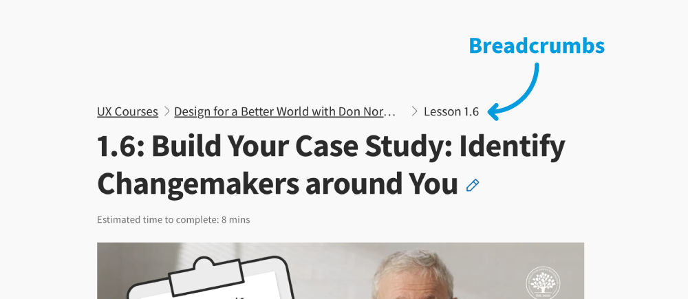
For example, the breadcrumbs design pattern lets users retrace their steps.

Designers can apply them to a broad range of cases, but must adapt each to the specific context of use.

Table of contents

Why Design Patterns Are Such Powerful Design Aids

Websites and apps have a conventional look and feel because of design patterns such as global navigation and tab bars. In UI design, you can use design patterns as a quick way to build interfaces that solve a problem; for instance, a filter pattern is a versatile tool that helps the user extract, enhance, or manipulate data to achieve specific goals.

Show Hide video transcript
  1. 00:00:00 --> 00:00:33

    User Interface Design Patterns are recurring components which designers use to solve common problems in interfaces. like, for example, when we think about those regular things that often are repeating themselves to kind of appear in, you know, in complex environments We need to show things that matter to people when they matter and nothing else. Right. it's just really sad what we see. Like, for example, if you look at Sears, right? Sears is just one of the many e-commerce sites, you know, nothing groundbreaking here. So you click on one of the filters and then the entire interface freezes

  2. 00:00:33 --> 00:01:00

    and then there is a refresh and you're being scrolled up. And I always ask myself, is this really the best we can do? Is really the best kind of interface for filtering that we can come up with, or can we do it a bit better? Because we can do it a bit better. So this is a great example where you have galaxies and then galaxies, you have all this filters which are in rows. Sometimes they take three rows, sometimes four or sometimes five rows. That's okay. Show people filters, show people buttons if they important show them.

  3. 00:01:00 --> 00:01:32

    Right. But what's important here, what I really like is we do not automatically refresh. Instead, we go ahead and say, "Hey, choose asmany filters as you like", right? And then whenever you click on show results, it's only then when you actually get an update coming up in the back. Which I think is perfectly fine. You don't need to auto update all the time. And that's especially critical when you're actually talking about the mobile view. The filter. Sure, why not? Slide in, slide out, although I probably prefer accordions instead.

  4. 00:01:32 --> 00:02:01

    And you just click on show products and it's only then when you return back to the other selection of filters and only when you click okay, show all products, then you actually get to load all the products, right? Designing good UI patterns is important because it leads to a better user experience, reduces usability issues, and ultimately contributes to the success of a product or application. It's a critical aspect of user centered design and product development.

UI design patterns serve as design blueprints that allow designers to choose the best and most commonly used interfaces for the user's specific context. Each pattern typically contains:

  • A user’s usability-related problem.

  • The context/situation where that problem happens.

  • The principle involved—e.g., error management.

  • The proven solution for the designer to implement to address the core of the problem.

  • Why—the reason for the pattern’s existence and how it can affect usability.

  • Examples—which show the pattern’s successful real-life application (e.g., screenshots and descriptions).

  • Implementation—some patterns include detailed instructions.

Common UI Design Patterns

Some of the most common UI design patterns are:

  • Breadcrumbs: Use linked labels to provide secondary navigation that shows the path from the front to the current site page in the hierarchy.

  • Lazy Registration: Forms can put users off registration. So, use this sign-up pattern to let users sample what your site/app offers for free or familiarize themselves with it. Then, you show them a sign-up form. For example, Amazon allows unrestricted navigation and cart-loading before it prompts users to register for an account. Note:

    • When content is accessible only to registered users or users must keep entering details, offer them simplified/low-effort sign-up forms.

    • Minimize/Avoid optional information fields. Use the Required Field Markers pattern to guide users to enter needed data.

  • Forgiving Format: Let users enter data in various formats (e.g., city/town/village or zip code).

  • Clear Primary Actions: Make buttons stand out with color so users know what to do (e.g., “Submit”). You may have to decide which actions take priority.

Here, we use the design pattern “clear primary action” to clearly show users where they can click.

© Interaction Design Foundation, CC BY-SA 4.0

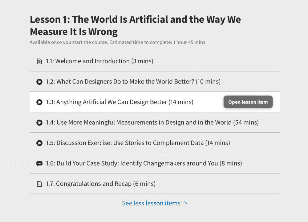
  • Progressive Disclosure: Show users only features relevant for the task at hand, one per screen. If you break input demands into sections, you’ll reduce cognitive load (e.g., “Show More”).

  • Hover Controls: Hide nonessential information on detailed pages to let users find relevant information more easily.

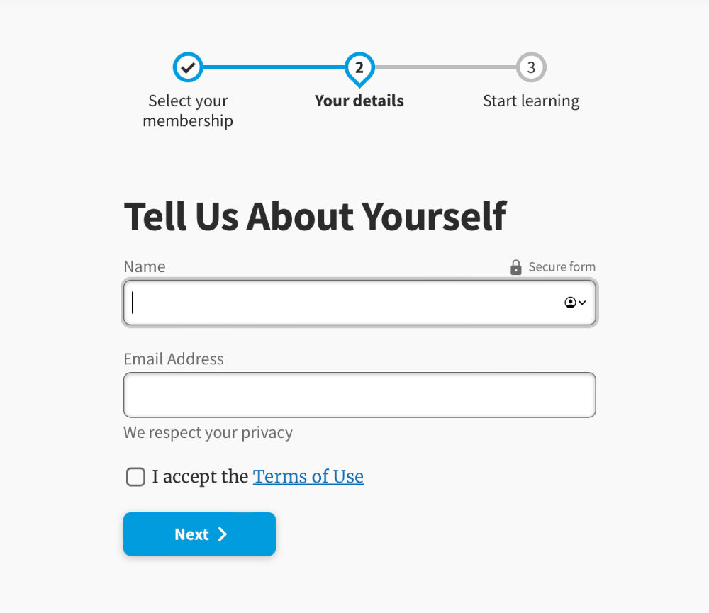
  • Steps Left: Designers typically combine this with a wizard pattern. It shows how many steps a user has to take to complete a task. You can use gamification (an incentivizing design pattern) here to enhance engagement.

  • Subscription Plans: Offer users an options menu (including “Sign-up” buttons) for joining at certain rates.

  • Leaderboard: You can boost engagement if you use this social media pattern.

    This page uses the design patterns progress tracker, clear primary actions and progressive disclosure.

    © Interaction Design Foundation, CC BY-SA 4.0

  • Dark Patterns: Some designers use these to lead or trick users into performing certain actions, typically in e-commerce, so they spend more or surrender personal information. Dark patterns range in harmfulness. Some designers leave an unchecked opt-out box as a default to secure customer information. Others slip items into shopping carts. To use dark patterns responsibly, you must be ethical and have empathy with your users. Dark patterns are risky because user mistrust and feedback can destroy a brand’s reputation overnight.

How to Use Design Patterns

Show Hide video transcript
  1. 00:00:00 --> 00:00:30

    All right, so now it's time to take a  look at some common UI patterns and how to use them. So, we use UI patterns as a way to help users not have to relearn, and there's a really great example here from Down Dog. And in particular, their onboarding, their visual design, their affordances, their contrast, it's all just beautifully executed.

  2. 00:00:30 --> 00:01:04

    It's actually one of the most popular apps for yoga and other types of fitness training. *Gestures* – of course, this is a gesture-based medium. But gestures are classically difficult to  learn. And so, they've kind of become standardized on all mobile operating systems, more or less. There may be some unique gestures, and there are some gesture hints you can give. So, you can say, "Swipe up to begin." So, you can give like a hint like that. But just be familiar with the fact that gestures in the very beginning of mobile

  3. 00:01:04 --> 00:01:33

    had all these different variances across  operating systems and most users just did not learn and did not take the time; they don't care. So, the most basic – you know – tap, swipe. There are some gestures like the Tinder gesture that was made famous, like was it: swipe left, swipe right. The other pattern is *integration*, that if you send them to email to validate and they click on email, it should take them back to the app, hopefully.

  4. 00:01:33 --> 00:02:02

    So, there's a little bit of technology there in terms of opening the container. Some apps do it really well; other apps don't. They send you to a website. Click on another button; then that launches the container. I think that's okay, too, as long as it makes the connection  and the app actually opens. But you should have seamlessness between notifications, the websites or email and the app itself so that if anyone is on any of those touchpoints, they're fluidly able to jump in between.

  5. 00:02:02 --> 00:02:33

    *Back buttons* are important. It's important that the back buttons act like back buttons and a user can go back to previous content or to a previous section, and that they're *not lost*. And that's actually another point about if you're using accordions and the accordion opens up, the user might get lost inside of the accordion menu. So, you want users to be able to control where they left off, especially if it's a lot of content and to be able to go back and kind of have

  6. 00:02:33 --> 00:03:01

    more control over that. There's nothing wrong with accordions – they're great – but they can lose their robustness in terms of lost in navigation. Also remember *contrast and affordance* so that – you know – the open / close, whether it's an arrow or plus minus sign, however you illustrate that affordance, that that's visible as well; unless you're deliberately giving the user some kind of focus where they need to be like on that particular page,

  7. 00:03:01 --> 00:03:30

    it's better if you show navigation and let them quickly bail out because remember you're in that micro  interaction, that clipped attention span. *Hamburger menus* can do without actually the three bars is what the research showed, so a menu with a square around it. And putting that little square or that line around it really helps. Be sure to *test*, of course, to make sure your users can get in there. Be sure to *tag* it from an accessibility standpoint, in other words, so that

  8. 00:03:30 --> 00:04:09

    a screen reader can know that it's a menu that can be opened. *Use search diligently* – in other words, let users search your mobile app or your mobile site, but if you're letting them drill into a search – say that it's for this section, so this is a news search or this is an archive search or this is – you know – so a lot of sites will just use search and just assume that users know, when really it's like a global search. The key to using different UI controls such  as presenting information in a carousel

  9. 00:04:09 --> 00:04:31

    or in a bigger menu like a mega menu for mobile is to give people visibility. Don't make them look at each single item. Let them actually get a glance of it and so that they can go on to the next screen. *Videos*, of course, are popular content, but videos force users to sit and watch them.

  10. 00:04:31 --> 00:05:02

    So, maybe tell them what the video is about and let them scan it quickly, so you might put *markers* in the videos. Make sure those videos are *captioned* for accessibility, for deaf and hard of  hearing users. And the same with *infographics*; if you use infographics, make sure that the infographics have good described by Aria tags. So, Aria is perfect for mobile and can  be used on mobile to make it more accessible. So, it's really important, that customization, personalization.

  11. 00:05:02 --> 00:05:34

    Giving users *control* of their data is a really good idea. Be *careful of random features*.  Make sure that your features   are based on desirability and from  observed user behavior.  Remember *touch target size and placement and tappability signifiers* so that users know they can tap certain objects and *watch out for accidental touches*.

  12. 00:05:34 --> 00:05:56

    You know, you can support undo or you can have good error handling to deal with that. Think about how you can help take a user to their task, give them what they need, build motivation, build momentum and have them, you know, essentially convert or engage if it's not an e-commerce or transactional type of thing.

Freely available, UI design patterns let you save time and money since you can copy and adapt them into your design—instead of reinventing the wheel for every new interface. They also facilitate faster prototyping and user familiarity. However, you should use them carefully. The wrong choices can prove costly – for example, if you:

  • Approach problems incorrectly because you’re over-relying on patterns.

  • Don’t fine-tune patterns to specific contexts.

  • Don’t customize a distinct brand image (e.g., your website ultimately resembles Facebook).

  • Overlook management requirements. If you create your own patterns, you must clearly define how to use them and with what types of problems, version-control them, and store them for team access.

Overall, give users familiar frameworks that maximize convenience and prevent confusion while they interact with your unique-looking brand.

Future-Focused UI Patterns for Mobile

Let’s look at mobile UX design, more specifically, common mobile UI patterns. These can be used to design intuitive interfaces and speed up your design process.

Show Hide video transcript
  1. 00:00:00 --> 00:00:34

    I'd like to talk a little bit about some future-facing type of patterns. This is 3D flip – having that playfulness through animation, through motion graphics, through swipe gestures that kind of add a little bit more interest to the UI and make it feel a little more like a real experience. The other one that's related to this in that kind of animation and playfulness area is

  2. 00:00:34 --> 00:01:05

    *buttonless transitions* – so you swipe and there is no button; it sort of reloads and brings you fresh  content, or in this case little micro videos. The other one, of course, is *voice* – having more speech recognition and more speech interfaces and speech inputs. And finally it's *AR* – so, like Ikea's augmented reality or Amazon's – you know – where you can build out small things like the  measuring tape that's built into Apple phones, for example.

  3. 00:01:05 --> 00:01:32

    We are moving into an opportunity space  where we have service-powered mobile experiences. So, we are already in that – so, so  many services and products. What that means is that you should understand *service design*, because mobile is a platform or a trigger to services, and if you just use a product-centric lens, you're going to miss out on some of the wonderful tools and techniques that service design brings.

  4. 00:01:32 --> 00:02:04

    The second big trend is *ecosystem-enabled*. And ecosystem thinking is also part of service design, is like thinking about your entire, not just the app as it sits in this little task, this lonely task space, but how it *interconnects* to its environment and to other actors and to other devices or other information – whatever it might be. The next one is *IoT* (Internet of Things) or *device-to-physical experience*. That has already started; that will continue – so, looking for opportunities where your

  5. 00:02:04 --> 00:02:31

    device can operate or connect to a physical experience or another product. And, finally, it's *immersive meshed realities*. What I mean by immersive is through AR, through VR,  through mixed reality, through a blend of AR and VR, through holograms, through telepresence, through tele-immersion, but controlled by your *phone*. I think the phone is essentially the operating system now

  6. 00:02:31 --> 00:02:36

    that will dictate other experiences.

Learn More about UI Design Patterns

Take our UI Design Patterns course.

Take our Mobile UI Design course.

Register to Complex UI Design: Practical Techniques Master Class webinar with Smashing Magazine creative lead Vitaly Friedman.

Explore UI Patterns in this library of real-life examples.

Read UX content strategist Jerry Cao’s detailed examination of mobile UI Design patterns.

What is an example of a UI pattern?

A UI pattern is a repeatable solution to a standard design problem, ensuring consistent user experience. This video highlights the 'OK/Cancel' pattern, emphasizing the concept of proximity

Show Hide video transcript
  1. 00:00:00 --> 00:00:32

    Hi. Welcome to this UX Daily Video. My name is Priscilla Esser, and I will show you how YouTube has used design patterns on their website. YouTube is the 2nd-most visited website, only behind Google in terms of average number of unique monthly visitors. One billion people visit YouTube every month. To help users navigate the site and quickly locate the desired videos, a number of different user interface design patterns have been used.

  2. 00:00:32 --> 00:01:04

    User interface design patterns are the visible and interactive elements within the display that allow users to carry out their activities with speed and accuracy. With such an enormous number of visitors, the YouTube design must satisfy *all* users whether they are experienced or newcomers to the site. Using unfamiliar interactive elements could confuse the user and cause abandonments. Therefore, the YouTube design makes use of many design patterns familiar to most users which represent tried-and-tested methods of interaction, navigation and data entry.

  3. 00:01:04 --> 00:01:33

    Let's start with the basics – the page structure. On the homepage, you can see the structure that YouTube uses throughout most of the pages. It consists of a horizontal top bar with the homepage logo and the search box. Also, there's a vertical bar on the left-hand side which provides the global navigation opportunities. At center stage, the most important selection of content is displayed. This attracts the most attention, whereas the other parts are only supportive to that. The center stage area has titled sections which consist of categories of videos placed in a horizontal manner.

  4. 00:01:33 --> 00:02:01

    The user only sees four for each category and has the opportunity to scroll further using the arrows on the side. This is an example of the slideshow design pattern. This layout with a horizontal top bar, the vertical sidebar and center stage combines into the visual framework that is used throughout the entire website. This is complemented with the use of color and typography, which makes some bits stand out more than others. For example, it's clear that currently the homepage is selected.

  5. 00:02:01 --> 00:02:33

    Also, YouTube wants to encourage users to subscribe. Both of these elements have been visualized with a red area and crisp white text similar to the YouTube logo. When navigating to the Creator Studio, we can see that the visual framework is still maintained – although the appearance of center stage has changed somewhat. Here, they allow users to *personalize* the center stage area by moving the blocks of content around. Although it's not quite similar to the movable pieces design pattern, it does take advantage of some of its effects.

  6. 00:02:33 --> 00:03:02

    When looking at the way YouTube organizes its content, we can conclude that they decided against a few design patterns that could have had some benefits for them. For example, they don't use the big seductive slideshows you might know from other websites to inspire users to watch a certain category of videos, and they don't use pagination to chop up search results into manageable chunks. What they do use are navigation tabs, and actually they use them as a backup for their global navigation and sidebar. The navigation tabs are located at the top of the center-stage area. They consist of three tabs.

  7. 00:03:02 --> 00:03:31

    And to indicate which tab is active, rather than opting for the traditional visual representation of the tab, YouTube has chosen to use bold letter typing and a red underline. When investigating design patterns that support fluid navigation, we can find, of course, the global navigation that we talked about earlier. The most important design pattern may be the search box, as it is likely that users will be searching for a specific topic. However, the search box is not placed and visualized as prominently as some other websites do.

  8. 00:03:31 --> 00:04:00

    Since the content on the YouTube website isn't ordered in multiple layers of categories, chances are that users will not need breadcrumbs to find their way back in the hierarchy of the contents. And, unsurprisingly, they *haven't* used the pattern in their design. A pattern that could be useful for that target group, though, is a *tag cloud*. Users often use the website to browse and get inspired by what other people consider to be interesting or entertaining videos. A tag cloud would allow the user to find the most popular subjects easily from a visual layout.

  9. 00:04:00 --> 00:04:30

    However, YouTube has chosen to use categories of videos in a slideshow to do this more efficiently. Zooming in on the search box, we find the design pattern of *autocomplete*. This design pattern makes searching faster, easier and possibly more inspiring. After entering a search term, the user can refine their search results by filtering on upload time, type of match, duration of the video and file features. They can also sort the results based on relevance, upload date, view count and rating, making it even faster and easier to find what the user is looking for.

  10. 00:04:30 --> 00:05:00

    For YouTube, the social aspects are very important. To support social interaction among users, they allow them to rate a video based on the easy thumbs-up/ thumbs-down method. This is a pattern that is becoming increasingly popular and is an alternative to the start/ refuse design pattern. Its main advantage is the ease with which the rating is given. Users no longer have to think carefully if something is worth two or three stars. They simply decide if they have enjoyed watching the video or not.

  11. 00:05:00 --> 00:05:32

    These ratings and the number of views also serve as *achievements* – a design pattern that encourages the user to contribute even more and strive to be better. YouTube further uses leaderboards to encourage users to participate and engage with the platform. In this overview, they give the best videos within a certain category – for example, music, sports or gaming. What they don't indicate is how they *select* the best videos. But you could imagine that the ones with the most thumbs up would be considered best. Finally, YouTube keeps you updated with all social interactions that are going on in your account

  12. 00:05:32 --> 00:06:01

    by providing you with *update alerts*. Here, they encourage you to subscribe to specific channels so they can keep you updated on any activities. You may expect another design pattern to pop up – the sign-in reminder – once you decide to subscribe to a channel, as you will need to sign in to see your channels and recommendations. A small preview of such a reminder is already given below the leaderboard. As it's an extremely popular but free service, you may expect to find an

  13. 00:06:01 --> 00:06:34

    abundance of dark patterns to coerce you – to increase their revenues. One dark pattern that I would like to highlight here is very specific to the services that YouTube offers. It shows you how they carefully select when and where to use a dark pattern to strike the right balance and not turn users off. The automatic opt-in pattern is described by the sentence: "By submitting your videos on YouTube you acknowledge that you agree to YouTube's Terms of Service and Community Guidelines." And here, you can also see how regular users can only upload videos of 15 minutes or less.

  14. 00:06:34 --> 00:07:02

    If you want to upload longer videos, you must leave your contact details. They explain how this helps them keep that platform secure. And they suggest that they won't do anything bad with your information – like selling it to a third party. But it is still a nifty little trick to get you to become less anonymous to them. Remember that YouTube is a Google company. So, in effect, you will be giving your contact details to Google.

  15. 00:07:02 --> 00:07:34

    In this video, we've taken a closer look at the YouTube platform and have identified some design patterns that they've used to improve the user experience. We've seen a visual framework with center stage pattern and titled sections. We've seen how the dashboard allows customization with elements that resemble movable pieces. We've pointed out the global navigation and navigation tabs as well as the search box. Social interaction is stimulated with thumbs up and down and comments below each video. The designers have taken care not to use too many dark patterns. We showed you how they use the automatic opt-in for the terms and agreements.

  16. 00:07:34 --> 00:08:01

    But you will probably be able to find some more. The take-away from analyzing all of the different design patterns that are used in a single website is that *everything is connected to everything*. You cannot consider any design pattern on its own, but you have to realize that it's related to other patterns. For example, the search box is merged with the autocomplete and a refined search pattern. This way, all of the good properties of each design pattern can strengthen each other

  17. 00:08:01 --> 00:08:07

    and will help you create the best user experience for your designs.

The pattern uses grouping to indicate that items, like the 'OK' and 'Cancel' buttons, relate to each other. This means users instinctively understand their relationship and function when they see these buttons together. Following a recognizable UI pattern, such as this, can significantly enhance a user's navigation experience. Check out the full video for insights on essential mobile UX design patterns.

What are the 4 golden rules of UI design?
  1. Grid and Layout: The foundation of any design is its grid and layout. Proper alignment and spacing ensure that content is organized and easily digestible by users.

  2. Typography: Text plays a vital role in conveying information. Choosing the right font and maintaining readability is paramount.

  3. Hierarchy: This defines the order and prominence of elements, guiding users through the interface and highlighting important content.

  4. Simplicity and Order: Our brains prefer order over chaos. A well-organized interface, free from clutter, allows faster processing and a more pleasant user experience.

Show Hide video transcript
  1. 00:00:00 --> 00:00:30

    In general, what you really, really need to learn first, because everything else comes with practice is grid typography, hierarchy, readability and some basic esthetics. But you don't really need to be an artist and design is definitely not art. It's not art because you have a very limited, you know, kind of scope of what you can do and you can't be too creative because that's going to make it unusable.

  2. 00:00:30 --> 00:01:03

    So a lot of those Dribbble shots are basically artworks and they're just not able to become a real product because they are done in a way to just kind of have like a flashy visual. So we need to understand that. But what I think is the most important thing is the grid and the layout. I often tell the junior designers what I think the UI design really is, because this whole design thing is really, really like created to feel difficult to people. Like, you know, we have those super genius UX designers talking about lengthy processes

  3. 00:01:03 --> 00:01:30

    and as a junior, we get discouraged. We get like, Oh, I'm not going to learn that ever because I'm not a super genius like they are. But in reality, a lot of the design is basically moving rectangles around. So you take a rectangle and based on some research and some knowledge, you move it to a different position, change the color, change the size, and that's it. And it's all rectangles, even if you're moving ovals because the bounding boxes are rectangular as well.

  4. 00:01:30 --> 00:02:03

    So if you learn how and why and where to move those rectangles to, you're set to go. And after two years at university, I had a very hands on experience because I could actually walk to a desk and see what people struggled with. And these were the same problems over and over, mostly great problems, some color problems and typography problems. And do you think that this font is good and I'm going to break it to you know, it's not.

  5. 00:02:03 --> 00:02:31

    So rule one off one because there is basically just one rule of good UI design. You don't want your brain to be working too much because our brains love order. They, they really, really hate chaos and they love order because it's easier for them to process. So if something is well-organized visually, it's just faster to process. So that brain is just working a little bit less. And if something is harder to process and it takes longer visually

  6. 00:02:31 --> 00:02:37

    to process, then the brain is tired and it's kind of disliking the thing already.

By mastering these rules, designers can craft aesthetically pleasing and functional interfaces.

Why are UI patterns important?

UI Design Patterns are essential, recurring solutions designers employ to address common interface dilemmas. These patterns simplify complex environments, ensuring users view vital content when needed. 

Show Hide video transcript
  1. 00:00:00 --> 00:00:33

    User Interface Design Patterns are recurring components which designers use to solve common problems in interfaces. like, for example, when we think about those regular things that often are repeating themselves to kind of appear in, you know, in complex environments We need to show things that matter to people when they matter and nothing else. Right. it's just really sad what we see. Like, for example, if you look at Sears, right? Sears is just one of the many e-commerce sites, you know, nothing groundbreaking here. So you click on one of the filters and then the entire interface freezes

  2. 00:00:33 --> 00:01:00

    and then there is a refresh and you're being scrolled up. And I always ask myself, is this really the best we can do? Is really the best kind of interface for filtering that we can come up with, or can we do it a bit better? Because we can do it a bit better. So this is a great example where you have galaxies and then galaxies, you have all this filters which are in rows. Sometimes they take three rows, sometimes four or sometimes five rows. That's okay. Show people filters, show people buttons if they important show them.

  3. 00:01:00 --> 00:01:32

    Right. But what's important here, what I really like is we do not automatically refresh. Instead, we go ahead and say, "Hey, choose asmany filters as you like", right? And then whenever you click on show results, it's only then when you actually get an update coming up in the back. Which I think is perfectly fine. You don't need to auto update all the time. And that's especially critical when you're actually talking about the mobile view. The filter. Sure, why not? Slide in, slide out, although I probably prefer accordions instead.

  4. 00:01:32 --> 00:02:01

    And you just click on show products and it's only then when you return back to the other selection of filters and only when you click okay, show all products, then you actually get to load all the products, right? Designing good UI patterns is important because it leads to a better user experience, reduces usability issues, and ultimately contributes to the success of a product or application. It's a critical aspect of user centered design and product development.

For instance, in the clip, the Galaxus product search uses an, efficient UI patterns to provide a better filtering experience. Such designs prioritize user convenience, eliminating unnecessary auto-refreshes and incorporating intuitive features, especially in mobile views. Whether through slide-in filters or accordions, these patterns enhance navigation. Crucially, well-designed UI patterns improve user experience, mitigate usability problems, and bolster a product's success. They remain a cornerstone of user-centric design and product innovation.

What are the categories of UI patterns?

UI patterns streamline user experience and can be classified into various categories. Some essential UI pattern categories include:

  1. Onboarding: Engaging users with compelling visual design, like the Down Dog app.

  2. Gestures: Intuitive actions like tap, swipe, and unique gestures made familiar by apps like Tinder.

  3. Integration: Seamlessly connecting apps with other platforms, ensuring fluid transitions.

  4. Back Buttons: Allowing users to navigate to previous content or sections without feeling lost.

  5. Accordions: Efficient navigation tools, but must ensure users don't get lost within.

  6. Contrast and Affordance: Showcasing navigational cues like open/close indicators.

  7. Hamburger Menus: Simplified navigation menus, optimizing visibility and accessibility.

  8. Search: Allowing users to search content within specified parameters effectively.

  9. Videos: Engaging content that should be easily scannable, captioned, and accessible.

  10. Customization: Providing users control of their data and avoiding random, non-desirable features.

  11. Touch Targets: Ensuring clear signifiers for tapable items and preventing accidental touches.

These categories are essential for creating user-friendly, effective interfaces.

What is the difference between UI patterns and components?

UI patterns and components are essential to interface design but serve distinct purposes. UI patterns are recurring solutions that address common design challenges in user interfaces. They provide consistent, efficient ways to solve usability issues, like how filtering should function in e-commerce sites without causing disruptive refreshes. On the other hand, components are the building blocks used within those patterns. For instance, in an e-commerce filter pattern, buttons, drop-down menus, and checkboxes are the components. Simply put, UI patterns guide how components are organized and interact to deliver an optimal user experience. By understanding and leveraging both, designers can create functional and user-friendly interfaces.

What is the difference between a design system and a design pattern?

A design pattern solves common user interface challenges, focusing on specific interaction or design problems. It's a repeatable solution applied within different contexts. On the other hand, a design system is a comprehensive set of standards meant to guide the creation of products. It encompasses a library of patterns, components, guidelines, and best practices, ensuring consistency across an organization's designs. While design patterns offer singular solutions, design systems provide a holistic framework and a shared vocabulary for teams, streamlining the product development process. Design patterns can be seen as individual elements within the broader architecture of a design system.

What are UI pattern libraries?

UI pattern libraries are curated collections of user interface design solutions that address recurring challenges in product development. These libraries offer a repository of proven, practical design components that can be reused across different projects. Leveraging UI pattern libraries can help designers maintain consistency, speed up the design process, and ensure best practices in usability. As highlighted in this article from Interaction Design Foundation, there are numerous resources online where designers can access and get inspired by extensive UI pattern libraries, streamlining their design workflow and enhancing user experience.

What are design system patterns?

Design system patterns are reusable, standardized solutions to commonly occurring design challenges. Within a design system, they ensure consistency across products by providing a shared language for both designers and developers. These patterns encompass visual elements, interactions, and even code snippets. By utilizing them, teams can improve design cohesiveness, speed up the design process, and ensure a smoother design handoff between designers and developers. 

Different states of IxDF's buttons from our Design System.

Incorporating design system patterns promotes efficiency and maintains brand integrity throughout different projects.

What is the 60 30 10 rule in UI design?

The 60-30-10 rule in UI design is a color distribution guideline for creating balanced and visually appealing interfaces. 

Show Hide video transcript
  1. 00:00:00 --> 00:00:33

    If you're starting as a designer, you don't  need a lot of colors, just as with fonts. If you're thinking, 'Okay, I have 60 million colors in that little picker, so let's try to use all of them!' that's not really the case. What you really need is a *background color*, a *foreground color* and an *accent color*. And there are some rules that you  can then look up on your own later, like the *60-30-10 rule*, which is pretty useful. But, in general, what you need to really remember from this is that you need a *background color*,  so in my case it's going to be white.

  2. 00:00:33 --> 00:01:03

    Then you need a *text color*, which is going to be some sort of black or dark gray, and the *accent color for the important actions*. And one thing that you can actually tweak here is to have that darker color instead of being pure black, add a little bit of that accent color. So, in our case, the blue to it, so it's just going to look a little bit more connected to the blue and it's just going to look better together. So, that's just one way. And you need *three colors* really to pull off most designs.

  3. 00:01:03 --> 00:01:31

    And you can start adding colors once you  feel more comfortable with them. But when you're starting, really just the less colors the better because it's just much harder that way to screw it up. Two of the worst possible color combinations  are mixing red with either very saturated blue or very saturated green. And if you look at it more closely depending on the type of screen that you have, you'll see that on the place where they kind of mix together,

  4. 00:01:31 --> 00:02:01

    that little line becomes a little bit fuzzy. If you look at it a little bit longer, it starts to hurt your eyes in some cases on some screens because this contrast of those colors works really, really bad together. So, if you want to make a Christmas app, for example, there are better ways to do it, but *generally avoid those color combinations* and *always test your colors if they're clashing that way*. So, you can just place one on top of the other and see if that fuzzy line appears on them.

  5. 00:02:01 --> 00:02:07

    And that's one way to actually test it – you know – *by eye*, just looking at it. If it looks good, then it looks good.

This rule suggests using three primary colors:

  1. Background color (60%): This dominates the design, typically a neutral tone.

  2. Foreground (text) color (30%): Provides visual contrast, often a darker shade.

  3. Accent color (10%): Draws attention to essential elements or actions.

Starting with these primary colors is essential, ensuring harmony and reducing visual clutter. For a cohesive look, the foreground color can sometimes hint at the accent color. This rule simplifies the design process and ensures a consistent, user-friendly experience.

Where to learn more about UI Design patterns?

For a comprehensive understanding of UI design patterns, consider these courses from Interaction Design Foundation:

  1. UI Design Patterns for Successful Software: Delve into effective patterns, their psychology, and real-world applications in design.

  2. Mobile UI Design Course: Learn mobile-specific design patterns and best practices for intuitive mobile interfaces.

Show Hide video transcript
  1. 00:00:00 --> 00:00:30

    Learn mobile UI design from a fresh perspective. Okay, we're done playing around. This is a design language. Secrets, patterns, frameworks. Big affordances, big tappable... And also the visual of: “Is it on?” Inspiring stories based on professional experience. Don't distract them because they might get hit by a bus. Invaluable advice and portfolio building exercises. And it's based on usability. It's based on strong UX principles. Make your users happy,

  2. 00:00:30 --> 00:00:36

    learn to craft intuitive mobile user interfaces. Hey, you can click on me, that kind of thing.

If you're short on time, the UI Design Skills Masterclass provides a swift yet thorough overview of crucial UI design concepts. Enhance your design acumen and stay abreast of evolving UI trends with these invaluable resources.

Earn a Gift, Answer a Short Quiz!

Question 1

What is the main purpose of UI design patterns?

1 point towards your gift

Literature on User Interface (UI) Design Patterns

Here's the entire UX literature on User Interface (UI) Design Patterns by the Interaction Design Foundation, collated in one place:

Learn more about User Interface (UI) Design Patterns

Take a deep dive into User Interface (UI) Design Patterns with our course UI Design Patterns for Successful Software .

Have you ever found yourself spotting shapes in the clouds? That is because people are hard-wired to recognize patterns, even when there are none. It’s the same reason that we often think we know where to click when first experiencing a website—and get frustrated if things aren’t where we think they should be. Choosing the right user interface design pattern is crucial to taking advantage of this natural pattern-spotting, and this course will teach you how to do just that.

User interface design patterns are the means by which structure and order can gel together to make powerful user experiences. Structure and order are also a user’s best friends, and along with the fact that old habits die hard (especially on the web), it is essential that designers consider user interfaces very carefully before they set the final design in stone. Products should consist of such good interactions that users don’t even notice how they got from point A to point B. Failing to do so can lead to user interfaces that are difficult or confusing to navigate, requiring the user to spend an unreasonable amount of time decoding the display—and just a few seconds too many can be “unreasonable”—rather than fulfilling their original aims and objectives.

While the focus is on the practical application of user interface design patterns, by the end of the course you will also be familiar with current terminology used in the design of user interfaces, and many of the key concepts under discussion. This should help put you ahead of the pack and furnish you with the knowledge necessary to advance beyond your competitors.

So, if you are struggling to decide which user interface design pattern is best, and how you can achieve maximum usability through implementing it, then step no further. This course will equip you with the knowledge necessary to select the most appropriate display methods and solve common design problems affecting existing user interfaces.

All open-source articles on User Interface (UI) Design Patterns

Please check the value and try again.
  • 1
  • 2
  • 1 of 2

Open Access—Link to us!

We believe in Open Access and the democratization of knowledge. Unfortunately, world-class educational materials such as this page are normally hidden behind paywalls or in expensive textbooks.

If you want this to change, , link to us, or join us to help us democratize design knowledge!

Privacy Settings
By using this site, you accept our Cookie Policy and Terms of Use.

Share Knowledge, Get Respect!

Share on:

or copy link

Cite according to academic standards

Simply copy and paste the text below into your bibliographic reference list, onto your blog, or anywhere else. You can also just hyperlink to this page.

Interaction Design Foundation - IxDF. (2016, May 25). What are User Interface (UI) Design Patterns?. Interaction Design Foundation - IxDF.

New to UX Design? We're Giving You a Free eBook!

The Basics of User Experience Design

Download our free ebook “The Basics of User Experience Design” to learn about core concepts of UX design.

In 9 chapters, we'll cover: conducting user interviews, design thinking, interaction design, mobile UX design, usability, UX research, and many more!

A valid email address is required.
316,016 designers enjoy our newsletter—sure you don't want to receive it?