Adaptive Design

Your constantly-updated definition of Adaptive Design and collection of videos and articles
503 shares

What is Adaptive Design?

Adaptive designs are a range of pre-made layouts that fit different screen sizes. The device's browser selects the best-fitting design from those options. 

Show Hide video transcript
  1. Transcript loading…

Adaptive design is one method of ensuring webpages function on different-sized devices, which makes it a good option for mobile User Experience (UX) design. Designers might make differently-sized graphical user interfaces (GUIs) ranging from smartwatches to TVs. 

Adaptive design for websites uses multiple fixed layout sizes. The system detects the browser size and selects the most appropriate layout.

Adaptive designs usually include six designs for the six most common screen widths—320, 480, 760, 960, 1200, and 1600 pixels. 

Adaptive and Responsive Design

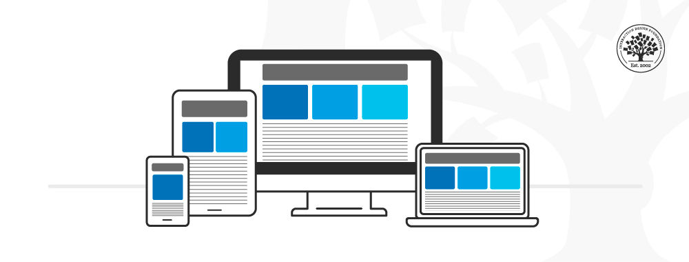
Adaptive design is like responsive design, which also adapts to different screen sizes. However, responsive designs use a single layout that adjusts in response to screen size. Adaptive design content chooses the best configuration from a selection of fixed layouts.

In this image, you can see a comparison between the responsive design approach and the adaptive design approach.

© Interaction Design Foundation, CC BY-SA 4.0

The advantage of adaptive design is that it is a tailor-made solution. The GUI will appear exactly as intended on different screen sizes. The disadvantage is that adaptive design is expensive. The designer creates up to six versions of a webpage to match the screen specifications a user needs. An adaptive design might leave users with non-standard-sized screens with an unoptimized solution. 

Responsive design is the "default" for accessing web content on any device. Adaptive design is a related technique that allows for UX to be optimized. Which approach you take depends on several factors, the most important of which is your users’ needs and contexts of use. The trade-off between responsive and adaptive design ultimately comes down to consistency and flexibility. Responsive affords less control over your design on each screen size. 

Adaptive and responsive design are different approaches to deliver device-specific experiences for users. While responsive design focuses on just the device, adaptive design takes both device and the user’s context into account. Sometimes, a hybrid approach is best.

Learn more about Adaptive Design

Take our course: Mobile UX Design: The Beginner's Guide.

Understanding the users’ context of use is crucial to create effective adaptive designs. For more on the context of use for mobile, see this.

When you design for different types of devices, keep in mind the challenges, constraints and opportunities of each device. Here are the key design considerations for smartphones and tablets.


Answer a Short Quiz to Earn a Gift

Question 1

What is the primary benefit of adaptive design?

1 point towards your gift

Question 2

How does adaptive design differ from responsive design?

1 point towards your gift

Question 3

Why is adaptive design particularly useful for mobile user experience?

1 point towards your gift

Question 4

What should designers consider when they choose between adaptive and responsive design?

1 point towards your gift

Question 5

What advantage does adaptive design have over responsive design?

1 point towards your gift

Better luck next time!

0 out of 5 questions answered correctly

Do you want to improve your UX / UI Design skills? Join us now

Congratulations! You did amazing

5 out of 5 questions answered correctly

You earned your gift with a perfect score! Let us send it to you.

Letter from IxDF

Check Your Inbox

We’ve emailed your gift to name@email.com.

Do you want to improve your UX / UI Design skills? Join us now

Literature on Adaptive Design

Here’s the entire UX literature on Adaptive Design by the Interaction Design Foundation, collated in one place:

Learn more about Adaptive Design

Take a deep dive into Adaptive Design with our course Mobile UX Design: The Beginner's Guide .

In the “Build Your Portfolio” project, you’ll find a series of practical exercises that will give you first-hand experience with the methods we cover. You will build on your project in each lesson so once you have completed the course you will have a thorough case study for your portfolio.

Mobile User Experience Design: Introduction, has been built on evidence-based research and practice. It is taught by the CEO of ExperienceDynamics.com, Frank Spillers, author, speaker and internationally respected Senior Usability practitioner.

All open-source articles on Adaptive Design

Please check the value and try again.

Open Access—Link to us!

We believe in Open Access and the democratization of knowledge. Unfortunately, world-class educational materials such as this page are normally hidden behind paywalls or in expensive textbooks.

If you want this to change, , link to us, or join us to help us democratize design knowledge!

Share Knowledge, Get Respect!

Share on:

or copy link

Cite according to academic standards

Simply copy and paste the text below into your bibliographic reference list, onto your blog, or anywhere else. You can also just hyperlink to this page.

Interaction Design Foundation - IxDF. (2016, June 3). What is Adaptive Design?. Interaction Design Foundation - IxDF.

New to UX Design? We're Giving You a Free eBook!

The Basics of User Experience Design

Download our free ebook “The Basics of User Experience Design” to learn about core concepts of UX design.

In 9 chapters, we’ll cover: conducting user interviews, design thinking, interaction design, mobile UX design, usability, UX research, and many more!

A valid email address is required.
316,568 designers enjoy our newsletter—sure you don’t want to receive it?