Your constantly-updated definition of Color Modes and
collection of videos and articles. Be a conversation starter: Share this page and inspire others!
176shares
What are Color Modes?
Color modes are the settings designers use to show colors consistently across devices and materials. Commonly used modes are LAB, RGB, CMYK, index, grayscale and bitmap, which differ in quality and file size. Designers pick modes to optimize images and ensure these appear identically across media for brand consistency.
“The main function of color should be to serve expression.”
— Henri Matisse
Learn about the intricate properties of color here.
ShowHide
video transcript
00:00:00 --> 00:00:31
Let me introduce myself; my name is Joann Eckstut. I am the co-author of *What Is Color? 50 Questions and Answers on the Science of Color*. When I'm not writing, I spend my time working as an interior designer. Today, I would like to discuss with you the transitory nature of color.
00:00:31 --> 00:01:06
There are four primary ways in which colors appear to change or shift. Number 1: Daylight is constantly changing. So, the colors we see change constantly as well. Number 2: Changing a light source changes what colors we see. Number 3: Colors appear to change depending on what colors surround them. And Number 4: Colors that appear to match in one setting do not match in another.
00:01:06 --> 00:01:32
Let's start with number one. Daylight is constantly changing. So, the colors we see change constantly as well. Although we don't necessarily realize it, millions of changes in light happen all throughout the day. Here, it's beautifully illustrated in this time-lapse image of the Statue of Liberty, which takes place just as the Sun sets.
00:01:32 --> 00:02:02
You can see that even in this short period of time there are myriad changes. We could be overwhelmed by this information about constantly changing light, but our brains help us to hold steady. So, for example, when viewing the red house in this illustration, the human brain has no difficulty in seeing it as entirely one red, even though the side in the Sun looks coral and the side in the shade looks maroon.
00:02:02 --> 00:02:31
When you isolate the colors and place them side by side, as in the two swatches here, the coral and the maroon tell a different story. Number 2: Changing a light source changes the colors we see. When we change the light source illuminating a space, the elements in the space reflect *different* wavelengths of light, causing the space and the objects in it to change their color appearance.
00:02:31 --> 00:03:03
For example, daylight emits light evenly across the spectrum, so no particular color is emphasized, while incandescent light emphasizes reds, oranges and yellows, so objects lit in this way emphasize those tones. Fluorescents have an uneven pattern of emissions, giving objects a green or a yellow-green kind of a cast; whereas LEDs are weak in violet, blue-violet and red areas,
00:03:03 --> 00:03:32
but peak in the orange, yellow and green range. In the example that we see here, the pencils on the left, lit in incandescent light, show the red as enhanced and the natural wood as pinker. The penicils in the middle, that are lit with LEDs, slightly neutralize all the colored pencils and the wood appears beige. The pencils on the right, that are lit with fluorescent lights,
00:03:32 --> 00:04:01
are more muted generally and the natural wood appears a light brown. So, the source of the light determines the way colors are perceived. Number 3: Colors appear to change depending on what colors surround them. This phenomenon is known as *simultaneous contrast*. Simultaneous contrast reveals something of utmost importance: Color is not a fixed entity.
00:04:01 --> 00:04:33
Color isn't constructed solely via particular wavelengths of light, but by a larger visual field. Simultaneous contrast can make a color look more saturated, duller, darker, lighter, or some combination thereof, depending on what color it sits next to. In the example seen here, all of the X's are printed in the same color, although they appear to change color as they are paired with different backgrounds.
00:04:33 --> 00:05:05
In the second example, the turquoise-blue in the circle on the left and the bright lime-green in the circle on the right are actually the *same color*. I know this seems impossible at first glance, but I assure you this is true. They *appear* to be completely distinct colors only because the colors they sit next to are different. Number 4: Colors that appear to match in one setting do not in another.
00:05:05 --> 00:05:32
Two materials can appear to be the same matching color under particular lighting, but no longer match when moved to a different light source. This called *metamerism*. For example, a blue carpet and a blue fabric swatch, as seen in this illustration, may look the same when observed in a showroom that is lit with bulbs that are close to daylight in temperature.
00:05:32 --> 00:06:05
*However*, inside a room lit with *incandescent* bulbs, that reflect more red, the carpet may appear to have a more purple cast and no longer match the upholstery fabric as it did in the showroom. This is the bane of every designer's existence: color appearing one way in the showroom, another in the interior where it's going to be used. So, beware! This is due to the different molecular properties of the dyes – say, a vat dye versus a pigment dye –
00:06:05 --> 00:06:20
and the different molecular properties of the fibers – say, a wool versus a nylon. So, now that you are aware of how ephemeral color can be, you will be prepared to work with it.
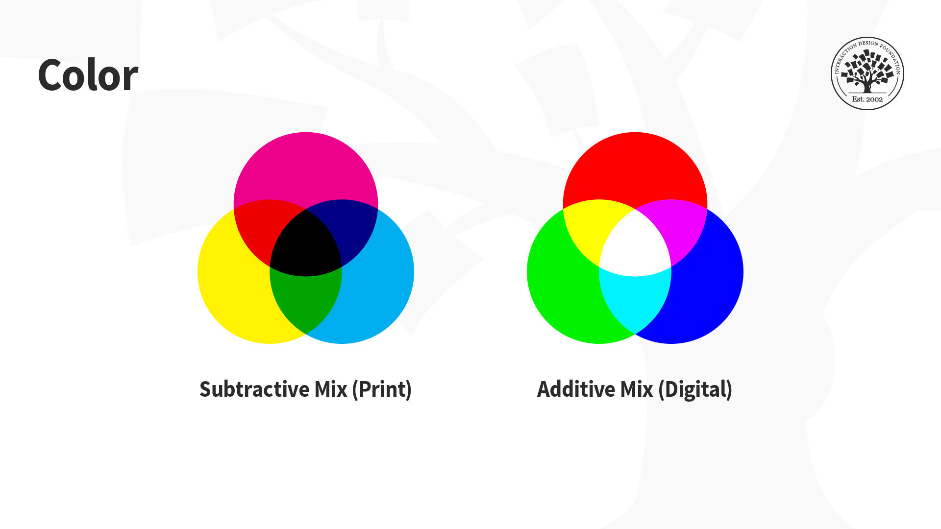
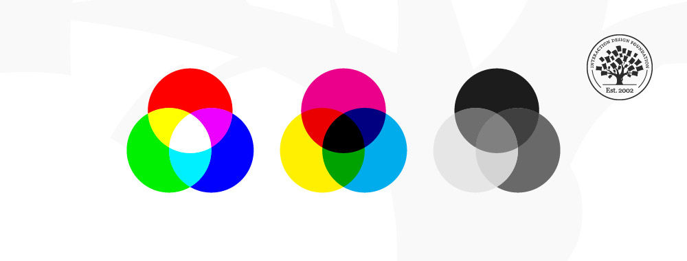
The designs we create appear on many devices and materials, and how we manipulate color greatly depends on the medium we use. This is due to differences in color spaces (i.e., the specific organization of colors), and the two processes for producing color, namely:
Additive: Involves the blending of light. We “create” white by mixing all the colors at full intensity; black is the total absence of color.
Subtractive: Involves mixing physical substances (e.g., ink, paint). Each dot/splotch covers the medium (e.g., paper). A classic example of mixing all paint colors is that curious dark grey-brown hue.
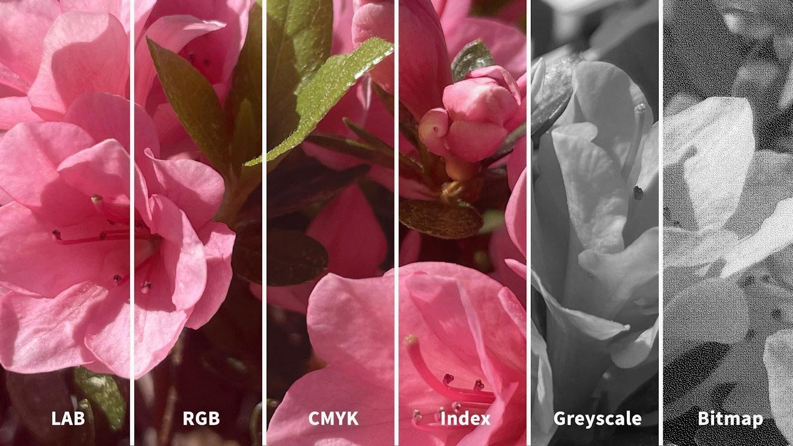
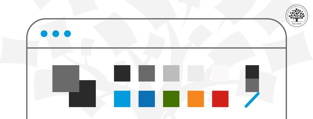
You may have seen how printed-out colors can look different from those on-screen. This phenomenon happens because the printer’s colors (using the subtractive process) didn’t replicate the screen’s (using the additive). Such inconsistencies can be easy to correct if you choose the suitable color mode. The illustration below depicts the difference between LAB, RGB, CMYK, Index, Greyscale and Bitmap color modes. You’ll notice how the quality from left (LAB) to right (Bitmap) decreases as the amount of color decreases.
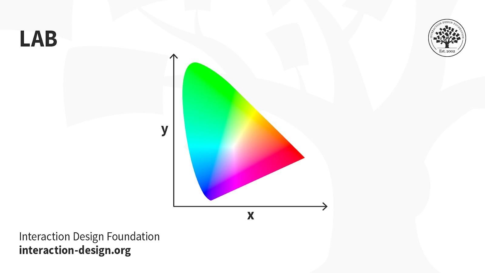
LAB: Also called CIELab, LAB is based on how humans perceive color. It comprises one channel for lightness (L, ranging from the values 0–100) and two for color (A—the Green-Red Axis channel—and B, the Blue-Yellow Axis channel, ranging from +127 to -128).
LAB color is device-independent, making it easy to achieve precisely the same color across different types of media so your (e.g.) digital logo appears identically on a mug, banner, etc. However, LAB’s large file sizes can delay load times.
Uses:
Branded Products (e.g., T-shirts, banners).
Color Reference.
Photography.
Improving images with a natural and vibrant look.
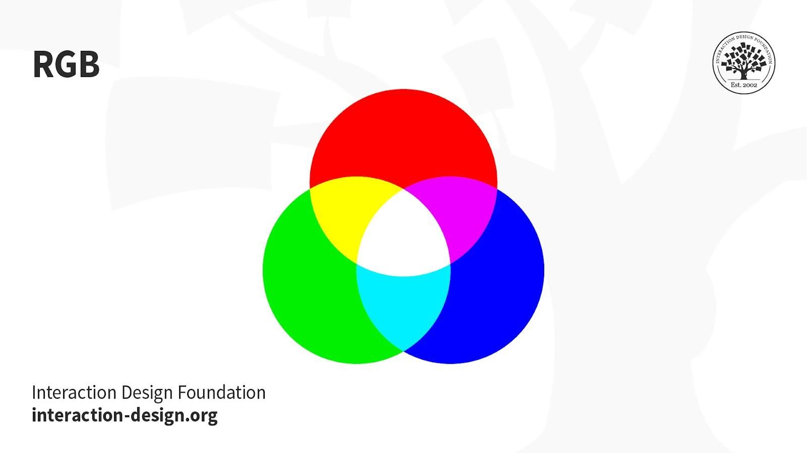
RGB: This color mode uses the additive process. It comprises Red, Green and Blue hues that combine to create extensive color variations.
RGB exists exclusively in digital formats (e.g., mobile screens). Although RGB is present across most electronic devices, the color elements vary across systems and models. So, an image can display differently on-screen from brand to brand.
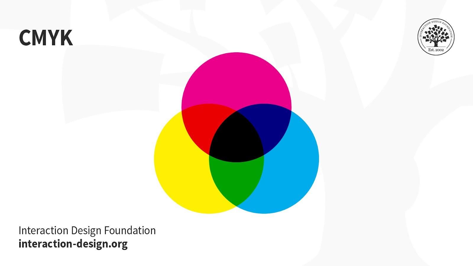
CMYK: This subtractive color mode comprises Cyan, Magenta, Yellow and Key (Black), which combine to produce a range of hues. This four-color process works for most printers.
Printed images are a series of layered four-color dots (measured in dots per inch) that create different hues and gradations. Although CMYK is a standard color model, the exact range of colors represented can vary depending on the press and printing conditions.
Uses:
Stationery (e.g., business cards).
Advertising (e.g., posters, flyers, brochures).
Product Packaging.
Tip—Use CMYK mode when preparing an image to be printed with process colors, as image conversion from RGB to CMYK creates a color separation. If you start with an RGB image, it’s best to edit first in RGB and then convert to CMYK afterward.
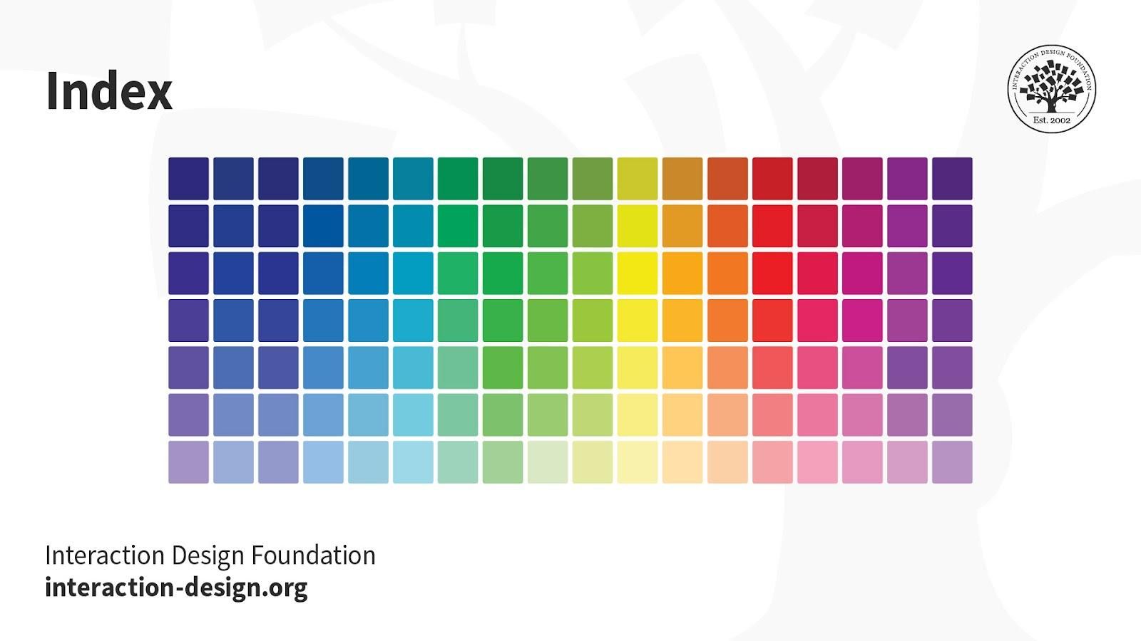
Index: This mode produces 8‑bit image files with up to 256 colors. Like RGB, this color mode is exclusively for digital formats, on-screen. When you convert an image to index color, a color table gets built to store and index the image’s colors.
If a color in the original image doesn’t appear in the table, the software chooses the closest one or uses a dither effect to simulate the color.
Uses:
Websites.
Digital Presentations.
Mobile Applications.
While its color palette is limited, index color can reduce file size yet maintain the desired visual quality for digital presentations, websites and mobile applications. So, this mode is ideal for image optimization. For extensive editing, it’s best to convert temporarily to RGB mode.
Greyscale: This black-and-white-looking mode comprises various shades of grey within an image.
You can use it in print and digital formats. In digital, each image pixel has a value ranging from 0 (black) to 255 (white). In print, the values range from 0% (white) to 100% (black), representing the amount of black ink used.
Uses:
Digital formats to express a specific tone in your designs.
Print formats to lower costs and minimize ink usage.
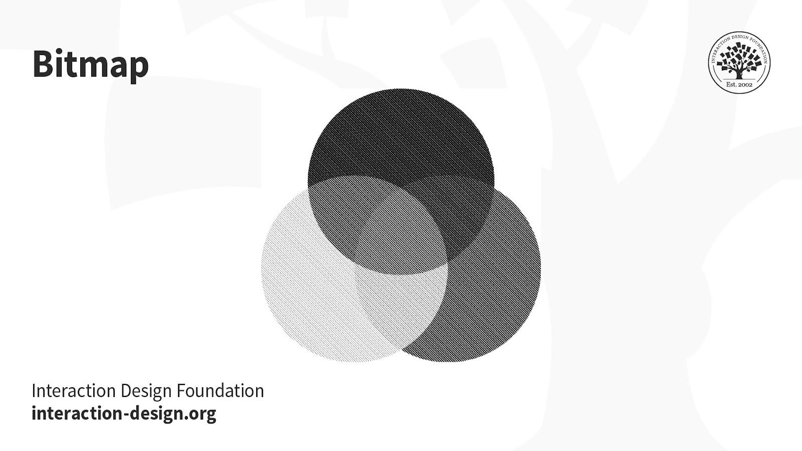
Bitmap (a.k.a. line art): This mode comprises black and white pixels, with no colors or shades of grey.
In digital formats, black and white values represent an image’s pixels, while black ink dots and the white of the paper represent the overall image in print formats.
Uses:
Print and digital formats to create a line drawing or hand-drawn sketch or make vintage effects.
While jagged-edged on-screen, bitmap images usually print smoothly with high resolution.
The Interaction Design Foundation has published multiple articles on the use and definition of color modes. Take the Visual design course by IxDF to understand when and how to incorporate colors in your designs. This course provides comprehensive insights into the strategic use of colors in your plans in digital and printed formats. It also highlights the detailed use of the color modes in different scenarios and design types.
Understanding color modes is essential in making your designs visually impactful, whether on screens or in print. Colors play a crucial role in capturing attention and conveying messages effectively. Designers use suitable color modes to make their work stand out.
Watch this video to learn what the visual design course offers.
What is the 20-20-20 rule?
The 20-20-20 rule is suggested for users who spend prolonged periods in front of screens. They could be software developers, graphic designers, or end users. The states that users should take a 20-second break to look at something 20 feet away every 20 minutes to reduce eye strain from screen exposure. The rationale behind this rule is rooted in tackling the effects of prolonged screen time, such as digital eye strain and computer vision syndrome. By redirecting the gaze to a distant point, users engage their eyes in different focal lengths, reducing fatigue and potential discomfort. Incorporating the 20-20-20 rule into regular screen-based activities promotes eye health, contributing to sustained visual comfort and well-being.
Can you tell the difference between CMYK and RGB?
There is a difference between CMYK and RGB across many factors. RGB is the more vibrant color mode, uses an additive process, and is used in digital designs. Its ability to create a broad spectrum of vivid colors is particularly advantageous in the digital realm. CMYK is the printing-based color mode, uses a subtractive process, and is used in printed designs like flyers, brochures, etc. Knowing this difference is vital while deciding on the palette for your UI design. The visual characteristics of RGB and CMYK can impact a design's overall aesthetics and consistency across various mediums. Designers must navigate these distinctions thoughtfully to ensure optimal visual outcomes in digital and print contexts. This article by IxDF tells you about the must-knows of UI color palettes.
Which color mode is good for the eyes?
No rule or restriction exists on which color mode is best for human eyes. It is subjective and depends on anomalies, in the viewer's eyesight and in viewing conditions. Generally, warm and muted colors with appropriate brightness are considered eye-friendly. However, personal preferences and visual comfort can vary. Considerations such as color contrast, text size, and ambient lighting play significant roles. Designers may experiment with different color modes, contrasts, and brightness levels to optimize visual comfort based on the context and target audience. Ultimately, a thoughtful and user-centric approach and an awareness of individual visual sensitivities contribute to creating visually pleasing designs.
ShowHide
video transcript
00:00:00 --> 00:00:30
Why do we see color? Designers intuitively know the answer to this question: It's to help us distinguish one thing from another and even to understand the thing itself. And what I mean by that is if you're looking at someone's face and they look very pale,
00:00:30 --> 00:01:02
maybe with a yellow cast or a blue cast, we might understand that that person is sick or something is wrong; or, we're looking at a series of tomatoes, each one more ripe than the next – we are clued in to when the tomato is ready to eat. Maybe we're looking at a subway map and we see that each line is a different color, helping us to understand
00:01:02 --> 00:01:35
which line we want to go on and where we want to go to. Along with shape, texture, movement, darkness and lightness, the more color that we could see, the more we could interpret about the world around us. By using color, designers are giving people a shorthand for how to use the products that they are designing. For example, if you are designing a pill bottle with pills inside,
00:01:35 --> 00:02:04
the color of the bottle and the color of the pills themselves can distinguish not only from other pills that someone might be taking but even different dosages between them. Things like a traffic light, which, sure we could memorize what the order of the traffic light is, but having *color on top of order* gives us an incredibly quick and easy mechanism
00:02:04 --> 00:02:33
for our brain to understand what to do next. Even things like sports uniforms – the reason that we have different colors for different uniforms is that it gives fans that immediate clue as to what to do when someone runs down one side of a field or another: do we cheer or do we boo? Just as important to the question of "Why do we see color?" is:
00:02:33 --> 00:03:01
Why do we not see all the colors that are in our vision at once? And I'm not talking about ultraviolet or infrared or colors outside of the ability of our color vision. I'm talking about when we look at, for example, a red house and one side is in shadow and one side is in light; we're not seeing that house as partly dark red and partly pink.
00:03:01 --> 00:03:31
We are just seeing it as a red house, and there's a very good reason for that. Just as I don't feel every sensation that is happening to my body every minute, like my glasses on the bridge of my nose – I'm not thinking about that until I actually think about it. My feet on the floor, that sensation – I'm not aware of it until I bring my mind to it, and throughout my body, there are all kinds of sensations going on all at once;
00:03:31 --> 00:04:05
but it would be too much for the brain to be thinking about those things *all the time* on top of all the other sensations that we have, one of which is the light that is entering our eyes. So, if we were to register the millions of colors that are coming into our eyes all at once, our brain would just shut down; it would be too much; we wouldn't be able to make our way through the world, to make decisions, to move – all of these things. So, this becomes very important for designing because we have to decide
00:04:05 --> 00:04:34
what we want the *focus* of people's attention to be. If we go back to this idea that color gives us information to help interpret the world, then we have to think about: "How are we using color so that it is giving us the right information to give us the right interpretation?" So, too much color, too much sensation, and then what follows we call *perception* – what we're actually
00:04:34 --> 00:05:02
perceiving – can be confusing. Too little color might not give us enough information. We also take our clues about color from the *culture* where we live. So, for example, in the Western world, yellow is not a color that is particularly beloved, but in the Eastern world, it is.
00:05:02 --> 00:05:31
So, the messaging that comes with the colors that you choose depend on *who* is receiving that color. We also have very personal associations with color which make it hard for designers because we don't know – unless we're designing for one person – what each person's reaction to a color is going to be. And lastly, we have these *biological reactions* to color, which at this point we know very, very little about.
00:05:31 --> 00:06:00
So, when you go on the internet and you read, for example, that peach makes you hungry, the color peach, well, we don't know that at all – that's just a bunch of internet fake news. But we do know certain things about blue light, for example, or about the color red, and there are associations – biological – rooted in our biology in these colors that have an effect on us.
00:06:00 --> 00:06:32
But taken together with the cultural and the personal, there's lots and lots of clues that are being given to a person, and these have to be accounted for in the design process – maybe not the personal part, but certainly the biological – the little that we know – and the cultural piece of it. So, to sum this up, why do we see color? We see color to help give us information so that we can make our way through the world
00:06:32 --> 00:07:08
without harming ourselves and hopefully with helping ourselves. And color is this extraordinary tool, and it's one with a very fine point. It's one that was developed late in the development of the human brain. It is not essential to our being alive; take color-blind people, for example, but it's one that gives us the opportunity to be able to navigate quickly, easily and often with joy.
Watch this video to understand how and why we see colors.
Why does RGB look better than CMYK?
RGB may look better than CMYK on screens due to the additive color process, but the choice depends on the intended medium. While RGB may excel in digital environments, its vividness may only sometimes translate accurately to CMYK's more subdued and subtractive color process, commonly used in print. Designers must consider the medium's characteristics and choose the color mode accordingly. With their intense hues, RGB colors often evoke a sense of appeal or extremity, aligning with human emotions and perceptions tied to colors. Humans connect feelings with colors; hence, RGB colors are better for depicting designs. Learn more about color symbolism and how colors portray different emotions and feelings.
What is the best color mode for printing?
CMYK is the best color mode for printing. The 4 color combinations of Cyan, Magenta, Yellow, and Key(Black) are found in most printers. Printed images use a series of these four color dots. Using complementary colors in your designs is suggested for a better appeal. Designers aiming for vibrant and accurate printed outputs should favor CMYK to ensure that the colors visually translate from digital design to print. An additional consideration for enhanced visual appeal in print design involves incorporating complementary colors. Utilizing colors that complement each other within the CMYK spectrum can elevate the overall aesthetics of printed materials. Refer to this article to learn more about the use of complementary colors.
What happens if you print RGB instead of CMYK?
RBG and CMYK follow different color processes, making the theme suitable for specific formats. This is because any digital design will appear different to the eyes when viewed in printed format. RGB relies on an additive color process, combining red, green, and blue light to create a spectrum. In contrast, CMYK employs a subtractive process using cyan, magenta, yellow, and black ink for printing. When a digital design created in RGB is directly printed without conversion, the colors may appear differently in print than on-screen. This will affect the design's visual appeal in the physical form. Converting RGB to CMYK is essential before printing to ensure accurate color reproduction.
Which color mode is better?
The choice between RGB and CMYK depends on the context. RGB is the better choice when designing for digital consumption, as it utilizes an additive color model. Designs intended for digital screens, such as those for websites, apps, and social media, appear more vibrant and visually appealing when using the RGB color mode. CMYK is the better choice for designs that must be printed, like the packages on products, flyers, brochures, and advertisements. CMYK ensures accurate color representation in the printed output, aligning with the capabilities of physical printers. Designers must align their color mode choices with the intended medium to optimize visual impact.
ShowHide
video transcript
00:00:00 --> 00:00:31
Let me introduce myself; my name is Joann Eckstut. I am the co-author of *What Is Color? 50 Questions and Answers on the Science of Color*. When I'm not writing, I spend my time working as an interior designer. Today, I would like to discuss with you the transitory nature of color.
00:00:31 --> 00:01:06
There are four primary ways in which colors appear to change or shift. Number 1: Daylight is constantly changing. So, the colors we see change constantly as well. Number 2: Changing a light source changes what colors we see. Number 3: Colors appear to change depending on what colors surround them. And Number 4: Colors that appear to match in one setting do not match in another.
00:01:06 --> 00:01:32
Let's start with number one. Daylight is constantly changing. So, the colors we see change constantly as well. Although we don't necessarily realize it, millions of changes in light happen all throughout the day. Here, it's beautifully illustrated in this time-lapse image of the Statue of Liberty, which takes place just as the Sun sets.
00:01:32 --> 00:02:02
You can see that even in this short period of time there are myriad changes. We could be overwhelmed by this information about constantly changing light, but our brains help us to hold steady. So, for example, when viewing the red house in this illustration, the human brain has no difficulty in seeing it as entirely one red, even though the side in the Sun looks coral and the side in the shade looks maroon.
00:02:02 --> 00:02:31
When you isolate the colors and place them side by side, as in the two swatches here, the coral and the maroon tell a different story. Number 2: Changing a light source changes the colors we see. When we change the light source illuminating a space, the elements in the space reflect *different* wavelengths of light, causing the space and the objects in it to change their color appearance.
00:02:31 --> 00:03:03
For example, daylight emits light evenly across the spectrum, so no particular color is emphasized, while incandescent light emphasizes reds, oranges and yellows, so objects lit in this way emphasize those tones. Fluorescents have an uneven pattern of emissions, giving objects a green or a yellow-green kind of a cast; whereas LEDs are weak in violet, blue-violet and red areas,
00:03:03 --> 00:03:32
but peak in the orange, yellow and green range. In the example that we see here, the pencils on the left, lit in incandescent light, show the red as enhanced and the natural wood as pinker. The penicils in the middle, that are lit with LEDs, slightly neutralize all the colored pencils and the wood appears beige. The pencils on the right, that are lit with fluorescent lights,
00:03:32 --> 00:04:01
are more muted generally and the natural wood appears a light brown. So, the source of the light determines the way colors are perceived. Number 3: Colors appear to change depending on what colors surround them. This phenomenon is known as *simultaneous contrast*. Simultaneous contrast reveals something of utmost importance: Color is not a fixed entity.
00:04:01 --> 00:04:33
Color isn't constructed solely via particular wavelengths of light, but by a larger visual field. Simultaneous contrast can make a color look more saturated, duller, darker, lighter, or some combination thereof, depending on what color it sits next to. In the example seen here, all of the X's are printed in the same color, although they appear to change color as they are paired with different backgrounds.
00:04:33 --> 00:05:05
In the second example, the turquoise-blue in the circle on the left and the bright lime-green in the circle on the right are actually the *same color*. I know this seems impossible at first glance, but I assure you this is true. They *appear* to be completely distinct colors only because the colors they sit next to are different. Number 4: Colors that appear to match in one setting do not in another.
00:05:05 --> 00:05:32
Two materials can appear to be the same matching color under particular lighting, but no longer match when moved to a different light source. This called *metamerism*. For example, a blue carpet and a blue fabric swatch, as seen in this illustration, may look the same when observed in a showroom that is lit with bulbs that are close to daylight in temperature.
00:05:32 --> 00:06:05
*However*, inside a room lit with *incandescent* bulbs, that reflect more red, the carpet may appear to have a more purple cast and no longer match the upholstery fabric as it did in the showroom. This is the bane of every designer's existence: color appearing one way in the showroom, another in the interior where it's going to be used. So, beware! This is due to the different molecular properties of the dyes – say, a vat dye versus a pigment dye –
00:06:05 --> 00:06:20
and the different molecular properties of the fibers – say, a wool versus a nylon. So, now that you are aware of how ephemeral color can be, you will be prepared to work with it.
Watch this video to learn how colors change in different modes.
What are RGB and CMYK color modes?
RGB is a color mode that uses Red, Green, and Blue hues that can be combined to produce a spectrum of colors. It uses the additive process and suits digital, web, app, and social media designs. CMYK comprises Cyan, Magenta, Yellow, and Key (Black). Primarily used in print design, CMYK colors use the subtractive process and are layered in various combinations to achieve a full spectrum. This mode is crucial for printed materials such as advertisements, brochures, flyers, business cards, product portfolios, and packaging, ensuring accurate color representation in the final output. Digital displays almost exclusively use RGB.
How many modes of color are there?
Recognizing the right colors for your design is essential for every designer. A precise knowledge of the color modes can make it easier for a designer to choose correctly. There are four modes of color:
RGB: This color mode utilizes additive color mixing and is used in electronic displays.
CMYK: Relies on subtractive color mixing and is essential for print design.
LAB: This color mode represents colors in a way that aligns with human perception, making it valuable for precise color reproduction.
Pantone Matching System (PMS): The Pantone system is a proprietary color space used in various industries, primarily printing. The Pantone system allows for nearly exact color matching and standardization, meaning designers and printers can know they're on the same page regarding color expectations.
ShowHide
video transcript
00:00:00 --> 00:00:33
Hi. My name is Arielle Eckstut, and I am the author of What Is Color? 50 Questions and Answers on the Science of Color. Color is an incredibly difficult subject, one that encompasses all kinds of categories of science and history and culture – you name it.
00:00:33 --> 00:01:04
But today in about five minutes I'm going to try to answer this question: What is color? And I'm going to do that by starting with yet another question. In the fall, do the leaves change color if no one is there to see them? Take a moment to think about that: Do the leaves change color if no one is there to see them? Now, the *obvious answer* to this question is "Of course they change color
00:01:04 --> 00:01:37
because the color of the leaves are inherent to the leaves themselves." But in fact, that is not true at all, and the answer is a resounding *no*. If there is not a living being with a brain observing those leaves, the leaves do not change color. And the reason for this is that there's no such thing as color without the *eyes* and the *brain*.
00:01:37 --> 00:02:02
So, different brains process visual information differently. And I realized that this idea that color does not exist outside of our perception can be very difficult to swallow. And in fact, our brains go to great lengths to give us all of the colors that we see.
00:02:02 --> 00:02:36
The source of our color vision is in our *retina*, a credit-card-thin sheet of neurons in the back of our eyeballs. And it's actually a part of our brain, our retina. It's the only part of our brain that exists outside of our skulls. And our retina is what we typically associate with sight in general. If I were to ask you, "Why do we have eyes?" most people would say, "So we can see."
00:02:36 --> 00:03:03
But that was actually not the original purpose of our eyes and our retina. The original purpose was to tell us when to be awake and when to be asleep. So, our eyes sensed when it was light out and when it was dark out, and "when" is the most important word here because our eyes, our retinas have three different systems:
00:03:03 --> 00:03:32
the *when system* being the most primitive and the first use of our eyes. The next system is the *where system*, and that tells us where we are situated in the world. Are we right at the edge of a cliff? Are we too close to a potential predator? Or are we too far to reach a berry that is ripe that we would like to eat?
00:03:32 --> 00:04:00
Lastly, we get to our *what system* – the system that designers deal with on a daily basis but the one that is actually *least important* to our visual system. The what system is the system that we use when we are *focusing on something*, whether that be a computer screen or a phone or a face or a road sign. It's also the system that we use to see color.
00:04:00 --> 00:04:30
Color scientist Mark Rea has a great quote that I adore: "Color is a pigment of our imagination." And that really is true. Our imagination plays such a big role when it comes to color. And our brains are constantly taking in information from the outside world to help inform us about what time of day it is, where we are in the world, what we're looking at,
00:04:30 --> 00:04:36
which really gets us to the next question, which is: Why do we see color to begin with?
Watch this video to learn more about colors.
Earn a Gift, Answer a Short Quiz!
Question 1
Question 2
Question 3
Get Your Gift
Try Again! IxDF Cheers For You!
0 out of 3 questions answered correctly
Remember, the more you learn about design, the more you make yourself valuable.
In this course, you will gain a holistic understanding of visual design and increase your knowledge of visual principles, color theory, typography, grid systems and history. You’ll also learn why visual design is so important, how history influences the present, and practical applications to improve your own work. These insights will help you to achieve the best possible user experience.
In the first lesson, you’ll learn the difference between visual design elements and visual design principles. You’ll also learn how to effectively use visual design elements and principles by deconstructing several well-known designs.
In the second lesson, you’ll learn about the science and importance of color. You’ll gain a better understanding of color modes, color schemes and color systems. You’ll also learn how to confidently use color by understanding its cultural symbolism and context of use.
In the third lesson, you’ll learn best practices for designing with type and how to effectively use type for communication. We’ll provide you with a basic understanding of the anatomy of type, type classifications, type styles and typographic terms. You’ll also learn practical tips for selecting a typeface, when to mix typefaces and how to talk type with fellow designers.
In the final lesson, you’ll learn about grid systems and their importance in providing structure within design. You’ll also learn about the types of grid systems and how to effectively use grids to improve your work.
You’ll be taught by some of the world’s leading experts. The experts we’ve handpicked for you are the Vignelli Distinguished Professor of Design Emeritus at RIT R. Roger Remington, author of “American Modernism: Graphic Design, 1920 to 1960”; Co-founder of The Book Doctors Arielle Eckstut and leading color consultant Joann Eckstut, co-authors of “What Is Color?” and “The Secret Language of Color”; Award-winning designer and educator Mia Cinelli, TEDx speaker of “The Power of Typography”; Betty Cooke and William O. Steinmetz Design Chair at MICA Ellen Lupton, author of “Thinking with Type”; Chair of the Graphic + Interactive communication department at the Ringling School of Art and Design Kimberly Elam, author of "Grid Systems: Principles of Organizing Type.”
Throughout the course, we’ll supply you with lots of templates and step-by-step guides so you can go right out and use what you learn in your everyday practice.
In the “Build Your Portfolio Project: Redesign,” you’ll find a series of fun exercises that build upon one another and cover the visual design topics discussed. If you want to complete these optional exercises, you will get hands-on experience with the methods you learn and in the process you’ll create a case study for your portfolio which you can show your future employer or freelance customers.
You can also learn with your fellow course-takers and use the discussion forums to get feedback and inspire other people who are learning alongside you. You and your fellow course-takers have a huge knowledge and experience base between you, so we think you should take advantage of it whenever possible.
You earn a verifiable and industry-trusted Course Certificate once you’ve completed the course. You can highlight it on your resume, your LinkedIn profile or your website.
UI Color Palette 2025: Best Practices, Tips, and Tricks for Designers
Color is vital in user interface (UI) design because not only does it enhance the aesthetics on screens, but it shapes t
1.1k shares
2 mths ago
Open Access—Link to us!
We believe in Open Access and the democratization of knowledge. Unfortunately, world-class educational materials such as this page are normally hidden behind paywalls or in expensive textbooks.