Your constantly-updated definition of UI Kits and
collection of videos and articles. Be a conversation starter: Share this page and inspire others!
88shares
What are UI Kits?
User interface kits (UI kits) are collections of pre-designed, standalone UI elements. Designers use them to create prototypes and interfaces. Each kit usually features various individual UI components like buttons, input fields and icons, and other assets like images. Less comprehensive than design systems or libraries, UI kits focus on specific design components and are helpful aids.
UI kits see common use in web and mobile design. They’re also handy tools for designers to use in prototyping. An important distinction to make about these kits is that they’re different from design systems. Design systems are a set of guidelines, reusable components and patterns, which user experience (UX) designers and user interface (UI) designers also use. However, designers can use a UI kit to design websites and other digital products without the need for a design system overall.
User interface design tends to involve heavy investment of time and resources. Likewise, an organization’s design process that encompasses UI and visual design usually demands a wide range of activities—ranging from the initial steps of user research and empathizing with target users, through wireframing, prototyping, extensive usability testing and numerous design iterations throughout app or web development.
Author and Human-Computer Interaction Expert, Professor Alan Dix explains important points about prototyping:
ShowHide
video transcript
00:00:00 --> 00:00:31
So, why do you need prototyping? Well, we never get things right first time. It's about getting things *better* when they're not perfect and also *starting in a good place*. Maybe if I'm going to make a wall for a house, I know exactly how big the wall should be. I can work out how many bricks I need. I can make it exactly the right size.
00:00:31 --> 00:01:00
So, I can get it right first time. It's important to. I don't want to knock the wall down and retry it several times. However, there I have a very clear idea of what I'm actually creating. With people involved, when you're designing something for people, people are not quite as predictable as brick walls. So, we *don't* get things right first time. So, there's a sort of classic cycle – you design something, you prototype it,
00:01:00 --> 00:01:31
and that prototyping might be, you might sort of get a pad of paper out and start to sketch your design of what your interface is going to be like and talk through it with somebody. That might be your prototype. It might be making something out of blue foam or out of cardboard. Or it might be actually creating something on a device that isn't the final system but is a "make-do" version, something that will help people understand.
00:01:31 --> 00:02:03
But, anyway, you make some sort of prototype. You give it to real users. You talk to the real users who are likely to be using that about it. You evaluate that prototype. You find out what's wrong. You redesign it. You fix the bugs. You fix the problems. You mend the prototype, or you make a different prototype. Perhaps you make a better prototype, a higher-fidelity prototype – one that's closer to the real thing. You test it again, evaluate it with people, round and round and round. Eventually, you decide it's good enough. "Good enough" probably doesn't mean "perfect", because we're not going to get things perfect, ever.
00:02:03 --> 00:02:33
But "good enough" – and then you decide you're going to ship it. That's the story. In certain cases in web interfaces, you might actually release what in the past might have been thought of as "a prototype" because you know you can fix it, and there might not be an end point to this. So, you might in delivering something – and this is true of any product, actually – when you've "finished" it, you haven't really finished, because you'll see other problems with it, and you might update it
00:02:33 --> 00:03:02
and create new versions and create updates. So, in some sense, this process never stops. In one way, it's easy to get so caught up with this *iteration* – that is an essential thing – that you can forget about actually designing it well in the first place. Now, that seems like a silly thing to say, but it is easy to do that. You know you're going to iterate anyhow. So, you try something – and there are sometimes good reasons for doing this –
00:03:02 --> 00:03:32
you might have *so little* understanding of a domain that you try something out to start with. However, then what you're doing is creating a *technology probe*. You're doing something in order to find out. Of course, what's easy then to think about is to treat that as if it was your first prototype – to try and make it better and better and better. The trouble is – if it didn't start good, it might not end up very good at the end, despite iteration. And the reason for that is a phenomenon that's called *local maxima*.
00:03:32 --> 00:04:02
So, what I've got here is a picture. You can imagine this is a sort of terrain somewhere. And one way to get to somewhere high if you're dumped in the middle of a mountainous place – if you just keep walking uphill, you'll end up somewhere high. And, actually, you can do the opposite as well. If you're stuck in the mountains and you want to get down, the obvious thing is to walk downhill. And sometimes that works, and sometimes you get stuck in a gully somewhere. So, imagine we're starting at this position over on the left. You start to walk uphill and you walk uphill and you walk uphill.
00:04:02 --> 00:04:31
And, eventually, you get onto the top of that little knoll there. It wasn't very high. Now, of course, if you'd started on the right of this picture, near the *big* mountain, and you go uphill and you go uphill and you go uphill and you get uphill, you eventually end up at the top of the big mountain. Now, that's true of mountains – that's fairly obvious. It's also true of user interfaces. *If you start off* with a really dreadful design and you fix the obvious errors,
00:04:31 --> 00:05:00
*then you end up* with something that's probably still pretty dreadful. If you start off with something that's in the right area to start with, you do better. So, the example I've put on the slide is the Malverns. The Malverns are a set of hills in the middle of the UK – somewhere to the southwest of Birmingham. And the highest point in these hills is about 900 feet. But there's nothing higher than that for miles and miles and miles and miles.
00:05:00 --> 00:05:30
So, it is the highest point, but it's not *the* highest point, certainly in Britain, let alone the world. If you want to go really high, you want to go to Switzerland and climb up the Matterhorn or to Tibet and go up Mount Everest, up in the Himalayas, you'll start somewhere better, right? So, if you start – or on the island I live on, on Tiree, the highest point is 120 meters. So, if you start on Tiree and keep on walking upwards, you don't get very high.
00:05:30 --> 00:06:04
You need to start in the *right* sort of area, and similarly with a user interface, you need to start with the *right* kind of system. So, there are two things you need for an iterative process. You need a *very good starting point*. It doesn't have to be the best interface to start with, but it has to be in the right area. It has to be something that when you improve it, it will get really good. And also – and this is sort of obvious but actually is easy to get wrong – you need to understand *what's wrong*. So, when you evaluate something, you really need to understand the problem.
00:06:04 --> 00:06:31
Otherwise, what you do is you just try something to "fix the obvious problem" and end up maybe not even fixing the problem but certainly potentially breaking other things as well, making it worse. So, just like if you're trying to climb mountains, you need to start off in a good area. Start off in the Himalayas, not on Tiree. You also need to know which direction is up.
00:06:31 --> 00:07:03
If you just walk in random directions, you won't end up in a very high place. If you keep walking uphill, you will. So, you need to *understand where to start* and *understand which way is up*. For prototyping your user interface, you need a *really rich understanding* of *your users*, of the nature of *design*, of the nature of the *technology* you're using, in order to start in a good place. Then, when you evaluate things with people,
00:07:03 --> 00:07:30
you need to try and *really deeply* understand what's going on with them in order to actually *make things better* and possibly even to get to a point where you stand back and think: "Actually, all these little changes I'm making are not making really a sufficient difference at all. I'm going around in circles." Sometimes, you have to stand right back and make a *radical change* to your design. That's a bit like I'm climbing up a mountain
00:07:30 --> 00:08:00
and I've suddenly realized that I've got stuck up a little peak. And I look out over there, and there's a bigger place. And I might have to go downhill and start again somewhere else. So, iteration is absolutely crucial. You won't get things right first time. You *alway*s need to iterate. So, prototyping – all sorts of prototypes, from paper prototypes to really running code – is very, very important. However, *crucial to design is having a deep and thorough understanding of your users*,
00:08:00 --> 00:08:05
*a deep and thorough understanding of your technology and how you put them together*.
Fortunately, designers have a powerful ally in their toolkit to help them achieve visually appealing web pages, apps that offer seamless user experiences and much more—that much sooner than they might otherwise. Many designers turn to UI kits for handy reference and inclusion of helpful visual elements, layouts and other interaction design features when they work to create new websites and apps. These kits emerged to offer designers and design teams solid foundations and frameworks on which to build digital products that pass with flying colors when it comes to user testing and users’ interactions with a product after its release.
What are the Benefits of Using UI Kits?
Designers have a convenient tool with many helpful options when they consider UI kits because these kits can:
1. Save Time and Effort
Designers use UI kits as tools to boost and accelerate their creative and design process, such as design thinking. An effective kit is a handy tool for designers to fast-track their work so they can apply easy-to-use and reusable items without sinking time into creating them from scratch. Here are some typical features that UI kits contain:
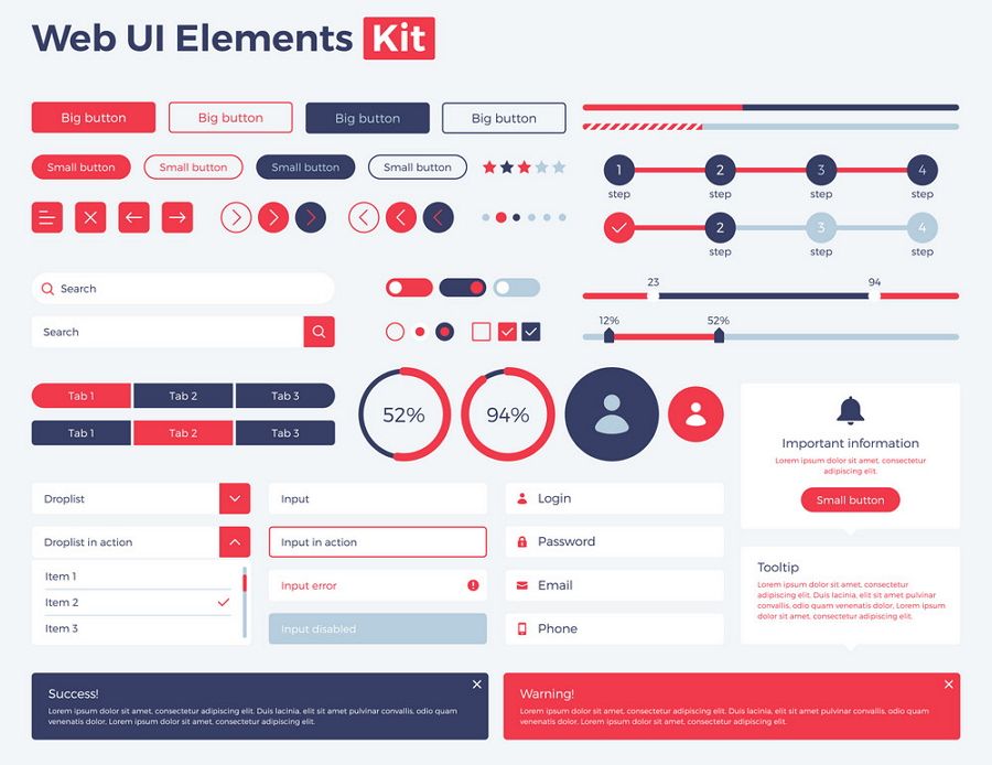
Since designers can conveniently reach for a collection of pre-designed elements—like buttons, forms and menus—in a UI kit, these can be crucial aids in fast-paced environments where time is a critical resource. For instance, mobile UI kits equip designers with a massive range of ready-to-use assets. That means designers can focus more on enhancing the esthetic and functional aspects of their designs—and not get bogged down in the basic construction of each element.
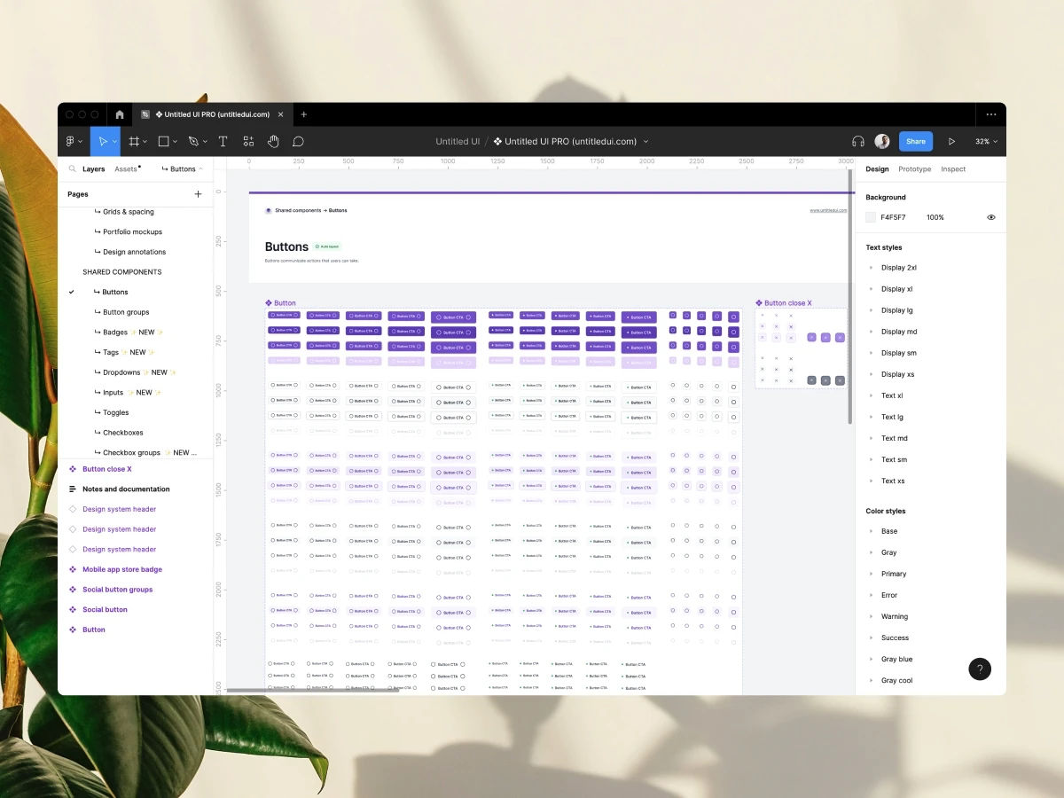
Here are some button component examples, from Untitled UI.
Another major benefit that designers can enjoy when they use UI kits is the consistency that these kits bring to the design process. Consistency across an application or website is a vital factor in UX and UI design. That’s because consistency is key for esthetic coherence as well as the overall user experience—including the trust that develops between brand and user when design elements look consistent and professional. Users benefit from a uniform interface—one that behaves predictably across different screens, so users can have the best of a smooth and intuitive experience with the interface and not have to pause in confusion. A UI kit helps keep this consistency no matter if the project is a small-scale mobile app or a comprehensive website, all thanks to the standardized components within the kit.
3. Collaboration
When design teams and development teams see eye to eye—and do so well within critical timeframes in their UX design process—it helps their brand avoid some problems that might otherwise plague the evolution of a digital product. UI kits serve as a form of bridge between the teams. Kits reduce the chances of misunderstandings while teams enjoy more productive collaboration, especially cross-functionally between the spheres of design and development. In an Agile environment—where communication and collaboration channels tend to be more open more often—UI kits can help smooth the way towards a better prototype and a better solution, with fewer design-related issues arising along the way.
UX Designer and Author of Build Better Products and UX forLean Startups, Laura Klein explains important points about Agile and cross-functional collaboration:
ShowHide
video transcript
00:00:00 --> 00:00:30
Cross-functional teams, unlike silos, have all the people necessary to build a specific thing together. Let's look at an example. Imagine you're on a team that is supposed to build the onboarding flow for a new app that helps connect job applicants with jobs. You can't build the whole thing with just designers. Or with just engineers, for that matter. I mean, you probably could do it with just engineers, but it's a terrible idea.
00:00:30 --> 00:01:00
A cross-functional team for this onboarding work might include a few engineers, perhaps some for the front end and some for the back end. Might include a designer, a researcher, a product owner or manager, maybe a content writer or a marketing person. In an ideal world, all of these folks would only work on this particular team. In the real world, where we actually live, sometimes folks are on a couple of different teams and some specialists may be brought in to consult. For example, if the team needed help from the legal department to explain some of the ramifications of a specific decision,
00:01:00 --> 00:01:32
a cross-functional team would have a dedicated legal expert they could go to. But that legal expert might also work with lots of other teams. In agile environments, the cross-functional team generally sits together or if remote, has some sort of shared workspace. They all go to the required team meetings. They understand the goal of the team and the users. They're experts, or they soon become experts, on that onboarding flow. Contrast this to how it might be done in a siloed environment. In that case, you might have different people assigned to the team depending on need, which can seem really flexible.
00:01:32 --> 00:02:00
Until you realize that you end up with five different designers working on the project all at different times and they all have to be brought up to speed and they don't really understand why the other designers made the decisions that they did. Same with the engineers. And do not get me started on legal. Silo teams tend to rely more on documentation that gets handed between groups. And this can lead to a waterfall project where project managers or product managers work on something for a while to create requirements, which they then hand off to designers who work on designs for a while
00:02:00 --> 00:02:29
and then they pass the deliverables on to engineering, who immediately insists that none of this will work and demands to know why they weren't brought in earlier for consultation. You get it. By working in cross-functional teams instead, the people embedded on the project get comfortable with each other. They know how the team works and can make improvements to it. They come to deeply understand their particular users and their metrics. They actually bring engineering and even design and research into the decision making process early to avoid the scenario I described above.
4. Accessibility
Accessibility is an essential dimension of modern design. It’s also a legal requirement in many jurisdictions to design to include users with disabilities. Brands that fail to incorporate features to support a good UX for users with physical and cognitive disabilities can face penalties and fines. Fortunately, accessibility isn’t just an affordable factor to include in design; it also benefits all users, since features like captions can help users of all ability levels—when they can’t hear in loud environments, for example.
Many UI kits have built-in accessibility features, like keyboard shortcuts and color schemes with sufficient contrast for users with vision disabilities. So, designers and the brands they work for can enjoy more peace of mind when they create interfaces that everyone can use.
Watch our video to understand why accessibility is such a vital part of UX and UI design:
ShowHide
video transcript
00:00:00 --> 00:00:30
Accessibility ensures that digital products, websites, applications, services and other interactive interfaces are designed and developed to be easy to use and understand by people with disabilities. 1.85 billion folks around the world who live with a disability or might live with more than one and are navigating the world through assistive technology or other augmentations to kind of assist with that with your interactions with the world around you. Meaning folks who live with disability, but also their caretakers,
00:00:30 --> 00:01:01
their loved ones, their friends. All of this relates to the purchasing power of this community. Disability isn't a stagnant thing. We all have our life cycle. As you age, things change, your eyesight adjusts. All of these relate to disability. Designing accessibility is also designing for your future self. People with disabilities want beautiful designs as well. They want a slick interface. They want it to be smooth and an enjoyable experience. And so if you feel like
00:01:01 --> 00:01:30
your design has gotten worse after you've included accessibility, it's time to start actually iterating and think, How do I actually make this an enjoyable interface to interact with while also making sure it's sets expectations and it actually gives people the amount of information they need. And in a way that they can digest it just as everyone else wants to digest that information for screen reader users a lot of it boils down to making sure you're always labeling
00:01:30 --> 00:02:02
your interactive elements, whether it be buttons, links, slider components. Just making sure that you're giving enough information that people know how to interact with your website, with your design, with whatever that interaction looks like. Also, dark mode is something that came out of this community. So if you're someone who leverages that quite frequently. Font is a huge kind of aspect to think about in your design. A thin font that meets color contrast
00:02:02 --> 00:02:20
can still be a really poor readability experience because of that pixelation aspect or because of how your eye actually perceives the text. What are some tangible things you can start doing to help this user group? Create inclusive and user-friendly experiences for all individuals.
5. Scalability
All being well, brands’ digital products will grow and evolve from the initial release. So, designers often have to return and add new pages and features to the websites and apps they create. When designers use a UI kit that’s suited for their product, it’s easy for them to insert new elements as they won’t have to wonder if the new elements are consistent.
6. Learn Best Practices
UI kits aren’t just tools for simplification. They’re valuable educational resources as well. They offer designers insights into best practices in UI design since they incorporate elements that adhere to established design principles and guidelines. So, new and seasoned designers alike can learn from these pre-built components. They can sharpen their understanding of how to effectively implement and optimize user-friendly interfaces—ones that don’t just meet users’ needs and expectations but exceed them as well. To support this learning process, designers have the opportunity to explore various design patterns and styles that come with such kits. From there, they can adapt and customize these as they need to for the project or product at hand.
Watch our video on design patterns to understand more about them and why they’re important:
ShowHide
video transcript
00:00:00 --> 00:00:33
User Interface Design Patterns are recurring components which designers use to solve common problems in interfaces. like, for example, when we think about those regular things that often are repeating themselves to kind of appear in, you know, in complex environments We need to show things that matter to people when they matter and nothing else. Right. it's just really sad what we see. Like, for example, if you look at Sears, right? Sears is just one of the many e-commerce sites, you know, nothing groundbreaking here. So you click on one of the filters and then the entire interface freezes
00:00:33 --> 00:01:00
and then there is a refresh and you're being scrolled up. And I always ask myself, is this really the best we can do? Is really the best kind of interface for filtering that we can come up with, or can we do it a bit better? Because we can do it a bit better. So this is a great example where you have galaxies and then galaxies, you have all this filters which are in rows. Sometimes they take three rows, sometimes four or sometimes five rows. That's okay. Show people filters, show people buttons if they important show them.
00:01:00 --> 00:01:32
Right. But what's important here, what I really like is we do not automatically refresh. Instead, we go ahead and say, "Hey, choose asmany filters as you like", right? And then whenever you click on show results, it's only then when you actually get an update coming up in the back. Which I think is perfectly fine. You don't need to auto update all the time. And that's especially critical when you're actually talking about the mobile view. The filter. Sure, why not? Slide in, slide out, although I probably prefer accordions instead.
00:01:32 --> 00:02:01
And you just click on show products and it's only then when you return back to the other selection of filters and only when you click okay, show all products, then you actually get to load all the products, right? Designing good UI patterns is important because it leads to a better user experience, reduces usability issues, and ultimately contributes to the success of a product or application. It's a critical aspect of user centered design and product development.
What are the Types of UI Kits?
As UI kits are popular and valuable staples in the larger toolkit of UX and UI designers—and since they provide essential components that streamline the design process and make sure of a cohesive look and feel across projects—they come in several main forms. UI kits see extensive use in design tools like Sketch and Figma. They offer a solid starting point that allows designers to create user interfaces much more efficiently with pre-made elements like typography, color palettes and spacing—all tailored to the components of the specific UI kit.
UI kits can vary greatly in their composition and quality. Some might include a basic set of components, like icons and checkboxes. Meanwhile, others provide an extensive collection that contains everything a designer might need to design modern user interfaces, mobile apps and websites—for example, toggles that modify fonts, colors and shapes dynamically. Not all UI kits include code components, for example, but those that do can offer HTML/CSS, React or Tailwind components—so giving a boost to their practicality and application in real-world projects.
Here are the main types of UI kits:
1. Web UI Kits
Web UI kits are specifically for website development. They provide a comprehensive array of pre-designed components—such as navigation bars, footers and content sections. These kits streamline the web design process, as designers can quickly assemble pages that have a consistent look and feel. Here are some examples:
The EcoShop Web UI Kit, which offers tailored components for e-commerce sites.
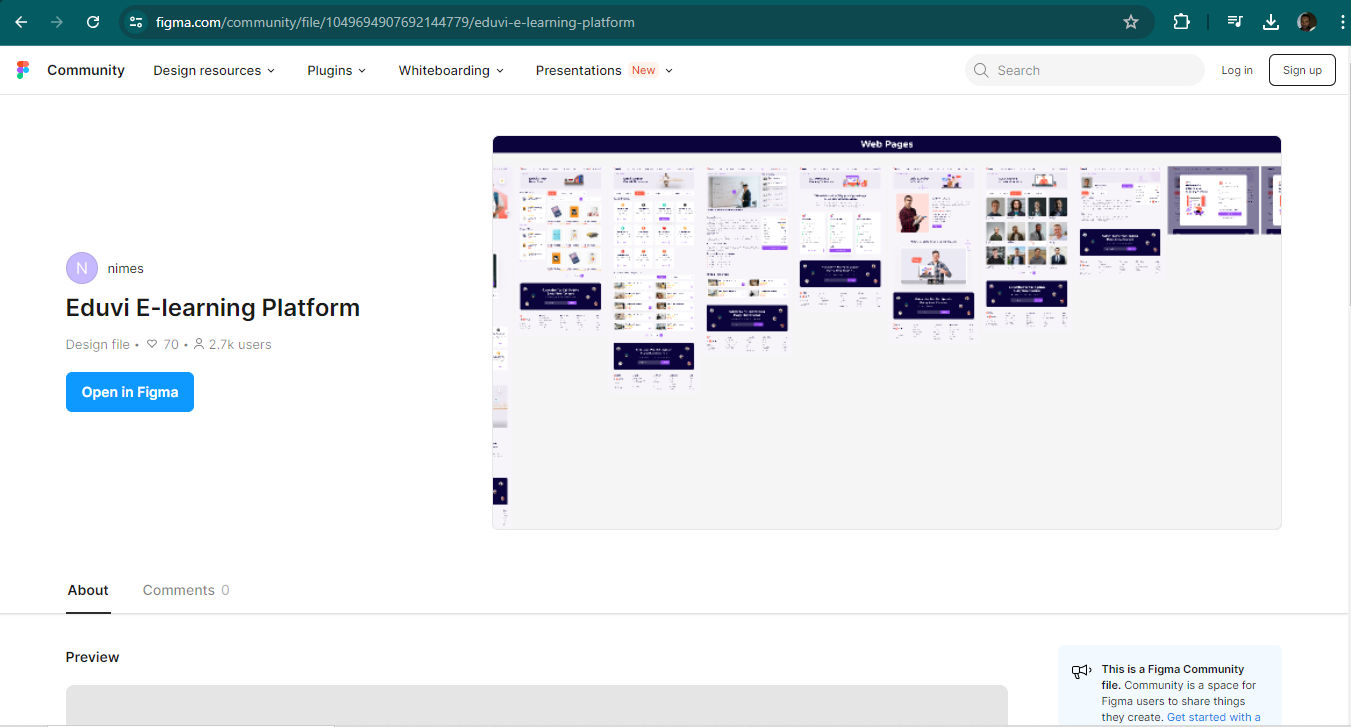
The Eduvi E-learning Web UI Kit, ideal for educational platforms.
Mobile UI kits cater to app development for devices like smartphones and tablets. In the mobile-first era, where most users access digital products—as well as services through digital products—designers have to aim larger amounts of thought and effort at smaller screens, especially their targeted users’ ubiquitous smartphones.
UI kits for mobile consist of elements optimized for touch interactions and smaller screens. These include mobile-friendly menus, button sizes and gestural controls. Mobile kits help designers make sure that their apps deliver an optimal user experience on various mobile devices. Here are a few notable examples which are popular among designers for their versatility and ease of use:
Hybrid UI kits are kits designers use to help create applications that run on both web and mobile platforms. These kits utilize technologies like React Native and Ionic so designers can build apps that offer near-native performance on a variety of devices. At the same time, they maintain the flexibility of web-based development. Hybrid kits often include components that adapt smoothly to different operating environments. That factor makes them a cost-effective solution for developers who want to reach a broad audience across multiple platforms with their brand’s design solution.
How to Choose the Right UI Kit?
It’s vital to concentrate on several areas as a designer decides which UI kit is the best fit for a project, prototype and product. Here are some main considerations to bear in mind and actions to take:
1. Identify Needs
The first step is to clearly understand the specific needs of the design project—and, by association, the users’ needs, which should form the core of the design decisions throughout. For example, designers might want to create an e-commerce site, a social media platform or a healthcare app to access a brand’s target audience best. Each type of project has unique requirements and user expectations, and these call for thorough research. So, it's crucial to choose a UI kit that aligns well with these needs.
When designers pick the right kit, they can make sure that the design elements and features they include do effectively support the primary functions of the app or website they propose to develop and release.
UX Strategist and Consultant, William Hudson explains important points about user research:
ShowHide
video transcript
00:00:00 --> 00:00:30
User research is a crucial part of the design process. It helps to bridge the gap between what we think users need and what users actually need. User research is a systematic process of gathering and analyzing information about the target audience or users of a product, service or system. Researchers use a variety of methods to understand users, including surveys, interviews, observational studies, usability testing, contextual inquiry, card sorting and tree testing, eye tracking
00:00:30 --> 00:01:02
studies, A-B testing, ethnographic research and diary studies. By doing user research from the start, we get a much better product, a product that is useful and sells better. In the product development cycle, at each stage, you’ll different answers from user research. Let's go through the main points. What should we build? Before you even begin to design you need to validate your product idea. Will my users need this? Will they want to use it? If not this, what else should we build?
00:01:02 --> 00:01:31
To answer these basic questions, you need to understand your users everyday lives, their motivations, habits, and environment. That way your design a product relevant to them. The best methods for this stage are qualitative interviews and observations. Your visit users at their homes at work, wherever you plan for them to use your product. Sometimes this stage reveals opportunities no one in the design team would ever have imagined. How should we build this further in the design process?
00:01:31 --> 00:02:00
You will test the usability of your design. Is it easy to use and what can you do to improve it? Is it intuitive or do people struggle to achieve basic tasks? At this stage you'll get to observe people using your product, even if it is still a crude prototype. Start doing this early so your users don't get distracted by the esthetics. Focus on functionality and usability. Did we succeed? Finally, after the product is released, you can evaluate the impact of the design.
00:02:00 --> 00:02:15
How much does it improve the efficiency of your users work? How well does the product sell? Do people like to use it? As you can see, user research is something that design teams must do all the time to create useful, usable and delightful products.
2. Consider Compatibility
Compatibility with development tools is another essential factor to consider. The UI kit a designer chooses should integrate smoothly with the platform or framework they’re using. For instance, if a designer is building a project with React, it's important to select a UI kit that supports React components. This compatibility streamlines the development process. What’s more, it makes it easier for the design and development team to implement and maintain the design. That will translate to smoother, more enduring solutions. Plus, it will help to keep the risk of errors cropping up later to a comfortable minimum.
Finally, it’s a vital point to weigh up the quality of the UI kit and the customization options it offers. Other designers and developers have thoroughly tested and reviewed high-quality UI kits—and that’s a good assurance of their effectiveness. There are other things to think about as well. For example, designers should look for UI kits that offer extensive documentation and support. These resources can be invaluable when designers need to customize the kit to fit their project's unique requirements. UI kits offer the essentials, and many feature extensive and sophisticated arrays of material to put to use. Nevertheless, a designer’s discernment and the ability to modify elements such as colors, fonts and sizes are key for them to tailor the design to meet the users’ specific needs and the brand’s business goals.
Overall, UI kits are a handy, popular and much-trusted aid for a diverse range of designers. Especially in the fast-paced atmosphere of designing solutions for mobile, web and hybrid applications, these kits offer designers, their teams and brands an indispensable convenience to get up and running quickly. They can spend less time to produce reliable prototypes they can test—and move on to more solid design solutions they eventually can release to their target audience.
It’s important to remember the significance of compatibility, quality and customization options. Designers need to consider how UI kits line up with the look and feel of their brand. For example, how stylized are the components, and can they match well with the look and feel the brand wants to cast?
It takes good judgment and a solid grasp of design principles to be in a position to appreciate which kit will work best for a certain project. When they choose carefully and apply elements well, designers—along with their brands—can enjoy the great boost that the right UI kit can give. From there, designers can power their way along the design process to solutions that users can enjoy seamless experiences within, and scale these long into the future.
Learn More About UI Kits
Take our course Mobile UI Design for many valuable insights into the exciting world of designing for how most users access apps and sites.
Yes, you can find free UI kits online. These kits provide pre-designed elements and templates. They save you time and make sure that there’s good consistency going on in your design projects. Here are some recommended free UI kits, in no particular order:
Ant Design: Ant Design provides a robust UI kit with a wide range of high-quality components for web applications. It's particularly useful for enterprise-level projects and includes detailed documentation.
Sketch App Sources: This site offers a variety of free UI kits and templates specifically for Sketch. It's a valuable resource for designers who use Sketch for their projects.
Figma Community: Figma has a thriving community where designers share free UI kits and resources. You can find kits for various design needs, from mobile apps to web interfaces.
To customize a UI kit for your brand, try the following:
To start, identify your brand’s colors, fonts, and design elements. Replace the default colors in the UI kit with your brand colors.
Next, change the fonts to match your brand's typography. Adjust the shapes and styles of UI elements like buttons, icons, and input fields to align with your brand’s aesthetic.
Make sure there’s an effective consistency across all elements—to maintain a cohesive look. Then, test your customized UI kit on different devices to ensure it looks great everywhere. This will create a strong, recognizable brand identity.
Use tools like Sketch or Figma to make customization easier and more precise.
Watch our video to understand more about web design:
ShowHide
video transcript
00:00:00 --> 00:00:30
Web design usually refers to the design of the user experience of websites. It's not just about making a website on brand. It's about crafting an unforgettable user experience that's useful, accessible, usable and intuitive. A great web designer ensures that a website is easy to use and esthetically pleasing aligned with the user's needs and responsive across all kinds of devices.
00:00:30 --> 00:00:41
The ultimate goal is to create a website that not only looks amazing, but also builds trust with the audience. It's not just a digital storefront.
What elements typically come with a UI kit?
A UI kit typically includes buttons, icons, typography and color schemes. It usually has components like navigation bars, sliders and input fields as well. Designers often find form elements such as checkboxes, radio buttons and dropdown menus in a UI kit. These kits also contain templates for common screens or layouts—like login pages, dashboards and user profiles.
What’s more, UI kits may include design assets like images, illustrations and patterns to keep an effective consistency. Make sure your UI kit is well-organized so you can quickly find and use elements during your design process.
Watch our Master Class Boost Mobile UX with UX Design Principles and Best Practices with Miklos Philips, Lead UX Designer/Product Designer for many valuable insights into the exciting world of designing for how most users access apps and sites.
Where can I find high-quality UI kits?
You can find high-quality UI kits on several online platforms. Websites like Sketch and Figma offer a variety of UI kits specifically designed for their tools. Visit design resource websites like UI8, Creative Market and Envato Elements for diverse and professionally crafted UI kits. Explore free resources on GitHub and Dribbble—where designers share their work. Check out specialized design communities like Behance for unique and innovative UI kits. Always review user ratings and comments to help you be more certain about the quality and relevance of the UI kit for your project.
Many high-quality UI kits come with updates and support from their creators. You might want to download a few UI kits and test them to see which one best fits your design process and project needs.
What are the benefits of using a UI kit for prototyping?
If you use an effective and suitable UI kit for prototyping, you’ll save time and be sure of great consistency in your design work. You can quickly assemble screens with pre-designed elements like buttons, icons and forms. This speeds up the design process; plus, it allows you to focus on user experience and functionality.
A UI kit also helps keep a cohesive look going across your project. That will make it easier for users to navigate and understand. What’s more, it improves collaboration as it provides a common design language for team members. What’s more, a good UI kit allows for faster iterations. So, it can empower you and your team to test and refine designs more efficiently.
Be sure to choose a UI kit that aligns with your project's design goals to maximize efficiency and consistency.
Watch as Author and Human-Computer Interaction Expert, Professor Alan Dix explains important points about prototyping in this video:
ShowHide
video transcript
00:00:00 --> 00:00:31
So, why do you need prototyping? Well, we never get things right first time. It's about getting things *better* when they're not perfect and also *starting in a good place*. Maybe if I'm going to make a wall for a house, I know exactly how big the wall should be. I can work out how many bricks I need. I can make it exactly the right size.
00:00:31 --> 00:01:00
So, I can get it right first time. It's important to. I don't want to knock the wall down and retry it several times. However, there I have a very clear idea of what I'm actually creating. With people involved, when you're designing something for people, people are not quite as predictable as brick walls. So, we *don't* get things right first time. So, there's a sort of classic cycle – you design something, you prototype it,
00:01:00 --> 00:01:31
and that prototyping might be, you might sort of get a pad of paper out and start to sketch your design of what your interface is going to be like and talk through it with somebody. That might be your prototype. It might be making something out of blue foam or out of cardboard. Or it might be actually creating something on a device that isn't the final system but is a "make-do" version, something that will help people understand.
00:01:31 --> 00:02:03
But, anyway, you make some sort of prototype. You give it to real users. You talk to the real users who are likely to be using that about it. You evaluate that prototype. You find out what's wrong. You redesign it. You fix the bugs. You fix the problems. You mend the prototype, or you make a different prototype. Perhaps you make a better prototype, a higher-fidelity prototype – one that's closer to the real thing. You test it again, evaluate it with people, round and round and round. Eventually, you decide it's good enough. "Good enough" probably doesn't mean "perfect", because we're not going to get things perfect, ever.
00:02:03 --> 00:02:33
But "good enough" – and then you decide you're going to ship it. That's the story. In certain cases in web interfaces, you might actually release what in the past might have been thought of as "a prototype" because you know you can fix it, and there might not be an end point to this. So, you might in delivering something – and this is true of any product, actually – when you've "finished" it, you haven't really finished, because you'll see other problems with it, and you might update it
00:02:33 --> 00:03:02
and create new versions and create updates. So, in some sense, this process never stops. In one way, it's easy to get so caught up with this *iteration* – that is an essential thing – that you can forget about actually designing it well in the first place. Now, that seems like a silly thing to say, but it is easy to do that. You know you're going to iterate anyhow. So, you try something – and there are sometimes good reasons for doing this –
00:03:02 --> 00:03:32
you might have *so little* understanding of a domain that you try something out to start with. However, then what you're doing is creating a *technology probe*. You're doing something in order to find out. Of course, what's easy then to think about is to treat that as if it was your first prototype – to try and make it better and better and better. The trouble is – if it didn't start good, it might not end up very good at the end, despite iteration. And the reason for that is a phenomenon that's called *local maxima*.
00:03:32 --> 00:04:02
So, what I've got here is a picture. You can imagine this is a sort of terrain somewhere. And one way to get to somewhere high if you're dumped in the middle of a mountainous place – if you just keep walking uphill, you'll end up somewhere high. And, actually, you can do the opposite as well. If you're stuck in the mountains and you want to get down, the obvious thing is to walk downhill. And sometimes that works, and sometimes you get stuck in a gully somewhere. So, imagine we're starting at this position over on the left. You start to walk uphill and you walk uphill and you walk uphill.
00:04:02 --> 00:04:31
And, eventually, you get onto the top of that little knoll there. It wasn't very high. Now, of course, if you'd started on the right of this picture, near the *big* mountain, and you go uphill and you go uphill and you go uphill and you get uphill, you eventually end up at the top of the big mountain. Now, that's true of mountains – that's fairly obvious. It's also true of user interfaces. *If you start off* with a really dreadful design and you fix the obvious errors,
00:04:31 --> 00:05:00
*then you end up* with something that's probably still pretty dreadful. If you start off with something that's in the right area to start with, you do better. So, the example I've put on the slide is the Malverns. The Malverns are a set of hills in the middle of the UK – somewhere to the southwest of Birmingham. And the highest point in these hills is about 900 feet. But there's nothing higher than that for miles and miles and miles and miles.
00:05:00 --> 00:05:30
So, it is the highest point, but it's not *the* highest point, certainly in Britain, let alone the world. If you want to go really high, you want to go to Switzerland and climb up the Matterhorn or to Tibet and go up Mount Everest, up in the Himalayas, you'll start somewhere better, right? So, if you start – or on the island I live on, on Tiree, the highest point is 120 meters. So, if you start on Tiree and keep on walking upwards, you don't get very high.
00:05:30 --> 00:06:04
You need to start in the *right* sort of area, and similarly with a user interface, you need to start with the *right* kind of system. So, there are two things you need for an iterative process. You need a *very good starting point*. It doesn't have to be the best interface to start with, but it has to be in the right area. It has to be something that when you improve it, it will get really good. And also – and this is sort of obvious but actually is easy to get wrong – you need to understand *what's wrong*. So, when you evaluate something, you really need to understand the problem.
00:06:04 --> 00:06:31
Otherwise, what you do is you just try something to "fix the obvious problem" and end up maybe not even fixing the problem but certainly potentially breaking other things as well, making it worse. So, just like if you're trying to climb mountains, you need to start off in a good area. Start off in the Himalayas, not on Tiree. You also need to know which direction is up.
00:06:31 --> 00:07:03
If you just walk in random directions, you won't end up in a very high place. If you keep walking uphill, you will. So, you need to *understand where to start* and *understand which way is up*. For prototyping your user interface, you need a *really rich understanding* of *your users*, of the nature of *design*, of the nature of the *technology* you're using, in order to start in a good place. Then, when you evaluate things with people,
00:07:03 --> 00:07:30
you need to try and *really deeply* understand what's going on with them in order to actually *make things better* and possibly even to get to a point where you stand back and think: "Actually, all these little changes I'm making are not making really a sufficient difference at all. I'm going around in circles." Sometimes, you have to stand right back and make a *radical change* to your design. That's a bit like I'm climbing up a mountain
00:07:30 --> 00:08:00
and I've suddenly realized that I've got stuck up a little peak. And I look out over there, and there's a bigger place. And I might have to go downhill and start again somewhere else. So, iteration is absolutely crucial. You won't get things right first time. You *alway*s need to iterate. So, prototyping – all sorts of prototypes, from paper prototypes to really running code – is very, very important. However, *crucial to design is having a deep and thorough understanding of your users*,
00:08:00 --> 00:08:05
*a deep and thorough understanding of your technology and how you put them together*.
What’s the difference between a UI kit and a design system?
A UI kit provides a collection of ready-made design elements like buttons, icons and forms. Designers use a UI kit to quickly create user interfaces. A design system—however—offers a comprehensive set of guidelines, principles and components. It not only includes UI elements. It defines how designers should use these elements to make sure of consistency across an entire product or brand as well.
While a UI kit focuses on individual projects, a design system scales across multiple projects—keeping a unified look and feel. So, you might use a UI kit for rapid prototyping, for example, and a design system for long-term consistency and scalability.
Watch as CEO of Experience Dynamics, Frank Spillers explains Google’s Material Design, a well-known and much-used design language:
ShowHide
video transcript
00:00:00 --> 00:00:31
A very, very good source of guidance and inspiration comes from Google's Material Design. Google originally created this around 2014. And they've updated it since, so it's important that you look at the latest and greatest for the Material Design language or design system. It's interesting to note that one of the journalists said, 'The mind-numbing specificity of Material Design is a response of two factors:
00:00:31 --> 00:01:02
one – if it's possible for them to ruin a UI, they will. and two, the alternative to good design isn't no design, it's bad design.' And so, Material Design brings this nice *balance of beauty as well as function*. And it's really important to understand that because underlying Material Design is an agenda for *clean affordances*. Affordances are those ways that your users know that the UI is there to interact with,
00:01:02 --> 00:01:31
like a button looks like a button, a menu looks like a menu, search looks like search and so forth. You can see from the Material style guide that there are very specific UI guidelines, and that's why it's important to consult the UI style guide – Material, also Android, also iOS, depending on which platform you happen to be building for; probably you're building for all. So, you want to consult each one and align your UI to the best practices that are laid out in the style guides.
00:01:31 --> 00:02:06
You'll see here in this example that Material Design is looking for *visual consistency* to reduce the noise, to reduce the clutter, and this is a nice example of that. The other thing that's typical of Material is kind of large fonts or large typography in order to enunciate or to bring attention to a task and to bring focus, really. Of course, *icons* are important, and the Material icons are maybe a little too materially too colorful.
00:02:06 --> 00:02:31
So, one of the styles that's really emerged that's become more standard is this kind of flat and almost black and white or blue or – you know – or even filling in like a little corner of a notification or a mailbox, and then the rest of it is black or blue or something like that. So, going with a more simple style is definitely better. Material is asking for *high contrast* because Material also has accessibility guidelines.
00:02:31 --> 00:03:01
And you should also look up Material accessibility guidelines. So, contrast is so important for all users but particularly users with low vision. They just can't see – no affordance, because everything blends together: grey on grey or red on some other lighter color. Motion graphics and animation are an important thing, so you can bring a lot of motion and a lot of play through animation and it can help highlight affordances.
00:03:01 --> 00:03:35
Material is all about *bold colors*; it's all about the boldness. And Google actually offers a really nice tool for color contrast, so you can play with those. When we say bold colors, though, it's important that you stick to like *one or two primary colors* and then maybe *one or two secondary complementary colors*. You don't really want to add way too much color, and, like I said, the trend has been to go towards more of a simplified and less colorful type of approach, especially with icons.
00:03:35 --> 00:04:02
Check out this example. Look at what might possibly go wrong here in terms of contrast, icons, affordances – you know – call to action, essentially icon navigation, just lost in this kind of colorful sort of – you know – low contrast; you see the yellow and the grey, the select. It's very hard for your eye to focus and Material is saying use color to bring contrast,
00:04:02 --> 00:04:09
boldness and also, of course, beauty and a sense of style or a sense of crispness.
What are the common pitfalls to avoid when using a UI kit?
Whenever you use a UI kit, keep inconsistency at bay—stick to the provided elements and styles. Don’t mix components from different kits; it can confuse users and disrupt the visual flow. Resist over-customizing elements. Over-customization will defeat the purpose of the kit and waste time. Also, make sure the UI kit matches your project’s goals; otherwise, it may not fit well with your brand.
Another major area is accessibility. So, always check that components are user-friendly for everyone. Last—but not least—don’t neglect updates. Regularly make sure your UI kit is up to date, so it can keep up with design trends and technology changes. Plus, regularly review your UI kit usage to make sure it’s in line with your design goals and that it maintains a cohesive user experience.
What are the key features to look for in a UI kit?
When you’re choosing a UI kit, look for completeness. Make sure it includes essential components like buttons, icons, forms and navigation bars. Check for flexibility so you can easily customize it to match your brand. What’s more, make sure it supports responsive design to work well on different devices.
Also, look for consistency in style and design principles to create a cohesive user experience. Ensure the UI kit includes documentation to help you understand how to use and modify components. Another point is to prioritize compatibility with your design tools like Sketch or Figma.
Overall, be sure to choose a UI kit that aligns with your design process and tools to maximize efficiency and ease of use.
CEO of Experience Dynamics, Frank Spillers explains responsive design and why it’s important:
ShowHide
video transcript
00:00:00 --> 00:00:30
Now, just to start off by saying responsive is a default. Responsive is not an option – *do it*. And the reason is because that's where the world is at. Everyone expects things to be mobile-optimized, and responsive just means that if I switch from my laptop to my tablet to my phone, the site's going to fit to that resolution; it's going to kind of follow me.
00:00:30 --> 00:00:52
And we know that users do that; that's the default. So, by doing responsive design, you're supporting device switching, and that's why it's important. You're also potentially making things a little bit more accessible and SEO-friendly, which is a factor for Google's algorithm that prioritizes responsive sites.
Can I create my own UI kit from scratch?
Yes, you can make your own UI kit from scratch; try the following:
Define your design principles and style guide: Design essential components like buttons, icons, forms and navigation bars. Make sure you’ve got consistency in colors, typography and spacing. Use good design tools like Sketch or Figma to create and organize your elements.
Test your UI kit across different devices: That way, you can make sure of responsiveness.
Document your components and their usage: That will help others understand and use your kit effectively.
Regularly update your UI kit: That’s how you can keep it aligned with design trends and technology changes.
Custom UI kits can enhance your brand’s identity and streamline the design process. Be sure to involve your team in the creation process to make sure the UI kit meets everyone's needs and that it maintains a cohesive design language.
How do I incorporate accessibility features into a UI kit?
Many modern UI kits have accessibility features built into them. These features often include high-contrast color schemes, accessible fonts and ARIA labels for screen readers. They also ensure keyboard navigability for all interactive elements.
Some UI kits provide detailed guidelines about how to implement accessibility best practices—which helps designers create inclusive user interfaces. Even so, always review the UI kit's documentation so you understand its accessibility support and do your own testing to make sure it meets your project's needs.
Watch our video to understand more about accessibility, a vital ingredient in design:
ShowHide
video transcript
00:00:00 --> 00:00:30
Accessibility ensures that digital products, websites, applications, services and other interactive interfaces are designed and developed to be easy to use and understand by people with disabilities. 1.85 billion folks around the world who live with a disability or might live with more than one and are navigating the world through assistive technology or other augmentations to kind of assist with that with your interactions with the world around you. Meaning folks who live with disability, but also their caretakers,
00:00:30 --> 00:01:01
their loved ones, their friends. All of this relates to the purchasing power of this community. Disability isn't a stagnant thing. We all have our life cycle. As you age, things change, your eyesight adjusts. All of these relate to disability. Designing accessibility is also designing for your future self. People with disabilities want beautiful designs as well. They want a slick interface. They want it to be smooth and an enjoyable experience. And so if you feel like
00:01:01 --> 00:01:30
your design has gotten worse after you've included accessibility, it's time to start actually iterating and think, How do I actually make this an enjoyable interface to interact with while also making sure it's sets expectations and it actually gives people the amount of information they need. And in a way that they can digest it just as everyone else wants to digest that information for screen reader users a lot of it boils down to making sure you're always labeling
00:01:30 --> 00:02:02
your interactive elements, whether it be buttons, links, slider components. Just making sure that you're giving enough information that people know how to interact with your website, with your design, with whatever that interaction looks like. Also, dark mode is something that came out of this community. So if you're someone who leverages that quite frequently. Font is a huge kind of aspect to think about in your design. A thin font that meets color contrast
00:02:02 --> 00:02:20
can still be a really poor readability experience because of that pixelation aspect or because of how your eye actually perceives the text. What are some tangible things you can start doing to help this user group? Create inclusive and user-friendly experiences for all individuals.
What are some highly cited scientific articles about UI kits?
Sohail, S. M. A., Mujeeb, M. M., Javeed, S. M., Santhosh, K., Reddy, J. V. V., & Sinha, G. (2023). IOS Frameworks: Ticketing system using UI Kit Framework. International Journal for Research in Applied Science & Engineering Technology (IJRASET), 11(5), 1942-1946.
This publication is influential in the field of iOS development. It focuses on the implementation of a ticketing system using the UIKit framework. The paper presents a solution to automate the reservation process using modern software and digital equipment. It describes a user-friendly system—one that allows efficient management of customer information and transactions. The authors highlight the advantages of their proposed system—including improved resource utilization, streamlined record-keeping, and enhanced data accessibility. This work is significant as it demonstrates the practical application of iOS frameworks in creating efficient, user-centric mobile applications for the transportation and ticketing industry, potentially serving as a model for similar systems in various sectors.
Earn a Gift, Answer a Short Quiz!
Question 1
Question 2
Question 3
Get Your Gift
Try Again! IxDF Cheers For You!
0 out of 3 questions answered correctly
Remember, the more you learn about design, the more you make yourself valuable.
In the “Build Your Portfolio” project, you’ll find a series of practical exercises that will give you first-hand experience of the methods we cover. You will build on your project in each lesson so once you have completed the course you will have a thorough case study for your portfolio.
Mobile User Experience Design: UI Design is built on evidence-based research and practice. Your expert facilitator is Frank Spillers, CEO of ExperienceDynamics.com, author, speaker and internationally respected Senior Usability practitioner.
Web UI Design Examples: Inspire Your Next Project with Stunning Designs
What makes a great user interface (UI) on a website is more than just a collection of pretty images arranged well—the we
556 shares
2 mths ago
Open Access—Link to us!
We believe in Open Access and the democratization of knowledge. Unfortunately, world-class educational materials such as this page are normally hidden behind paywalls or in expensive textbooks.