Don Norman is deservedly considered to be one of the greats of usability design. He is founder of the Nielsen Norman Group and he is also a former professor of Cognitive Science (among many, many, many other things). In short, he’s a guy who has spent his whole life researching what makes users tick and how to make products that they find to be ultimately usable and pleasurable.
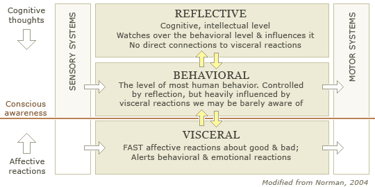
Norman’s book, Emotional Design, is a must read text for designers. One of the ideas that he explores within it is the idea that there are three different levels of experience and that these experiences can be triggered by three different levels of design. Let’s take a quick look at them:
1. The Visceral Design
Visceral refers to the “gut” in this instance. It’s a reference to the concept of “gut instinct”. It’s a subconscious level of reaction to certain experiences. For example; if you’re taken to see your local landfill before you’ve even arrived you’ll be pretty certain that you won’t like the smell and that the rodent population may cause you a certain amount of distress.
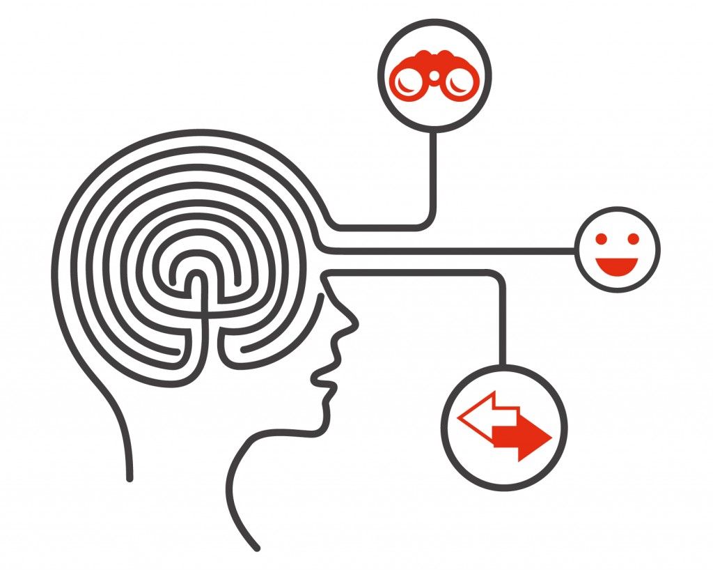
Conversely you might be taken to an exhibition of luxury automobiles and before you’ve arrived you’ll be looking forward to the smell of fresh leather upholstery and the cool curves of the vehicles arrayed around you.
The visceral reaction is the one triggered by the initial sensory scan of the experience. It’s immediate and often beyond our control.
2. The Behavioural Design
How does the product feel when we play with it? Do we still like the way it looks? How easy is the product to use? Do we feel like sharing the product with our friends and family? The meat and potatoes of our experience with something comes from the time when we put it into use.
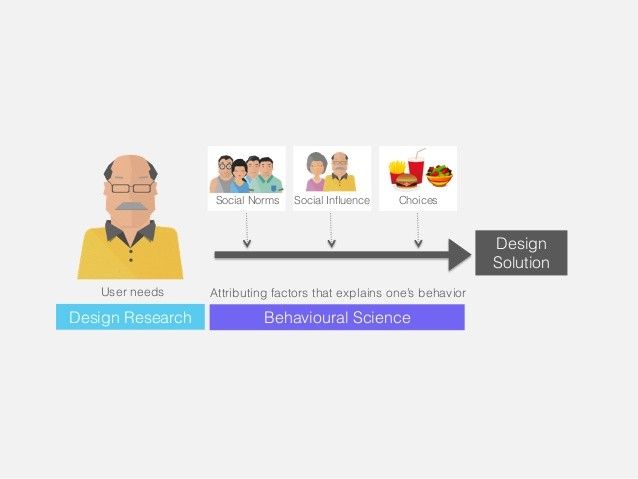
This is the most meaningful of experiences, possibly, because it encompasses the “how it is” and not how we perceive it might be. However, to get to behavioural design we have to pass through the visceral design test first.
3. The Reflective Design
There was a time when I used to play Candy Crush. It’s a game that stays with you long after you put it down. You’re drawn mentally back into lining up 3 types of candy (or more) and all the bells, whistles, and frustrations come back to the surface again and again.
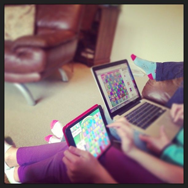
There’s an experience beyond the initial experience of using a product. It’s the experience of association and familiarity. How do we feel about the product now we’re not holding it? What values do we put on the product in retrospect? If we walk through the whole process of coming across and using a product in hindsight; does it change anything about the way we feel or think we feel about it?
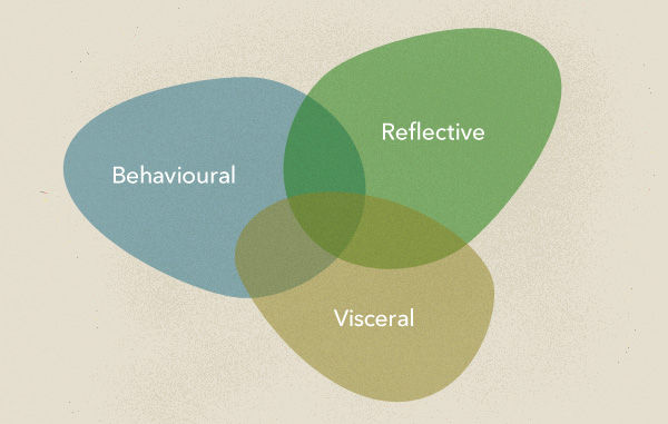
The reflective design is much more subtle than the first two but equally important if we want our designs to have lasting value for our users.
Header Image: Author/Copyright holder: A list apart. Copyright terms and licence: All rights reserved. Img
Image Sources: Jean Baptiste Paris (link to image), B2Bento (link to image), Slide Share (link to image), Ian Hughes (link to image), Blonde (link to image)
