As a user experience designer, you want to solve their challenges and problems. You research your target users, prototype your ideas, test your products for usability ... And importantly, you want your end users to benefit from your products. After all, what is the point of your efforts if no one will use what comes of them? Even the most user-friendly products can get snubbed by people. Let’s take a look at the three major reasons why users love some products over others, and what you can do to make sure they keep coming back to you!
Whether you sell freemium software or manage a personal blog, you will be interested in knowing how many people interact with your offering — download the application, sign-up for newsletters, etc. Once you know what those numbers are, you need to find out why those numbers look the way they do.
If you don’t know what works in your favor, you risk messing it up. And if you know why people do not interact with you, you will know what to fix.
In her talk, The Three Reasons Users Don't Convert, Laura Klein, the author of Build Better Products and UX for Lean Startups, offers a framework to understand why people don’t convert and what you can do to fix the problems. Taking inspiration from her framework, we look at three reasons why people do or do not engage with products and services.
1. Value Proposition
The value proposition refers to the benefits that customers can get from our products and services. Your products are what people use. Your value proposition is why they use them.
“People don’t buy products; they buy the expectation of benefits.”
— Theodore Levitt, author of “The Marketing Mode: Pathways To Corporate Growth”
For example, Netflix offers video-streaming services (the “what”). Customers use Netflix to entertain themselves (the “why”). If we go back to the origins of Netflix, we find that their services have evolved: from online DVD rental to video-streaming to video production. Their value proposition, however, has remained constant.
Why You Should Care
The value proposition sets the overall direction of your UX design efforts. It helps you answer the question: Do our products and services solve a problem or fulfill a need? If the answer is “no”, “maybe” or “don’t know”, then you should take a step back and look at the larger picture. No matter how user-friendly your product is, if people don’t need it, they won’t use it even if it is free, let alone pay for it. Before you brainstorm what features to add to your product, take a moment to examine your value proposition. What benefits do you provide to your users? What problem does your product or service solve?
What You Can Do
Observe your users: Find out what people do with your product. Do they use it as you intended it to be used? You can do this in-person in a lab. Ideally, you’d want to observe them in their environment. Another way to understand user behavior is to track them at the product level. For example: Did users open the newsletter? Which landing pages did they access the most? Which screens did they spend the most time on?
Interview your users: Quantitative research techniques such as surveys and analytics help you get data about what people say and do (the “what”). When you conduct interviews, you have the chance to ask them why they use your (or your competitors’) product or service. If you can get hold of people who have stopped using your products or services, you can get very revealing insights.
![A woman works on a laptop as a man looks at the screen and takes notes.]()
Qualitative user research techniques such as user interviews and field observation can help you understand your users and their environment.
© Startup Stock Photos, CC0.Know your competition: Find out who fulfills the same needs or solves the same problems as you do. Your competitors are not always those who make products that are similar to yours. YouTube provides a platform for people to publish video content, while Netflix produces and distributes its video content. Yet, they share the same value proposition — to entertain people.
Additionally, nothing can stop an existing, even unrelated, product from evolving to cater to the same value proposition. In the year 2000, Netflix delivered DVDs, and Amazon delivered books. By 2020, both produced movies and original content and competed against YouTube.
2. Communication
Website landing pages, product descriptions on app stores, emails and even the messages on social media — every piece of content you put “out there” is as much a part of your communication strategy as are advertisements and press releases.
Not only do you need to communicate well, but you must do it fast, too. While there is no exact number, research indicates that you have about 10 seconds to pitch your value proposition to your customers.
Why You Should Care
If you have a great value proposition, but people don’t understand what you can do for them, they will not try your products or sign up for your services.
People value time. They have things to do and places to be. When they first interact with you, they likely have 17 other browser tabs open, half of them may be your competitors. Or perhaps they see you on a mobile app store, or through an advertisement or an email — again, none of these are in isolation. They’ll have a sea of information competing for their attention. And you’ll have only a few seconds to convince them that your product is the one that is perfect for them.
What You Can Do
Make it about them: Use language that resonates with your users. You may be tempted to brag about yourself, and how you’re better than everyone else (and we have no doubt about it). However, what users want to know is what’s in it for them. Let them know how they can benefit from you. In other words, talk about your value proposition, not your product. Plug the insights from your user research into your communication.
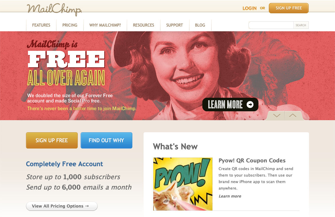
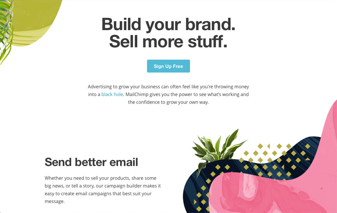
Here are two screenshots from Mailchimp’s website: one from 2010 and the other from 2017.![Screenshot of Mailchimp's website from 2010.]()
Communication on Mailchimp’s website in 2010 was all about the features of Mailchimp. The heading screams “Mailchimp is free all over again”. There’s a “What’s New” section that talks about how you can create QR codes. You can sign up for free and send 6,000 emails a month.
© Mailchimp, Fair Use.![Screenshot of Mailchimp's website from 2017.]()
In 2017, Mailchimp switched its message to, “Build your brand. Sell more stuff.” Same product, same company, but this time the product takes a back seat. Mailchimp knows their customers’ end goal is not to send emails but to build their brand. The website shows customers how they can grow with the help of Mailchimp.
© Mailchimp, Fair Use.Help them make a decision: To motivate people to take that final action — download the app, sign up for the newsletter or try out the service — helps to instill confidence. There is an entire discipline called behavioral economics devoted to this topic. While we can't cover it entirely here, you will recognize some techniques:
Tell them how many people have interacted with you to build credibility.
Prominently display risk-free trials (if you offer one).
Use reviews and testimonials from other customers to show how other people have benefitted.
Highlight time-sensitive promotional offers.
Test your messages: You can test your communication with users to see if they understand your value proposition. The five-second test is ideal for this. Show your landing page (or other messages) to people for five seconds and ask them a few questions to gauge whether they understand the value proposition. You can then tweak your messages and repeat the test to see if it made any difference.
3. Experience
Experience has a very wide scope. Among other factors, it includes how easy it is to learn and use your product and if it delivers good value for money. A good experience will make the case for your users to continue to interact with your products and services. Good experience depends not just on how your product looks and feels, but also on what your users expect. People who are new to your product will have different expectations, as opposed to “expert” users. And people who switch from your competitors’ solution will have a very different set of expectations compared with those who started with you.
Why You Should Care
When people use your products and services, they invest their time and energy to understand how they can get the most benefit. If you have a compelling value proposition, people might take the trouble to experiment and learn through trial and error. Beyond a certain point, however, people would rather not waste time, effort and money on a product that is only marginally better than what they had before you showed up. And should a competitor’s solution show up and people find it easier to use, even the most loyal users will jump ship.
What You Can Do
Set the right expectations: This goes back to the point about communication. If your communication sets a certain expectation, then your product should live up to it.
Ease the transition through onboarding: Everyone who uses your product or service starts as a first-time user. If people feel at ease, they will return. If they feel overwhelmed, or struggle to understand how to get what they want, there is a greater chance that they will stop using the product. A good onboarding flow will help your users get up and running with minimal fuss and pain. Here are just some of the ways you can help your users get comfortable:
Suggest a starting point. Users can feel a little lost in a new interface. Offer them cues on where to start with microcopy.
Help migrate data. If people are likely to have data stored elsewhere, help them get that data in.
Guide them step by step. If your users have to complete a series of steps to accomplish a task, show them the road ahead and hold their hand every step of the way. You can add instructions or contextual tips when users first interact with a particular feature.
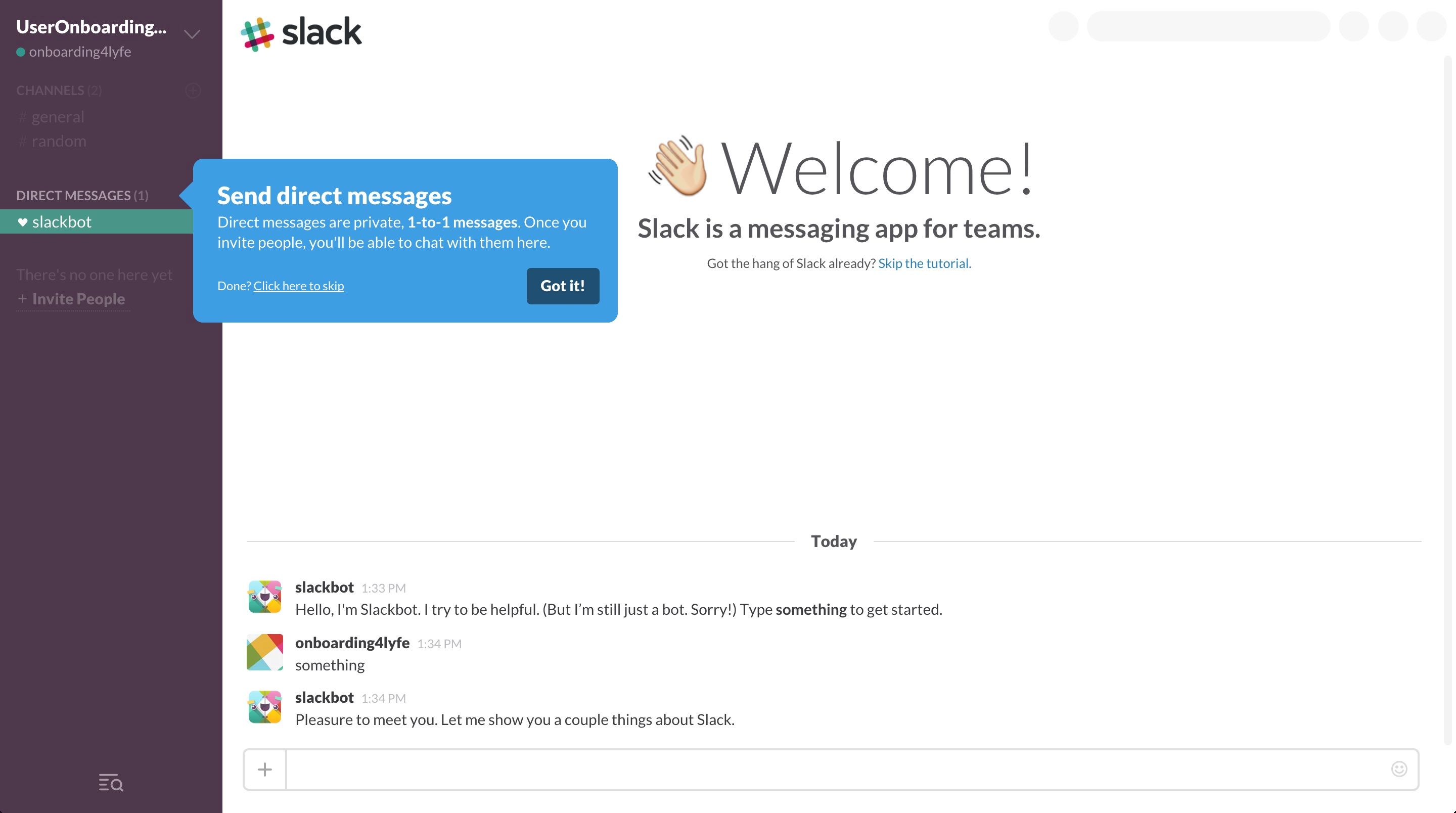
![Screenshot of Slack in which there is a tooltip and and a welcome message from slackbot.]()
Slack has a different approach to work-place communication than emails. A combination of tooltips and a friendly Slackbot helps users become comfortable with a radically different way to send messages.
© Appcues, Fair Use.
Usability testing: Give your products to users and see how they interact with them. Ask them to voice their thoughts as they use them to understand whether your users interpret your design the way you intended them to. With people who eat and breathe the products, even the most experienced designers can develop a blind spot. Usability testing helps you take yourself out of the picture and watch how real users interact with your product. Where do they click/tap? Are they able to accomplish the tasks they set out to do? Where do they get stuck?
The Take Away
Several factors determine whether your users will continually interact with your offerings. Broadly speaking, they are related to the value proposition (the benefits you provide to your users), how you communicate your value proposition, and the product experience.
Qualitative user research will help you evaluate whether your value proposition fits your users’ requirements and identify how you can fill any gaps. You can also plug your findings into your communication strategy to explain your value proposition.
Whatever you plan to deliver, whether a new feature or a revised message on your landing page, make sure you test and iterate your design, as needed. The five-second test will help you find out if your messaging works, while usability testing will help you improve your products’ usability.
These factors come into play only after you attract people to your products. You still need to reach out to potential customers and users and bring them to you. Once you have their attention, woo them with your value proposition and product experience.
References & Where to Learn More
Laura Klein explains three reasons why users don’t convert in this fun Webinar (~1 hour):
The Three Reasons Users Don’t Convert
Learn all about Value Proposition Design in the book:
Alexander Osterwalder, Yves Pigneur, Gregory Bernada, Alan Smith, Patricia Papadakos, Value Proposition Design, 2014
Jakob Nielsen breaks down the numbers behind his conclusion that the first 10 seconds are the most critical:
How Long Do Users Stay on Web Pages?
See how Mailchimp (or any other site) has evolved with the Internet Archive’s Wayback Machine.
For a deeper exploration into concepts of behavioral economics and how you can persuade people to take action, ethically, of course, read:
The Process of Persuasion — How to Make a Casual Browser an Intrigued User
Explore our literature on usability testing here.
Images
Hero Image: © Anete Lusina, CC0.


