We think 2015 will be the year when the idea of “Mobile UX” disappears. Responsive design will be near mandatory and that designers are going to consider screen scalablity and usability as part of every project that they work on. However, it’s still 2014 and we think there are a range of things that you need to consider to get the right mobile UX. So let’s take a look:
On Screen Performance
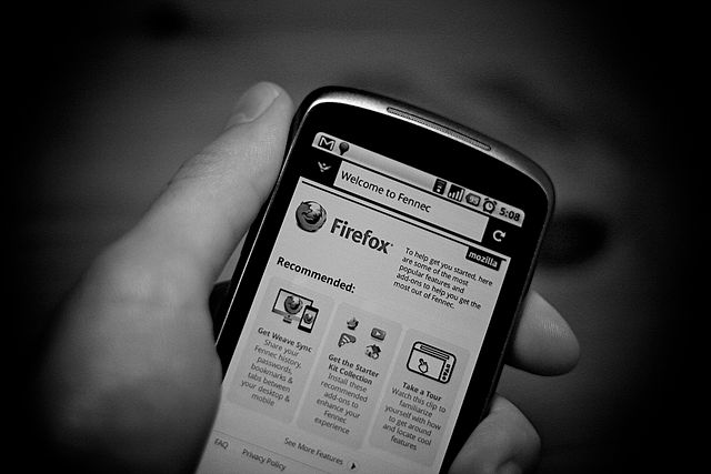
It can be all too easy to get carried away with making things look pretty. This is particularly true when your mobile apps are going to be sold in stores with one or two screenshots that show the users what you do. Yet, if the pretty performs badly on screen – you have a poor UX. If it takes too long to load, crashes regularly, or the central server is down; you can’t fix those problems by fixing the aesthetic appeal of your offering.
Why Are Your Users Here?
If you can develop a customer journey for your mobile product what does it tell you? If your customers visit your app for information; how easy is it for them to get to that information through your mobile interface?

If they’re there to shop; is the UX designed to facilitate that? We appreciate how much better it is when a mobile app is all singing and all dancing and encourage more rounded mobile experiences; however, it’s vital to start with delivering the core experiences that your users expect.
Check Perception of Performance
It’s entirely possible to change people’s perception of performance from your mobile app when the technology isn’t quite up to delivering the performance that you really want. For example; you can load the outline of a page and then delay a little before you serve the content. It lets people know that the app is doing something rather than just waiting and waiting and waiting for data… tiny tweaks to Mobile UX can make a big difference to the way people perceive the performance of your app.
Check the Performance of the UI
Can you simplify and/or minimize the impact of individual parts of the UI? For example; could a background be reduced to a repeated tiling effect rather than be loaded as a single big image? Can you drop the resolution of the images you serve for smaller screens to make them load faster?
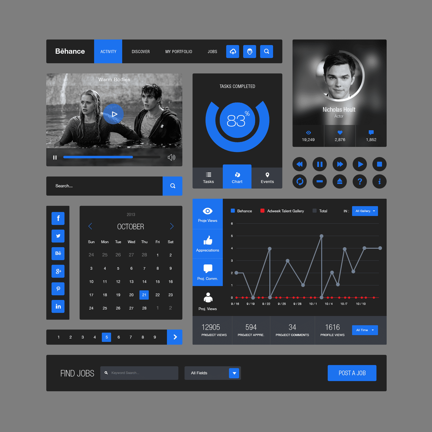
And so on… when it comes down to it, you may find huge performance savings to be made by implementing some simple (and unnoticeable to the user) tweaks to your UI.
Check the Performance of Your Competitors

Want to ensure the best UX in mobile? Then make sure you outperform your competitor’s applications. It’s best to break down the experience into the critical and non-critical items and check the performance of both. You want to be aiming to deliver the best performance in critical areas before you prioritize any resources into the non-critical areas of work.
Image Sources: Canned Tuna (link to image), Johan Larsson (link to image), Christine Saetre (link to image), UI Pixels (link to image), Anjan Chatterjee (link to image)
