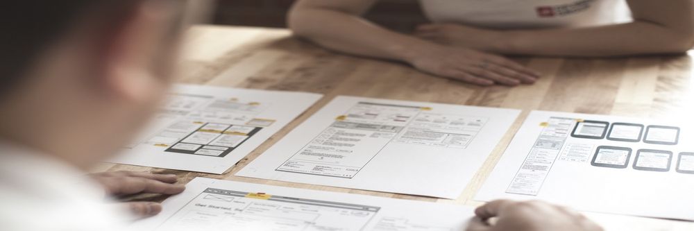
In user experience design (UX design), wireframing is one of the most fundamental steps UX designers take. Wireframes are like blueprints for houses—you’d find it tough to build without one—only the structures you build from them are digital projects. They’re sketches that set out things so you’ve got a visual guide for the layout of the website or app you’re going to create, and an effective wireframe shows where elements will go before you get into any detailed design work, hence why you’ll read all about wireframing here.
After you’ve done your user research, you’ll find wireframing to be one of the earliest stages for your UX design process, and the chief reason for that is how wireframes save you so much—and prevent headaches. Make an effective wireframe and you’ll save time, reduce errors, and make sure you’ve got a clear vision to head towards with your efforts. Not just you, dear designer, but others on your design team and developers and other stakeholders will get to enjoy a clear project view when they’ve got a wireframe in front of them.
Wireframes work like roadmaps for making an effective digital solution, and they’re a huge plus in syncing everyone’s expectations and getting team members on board for a user-friendly digital experience to emerge. They’re cost-efficient, they focus on functionality, and they’re neat and clear deliverables to start the ball rolling on really effective designs.
ShowHide
video transcript
00:00:00 --> 00:00:30
Design is hot. I think good designers are going to be in demand. Now, a lot of the people who do UX design – they're designing websites; they're designing simple things. And – yeah – they're going to be in demand, but that's where almost everybody is going because if you don't get much, if you don't get a deep training, that's all you're good at. So, that's not going to be the best place to get a new job, or at least a well-paying job. To get a well-paying job, you have to have superior skills
00:00:30 --> 00:01:03
and you have to go to a better design school or – it doesn't have to be a university, by the way; there's a lot of non-degree programs that are quite good. The IxDF – Interaction Design Foundation – has some really excellent courses and excellent materials – one of the best locations I know of to get really good material. I've been with this foundation and helping the foundation since it was started in the early days. So, I really am a big believer in it. But it's not enough,
00:01:03 --> 00:01:30
because reading is not the way you become an expert; you become an expert by *doing*. But I think at the higher levels of design, we're going to need more and more of them. And as I answered earlier, because of the new tools that are starting to develop, it's called generative design tools – generative artificial intelligence, designers can use those to be even better. Not yet, but they're getting there.
00:01:30 --> 00:01:39
Actually, Autodesk has tools in generative AI, generative design that already are very effective and that can make you into a better designer.
In a wireframe, your goal is to make the best possible visual representation of the workflow of a website or mobile application, but—instead of making a high-fidelity prototype in high and fine detail—you want to illustrate the page’s structure, layout, and functionality so you help plan out the user experience without color, graphics, or content getting in the way and causing distractions. What’s key when you’re making a wireframe is to organize the content in a logical way—the layout should guide the user through the information so an intuitive and pleasant browsing experience happens when they view it without having to hesitate in confusion.
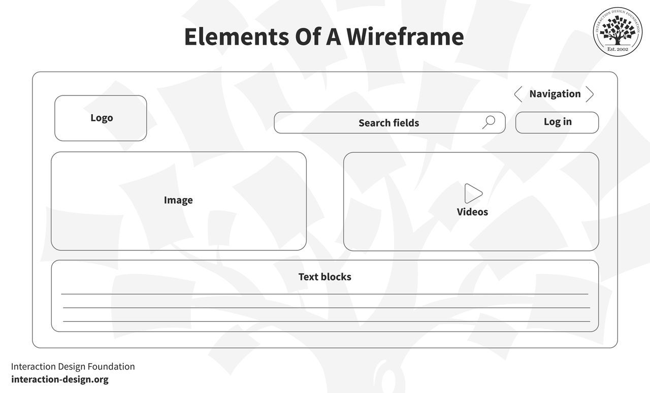
The overall content breaks down into the elements, and first up is the logo, which carries the brand identity and usually sits at the top corner of a page. It’s vital to anchor the brand’s presence and build trust with users. Next, navigation is what helps users explore different parts in the site or app—often appearing as a menu bar or sidebar—and it directs users to primary sections or features so they can get around the design you put before them. After that, search fields are what let users find specific content or features, by typing or speaking if they’ve got mic capabilities, and it’s great to have a search field if a content-heavy site is the plan.
Speaking of typing, text blocks in a wireframe are for content placement—namely, the textual content like headlines, paragraphs, or bullet points. Buttons are, of course, the prompts for users to take actions like “Submit,” “Read More,” or “Buy Now”—whatever the site or app calls for—and they’re vital for users to make calls to action.
ShowHide
video transcript
00:00:00 --> 00:00:31
Buttons are very important in terms of UI elements because, first of all, there are a lot of problems with buttons and, second of all, buttons are what gets people paid; because ultimately, if there is an online business or something, there is a button somewhere that says 'Give me your money' or... 'Pay' or 'Check out', and that kind of keeps the whole internet going. So, buttons are really, really important. So, a couple of things about the button: it has an internal margin called 'padding'. It has an external margin just called 'margin'.
00:00:31 --> 00:01:01
It can have a color, a weight and a font for the label on it, a different corner style, a color or gradient fill. And, no, we don't fill buttons with photos. And it can have a shadow. Most buttons out there, or maybe at least 50% of them, have the same problem, and hopefully you can see it here. I'm just going give you a second. I'm going to drink some water, and... If you see it, then you're already on the good path.
00:01:01 --> 00:01:31
Okay, this button has a label that's not vertically in the center of the button. And this is a really big problem because it makes our brain process it like a fraction of a millisecond longer, and if you have a lot of elements like that in your layout, it's just going to make it more difficult in the long run. So, if you use a simple rule of *just adding guides* in like going through the middle of every side of the button, of the button shape, and then *positioning the text exactly in the center*,
00:01:31 --> 00:02:01
that's going to put you ahead already because this is something most people do wrong. This is something that is so common and is so easy to fix that it's just mind-blowing. And just this one thing is going to take your designs to the next level. Of course, once you notice things like that, you can look at everything that way. So, if there is a title on a card and it's a little bit off-center, just place it in the center. If it's a different margin than something else, just fix the margin. Another common problem is *not enough space on the button or just bad alignment overall*.
00:02:01 --> 00:02:34
So, this is also a very common one while we try to fit a longer text on a smaller button. And this is really bad as well because those vertical lines, the left edge of the button and the left edge of the text, are actually kind of merging together in our head. And then the right edge does the same thing. So, it creates a lot of those vertical lines to process for us, and that makes it harder and longer to process. So, it's just harder to read that way. And there is a very easy solution to this. If the distance from the bottom is X, let's say,
00:02:34 --> 00:03:06
then just use 2X on the sides. But there is an even easier way. If you *use the 'W' of the same font* – and that's because that's one of the widest letters – if you use the 'W' of the same font next to it, on the top, bottom and left and right and then a double 'W' ('WW') on the sides, you should be completely fine. But at least a single 'W' on every side would make a button just simply faster to process and just easier to read. So, single is good; a double is even better.
00:03:06 --> 00:03:31
And you can see it here as well in a typical example. This button on the left is just harder to read, and then just this one little change makes it instantly a lot better. So, once we're talking buttons, there's one other thing that most junior designers do quite a lot. And it should be really clear that *what buttons are saying is important*.
00:03:31 --> 00:04:02
So, don't have them say 'Next' or 'Continue', but instead *always state clearly what will happen after they click the button*. So, a label called 'Next' is just not helpful, because they don't know what's next; they don't know what's going to happen. And another thing, *rectangular shapes or underlined links are much faster to process as a button* – of course – and *if they have a shadow, they're even a little bit faster still*. So, a blobby weird shape, if you want to have this as a button, is always going to be
00:04:02 --> 00:04:10
processed slower and in some cases people might not even click on it at all. So, *just keep your buttons rectangular* – it's just the best way.
Image placeholders are the areas where you’re going to put your visuals, and they help in understanding a page’s content-to-visual balance—and that’s another vital thing to get right for effective designs. And, while we’re in picture-oriented matters here, videos—or video placeholders—save the spot for where multimedia content, such as videos or animations, will go.
You’ve essentially got five principles of wireframing to bear in mind as you create these superb tools to help your UX design process along: simplicity, user-centricity, clarity, feedback loop, and consistency. For simplicity, you keep it straightforward and focus on structure and functionality, while user-centricity refers to how you prioritize your users’ needs and user journeys. Clarity in wireframing means every element should have a clear purpose—another vital thing to get right and what also takes a fair degree of thought—while feedback loop means you keep gathering feedback and iterating to shape the wireframe well. Last—but not least—is consistency, so you keep a uniform structure and design language going throughout.
Different Types of Wireframes
1. Low-fidelity Wireframes
Low-fidelity wireframes—or lo-fi wireframes—are the first ones you create, and they give the basic visuals of the design. Key here is “basic”—and you don’t want scale, grid, or pixel accuracy, because the aim is to have no distractions, but instead to help find simple images, block shapes, and placeholder text.
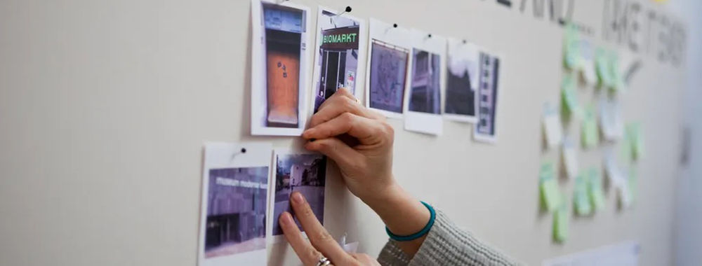
An example would be if you, dear designer, were in a room with stakeholders and clients, and wanted to sketch an app layout on paper, and these wireframes wouldn’t just ease discussions but help set navigation and outline users’ paths, too. You’d sketch ideas with a pen in this meeting, and with a great deal of product ideas coming to or at you, low-fi wireframes help you zero in on one; plus, they’d be helpful for initial tests at this level.
2. Mid-fidelity Wireframes
Mid-fidelity wireframes are—of the three kinds—the most prevalent. They’re not “crude” like most lo-fi ones, and they offer a clearer layout view but still leave out visuals like images or specific typography.
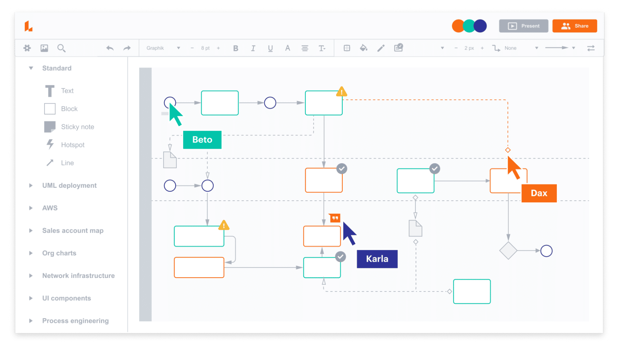
What’s key here, though, is that components have got more precision and features stand out, and you can use, for instance, varied text weights to help distinguish between titles and body text. Instead of colors, you use different shades of grey to indicate importance of elements. Mid-fi wireframing is suitable for early product stages, to be sure, but you use digital tools like Miro or Figma to craft these kinds of wireframes.
3. High-fidelity Wireframes
True to their name, high-fidelity wireframes—or hi-fi wireframes—are detailed and give pixel-specific layout views. Instead of placeholder text (“lorem ipsum”) and symbols which you’d more likely find in lo-fi versions, here is where you present actual images and relevant content. That level of intricate detail makes these wireframes good to explore and record complex ideas with.
To take detailed menu systems or dynamic maps as an example, this is where designers reserve hi-fi wireframes for the design cycle’s advanced stages—and it’s through these that they refine and finalize design concepts in sharp relief, so they save the “best” until last in that sense.
When to Use Wireframes?
Explore the initial idea: At the start of a project, wireframes help designers and design teams visualize rough ideas and bring abstract concepts to life.
Collect meaningful feedback: Before you get right down into the details of a design, wireframes can help you get in that vital initial feedback to see if you’re on the right track. Stakeholders, members of the design team, and potential users can provide valuable insights so you’ll be better placed—and more clued up—to revisit, tweak, or discard things before you move on to the next step.
Plan functionality: Wireframes map where you’re going to put functional elements—like buttons or interactive features—and it helps you understand how to create an interaction design for usability, and one that will work well.
ShowHide
video transcript
00:00:00 --> 00:00:32
One of the early standards that mentioned usability was ISO 9241. And it talked about three crucial issues for user interfaces. One of them was *effectiveness* – does it do the right thing? Does it get things done that are important? The second was *efficiency* – does it do that with the minimum effort? The minimum mental effort?
00:00:32 --> 00:01:03
The minimum physical effort? Or is it taking extraneous effort that's unnecessary? And very often, people only quote those two because there was a third one as well, which is *satisfaction*: Does it make you feel good? Do you feel happy having used this system or used this piece of software? And so, that last one is often missed entirely. And that's all about the *emotion*, the way you feel.
00:01:03 --> 00:01:32
And it was often ignored, often missed in the past. What's now happened is that's become perhaps in some ways more important than the other two. Emotion is important because it's good to feel emotion. But also, *emotion affects the bottom line in business*. If your employees are happy, they tend to be more productive. So, if you're designing a production line or an office or wherever the environment,
00:01:32 --> 00:02:09
if you can have software and systems that make people feel good, they'll tend to work better. And certainly you want your customers to feel happy because they're the people who are usually going to buy your goods. So, if you've not made your customers happy, they don't buy anything. So, emotion is important to us as humans, but it's also important from a business point of view.
Structure content: Wireframes help you plan where content will appear from early on—and so they make it easier, for instance, to position text, images, or multimedia so that you’re not left wondering about where to put these later on.
Customer journey mapping: Wireframes are effective tools to plot user journeys with, and they’re a great way to enable designers to envision how users are going to navigate a site or app and experience it in that way.
Usability testing: Before you move on and get anywhere near your final designs—or even high-fidelity prototypes (prototypes are more involved design deliverables where, say, while a wireframe shows there’s a button, a prototype shows what that button does as an action)—wireframes can work as wonderful test “subjects” for you to usability-test with so you can get an early edge to identify and rectify usability issues.
How to Choose the Right Wireframing Tools
Benefits of Digital Wireframing
The precision digital tools have offer accurate measurements, so you can be sure that elements align and match the intended design—so you’ve got an edge over just drawing them on paper.
Author and Human-Computer Interaction (HCI) Expert, Professor Alan Dix explains alignment in this video:
ShowHide
video transcript
00:00:00 --> 00:00:31
One of the other tools you have in your toolbox for making visual design is alignment. So, let's see how you can use this in order to help you help the user achieve things. So, first of all, let's think about text. Now, what I'm going to do is assume that I'm an English speaker and I'm an English writer. And so, I have a left-to-right text that I use.
00:00:31 --> 00:01:02
I'm also learning a bit of Welsh. And Welsh also is a left-to-right language, as are most European languages. If you come from a language which is the other way round, or if your users' are right-to-left languages, then you need to flip everything I say for the next slide or two the other way round as well. So, being aware of your users is absolutely crucial here. But I am going to assume left to right. So, for left-to-right text, then you normally want to align things to the left.
00:01:02 --> 00:01:32
And this is the most common. You'll have seen this in many, many layouts. So, the reason for that, though, is that if you're scanning text, you read left to right, and therefore you want your eyes to go down and very rapidly move down the left-hand side of that text and scan the beginning. This is partly driven by the fact, too, that you distinguish that beginning bit first. There may be contexts where the end of a sentence or the end of a title
00:01:32 --> 00:02:00
is the most critical bit. So, you might want to reverse this. So, again, think purpose. Why is somebody looking at this line of text items? And if what they're trying to do is scan something and if what they'd like you to distinguish, which is the most common case, is the front of the text, then you left-align. It does tend to be a bit boring sometimes. So, you might want to mix it up. But if you do, and if you right-align – and I have used right-aligned text; there's occasions I've used it –
00:02:00 --> 00:02:34
you have to know that makes quick scanning to find something more difficult. However, there might be... if the context is somebody knows the name of a film and they're trying to find it in order to choose it, and they want to do that quickly because it's about to start in a few minutes and it's a live film, you want to make that as easy to scan as possible. However, perhaps if you're just making new suggestions of films to the user and the user doesn't necessarily recognize them straight away – so, what you're doing: it's a range of things they're looking at – then it may not matter as much
00:02:34 --> 00:02:48
whether they're left-aligned, right-aligned, or maybe center-aligned in the middle. So, there are times for special effects when you want to do that. But you have to understand then that a particular purpose, which is scanning to find something that you recognize is going to be harder.
Another massive benefit of digital wireframing is the efficiency they provide you with, since you can speed up the wireframing process with digital and features like copy, paste, and templates, which save time as well as potential headaches from all the labor of hand-drawn efforts. On the subject of saving time, there’s the benefit of easy sharing in that you can share digital wireframes just with a link, and that makes the process of gathering feedback easier, too.
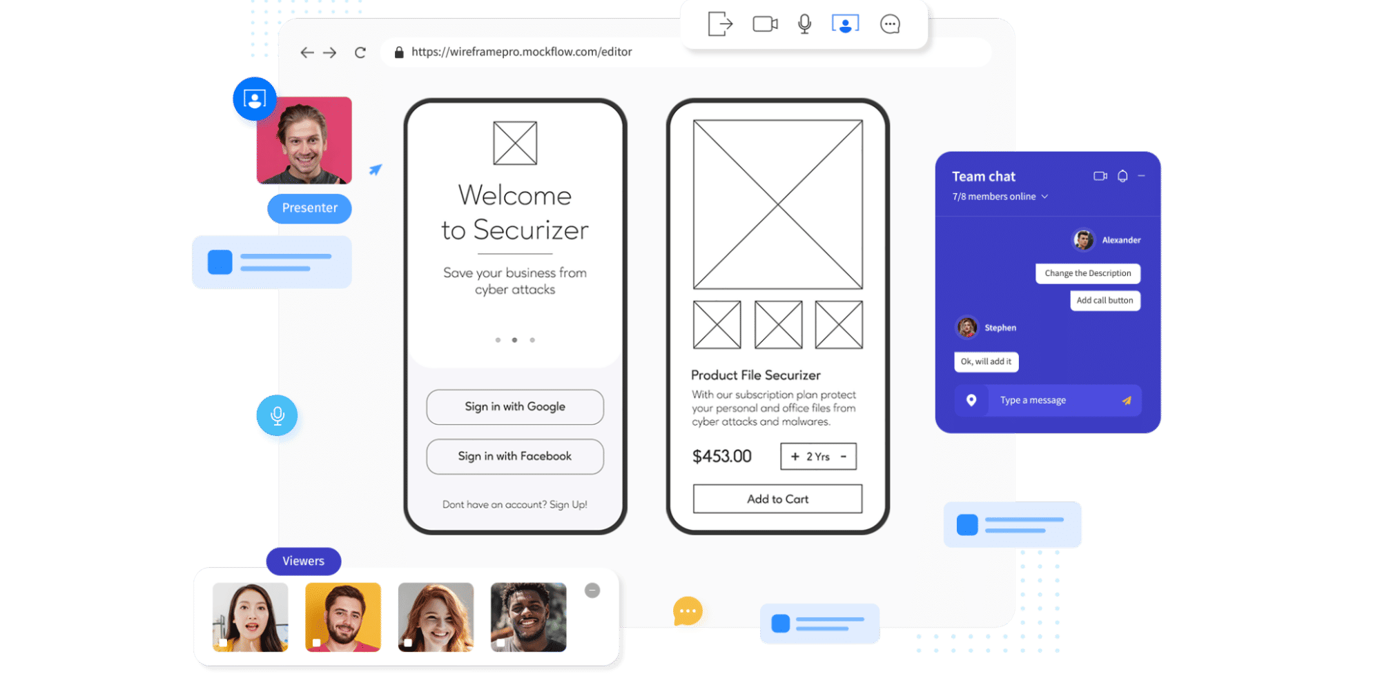
Another point to sharing is sharing in the work on the project, so better collaboration comes with digital wireframing—not least since many digital tools have got built-in collaboration features, and so teams can review, comment, and iterate together in real-time.
With all this efficient work going into a project, there’s always the chance that you and your team will want to check back on different versions of what you’ve done, and that’s where version control comes in, since digital wireframing can help you track changes—with most tools offering version history and allowing designers to compare versions or revert back to old ones.
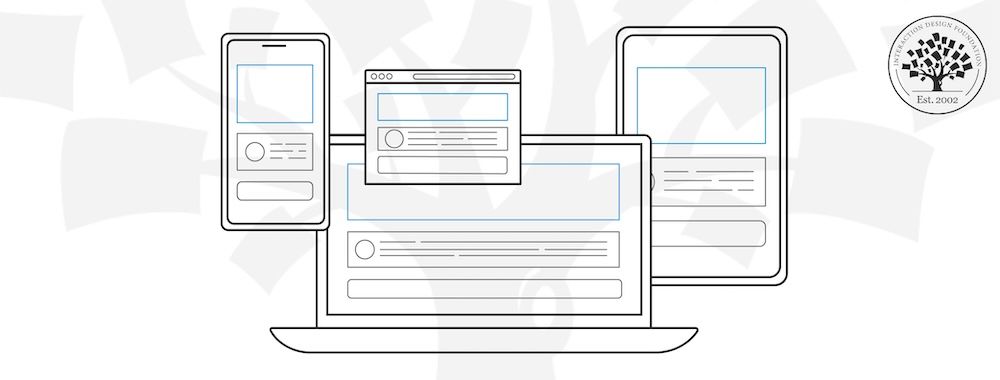
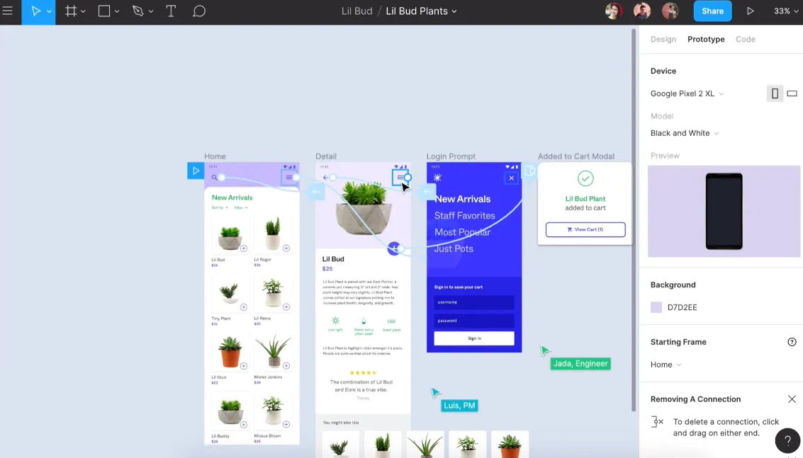
The difference between prototypes and wireframes came up earlier, but let’s revisit a feature there—of interactivity—and some tools enable clickable wireframes, and that handy feature simulates user interactions by offering them a dynamic preview. Scalability is another big benefit of going digital with wireframes, and it’s just a straightforward matter to adjust wireframe sizes for various devices—so you can also ensure designs are responsive.
Another juicy plus is the factor of integration—and many tools integrate with other design software, and so that streamlines the transition from wireframing to high-fidelity designs. Asset management is yet another benefit, and it’s easy to organize and store assets—not least since icons, components, and UI elements remain at your fingertips.
Last—but not least—there’s the boost of professional presentation, and as digital wireframes look polished, and if you present them to stakeholders or clients, it’ll give a professional impression.
Wireframing tools and software
Wireframing tools help you map the user experience, layout, and overall flow—and put you streets ahead of pen-and-paper sketching (although hand-drawn wireframes can come in very handy in brainstorming sessions and the like). Software for wireframing helps you streamline the design process and ensure everyone is on the same page, so we’ll talk about some of the top wireframing tools leading the industry. (Prices correct at the time of writing.)
Figma is a top-tier, cloud-based design tool, and it's a favorite among solo designers and teams alike. Even free users benefit from its comprehensive feature set. FigJam is an online whiteboard, and it integrates with Figma, so you can use it for brainstorming and user flow mapping.
You can transition to wireframing and prototyping within the same platform, and a juicy plus is that there’s no need for external design apps. What’s more, the platform excels at team collaboration with real-time edits and in-file discussions. Developers can extract CSS for smooth transitions to production.
Best Features
Generous free plan
Online whiteboard companion (FigJam)
Seamless team collaboration
Vector-based pen tool
Integrated team conversations
Pricing
Free (3 projects). Professional plan at $12/user/month (annual billing).
MockFlow is an online wireframe tool with real-time collaboration, and its clean, intuitive interface makes wireframing simple with a great many UI packages. The platform has design controls placed on the left—which maximizes the space for the design—and beginners find it easy to use due to the precise placement of its diverse elements.
The platform offers unique features—like organizational functionality—and it allows you to create separate spaces for each project, plus you can export in various formats, too, including Word and PowerPoint.
With native Slack and Microsoft Teams integrations, team communication stays streamlined with Mockflow, and bonus features like AI image and text generators are neat plusses that enhance its capabilities.
Lucidchart is a diagramming tool that’s accessible via web browsers, and it empowers users to draw, do revisions, and distribute charts and diagrams collaboratively. This platform is ideal for enhancing organizational structures, systems, and workflows, and a user-friendly interface makes it a top choice if you’re after visual collaboration tools.
The platform’s strength is how it promotes teamwork through real-time collaboration, in-app chats, and extensive integration capabilities. Lucidchart syncs with popular tools—including Microsoft Office and Google apps—and it connects with its virtual whiteboarding product, Lucidspark.
Best Features
Vast wireframe template library
Drag-and-drop functionality
Real-time collaboration
In-app chat
Automatic sync and save
Integration with Microsoft, Google, Atlassian, and more
Pricing
Freemium version. Paid plans start at $7.95/month.
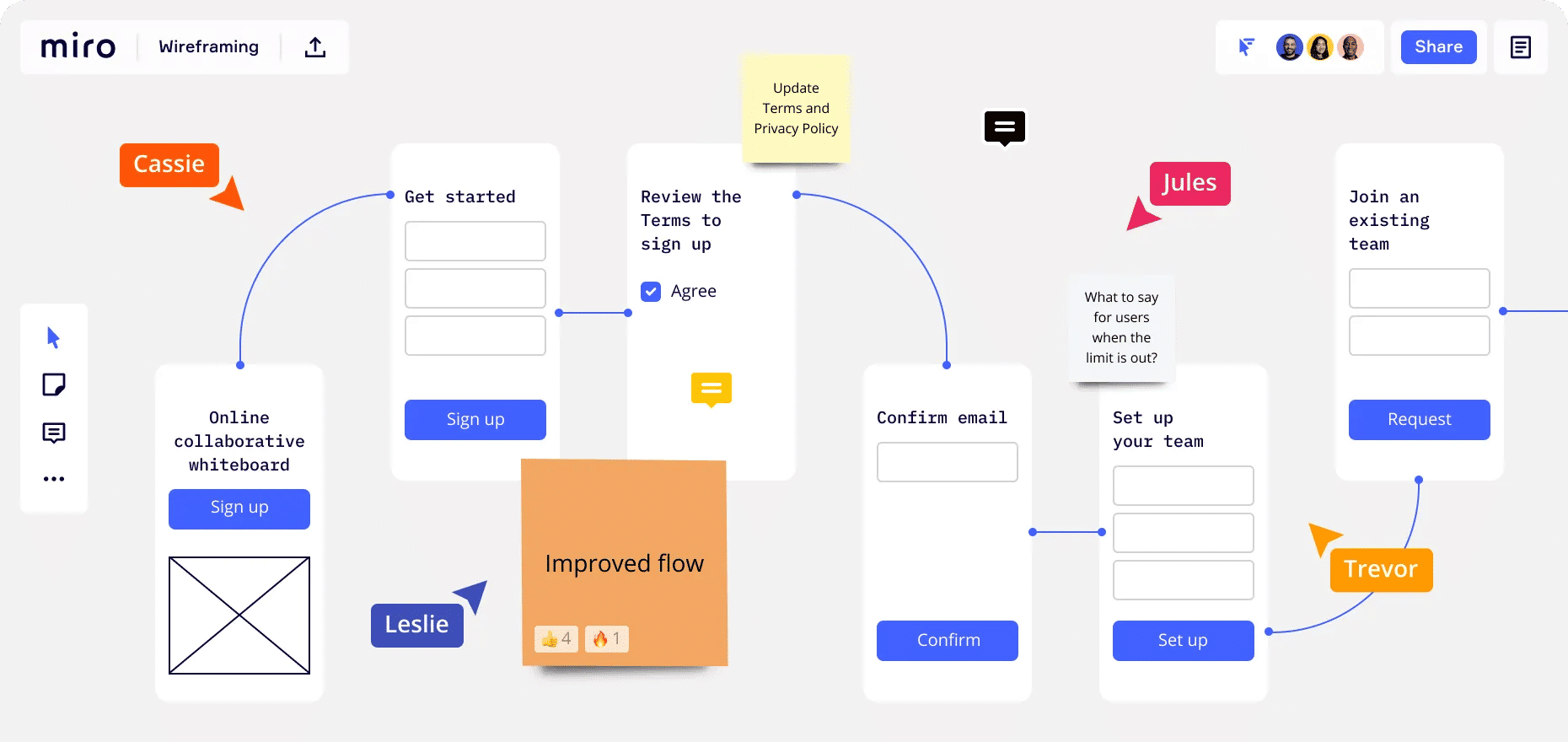
Miro is a popular and dynamic AI-powered virtual whiteboard platform, and it fosters real-time team collaboration with features like sticky notes, wireframe libraries, and mind-mapping tools.
With its diverse integrations and templates, what also makes Miro a nifty pick is how it provides a holistic solution for brainstorming and design. The free version is pretty generous—and additional perks come with the team plan.
Before you get to sketching, you’ve got to understand your target audience and business well, so be sure to start your UX research from the perspective of your target audience and look at some questions and keep them well in mind about your users, like: What motivates them? What holds them back? Which products resonate with them? If you get tools like user personas or the jobs-to-be-done (JTBD) framework, you can find them invaluable aids here.
ShowHide
video transcript
00:00:00 --> 00:00:34
Personas are one of these things that gets used in very, very many ways during design. A persona is a rich description or description of a user. It's similar in some sense, to an example user, somebody that you're going to talk about. But it usually is not a particular person. And that's for sometimes reasons of confidentiality.
00:00:34 --> 00:01:02
Sometimes it's you want to capture about something slightly more generic than the actual user you talked to, that in some ways represents the group, but is still particular enough that you can think about it. Typically, not one persona, you usually have several personas. We'll come back to that. You use this persona description, it's a description of the example user, in many ways during design. You can ask questions like "What would Betty think?"
00:01:02 --> 00:01:35
You've got a persona called / about Betty, "what would Betty think" or "how would Betty feel about using this aspect of the system? Would Betty understand this? Would Betty be able to do this?" So we can ask questions by letting those personas seed our understanding, seed our imagination. Crucially, the details matter here. You want to make the persona real. So what we want to do is take this persona, an image of this example user, and to be able to ask those questions: will this user..., what will this user feel about
00:01:35 --> 00:02:01
this feature? How will this user use this system in order to be able to answer those questions? It needs to seed your imagination well enough. It has to feel realistic enough to be able to do that. Just like when you read that book and you think, no, that person would never do that. You've understood them well enough that certain things they do feel out of character. You need to understand the character of your persona.
00:02:01 --> 00:02:30
For different purposes actually, different levels of detail are useful. So I'm going to sort of start off with the least and go to the ones which I think are actually seeding that rich understanding. So at one level, you can just look at your demographics. You're going to design for warehouse managers, maybe. For a new system that goes into warehouses. So you look at the demographics, you might have looked at their age. It might be that on the whole that they're older. Because they're managers, the older end. So there's only a small number under 35. The majority
00:02:30 --> 00:03:01
are over 35, about 50:50 between those who are in the sort of slightly more in the older group. So that's about 40 percent of them in the 35 to 50 age group, and about half of them are older than 50. So on the whole list, sort of towards the older end group. About two thirds are male, a third are female. Education wise, the vast majority have not got any sort of further education beyond school. About 57 percent we've got here are school.
00:03:01 --> 00:03:34
We've got a certain number that have done basic college level education and a small percentage of warehouse managers have had a university education. That's some sense of things. These are invented, by the way, I should say, not real demographics. Did have children at home. The people, you might have got this from some big survey or from existing knowledge of the world, or by asking the employer that you're dealing with to give you the statistics. So perhaps about a third of them have got children at home, but two thirds of them haven't.
00:03:34 --> 00:04:05
And what about disability? About three quarters of them have no disability whatsoever. About one quarter do. Actually, in society it's surprising. You might... if you think of disability in terms of major disability, perhaps having a missing limb or being completely blind or completely deaf. Then you start relatively small numbers. But if you include a wider range of disabilities, typically it gets bigger. And in fact can become
00:04:05 --> 00:04:32
very, very large. If you include, for instance, using corrective vision with glasses, then actually these numbers will start to look quite small. Within this, in whatever definition they've used, they've got up to about 17 percent with the minor disability and about eight percent with a major disability. So far, so good. So now, can you design for a warehouse manager given this? Well,
00:04:32 --> 00:05:01
you might start to fill in examples for yourself. So you might sort of almost like start to create the next stage. But it's hard. So let's look at a particular user profile. Again, this could be a real user, but let's imagine this as a typical user in a way. So here's Betty Wilcox. So she's here as a typical user. And in fact, actually, if you look at her, she's on the younger end. She's not necessarily the only one, you usually have several of these. And she's female as well. Notice only up to a third of our warehouse ones are female. So
00:05:01 --> 00:05:31
she's not necessarily the center one. We'll come back to this in a moment, but she is an example user. One example user. This might have been based on somebody you've talked to, and then you're sort of abstracting in a way. So, Betty Wilcox. Thirty-seven, female, college education. She's got children at home, one's seven, one's 15. And she does have a minor disability, which is in her left hand. And it's there's slight problem in her left hand.
00:05:31 --> 00:06:00
Can you design, can you ask, what would Betty think? You're probably doing a bit better at this now. You start to picture her a bit. And you've probably got almost like an image in your head as we talk about Betty. So it's getting better. So now let's go to a different one. You know, this is now Betty. Betty is 37 years old. She's been a warehouse manager for five years and worked for Simpkins Brothers Engineering for 12 years. She didn't go to university, but has studied in her evenings for a business diploma.
00:06:00 --> 00:06:31
That was her college education. She has two children aged 15 and seven and does not like to work late. Presumably because we put it here, because of the children. But she did part of an introductory in-house computer course some years ago. But it was interrupted when she was promoted, and she can no longer afford to take the time. Her vision is perfect, but a left hand movement, remember from the description a moment ago, is slightly restricted because of an industrial accident three years ago.
00:06:31 --> 00:07:04
She's enthusiastic about her work and is happy to delegate responsibility and to take suggestions from the staff. Actually, we're seeing somebody who is confident in her overall abilities, otherwise she wouldn't be somebody happy to take suggestions. If you're not competent, you don't. We sort of see that, we start to see a picture of her. However, she does feel threatened – simply, she is confident in general – but she does feel threatened by the introduction of yet another computer system. The third since she's been working at Simpkins Brothers. So now, when we think about that, do you have a better vision of Betty?
00:07:04 --> 00:07:32
Do you feel you might be in a position to start talking about..."Yeah, if I design this sort of feature, is this something that's going to work with Betty? Or not"? By having a rich description, she becomes a person. Not just a set of demographics. But then you can start to think about the person, design for the person and use that rich human understanding you have in order to create a better design.
00:07:32 --> 00:08:06
So it's an example of a user, as I said not necessarily a real one. You're going to use this as a surrogate and these details really, really matter. You want Betty to be real to you as a designer, real to your clients as you talk to them. Real to your fellow designers as you talk to them. To the developers around you, to different people. Crucially, though, I've already said this, there's not just one. You usually want several different personas because the users you deal with are all different.
00:08:06 --> 00:08:30
You know, we're all different. And the user group – it's warehouse managers – it's quite a relatively narrow and constrained set of users, will all be different. Now, you can't have one persona for every user, but you can try and spread. You can look at the range of users. So now that demographics picture I gave, we actually said, what's their level of education? That's one way to look at that range. You can think of it as a broad range of users.
00:08:30 --> 00:09:02
The obvious thing to do is to have the absolute average user. So you almost look for them: "What's the typical thing? Yes, okay." In my original demographics the majority have no college education, they were school educated only. We said that was your education one, two thirds of them male – I'd have gone for somebody else who was male. Go down the list, bang in the centre. Now it's useful to have that center one, but if that's the only person you deal with, you're not thinking about the range. But certainly you want people who in some sense
00:09:02 --> 00:09:24
cover the range, that give you a sense of the different kinds of people. And hopefully also by having several, reminds you constantly that they are a range and have a different set of characteristics, that there are different people, not just a generic user.
As you’re doing this, make yourself familiar with the business side—and understand what you offer, the goals you’ve set, and what your desired outcomes are. This may call for input from your clients or employer brand, but the main point is to balance user needs with business objectives in your wireframe.
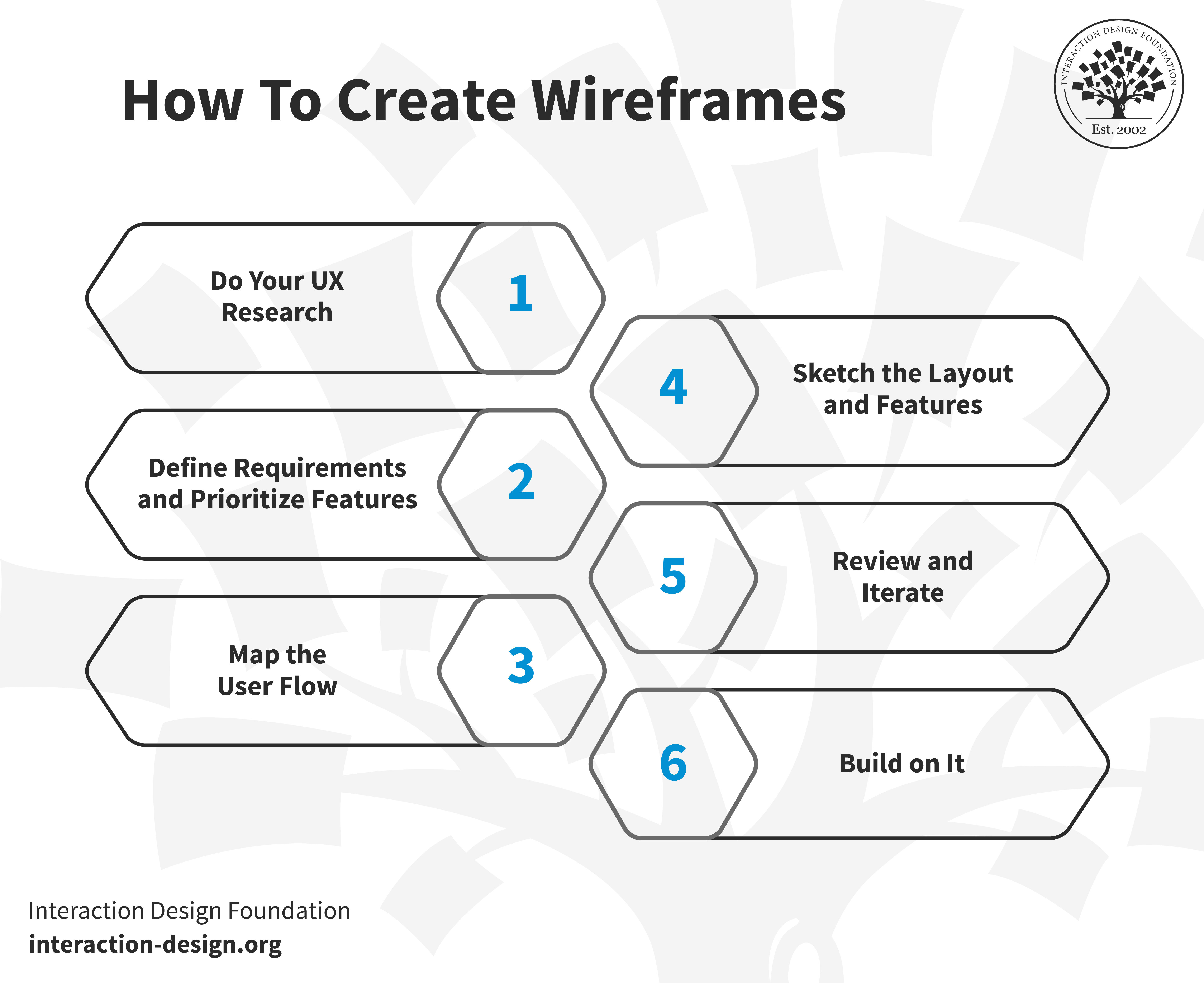
Step 2: Define Requirements and Prioritize Features
After you’ve completed your UX research, the next step is to narrow down what to build and here’s where you will need to involve stakeholders or the product owner. They’ll help translate broad user needs into specific features.
For instance, if your brand wants to improve user engagement on its e-commerce site, you can learn from stakeholders about what features align with user needs and business goals if you’re to design a “Recommended Products” section.
You’ll find this step a crucial one for deciding what elements will make it to the wireframe, so do list prioritized features to help you focus on what’s most important for users and the brand—and it’ll help guide the design process.
Step 3: Map the User Flow
Now you’ll need to envision how a user’s journey on your platform will go, and a user flow is the blueprint for that. If it’s an e-commerce site, a user’s path might begin at the homepage, move to a product search, then select a product, make a payment, and—last, but not least—get an order confirmation. When you’ve got these steps clear in your mind, you’ll be better able to highlight necessary features and make good design decisions from there.
Step 4: Sketch the Layout and Features
Congratulations—you’ve got the user research and project requirements well in hand, so now it’s time to go ahead and sketch the wireframe, so pick a fitting canvas size and start to position elements. Think of it like piecing together a puzzle, and you can shift components until you’ve got a nice and intuitive, user-friendly design in front of you, and as you’re working on this, think about some things like information architecture, interactive elements, static elements, and your fidelity choice. For information architecture—IA, for short—focus on how to organize the content and prioritize information based on its significance. For interactive elements, highlight buttons, links, and other clickable items; while for static elements, don’t forget foundational parts like headers, footers, or menus. As to fidelity level, do you want low-, mid-, or high-fidelity (it’ll largely depend on how early on you are in your design process to work out the detail level of this)?
Step 5: Review and Iterate
Now, it’s time to share your wireframes and get that vital feedback in from stakeholders—and they can, and maybe should, include business professionals and developers. You could run “bona fide” usability tests on your wireframes, too, and see what users make of them. When you collect feedback and gather insights in from users, you can frame your questions so they include broad insights and specific details, and—to help things along in a big way—if you’ve got a variety of wireframe versions, let reviewers pick their favorites.
Here, collaboration is a vital thing—and you, dear UX designer, are a champion for the user’s voice and advocate for a user-centered design while brands have objectives and developers focus on the feasibility side of things. In any case, user testing wireframes is invaluable before you and your team get deep into design or development—wireframes work as a tangible product for users to interact with, early-stage testing that can spot potential usability issues, layout problems, or unclear navigation paths before things start costing.
Step 6: Build on It
Once you’re all agreed on the wireframe design, you can move on to make detailed mockups and interactive prototypes—and then kick things up a gear or three so you can transform them into minimum viable products (MVPs) so you refine the user experience towards a final product that’s both functional and user-centric.
Watch this video to learn about the minimum viable product and how to scope out the MVP:
ShowHide
video transcript
00:00:00 --> 00:00:31
One of the key ways of designing for experimentation is to build an MVP, or Minimum Viable Product. This is a concept that was first introduced by Frank Robinson back in 2001 and was popularized by Eric Ries and Steve Blank. It's now heavily associated with The Lean Startup methodology, and it's obviously probably one of the most misunderstood concepts that is also wildly popular, which is impressive because there's actually a lot of competition in that category. People seem to have misunderstood what a minimum viable product is
00:00:31 --> 00:01:04
in about as many ways as you can do it, but the most common misunderstanding is that you can just cut as much stuff out of a feature or product and then ship it and then – I don't know – learn something, I guess. But the thing is, you *can't learn something from a really bad product*. You just learn that nobody likes really bad things, which is something that we already know. Instead, what we should be doing is designing and building something that *we can actually learn something from*. Specifically, what we normally want to learn from building an MVP is whether the proposed feature or product *solves a real problem* for a specific type of user.
00:01:04 --> 00:01:33
The idea is, if the users we've identified really have a problem that they want solved and they try out our *small* version of the product, that they'll overlook some simple missing features or some small problems because getting that problem solved in this way is so important. The great thing is, if we combine this technique with the one where we share our work with a small group of early users, we can end up getting really good data on the exact things that we're missing. This can sometimes mean that we end up building something far smaller than we thought we'd need in the first place.
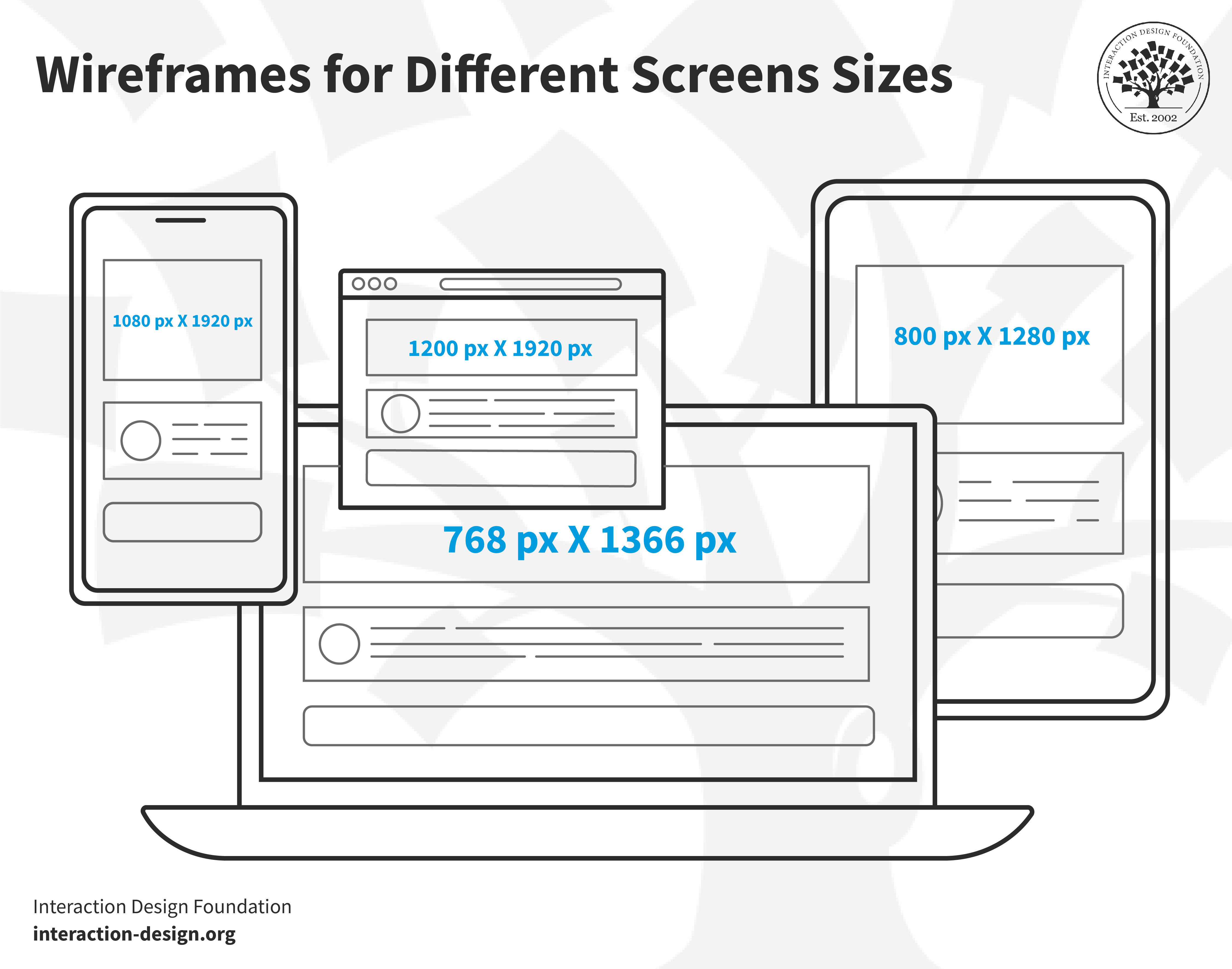
Different platforms have specific wireframe sizes for you to make your skeletal layout for a digital product, and these are:
Smartphone screen: 1080 px x 1920 px
8” Tablet screen: 800 px x 1280 px
10” Tablet screen: 1200 px x 1920 px
Desktop screen: 768 px x 1366 px
Watch this video to learn about the differences between smartphones and tablets:
ShowHide
video transcript
00:00:00 --> 00:00:32
Let's get into the differences between smartphones and tablets for a minute. You're familiar, I'm sure, with a phone and a tablet, but I just want to point out a couple of key distinctions. The other thing I wanted to point out is I'm not showing too many tablet examples in this course, because tablet is easier – the resolutions are much larger. And if you're on the mobile web, responsive design takes care of that.
00:00:32 --> 00:01:01
The key, though, is to notice the difference. So, with smartphone we have *more distractions*, *smaller resolution*, *not always the primary access point*, that users are *multitasking*; they're in a *deep social and emotional context*. And that also includes *environmental factors* such as low lighting. And that they need to *know how to tap on objects*.
00:01:01 --> 00:01:30
And notice that compared to a desktop, that you can click on things and you can have things like hovers; and on mobile, classically this is one of the big things when you start doing mobile design, is, 'Oh, you can't do that on mobile. Mobile doesn't support that.' Actually, mobile can support hovers with a CSS hover class. But just to say that those are kind of key distinctions for smartphone. And tablet itself is less fixed, so users are kind of sitting there;
00:01:30 --> 00:02:03
in a way, easier to design for. If it's a mobile app, I guess that you're porting to a tablet as well – you know – as you usually do and then it's terrible if you don't, because if it's a mobile app and they just open it – and we're talking about an app now – and there's just a tiny little screen; it was optimized for mobile. So, you need to be respectful if you're doing a mobile app that you think natively in a mobile – in other words, you've got all that real estate and you want to lay things out nicely and have them feel and look appropriate to the tablet.
00:02:03 --> 00:02:25
More kind of consumers using tablets at home, less used in business than, say, a mobile phone. Multi-user device, so tablets are often shared with other users in a family kind of situation or in a home. Of course, the resolution is larger. You still need the *tapability*, though, so that's the key.
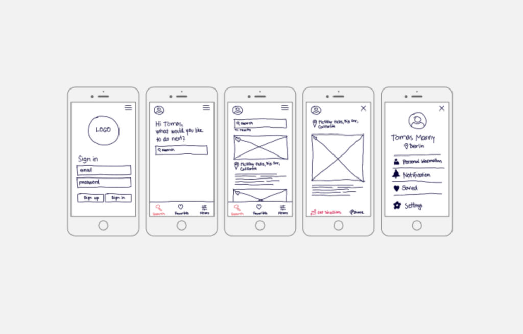
This is a hand-drawn app wireframe with detail, and—despite the point it’s got limited detailing, doesn’t capture specific UI nuances or interactions, and isn’t so suitable for complex app structures with multiple layers—it gives context for each step and uses grids for structure. It emphasizes the mobile-first approach, focusing on essential features, and it’s quick to draft and foster iterative design.
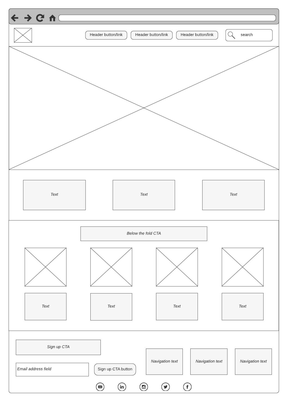
A straightforward digital wireframe example above, this one uses basic tags for description. Empty boxes in the wireframe with crossbars indicate image spots in the UI, and—with its distinct placeholders that indicate where images will be, a straightforward layout that supports content-focused designs like blogs and product listings, and a minimalistic design that helps prioritize content hierarchy—this wireframe is an ideal one for blogs and primary eCommerce sites.
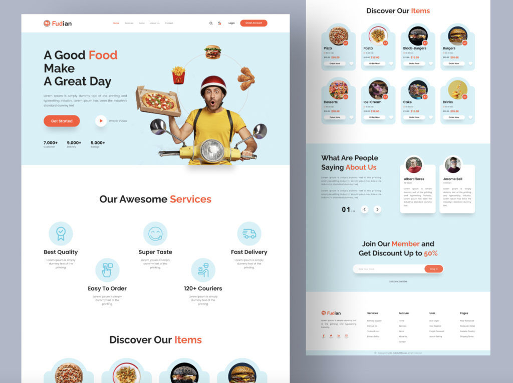
A complete wireframe showcasing text, buttons, colors, and images, this one provides a preview of the site’s final look before development. It’s fully detailed with copy, imagery, and design elements, it’s ready for stakeholder review, and it neatly embraces the brand's colors, imagery, and voice for an authentic feel. Last—but not least—a comprehensive representation provides a clear vision for developers. A detailed vision of high-fidelity wireframes reduces ambiguities during the development phase, and it leads to a smoother project flow.
The Take Away
A crucial preliminary step in UX design, wireframing helps in the visualization and planning of a product's structure, and you need a clear understanding of elements, types, and appropriate use cases to create better wireframes—and you've got wireframing tools like Figma, Mockflow, and Lucidchart to support your efforts to make wireframes that work as foundational deliverables for your design process.
You’ve got a step-by-step guide in the form of do your UX research, define requirements and prioritize features, map the user flow, sketch the layout and features, review and iterate, and—last, but not least—build on it.
Wireframe examples also help as stepping stones toward creating the best wireframes of each type for your purpose. In any case, the choice of wireframing—and prototyping—tools can have a great influence on how easy and efficient your design process turns out to be, so it’s vital to pick the right one when you know what your goals are. Effective wireframing can save you a great deal, serve you well, and go a long way towards creating digital solutions that resonate best in the marketplace.
The differences between responsive and adaptive design approaches spotlight important options for us as web and app desi
1.3k shares
4 years ago
Open Access—Link to us!
We believe in Open Access and the democratization of knowledge. Unfortunately, world-class educational materials such as this page are normally hidden behind paywalls or in expensive textbooks.


