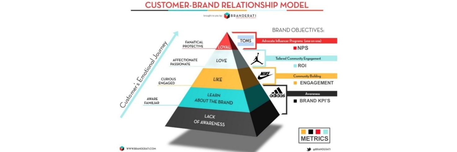
The user experience for your customers often doesn’t start when they arrive at your web page or when they first open your shiny application on their smartphone or tablet; it starts the very first time they encounter your brand. The “awareness” phase as marketers call it. This is the moment when a potential customer is aware of you and hasn’t yet decided that they need (or want) your product.
To ensure a consistent user experience it can be a good idea to focus on a few key ideas as you create your awareness campaigns:
Measure Engagement

Author/Copyright holder: Ben Watkin. Copyright terms and licence: CC BY-NC 2.0
If you are creating a high quality UX through your awareness efforts; it stands to reason that you will be creating good levels of user engagement. You need to determine some KPIs for this (and review them regularly). You might consider some of the following:
- Page views
- Bounce rates
- Total hits
- Impressions
- CTR (Click Through Rates)
- Etc.
Split Test for Reactions
Author/Copyright holder: Alexander Baxevanis. Copyright terms and licence: CC BY 2.0
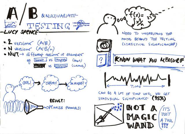
Create some simple sites and make sure that you A/B test your copy and images to create the right level of engagement with your users. This can also be applied to any other advertising content that you release and even to your e-mail marketing campaigns.
Consistency in Search
Your adverts should deliver on their promises. This is particularly true in SEO and SEM delivered adverts. Are your links providing the information or reason that someone clicked on the link in the first place? If not – change them until they do.
Develop Credibility
One of the things that most people want to know during the awareness phase is; “can I trust this brand/product/company?” The placement of your advertising can help build this credibility or destroy it. For example; the Pirate Bay (until its recent troubles) hosts plenty of adverts but would your users trust you more when they find that you are using a piracy website to push your products.
In most cases we’d argue that they wouldn’t. Whereas if your advert appears on CNNs home page (or something similar) there’s a good argument to say that this will improve your credibility with you users.
Check Imagery and Words
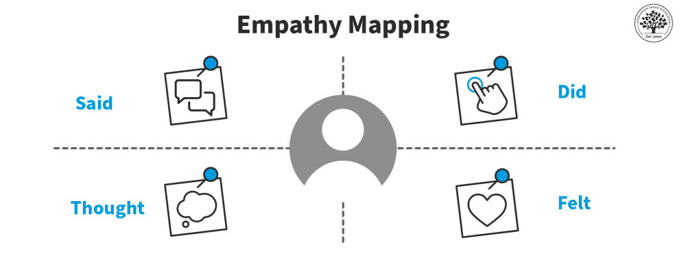
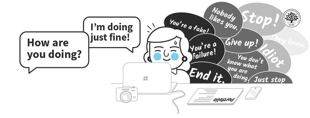
Part of the user experience is emotional. Adverts are supposed to create some form of emotional response in the viewer. Someone is much more likely to click an advert when it speaks to them on a subconscious level and encourages them to respond to their own needs. If you find that your CTR is particularly low – this is often the place to start.

Author/Copyright holder: Unknown. Copyright terms and licence: Unknown Img source
Are your words and images creating emotions or are they boring or worse a complete turn off to the user?
Soft Landings
When someone finally engages with your awareness campaign; is it easy for them to get right into doing business with you when they land on your website or app home page? Creating awareness is all well and good but it’s wasted if you can’t turn that awareness into action when the opportunity arises.
Header Image: Author/Copyright holder: Branderati. Copyright terms and licence: All rights reserved. Img
