Your constantly-updated definition of Key Performance Indicators (KPIs) and
collection of videos and articles. Be a conversation starter: Share this page and inspire others!
88shares
What are Key Performance Indicators (KPIs)?
KPIs (Key Performance Indicators) are metrics that brands collect and evaluate to measure how successful their user experience (UX) activities are. UX KPIs show how close a company is to meeting its UX goals and they help UX designers turn the more abstract user experience into measurable data. When designers track UX KPIs, they can monitor user interactions with a product and gauge how the experience makes users feel.
CEO of Experience Dynamics, Frank Spillers explains important points about UX KPIs:
ShowHide
video transcript
00:00:00 --> 00:00:34
So, how do you craft your UX strategy plan? First of all, make sure you're building the business case. This is a mistake that a lot of people make. Make sure that you're clear about what your ROI is and what it *can* be, right? What are you currently getting from your UX efforts, or *lack* of efforts? Even if you're measuring Google Analytics, what are the KPIs that are relevant to *your* user experience?
00:00:34 --> 00:01:03
And then, what *should* they be or what *can* they be? And you may need to define these as you're starting to build your practice if you're new to UX and you're just getting started. But think about what that is and make sure you define that as you go along. Don't get too excited and just start doing user testing or start doing some type of UX activity and then forget about this. You know, it's really important to remember, remember, remember. Cost-benefits analysis, as we talked about, can be helpful, but *create a template*
00:01:03 --> 00:01:31
and *a practice for costing* so that you're requiring that as part of your project plan. We start all our projects at Experience Dynamics with *business objectives*. So, we're laying that out so we understand what we're building the UX on top of. It's important to *identify your KPIs* (your key performance indicators). *Start with small measurements*; so, don't try and boil the ocean, but start with a few small metrics to measure
00:01:31 --> 00:02:02
– things like success rate in usability testing – as a way to kind of start gauging where you are. Success rate is the main metric from usability testing, so it makes sense that you would measure that and track that. And then, make sure to *share and review those metrics monthly*, at least. It's so important to keep your eye on the metrics, to socialize them and make sure that they get out to people who need to hear about them. So, to start with your UX strategy, you want to *map your current state*.
00:02:02 --> 00:02:30
So, create an *assessment* of your usability and your UX practices and methods. You know – What are you doing? What are you calling UX? And that means taking a look at your product Iifecycle, your management, your staffing attributes and, of course, your UX maturity rating, which is something that you can get from a scorecard I'll be sharing with you soon. So, UX readiness and agile experience are also important to measure in terms of usability and
00:02:30 --> 00:03:05
the UX resources that you currently leverage and the techniques, you know. Essentially you're trying to figure out how things are *done today*. So, this is a current state. How are things happening from a process map? And then, from that – and so, what's important about that is that you get the picture of where your organization "is at". This is not about forcing your organization to act in a way that I want you to act in or that – you know – some guru or some book or some video or something or some voice of Forrester or a voice of Gartner analyst group.
00:03:05 --> 00:03:36
It's not about that – it's about what works for *your* organization. So, a *UX maturity roadmap* is what you're going to end up with. It's going to have detailed guidelines for how to grow your UX competency. And it's going to have things like staffing positions or roles that are required, specific requirements for, again, *your* organization exactly, not somebody else's, and not the organization that you worked at *before* you came here. Don't try and bring that culture over to the organization you're in. It's *so* important that it's *custom-fit* to the
00:03:36 --> 00:04:03
conditions, to the vibrations, if you will, to the frequency of your organization. because every organization is different. It is shaped by the founder, the CEO, the senior managers, the shareholders, the industry – the specific industry, the niche that you're in. So, *UX organization next steps and action plan* are going to be what you create in this ideal state
00:04:03 --> 00:04:10
– so, where you're marching to, where you're going, essentially.
Why Are User Experience Key Performance Indicators Vital to Measure?
User experience designers value user experience KPIs as vital signs of how they can guide their design work towards the most desired outcomes both for their brands’ users and to meet their brands’ business goals, too. It’s crucial to measure UX KPIs, and for several reasons—namely to:
1. Track Success
UX KPIs help brands keep a finger on the pulse of their UX activities in real-world areas such as product development. When they monitor how successful efforts and iterations have been, they can make informed decisions or test hypotheses about how to improve the user experience as needs be.
2. Maximize Visibility
KPIs make UX contributions to the company's success both traceable and visible over extended periods of time.
3. Apportion Budget
UX KPIs that show signs of success can be a useful argument for design teams to bring up if their management think about allocating budgets away from their UX activities to, say, marketing campaigns.
4. Boost The Sense of Achievement
UX KPIs help bring a rewarding sense of accomplishment for teams as they make visible progress towards their set UX goals. Plus, success breeds success—and they can be nice morale boosters to give team members the lift they need to see that they’re on the right track with design efforts.
KPIs can comfortably split into three large branches or general types:
Behavioral KPIs
Behavioral UX KPIs help designers measure what users actually do when they’re interacting with a product. These are critical metrics because they yield invaluable insights into user behavior in the moment and in the field. Another important point is that they can clearly highlight areas where improvements need making. Key behavioral UX KPIs include:
1. Task Success Rate
The task success rate UX metric sees wide use, and—true to its name—it shows what percentage of users successfully complete a specific task. It's a simple—yet powerful—way to see how well users can actually achieve their goals when they use a product. In the main—and regarding KPI UX design efforts—a good task success rate to aim for is around 78%.
To measure their task success rate, designers typically run usability studies with multiple users and then they calculate the percentage of them who manage to finish the assigned task. It's important to consider partial successes, too, however—and in varying degrees. For example, if 35 out of 100 users complete a task with just a minor issue, then it’s important to record that 35% of users were able to complete the task with just that small kink—something that designers can iron out in the next iteration from the data collected.
Just as it sounds, time-on-task measures how long it takes a user to get through and finish a specific task. The time spent usually gets reported as an average, and so it can give valuable insights into a user interface’s (UI’s) efficiency. Naturally, it can vary according to the individual user—and numerous factors might be at play, including external distractions and other factors such as their mood. Generally, though, shorter task times directly indicate high levels of usability. KPIs that reflect these can be a strong indicator of a decently crafted UI, therefore, if tasks that take just a small amount of time chart as a distinct majority.
At the other end of the scale, longer times might well suggest that users are really struggling to understand the product or find the information they need to use it. If there’s a sizeable amount of longer time-on-task KPIs showing up, then it’s almost certainly going to call for a revisit to the design. It’s a particularly helpful KPI for UI-UX designers, since it’ll also provide a chance for design teams to take a closer look at how they can make the content a better fit for the users’ contexts:
Watch Frank Spillers explain important points about context, content and what users need.
ShowHide
video transcript
00:00:00 --> 00:00:30
Now, when you do journey maps or you create personas, and when you think about content strategy or improving your content and making it more useful, more desirable for your users, it's important that you get that guidance from user research and specifically doing field studies, sitting down with users, going to their homes;
00:00:30 --> 00:01:03
if it's B2B, going to their office place, sitting beside them. I once was doing an internal intranet study for a big hospital. I would go from desk to desk talking to different users. When I would come up with an artifact, so when I would discover an artifact, in one case it was a list of telephone numbers of – you know – frequent people to call; you really need to dig deeper and discover *all the opportunities that exist*. And I ended up carrying a stack of papers.
00:01:03 --> 00:01:30
And one of the users said, "You know, it would be really nice if I had a list of frequent people to call..." And I pulled it out for my stack of papers and said, "Oh, you mean something like this?" And she went, "Yeah. That's exactly right!" I'll tell you another story from a store – it's like a country store. So, on the West coast of the United States there are a new generation of farmers. The focus of this study was to discover what the experience was for younger, for Millennial farmers,
00:01:30 --> 00:02:02
and in particular what content they might need to go along with an e-commerce experience. So, we went out to farms and interviewed people – actually we recruited through, we joined groups on Facebook and we could actually see from the Facebook groups that people were recommending our client's brand and other brands, and they were asking questions like "Where can I sell chicken eggs?" because when you start farming at home, out in the countryside, like chickens are a popular one, goats are the other one; you start developing the byproducts of those of those things.
00:02:02 --> 00:02:31
So, we talked to a lawyer – she's a lawyer by day, when she goes into Seattle, the nearest biggest city, she takes her Nubian goats and sells them to people that buy the goats. It's really interesting. Then the other thing she made was soap with the lard she was making with the extra fat that she was getting from her pigs. She was making her own soap and then selling her own soap as kind of a cottage industry. So, we could see this – we heard from the users that kind of stuff; we saw them doing this online as well.
00:02:31 --> 00:03:02
So, we had a kind of the social side of it, and Facebook groups are extremely important for certain communities like this. They also act as a way to sell products if you have excess products. But one thing we found out is the users said they want to be able to do this at the stores as well. They said they like the physical events, the social events that stores put on. So, you know, come to the store – a little music, a little bit of food: community essentially. They really liked that, but they wanted more of them. We also discovered that a lot of women
00:03:02 --> 00:03:34
were making the buying decisions. One of our personas was the manager of the farm. A lot of these people have just learned how to do farming off of YouTube; they call it the University of YouTube. So, that small content about how to make your own sauerkraut, how to raise goats, how to make a fence that is deer-proof so the deer don't come and eat your vegetables. All these kinds of things they rely on YouTube, so that was a content discovery source for us. We realized as well that these women were one of the primary personas; they kept coming up.
00:03:34 --> 00:04:00
The irony here was the CEO of the company was actually a woman, but they didn't tell us to interview women – they didn't tell us anything about the gender side of it. We went and did some research just because it was one of our findings and it turns out that in Oregon, anyway, 50% of new farmers are women. This is a huge cultural shift from the 1950s, '60s, where it was like 85 to 90% men.
00:04:00 --> 00:04:30
This is an inclusion and a bias story of discovering bias. Women were complaining that the jeans were designed for men. Women said that after going on a horse for like 20 minutes, the jeans would rip. Then the crotch would just rip out, so they're throwing away, wasting money on clothes that were not designed for a woman's body, for her physical needs as well as social and other in these. In other words, they were made cute, so little tiny pockets that you can't put anything in – no tools, no phone.
00:04:30 --> 00:05:00
Whereas the men's clothing had that functionality. And there's a bias on clothing, in particular work clothing, and there are actually brands that cater specifically to women that understand this, and there are two or three brands. But it's still very niche; it's very like edge case. Yet up to 50%, in California, close to 35 to 40% of farmers are women now. And these are government statistics, and it matched kind of our study.
00:05:00 --> 00:05:33
So, it was a finding that we stumbled upon by making sure that we interviewed the right users, that we listened to – we didn't just assume that farmers were men. We kept an open mind when we created the study. The content ideas that poured out of this gave us all the types of things that users were saying they needed, and we were able to tell our client to have their social media team and make the kind of content that would work, that would resonate emotionally with the kind of problems that users were trying to solve, in addition to the e-commerce.
00:05:33 --> 00:05:58
And actually when that site launched after six months, (there was) a 10x increase in sales from that site. So, they did something right, and a lot of it had to do with just doing one of these very open baseline professional field studies that can give you all the content and desirability insights that you need to make the right decisions.
To measure time-on-task accurately, it's best to track time per screen—or activity—as well as how long it takes users to get through the overall task; that means as a sequence of actions or screens. This helps to pinpoint which steps are taking them the most time to get through or which might be adding unnecessary seconds. Every split-second counts in this KPI for UX designers—a vital opportunity for them to deliver great customer service through seamless experiences that respect individual users’ time. To calculate average task time, it’s wise to use the geometric mean for sample sizes smaller than 25, and the median for larger samples.
These two KPIs are in the same “bucket,” but they’ve got minor differences which are important to understand to maximize the benefit designers can get when they use them.
To measure the user error rate is to find the percentage of mistakes that users make while they’re trying to complete a task. Take the number of user errors and divide it by the total number of task attempts and then multiply that result by 100. A high error rate is a pretty sure sign that usability issues are lurking in digital solutions and designers need to address these as soon as possible.
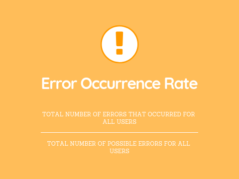
Then, there’s the error occurrence rate or average error occurrence rate. Designers can use that whenever the task they want to measure has just one potential chance for error—for example, if users click the wrong button—or if designers, or UX researchers, just want to track one error among several different ones that a user could make. To calculate the average error occurrence rate, divide the total number of user errors which happened—for all users—by the total number of possible errors that all users could have made.
Naturally, the error rate is a huge factor—and potential worry—for designers, design teams and the brands they work for. It doesn’t mean the other KPIs are any less important; it’s just that error rates tend to flag—in clear terms—what designers may need to do to improve UIs as a matter of urgency. Tasks might be too complex for users; the system itself might demand too much familiarity for them to use straight away—and so not be as intuitive as needed—or there might be environmental factors, like distractions, or user characteristics, like cognitive abilities to account for. The latter point highlights precisely why accessibility is so vital a matter in UX design.
Watch this video to understand key points about the need for accessible designs:
ShowHide
video transcript
00:00:00 --> 00:00:30
Accessibility ensures that digital products, websites, applications, services and other interactive interfaces are designed and developed to be easy to use and understand by people with disabilities. 1.85 billion folks around the world who live with a disability or might live with more than one and are navigating the world through assistive technology or other augmentations to kind of assist with that with your interactions with the world around you. Meaning folks who live with disability, but also their caretakers,
00:00:30 --> 00:01:01
their loved ones, their friends. All of this relates to the purchasing power of this community. Disability isn't a stagnant thing. We all have our life cycle. As you age, things change, your eyesight adjusts. All of these relate to disability. Designing accessibility is also designing for your future self. People with disabilities want beautiful designs as well. They want a slick interface. They want it to be smooth and an enjoyable experience. And so if you feel like
00:01:01 --> 00:01:30
your design has gotten worse after you've included accessibility, it's time to start actually iterating and think, How do I actually make this an enjoyable interface to interact with while also making sure it's sets expectations and it actually gives people the amount of information they need. And in a way that they can digest it just as everyone else wants to digest that information for screen reader users a lot of it boils down to making sure you're always labeling
00:01:30 --> 00:02:02
your interactive elements, whether it be buttons, links, slider components. Just making sure that you're giving enough information that people know how to interact with your website, with your design, with whatever that interaction looks like. Also, dark mode is something that came out of this community. So if you're someone who leverages that quite frequently. Font is a huge kind of aspect to think about in your design. A thin font that meets color contrast
00:02:02 --> 00:02:20
can still be a really poor readability experience because of that pixelation aspect or because of how your eye actually perceives the text. What are some tangible things you can start doing to help this user group? Create inclusive and user-friendly experiences for all individuals.
4. Navigation Versus Search
With this KPI, digital designs’ essential quality of navigation vs search is a metric to compare the effectiveness and usage of a website or application's navigation system against its search functionality. This KPI helps designers and developers understand how users prefer to find information or complete tasks within a digital product like a website or mobile app. Navigation refers to the menu structure, links and hierarchical organization of content that lets users browse through a website or app. Meanwhile, search is the functionality that enables users to directly query for specific information or content using keywords or phrases.
This KPI compares these two methods of information retrieval so researchers or designers can tell which one’s more effective and preferable to users. For example, a large e-commerce website might have thousands of products with users being able to find the products they want in two primary ways, if they:
Navigate through categories and subcategories: for example, Electronics > Smartphones > iPhones.
Use the search bar to type in specific product names or features: for example, "iPhone 13 Pro Max."
The KPI of navigation vs search would measure and compare how often users successfully find products using each method and how efficiently they do so. For example, designers and UX researchers measure this KPI with analytics tracking—such as Google Analytics to track user behavior—and navigation path analysis, click tracking and heat maps. The insights they get from collecting data like this can show them many things about which way is better. For instance, a check in the search log analysis could reveal what search terms users enter to look for what they’re after.
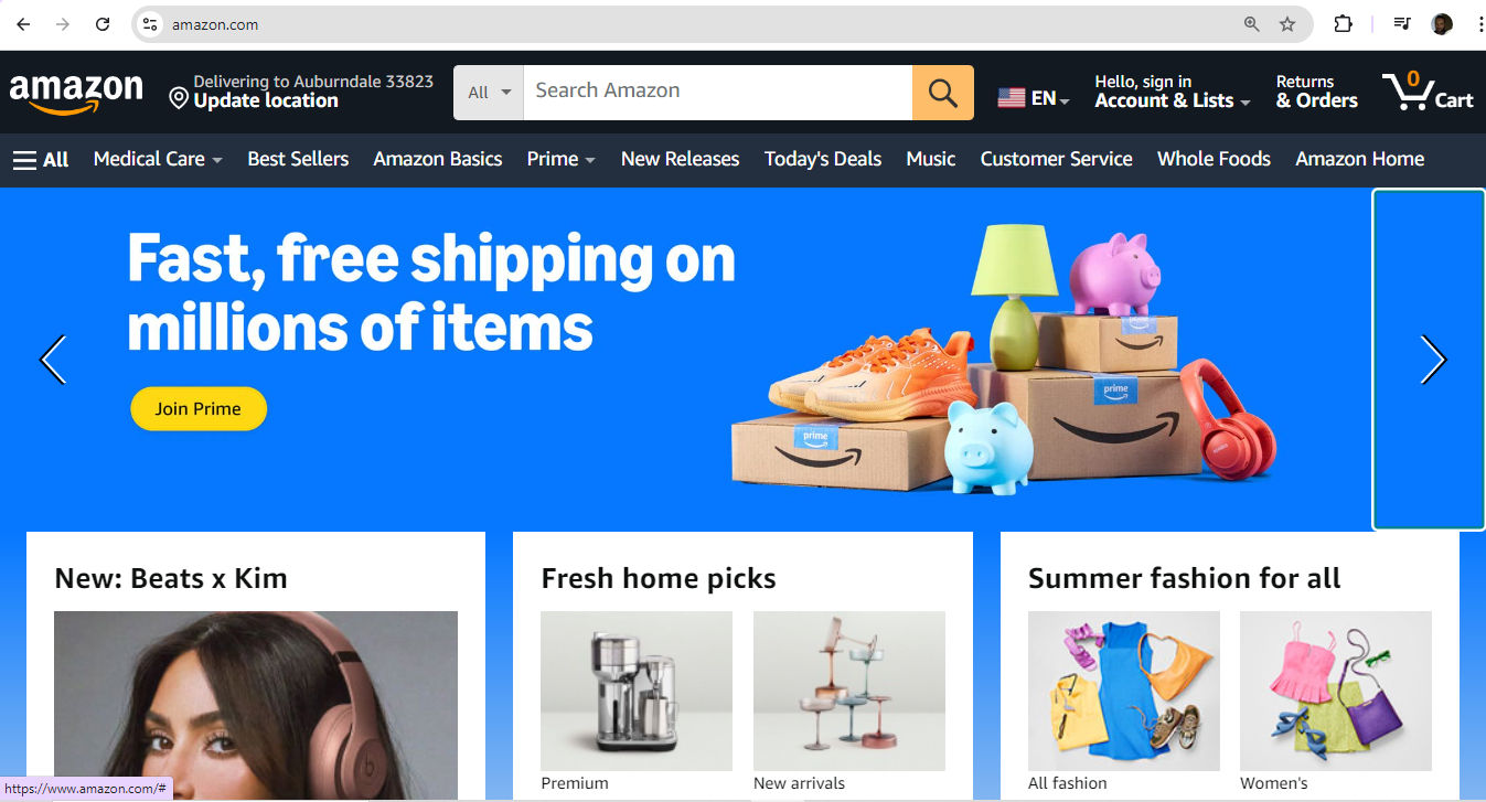
Amazon offers a wealth of possibilities for users to find what they want—how they get to the item page might be a matter of interest with key insights into this part of their user and customer experience.
For this KPI—the number of views of a page—designs can involve anything from blog posts to the most particular type of item a brand might offer—like a tiny accessory or hard-to-find car part—and be a more intricate matter for interactive design.
Still, page views alone don't tell the whole story. To really understand how people use a website, it's smart to look at other factors as well. For example, with mobile apps, it’s advisable to keep a count of items like taps, clicks or how many screens a user goes through. When researchers or designers combine these details with page views, they’ll likely get a much clearer picture of how users use a site or app.
6. Bounce Rate
Bounce rate is a key user engagement metric—and even a UX designer KPI in the sense that a high bounce rate can show up a designer’s errors in judgment and other elements of work performance. It measures the percentage of visitors who leave a webpage without further interaction—potentially a major drawback for product designers, especially. To track bounce rates and other behavioral metrics, brands can use web analytics tools or app-specific platforms—with features like session tracking, heat maps and bug identification, among alternative methods like A/B testing.
UX Strategist and Consultant, William Hudson explains important points about A/B testing:
ShowHide
video transcript
00:00:00 --> 00:00:32
A/B testing is all about changes in behavior. We present people with alternative designs and we look to see how much that alters their subsequent response. So in the simple A/B case, we show them design A, we show them design B, and we measure typically a completion goal, which a lot of subject areas in user experience we refer to as conversions.
00:00:32 --> 00:01:04
So signing up to a newsletter, adding an item to a shopping basket, making a donation to a charity. These are all things that are important to their respective organizations. And typically for the interactive technology that we're working on. So websites and and apps, for example. So these are the things often that we're measuring, but they're not the only things that we can measure. We can measure really straightforward stuff like time spent on page, time spent in the site and also bounce rates.
00:01:04 --> 00:01:33
For example, we'll be looking at some of those a bit later on. Just a reminder that because A/B testing is done very late in the day with live sites and large numbers of users, you really want to make sure that your solution is sound before you get this far. You're not going to be able to test everything that is possibly worrying you or possibly causing problems to users. It's just too long involved and potentially expensive in terms
00:01:33 --> 00:02:00
of user loyalty and also the amount of effort you'd have to put into it. So we are looking at using A/B testing to basically polish the solution rather than to rework it. Bear that in mind and make sure that you've done adequate testing up to this point. Also, bear in mind that A/B testing tends to be focused on individual pages, so it is possible to have multi-page tests, but
00:02:00 --> 00:02:30
it's a more complex area than we're going to be looking at in this lesson. So experiments have research questions that basically the things that you're trying to answer and because A/B testing focuses on changes in behavior, the research questions are going to be centered on defined goals. And as I've mentioned already, typically conversions. So will as an example, moving the add button above the fold improve sales conversions? I would imagine it would actually do something. I always find people
00:02:30 --> 00:03:01
are making the mistake of getting too talkative on the first screen of the page and the actual “buy this” or “add to basket” button gets pushed further and further down until users actually don't even see it. Will a more clearly worded charitable purpose increase donations? If people have a better understanding of what your charity's about or where this money is going, would that improve conversions for those users? So both of these can be A/B tested by using goals that you almost
00:03:01 --> 00:03:30
certainly have already defined in your analytic solution. So these are very good candidates for A/B and multivariate testing. But I'll give you some examples of bad questions too. So obviously I will repeat the words “don't ask this” when I've mentioned them because they're not meant as examples that you should be taking away. Conversely, research questions that are not directly related to improved goal completions tend not to be suitable for AB testing.
00:03:30 --> 00:04:02
And a kind of vague question like “will better product photos reduce questions to customer service?”, don't ask this, is the sort of thing that you simply cannot effectively test in A/B testing. And the reason is that there are all kinds of channels to customer service and only some of them are through the website and only some of them can be effectively measured as goals. So it's just not a suitable scenario for A/B testing. There is a related question you could ask though,
00:04:02 --> 00:04:30
which might be just as good, although not exactly equivalent, and that would be: “Will better product photos improve sales conversions?” Because if it reduces queries to customer service, it's almost certain that people are going to be much more confident about placing orders, adding those things to their basket. So that is a very easily measured outcome in terms of A/B testing, and that is the kind of question that A/B testing is very good at.
00:04:30 --> 00:04:43
So simply rewording or rethinking the question in terms of defined user and business goals is one way of getting to a satisfactory conclusion, even if you have a slightly squiffy question to start with.
Attitudinal KPIs
These KPIs measure what users say, with these key examples:
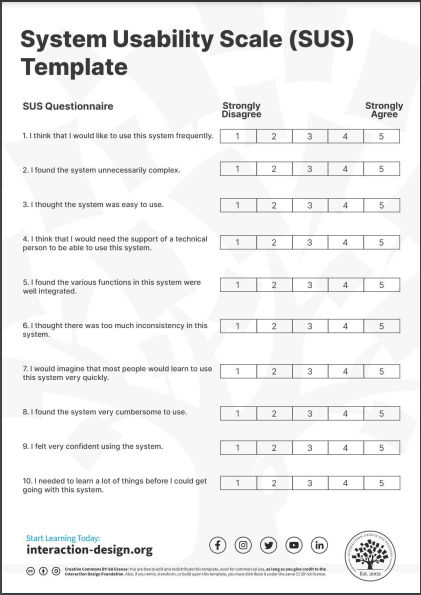
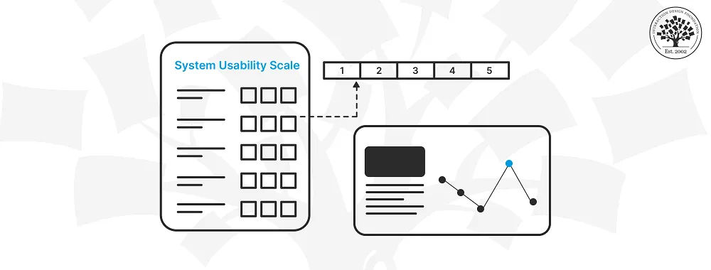
1. System Usability Scale (SUS)
The System Usability Scale (SUS) is a widely used tool for evaluating how usable software, websites and other interactive systems are. John Brooke of Digital Equipment Corporation created the SUS in 1986, and it’s become a standard method for assessing the overall user-friendliness of a product. It consists of a 10-question survey that users complete after they’ve interacted with a system, and it provides quick and unfiltered feedback.
The SUS uses a 5-point Likert scale—ranging from strongly disagree to strongly agree. The final score is something to calculate on a scale of 0 to 100, with higher scores indicating better usability. It’s important to point out that the average SUS score is 68%—roughly translating to “C” grade, with 51% being the threshold for a system not to fail.
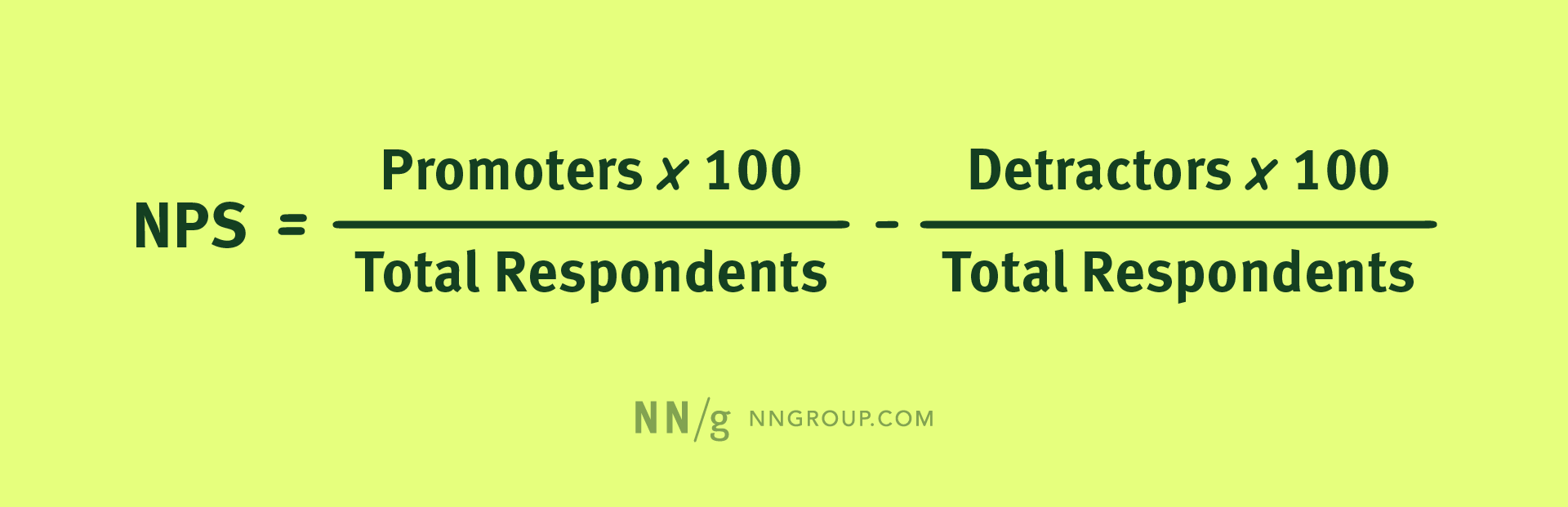
The Net Promoter Score (NPS) is a customer loyalty metric—one that Fred Reicheld at Bain & Company introduced in 2003. It asks users a simple question: "On a scale of 1-10, how likely are you to recommend this product to a friend?" Based on their responses, users are categorizable as Promoters (9-10), Passives (7-8) or Detractors (0-6).
To calculate NPS, subtract the percentage of Detractors from the percentage of Promoters. The score can range from -100 to +100. A positive score indicates that Promoters outnumber Detractors, which suggests there’s considerable customer loyalty at work.
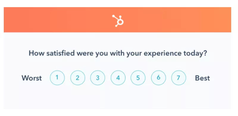
Customer Satisfaction (CSAT) is a metric that measures how satisfied customers are with a company's products or services. Researchers measure CSAT when they ask for customer feedback, and often use variations of the question: "How would you rate your overall satisfaction with the [goods/service] you received?" To calculate CSAT, use the responses of 4 (satisfied) and 5 (very satisfied) on a 5-point scale, though some Likert scales can vary.
Hubspot’s 7-point scale, for fine-tuned CSAT feedback.
Here are some other major KPIs for designers to consider:
1. Conversion Rate
One of the most telling indicators of how effective a product is is its ability to transform casual browsers into active participants—or visitors into customers. This transformation is something to quantify through the conversion rate, and it’s a percentage that reflects how many users complete a desired action, like to finalize a purchase or subscribe to a newsletter. To calculate this rate means to divide the number of successful conversions by the total visitor count.
2. Retention Rate
The retention rate is the percentage of users who continue to engage with a product—or a service—over time. To determine it, divide the number of customers retained by the total number of customers at the start of the measurement period.
CEO of Experience Dynamics, Frank Spillers explains vital points about KPIs in a business and UX context:
ShowHide
video transcript
00:00:00 --> 00:00:31
John Nielsen found that there's an average of 83% increase in key performance indicators from UX. UX improves KPIs. If it's not improving KPIs, then it's not good UX, right? And there are a lot of usability people who don't have an ROI background, who don't have business acumen, who don't get this.
00:00:31 --> 00:01:02
They're busy trying to make the user feel good. That's important. But you also need to connect to key performance indication. Like, you know, write to improving your business metrics. In terms of e-commerce, you can expect to spend 10% and that 83% conversion conversion rates are normally 2%, and that's normal to have a 2% conversion rate. So we're seeing up to 15, 18, 22% and then the jumps up to 80% and 90%,
00:01:02 --> 00:01:33
which which are just, you know, gangbusters returns intention to return. So if a user says I want to come back 60% from Forrester and stat market studies have found that and interesting to compare that to the you know how much would you be willing to spend while intention to return is incremental revenue on the back side right when they're coming back. So typically spending between 10 to 12% of dev budgets in order to get these ROI
00:01:33 --> 00:02:01
returns. So the deal with how much you spend and how much you get back, it's the 110 100 role spend a dollar on research to make the six upfront. That's that early on user research $10 to change it during design or spend $100 to change something in development. So once you start baking and coding, you know, all the interrelationships of JavaScript kind of this and that it's actually easier to
00:02:01 --> 00:02:21
learn about users prototype without much effort and figure out what the requirements are and validate it. Get the outside in validation before you start coding. It just makes sense. It makes financial sense. And that's why UX has become a staple in software development teams.
3. Average Order Value
For e-commerce businesses, the Average Order Value (AOV) is critical for them to understand actual customer spending, and it’s the typical amount a customer spends in each transaction over a specific time frame. To calculate AOV, divide the total revenue by the number of orders that users placed during the chosen period.
It’s helpful to keep an eye on UX design KPI examples in context and in combination with other UX metrics.
This typically applies more to startups—since established or bigger brands will likely already have a concrete grasp of what KPIs they should follow. It's critical to note that UX teams need to make sure they have their KPIs based on specific UX goals that support general corporate goals. The selection of UX KPIs should include business-centered, marketing-centered and user-centered metrics—that way, they can be in line with various corporate goals and avoid disconnects between what designers see as success and what the high management might deem success to look like and expect from a production team under them.
Set Up A Measurement Framework
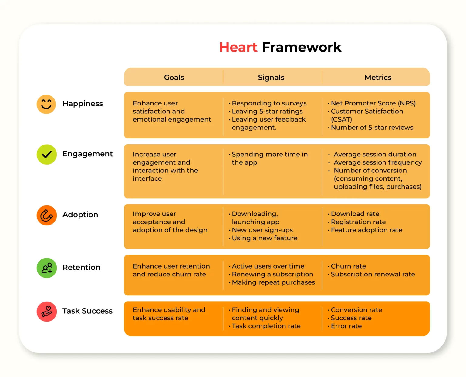
To set up a solid measurement framework, start by identifying relevant KPIs. Google's HEART framework is a helpful tool for this. It covers Happiness, Engagement, Adoption, Retention and Task success. These metrics are applicable at both product and feature levels.
Next, it’s important to align the chosen metrics with business goals to make sure they really do support key objectives. So, set clear benchmarks and goals for each KPI to track progress effectively, and use tools such as heatmaps and session recordings—important ways to bring qualitative and quantitative data into the picture. To implement UX KPIs effectively, it’s essential to combine quantitative and qualitative data—and so reveal both the “what” and the “why” behind user behaviors.
Ah, well – it's a lovely day here in Tiree. I'm looking out the window again. But how do we know it's a lovely day? Well, I could – I won't turn the camera around to show you, because I'll probably never get it pointing back again. But I can tell you the Sun's shining. It's a blue sky. I could go and measure the temperature. It's probably not that warm, because it's not early in the year. But there's a number of metrics or measures I could use. Or perhaps I should go out and talk to people and see if there's people sitting out and saying how lovely it is
00:00:32 --> 00:01:01
or if they're all huddled inside. Now, for me, this sunny day seems like a good day. But last week, it was the Tiree Wave Classic. And there were people windsurfing. The best day for them was not a sunny day. It was actually quite a dull day, quite a cold day. But it was the day with the best wind. They didn't care about the Sun; they cared about the wind. So, if I'd asked them, I might have gotten a very different answer than if I'd asked a different visitor to the island
00:01:01 --> 00:01:31
or if you'd asked me about it. And it can be almost a conflict between people within HCI. It's between those who are more *quantitative*. So, when I was talking about the sunny day, I could go and measure the temperature. I could measure the wind speed if I was a surfer – a whole lot of *numbers* about it – as opposed to those who want to take a more *qualitative* approach. So, instead of measuring the temperature, those are the people who'd want to talk to people to find out more about what *it means* to be a good day.
00:01:31 --> 00:02:02
And we could do the same for an interface. I can look at a phone and say, "Okay, how long did it take me to make a phone call?" Or I could ask somebody whether they're happy with it: What does the phone make them feel about? – different kinds of questions to ask. Also, you might ask those questions – and you can ask this in both a qualitative and quantitative way – in a sealed setting. You might take somebody into a room, give them perhaps a new interface to play with. You might – so, take the computer, give them a set of tasks to do and see how long they take to do it. Or what you might do is go out and watch
00:02:02 --> 00:02:30
people in their real lives using some piece of – it might be existing software; it might be new software, or just actually observing how they do things. There's a bit of overlap here – I should have mentioned at the beginning – between *evaluation techniques* and *empirical studies*. And you might do empirical studies very, very early on. And they share a lot of features with evaluation. They're much more likely to be wild studies. And there are advantages to each. In a laboratory situation, when you've brought people in,
00:02:30 --> 00:03:00
you can control what they're doing, you can guide them in particular ways. However, that tends to make it both more – shall we say – *robust* that you know what's going on but less about the real situation. In the real world, it's what people often call "ecologically valid" – it's about what they *really* are up to. But it is much less controlled, harder to measure – all sorts of things. Very often – I mean, it's rare or it's rarer to find more quantitative in-the-wild studies, but you can find both.
00:03:00 --> 00:03:34
You can both go out and perhaps do a measure of people outside. You might – you know – well, go out on a sunny day and see how many people are smiling. Count the number of smiling people each day and use that as your measure – a very quantitative measure that's in the wild. More often, you might in the wild just go and ask people. It's a more qualitative thing. Similarly, in the lab, you might do a quantitative thing – some sort of measurement – or you might ask something more qualitative – more open-ended. Particularly quantitative and qualitative methods,
00:03:34 --> 00:04:01
which are often seen as very, very different, and people will tend to focus on one *or* the other. *Personally*, I find that they fit together. *Quantitative* methods tend to tell me whether something happens and how common it is to happen, whether it's something I actually expect to see in practice commonly. *Qualitative* methods – the ones which are more about asking people open-ended questions – either to both tell me *new* things that I didn't think about before,
00:04:01 --> 00:04:32
but also give me the *why* answers if I'm trying to understand *why* it is I'm seeing a phenomenon. So, the quantitative things – the measurements – say, "Yeah, there's something happening. People are finding this feature difficult." The qualitative thing helps me understand what it is about it that's difficult and helps me to solve it. So, I find they give you *complementary things* – they work together. The other thing you have to think about when choosing methods is about *what's appropriate for the particular situation*. And these things don't always work.
00:04:32 --> 00:05:00
Sometimes, you can't do an in-the-wild experiment. If it's about, for instance, systems for people in outer space, you're going to have to do it in a laboratory. You're not going to go up there and experiment while people are flying around the planet. So, sometimes you can't do one thing or the other. It doesn't make sense. Similarly, with users – if you're designing something for chief executives of Fortune 100 companies, you're not going to get 20 of them in a room and do a user study with them.
00:05:00 --> 00:05:07
That's not practical. So, you have to understand what's practical, what's reasonable and choose your methods accordingly.
What Are Best Practices to Improve UX KPIs?
Designers can boost their essential KPIs in many ways, and here are some important ones:
Conduct thorough user research to understand their target audience’s needs.
UX Strategist and Consultant, William Hudson explains important points about UX research:
ShowHide
video transcript
00:00:00 --> 00:00:30
User research is a crucial part of the design process. It helps to bridge the gap between what we think users need and what users actually need. User research is a systematic process of gathering and analyzing information about the target audience or users of a product, service or system. Researchers use a variety of methods to understand users, including surveys, interviews, observational studies, usability testing, contextual inquiry, card sorting and tree testing, eye tracking
00:00:30 --> 00:01:02
studies, A-B testing, ethnographic research and diary studies. By doing user research from the start, we get a much better product, a product that is useful and sells better. In the product development cycle, at each stage, you’ll different answers from user research. Let's go through the main points. What should we build? Before you even begin to design you need to validate your product idea. Will my users need this? Will they want to use it? If not this, what else should we build?
00:01:02 --> 00:01:31
To answer these basic questions, you need to understand your users everyday lives, their motivations, habits, and environment. That way your design a product relevant to them. The best methods for this stage are qualitative interviews and observations. Your visit users at their homes at work, wherever you plan for them to use your product. Sometimes this stage reveals opportunities no one in the design team would ever have imagined. How should we build this further in the design process?
00:01:31 --> 00:02:00
You will test the usability of your design. Is it easy to use and what can you do to improve it? Is it intuitive or do people struggle to achieve basic tasks? At this stage you'll get to observe people using your product, even if it is still a crude prototype. Start doing this early so your users don't get distracted by the esthetics. Focus on functionality and usability. Did we succeed? Finally, after the product is released, you can evaluate the impact of the design.
00:02:00 --> 00:02:15
How much does it improve the efficiency of your users work? How well does the product sell? Do people like to use it? As you can see, user research is something that design teams must do all the time to create useful, usable and delightful products.
Provide clear and concise instructions for complex tasks.
Design with a mobile-first approach for responsiveness.
Now, just to start off by saying responsive is a default. Responsive is not an option – *do it*. And the reason is because that's where the world is at. Everyone expects things to be mobile-optimized, and responsive just means that if I switch from my laptop to my tablet to my phone, the site's going to fit to that resolution; it's going to kind of follow me.
00:00:30 --> 00:00:52
And we know that users do that; that's the default. So, by doing responsive design, you're supporting device switching, and that's why it's important. You're also potentially making things a little bit more accessible and SEO-friendly, which is a factor for Google's algorithm that prioritizes responsive sites.
Use progressive disclosure to lessen cognitive load.
William Hudson explains vital aspects of progressive disclosure:
ShowHide
video transcript
00:00:00 --> 00:00:31
Imagine walking into a room filled with countless doors, each leading to a different destination. Where do you begin? This is how users feel when faced with a new and confusing interface. To combat this, designers use progressive disclosure, a user centered design method that carefully reveals information and features to users as they are needed. The purpose here is to avoid overwhelming the user with a cluttered interface. We are talking about this beast. How do we fix that, right?
00:00:31 --> 00:01:01
Well, there is a very simple way of fixing it. First of all, for tables, you usually would have not that many options In customize and sorting, you would have, you know, probably some hopefully not hover actions, but a button saying actions, which would be a dropdown opening things on tap, on click, have us you know, the checkboxes on the left allowing you to select things. We have 49 filters. We have 49 dropdowns with approximately 300 options living within those dropdowns.
00:01:01 --> 00:01:33
Now imagine that you're working on Finviz. That means that you are, you know, you have your screen application, so you might be managing a portfolio with 60 different assets, right, of sixty different customers. You also want to kind of understand trends of what you know, what is going on. You also want to navigate the table to understand what is going on there. Right? So maybe there are some companies that are performing really badly. Some companies are performing better. You kind of monitoring it. And very often you would be looking at this interface for 6 to 8 hours a day.
00:01:33 --> 00:02:00
Right? Speed is important here. Dropdowns are the worst thing you can give for people who want to be fast. Dropdowns are the slowest mode of interaction. And you know what is the fastest? Buttons! There is nothing wrong with just 200 buttons. Give people 200 buttons. Just organize them better. And they'll be happy because this is going to be much faster. How can we do that? Well, if we think about the filtering experience,
00:02:00 --> 00:02:31
well, surely enough, we have 49 of those. So we better organize them in some way, like this. So we have this different groups of filters, right? And then we basically need a search engine or like a little search autocomplete for filters. We do it in two steps. The first step is we select what filters we want to have. Right? So we go for the sections. We just have a couple of checkboxes to mark the filters that we need. And in the second step for each of those filters, we define what the properties should have.
00:02:31 --> 00:03:00
You know what? What properties every filter should have. I'll show you an example in a moment. And there is nothing wrong, again, just show buttons. A lot of buttons. Just show buttons. There is nothing wrong with showing buttons. It's fine. In its simplest form, it could look like this. You search your filters. It's kind of a filtering for filters, where you go for all the different groups. Then you select what filters you actually want to have. And then for each of them, you actually define the properties that you want to define.
00:03:00 --> 00:03:32
Now, in example, this is what it looks like on Financial Times, which is a great example of equity screen. You have exactly the same amount of filter actually, but it looks differently. We have a core audience. We have the split menu. We saw this already, right? You select what attributes you care about first. You have buttons so you can actually tap on those quickly, relatively quickly. And if we open equity attributes right, not only do we get this button kind of giving you this overview of what is the most common kind of area where you should be expecting those results, you also can add
00:03:32 --> 00:04:00
or change criteria, and this is how it works. Balance sheet. Okay, I need to add cash per share. Boom. And I need to add price, boom. And I need to add 52% receivable turnover. Right. And so I kind of always show what you need and you never show what you don't need. Which I think is actually pretty cool and pretty useful as well. So that's actually very, very helpful. And I guess this is actually what it needs to be, right?
00:04:00 --> 00:04:22
You show what you need when you know that people need it. And most importantly, you do not show things that are likely to be irrelevant to people. We just say, “here is everything we've got, all the navigation, you've got, you figure it out”. Or “here are all the filters you've got, you figure it out”. No. We need to show things that matter to people when they matter and nothing else.
Watch this video on UI patterns to understand more about how useful they are:
ShowHide
video transcript
00:00:00 --> 00:00:33
User Interface Design Patterns are recurring components which designers use to solve common problems in interfaces. like, for example, when we think about those regular things that often are repeating themselves to kind of appear in, you know, in complex environments We need to show things that matter to people when they matter and nothing else. Right. it's just really sad what we see. Like, for example, if you look at Sears, right? Sears is just one of the many e-commerce sites, you know, nothing groundbreaking here. So you click on one of the filters and then the entire interface freezes
00:00:33 --> 00:01:00
and then there is a refresh and you're being scrolled up. And I always ask myself, is this really the best we can do? Is really the best kind of interface for filtering that we can come up with, or can we do it a bit better? Because we can do it a bit better. So this is a great example where you have galaxies and then galaxies, you have all this filters which are in rows. Sometimes they take three rows, sometimes four or sometimes five rows. That's okay. Show people filters, show people buttons if they important show them.
00:01:00 --> 00:01:32
Right. But what's important here, what I really like is we do not automatically refresh. Instead, we go ahead and say, "Hey, choose asmany filters as you like", right? And then whenever you click on show results, it's only then when you actually get an update coming up in the back. Which I think is perfectly fine. You don't need to auto update all the time. And that's especially critical when you're actually talking about the mobile view. The filter. Sure, why not? Slide in, slide out, although I probably prefer accordions instead.
00:01:32 --> 00:02:01
And you just click on show products and it's only then when you return back to the other selection of filters and only when you click okay, show all products, then you actually get to load all the products, right? Designing good UI patterns is important because it leads to a better user experience, reduces usability issues, and ultimately contributes to the success of a product or application. It's a critical aspect of user centered design and product development.
Incorporate visual cues and micro-interactions for feedback.
Work effective error handling and recovery into the UI.
Leverage A/B testing to refine design choices.
Create clear, intuitive navigation structures.
Include a clear and logical information architecture.
Watch William Hudson explain important points about information architecture:
ShowHide
video transcript
00:00:00 --> 00:00:33
In a world overflowing with information, how do we find exactly what we're looking for, both online and offline? Enter Information Architecture, or IA: the discipline that helps us navigate through vast data landscapes. Information architecture is the framework of organization and labeling we use to structure and categorize content and data, primarily within digital products to make it easy to understand and navigate. Is like organizing a massive global library so you can find that one book without getting lost.
00:00:33 --> 00:01:03
Whether it's grouping Jurassic Period fossils in a museum, or arranging your favorite snacks in the supermarket, IA can guide us through physical and digital spaces alike. At its core, IA focuses on arranging the part of something to be understandable as a whole. In the context of UX design, IA is akin to the blueprint of a building: it lays out the foundation and structure upon which user experiences are built. It operates on the understanding that we perceive information as places
00:01:03 --> 00:01:30
made of language: labels, menus, visuals that can be organized for better navigation. Good IA is shaped by the content available, the context in which it's sought and the users seeking it, forming a complex information ecology. For UX designers, this means starting with understanding users needs, which leads to the creation of intuitive site maps, navigation and user flows that make digital experiences seamless.
00:01:30 --> 00:02:00
After a designer identifies user needs and content requirements, they will create a hierarchy that aligns with user behavior and psychology. This involves defining how information is grouped, how it flows from one section to another, and how users access it through navigation and search functionalities. Effective IA results in a coherent, intuitive user interface that allows users to find information quickly, accomplishes tasks efficiently, and understand the location within the digital space at any given time.
00:02:00 --> 00:02:13
Effective information architecture isn't just an initial step. It's the foundation upon which effective user experience is built, ensuring that every digital interaction is meaningful and easy to navigate.
Make sure of an accessible design for all users—including those with disabilities.
Simplify forms and minimize unnecessary fields.
Provide search functionality with relevant results.
Regularly analyze user behavior data and make iterative improvements.
Create designs that evoke positive emotions and align with users' values and expectations.
Author and Human-Computer Interaction Expert, Professor Alan Dix explains vital aspects of emotions and usability:
ShowHide
video transcript
00:00:00 --> 00:00:31
So feelings clearly matter in a user interface. That's why we worry about user experience. But depending on the kind of product, the kind of service, the kind of system you're creating, then feelings matter in different ways. So I'm going to distinguish two major ways this can be. So first of all, where emotion is the primary goal of what you're designing.
00:00:31 --> 00:01:00
So eliciting that emotion is the very purpose of the product. So think about art. Think about games, entertainment applications in general. What you're trying to do is create a *sense of emotion* in the person. That's the primary goal. Other things are secondary. Now, in order to satisfy that primary goal, you often need to get *good functionality* and *good usability*.
00:01:00 --> 00:01:31
So when you’re wanting to choose what movie to watch, you want to be able to find, perhaps, the box set that you know is there and the right episode of it as efficiently as possible. So you still have these fundamental usability requirements, even if the primary goal is emotion. But it's often the things that serve that. So think about again, if you're going to share a picture you just taken a picture of, whether it's a meal you're eating
00:01:31 --> 00:02:03
or your cats or whatever else you're wanting to share, the sharing is about the emotional impact that you're wanting to pass on to other people, to your friends, and to your family. However, when you take that photograph, you want a very efficient, slick and easy process to actually get that shared on your social media channels. So, again, although emotion is the primary purpose of what you're doing, you still need the usability and functionality in order to support that process.
00:02:03 --> 00:02:30
Alternatively, emotion might be a secondary goal. So the primary purpose might be something that's more, shall we say, business like. It might be about your work. So like I'm doing now, producing this video, it might be about office work, might be using a spreadsheet, using a database, might be about getting your money from the ATM and get the money out of the hole in the wall.
00:02:30 --> 00:03:00
It might be about paying using your card in a restaurant. But the thing you're trying to do at that point, the primary goal is to get the thing done efficiently and effectively. However, typically, emotions help. They help in the sense that if you're doing, say, a repetitive job, then being alert is important. You know, this is true whether you're a policeman on the beat and watching out, or a soldier in a battlefield situation.
00:03:00 --> 00:03:31
Whether you're driving your car and needing to sort of have a little bit of peripheral awareness. So emotion helps you do that. It helps you keep alert so that you're ready for things. So if you think about online shopping. Some of online shopping is about getting the job done and getting the thing purchased. But there's also an aspect of shopping, this is particularly true of offline shopping. Of when you go into a clothes shop where
00:03:31 --> 00:04:00
the actual process of doing the shopping is part of the joy of the shopping. It's harder to do that online, incidentally. But there are some brands where that is the thing you’re trying to do. You're trying to create a sense of identity in the brand, a sense of joy in exploring it. So within the same kind of application area, online shopping, depending on the brand and depending on the person's need at that moment,
00:04:00 --> 00:04:03
you might want to emphasize one or the other.
Make sure there’s a cohesive visual identity and tone of voice across all touchpoints.
Be upfront about product features, limitations and any potential issues.
Tailor the user experience with individual personalized preferences and needs whenever possible.
Add little, engaging elements—micro-interactions that surprise and please users.
Why Are KPIs Important to Feature in UX Portfolios?
It's crucial for designers to demonstrate their ability to work with KPIs in their UX portfolios for several reasons—namely since designers can:
Demonstrate business acumen: To show how proficient they are in handling KPIs indicates that a designer understands how important it is to align design decisions with business goals and objectives.
Prove a data-driven approach: It showcases how well the designer can make informed decisions—as in, ones based on measurable metrics and hard analytics—rather than just aesthetics or personal preferences.
William Hudson explains key points about analytics:
ShowHide
video transcript
00:00:00 --> 00:00:30
*When and Why to use Analytics* Primarily, we're going to need to be using analytics on existing solutions. So, if you're talking about *green field* – which is a brand-new solution, hasn't been built and delivered yet – versus *brown field* – which is something that's already running but perhaps we want to improve it – then we're decidedly on the brown field side.
00:00:30 --> 00:01:00
So, we're looking at existing solutions because it's only existing solutions that can provide us with the analytics. If you haven't got an existing solution, you're going to have to use another technique. And there are obviously many other techniques, but they're not going to provide you with much in the way of *quantitative data*. We do have early-research methods, which we'll be talking about very briefly as an alternative, but predominantly analytics for existing deployed solutions.
00:01:00 --> 00:01:31
Having said that, then if you're looking at a rework of an existing site or app, then looking at current analytics can tell you a lot about what you might like to address; what questions you might like to raise with your team members, stakeholders, users. So, those are important considerations. A good starting point in organizations or teams with low UX maturity is analytics because analytics are easier to sell – to be honest – than qualitative methods.
00:01:31 --> 00:02:01
If you're new to an organization, if they're only just getting into user experience, then trying to persuade colleagues that they should be making important decisions on the basis of six to eight qualitative sessions, which is typically what we do in the usability lab, then you should find by comparison web analytics a much easier thing to persuade people with. And the other issue particularly relevant to qualitative methods
00:02:01 --> 00:02:33
is that quantitative methods tend to be very, very much cheaper – certainly on the scale of data, you are often having to talk in terms of hundreds of dollars or pounds per participant in a *qualitative* study, for various expenses; whereas a hundred dollars or pounds will get you potentially hundreds or thousands of users. And, in fact, if you're talking about platforms like Google Analytics which are free, there is no cost other than the cost of understanding and using
00:02:33 --> 00:03:01
the statistics that you get out; so, obviously it is very attractive from a cost perspective. Some of the things that we'll be needing to talk about as alternatives to analytics or indeed *in addition* to analytics: Analytics can often *highlight* areas that we might need to investigate, and we would then have to go and consider what alternatives we might use to get to the bottom of that particular problem.
00:03:01 --> 00:03:32
Obviously, *usability testing* because you'll need to establish *why* users are doing what they're doing. You can't know from analytics what users' motivations are. All you can know is that they went to *this* page and then they went to *that* page. So, the way to find out if it isn't obvious when you look at the pages – like there's something wrong or broken or the text makes no sense – is to bring users in and watch them actually doing it, or even use remote sessions – watching users doing the thing that has
00:03:32 --> 00:04:00
come up as a big surprise in your analytics data. A/B testing is another relatively low-cost approach. It's – again – a *quantitative* one, so we're talking about numbers here. And A/B testing, sometimes called *multivariate testing*, is also performed using Google Tools often, but many, many other tools are available as well; and you show users different designs;
00:04:00 --> 00:04:33
and you get statistics on how people behaved and how many converted, for example. And you can then decide "Well, yes, putting that text there with this picture over here is better than the other way around." People do get carried away with this, though; you can do this ad nauseam, to the point where you're starting to change the background color by minute shades to work out which gets you the best result. These kinds of results tend to be fairly temporary. You get a glitch and then things just settle down afterwards.
00:04:33 --> 00:05:03
So, mostly in user experience we're interested in things which actually really change the user experience rather than getting you temporary blips in the analytics results. And then, finally, *contextual inquiry* and *early-design testing*: Contextual inquiry is going out and doing research in the field – so, with real users doing real things to try to find out how they operate in this particular problem domain; what's important to them; what frustrations they have;
00:05:03 --> 00:05:30
how they expect a solution to be able to help them. And early-design testing – mostly in the web field these days but can also be done with software and mobile apps; approaches like *tree testing* which simulate a menu hierarchy. And you don't actually have to do anything other than put your menu hierarchy into a spreadsheet and upload it – it's as simple as that; and then give users tasks and see how they get on.
00:05:30 --> 00:06:00
And you can get some very interesting and useful results from tree testing. And another early-design testing approach is *first-click testing*. So, you ask users to do something and you show them a screenshot – it doesn't have to be of an existing site; it can be just a design that you're considering – and find out where they click, and is where they click helpful to them? Or to you? So, these are examples of early-design testing – things that you can do *before* you start building
00:06:00 --> 00:06:34
a product to work out what the product should look like or what the general shape or terminology or concepts in the product should be. And both of these can be used to find out whether you're on the right track. I have actually tested solutions for customers where users had no idea what the proposition was: "What does this site do?"; "What are they actually trying to sell me?" or "What is the purpose of it?" – and it's a bit late to be finding that out in usability testing towards the end of a project, I have to say. And that was indeed exactly what happened in this particular example
00:06:34 --> 00:07:08
I'm thinking of. So, doing some of these things really early on is very important and, of course, is totally the opposite of trying to use web analytics, which can only be done when you finish. So, do bear in mind that you do need some of these approaches to be sure that you're heading in the right direction *long before* you start building web pages or mobile app screens. Understand your organization's *goals* for the interactive solution that you're building.
00:07:08 --> 00:07:31
Make sure that you know what they're trying to get out of it. Speak to stakeholders – stakeholders are people typically within your organization who have a vested interest in your projects. So, find out what it's supposed to be doing; find out why they're rebuilding this site or why this mobile app is being substantially rewritten. You need to know that; so, don't just jump in and start looking for interesting numbers.
00:07:31 --> 00:08:02
It's not necessarily going to be that useful. Do know the solutions; become familiar with them. Find out how easy it is to use them for the kinds of things which your stakeholders or others have told you are important. Understand how important journeys through the app or website work. And get familiar with the URLs – that's, I'm afraid, something that you're going to be seeing a lot of in analytics reports – the references for the individual pages or screens,
00:08:02 --> 00:08:33
and so that you'll understand, when you actually start looking at reports of user journeys, what that actually means – "What do all these URLs mean in my actual product?" So, you're going to have to do some homework on that front. You're also going to have to know the users – you need to speak to the users; find out what they think is good and bad about your solutions; find out how they think about this problem domain and how it differs from others and what kind of solutions they know work and what kind of problems they have with typical solutions.
00:08:33 --> 00:08:59
Also ask stakeholders and colleagues about known issues and aspirations for current solutions. So, you know, if you're in the process of rebuilding a site or an app, *why* – is it just slow-ish? Is it just the wrong technology? Maybe. Or are there things which were causing real problems in the previous or current version and that you're hoping to address those in the rebuild.
Highlight problem-solving skills: To address KPIs in design work shows how ably a designer can spot and solve complex problems that impact business performance.
Show value creation: When designers link design decisions to KPIs, they can illustrate how their work contributes to improving key metrics and overall business success.
Differentiate themselves from other candidates: Many designers focus just on visual aspects; so, if a designer showcases KPI-driven work, it can really set them apart in a competitive job market.
Design Director at Societe Generale CIB, Morgane Peng discusses essential aspects of designer portfolios:
ShowHide
video transcript
00:00:00 --> 00:00:29
A portfolio is a collection of work and projects curated by you to showcase your skills, experiences, and achievements. Think of it like a friend: it's your best advocate. It tells your story, it introduces you without you being around, and, if you're looking for a job, it's a key tool to get noticed and hired.
How Can Designers Optimize Their Portfolios with KPIs?
Here are some important items that designers can effectively showcase their KPI-handling skills with in their UX portfolios:
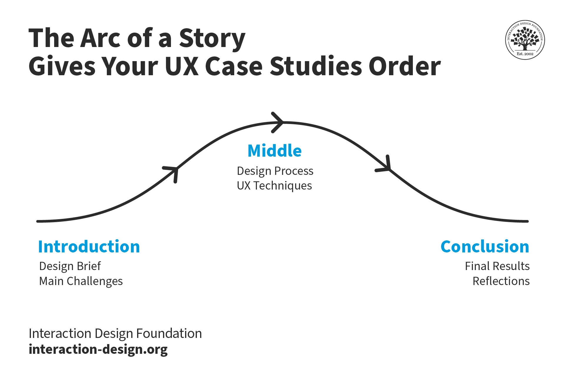
Case studies: Present detailed case studies that outline the project's goals, the KPIs targeted, the design process and the resulting impact on those KPIs—and it’s best to angle these in the form of a story arc.
Designers can include KPIs in their portfolios to great effect, especially when these tie in with a story arc approach.
Collaboration highlights: A designer would do well to describe how they worked with other teams—like marketing and development—to align on KPIs and achieve shared goals.
UX Designer and Author of Build Better Products and UX for Lean Startups, Laura Klein explains essential points about cross-functional collaboration:
ShowHide
video transcript
00:00:00 --> 00:00:30
Cross-functional teams, unlike silos, have all the people necessary to build a specific thing together. Let's look at an example. Imagine you're on a team that is supposed to build the onboarding flow for a new app that helps connect job applicants with jobs. You can't build the whole thing with just designers. Or with just engineers, for that matter. I mean, you probably could do it with just engineers, but it's a terrible idea.
00:00:30 --> 00:01:00
A cross-functional team for this onboarding work might include a few engineers, perhaps some for the front end and some for the back end. Might include a designer, a researcher, a product owner or manager, maybe a content writer or a marketing person. In an ideal world, all of these folks would only work on this particular team. In the real world, where we actually live, sometimes folks are on a couple of different teams and some specialists may be brought in to consult. For example, if the team needed help from the legal department to explain some of the ramifications of a specific decision,
00:01:00 --> 00:01:32
a cross-functional team would have a dedicated legal expert they could go to. But that legal expert might also work with lots of other teams. In agile environments, the cross-functional team generally sits together or if remote, has some sort of shared workspace. They all go to the required team meetings. They understand the goal of the team and the users. They're experts, or they soon become experts, on that onboarding flow. Contrast this to how it might be done in a siloed environment. In that case, you might have different people assigned to the team depending on need, which can seem really flexible.
00:01:32 --> 00:02:00
Until you realize that you end up with five different designers working on the project all at different times and they all have to be brought up to speed and they don't really understand why the other designers made the decisions that they did. Same with the engineers. And do not get me started on legal. Silo teams tend to rely more on documentation that gets handed between groups. And this can lead to a waterfall project where project managers or product managers work on something for a while to create requirements, which they then hand off to designers who work on designs for a while
00:02:00 --> 00:02:29
and then they pass the deliverables on to engineering, who immediately insists that none of this will work and demands to know why they weren't brought in earlier for consultation. You get it. By working in cross-functional teams instead, the people embedded on the project get comfortable with each other. They know how the team works and can make improvements to it. They come to deeply understand their particular users and their metrics. They actually bring engineering and even design and research into the decision making process early to avoid the scenario I described above.
Lessons learned: It’s helpful to think from a storytelling angle again and discuss any challenges that came up while working with KPIs—and how the designer overcame them; something that can showcase adaptability and continuous learning.
Contextual explanation: Give context for the KPIs chosen—and explain why they’re relevant to the project plus how they aligned with the overall business objectives.
Morgane Peng explains additional valuable points about how to craft a strong portfolio:
ShowHide
video transcript
00:00:00 --> 00:00:36
Most people are really excited about this stage of making their portfolio and indeed it's time to work on the visual identity of your portfolio. I'll introduce here the main visual elements that you need to define and although those elements need to reflect you and your identity, I will also cover the good practices of making your portfolio easy to navigate for your visitors. Fonts and typographic scale are usually made of the following: a heading for your page titles, subheadings for your section titles,
00:00:36 --> 00:01:00
lead text for bigger text sizes like in hero areas, your intros or quotes, body text to use for most of your content, and caption text to use as captions for your images or embedded elements. I'd like to mention that it's usually okay to choose one font that is different for your headings compared
00:01:00 --> 00:01:31
to your body text, but I would recommend using a standard font for your body text. These fonts are standard for a reason: they are easy to read and you actually don't want to strain the eyes of your reader, especially if they've been looking at portfolios all day long. Colors I use for the following elements: text color, usually black or dark gray, don't go too light as it may make your text difficult to read and not accessible. The reverse applies if you want a portfolio in a dark
00:01:31 --> 00:02:00
theme. A dominant color for your main call to actions like buttons and links, a supporting color for your secondary actions, usually less vibrant and less saturated than the dominant color. An accent color, if you're including illustrations or pictures, you can be intentional and choose an accent color and use touches of it for your portfolio. Some background colors, usually a combination of white and grays, to organize your content sections. Again, if you're doing a dark theme, they will
00:02:00 --> 00:02:30
be a combination of black and dark grays. And unless you're an expert in visual design, don't go crazy with colors. Use online palette editors to help you choose and calibrate your colors. A grid system. If you're designing your portfolio for the web, you will also need to define your grid system, similar to when you do it for your digital projects. Things to consider are, for example, what's your maximum width? Do you want to center your content on one main column or use
00:02:30 --> 00:03:02
layouts and organize content into two or three columns? You can also play with grid offsets to structure your content as long as it's consistent across your portfolio. Responsiveness, again, here for the web, you need to care about how your content is displayed on various screen sizes, usually desktop, tablet, and mobile. You can rely here on the web builder tools that you choose to use and their behaviors, or if you have code knowledge, you can do it with media queries and flex boxes.
00:03:02 --> 00:03:34
Accessibility. Your website must be accessible. If your case studies showcase your work on accessibility but your portfolio is not, well, it may constitute a red flag for hiring managers. And finally, a logo. A well-crafted logo can be a big plus for your portfolio's visual identity. However, it is not mandatory at all. If you don't have a strong background in visual design, I would even recommend not to have any logo at all as it can be badly designed and play against you.
00:03:34 --> 00:03:57
If you are a UX designer with no visual background at all or maybe a UX researcher with no visual background, then I would actually recommend you to use templates online. Choose one that you can customize, again using palette editors to make sure that your colors are consistent. But you can play around with that and also, as usual, get feedback on your work and iterate from there.
What are Potential Pitfalls of Relying on KPIs Too Much?
Regarding pros and cons, there are so many benefits—and vital ones to consider, especially—that it’s easy to overlook some potential downsides that can come if designers, design teams and their brands over-rely on them. Here are some important concerns:
Oversimplification: Complex user experiences can't always boil down into simple metrics—to try to do so can result in missed nuanced insights.
Quantitative bias: To put too much emphasis on quantitative KPIs may overlook valuable qualitative feedback and insights—so get qualitative data, too.
One-size-fits-all approach: Standardized KPIs mightn’t be suitable for all products, services or user segments. For example, there’s the users’ culture to consider.
Author and Human-Computer Interaction Expert, Professor Alan Dix explains important points about how to design for culture:
ShowHide
video transcript
00:00:00 --> 00:00:32
As you're designing, it's so easy just to design for the people that you know and for the culture that you know. However, cultures differ. Now, that's true of many aspects of the interface; no[t] least, though, the visual layout of an interface and the the visual elements. Some aspects are quite easy just to realize like language, others much, much more subtle.
00:00:32 --> 00:01:04
You might have come across, there's two... well, actually there's three terms because some of these are almost the same thing, but two terms are particularly distinguished. One is localization and globalization. And you hear them used almost interchangeably and probably also with slight differences because different authors and people will use them slightly differently. So one thing is localization or internationalization. Although the latter probably only used in that sense. So localization is about taking an interface and making it appropriate
00:01:04 --> 00:01:31
for a particular place. So you might change the interface style slightly. You certainly might change the language for it; whereas global – being globalized – is about saying, "Can I make something that works for everybody everywhere?" The latter sounds almost bound to fail and often does. But obviously, if you're trying to create something that's used across the whole global market, you have to try and do that. And typically you're doing a bit of each in each space.
00:01:31 --> 00:02:02
You're both trying to design as many elements as possible so that they are globally relevant. They mean the same everywhere, or at least are understood everywhere. And some elements where you do localization, you will try and change them to make them more specific for the place. There's usually elements of both. But remembering that distinction, you need to think about both of those. The most obvious thing to think about here is just changing language. I mean, that's a fairly obvious thing and there's lots of tools to make that easy.
00:02:02 --> 00:02:31
So if you have... whether it's menu names or labels, you might find this at the design stage or in the implementation technique, there's ways of creating effectively look-up tables that says this menu item instead of being just a name in the implementation, effectively has an idea or a way of representing it. And that can be looked up so that your menus change, your text changes and everything. Now that sounds like, "Yay, that's it!"
00:02:31 --> 00:03:00
So what it is, is that it's not the end of the story, even for text. That's not the end of the story. Visit Finland sometime. If you've never visited Finland, it's a wonderful place to go. The signs are typically in Finnish and in Swedish. Both languages are used. I think almost equal amounts of people using both languages, their first language, and most will know both. But because of this, if you look at those lines, they're in two languages.
00:03:00 --> 00:03:31
The Finnish line is usually about twice as large as the Swedish piece of text. Because Finnish uses a lot of double letters to represent quite subtle differences in sound. Vowels get lengthened by doubling them. Consonants get separated. So I'll probably pronounce this wrong. But R-I-T-T-A, is not "Rita" which would be R-I-T-A . But "Reet-ta". Actually, I overemphasized that, but "Reetta". There's a bit of a stop.
00:03:31 --> 00:04:02
And I said I won't be doing it right. Talk to a Finnish person, they will help put you right on this. But because of this, the text is twice as long. But of course, suddenly the text isn't going to fit in. So it's going to overlap with icons. It's going to scroll when it shouldn't scroll. So even something like the size of the field becomes something that can change. And then, of course, there's things like left-to-right order. Finnish and Swedish both are left-to-right languages. But if you were going to have, switch something say to an Arabic script from a European script,
00:04:02 --> 00:04:31
then you would end up with things going the other way round. So it's more than just changing the names. You have to think much more deeply than that. But again, it's more than the language. There are all sorts of cultural assumptions that we build into things. The majority of interfaces are built... actually the majority are built not even in just one part of the world, but in one country, you know the dominance... I'm not sure what percentage,
00:04:31 --> 00:05:02
but a vast proportion will be built, not just in the USA, but in the West Coast of the USA. Certainly there is a European/US/American centeredness to the way in which things are designed. It's so easy to design things caught in those cultures without realizing that there are other ways of seeing the world. That changes the assumptions, the sort of values that are built into an interaction.
00:05:02 --> 00:05:35
The meanings of symbols, so ticks and crosses, mostly will get understood and I do continue to use them. However, certainly in the UK, but even not universally across Europe. But in the UK, a tick is a positive symbol, means "this is good". A cross is a "blah, that's bad". However, there are lots of parts of the world where both mean the same. They're both a check. And in fact, weirdly, if I vote in the UK,
00:05:35 --> 00:06:02
I put a cross, not against the candidate I don't want but against the candidate I do want. So even in the UK a cross can mean the same as a tick. You know – and colors, I said I do redundantly code often my crosses with red and my ticks with green because red in my culture is negative; I mean, it's not negative; I like red (inaudible) – but it has that sense of being a red mark is a bad mark.
00:06:02 --> 00:06:33
There are many cultures where red is the positive color. And actually it is a positive color in other ways in Western culture. But particularly that idea of the red cross that you get on your schoolwork; this is not the same everywhere. So, you really have to have quite a subtle understanding of these things. Now, the thing is, you probably won't. And so, this is where if you are taking something into a different culture, you almost certainly will need somebody who quite richly understands that culture.
00:06:33 --> 00:06:43
So you design things so that they are possible for somebody to come in and do those adjustments because you probably may well not be in the position to be able to do that yourself.
Video copyright info
Copyright holder: Tommi Vainikainen _ Appearance time: 2:56 - 3:03 Copyright license and terms: Public domain, via Wikimedia Commons
Copyright holder: Maik Meid _ Appearance time: 2:56 - 3:03 Copyright license and terms: CC BY 2.0, via Wikimedia Commons _ Link: https://commons.wikimedia.org/wiki/File:Norge_93.jpg
Copyright holder: Paju _ Appearance time: 2:56 - 3:03 Copyright license and terms: CC BY-SA 3.0, via Wikimedia Commons _ Link: https://commons.wikimedia.org/wiki/File:Kaivokselan_kaivokset_kyltti.jpg
Copyright holder: Tiia Monto _ Appearance time: 2:56 - 3:03 Copyright license and terms: CC BY-SA 3.0, via Wikimedia Commons _ Link: https://commons.wikimedia.org/wiki/File:Turku_-_harbour_sign.jpg
Resource drain: To collect and analyze KPI data can be time-consuming and expensive—plus, it might even divert resources from actual UX improvements.
False sense of security: Good KPI numbers might invite complacency—supposedly healthy readings can mask a complex design and user landscape, and end up meaning missed opportunities for innovation and improvement.
Remember, UX KPIs function much like the vital signs of a digital solution and—by association—the brand behind it; so, use them wisely and take insights alongside each other for the best results.
Watch our Master Class, Design KPIs: From Insights to Impact with Vitaly Friedman, Senior UX Consultant, European Parliament, and Creative Lead, Smashing Magazine.
KPIs—or Key Performance Indicators—are specific, strategic goals that businesses track to measure their success over time. They provide a clear focus on what matters most to achieve long-term objectives. Metrics—on the other hand—are the data points that support KPIs. They’re the raw numbers or statistics that you can measure and analyze to understand performance. While every KPI is a metric, not every metric qualifies as a KPI. KPIs indicate whether you're on the right path, while metrics provide the detailed information needed to make adjustments.
Watch our Master Class, Design KPIs: From Insights to Impact with Vitaly Friedman, Senior UX Consultant, European Parliament, and Creative Lead, Smashing Magazine.
CEO of Experience Dynamics, Frank Spillers explains important aspects of KPIs:
ShowHide
video transcript
00:00:00 --> 00:00:34
So, how do you craft your UX strategy plan? First of all, make sure you're building the business case. This is a mistake that a lot of people make. Make sure that you're clear about what your ROI is and what it *can* be, right? What are you currently getting from your UX efforts, or *lack* of efforts? Even if you're measuring Google Analytics, what are the KPIs that are relevant to *your* user experience?
00:00:34 --> 00:01:03
And then, what *should* they be or what *can* they be? And you may need to define these as you're starting to build your practice if you're new to UX and you're just getting started. But think about what that is and make sure you define that as you go along. Don't get too excited and just start doing user testing or start doing some type of UX activity and then forget about this. You know, it's really important to remember, remember, remember. Cost-benefits analysis, as we talked about, can be helpful, but *create a template*
00:01:03 --> 00:01:31
and *a practice for costing* so that you're requiring that as part of your project plan. We start all our projects at Experience Dynamics with *business objectives*. So, we're laying that out so we understand what we're building the UX on top of. It's important to *identify your KPIs* (your key performance indicators). *Start with small measurements*; so, don't try and boil the ocean, but start with a few small metrics to measure
00:01:31 --> 00:02:02
– things like success rate in usability testing – as a way to kind of start gauging where you are. Success rate is the main metric from usability testing, so it makes sense that you would measure that and track that. And then, make sure to *share and review those metrics monthly*, at least. It's so important to keep your eye on the metrics, to socialize them and make sure that they get out to people who need to hear about them. So, to start with your UX strategy, you want to *map your current state*.
00:02:02 --> 00:02:30
So, create an *assessment* of your usability and your UX practices and methods. You know – What are you doing? What are you calling UX? And that means taking a look at your product Iifecycle, your management, your staffing attributes and, of course, your UX maturity rating, which is something that you can get from a scorecard I'll be sharing with you soon. So, UX readiness and agile experience are also important to measure in terms of usability and
00:02:30 --> 00:03:05
the UX resources that you currently leverage and the techniques, you know. Essentially you're trying to figure out how things are *done today*. So, this is a current state. How are things happening from a process map? And then, from that – and so, what's important about that is that you get the picture of where your organization "is at". This is not about forcing your organization to act in a way that I want you to act in or that – you know – some guru or some book or some video or something or some voice of Forrester or a voice of Gartner analyst group.
00:03:05 --> 00:03:36
It's not about that – it's about what works for *your* organization. So, a *UX maturity roadmap* is what you're going to end up with. It's going to have detailed guidelines for how to grow your UX competency. And it's going to have things like staffing positions or roles that are required, specific requirements for, again, *your* organization exactly, not somebody else's, and not the organization that you worked at *before* you came here. Don't try and bring that culture over to the organization you're in. It's *so* important that it's *custom-fit* to the
00:03:36 --> 00:04:03
conditions, to the vibrations, if you will, to the frequency of your organization. because every organization is different. It is shaped by the founder, the CEO, the senior managers, the shareholders, the industry – the specific industry, the niche that you're in. So, *UX organization next steps and action plan* are going to be what you create in this ideal state
00:04:03 --> 00:04:10
– so, where you're marching to, where you're going, essentially.
When should you review your KPIs?
Review your KPIs regularly so you can be sure they stay aligned with your business goals. At a minimum, conduct a quarterly review to assess performance and make any necessary adjustments. What’s more, review your KPIs whenever there's a significant change in your business—like a new strategy, market shift or product launch. Regular reviews help you spot trends, address issues early and keep your team focused on the most relevant objectives. When you stay proactive with your KPI reviews, you’ll make sure that your business really stays on track and adapts quickly to any changes.
Watch our Master Class, Design KPIs: From Insights to Impact with Vitaly Friedman, Senior UX Consultant, European Parliament, and Creative Lead, Smashing Magazine.
Frank Spillers explains important aspects of KPIs:
ShowHide
video transcript
00:00:00 --> 00:00:31
John Nielsen found that there's an average of 83% increase in key performance indicators from UX. UX improves KPIs. If it's not improving KPIs, then it's not good UX, right? And there are a lot of usability people who don't have an ROI background, who don't have business acumen, who don't get this.
00:00:31 --> 00:01:02
They're busy trying to make the user feel good. That's important. But you also need to connect to key performance indication. Like, you know, write to improving your business metrics. In terms of e-commerce, you can expect to spend 10% and that 83% conversion conversion rates are normally 2%, and that's normal to have a 2% conversion rate. So we're seeing up to 15, 18, 22% and then the jumps up to 80% and 90%,
00:01:02 --> 00:01:33
which which are just, you know, gangbusters returns intention to return. So if a user says I want to come back 60% from Forrester and stat market studies have found that and interesting to compare that to the you know how much would you be willing to spend while intention to return is incremental revenue on the back side right when they're coming back. So typically spending between 10 to 12% of dev budgets in order to get these ROI
00:01:33 --> 00:02:01
returns. So the deal with how much you spend and how much you get back, it's the 110 100 role spend a dollar on research to make the six upfront. That's that early on user research $10 to change it during design or spend $100 to change something in development. So once you start baking and coding, you know, all the interrelationships of JavaScript kind of this and that it's actually easier to
00:02:01 --> 00:02:21
learn about users prototype without much effort and figure out what the requirements are and validate it. Get the outside in validation before you start coding. It just makes sense. It makes financial sense. And that's why UX has become a staple in software development teams.
Why do some KPIs fail to deliver results?
Some KPIs fail to deliver results because they don't align with the business's core objectives. When KPIs are too broad—or too narrow or irrelevant—they can mislead rather than guide effective decision-making. Another reason is poor data quality or inaccurate tracking methods—things that lead to unreliable insights. Another thing to consider is if teams don't fully understand or engage with the KPIs, they may not take the necessary actions to improve a UI’s performance. So, it’s a good idea to regularly review and refine your KPIs, to be sure they’re actionable and relevant. It’ll help avoid these pitfalls and make sure they’re KPIs that truly drive meaningful results.
Watch our Master Class, Design KPIs: From Insights to Impact with Vitaly Friedman, Senior UX Consultant, European Parliament, and Creative Lead, Smashing Magazine.
How do you present KPI data to stakeholders?
It’s important for user experience designers, user interface designers and others to focus on clarity and relevance. Start with a summary of the most critical KPIs that directly impact the business goals. Use visual aids like charts, graphs and dashboards to make the data easy to understand at a glance. Tailor the presentation to your audience—and highlight the KPIs that matter most to them, plus explain the implications in clear, concise language. Provide context by comparing current performance to targets or past results. Lastly, offer actionable insights and suggest next steps to show how the data can inform decision-making.
Watch our Master Class, Design KPIs: From Insights to Impact with Vitaly Friedman, Senior UX Consultant, European Parliament, and Creative Lead, Smashing Magazine.
Author, Speaker and Leadership Coach, Todd Zaki Warfel explains important points about how to present to stakeholders:
ShowHide
video transcript
00:00:00 --> 00:00:32
This new narrative starts with *identifying your audience and intent*. The way you pitch an idea to a client, peer or executive requires an *adjustment to your language and approach*. Client – they're more of an occasional traveler. They don't know the system; they don't know the ins and outs. They're less likely to share your language. I mean, you're probably speaking design. They speak business and outcomes and results. So, you may need to establish a basic level of understanding.
00:00:32 --> 00:01:04
Clients and executives are also less patient and don't want to waste 20 minutes going through every single detail just to get to the answer. Karen's what you would call an occasional traveler. She expected high-fidelity visual comps and just had a bottom-liner approach. Karen's one of these busy executives. She doesn't have time for – nor does she need to or want to hear – all the details. She just needs to know *why she should care*, *why it matters to her line of business*,
00:01:04 --> 00:01:30
and then she can decide to support your proposal ...or not. Now, the last time the team had presented to Karen, they spent the *entire 60-minute meeting* walking her through *their process* and *justifying their decisions*. If you know anything about executives – a 60-minute meeting; *not* a good idea. Here's the rub. They never addressed the value of the business, and the team didn't come in with a clear ask.
00:01:30 --> 00:02:02
In the own words of the team, it was the most grueling 60 minutes of their entire careers at this company. So, what do we do? Well, this time around, we started with audience and intent. We changed the story and wrote a new narrative and developed a new plan. We started with the *intended outcome* with Karen, shared a few *stories* and then highlighted the *value* that our approach would bring to her business – and quickly gained approval from her. And I'll never forget the moment; it was like eight minutes into my presentation.
00:02:02 --> 00:02:22
I actually looked down at my watch to check, when Karen interrupted me mid-sentence and said, 'Okay, Todd – I get it. You've done your homework; you've clearly shown how the solution solves the problem and how it's better than my original idea. What do we need to do to move forward? What do you need from *me* to deliver this?'
How do you set realistic KPI targets?
For one thing, analyze historical data to understand past performance trends. Consider your current resources, market conditions and business goals when you’re establishing these targets. Engage with your team to get their insights on what’s achievable, as they’re often closest to the processes that are under the “microscope.” Break down larger goals into smaller, incremental targets to ensure progress is steady and manageable. Use benchmarks from your industry to set targets that are challenging yet attainable, too. Last—but not least—regularly revisit and adjust these targets to reflect any changes in your business environment.
Watch our Master Class, Design KPIs: From Insights to Impact with Vitaly Friedman, Senior UX Consultant, European Parliament, and Creative Lead, Smashing Magazine.
How do you calculate the ROI of KPIs?
To calculate the ROI of KPIs, start by identifying the specific outcomes or benefits linked to each KPI. Quantify these benefits in financial terms—like increased revenue, cost savings or improved efficiency. Next, determine the total investment that’s needed to track and achieve the KPIs—including costs like software, personnel and time. Subtract the total investment from the financial benefits; then, divide this number by the investment amount. Finally, multiply by 100 to express the ROI as a percentage. This calculation shows how effectively your KPIs are driving financial returns relative to their cost.
Watch our Master Class, Design KPIs: From Insights to Impact with Vitaly Friedman, Senior UX Consultant, European Parliament, and Creative Lead, Smashing Magazine.
CEO of Experience Dynamics, Frank Spillers explains crucial aspects of KPIs:
ShowHide
video transcript
00:00:00 --> 00:00:31
John Nielsen found that there's an average of 83% increase in key performance indicators from UX. UX improves KPIs. If it's not improving KPIs, then it's not good UX, right? And there are a lot of usability people who don't have an ROI background, who don't have business acumen, who don't get this.
00:00:31 --> 00:01:02
They're busy trying to make the user feel good. That's important. But you also need to connect to key performance indication. Like, you know, write to improving your business metrics. In terms of e-commerce, you can expect to spend 10% and that 83% conversion conversion rates are normally 2%, and that's normal to have a 2% conversion rate. So we're seeing up to 15, 18, 22% and then the jumps up to 80% and 90%,
00:01:02 --> 00:01:33
which which are just, you know, gangbusters returns intention to return. So if a user says I want to come back 60% from Forrester and stat market studies have found that and interesting to compare that to the you know how much would you be willing to spend while intention to return is incremental revenue on the back side right when they're coming back. So typically spending between 10 to 12% of dev budgets in order to get these ROI
00:01:33 --> 00:02:01
returns. So the deal with how much you spend and how much you get back, it's the 110 100 role spend a dollar on research to make the six upfront. That's that early on user research $10 to change it during design or spend $100 to change something in development. So once you start baking and coding, you know, all the interrelationships of JavaScript kind of this and that it's actually easier to
00:02:01 --> 00:02:21
learn about users prototype without much effort and figure out what the requirements are and validate it. Get the outside in validation before you start coding. It just makes sense. It makes financial sense. And that's why UX has become a staple in software development teams.
How do you select the right KPIs for your business?
Start by defining your core business objectives. Find the key activities and processes that directly influence these objectives. Choose KPIs that align closely with these areas and can effectively measure progress toward your goals. Make sure that each KPI is specific, measurable, attainable, relevant and time-bound (SMART). Involve stakeholders in the selection process to get diverse insights on board and ensure buy-in. Review and refine your KPIs—regularly—to adapt to any changes in your business environment. Focus on KPIs that truly reflect your priorities and you can make sure they drive truly meaningful outcomes.
Watch our Master Class, Design KPIs: From Insights to Impact with Vitaly Friedman, Senior UX Consultant, European Parliament, and Creative Lead, Smashing Magazine.
Frank Spillers explains important aspects of KPIs:
ShowHide
video transcript
00:00:00 --> 00:00:31
John Nielsen found that there's an average of 83% increase in key performance indicators from UX. UX improves KPIs. If it's not improving KPIs, then it's not good UX, right? And there are a lot of usability people who don't have an ROI background, who don't have business acumen, who don't get this.
00:00:31 --> 00:01:02
They're busy trying to make the user feel good. That's important. But you also need to connect to key performance indication. Like, you know, write to improving your business metrics. In terms of e-commerce, you can expect to spend 10% and that 83% conversion conversion rates are normally 2%, and that's normal to have a 2% conversion rate. So we're seeing up to 15, 18, 22% and then the jumps up to 80% and 90%,
00:01:02 --> 00:01:33
which which are just, you know, gangbusters returns intention to return. So if a user says I want to come back 60% from Forrester and stat market studies have found that and interesting to compare that to the you know how much would you be willing to spend while intention to return is incremental revenue on the back side right when they're coming back. So typically spending between 10 to 12% of dev budgets in order to get these ROI
00:01:33 --> 00:02:01
returns. So the deal with how much you spend and how much you get back, it's the 110 100 role spend a dollar on research to make the six upfront. That's that early on user research $10 to change it during design or spend $100 to change something in development. So once you start baking and coding, you know, all the interrelationships of JavaScript kind of this and that it's actually easier to
00:02:01 --> 00:02:21
learn about users prototype without much effort and figure out what the requirements are and validate it. Get the outside in validation before you start coding. It just makes sense. It makes financial sense. And that's why UX has become a staple in software development teams.
What are some highly cited scientific articles about KPIs?
Lachner, F., Naegelein, P., Kowalski, R., Spann, M., & Butz, A. (2016). Quantified UX: Towards a Common Organizational Understanding of User Experience. In Proceedings of the 9th Nordic Conference on Human-Computer Interaction (NordiCHI '16). Association for Computing Machinery, New York, NY, USA, Article 56, 1–10. This conference paper's authors propose a framework for quantifying user experience—crucial for establishing meaningful KPIs. They present a method for translating qualitative UX insights into quantitative metrics.
Earn a Gift, Answer a Short Quiz!
Question 1
Question 2
Question 3
Get Your Gift
Try Again! IxDF Cheers For You!
0 out of 3 questions answered correctly
Remember, the more you learn about design, the more you make yourself valuable.
“Your portfolio is your best advocate in showing your work, your skills and your personality. It also shows not only the final outcomes but the process you took to get there and how you aligned your design decisions with the business and user needs.”
— Morgane Peng, Design Director, Societe Generale CIB
In many industries, your education, certifications and previous job roles help you get a foot in the door in the hiring process. However, in the design world, this is often not the case. Potential employers and clients want to see evidence of your skills and work and assess if they fit the job or design project in question. This is where portfolios come in.
Your portfolio is your first impression, your foot in the door—it must engage your audience and stand out against the hundreds of others they might be reviewing. Join us as we equip you with the skills and knowledge to create a portfolio that takes you one step closer to your dream career.
The Build a Standout UX/UI Portfolio: Land Your Dream Job courseis taught by Morgane Peng, a designer, speaker, mentor and writer who serves as Director of Experience Design at Societe Generale CIB. With over 12 years of experience in management roles, she has reviewed thousands of design portfolios and conducted hundreds of interviews with designers. She has collated her extensive real-world knowledge into this course to teach you how to build a compelling portfolio that hiring managers will want to explore.
In lesson 1, you’ll learn the importance of portfolios and which type of portfolio you should create based on your career stage and background. You’ll discover the most significant mistakes designers make in their portfolios, the importance of content over aesthetics and why today is the best day to start documenting your design processes. This knowledge will serve as your foundation as you build your portfolio.
In lesson 2, you’ll grasp the importance of hooks in your portfolio, how to write them, and the best practices based on your career stage and target audience. You’ll learn how and why to balance your professional and personal biographies in your about me section, how to talk about your life before design and how to use tools and resources in conjunction with your creativity to create a unique and distinctive portfolio.
In lesson 3, you’ll dive into case studies—the backbone of your portfolio. You’ll learn how to plan your case studies for success and hook your reader in to learn more about your design research, sketches, prototypes and outcomes. An attractive and attention-grabbing portfolio is nothing without solid and engaging case studies that effectively communicate who you are as a designer and why employers and clients should hire you.
In lesson 4, you’ll understand the industry expectations for your portfolio and how to apply the finishing touches that illustrate your attention to detail. You’ll explore how visual design, menus and structure, landing pages, visualizations and interactive elements make your portfolio accessible, engaging and compelling. Finally, you’ll learn the tips and best practices to follow when you convert your portfolio into a presentation for interviews and pitches.
Throughout the course, you'll get practical tips to apply to your portfolio. In the "Build Your Portfolio" project, you'll create your portfolio strategy, write and test your hook, build a case study and prepare your portfolio presentation. You’ll be able to share your progress, tips and reflections with your coursemates, gain insights from the community and elevate each other’s portfolios.
All open-source articles on Key Performance Indicators (KPIs)
User experience is essential; we know that as UX professionals, but how do we communicate the benefits to those who pay
510 shares
2 years ago
Open Access—Link to us!
We believe in Open Access and the democratization of knowledge. Unfortunately, world-class educational materials such as this page are normally hidden behind paywalls or in expensive textbooks.