Empathy Map Cover Image

Empathy Map – Why and How to Use It

by Rikke Friis Dam and Teo Yu Siang | | 31 min read
1,299 shares

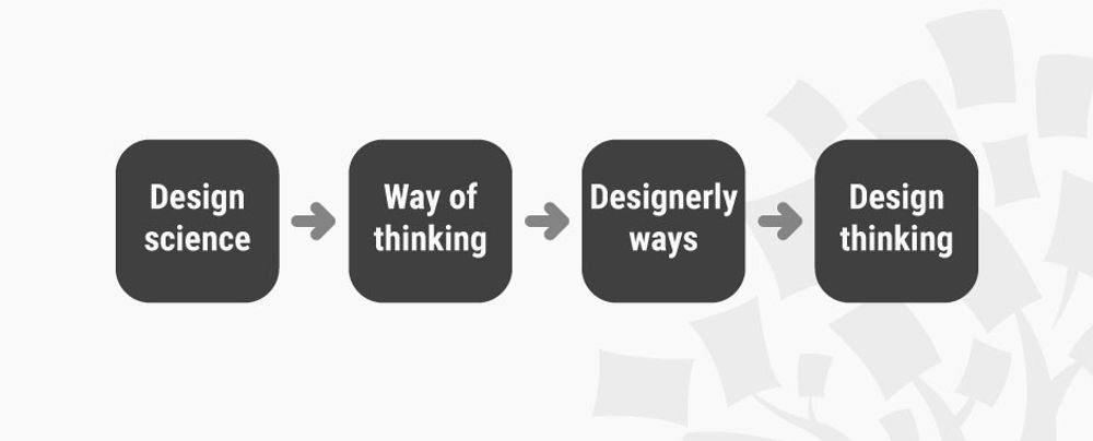
Here’s an interesting fact you may—or may not—know: users are more likely to choose, buy, and use products that meet their needs than products that just meet their wants. And an Empathy map will help you understand your user’s needs while you develop a deeper understanding of the persons you’re designing for. There are many techniques you can use to create this kind of understanding. An Empathy Map is just one tool that can help you empathize, synthesize your observations from the research phase, and draw out useful insights about your user’s needs.

An Empathy Map lets us sum up our learning from engagements with people in design research. The map provides four significant areas to focus our attention on, thus providing an overview of a person’s experience. Empathy maps are also great as a background for the construction of the personas that you will often want to create later.

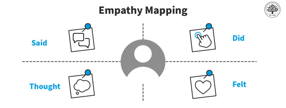
An Empathy Map consists of four quadrants, and these reflect four key traits which the user demonstrated—or possessed—during the observation/research stage. These four quadrants refer to some pretty important points—namely, what the user Said, Did, Thought, and Felt. Sure, it’s relatively easy to determine what the user said and did, but how about working out what they thought and felt? Do you need to have preternatural skills—like a psychic—to tell what’s going on with those? Well, don’t worry; it’s based on careful observations and analysis of how the user behaved and responded to certain activities, suggestions, conversations, and the like.

Visual Example of an Empathy map

An empathy map typically includes four quadrants of information about the user.

© Interaction Design Foundation, CC BY-SA 4.0

Table of contents

What are the Best Practices to Create an Empathy Map?

Step 1: Fill out the Empathy Map

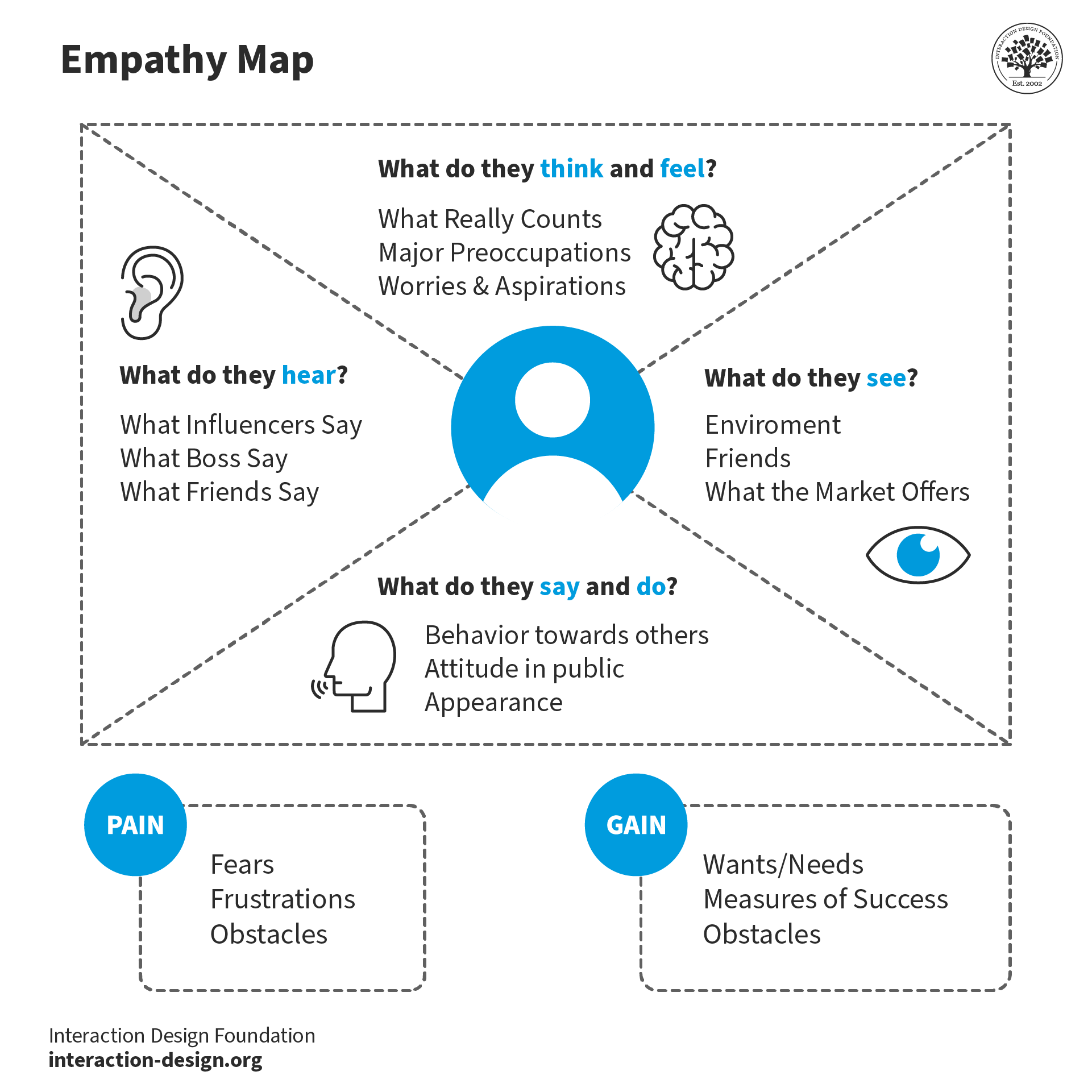
  • Set the four quadrants out on a table and draw them on paper or a whiteboard, as you see them laid out above.

  • Review your notes, pictures, audio, and video from your research/fieldwork and then fill out each one of the four quadrants while you’re defining and synthesizing.

  • What did the user SAY? Write down significant quotes and keywords that the user said.

  • What did the user DO? Describe which actions and behaviors you noticed or insert pictures or drawings.

  • What did the user THINK? Dig deeper. What do you think that your user might be thinking? What are their motivations, their goals, their needs, their desires? What does this tell you about their beliefs?

  • How did the user FEEL? What emotions might your user be feeling? Take into account subtle cues like body language and their choice of words and tone of voice.

Step 2: Synthesize NEEDS

  • Synthesize the user’s needs based on your Empathy Map. This’ll help you define your design challenge.

  • Needs are verbsi.e., they’re activities and desires—and remember that needs aren’t nouns, which will instead lead you to define solutions.

  • Identify needs directly from the user traits you’ve noted. Spot needs based on contradictions between two attributes—such as a disconnect between what a user says and what the user actually does.

Pyramid diagram showing various types of needs.

© Interaction Design Foundation, CC BY-SA 3.0

Step 3: Synthesize INSIGHTS

  • An “Insight” is the realization that can help you solve your current design challenge—think “Eureka” or “Aha! moment” here.

  • Look to synthesize significant insights—and that’s especially so from contradictions between two user attributes. You’ll be able to find this within one quadrant or in two different quadrants. You can synthesize insights by asking yourself a question, too—and that’s “Why?”—whenever you notice strange, tense, or surprising behavior.

  • Now it’s time to write down your insights.

You can download and print the Empathy Map template here:

Get your free template for “Empathy Map”
Empathy Map Empathy Map
Secure form
Please provide your name.
We respect your privacy
Please provide a valid email address.
315,777 designers enjoy our newsletter—sure you don't want to receive it?

What Are the Benefits of Empathy Maps?

What makes empathy maps so useful for design thinking and product development is the way they delve into the user’s thoughts, feelings, words, and actions and so can offer a holistic view of the user’s experience. Here, we’re going to get right into the key benefits of empathy mapping.

An illustration showing the key benefits of empathy maps.

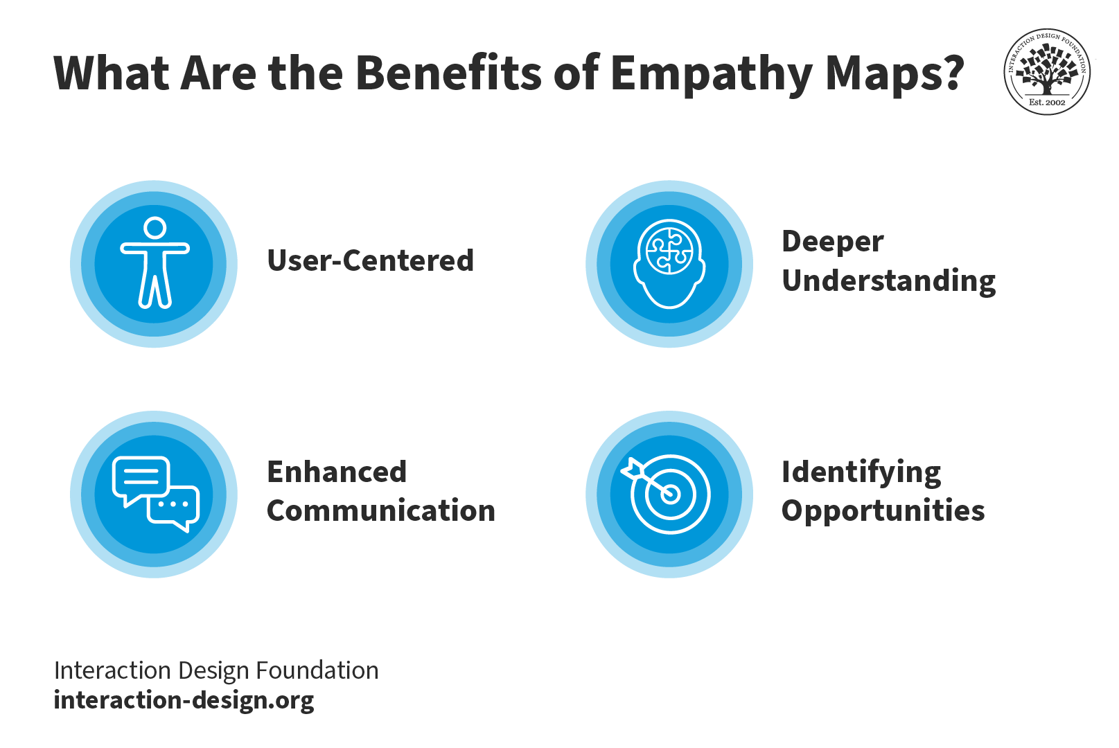
Key Benefits of Empathy Maps: they’re user-centered, they foster a deeper understanding of the user, they improve communication, and they help identify opportunities.

© Interaction Design Foundation, CC BY-SA 4.0

1. User-Centered 

The design process has got to address the user's needs and emotions and, happily, empathy maps make sure that there’s a user-centric approach in place, and it’s something that makes it more likely that you’ll create products that truly connect with users.

2. Deeper Understanding 

Empathy mapping goes beyond what users explicitly state and manages to unearth hidden motivations, desires, and pain points—all of which are valuable nuggets that deliver on a deeper understanding that helps you design solutions that address unspoken needs.

3. Enhanced Communication

These maps visually and concisely represent user insights so that everyone on the team gets to see the same information. And it’s something that makes it so much easier to communicate findings within cross-functional teams. Brands that stick to this process can work that magic where they lubricate things and nurture better collaboration among stakeholders and team members.

4. Identifying Opportunities

Empathy maps highlight potential areas for improvement and innovation, and that’s because they focus on user needs. The insights that come out of all this become the foundation for brands to refine existing products or develop new, user-focused solutions that can resonate that much better with the target audience.

Drawbacks of Empathy Maps

To be sure, empathy maps are valuable tools; saying that, though, they’ve got a few drawbacks inherent to them; let’s look at these now:

1. Limited perspective: One drawback is that teams often have got to interpret research data that mightn’t always accurately represent the user’s thoughts and feelings. It means that—at least, potentially—a skewed understanding of the user can come out of this.

2. Lack of context: Because empathy maps tend to focus on an individual user’s interaction with a product or service, they can often miss the bigger picture, or larger context. A great deal of a user’s thoughts and behaviors are things that come down to environmental factors, and they’re elements that you just can’t capture in an empathy map.

3. Incomplete information: Another risk is that if a brand takes the empathy map as their only user research tool, they may end up with gaps in their understanding of the full user experience. A map is a handy tool to have, to be sure, but it doesn’t replace other user research methods like interviews, usability testing, or surveys.

4. Static Nature: Because empathy maps are static representations, there’s a risk that they mightn’t capture the dynamic nature that’s involved in user emotions and thoughts—and they’re things that change over time and in response to different situations. So, teams have got to treat the empathy map as an evolving, living document and update it—continually—so they make sure it stays relevant.

It’s wise to always use empathy maps together with other research and design methods so you can get a more holistic understanding of users.

What Is the Difference Between a Journey Map and an Empathy Map?

While empathy maps focus on a specific moment or interaction, journey maps are what give a broader view of the user experience. Empathy mapping focuses on the user's thoughts and emotions during a scenario; meanwhile journey maps outline the user's end-to-end experience, and that includes a whole variety of touchpoints and stages.

Empathy maps offer a great deal of depth, and they get into dissecting specific instances. Journey maps, though, will provide you with breadth, capturing the entire user journey. What the benefit of using them together is, is that both tools complement each other and help design teams understand the user experience—and comprehensively so.

5 Tips for an Empathy Mapping Session

5 tips for an empathy mapping session.

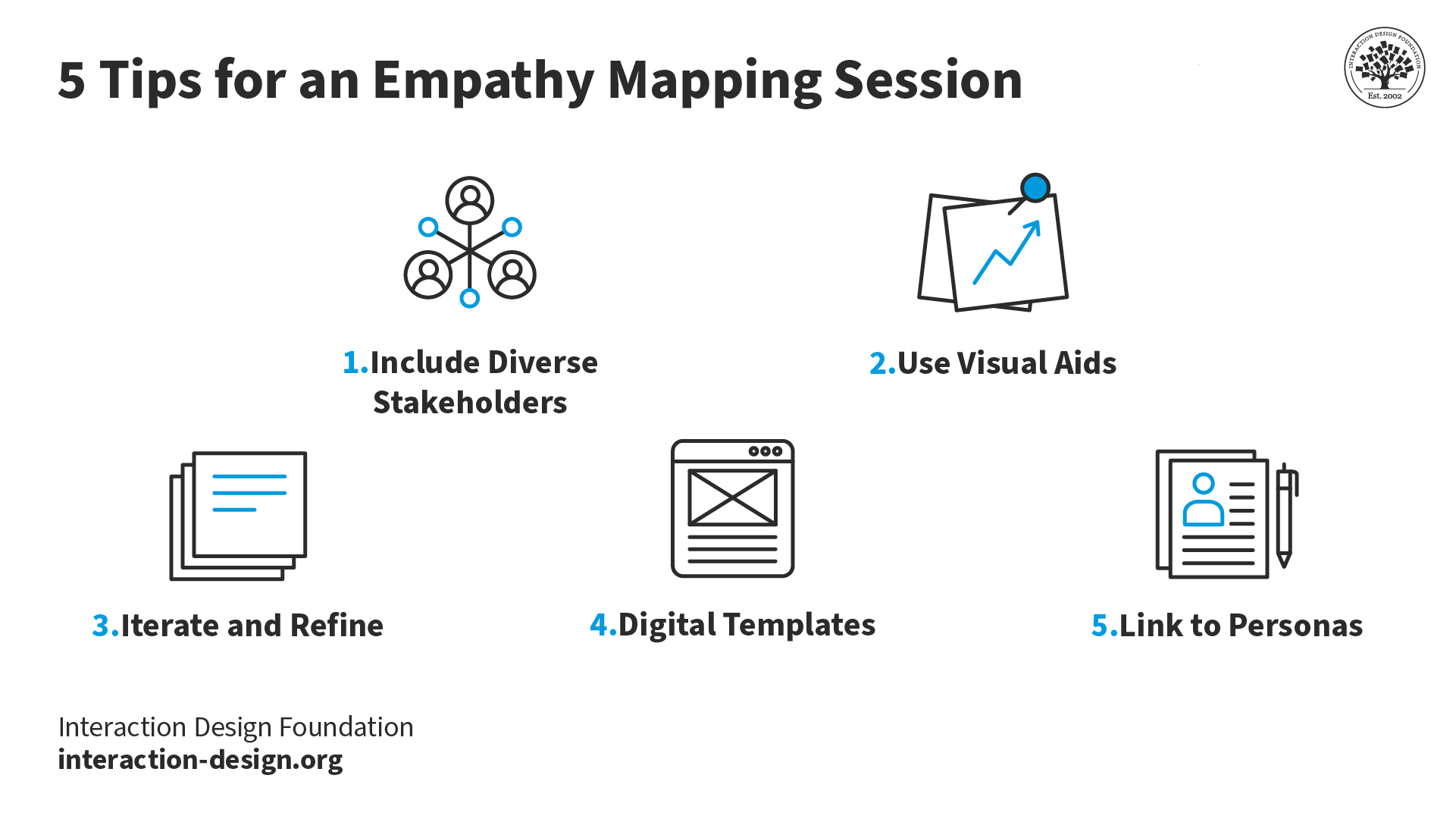
Top 5 tips for you and your team and stakeholders to enjoy a successful empathy mapping session.

© Interaction Design Foundation, CC BY-SA 4.0

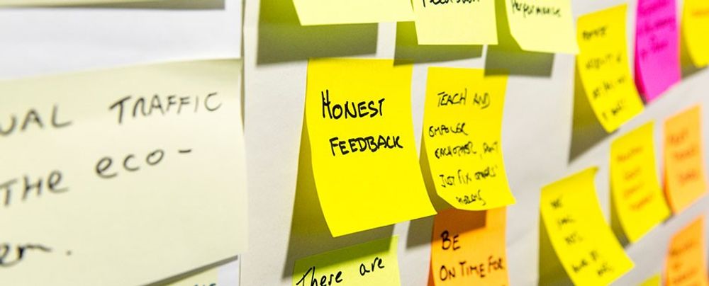
1. Include diverse stakeholders: It’s really vital to get in the perspectives of various team members and stakeholders. And the richness that comes from having this difference is that it’s going to ensure the team gets a well-rounded understanding of the user. What’s more, when the team builds the empathy map together, they’re more likely to adopt the map in their work process.

2. Use visual aids: These will be vital sources of help to bring ideas to life and empower team members and stakeholders to understand things better.

3. Iterate and refine: Empathy maps aren’t static—they’re “living” documents. So, it’s important to regularly revisit and update them as new insights come up on the horizon and into focus. This iterative process really makes sure that the design stays aligned with evolving user needs—pretty much underlining the point that these maps are great aids for looking ahead with.

4. Digital templates: Use digital tools and templates for remote collaboration—and how important it is to work well with team members remotely is impossible to overstate—and create a centralized database of user insights. It’ll facilitate easy sharing and accessibility for team members to enjoy and make the most of.

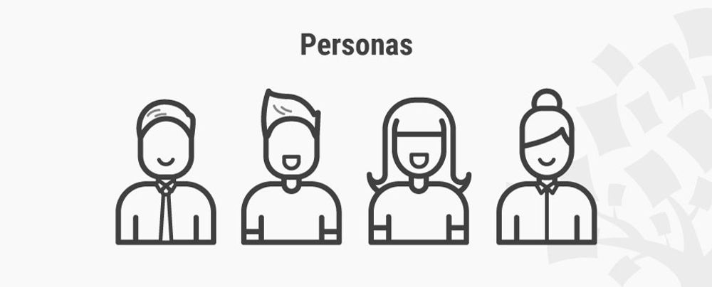
5. Link to personas: Connect empathy maps to how you and your design team create user personas. The insights from these maps form the foundation for developing rich and realistic user personas—vital tools to have on board your design process.

In this video, HCI Expert Professor Alan Dix offers an overview of personas.

Show Hide video transcript
  1. 00:00:00 --> 00:00:34

    Personas are one of these things that gets used  in very, very many ways during design. A persona is a rich description or description of a user. It's similar in some sense, to an example user, somebody that you're going to talk about. But it usually is not a particular person. And that's for sometimes reasons of confidentiality.

  2. 00:00:34 --> 00:01:02

    Sometimes it's you want to capture about something slightly more generic than the actual user you talked to, that in some ways represents the group, but is still particular enough  that you can think about it. Typically, not one persona, you usually have  several personas. We'll come back to that.   You use this persona description, it's  a description of the example user,   in many ways during design. You can ask  questions like "What would Betty think?"

  3. 00:01:02 --> 00:01:35

    You've got a persona called / about Betty, "what would  Betty think" or "how would Betty feel about using this aspect of the system? Would Betty understand this? Would Betty be able to do this?"   So we can ask questions by letting those personas  seed our understanding, seed our imagination.   Crucially, the details matter here. You want to make the persona real. So what we want to do is take this  persona, an image of this example user,   and to be able to ask those questions: will  this user..., what will this user feel about  

  4. 00:01:35 --> 00:02:01

    this feature? How will this user use this system  in order to be able to answer those questions?  It needs to seed your imagination well enough.  It has to feel realistic enough to be able to   do that. Just like when you read that book  and you think, no, that person would never   do that. You've understood them well enough that  certain things they do feel out of character. You need to understand the character of your  persona.

  5. 00:02:01 --> 00:02:30

    For different purposes actually, different levels of detail are useful. So I'm going to sort of start off with   the least and go to the ones which I think are  actually seeding that rich understanding.  So at one level, you can just look at your  demographics. You're going to design for warehouse   managers, maybe. For a new system that goes into  warehouses. So you look at the demographics, you might have looked at their age. It might be that on the whole that they're   older. Because they're managers, the older end. So  there's only a small number under 35. The majority  

  6. 00:02:30 --> 00:03:01

    are over 35, about 50:50 between those who are in  the sort of slightly more in the older group.  So that's about 40 percent of them in  the 35 to 50 age group, and about half   of them are older than 50. So on the whole  list, sort of towards the older end group.   About two thirds are male, a third are female.  Education wise, the vast majority have not got   any sort of further education beyond school. About 57 percent we've got here are school.  

  7. 00:03:01 --> 00:03:34

    We've got a certain number that have done basic  college level education and a small percentage   of warehouse managers have had a university  education. That's some sense of things.   These are invented, by the way, I should say, not  real demographics. Did have children at home. The people, you might have got this from some big  survey or from existing knowledge of the world,   or by asking the employer that you're  dealing with to give you the statistics.   So perhaps about a third of them have got children  at home, but two thirds of them haven't. 

  8. 00:03:34 --> 00:04:05

    And what about disability? About three  quarters of them have no disability whatsoever.   About one quarter do. Actually, in society  it's surprising. You might... if you think   of disability in terms of major disability,  perhaps having a missing limb or being   completely blind or completely deaf. Then you start relatively small numbers.   But if you include a wider range of disabilities,  typically it gets bigger. And in fact can become  

  9. 00:04:05 --> 00:04:32

    very, very large. If you include, for  instance, using corrective vision with   glasses, then actually these numbers  will start to look quite small.  Within this, in whatever definition they've  used, they've got up to about 17 percent with   the minor disability and about eight percent  with a major disability. So far, so good. So now, can you design for a  warehouse manager given this? Well,  

  10. 00:04:32 --> 00:05:01

    you might start to fill in examples for  yourself. So you might sort of almost like   start to create the next stage. But it's hard. So let's look at a particular user profile. Again,   this could be a real user, but let's imagine  this as a typical user in a way. So here's Betty Wilcox. So she's here as a typical user.  And in fact, actually, if you look at her, she's   on the younger end. She's not necessarily the  only one, you usually have several of these.  And she's female as well. Notice only up to  a third of our warehouse ones are female. So  

  11. 00:05:01 --> 00:05:31

    she's not necessarily the center one. We'll come  back to this in a moment, but she is an example user. One example user. This might have been  based on somebody you've talked to, and then you're sort of abstracting in a way. So, Betty Wilcox. Thirty-seven, female, college education. She's got children at home, one's  seven, one's 15. And she does have a minor disability, which is in her left hand. And  it's there's slight problem in her left hand.  

  12. 00:05:31 --> 00:06:00

    Can you design, can you ask, what would Betty  think? You're probably doing a bit better at   this now. You start to picture her a bit. And you've probably got almost like an image   in your head as we talk about  Betty. So it's getting better.   So now let's go to a different one. You know, this  is now Betty. Betty is 37 years old. She's been a   warehouse manager for five years and worked for  Simpkins Brothers Engineering for 12 years. She didn't go to university, but has studied  in her evenings for a business diploma.

  13. 00:06:00 --> 00:06:31

    That was her college education. She has two children  aged 15 and seven and does not like to work late.   Presumably because we put it  here, because of the children.   But she did part of an introductory  in-house computer course some years ago.   But it was interrupted when she was promoted,  and she can no longer afford to take the time.   Her vision is perfect, but a left hand movement,  remember from the description a moment ago,   is slightly restricted because of an  industrial accident three years ago. 

  14. 00:06:31 --> 00:07:04

    She's enthusiastic about her work and  is happy to delegate responsibility   and to take suggestions from the staff. Actually,  we're seeing somebody who is confident in her   overall abilities, otherwise she wouldn't  be somebody happy to take suggestions.   If you're not competent, you don't. We sort of see that, we start to see a   picture of her. However, she does feel threatened  – simply, she is confident in general – but she   does feel threatened by the introduction of  yet another computer system. The third since she's been working at Simpkins Brothers. So now, when we think about that, do you have a better vision of Betty?

  15. 00:07:04 --> 00:07:32

    Do you feel you might be in a position to start talking about..."Yeah, if I design this sort of feature, is this something that's going to work with Betty? Or not"? By having a rich  description, she becomes a person. Not just a set of demographics. But then you  can start to think about the person, design for the person and use that rich human understanding you have in order to create a better design.

  16. 00:07:32 --> 00:08:06

    So it's an example of a user, as I said not  necessarily a real one. You're going to use this as a surrogate and these details really, really matter. You want Betty to be real to   you as a designer, real to your clients as you  talk to them. Real to your fellow designers  as you talk to them. To the developers around  you, to different people. Crucially, though, I've already said this, there's not just one. You usually want several different personas because the users you deal with are all different.

  17. 00:08:06 --> 00:08:30

    You know, we're all different. And the user group – it's warehouse managers – it's quite a relatively narrow and constrained set of users, will all be different. Now, you can't have one persona for every user,   but you can try and spread. You can look at the range of users.   So now that demographics picture I gave,  we actually said, what's their level of education? That's one way to look at that range. You can think of it as a broad range of users.

  18. 00:08:30 --> 00:09:02

    The obvious thing to do is to have the absolute  average user. So you almost look for them:   "What's the typical thing? Yes, okay." In my  original demographics the majority have no college   education, they were school educated only. We said that was your education one,   two thirds of them male – I'd have gone for  somebody else who was male. Go down the list, bang   in the centre. Now it's useful to have that center  one, but if that's the only person you deal with,   you're not thinking about the range. But certainly you want people who in some sense  

  19. 00:09:02 --> 00:09:24

    cover the range, that give you a sense  of the different kinds of people.   And hopefully also by having several, reminds  you constantly that they are a range and have   a different set of characteristics, that there  are different people, not just a generic user.


Watch this video to learn more about Personas.

References & Where to Learn More

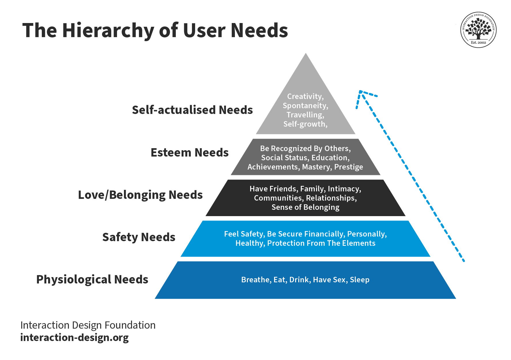
Needs Before Wants in User Experiences – Maslow and the Hierarchy of Needs

Abraham Maslow, A Theory of Human Motivation, 1943

Stephen Bradley’s original piece on the hierarchy of needs can be found at Smashing Magazine.

You can read Maslow’s original paper “A Theory of Human Motivation” online.

d.school, Bootcamp Bootleg, 2010.

Learn how to improve empathy in your team.

Hero Image: Author/Copyright holder: Teo Yu Siang and Interaction Design Foundation. Copyright terms and licence: CC BY-NC-SA 3.0

Get Weekly Design Insights

Join 315,777 designers who get useful UX / UI Design tips from our newsletter.
A valid email address is required.
1,299 shares

Open Access—Link to us!

We believe in Open Access and the democratization of knowledge. Unfortunately, world-class educational materials such as this page are normally hidden behind paywalls or in expensive textbooks.

If you want this to change, , link to us, or join us to help us democratize design knowledge!

Privacy Settings
By using this site, you accept our Cookie Policy and Terms of Use.

Share Knowledge, Get Respect!

Share on:

or copy link

Cite according to academic standards

Simply copy and paste the text below into your bibliographic reference list, onto your blog, or anywhere else. You can also just hyperlink to this article.

Dam, R. F. and Teo, Y. S. (2025, February 12). Empathy Map – Why and How to Use It. Interaction Design Foundation - IxDF.

New to UX Design? We're Giving You a Free eBook!

The Basics of User Experience Design

Download our free ebook “The Basics of User Experience Design” to learn about core concepts of UX design.

In 9 chapters, we'll cover: conducting user interviews, design thinking, interaction design, mobile UX design, usability, UX research, and many more!

A valid email address is required.
315,777 designers enjoy our newsletter—sure you don't want to receive it?