Now that we’ve seen, understood, and appreciated the value of the Gestalt principles, let’s build on our grasp of those and explore something else. It’s important to have a good grounding in the Gestalt laws before moving on, because, from knowing how to apply those, we can improve our designs even further, using emphasis. [check the Where to Learn More section, at the end of the article, for the links to the 3 Gestalt articles]
Emphasis is a strategy that aims to draw the viewer’s attention to a specific design element. That could be to an area of content, to an image, to a link, or to a button, etc. We see emphasis used in most fields of design, including architecture, landscape design, and fashion design. Emphasis surrounds us, even if you might not realize that it’s called “emphasis”. However, we are sure that you can recall some of these “emphasized” elements without too much effort! Reading on, you’ll see how common they are.
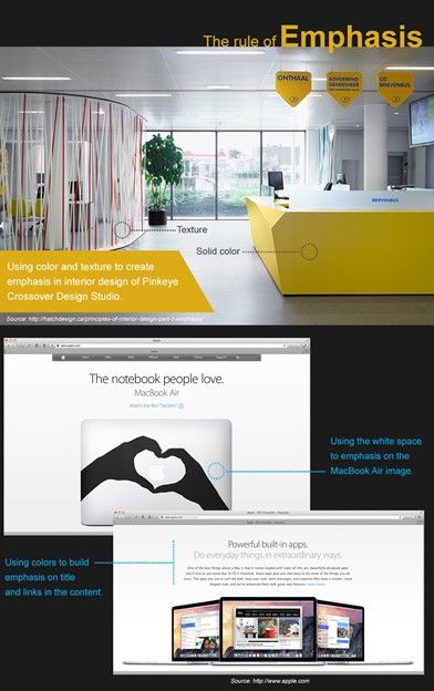
The aim is to create a focal point in the design: an eye-catching part that stands out, distinct from the rest of the design elements. You can use lines, shapes, colors, textures, size, etc., as well as many other elements to create emphasis.
Most often, we use emphasis to drive a call to action (e.g., a sign-up, purchase, or login button, etc.).
Design elements to create emphasis
As a designer, you have many tools to create emphasis in your product. Let’s just see some of them now:
Lines – Many designers use a specific linear flow to determine the overall direction of the page. When you change this flow, you call attention to the point on the page where the flow is broken. For example, if your design uses horizontal lines and if you break the pattern and use a vertical line, it will stand out as a point where attention is required. This is automatic – the human eye will catch it; so, it’s important that you make the distraction meaningful.
Shapes – If you are using a group of similar shapes on a page (say, rectangles), then using a different shape (say, a circle) will instantly draw the eye. The eye loves to go to find something different straightaway. Many puzzles and fun memes on the internet challenge us to find the different shape in a sea of many shapes which are the same as each other but only slightly different from it.
Colors - A shift in color can create a focal point in a design. The more contrasting the change, the more the point demands the viewer’s attention. Softer contrasts can gradually draw attention from one area to the next. Your choice of color should be in keeping with how you want your users to proceed on your page. Loud or dramatic color contrasts will make their eyes “jump”; softer shifts will allow them to move more leisurely, so you can keep a calmer information flow.
Textures - You can also use the texture of a website design to draw attention to an element. For example, you can use an embossed effect to emphasize areas in text. Or, in another example, you can use drop shadowing to make an area stand out on the page.
Mass – You can use color or shape to suggest “heaviness” too. For example, using a dark-colored element within a brightly colored page is likely to emphasize the dark-colored element against the rest of the content. You can see this in headline and title text in written content on almost every website.
Design principles that facilitate emphasis
 Author/Copyright holder: Mya Jamila. Copyright terms and licence: CC BY-NC-SA 2.0
We have seen how breaking the flow of a design element can help you create emphasis. Let’s see now how “breaking” design principles can also help you with the purpose of creating a focal point. Yes, we’re going to break some laws, but don’t worry – there is much to profit from this and no penalty for doing it!
Balance - The use of balance or symmetry grants equal weight to objects used in a design. However, breaking that balance by using an asymmetric arrangement of elements can draw attention to where the point of imbalance occurs. That point of imbalance is useful for you as a designer; it’s where you should think about inserting your most valuable image or message.
Proximity – According to Gestalt psychology, the law of proximity says that we perceive elements that are near to each other as a single group. If you can isolate an element from that group, you can call attention to it. This is your way of shining a spotlight on that “rebel” element. Why do you want to make it different? Is it because it’s carrying your design’s main point or punch line? Well, now is your chance: take this cool individual and show why it’s not running with the herd.
Alignment - Aligning elements in a design offers a simple flow for the eye to follow. We do this with text in content (for example). We like text if it’s aligned or justified; we don’t like having to jump around from line to line if the first and last words are poking into the margins. If you add an element that is not aligned, you’ll call attention to it. Remember that the human eye loves to trace roads, pathways, and rivers along what it sees. The instant you break that sequence, the eye will want to know why! While you’ve got a guaranteed audience held captive with your break in alignment, you’ve got a prime opportunity to make a statement with your different, standout element.
Repetition – Repeating a design element again and again in a design leads the eye to follow that element. It’s a great tool, especially in that you can have an army of elements (notice that I’m trying to encourage you to keep your designs ordered – we don’t want unruly crowds!). The user’s eye will trace over the design, accepting the orderliness of repetition... until, gradually, he or she may notice something different. What happened? You used repetition to draw someone’s attention to a specific area of the screen. It could be a series of archways that gradually ends at a town square, with a fountain, or it could be open air in which you can insert your message. The sameness of repetition frames it for you, and for them, to great effect.
Contrast – We designers often use contrast subtly in our designs, but when two areas starkly contrast with each other, the eye will be drawn to one area or the other. You can use this to call attention to two specific actions (either of which might further the objectives of the site’s creator). For example, you might want someone to create an account or buy a product. The “trick” here is to understand which colors play best off each other to match the strength of contrast you want. A call to action will want a stronger contrast (such as a blue/purple button on a yellow background) than a more casual “Did you know?” area.
White Space – We remember our old friend white space (sometimes called “whitespace”). We can also use it to call attention to an area. Most designs will use a consistent amount of white space (remember that white space does not have to be white – it can be any background color) to enable a visual flow through content. By increasing white space around an area, you break that flow and catch the viewer’s attention.
While this can all seem just to be common sense, remember that common sense is the least common of the senses! We often go too far to look for a solution, making life hard for ourselves because we’re reading too much into a design. Meanwhile, the answer was just there, right before us, achieved by tweaking a specific element or principle of the design. Don’t make it a problem; trust in the guaranteed eye-to-brain traits of your users: they’ll “get” it.
The Take Away
For most websites and apps, we designers use emphasis as a call for action. We can use tools to create emphasis, such as:
Lines
Colors
Shapes
Textures
Mass
Furthermore, we can facilitate emphasis “breaking” with design principles such as:
Balance
Proximity
Alignment
Repetition
Contrast
White space
In turn, emphasis facilitates user interaction with the areas that the design team deem important. We’re sure that you can easily picture these types of focal points, such as “Buy Now” or “Subscribe Here” buttons. You’ve probably noticed that these are often in standout colors (red, orange, or yellow are very popular) and have large, emphatic fonts on the buttons.
As a user experience designer, you need to have a clear idea of the call to action you want to emphasize. You also want to be clear about which design elements and principles you can use to create this focal point to take the best advantage of it.
Lastly, here is one more piece of common sense to bear in mind: emphasis is relative. For one element to stand out, there must be another that lies behind it. Nothing can be alone, and nothing happens in a vacuum. You need at least two elements to play off one another to entice the user’s eye. Playing with emphasis in early design iterations can be a great way to get your team members, boss, stakeholders, or client to reach a compromise. Not everything can stand out, and emphasizing too many elements can saturate your design, diluting the important areas while confusing the user, who won’t stay to try and figure it out. This is why visually playing with this dominant element can be helpful in making everyone commit to what is important.
