Symmetry in UX/UI Design

Your constantly-updated definition of Symmetry in UX/UI Design and collection of videos and articles. Be a conversation starter: Share this page and inspire others!
88 shares

What is Symmetry in UX/UI Design?

Symmetry in user experience design (UX design) refers to a visual balance designers achieve by arranging elements to mirror each other or follow a consistent pattern. Designers align elements along a central axis to make interfaces more harmonious, intuitive and visually appealing. Symmetrical designs often give a sense of stability and organization, and help users navigate more effectively.  

Illustration explaining different types of symmetry: rotational, reflectional, glide-reflectional, and translational.

© Interaction Design Foundation, CC BY-SA 4.0

Table of contents

Why is Symmetry Important in UX Design?

Symmetry is important in design largely because it’s so close to the human experience. It certainly abounds in nature and the human world. For example, the human body and elements like tree leaves and butterfly wings exhibit natural symmetry. They provide a balance that’s aesthetically pleasing and structurally efficient. In architecture, too, symmetrical designs appear well-constructed and reliably strong—the Parthenon is a classic, and classical, example. Symmetry has reassuring qualities, and this fact translates to graphic design and UX design as well.  

A key point about symmetry is how the human eye values order and seeks lines of symmetry to find balance in an image. The mind strives to make sense of what the viewer sees. People naturally tend to seek order in objects, and they typically understand that symmetrical elements are part of a unified group. This aspect comes from the Gestalt principles of psychology and design. In Gestalt terms, symmetry and order are sometimes known as the principle or law of Prägnanz (German for “good figure”)—the idea that individuals prefer simplicity and order in the forms they behold.  

Author and Associate Professor of Art Studio and Digital Design, University of Kentucky, Mia Cinelli explains the Gestalt principles—watch this video to learn more about them:  

Show Hide video transcript
  1. 00:00:00 --> 00:00:32

    Gestalt principles are principles of human  perception that describe how we group similar   elements, recognize patterns and simplify  complex images when we perceive objects.   - So, Gestalt principles — sometimes called  Gestalt laws — are simply a way of thinking through   Gestalt psychology — 'Gestalt' just meaning 'form', is how we're making sense of a visual field. These are ways of parsing out what things mean within a visual space. Gestalt relies first and foremost on the understanding of a visual field and the ability to create

  2. 00:00:32 --> 00:01:00

    what are called *figure/ground relationships. So, figure/ground relationships are sometimes called 'positive space' and 'negative space'. So, I'm going to talk about them as figure/ground, because when we look at something like this visual field of rectangles, it all looks the same — that is right now our ground. But the first rule of figure/ground relationships is that discontinuity creates figure. So, by changing one thing here, by creating that discontinuity, that draws our attention,

  3. 00:01:00 --> 00:01:30

    that becomes the thing in which we are focusing on, and that is really essential, because this can manifest through the Law of Similarity, by which visual similarities are read as being more related. And we can do this through color; we can do this through shape; we can do this through size. So, we read these things as being more of a group. Proximity works in a similar way wherein the actual visual or physical proximity of things relative to each other tells us that these are also read as a group.

  4. 00:01:30 --> 00:02:02

    There's the Law of Continuation, by which our eye wants to follow a particular line. And so, when we read this visual, we don't read it as two lines which have met in the middle and made a hard turn. We read this as two lines flowing over each other, and that's because of continuation. And all of these things — Gestalt principles —  influence hierarchy, informational grouping and readability, and they become essential for understanding both concept and content.


Why are the Types of Symmetry?

Symmetry as a design concept extends further than its Gestalt sense. In UX design, designers leverage symmetry to help users find websites and apps visually engaging and easy to navigate. Symmetry divides into several main types:  

  1. Reflectional symmetry, or bilateral symmetry: Designers achieve this when they reflect elements across a central axis, such as a website's header. This involves taking a single axis to make mirror images. This is typical in symmetrical logos.  

  1. Rotational symmetry, or radial symmetry: Designers arrange elements around a central point so that they keep their orientation when the user rotates them. What’s more, an object has axial symmetry if its appearance stays the same as the user rotates it. Circle symmetry designs such as circular logos are a good example of rotational symmetry.   

  1. Translational symmetry: Designers repeat elements at regular intervals. It’s common to find this in patterned backgrounds such as on-screen tiled arrangements.   

  1. Glide reflection symmetry: This combines reflection and translation. An example is footprints on the sand where each step mirrors and shifts from the last.  

It’s important to note that when digital product designers leverage symmetry, they seldom make perfectly symmetrical designs. Instead, they tend to apply it measuredly in symmetric balance so users can find elements more readily. Sometimes, designers will apply pseudo-symmetry—where two elements or sections aren’t perfectly symmetric but “close enough” for users to see as being symmetric.   

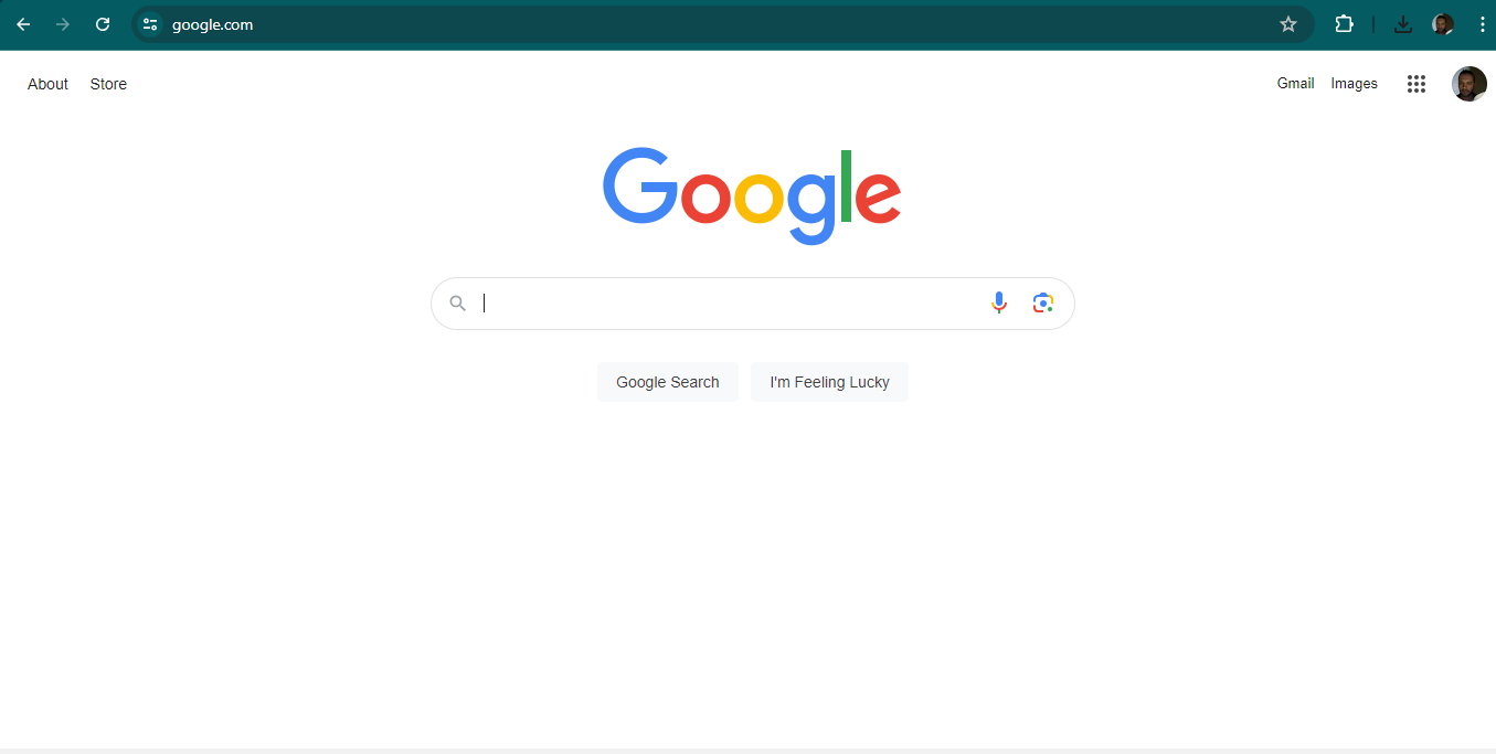
Full symmetric balance—or formal balance—is hard for designers to achieve in digital products. That’s because a perfect symmetry definition of elements in a design would constrain a designer to exceedingly simple and specific layouts. Google’s homepage, with its iconic, clean, lean and balanced look is pseudo-symmetric rather than symmetric. Users on Google’s main page tend to have one chief purpose—to look up keywords or subjects. Aside from the Doodles that celebrate and inform users on Google’s homepage, the latter offers a simple interface with much negative space so that users can get on with searching for the items and subjects they want.  

A screenshot of Google's home page.

Google’s homepage has a degree of symmetry that helps set a calm, reassuring stage on which users can put their search requests and terms—in all their rich variety.

© Google, Fair Use

Another important point is that designers can make an interface like a webpage balanced with or without symmetry. With symmetry—or approximate symmetry—design, they can include elements such as centralized images and text. Without symmetry, however, designers can still make it balanced if they use an imaginary central point and arrange different-sized elements in a way that’s unified. As long as a design isn’t out of harmony or lop-sided, users can flow in seamless experiences without caring to search for symmetry and lines of symmetry. Depending on the nature of the brand and their own goals and desires, users will tend to tacitly enjoy the balance they sense.      

What are the Benefits of Symmetry in UX Design?

When designers apply the balance that symmetry brings in their designs, they can:  

1. Boost the Visual Appeal

Symmetry in UX design goes a long way to boosting the visual appeal of digital designs. The sense of order and balance it gives tends to come across to users as both attractive and professional. More symmetrically designed websites and apps can therefore be more engaging—in a gently guiding way. They can encourage users to explore and interact with the content.  

2. Improve the User Experience

Symmetrical designs make for a better user experience as they make navigation simple, plus the content is easy to find and interact with. Symmetry is a tool to guide the user's eye in a natural flow across the interface. This will reduce the user’s cognitive load, so the interface feels more intuitive and user-friendly—important aspects especially in apps with users on the go. What’s more, a design with a symmetrical balance can draw users’ eyes to the middle of the screen—ideal to point them to the CTA and raise the likelihood that they’ll click on it. Design patterns can feature aspects of symmetry for such purposes. 

Learn more about design patterns in our video: 

Show Hide video transcript
  1. 00:00:00 --> 00:00:33

    User Interface Design Patterns are recurring components which designers use to solve common problems in interfaces. like, for example, when we think about those regular things that often are repeating themselves to kind of appear in, you know, in complex environments We need to show things that matter to people when they matter and nothing else. Right. it's just really sad what we see. Like, for example, if you look at Sears, right? Sears is just one of the many e-commerce sites, you know, nothing groundbreaking here. So you click on one of the filters and then the entire interface freezes

  2. 00:00:33 --> 00:01:00

    and then there is a refresh and you're being scrolled up. And I always ask myself, is this really the best we can do? Is really the best kind of interface for filtering that we can come up with, or can we do it a bit better? Because we can do it a bit better. So this is a great example where you have galaxies and then galaxies, you have all this filters which are in rows. Sometimes they take three rows, sometimes four or sometimes five rows. That's okay. Show people filters, show people buttons if they important show them.

  3. 00:01:00 --> 00:01:32

    Right. But what's important here, what I really like is we do not automatically refresh. Instead, we go ahead and say, "Hey, choose asmany filters as you like", right? And then whenever you click on show results, it's only then when you actually get an update coming up in the back. Which I think is perfectly fine. You don't need to auto update all the time. And that's especially critical when you're actually talking about the mobile view. The filter. Sure, why not? Slide in, slide out, although I probably prefer accordions instead.

  4. 00:01:32 --> 00:02:01

    And you just click on show products and it's only then when you return back to the other selection of filters and only when you click okay, show all products, then you actually get to load all the products, right? Designing good UI patterns is important because it leads to a better user experience, reduces usability issues, and ultimately contributes to the success of a product or application. It's a critical aspect of user centered design and product development.

3. Raise Readability and Accessibility

The balanced distribution of design elements in designs that have symmetry axes makes content more readable. Users can understand and absorb information more easily. That’s a major benefit for users with disabilities, who can more quickly recognize and interact with the interface elements than they would otherwise.  

 See why accessibility is such a vital concern in design:  

Show Hide video transcript
  1. 00:00:00 --> 00:00:30

    Accessibility ensures that digital products, websites, applications, services and other interactive interfaces are designed and developed to be easy to use and understand by people with disabilities. 1.85 billion folks around the world who live with a disability or might live with more than one and are navigating the world through assistive technology or other augmentations to kind of assist with that with your interactions with the world around you. Meaning folks who live with disability, but also their caretakers,

  2. 00:00:30 --> 00:01:01

    their loved ones, their friends. All of this relates to the purchasing power of this community. Disability isn't a stagnant thing. We all have our life cycle. As you age, things change, your eyesight adjusts. All of these relate to disability. Designing accessibility is also designing for your future self. People with disabilities want beautiful designs as well. They want a slick interface. They want it to be smooth and an enjoyable experience. And so if you feel like

  3. 00:01:01 --> 00:01:30

    your design has gotten worse after you've included accessibility, it's time to start actually iterating and think, How do I actually make this an enjoyable interface to interact with while also making sure it's sets expectations and it actually gives people the amount of information they need. And in a way that they can digest it just as everyone else wants to digest that information for screen reader users a lot of it boils down to making sure you're always labeling

  4. 00:01:30 --> 00:02:02

    your interactive elements, whether it be buttons, links, slider components. Just making sure that you're giving enough information that people know how to interact with your website, with your design, with whatever that interaction looks like. Also, dark mode is something that came out of this community. So if you're someone who leverages that quite frequently. Font is a huge kind of aspect to think about in your design. A thin font that meets color contrast

  5. 00:02:02 --> 00:02:20

    can still be a really poor readability experience because of that pixelation aspect or because of how your eye actually perceives the text. What are some tangible things you can start doing to help this user group? Create inclusive and user-friendly experiences for all individuals.


4. Improve the Mobile Experience 

Responsive design is an essential point to consider, especially in the mobile-first era where most users access digital products on handheld devices. Another main benefit of a more-or-less symmetrically designed website or app is that it can translate more easily across screen sizes with responsive design. Visual elements can appear on any screen as intended, which improves user interaction and the overall user experience.  

CEO of Experience Dynamics, Frank Spillers explains responsive design:  

Show Hide video transcript
  1. 00:00:00 --> 00:00:30

    Now, just to start off by saying responsive is a default. Responsive is not an option – *do it*. And the reason is because that's where the world is at. Everyone expects things to be mobile-optimized, and responsive just means that if I switch from my laptop to my tablet to my phone, the site's going to fit to that resolution; it's going to kind of follow me.

  2. 00:00:30 --> 00:00:52

    And we know that users do that; that's the default. So, by doing responsive design, you're supporting device switching, and that's why it's important. You're also potentially making things a little bit more accessible and SEO-friendly, which is a factor for Google's algorithm that prioritizes responsive sites.


5. Strengthen Brand Identity

A consistent symmetrical design across a brand’s digital platforms can help it establish a strong, recognizable brand identity. A high level of symmetry in visual design carries messages of stability and reliability. Plus, it fosters user trust and loyalty. These aspects are crucial for a brand to enjoy success.  

A screenshot from a Maersk web page.

Maersk’s application of symmetry helps their users and customers—and logistics and transportation tend to demand a high degree of trust in a brand.

© Maersk, Fair Use

Best Practices to Use Symmetry in UX/UI Design

Designers can leverage symmetry in their digital designs when they:   

1. Leverage Rotational and Translational Symmetry

Designers apply rotational—or radial—symmetry when they rotate elements around a central point. They use it to create dynamic patterns that give a sense of movement and energy. Meanwhile, translational symmetry is what designers use when they repeat elements at regular intervals. That can create depth and a sense of continuous flow in a design. These types of balance and symmetry are helpful to make the most of the visual impact and user engagement in a digital product.   

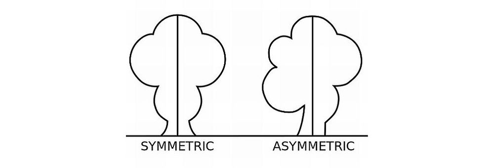
2. Balance Symmetry with Asymmetry

Symmetry brings order and familiarity—and, from that, a sense of stability and peace. Designers can add interest and focus to a design, though, with some calculated asymmetry. If they do it strategically, they can use some asymmetrical arrangements to guide users' attention to key areas, like calls to action. So, some degree of balance between symmetry and asymmetry can help designs be both beautiful and practical.  

3. Use Symmetry to Guide User Attention

Symmetry isn’t just about aesthetics; it's a powerful tool to organize content and guide user attention. When designers align and distribute elements symmetrically, they can leverage the interplay of equal halves to create a natural flow and lead users’ eyes through the interface. For instance, to align text and images on a central axis or distribute icons evenly across a navigation bar can improve a website’s usability and make for a more cohesive experience overall.  

A screenshot of Pinterest's web site.

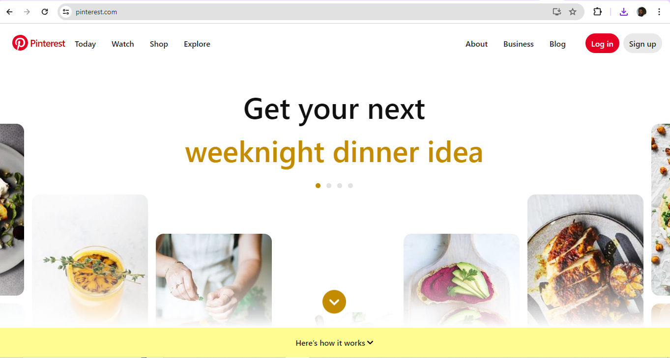
Pinterest’s use of symmetry naturally leads eyes to find what users’ want.

© Pinterest, Fair Use

4. Use Grids

One easy and popular technique that designers use to help with symmetry is to split a page into parts with a series of horizontal and vertical lines. Then, they put design elements in these sections to create a balanced and symmetrical layout. For instance, a 12-column grid for a web design layout can help designers place elements evenly across columns.  

5. Use Patterns

Designers can use repeating shapes or colors to establish order and balance. They might split a webpage into sections and leverage symmetry that way. Alternatively, they might create a background to do this, and make a webpage more appealing with an alluring pattern.   

6. Use Colors and Contrast

Designers can use a limited color palette to help create a sense of order and balance.  This can help a website look more harmonious and professional. Plus, designers can use colors to highlight important information and form a visual hierarchy so users’ eyes follow a helpful flow. It’s essential to get color balance and contrast right to maintain balance and help users, especially users with visual impairments like color blindness. For instance, if a designer puts a dark-colored element on one side of a page, they should balance it with a similarly dark element on the opposite side to achieve good symmetry.  

Watch as Arielle and Joann Eckstut, leading color consultants and authors—and among the most definitive authorities on color in the United States—give tips on how to choose colors: 

Show Hide video transcript
  1. 00:00:00 --> 00:00:32

    How do I choose the right colors? I am a firm believer that there are no such things as right colors. There is always more than one way to apply color successfully. But I do believe in asking a series of questions before choosing a palette. Number one. Most importantly, do you need to incorporate existing colors or are you starting from scratch?

  2. 00:00:32 --> 00:01:00

    Look at what's already there. Are you working with a company company that already has a turquoise logo like Waze, for example? That doesn't mean that a brochure you design has to match the turquoise, but it helps if your palette relates to the logo. If they're going to sit on the same page, you also should consider the context of the overall style of what's already in place.

  3. 00:01:00 --> 00:01:31

    Is the emphasis, for example, on darker, more conservative colors or bright and festive ones? Number two, what colors does your client love? What colors do you or the person or the company you're working with gravitate to? Does your client at fresh direct love the color green, but you're presenting them with oranges and reds. You're going to get a happier client, personally, if they like the colors.

  4. 00:01:31 --> 00:02:01

    If they personally, personally, like them. If not, it might not be so good. Getting a feel for their personal palette can be the key to success, and it can be as easy as putting a paint deck in front of someone and asking them to point to colors that they find appealing. Number three, what is the overall effect you're trying to create? Do you want a color scheme that shouts, “Here I am”?

  5. 00:02:01 --> 00:02:32

    or do you want something that whispers softly? It's not just the hue that you choose that evokes a particular feeling, but it's the chroma, meaning the intensity and the value how light or dark a color is as well. Intense colors emphasize objects that they cover and their flashy, dark, warm colors have a way of drawing things together and are intimate. Light cool colors have a way of opening things up

  6. 00:02:32 --> 00:03:02

    and making them more expansive, especially if they're in a similar hue and value. In the case of the Washington Post app, the deep blue connotes a seriousness and authority that matches with their mission. Number four, the effect of color on scale. Are you trying to make a room look smaller, bigger, taller or shorter? I use color to adjust any deficiencies

  7. 00:03:02 --> 00:03:30

    in the scale of a particular space. If I'm painting a room with an uncomfortably low ceiling, a lighter color on the ceiling than on the walls will make the room appear taller. As you can see on the slide on the left, if I'm painting a room with uncomfortably high ceilings, a darker color on the ceiling than on the walls will make that room appear lower. As you can see in the slide on the in the middle,

  8. 00:03:30 --> 00:04:04

    if you want to make a room feel less long and narrow. I would put an accent color on the end wall as in the slide on the right. The following slides illustrate how changing the paint colors can drastically change the scale and the feeling of a room. We are flipping through these now, just so you can get a quick sense of how this works and last on exterior facades. You can also see how color is used to emphasize either architectural details

  9. 00:04:04 --> 00:04:33

    like windows and trim or on the building form itself. In the left slide. The first and second houses are done in varying forms of a monochromatic scheme that is sort of maroon and dark blue, whereas the houses further down with the green and tan and the red and tan emphasize architectural details. In the slide on the right, the details like window

  10. 00:04:33 --> 00:05:00

    trim and doors are emphasized in the gray and yellow houses, while the architectural form of the building is emphasized in the charcoal gray house further down to the right. Number five. Are you looking for colors that are contrasting or harmonious? Once you have chosen your dominant hue, then you need to decide which color scheme you prefer.

  11. 00:05:00 --> 00:05:32

    Monochromatic schemes where you're using shades of the same color to give the greatest sense of harmony. Complimentary schemes that use highly contro casting colors that hit opposite each other on the color wheel can be anywhere from exciting to jarring. And then there's everything in between the two ends of the bell curve. In this last slide, there is what it's called an analogous color scheme where you can see the similar greens and in the green on the left it's

  12. 00:05:32 --> 00:06:01

    used with a color yellow, which is next to green on one side of the color wheel. And in the right side it's green with a blue, which is next to it, on the other side in the color wheel. Number six why a neutral in every palette. First, let me give you a definition of neutrals. Neutrals are created by mixing a hue and its complement together in varying proportions.

  13. 00:06:01 --> 00:06:31

    This muddies or grays down the original hue, neutrals help to bring other color choices together by creating a place for the eye to rest. And they work as excellent backgrounds for more intense accents. In this slide on the left, you can see that the neutral is used as the background color, and on the right, the neutral is used as an accent in the next slide.

  14. 00:06:31 --> 00:06:36

    You can see how the pale, gray, neutral acts as a background for intense accents.


7. Use Shapes

Simple shapes such as circles, squares and triangles are helpful tools for designers to leverage a sense of symmetry and balance. What’s more, they can use shapes to pique users’ interest and draw attention to important information. It’s important to use shapes—and sizes—of elements consistently. For example, an equilateral triangle can serve as a helpful Play or Proceed button element. Meanwhile, a button on either side with two triangles pointing to the right can serve as a Fast-forward button, and a button with two facing the other direction can indicate a Rewind button. This will also match users’ mental model for a media player.   

8. Remember the Purpose

It’s vital to consider the brand’s nature and message as a deciding factor between symmetry and asymmetry in a digital product. This could feature in a brand’s guidelines, so designers should refer to their client’s design brief as well. For a bank’s app, for example, a symmetrical design is more likely to instill a sense of trust in users. Meanwhile, a more asymmetrical design would be more in step with a brand in the entertainment industry—to bring its energy and dynamism to users.  

A screenshot from a Hubspot web page.

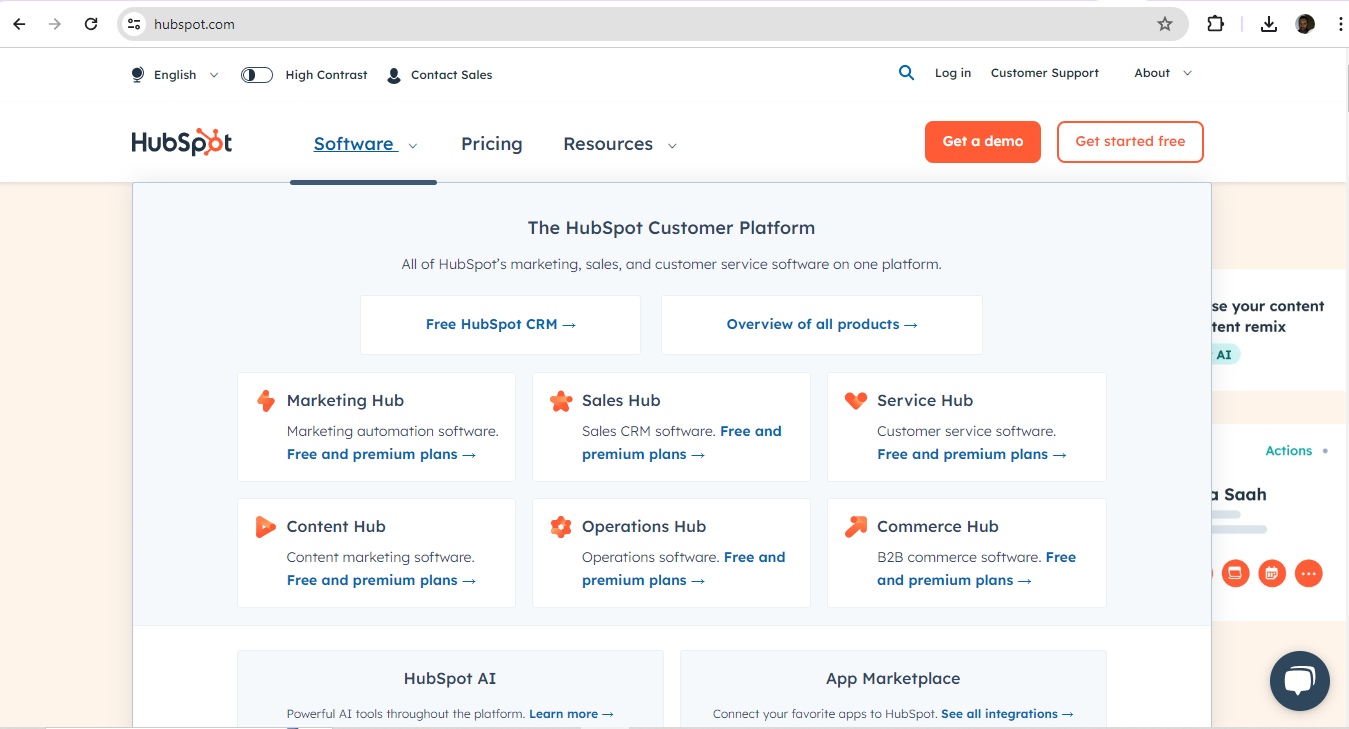
Cloud-based customer relationship management (CRM) platform, HubSpot show a neat grasp of symmetrical design that’s well-suited to their user base.

© HubSpot, Fair Use

9. Remember the Users

Aside from the brand—or maybe because of it as well—designers should always keep the users in mind when it comes to decisions about symmetry. Symmetrically designed digital products can convey a greater sense of sophistication and luxury. Meanwhile, less symmetry might appeal better to a younger audience, or one more interested in disruptive, unusual content.   

It’s also vital to consider the users’ culture in this respect. As symmetry and asymmetry are bound up in design principles that different cultures will appreciate in different ways, designers should align with these expectations.  

Author and Human-Computer Interaction Expert, Professor Alan Dix explains important points about how to design with culture in mind: 

Show Hide video transcript
  1. 00:00:00 --> 00:00:32

    As you're designing, it's so easy just to design for the people that you know and for the culture that you know.  However, cultures differ. Now, that's true of many aspects of the interface; no[t] least, though, the visual layout of an interface and the the visual elements. Some aspects are quite easy just to realize like language, others much, much more subtle.

  2. 00:00:32 --> 00:01:04

    You might have come across, there's two... well, actually there's three terms because some of these are almost the same thing, but two terms are particularly distinguished. One is localization and globalization. And you hear them used almost interchangeably and probably also with slight differences because different authors and people will use them slightly differently. So one thing is localization or internationalization. Although the latter probably only used in that sense. So localization is about taking an interface and making it appropriate

  3. 00:01:04 --> 00:01:31

    for a particular place. So you might change the interface style slightly. You certainly might change the language for it; whereas global – being globalized – is about saying, "Can I make something that works for everybody everywhere?" The latter sounds almost bound to fail and often does. But obviously, if you're trying to create something that's used across the whole global market, you have to try and do that. And typically you're doing a bit of each in each space.

  4. 00:01:31 --> 00:02:02

    You're both trying to design as many elements as possible so that they are globally relevant. They mean the same everywhere, or at least are understood everywhere. And some elements where you do localization, you will try and change them to make them more specific for the place. There's usually elements of both. But remembering that distinction, you need to think about both of those. The most obvious thing to think about here is just changing language. I mean, that's a fairly obvious thing and there's lots of tools to make that easy.

  5. 00:02:02 --> 00:02:31

    So if you have... whether it's menu names or labels, you might find this at the design stage or in the implementation technique, there's ways of creating effectively look-up tables that says this menu item instead of being just a name in the implementation, effectively has an idea or a way of representing it. And that can be looked up so that your menus change, your text changes and everything. Now that sounds like, "Yay, that's it!"

  6. 00:02:31 --> 00:03:00

    So what it is, is that it's not the end of the story, even for text. That's not the end of the story. Visit Finland sometime. If you've never visited Finland, it's a wonderful place to go. The signs are typically in Finnish and in Swedish. Both languages are used. I think almost equal amounts of people using both languages, their first language, and most will know both. But because of this, if you look at those lines, they're in two languages.

  7. 00:03:00 --> 00:03:31

    The Finnish line is usually about twice as large as the Swedish piece of text. Because Finnish uses a lot of double letters to represent quite subtle differences in sound. Vowels get lengthened by doubling them. Consonants get separated. So I'll probably pronounce this wrong. But R-I-T-T-A, is not "Rita" which would be R-I-T-A . But "Reet-ta". Actually, I overemphasized that, but "Reetta". There's a bit of a stop.

  8. 00:03:31 --> 00:04:02

    And I said I won't be doing it right. Talk to a Finnish person, they will help put you right on this. But because of this, the text is twice as long. But of course, suddenly the text isn't going to fit in. So it's going to overlap with icons. It's going to scroll when it shouldn't scroll. So even something like the size of the field becomes something that can change. And then, of course, there's things like left-to-right order. Finnish and Swedish both are left-to-right languages. But if you were going to have, switch something say to an Arabic script from a European script,

  9. 00:04:02 --> 00:04:31

    then you would end up with things going the other way round. So it's more than just changing the names. You have to think much more deeply than that. But again, it's more than the language. There are all sorts of cultural assumptions that we build into things. The majority of interfaces are built... actually the majority are built not even in just one part of the world, but in one country, you know the dominance... I'm not sure what percentage,

  10. 00:04:31 --> 00:05:02

    but a vast proportion will be built, not just in the USA, but in the West Coast of the USA. Certainly there is a European/US/American centeredness to the way in which things are designed. It's so easy to design things caught in those cultures without realizing that there are other ways of seeing the world. That changes the assumptions, the sort of values that are built into an interaction.

  11. 00:05:02 --> 00:05:35

    The meanings of symbols, so ticks and crosses, mostly will get understood and I do continue to use them. However, certainly in the UK, but even not universally across Europe. But in the UK, a tick is a positive symbol, means "this is good". A cross is a "blah, that's bad". However, there are lots of parts of the world where both mean the same. They're both a check. And in fact, weirdly, if I vote in the UK,

  12. 00:05:35 --> 00:06:02

    I put a cross, not against the candidate I don't want but against the candidate I do want. So even in the UK a cross can mean the same as a tick. You know – and colors, I said I do redundantly code often my crosses with red and my ticks with green because red in my culture is negative; I mean, it's not negative; I like red (inaudible) – but it has that sense of being a red mark is a bad mark.

  13. 00:06:02 --> 00:06:33

    There are many cultures where red is the positive color. And actually it is a positive color in other ways in Western culture. But particularly that idea of the red cross that you get on your schoolwork; this is not the same everywhere. So, you really have to have quite a subtle understanding of these things. Now, the thing is, you probably won't. And so, this is where if you are taking something into a different culture, you almost certainly will need somebody who quite richly understands that culture.

  14. 00:06:33 --> 00:06:43

    So you design things so that they are possible for somebody to come in and do those adjustments because you probably may well not be in the position to be able to do that yourself.

Video copyright info

Copyright holder: Tommi Vainikainen _ Appearance time: 2:56 - 3:03 Copyright license and terms: Public domain, via Wikimedia Commons

Copyright holder: Maik Meid _ Appearance time: 2:56 - 3:03 Copyright license and terms: CC BY 2.0, via Wikimedia Commons _ Link: https://commons.wikimedia.org/wiki/File:Norge_93.jpg

Copyright holder: Paju _ Appearance time: 2:56 - 3:03 Copyright license and terms: CC BY-SA 3.0, via Wikimedia Commons _ Link: https://commons.wikimedia.org/wiki/File:Kaivokselan_kaivokset_kyltti.jpg

Copyright holder: Tiia Monto _ Appearance time: 2:56 - 3:03 Copyright license and terms: CC BY-SA 3.0, via Wikimedia Commons _ Link: https://commons.wikimedia.org/wiki/File:Turku_-_harbour_sign.jpg


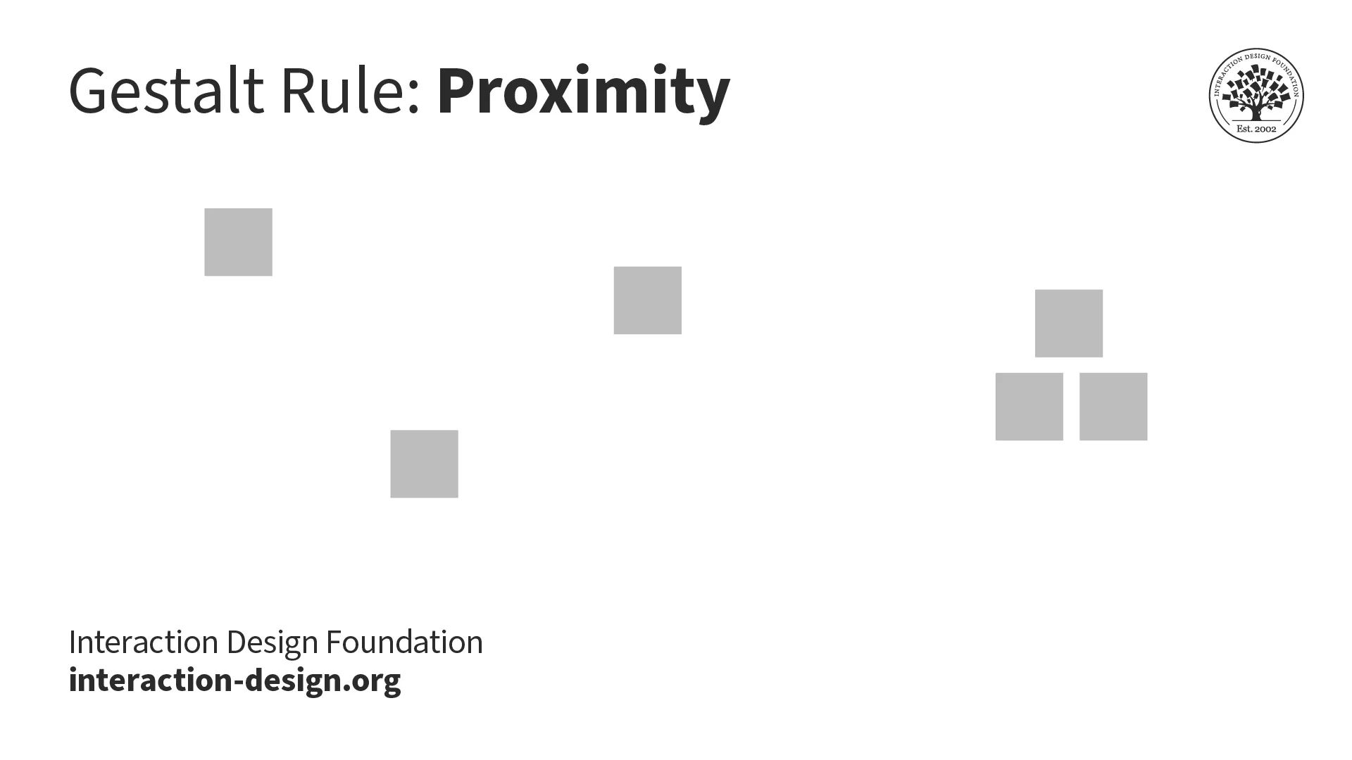
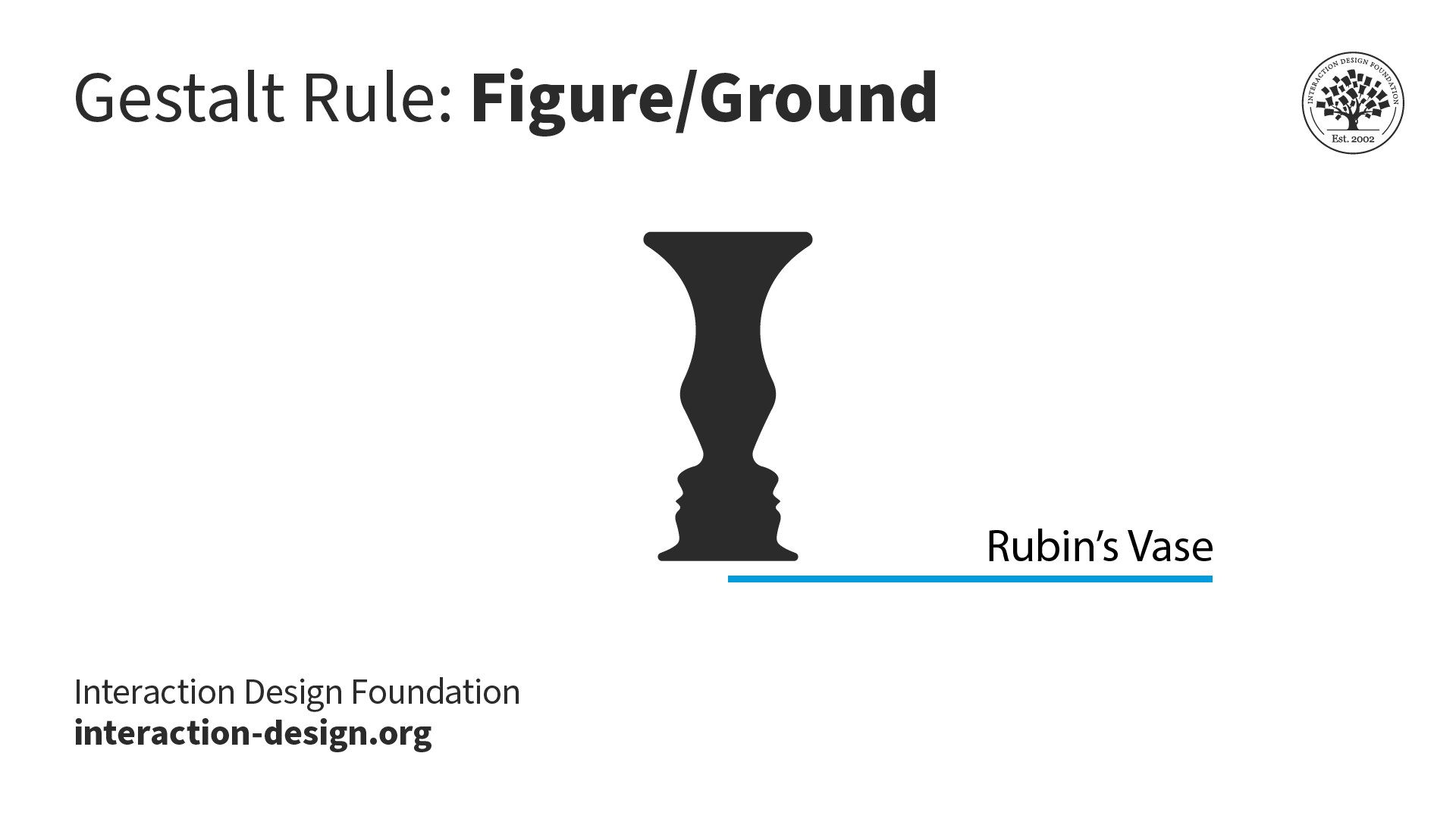
10. Consider the Other Gestalt Principles

Effective design doesn’t revolve entirely around how to find an axis of symmetry. The Gestalt principles of design are valuable allies for designers. Designers can consider how other Gestalt principles—such as the laws of proximity and figure-ground—might help achieve even more striking looks and helpful features in their design work. 

A diagram illustrating the Gestalt rule of proximity with two sets of squares, one scattered set and one close together.

Proximity (above) is one particularly useful Gestalt principle, law or rule; figure-ground is another (below).

© Interaction Design Foundation, CC BY-SA 4.0

A diagram illustrating the Gestalt law of figure-ground, with Rubin's vase showing two perspectives of a vase and a pair of faces facing each other.

© Interaction Design Foundation, CC BY-SA 4.0

Risks and Considerations with Symmetry in Digital Designs

1. Potential for Monotony

Symmetry brings a sense of order and harmony to design, but too much of it can give a design a dull look and turn users off a brand. Perfect symmetry can come across as artificial. The predictable nature of symmetrical balance means there’s little room for flexibility. Compositions must be identical on both sides for that. If designers tie themselves to an axis of symmetry, the equation can result in designs that feel dry and unengaging.  

2. Challenges with Complex Layouts

Perfect symmetry may promote stability and consistency, but it can sometimes stifle the creative expression a designer needs for more complex layouts. Strictly bilateral symmetry may dull the visual impact of a design. It can depend on the brand and the brand’s message, but if users arrive expecting some excitement, adventure and a visual feast, they’ll have little to excite them if a design is too symmetrical.  

3. Balance Symmetry with Creativity

It’s more of an art than a science to achieve balance in design. That’s why designers are better off when they consider how much of a thoughtful blend of symmetrical and asymmetrical elements they can use. It’s that all-important balance between the order and predictability of symmetry—to guide users and make a design feel more familiar—and some degree of asymmetry—to insert some dynamism and focus in it.   

A screenshot of the Beanstalk website home page.

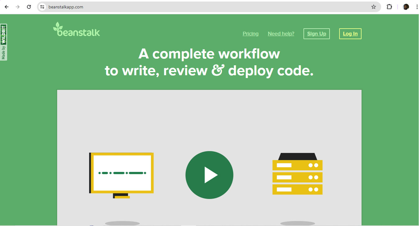
Beanstalk—from software company Wildbit—makes hosting code and managing deployments easier. Their use of symmetry helps to mirror this message in a highly user-friendly form, so teams can work on creating exceptional software instead.

© Wildbit, LLC., Fair Use

Overall, symmetry in the design of digital products is more about balance and order than perfect mirror-imaging. As with other design and art forms—like music—those who experience design work tend to have little patience for monotonous arrangements. It takes careful consideration to strike the perfect chord between predictability and engagement.  

The designers who reflect their brands’ values and users’ needs, desires and expectations well in this sense are those who leverage just the right amount of symmetry. So, rather than a game of calculating the equation of an axis of symmetry to find out how much “disorder” or “playfulness” a designer can get away with, it’s a question of balance. It’s about mirroring both client-brand and user demand in good-looking, user-friendly interfaces.  

Learn More about Symmetry in UX Design

Take our Visual Design: The Ultimate Guide course. 

Read our piece, Symmetry vs. Asymmetry - Recalling basic design principles

Consult Symmetrical and asymmetrical balance in web design by Eric Chung for more insights. 

Go to Guide: Understanding Symmetry and Asymmetry in UI Design by Leonardo Moreno for further details. 

See Benefits Of Symmetry In Web Design: What You Need To Know by BaseHost Team for additional insights and tips. 

Read The Magic of Symmetry in Design: Why It’s More Than Just a Pretty Face by Eduardo Feo for more information. 

Questions about Symmetry

How does symmetry affect user perception?

Symmetry plays a crucial role in how users perceive design. It makes interfaces look balanced and harmonious. That goes a long way to making them more visually appealing and easier to navigate. When designers use symmetry correctly, they can help users feel more comfortable and confident with the product.  

In design, perfect symmetry means that elements on one side of an axis mirror those on the other side. In practical terms, though, it’s less about sticking to a strict axis of symmetry formula and more about achieving a high degree of symmetry—whatever’s appropriate for the brand and users. This balance helps users process information more easily, and lightens their cognitive load. For instance, symmetrical website layouts help users find information quickly.  

What’s more, symmetry suggests stability and reliability. Users often see symmetrical designs as being more professional and high-quality. This perception can boost their sense of trust and satisfaction with the product. For example, many corporate websites use symmetry to carry tones of credibility and authority to users.  

Try using symmetry to organize key elements and create a clear visual hierarchy. Align buttons, menus and content blocks symmetrically, so you guide users smoothly through the interface. However, mix in some asymmetrical elements—to keep the design interesting.  

Take our Visual Design: The Ultimate Guide course. 

Watch our video on visual hierarchy to understand more about this important subject: 

Show Hide video transcript
  1. 00:00:00 --> 00:00:31

    Visual hierarchy refers to the arrangement or organization of elements within a design in a way that guides the viewer's eye through the content in a specific order of importance. It's about creating a clear and logical structure that helps users navigate and understand the information presented. You can use size and scale, color and contrast typography, white space

  2. 00:00:31 --> 00:01:00

    alignment, repetition, proximity, visual elements such as icons, images, textures and graphics and reading patterns. By using these principles effectively, Designers can guide the viewer's focus, ensuring that the most important elements are noticed first and create a more intuitive and engaging experience.


What are the different types of symmetry?

Designers use various types of symmetry to create balanced and appealing designs. The main types of symmetry are:  

  1. Reflection symmetry: Also called mirror symmetry, this type occurs when one half of an object mirrors the other half. For example, a butterfly's wings show reflection symmetry.  

  2. Rotational or radial symmetry: This type appears when an object looks the same after you rotate it around a central point. A common example is a wheel or a starfish.  

  1. Translational symmetry: This type happens when an object repeats itself at regular intervals. Think of a wallpaper pattern where the design repeats across the surface.  

  2. Glide reflection symmetry: This combines reflection and translation. Imagine footprints on the sand where each step mirrors and shifts from the last.  

Each type of symmetry can enhance a design through a sense of order and harmony. However, consider what you want to achieve. Use reflection symmetry for formal, balanced designs. Rotational symmetry can create dynamic, engaging visuals. Translational symmetry works well for patterns and backgrounds. Radial symmetry draws attention to a central point. Glide reflection adds complexity and interest.  

Take our Visual Design: The Ultimate Guide course. 

How can symmetry improve accessibility in design?

Symmetry can improve accessibility in design since it makes interfaces easier to understand and get through. When designers use symmetry, they create a balanced and predictable layout—one that helps users process information more quickly. More specifically, designs that have more symmetry:  

  1. Simplify navigation: Symmetrical designs help users predict where elements are. For example, navigation menus that appear symmetrically at the top or sides of a page help users find them easily.  

  2. Enhance readability: Symmetry in text layout—like evenly spaced columns and balanced paragraphs—makes reading easier. Users with cognitive disabilities benefit from this clarity and structure.  

  1. Reduce cognitive load: A symmetrical design reduces the mental effort users need to understand and use an interface. They won’t need to spend extra time figuring out where things are or how to navigate.  

  2. Help users with visual impairments: High-contrast symmetrical layouts help users with low vision distinguish between different parts of the user interface (UI). Consistent patterns and balanced elements will also improve the overall usability of an interface.  

  1. Improve user confidence: Symmetry provides a sense of order and stability, so users feel more confident while they interact with an interface. That’s especially important for users with anxiety or those new to digital interfaces.  

Watch our video on accessibility to understand more about this essential design dimension: 

Show Hide video transcript
  1. 00:00:00 --> 00:00:30

    Accessibility ensures that digital products, websites, applications, services and other interactive interfaces are designed and developed to be easy to use and understand by people with disabilities. 1.85 billion folks around the world who live with a disability or might live with more than one and are navigating the world through assistive technology or other augmentations to kind of assist with that with your interactions with the world around you. Meaning folks who live with disability, but also their caretakers,

  2. 00:00:30 --> 00:01:01

    their loved ones, their friends. All of this relates to the purchasing power of this community. Disability isn't a stagnant thing. We all have our life cycle. As you age, things change, your eyesight adjusts. All of these relate to disability. Designing accessibility is also designing for your future self. People with disabilities want beautiful designs as well. They want a slick interface. They want it to be smooth and an enjoyable experience. And so if you feel like

  3. 00:01:01 --> 00:01:30

    your design has gotten worse after you've included accessibility, it's time to start actually iterating and think, How do I actually make this an enjoyable interface to interact with while also making sure it's sets expectations and it actually gives people the amount of information they need. And in a way that they can digest it just as everyone else wants to digest that information for screen reader users a lot of it boils down to making sure you're always labeling

  4. 00:01:30 --> 00:02:02

    your interactive elements, whether it be buttons, links, slider components. Just making sure that you're giving enough information that people know how to interact with your website, with your design, with whatever that interaction looks like. Also, dark mode is something that came out of this community. So if you're someone who leverages that quite frequently. Font is a huge kind of aspect to think about in your design. A thin font that meets color contrast

  5. 00:02:02 --> 00:02:20

    can still be a really poor readability experience because of that pixelation aspect or because of how your eye actually perceives the text. What are some tangible things you can start doing to help this user group? Create inclusive and user-friendly experiences for all individuals.


How can I use symmetry to enhance user interface elements?

You can use symmetry to enhance your user interface (UI) elements by creating a balanced and visually appealing design. Symmetry helps users understand and navigate an interface more easily. Here are some practical ways to apply symmetry:  

  1. Align buttons and icons: Place buttons and icons symmetrically to make them easier to find and use. For example, arrange navigation buttons evenly across the top or bottom of your interface.  

  2. Balance text and images: Ensure that text and images align symmetrically. This creates a clean and organized look. For instance, place an image on one side; then balance it with text on the other side.  

  1. Use grids: Design your layout with a grid system to keep an effective balance of symmetry. This helps you align elements consistently. Plus, it’ll give users a calming sense of order.  

  2. Create consistent spacing: Use equal spacing between elements to make the most of symmetry. Consistent margins and padding can improve the overall balance of your design and make it more welcoming.  

  1. Design symmetrical forms: Make input forms symmetrical—align the labels and fields. This will help users to complete forms more easily and quickly.  

With the right amount of symmetry, you can create a UI that looks professional and feels intuitive to users. Symmetry will help them focus on important elements and not feel distracted. What’s more, you can leverage design patterns that take this and other user concerns well into account: 

Watch our video on design patterns: 

Show Hide video transcript
  1. 00:00:00 --> 00:00:33

    User Interface Design Patterns are recurring components which designers use to solve common problems in interfaces. like, for example, when we think about those regular things that often are repeating themselves to kind of appear in, you know, in complex environments We need to show things that matter to people when they matter and nothing else. Right. it's just really sad what we see. Like, for example, if you look at Sears, right? Sears is just one of the many e-commerce sites, you know, nothing groundbreaking here. So you click on one of the filters and then the entire interface freezes

  2. 00:00:33 --> 00:01:00

    and then there is a refresh and you're being scrolled up. And I always ask myself, is this really the best we can do? Is really the best kind of interface for filtering that we can come up with, or can we do it a bit better? Because we can do it a bit better. So this is a great example where you have galaxies and then galaxies, you have all this filters which are in rows. Sometimes they take three rows, sometimes four or sometimes five rows. That's okay. Show people filters, show people buttons if they important show them.

  3. 00:01:00 --> 00:01:32

    Right. But what's important here, what I really like is we do not automatically refresh. Instead, we go ahead and say, "Hey, choose asmany filters as you like", right? And then whenever you click on show results, it's only then when you actually get an update coming up in the back. Which I think is perfectly fine. You don't need to auto update all the time. And that's especially critical when you're actually talking about the mobile view. The filter. Sure, why not? Slide in, slide out, although I probably prefer accordions instead.

  4. 00:01:32 --> 00:02:01

    And you just click on show products and it's only then when you return back to the other selection of filters and only when you click okay, show all products, then you actually get to load all the products, right? Designing good UI patterns is important because it leads to a better user experience, reduces usability issues, and ultimately contributes to the success of a product or application. It's a critical aspect of user centered design and product development.


Take our Visual Design: The Ultimate Guide course. 

What are the best practices for achieving symmetry in mobile app design?

To leverage symmetry in mobile app design, try these tips:  

  1. Use grid systems: This can help you get a consistent alignment of elements—and keep good symmetry across different screen sizes and resolutions.  

  2. Align elements evenly: Place buttons, icons and text boxes in symmetrical positions. For example, center-align headings and distribute navigation icons evenly over the bottom of the screen.  

  1. Keep spacing consistent: Keep equal spacing between elements; it’ll boost the sense of visual balance. Use consistent margins and padding to make a clean, more organized layout.  

  2. Balance text and images: Ensure that text and images align symmetrically. For instance, if you put an image on the left side, balance it with corresponding text on the right side.  

  1. Design symmetrical forms: Align labels and input fields symmetrically in forms. This helps users understand the structure and fill out forms more easily.  

  2. Use repetition: Repeat certain design elements—like buttons or icons. That can create a sense of rhythm and balance.  

  1. Focus on visual hierarchy: Arrange elements in a way that guides users' attention naturally. Symmetrical layouts can often help users find important information quickly.  

Remember, symmetry is more about balance and appropriate order than dictionary-definition symmetry or mirror-imaging elements precisely. Use your designer’s judgment to get the right balance. 

CEO of Experience Dynamics, Frank Spillers explains a human-centered mobile approach in this video: 

Show Hide video transcript
  1. 00:00:00 --> 00:00:30

    In this five-step process to designing for mobile, I want to point out some of the aspects or steps that are so critical and tell you why they're so critical and explain a little bit about how they work. The first step, *assess*, is requirements, your internal priorities,

  2. 00:00:30 --> 00:01:05

    your business objectives. And so – that's for step one – the last step, step five, should be familiar as well, it's *sketch*. So, we'll also add sketch, review, refine and have that sort of iteration. But it's what happens in steps two, three and four that are really, really critical and make the difference in a mobile UX design that outperforms and differentiates and creates a very, very deep bond with users and in a way that what we call *user adoption*.

  3. 00:01:05 --> 00:01:36

    So, step two, *understand* user needs, and that means understand their context of use, problems they're trying to solve, their tasks, their goals, all the things that make up personas, and then make up journey maps. Once you do that very crucial user research step, it's step three where you *define* your value proposition and your emotional value. So, emotional value is what users get from the app so that you essentially support their tasks,

  4. 00:01:36 --> 00:02:01

    you support their goals, you support a social aspect of their experience. You help them by giving them features and functionality that they find useful. Maybe you surprise them pleasantly, delight them. Understand their cultural needs. Understand their safety needs. Whatever it might be, you define that value proposition,

  5. 00:02:01 --> 00:02:30

    but also emotional value, that chance to connect with a user in such a way that they feel at home with your app or mobile content. So, that's step three. Step four is where you take what you've learned from user needs and from defining your value proposition and your emotional value, and you then *create a UX strategy* that's like a blueprint for when you get to sketching in the next step.

  6. 00:02:30 --> 00:03:02

    So, a differentiated UX strategy is something that makes your app special and connects with your users in a special way. You can't just generate this internally. A lot of product folks have pressure in their jobs, product managers, to differentiate, and they typically rely on market research, focus groups, surveys, that kind of thing. That's market research. And so, what we're talking about is if you get into the behavior of your users,

  7. 00:03:02 --> 00:03:30

    if you really dig into their contextual experience and what surrounds it and what they do as they go through their day and their lives and how they live it – if you get into that, then you can understand their needs, define their value proposition and their emotional value in a way that helps you differentiate. So, it might be how you approach the design, what features you drop

  8. 00:03:30 --> 00:03:53

    or that you add. In other words, the priorities and the good decision-making is what all of UX is about. It's about good design decision-making, And this five-step process is based on a very powerful and proven approach that I've taken in my work over the years, and this is basically the way to do it.


How does symmetry impact the usability of a user interface?

Symmetry, done well, can create a balanced and organized layout that users will find easy to navigate. When designers use symmetry and create a proper balance, they can help users understand the structure of the interface quickly. More symmetrical designs can:  

  1. Enhance predictability: Users can find these layouts easier to predict regarding where elements are. For example, if navigation buttons follow a symmetrical placement, it can help users find them without effort.  

  2. Reduce cognitive load: Symmetry reduces the mental effort users need to process the interface. They won’t have to figure out where things are—something that makes the experience more intuitive.  

  1. Increase readability: Symmetrical text layouts improve how readable text is. Balanced columns and even spacing help with that. Users can read content far more easily when it shows in a well-structured format.  

  2. Boost visual appeal: Symmetry creates a visually pleasing interface—under the right circumstances and with the right amount of balance. Users are more likely to enjoy and engage with a design that looks orderly and harmonious if that’s what they expected to find to help them.  

  1. Support accessibility: High-contrast symmetrical layouts help users with visual impairments navigate more easily. Consistent patterns and balanced elements boost the overall usability.  

Remember, symmetry is a tool of balance. The right amount on the right brand interface can help users find what they need quickly and enjoy a smoother interaction with the design.  

 Take our Visual Design: The Ultimate Guide course. 

Watch our video on usability for more information about this important subject: 

Show Hide video transcript
  1. 00:00:00 --> 00:00:30

    What usability is, and basically it's the  extent to which a product can be used by specified users to achieve specified goals with three things: effectiveness, efficiency and satisfaction, in a specified context of use. Okay, that's the official definition of usability. It's been around for a really long time. But the *effectiveness* – okay – is it effective? So, if a person comes to a  website, an app, you know, anything – can they do what they're supposed to do?

  2. 00:00:30 --> 00:00:58

    *Efficiency* – can they do it quickly? Do they get stuck? Do they get sidetracked? Do they go in some totally different direction? And *satisfaction* – do they feel good? Okay, that's the more emotive kind of aspect. Do they feel good about their experience? We want to make sure that what we're  creating makes sense to our users and meets their needs. Are we meeting their needs?


What are the challenges of maintaining symmetry in responsive design?

More symmetrical designs may translate well across various screen sizes, but that doesn’t guarantee a page will turn out perfectly everywhere. Several challenges arise, including:  

  1. Different screen sizes with different dimensions: For instance, a layout that looks balanced on a desktop may not translate as well to a mobile screen. Desktops and laptops are more landscape-oriented, while smartphones are more portrait-oriented. 

  2. Orientation changes: Users can switch between portrait and landscape modes. A design that’s more symmetrical in one orientation may lose it in the other.  

  1. Content reflow: Responsive designs adapt to fit different screens, which can cause content to shift and disrupt symmetry. For example, text and images might not align properly when the layout changes, making the design look uneven.  

  2. Complex layouts: Advanced layouts with multiple elements can make it harder to keep a good sense of symmetry. So, to ensure that all elements stay balanced across different screen sizes will complicate matters in the design process.  

To address such issues, designers should use flexible grid systems, test across multiple devices and prioritize a balance between symmetry and usability. It’s better to test earlier than later, too, and to consider a mobile-first approach from the start.  

CEO of Experience Dynamics, Frank Spillers explains responsive design:  

Show Hide video transcript
  1. 00:00:00 --> 00:00:30

    Now, just to start off by saying responsive is a default. Responsive is not an option – *do it*. And the reason is because that's where the world is at. Everyone expects things to be mobile-optimized, and responsive just means that if I switch from my laptop to my tablet to my phone, the site's going to fit to that resolution; it's going to kind of follow me.

  2. 00:00:30 --> 00:00:52

    And we know that users do that; that's the default. So, by doing responsive design, you're supporting device switching, and that's why it's important. You're also potentially making things a little bit more accessible and SEO-friendly, which is a factor for Google's algorithm that prioritizes responsive sites.


How can symmetry affect the visual hierarchy in UI design?

Symmetry affects the visual hierarchy in UI design as it creates a clear and organized structure. This is to guide users' attention. So, when designers apply a higher degree of symmetry, they can make it easier for users to understand which elements are important and how to navigate the interface. Namely, symmetry can:  

  1. Direct attention: Symmetry helps highlight key elements. For example, if a button is central or a headline is in the middle of a symmetrical layout, it will draw users' focus immediately.  

  2. Create balance: A symmetrical design balances visual weight. So, no part of the interface will feel heavier or more cluttered. This balance can make the design more visually appealing and easier to follow.  

  1. Enhance readability: Symmetrical text and image arrangements improve readability. Users can scan and process information more efficiently when the layout is orderly for them.  

  2. Establish consistency: A consistent framework for placing elements means users can more easily predict where to find information.  

  1. Support navigation: Symmetrical navigation menus and buttons help users spot these elements fast. Users can then move through the interface without confusion keeping them back.  

Take our Visual Design: The Ultimate Guide course. 

Watch our video on visual hierarchy to understand more about this important subject: 

Show Hide video transcript
  1. 00:00:00 --> 00:00:31

    Visual hierarchy refers to the arrangement or organization of elements within a design in a way that guides the viewer's eye through the content in a specific order of importance. It's about creating a clear and logical structure that helps users navigate and understand the information presented. You can use size and scale, color and contrast typography, white space

  2. 00:00:31 --> 00:01:00

    alignment, repetition, proximity, visual elements such as icons, images, textures and graphics and reading patterns. By using these principles effectively, Designers can guide the viewer's focus, ensuring that the most important elements are noticed first and create a more intuitive and engaging experience.


Is it advisable to go for full or complete symmetry in a UI design?

It’s not advisable—except in circumstances that call for it. While symmetry creates balance and order, a design that features it exclusively can feel monotonous and predictable. Here are some points to consider:  

  1. Visual interest: Full symmetry can make a design look dull. To bring in some asymmetry will add visual interest and engage users. For example, you might balance symmetrical navigation with asymmetrical content areas.  

  2. Hierarchy and focus: Asymmetry can help highlight important elements. To put a key button or feature off-center will draw users’ attention to it. Meanwhile, complete symmetry might distribute focus evenly. If users have everything in front of them looking so similar, they’ll find it harder to spot the most important parts.  

  1. Adaptability: Asymmetrical elements allow for more flexibility in responsive design. They can adapt better to different screen sizes and orientations. 

  2. Natural design: Natural and intuitive designs often combine symmetry and asymmetry. This combination mimics the natural world, where perfect symmetry rarely occurs. So, those well-placed imperfections can be the perfect way to a more relatable and pleasing interface.  

Take our Visual Design: The Ultimate Guide course. 

Watch our video on visual hierarchy to understand more about this important subject: 

Show Hide video transcript
  1. 00:00:00 --> 00:00:31

    Visual hierarchy refers to the arrangement or organization of elements within a design in a way that guides the viewer's eye through the content in a specific order of importance. It's about creating a clear and logical structure that helps users navigate and understand the information presented. You can use size and scale, color and contrast typography, white space

  2. 00:00:31 --> 00:01:00

    alignment, repetition, proximity, visual elements such as icons, images, textures and graphics and reading patterns. By using these principles effectively, Designers can guide the viewer's focus, ensuring that the most important elements are noticed first and create a more intuitive and engaging experience.


How can I use symmetry to guide user navigation?

You can do this by creating a clear and intuitive layout that helps users find what they need quickly. Here are some effective strategies:  

  1. Align navigation elements: Put navigation menus and buttons in a symmetrical style. For example, place a horizontal menu at the top of the page with evenly spaced items. Users will quickly understand where to look for navigation options.  

  2. Create consistent layouts: Use symmetrical layouts for key sections. If the homepage and subsequent pages follow a similar structure, users will find it easier to navigate.  

  1. Balance the visual weight: Ensure that elements on one side of the page have corresponding elements on the other. This balance draws the user's eyes naturally from one section to another, so they can follow the interface more easily.  

  2. Highlight important features: You can use symmetry to make important features or calls to action stand out. Center-align a prominent button or feature so users’ eyes go right to it.  

  1. Design symmetrical forms: Place labels and input fields symmetrically in forms. This will help users complete forms faster—they’ll more easily predict where each field is.  

Watch our video on design patterns: 

Show Hide video transcript
  1. 00:00:00 --> 00:00:33

    User Interface Design Patterns are recurring components which designers use to solve common problems in interfaces. like, for example, when we think about those regular things that often are repeating themselves to kind of appear in, you know, in complex environments We need to show things that matter to people when they matter and nothing else. Right. it's just really sad what we see. Like, for example, if you look at Sears, right? Sears is just one of the many e-commerce sites, you know, nothing groundbreaking here. So you click on one of the filters and then the entire interface freezes

  2. 00:00:33 --> 00:01:00

    and then there is a refresh and you're being scrolled up. And I always ask myself, is this really the best we can do? Is really the best kind of interface for filtering that we can come up with, or can we do it a bit better? Because we can do it a bit better. So this is a great example where you have galaxies and then galaxies, you have all this filters which are in rows. Sometimes they take three rows, sometimes four or sometimes five rows. That's okay. Show people filters, show people buttons if they important show them.

  3. 00:01:00 --> 00:01:32

    Right. But what's important here, what I really like is we do not automatically refresh. Instead, we go ahead and say, "Hey, choose asmany filters as you like", right? And then whenever you click on show results, it's only then when you actually get an update coming up in the back. Which I think is perfectly fine. You don't need to auto update all the time. And that's especially critical when you're actually talking about the mobile view. The filter. Sure, why not? Slide in, slide out, although I probably prefer accordions instead.

  4. 00:01:32 --> 00:02:01

    And you just click on show products and it's only then when you return back to the other selection of filters and only when you click okay, show all products, then you actually get to load all the products, right? Designing good UI patterns is important because it leads to a better user experience, reduces usability issues, and ultimately contributes to the success of a product or application. It's a critical aspect of user centered design and product development.


Take our Visual Design: The Ultimate Guide course. 

What are some highly cited scientific articles about symmetry?

1. Thimbleby, H. (2002). Symmetry for successful interactive systems. In Proceedings of the 4th Conference on Human-Computer Interaction (HCI'02), People and Computers XVI (pp. 1-9). Springer, London.  

This conference paper introduces the concept of symmetry as a guiding principle for designing successful interactive systems and user interfaces. The author argues that symmetry—both in its geometric and abstract forms—can make user interfaces easier to learn, use and program. So, their reliability increases. The paper explores how symmetry can explain the effectiveness of well-established HCI concepts like affordance and direct manipulation. It also discusses the potential pitfalls of abusing symmetry by designing only superficially symmetric systems that may appear visually appealing but lack true functional symmetry. That problem can result in deceptive and ineffective interfaces. The paper gives a framework for how to understand and apply symmetry in interactive system design. It highlights its role in addressing design trade-offs and creating coherent and intuitive user experiences.  

2. Leopold, C. (2019). Symmetry Concepts as Design Approach. Aesthetics Between Irregularity and Regularity. In B. Sriraman (Ed.), Handbook of the Mathematics of the Arts and Sciences (pp. 202-210). Springer, Cham.   

This paper explores the application of symmetry concepts from modern mathematics as a design methodology in the context of the Ulm School of Design. The author discusses how the symmetry concept—understood as transformations—was implemented in design teaching at the Ulm School. The paper introduces the idea of defining levels of symmetry. There, the similarity of figures is something that the respective transformation and its invariants determine. The aim is to bridge the mathematical understanding of symmetry as transformations with a more associative approach in design disciplines—following the systematics Kurd Alsleben developed based on the work of Wolf and Wolff. The paper relates this symmetry concept to the theory of information aesthetics. There, the interplay between redundancy and innovation is crucial to achieve an aesthetic state. Such a state is defined as a relation between order and disorder according to Max Bense. Transformations with many invariants are associated with repetitive redundancy. Meanwhile, those with few or no invariants represent innovative creations. However, innovation becomes recognizable only on the basis of redundancy. The paper illustrates the application of this theoretical concept as a design methodology through an example of the creation process of patterns in a student work.  

Earn a Gift, Answer a Short Quiz!

  1. Question 1
  2. Question 2
  3. Question 3
  4. Get Your Gift

Question 1

What is the main characteristic of symmetry in design?

1 point towards your gift

Literature on Symmetry in UX/UI Design

Here's the entire UX literature on Symmetry in UX/UI Design by the Interaction Design Foundation, collated in one place:

Learn more about Symmetry in UX/UI Design

Take a deep dive into Symmetry with our course Visual Design: The Ultimate Guide .

In this course, you will gain a holistic understanding of visual design and increase your knowledge of visual principles, color theory, typography, grid systems and history. You’ll also learn why visual design is so important, how history influences the present, and practical applications to improve your own work. These insights will help you to achieve the best possible user experience.

In the first lesson, you’ll learn the difference between visual design elements and visual design principles. You’ll also learn how to effectively use visual design elements and principles by deconstructing several well-known designs. 

In the second lesson, you’ll learn about the science and importance of color. You’ll gain a better understanding of color modes, color schemes and color systems. You’ll also learn how to confidently use color by understanding its cultural symbolism and context of use. 

In the third lesson, you’ll learn best practices for designing with type and how to effectively use type for communication. We’ll provide you with a basic understanding of the anatomy of type, type classifications, type styles and typographic terms. You’ll also learn practical tips for selecting a typeface, when to mix typefaces and how to talk type with fellow designers. 

In the final lesson, you’ll learn about grid systems and their importance in providing structure within design. You’ll also learn about the types of grid systems and how to effectively use grids to improve your work.

You’ll be taught by some of the world’s leading experts. The experts we’ve handpicked for you are the Vignelli Distinguished Professor of Design Emeritus at RIT R. Roger Remington, author of “American Modernism: Graphic Design, 1920 to 1960”; Co-founder of The Book Doctors Arielle Eckstut and leading color consultant Joann Eckstut, co-authors of “What Is Color?” and “The Secret Language of Color”; Award-winning designer and educator Mia Cinelli, TEDx speaker of “The Power of Typography”; Betty Cooke and William O. Steinmetz Design Chair at MICA Ellen Lupton, author of “Thinking with Type”; Chair of the Graphic + Interactive communication department at the Ringling School of Art and Design Kimberly Elam, author of "Grid Systems: Principles of Organizing Type.”

Throughout the course, we’ll supply you with lots of templates and step-by-step guides so you can go right out and use what you learn in your everyday practice.

In the “Build Your Portfolio Project: Redesign,” you’ll find a series of fun exercises that build upon one another and cover the visual design topics discussed. If you want to complete these optional exercises, you will get hands-on experience with the methods you learn and in the process you’ll create a case study for your portfolio which you can show your future employer or freelance customers.

You can also learn with your fellow course-takers and use the discussion forums to get feedback and inspire other people who are learning alongside you. You and your fellow course-takers have a huge knowledge and experience base between you, so we think you should take advantage of it whenever possible.

You earn a verifiable and industry-trusted Course Certificate once you’ve completed the course. You can highlight it on your resume, your LinkedIn profile or your website.

All open-source articles on Symmetry in UX/UI Design

Please check the value and try again.

Open Access—Link to us!

We believe in Open Access and the democratization of knowledge. Unfortunately, world-class educational materials such as this page are normally hidden behind paywalls or in expensive textbooks.

If you want this to change, , link to us, or join us to help us democratize design knowledge!

Privacy Settings
By using this site, you accept our Cookie Policy and Terms of Use.

Share Knowledge, Get Respect!

Share on:

or copy link

Cite according to academic standards

Simply copy and paste the text below into your bibliographic reference list, onto your blog, or anywhere else. You can also just hyperlink to this page.

Interaction Design Foundation - IxDF. (2024, June 18). What is Symmetry in UX/UI Design?. Interaction Design Foundation - IxDF.