In any relationship consisting of two parties, we can see a distribution of resources between both actors or relational partners. This principle of “give and take” is central to the relationship’s status. Given the fact that as UX designers, we design to build relationships between products/services and our target users, we should keep the equity theory in mind. Through our designs, we are asking—persuading—users to involve themselves in achieving a goal: both to satisfy their needs, wants and desires and also, to for our benefit, to win their custom, favor, and loyalty, etc. With the “give and take” in mind, we will offer better user experiences and, thus, with a greater likelihood that those users will become consumers and repeatedly so.
What is Equity Theory?
Author/Copyright holder: R.,Roger. Copyright terms and licence: All rights reserved Img Src
Coined and developed by workplace and behavioral psychologist J. Stacy Adams in 1969, equity theory is a theory of justice. From the term, we can instantly deduce that the nature of the theory is about balance and ethics. Adams noted that employees will always look to keep equity between the work they put into a task or job and the benefits they get from that work. If an employee perceives that there’s an imbalance (i.e., he/she feels not well rewarded for input), he/she will experience distress and consider remedying the situation (which can include leaving).
The Mathematics of Equity Theory
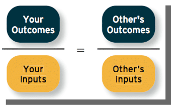
To check on what both partners are getting out of the relationship, we can represent it thus:
Inputs can involve anything from time, effort, skill, ability and determination up to loyalty. Let’s not forget hard work.
Outcomes can involve anything from job security, salary, a sense of achievement, and recognition, all the way down to a simple “thanks”.
Four Propositions make up Equity Theory
Individuals try to maximize their outcomes.
Groups will typically reward members who treat others fairly and punish those who don’t.
When individuals find themselves in an imbalanced relationship, they will become distressed. This distress is proportional to the amount of unfairness in the relationship. Note: distress can go either way. Someone who gets too much outcome for input may feel guilty or ashamed. Someone who gets too little typically gets upset or humiliated.
People who sense that they’re in an inequitable relationship will try to restore equity. If there’s a stronger imbalance, they’ll try harder to restore it.
The employee-employer “seesaw” differs from the scenario of, say, a romantic relationship (where both partners tend to see if the other is taking more than giving) in that employees who feel hard done by have other employees to compare themselves with to confirm their grievances. Employees who perceive inequity can try to reduce it “either by distorting inputs and/or outcomes in their own minds (‘cognitive distortion’), directly altering inputs and/or outcomes, or leaving the organization” (Carrell and Dittrich, 1978).
What Types of People Can Users Be?
Author/Copyright holder: Dilbert. Copyright terms and licence: All rights reserved
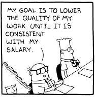
Equity sensitivity, a construct developed in 1985 by academic writers Miles, Hatfield, and Huseman of Georgia State University and the University of Georgia respectively, states that there can be any of three types of personality involved in a relationship.
BENEVOLENTS—People who prefer to be under-rewarded. These are the habitual givers in a relationship.
EQUITY SENSITIVES—People who prefer to be on an even footing with the relational partner, i.e., each gets his/her own proportionate and equal reward.
ENTITLEDS—People who prefer to get more reward and input less. These are the habitual takers in a relationship
Equity Theory in UX Design
The conflict between morality and self-interest indeed spills over to the other front in business: the vendor-consumer area.
Users accessing products or services do so because they are looking to interact and achieve a goal. True, sometimes users casually browse on downtime, looking up “nice to know” information; however, when they are looking for something to sign up for or buy, they’ll want a good deal.
A 2005 survey of American shoppers revealed that 76% of adults stated that they would be irritated to find out that others had bought the same products for less (Turrow et al., 2005). Although this included online and offline shoppers, it gives a good indication of equity theory at play. Amazon had apparently upset some customers who had discussed DVDs on the DVDTalk.com website and discovered that they were being charged up to 40% more than other consumers (Streitfeld 2000, Taylor 2004).
In his 2011 thesis submitted to TUI University entitled “Distress and Other Situational Factors that Influence Consumer Willingness to Prove Personal Information in an Online Buyer-Seller Exchange: An Equity Theory Perspective”, T.P. Barto studied how the input of information privacy bore a relationship to the vendor loyalty (outcome) in a sample of 459 participants. He noted the following:
“As hypothesized, results show that buyers’ privacy concerns negatively affect buyers’ willingness to provide personal information, perceived vendor loyalty positively affects buyers’ willingness to provide personal information: and, buyers’ privacy concerns positively affect perceived distress.”
Although Barto noted that the influence of equity on perceived distress was shown to be statistically insignificant, he still showed that users in an online commercial environment had a strong sense of give and take. The design they were interacting with was asking them to enter personal details. This, as we know, involves privacy and trust. Think of any signup procedure for a trial of site of software membership that you’ve ever experienced. How many data fields were you prompted to fill in? Regardless of the point that we live in an era where identity theft runs rampant, asking people to enter data when there is nothing in it for them is a gamble for a company. You may know that what your company has is a joy to use, and you believe that you’ve designed in a way to present it so that that is self-evident.
“What’s in it for me?” the User asked…
So, we can see that it’s important to establish a balance, showing users that it’s not a one-way street where they’re doing you a favor. In a trial period, when the user is sampling your design, it very much is a trial. Your design and product are being scrutinized and tested for usability and comfort, so it’s important to give users as much of a reason to enjoy themselves as possible. Interaction designer and storyteller Krystal Higgins identifies a powerful strategy for giving users a reason to participate by offering their time and data. Particularly, we have two crucial pieces of advice:
Let users use as many parts of your product as they can before asking them to log in. The benefit of playing around with a new ‘toy’ while remaining anonymous is a powerful attraction for users. In this early stage of finding, say, a new video game, they’re exploring, hopefully uncovering all the features in it intuitively.
Put everything into your sample that represents a true and compelling picture of the full version. In our imaginary video game, we should have full functionality; you can control your character and move around in one part of a very interesting world. In a book sample, the free chapter should sell the rest of the book.
Extending free samples is a great chance to build trust with users; free samples will show that a) you’re generous and sharing something, perhaps making users feel motivated to give something back, and b) you’re honest and upfront: the sample is a miniature or limited-time representation of what’s coming next, if they open a full account. At the same time, users will build familiarity (certainly losing uncertainty) with the features of your offering, thereby increasing the chances of becoming a consumer. However, you have to be certain just what kind of free samples your company can give. This can be difficult in some industries, so you may need to think laterally or get creative!
Overall, put the benefits that the user will get from your product or service into focus. You can show them how it will improve an aspect of their lives best if you express that to them directly. Knowing that they’ll be asking themselves “Why? What’s in it for me?”, you can be ready to explain to them exactly how cool and helpful what you’re offering is. Think about the features as benefits and highlight them, relating them to the user’s everyday experience.
Think about the most inviting and fun aspects of what you’re promoting; what can you focus on to present in a way that users can enjoy themselves while they test it? Can you minimize or condense labor-intensive input from them, so that they’re engaging with the design more than filling out data fields?
Ultimately, you can get a picture of existing users. Who are they? What are they interested in? Taking that on board, you can personalize your approach to access them at an individual level. Their feeling that you noticed and remember them will pay dividends and perhaps foster loyalty.
“Ah, but are you going to trick me?” the User thought…
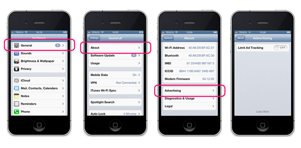
Dark patterns may not involve criminality, but they’re the reason why users may find it harder to trust a design, product, service, message, and, by association, you who are engaging them! A dark pattern is a user interface that tricks users into buying an item or service they had not been expecting. Insurance cover provisos or surcharges are examples. Anytime a company uses a dark pattern, they have “strings attached” to what they offer, and this gives a bad name to the company but also to its sector.
Author/Copyright holder: The Verge. Copyright terms and licence: All rights reserved Img Src
Keep this in mind when you’re communicating with your users, especially when you engage them at the start. Think, “Do I look trustworthy?” and remember that first impressions not only last, they form very, very quickly. Therefore, it’s vital to see your company’s presence from the users’ side. Explaining all the benefits and features to them and offering a FAQ section – for example - will keep them from that one thing that will destroy your relationship with them: uncertainty.
Designing with Equity Theory
Equity theory is an important consideration for you as you build your design. Here, you’re portraying the company you represent in the most trustworthy light. Or are you?
Check to see that you have:
(Before you design to engage)
Conducted user and marketresearch and have a clear understanding of your target users and that all your claims about the service offered are true.
Defined competitive prices in proportion to the quality of service offered.
Created an aesthetically pleasing, easy-to-use design with appropriately rich or lean media to represent your business as a trustworthy industrial presence.
Designed contact pages or payment pages so that users only have to enter the minimum amount of information required for the task.
Created a secure-looking environment for users to believe they can enter details and feel safe. Have you included fields for them to fill out and send with a copy of their input for them to have for future reference? Users like to know what they’ve submitted. This is especially true in a business transaction.
Checked your text for errors. Triple check and read aloud. Often, it’s not just spelling and grammar. Did you use a regional expression (e.g., something someone only in the United Kingdom would “get”)? Think about your usership? If you’re showing a national-centric language style, then that disconnect between your location and potential buyers’ may be enough to put them off. Why? Because he/she will have to think about what your expression means, which involves work, which involves sorting out uncertainty…which makes the user ask why he/she is bothering at all with your design. Having lost faith, they won’t be able to trust you, and so will end a bad UX.
Approached new users in a way that shows them the benefits of using your company’s service/product in a direct, respectful and courteous way (being mindful, too, that overfriendliness can make them wary and saturating them with information will bore them).
Can you offer any bonuses or discount incentives for completing a survey or questionnaire? Are you partnered with any companies who can? If so, consider including a goodie like that; when tastefully and appropriately presented, the “freebie” value is an incentive for users.
(Before you head out and engage users with your impressive design)
(When you engage users for the first time)
As you’re working, it might be a good idea to remember your position in the equation. As the UX designer, you’re in a privileged place. Although you don’t have the power of the company CEO, you’re creating the company’s presence. No one’s more qualified to do that than you. You have something that’s invaluable: an empathetic insight into the users’ world. As the ‘bridge’, you’ve got a unique chance to win and foster the trust that will pay off from a good design for a good product or service!
The Take Away
Equity theory, the study of the give-and-take dynamic in relationships, is a powerful concept in UX design. Users will look at the balance between the input you’re asking them to contribute versus the benefits that you’ll provide. At the basic level, this could be their simply filling in information fields with personal information. However, you are asking them to give something of themselves. While it’s a good sign that they’ve got to the point where they’re considering sending you personal details (if not a full purchase there and then!), you should check that a) they have no uncertainties, and b) that you have not asked them to do too much.
Users will have faith in your design and company if they recognize that they are at least getting out what they’re putting in. Ensuring that your design is trustworthy (including the points that it’s pleasing to view, shows who you are, and provides an FAQ section) is a powerful start. However, also look at your competition. What sort of benefits do you offer over them? Do you really give the best value for what you describe, or should you explain more?
Overall, remember that your design should enable a good UX. If users feel like they’re filling out a form, that’s not a good sign: forms are for getting jobs, completing a census, etc. They tend to be work and potentially stressful, especially if they’re asking for exact details. However, if you can make it minimalistic and even fun for them (remember to include an incentive/discount if you can), you’ll have tipped the balance in your favor. The users are not your employees; they don’t have to be there.They’re valuable, potential consumers and long-term clients whose loyalty you value and need, especially when it comes to seeing testimonials from them.
Where to Learn More
Here is the Wikipedia treatment of Equity Theory.
You can find Barto’s paper, “Distress and Other Situational Factors that Influence Consumer Willingness to Prove Personal Information in an Online Buyer-Seller Exchange: An Equity Theory Perspective”, here.
This is a well-written, insightful article into equity theory and associated topics. Toxboe, A. (2015). “Beyond Usability: Designing with Persuasive Patterns”. Smashing Magazine.
This is a great video feature on dark patterns here.
Reference
Hero Image: Author/Copyright holder: Anna M. Powlus. Copyright terms and licence: All rights reserved. Img


