Have you tried communicating your designs to your colleagues and stakeholders, only to realize later they’ve misunderstood what you meant? Have you found yourself stuck in a design, unable to see alternative approaches? Are you sure you’re working on the most optimal solution, or are you working with the only available design? One humble tool — sketching — can help you address these issues! Let’s see how.
Sketching is a distinctive form of drawing which designers use to propose, explore, refine and communicate ideas. As a UX designer, you too can use sketching as your first line of attack to crack a design problem.
“… there are techniques and processes whereby we can put experience front and centre in design. My belief is that the basis for doing so lies in extending the traditional practice of sketching.”
— Bill Buxton, HCI pioneer and partner researcher, Microsoft Research
In the digital age where it's easier than ever to create flawless graphics, flowcharts and interfaces, sketching holds its own.
In this video, ace designer and illustrator Mike Rohde highlights why nothing can replace the power of paper.
Show
Hide
video transcript
- Transcript loading…
Sketches are easy, fast, and cheap to create, iterate, and if needed, even discard without much effort. Unlike written or verbal communication, sketches sidestep rules of grammar and help clearly communicate ideas, all but eliminating misunderstandings. And the best part, they are a joy to create and document!
Sketches vs. Prototypes
Some designers may assume the role of sketches in the design process is the same as that traditionally associated with low-fidelity prototyping, but that is not the case.
Sketches and prototypes have distinctive roles in the development of a design concept and its refinement. You should use them at different stages. Draw sketches first in the exploratory stages of a design to propose, refine, communicate and critique your ideas in a “tangible” format. Later, use low-fidelity prototypes to test broad concepts and specific features.
The role of sketches and prototypes is complementary, but not interchangeable. Because prototypes demand a larger investment, we can’t and shouldn’t produce as many prototypes as sketches.
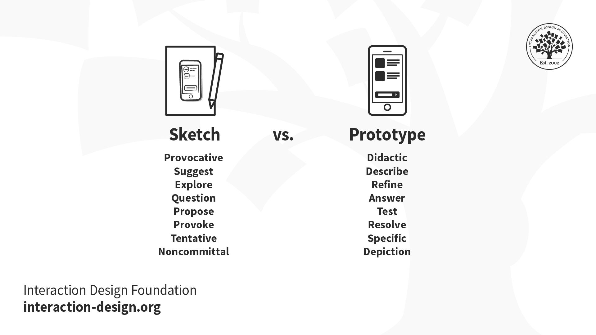
Sketches and prototypes have different uses in the design process.
The design funnel below illustrates the iterative and exploratory nature of sketches during the ideation stage of the design process. As the right design comes clearer into focus (the narrowing shaded trapezium), the costs of the product development cycle (arrow) increase. Increased costs prevent you from fundamentally altering your design choices. Use sketches during the initial, ideation phases. Towards the later stages of the design process, apply usability engineering on more refined and costly prototypes that can simulate the expected functionality.
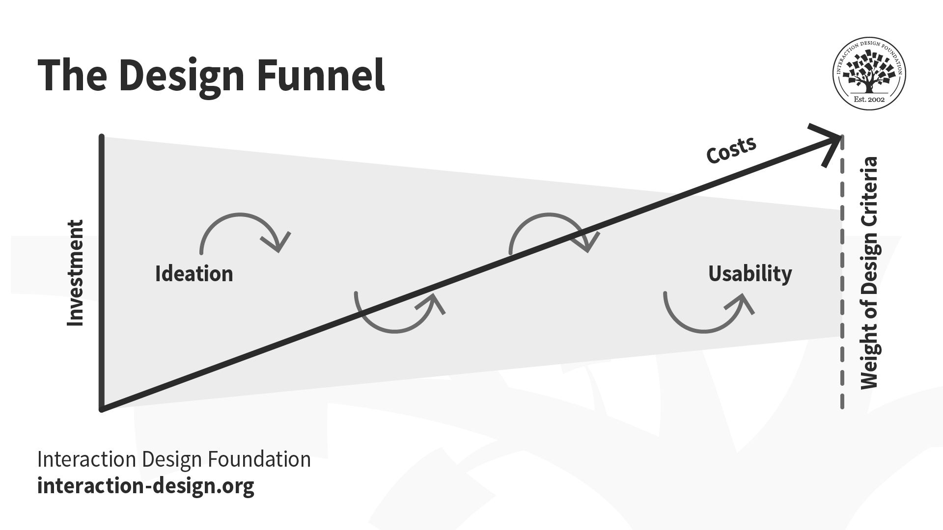
The design funnel illustrates the use of sketching to identify the right design, and the application of usability methods to refine the design. As investment increases (arrow), you lose the ability to make major changes to the design selected.
Getting the Right Design
Use sketching in the early stages of the design funnel to explore multiple design directions at low cost. Refrain from developing low- or high-fidelity prototypes at this stage. Discard promising leads that, upon closer inspection, are unable to meet your problem requirements.
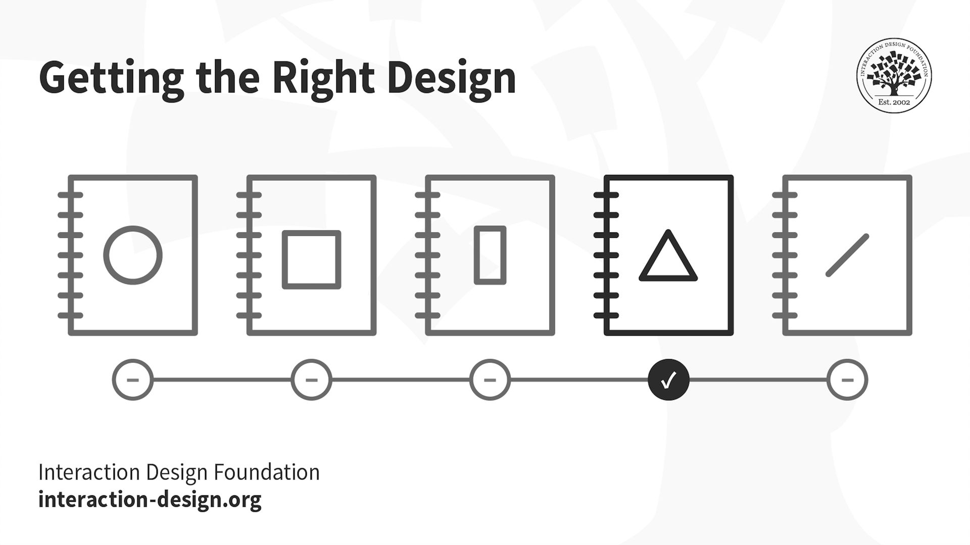
In the early stages of the design process, you should explore multiple design ideas simultaneously to identify the right design. Sketching out alternatives is the fastest and cheapest way to explore ideas.
If you focus on a single design idea prematurely, you narrow your opportunities. While it’s possible that you may identify a good design from the development of a single idea, you cannot confirm whether other ideas (that you never explored) may have provided a better solution to your problem.
Moreover, if you present only one design to users, they will provide a biased input. They will try to be polite and not offend you, even falsely praising your solution, instead of comparing different ideas and sharing genuine feedback.
Getting the Design Right
Once you have identified the right design, you should continue revising and reviewing your chosen design through additional sketching to ensure it’s an optimal design solution to your problem.
At this stage, you should apply usability engineering iteratively to build, test and evaluate your selected design. Every usability cycle would thus ensure the design converges on the optimal solution without major changes.
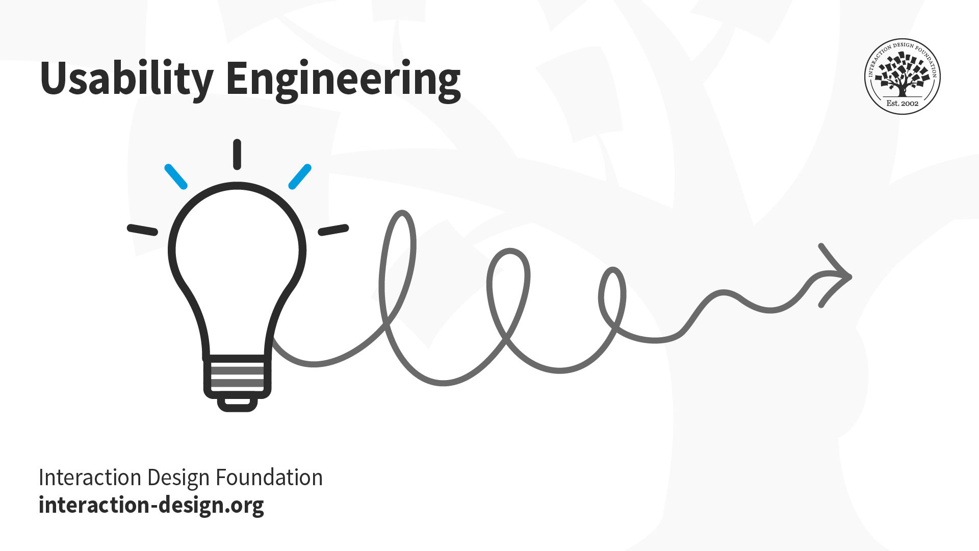
Refine the right design through an iterative usability approach.
Design and usability processes are complementary but not the same. Design explores a space of possibilities to identify the right design or solution to a problem from competing alternatives. Usability engineering sharpens the selected design, ensuring it satisfies all relevant usability criteria (i.e., getting the design right).
Ideas, Not Art — The Five Elements of Drawing
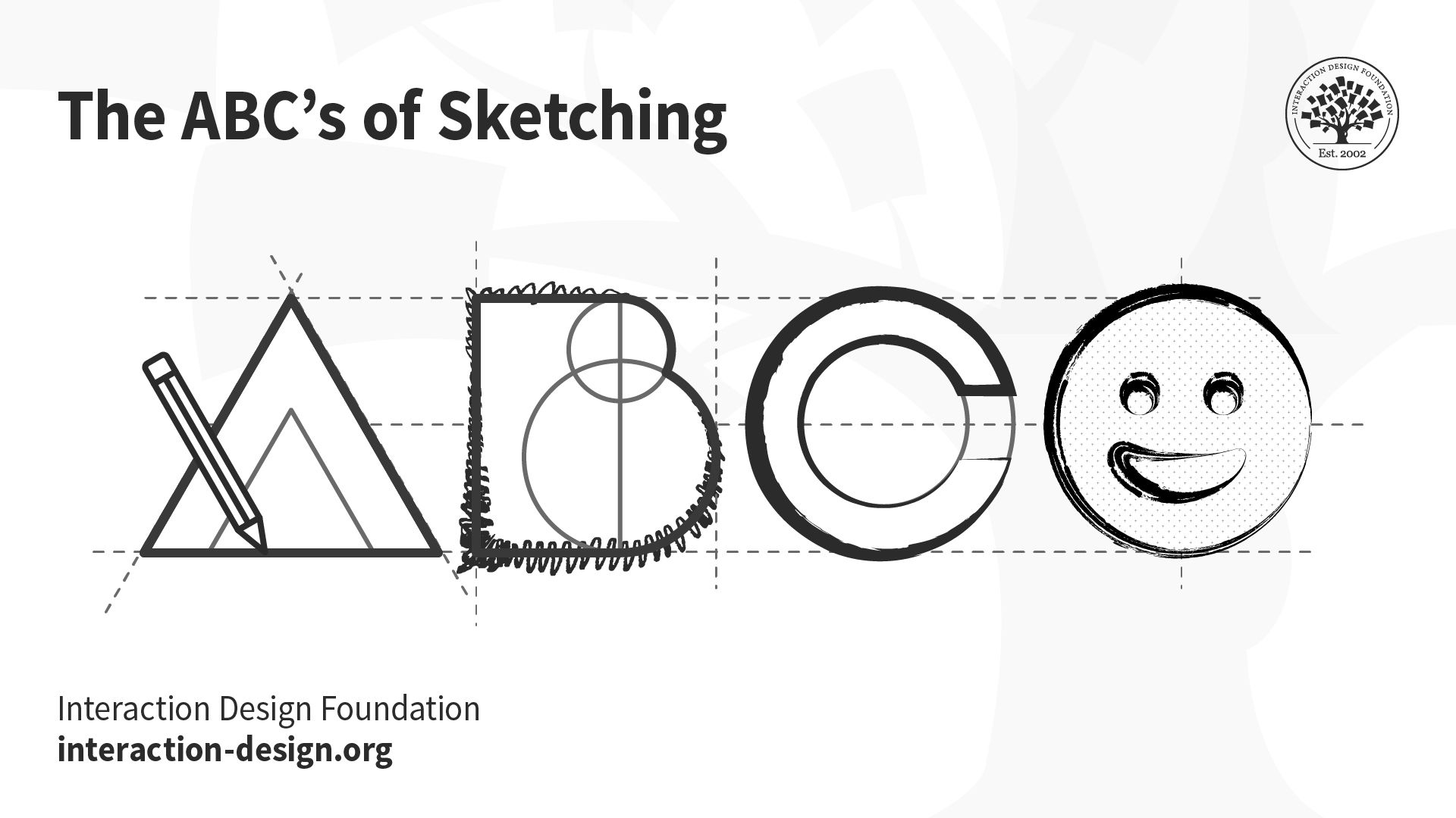
You can convey meaning and ideas through the simplest of shapes: squares, triangles, circles, lines and dots.
Sketches help you propose, explore, refine and communicate your design ideas. Not all drawings are sketches. As Mike Rohde emphasizes in the next video, your goal is to communicate ideas, not create art.
Sketches are:
Quick: Don’t invest a long period producing them.
Timely: Produce them when and as the need arises.
Disposable: Rely on their usefulness to explore a concept and not on their production costs.
Plentiful: Produce sketches as a collection that explores different aspects of interaction over time.
Minimalist: Use sketches to clarify one concept at a time.
Grab a pen and paper and get started with sketching along with Mike Rohde:
Show
Hide
video transcript
- Transcript loading…
Enhancing Sketches — Annotations, Arrows and Notes
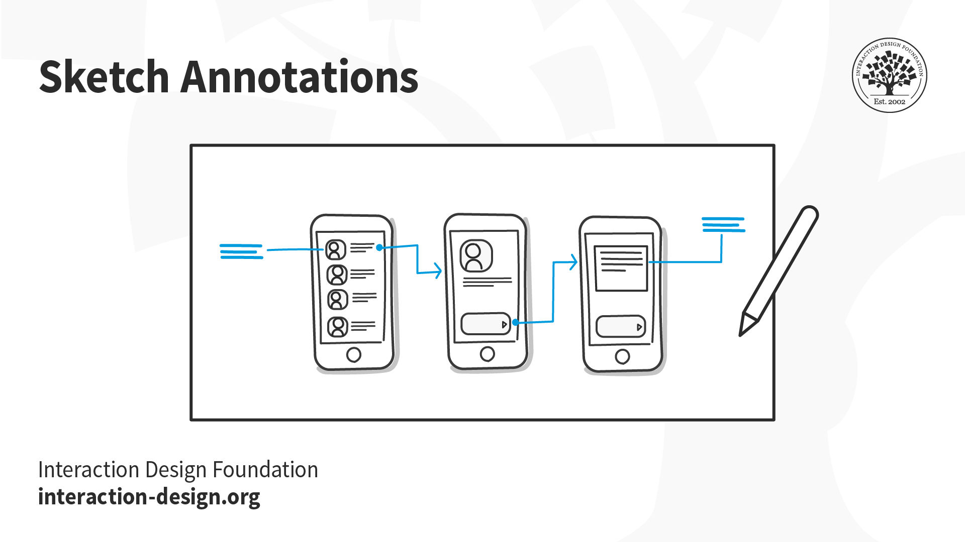
Annotations, arrows and notes increase the communicative power of your sketches.
Your sketches and accompanying text must communicate your entire design rationale to you and your team. All the following elements play their part in explaining your sketches and the objects, actions and emotions they represent.
Annotations – These are names, labels and explanations located next to different parts of a sketch to expand and clarify the meaning of any element depicted. Tie annotations to different elements in your sketch using arrows, braces, numbering and spatial proximity. Write your annotations using a different color that contrasts with the sketch proper.
Arrows – Apart from pointing to specific elements in a sketch, use arrows to illustrate interaction flow, a sequence of events, movement and direction.
Notes – Any text, long or short, that provides additional insight into your sketch is a note. Use notes to do the following:
Provide detailed explanation of the action or sequence illustrated.
Describe an idea derived from an illustration.
List unresolved issues.
Explore design elements not depicted in the sketch.
Clarify the purpose of each element you present, especially non-static ones.
Keep a record of your thought process when you first draw a sketch.
Build Your Sketching Muscle Memory
The best way to gain confidence in sketching is to practice. Use sketching to capture the ideas and/or designs you encounter in your daily activities. Other people’s designs are concrete examples of solutions posed to challenges under different constraints. Add them to your knowledge bank to remix, influence, inspire or steer your own ideas in different — and perhaps unexpected and innovative — directions. To help you in this process, we introduce below two simple approaches to collecting virtual and real-life designs.
1. Scribble Sketching
The idea behind this technique is to capture, as fast as possible and with the broadest of strokes, the essence of the object, design or action you are trying to preserve. Leave out non-important details, decorations, text and other non-essential elements. Include textual annotations (see previous section) in your scribble sketches to clarify functionality.
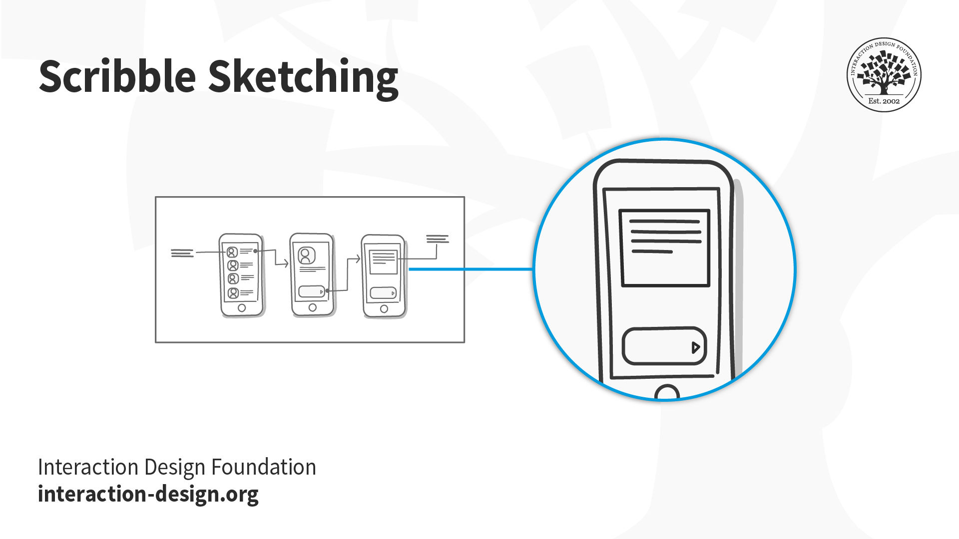
Capture with “broad strokes” the essence of the object, design or action you are trying to preserve.
Make a habit of always carrying a notebook to keep a record of objects, designs and actions that provoke or inspire you. Since you are the main audience of the scribble sketching technique, don’t feel forced to strive for fidelity. You should only provide a level of detail that is good enough to prompt your memory afterwards. Those rough etchings thus serve as a bank of ideas and skeletons you can eventually refine into powerful final versions.
2. Sampling with Cameras
The goal of this technique is to use still photos and video to capture some features of the world. You can easily capture samples during your weekly grocery shopping, while running your favorite route, on your commute to work or when you meet friends for dinner. Capture objects, designs and actions that delight, inspire and irritate you.
Create a Record of Failed Design Efforts
Keep a record of failed design efforts. Gather objects and situations that annoy you. Write down the reasons behind this negative effect. This exercise will help you develop a critical eye. A critical eye will allow you to identify even the shortcomings of your own work. In doing so, you will develop and show more sophisticated design skills.
Create a Record of Successful Design
You should also keep a record of successful design. This will help you draw inspiration from multiple domains to ground your design work on features other than those of the digital realm.
The Take Away
Sketching is a time-tested approach to propose, explore, refine and communicate your design ideas. Sketching should be your first line of attack when faced with a new design challenge. Unlike prototypes, you should produce sketches in abundance, on a very low budget and with just the right amount of detail in the early stages of the design process. Use sketches to explore multiple design directions simultaneously. Refine your chosen design with the standard tools of usability engineering to ensure it satisfies all relevant requirements. Sketch, sketch, sketch!
References and Where to Learn More
Researchers from the University of Toronto and Microsoft Research conducted an experiment: They compared “usability testing of a single interface versus three functionally equivalent but stylistically distinct designs” and found that users were more reluctant to criticize a single design, than when presented with the same design in a group of three. For more on this fascinating study, read this paper, “Getting the Right Design and the Design Right: Testing Many Is Better Than One.”
For more on sketching in UX design, we recommend the following books:
Sketching User Experiences: Getting the Design Right and the Right Design by Bill Buxton
Sketching User Experiences: The Workbook by Saul Greenberg, Sheelagh Carpendale, Nicolai Marquardt and Bill Buxton.
Images
© Interaction Design Foundation, CC BY-SA 3.0
