Your constantly-updated definition of Low-Fidelity Prototypes and
collection of videos and articles. Be a conversation starter: Share this page and inspire others!
384shares
What are Low-Fidelity Prototypes?
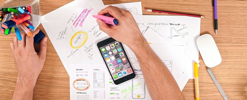
Low-fidelity prototypes are simplified, early-stage representations of a product or interface that prioritize functionality over visual design. They are usually created using pen and paper or basic digital tools and help visualize the core functions and flow of a product.
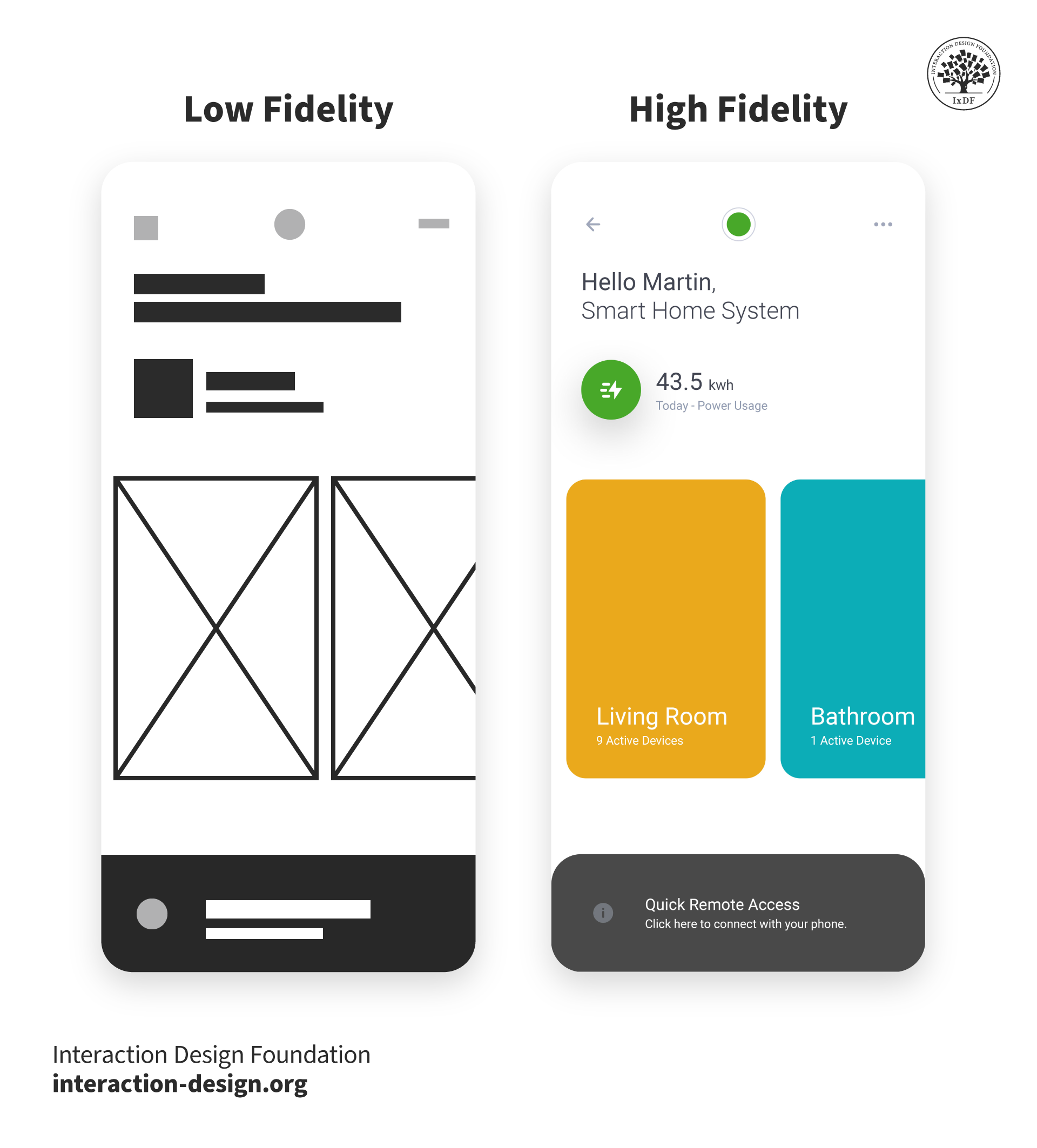
Fidelity refers to the level of detail and functionality of a prototype—there are low-fidelity, mid-fidelity and high-fidelity prototypes.
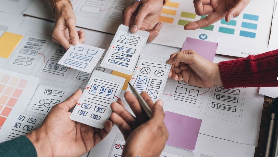
Designers use low-fidelity prototypes to quickly test and iterate ideas before investing time and resources in high-fidelity development. A classic example of low-fidelity prototypes are paper prototypes.
ShowHide
video transcript
Transcript loading…
Why Are Low-Fidelity Prototypes Important?
Low-fidelity prototypes are flexible and cost-effective ways to explore design concepts. They are usually created at the early stages of the design process. Designers use them to start visualizing their ideas and to test their validity. Designers can also use low-fidelity prototypes to do early testing with users and gather feedback to refine their ideas.
These prototypes help:
Uncover usability issues early: Thanks to testing the flow of an application with users, designers may identify potential pain points and inefficiencies. For instance, a paper prototype of a mobile app might reveal that users struggle to complete a specific task.
Foster collaboration and alignment: For non-designers, sometimes it can be difficult to understand early ideas or concepts. Low-fidelity prototypes help visualize these ideas and make sure all stakeholders are on the same page.
Reduce development costs: Any issue that is identified at this early stage of the process will save costs later on. For example, a navigation issue in a paper prototype can be easily addressed and fixed, whereas a navigation issue in a commercially available app will be far more difficult and costly to fix.
Stimulate creativity and innovation: the rapid and low cost of low-fidelity prototyping allows designers to experiment with different ideas and concepts in an efficient manner.
Rapid Iteration: Types of Low-Fidelity Prototypes
Designers use different types of low-fidelity prototypes depending on their objectives. Here are the primary types:
Sketches: Hand-drawn representations of screens or flows, often created with pen and paper. They can also be created with digital software. In this video, best-selling author Mike Rohde explains how everyone can sketch, even without having drawing skills.
ShowHide
video transcript
Transcript loading…
Storyboards: Sequential sketches that depict user interactions and the overall user experience. In this video, UX designer and author Laura Klein explains how telling stories and creating sketches can help designers.
ShowHide
video transcript
Transcript loading…
Post-it notes: Sticky notes can be used to represent different screens or elements, allowing for easy rearrangement.
Paper prototypes: Physical mockups using paper and pen to simulate user interactions.
Role-playing: Acting out user scenarios can help identify potential pain points and improve the design. This is especially useful when designing for a 3D product. In this video, CEO of Experience Dynamics Frank Spillers explains how low-fidelity prototypes are essential for creating3D experiences, such as AR or VR apps.
ShowHide
video transcript
Transcript loading…
Wizard of Oz prototyping: A technique where a designer simulates a software application's functionality behind the scenes. In other words, users interact with what seems like a fully functioning product, but behind the scenes, a designer is manually controlling the experience. It's a way to test complex interactions without building the entire system first. Learn more about Wizard of Oz prototyping in this video:
Lego prototypes: For physical products, Lego bricks can be used to create tangible representations of the design.
Digital wireframes: Basic digital representations of the interface using simple shapes and outlines.
Design Process in Focus: The Role of Low-Fidelity Prototypes in Your Portfolio
Hiring managers want to see the design process of a candidate. Therefore, designers should incorporate low-fidelity prototypes in their portfolio to visualize their design process and increase their chances of getting hired. This not only showcases design skills but also helps build credibility, and shows the designer’s full involvement in the project and their journey from design concept to final product.
High-Fidelity Prototypes vs. Low-Fidelity Prototypes: What’s the Difference
The level of prototype’s fidelity should match the desired outcome—if they’re going to be presented to users for testing and focused feedback is required, the prototype’s fidelity should reflect that.
Low-fidelity prototypes allow for quick iterations and easy modifications, encouraging a focus on core functionality. However, their lack of visual appeal and interactivity can limit their effectiveness in gathering detailed user feedback. While valuable for early-stage exploration, paper prototypes may not accurately represent the final product's complexity, which can lead to misunderstandings.
High-fidelity prototypes offer a more polished representation of the final product. While they require greater time and resources to develop, they provide a more realistic user experience, enabling more accurate feedback. However, this increased fidelity can also lead to a focus on superficial details, potentially overshadowing the core functionality. Additionally, designers may become overly attached to their work, making changes difficult. It's essential to balance the desire for a visually appealing prototype with the need for iterative improvement.
Some designers split high-fidelity prototyping into “mid-fidelity” (where prototypes can have basic digital interactivity or be slick wireframes) and “high-fidelity” (where they’re far closer to the final version). Interactive prototypes yield far more useful results in user tests. However, fidelity is relative—a static mockup of a landing page, for example, is of higher fidelity than sketched cut-outs users can move. Overall, the right prototype depends on the project stage and the specific product.
The Design Journey: From Low-Fidelity to High-Fidelity
The optimal moment to transition from the rapid iteration of low-fidelity prototypes to high-fidelity ones depends on the unique characteristics of each project. Designers must consider project goals and resource allocation.
Typically, once the main usability issues have been identified and solved, and the fundamental interactions and core flow are solid, it would be a good time to move on to high-fidelity prototypes.
What are some recommended books that cover low-fidelity prototypes?
- Mastering UX Design with Effective Prototyping: Turn your ideas into reality with UX prototyping by Apurvo Ghosh.
- The Design of Everyday Things by Don Norman. This book emphasizes the importance of user-centered design and provides valuable insights into creating intuitive and user-friendly interfaces. It covers the principles that underpin high-fidelity prototyping.
When should you use a low-fidelity prototype?
Use low-fidelity prototypes in the early design stages to quickly test and iterate on ideas. These simple, cost-effective prototypes focus on functionality over aesthetics and help designers explore concepts, gather user feedback, and facilitate team collaboration. They support an iterative design process, allowing rapid adjustments based on feedback.
What materials and tools are typically used for creating low-fidelity prototypes?
Designers typically use a range of materials and tools to create low-fidelity prototypes. These include:
Paper and pen: The simplest and most common tools. Sketching ideas on paper allows quick visualization and easy adjustments.
Post-it notes: Useful for creating modular components that can be rearranged to explore different layouts and interactions.
Cardboard: Helps create more tangible prototypes, especially for physical products, allowing designers to understand scale and ergonomics.
Wireframes: designers create digital low-fidelity prototypes with different digital design tools. These tools offer pre-made UI elements, enabling quick assembly of design ideas.
Whiteboards: Ideal for collaborative brainstorming sessions. Teams can draw and adjust their ideas in real-time.
Cutting tools: Scissors, craft knives, and cutting mats are often used to shape and refine paper or cardboard prototypes.
Glue and tape: Essential to assemble physical prototypes, allowing designers to combine various materials.
Markers and highlighters: Highlight key features or interactions, making it easier to communicate ideas to stakeholders.
A low-fidelity prototype should convey core functionality and user flow without focusing on visual details. Include a basic layout, key interactions, user journey, and brief annotations to explain elements and interactions. This approach allows for rapid creation and iteration, focusing on user experience and essential features.
What are the limitations of low-fidelity prototypes?
Low-fidelity prototypes, while useful for early design stages, have limitations such as lacking visual and interaction details, which can lead to misunderstandings about the final product. They may not elicit accurate user feedback and are less effective for stakeholder presentations. Additionally, they can oversimplify complex interactions, missing critical user experience aspects. As the design progresses, transitioning to higher-fidelity prototypes and supplementing with detailed annotations can address these limitations.
Can low-fidelity prototypes be used for user testing?
Yes, you can use low-fidelity prototypes for user testing, particularly in the early stages of design. These prototypes help gather valuable feedback on basic functionality, user flows, and overall concept without extensive investment. They allow designers to identify major usability issues and understand user needs quickly. However, keep in mind that the feedback may be less precise regarding visual details and complex interactions. As the design evolves, transitioning to higher-fidelity prototypes can provide more detailed and accurate user testing results.
How do you present a low-fidelity prototype to stakeholders?
To present a low-fidelity prototype to stakeholders, start by explaining its purpose and focusing on functionality and user flow over visual details. Clearly outline the goals, guide them through the prototype, and highlight key interactions. Use annotations to clarify elements and encourage feedback. Manage expectations by reminding them that the prototype is preliminary and will evolve.
What are common mistakes to avoid when creating low-fidelity prototypes?
When creating low-fidelity prototypes, avoid overcomplicating the design. Keep the prototype simple and focused on core functionalities, regularly update it based on feedback, and provide clear annotations to explain interactions.
How do you decide what features to include in a low-fidelity prototype?
To decide what features to include in a low-fidelity prototype, focus on core functionalities and key user interactions that need validation. Prioritize essential elements that demonstrate the basic user flow and overall concept, such as main user journeys and critical interactive components like buttons and forms. Incorporate features requiring user feedback and avoid unnecessary details.
Improve your UX / UI Design skills and grow your career!
Join IxDF now!
Question 1
Question 2
Question 3
Get Your Gift
Congratulations! You Did Amazing
3 out of 3 questions answered correctly
You earned your gift with a perfect score! Let us send it to you.
Check Your Inbox
We've emailed your gift to name@email.com.
Improve your UX / UI Design skills and grow your career!
Join IxDF now!
Literature on Low-Fidelity Prototypes
Here's the entire UX literature on
Low-Fidelity Prototypes by
the Interaction Design Foundation, collated in one place:
Learn more about Low-Fidelity Prototypes
Take a deep dive into Low-Fidelity Prototypes with
our course
AI for Designers
.
It's Easy to Fast-Track Your Career with the World's Best Experts
Master complex skills effortlessly with proven best practices and toolkits directly from the world's top design experts. Meet your expert for this course:
Ioana Teleanu: AI x Product Design Leader (ex-Miro, ex-UiPath). Founder, UX Goodies.
All open-source articles on Low-Fidelity Prototypes
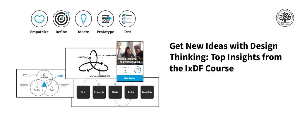
Transform Your Creative Process with Design Thinking
Think about a new user experience (UX) design project at work that your team needs fresh ideas for—you want to create a
496 shares
3 weeks ago
Open Access—Link to us!
We believe in Open Access and the democratization of knowledge. Unfortunately, world-class educational materials such as this page are normally hidden behind paywalls or in expensive textbooks.