If you already have an online UX/UI design portfolio, do you need a PDF version? The answer is – yes; it is better to be safe than sorry! Some hiring managers like to see a more detailed PDF portfolio after reviewing your online portfolio, while some job applications may request an upload instead of a link. The great news is you already have the perfect foundation to build your PDF UX portfolio. Your PDF portfolio is an expanded version of your online portfolio and provides the opportunity to showcase your design skills in greater detail. Let’s go through the steps to create your PDF UX/UI design portfolio, followed by five essential tips to elevate it above the rest. Finally, we’ve handpicked three real PDF UX portfolio examples to inspire you!
3 Simple Steps to Build a Standout PDF UX/UI Design Portfolio
You will likely find your PDF portfolio is more straightforward to produce than your online version. However, many of the same practices apply, and it’s important to keep these common mistakes in mind:
You never know when you’ll be asked for your PDF portfolio, so make sure you have it at the ready! Follow these three steps to get started and build a standout PDF portfolio:
1. Leverage Your Strengths: Use the Tools You Know
You should use a tool that enables you to quickly and efficiently write and edit your PDF portfolio. Your PDF portfolio will contain mostly images and text, which means you can use the following types of applications:
Presentation Software
Tools like Microsoft PowerPoint, Apple Keynote, and Google Slides are some of the easiest ways to create your PDF portfolio. Presentation software is often simple to use and comes with many templates. Templates can give you great results in little time.
However, these applications have limitations. For example, if you want to create detailed graphics or layouts, you may not have the customization options you need. Therefore, presentation software is ideal for non-visual designers but can be too simple for UI or graphic designers.
Publishing Software
Publishing software is a strong choice for extra control over layout and typography. Applications like Adobe InDesign and Affinity Publisher offer a good balance between ease of editing and detailed design. However, these programs have a somewhat steep learning curve, so depending on your needs, the effort may not be worthwhile.
Design Software
If you are a visual designer, you can use your existing expertise in software like Figma, Adobe Illustrator, or Sketch to create your portfolio. Design software offers almost limitless ways for you to arrange your portfolio. However, some applications have limited typography capabilities and require a lot of manual work. For example, you may need to rearrange and resize whole pages to fit in new information.
2. Assemble your UX/UI Design PDF Portfolio for Maximum Impact
Now for the main event! Once you’ve selected the best tool for you, you can begin writing your PDF portfolio. If you’ve already produced your online portfolio, lucky you! You can simply adapt it to the PDF version. A PDF portfolio gives you the opportunity to impress hiring managers further with your expanded case studies.
Use our skeleton outline as a guide for what to include in your PDF portfolio:
Cover page: This is the first impression of your PDF portfolio, so make it a strong one! Include your name, profession or specialization, and logo, if you have one. You can also include a headline that tells the reader a little about you and what to expect. For example, “Specialist UX Researcher Skilled in User-Centered Design, Usability Testing and Data-Driven Insights.”
About you: Keep this section concise. Hiring managers want to get to know you, but they also have many portfolios to review. Stick to the key points and keep it engaging—try not to ramble! Make sure to sprinkle in elements of your personality to give an impression of who you are as a person, not just as a designer. You can include:
A brief introduction of yourself.
Your design philosophy.
Your area of expertise and skills.
A short overview of your professional and educational background.
Anything else you think your potential employer needs to know before they read your case studies.
A notice about non-disclosure agreements (NDAs) and confidentiality: If any of your projects involve an NDA, first try to gain permission to share the project. If this fails, ask if you can ask for permission to discuss the project in private, in which case you can save it for your interview. If neither of these options are available to you, a better option is to instead include a personal project that showcases the same skills as the protected work. It is better to be cautious than get in trouble for breaching an NDA.
Morgane Peng, Design Director at Societe Generale CIB, advises how to handle NDAs in your portfolio:
Three to six UX case studies: Each can span anywhere from five to more than ten pages, depending on how in-depth you want to go. Generally, your PDF portfolio case studies should be more in-depth than your online UX case studies. However, remember to keep your case studies manageable and relevant for a recruiter.
Final page with contact information: Include your contact details on the final page to encourage hiring managers to reach out. You can also include a short message to thank your reader for reviewing your portfolio.
As you write your portfolio, consider your value proposition—how you solve your potential employer's problems. In this video, Morgane Peng explains what a value proposition is and how it applies to your portfolio:
3. Export to PDF, Upload, and Keep It Safe
A significant advantage of the PDF format is that it can be read on most devices, including smartphones. Upload your PDF portfolio to a cloud service such as Dropbox, Google Drive, or your own web server if you have a personal website. This way, you can quickly send a prospective recruiter the link to your PDF portfolio whenever you need to.
If your portfolio contains confidential information, consider how you share it. To reduce the chance of someone leaking your portfolio, you may want to use an access-limited or timed link.
That’s it—you’re done! Now, you’re ready to send an in-depth PDF UX design portfolio whenever necessary. To further help you, we’ve created a checklist of five tips to follow when you build your PDF UX design portfolio. Read on to learn more!
5 Top Design Tips to Optimize Your UX/UI Design PDF Portfolio
1. One Size Doesn’t Fit All: Tailor Your Portfolio for Each Scenario
One advantage of a PDF portfolio over an online portfolio is that you can tailor it, whereas your online portfolio has to cater to all audiences online.
For example, you can tweak your “About me” page to focus on traits relevant to the job role you want to apply for. If you’re applying for a UX writer role, for instance, highlight your strengths related to microcopy and A/B testing. To avoid confusion, include a version number on the cover page of each PDF to identify which one it is quickly.
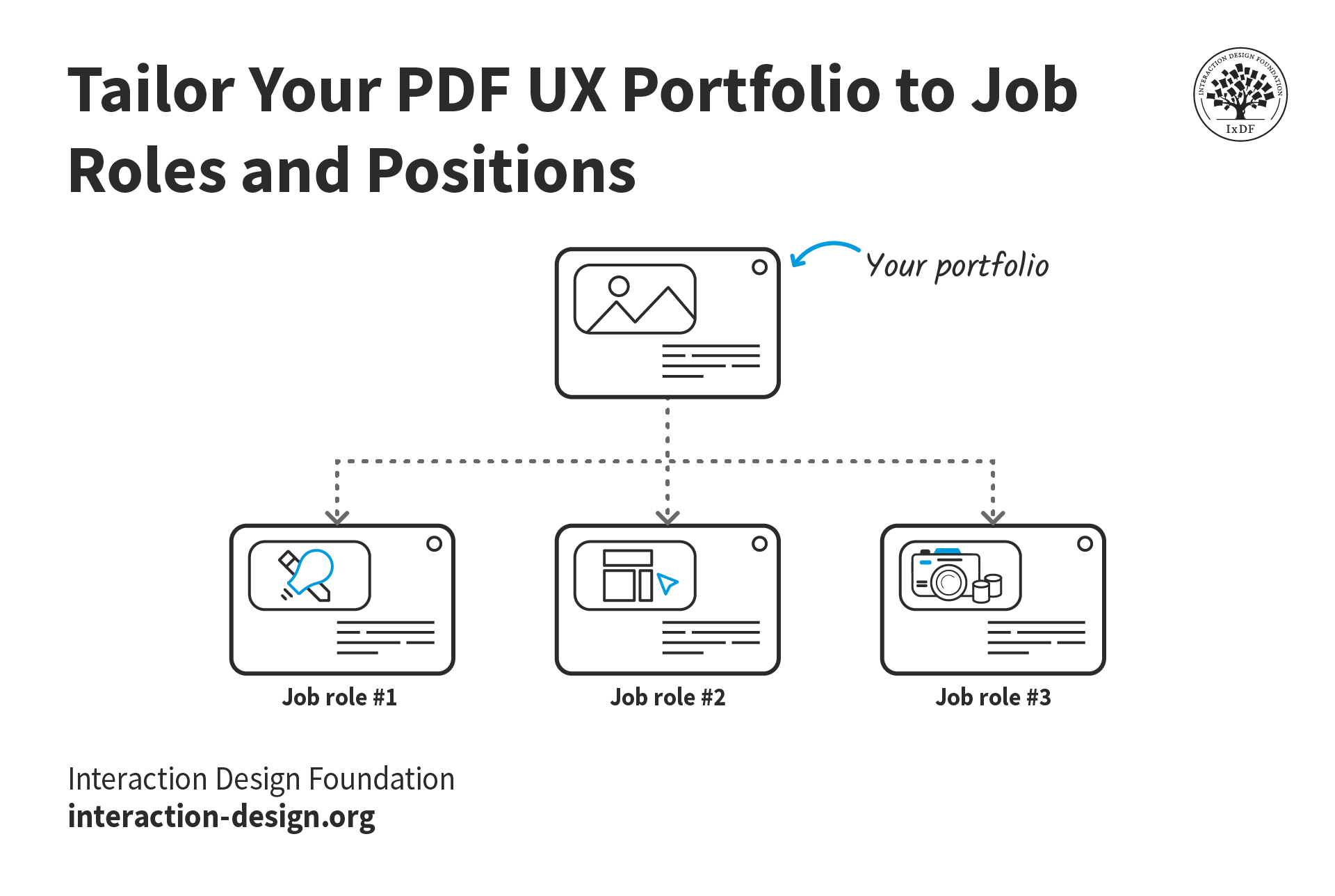
You can also tailor which UX case studies to include in your PDF portfolio, depending on what role you apply for. A quick way to manage multiple case studies is to create a modular system where you can easily switch case studies in and out. Most PDF software allows you to add and remove pages to create a simple drag-and-drop system.
© Interaction Design Foundation, CC BY-SA 4.0
2. Don’t Forget Usability and Accessibility
Your PDF portfolio must be usable, as recruiters will judge you on that. If it is difficult to read or use, you will create the wrong impression and hurt your chances of getting the job.
Here are a few guidelines for a usable PDF portfolio:
Make sure the text is readable. Optimize for mobile with narrow margins, appropriate font sizes, and, where possible, only use one column of text per page.
Take note of color contrast. Ensure your text and visuals have enough contrast for comfortable viewing.
Export your text as selectable text, not as images. Embedded text enables readers to search within the portfolio for words and phrases.
Embed your fonts and images to ensure the PDF opens correctly on any device and looks how it should.
Add PDF metadata to make your portfolio findable. Many people overlook the importance of metadata in PDF files, such as titles, descriptions, keywords, and author information. Metadata can enhance the discoverability of your portfolio when recruiters save or upload it to applicant tracking systems.
Your portfolio should also be accessible, especially if the roles you are applying for require knowledge of accessibility. Follow these guidelines to create an inclusive portfolio:
Use a proper headings structure to support screen readers.
Add alt text to all images that require it.
Use descriptive links that indicate their purpose.
Always check your PDF before you send it! Sometimes, your tool might not have exported your portfolio correctly. Check for any missing text or images and accessibility issues.
3. Visual Design: Consistency is Key
Like your online UX portfolio, your PDF UX portfolio has to look good. Even if you don’t have a background in visual design, it’s crucial to polish your portfolio so it gives a great first impression.
Here are some ways you can make your PDF UX portfolio look good:
Use consistent fonts. This is a big one! A different font somewhere will instantly give recruiters the impression that you lack attention to detail.
Stick to a color theme. Use the same few colors throughout your PDF to create a consistent visual experience. If you do not already have a color palette, use an artificial intelligence (AI) color palette tool to try out different options.
Balance white space. An extra page in a case study than a few overstuffed pages. Sufficient white space will make your portfolio more inviting and digestible.
Use high-quality images. Sometimes, images from past projects are only available in low resolutions. Consider using an AI upscaling tool to “restore” the image in these scenarios.
![[ALT TEXT] A section of a case study titled “Design process”. Each heading and paragraph uses different fonts, sizes, and colors.](https://public-images.interaction-design.org/literature/articles/materials/juekoFzpfsZ0vJNN2V657DTLqzl0Yj5RM4WiBJFT.png)
A visually inconsistent PDF UX portfolio is a sure way to create a poor impression. Check that your fonts and colors are consistent and guide the user visually, not confuse them.
© Interaction Design Foundation, CC BY-SA 4.0
4. Add Interactivity for Navigation
Your online portfolio is your opportunity to wow hiring managers with interactive elements. However, you can still add some quality-of-life interactivity to your PDF portfolio:
Table of contents: A table of contents will help your reader navigate your portfolio. Hyperlink each entry to its respective page to help hiring managers get where they need to go fast.
Bookmarks: Much like a table of contents, bookmarks help readers navigate your portfolio effortlessly. Most PDF readers include a bookmarks menu, enabling users to quickly jump to different document sections.
External links: Got a video you want to show? Or a Figma file for people to explore? Link to these from your PDF so those interested can dive deeper. Finally, make sure you hyperlink your email address to make it easy for hiring managers to get in touch.
5. Watch Your File Size
This is an easy one to forget. If your PDF UX portfolio contains many images, you must pay attention to its total file size. Remember that recruiters may download your PDF from the cloud, your web server, or as an email attachment. You don’t want recruiters to wait too long to download your PDF and a while longer for it to open.
Optimize your images before you insert them in your PDF UX portfolio. Alternatively, you can use your application export settings to manage image compression. Always check your final PDF’s file size and image quality on both desktop and mobile devices.
3 Excellent UX/UI Design PDF Portfolio Examples to Inspire You
We’ve selected five UX/UI PDF portfolios that tick many of the boxes above and add a few boxes of their own. Take inspiration from these designers when you build your PDF portfolio.
Sean Egan – UX/UI Designer
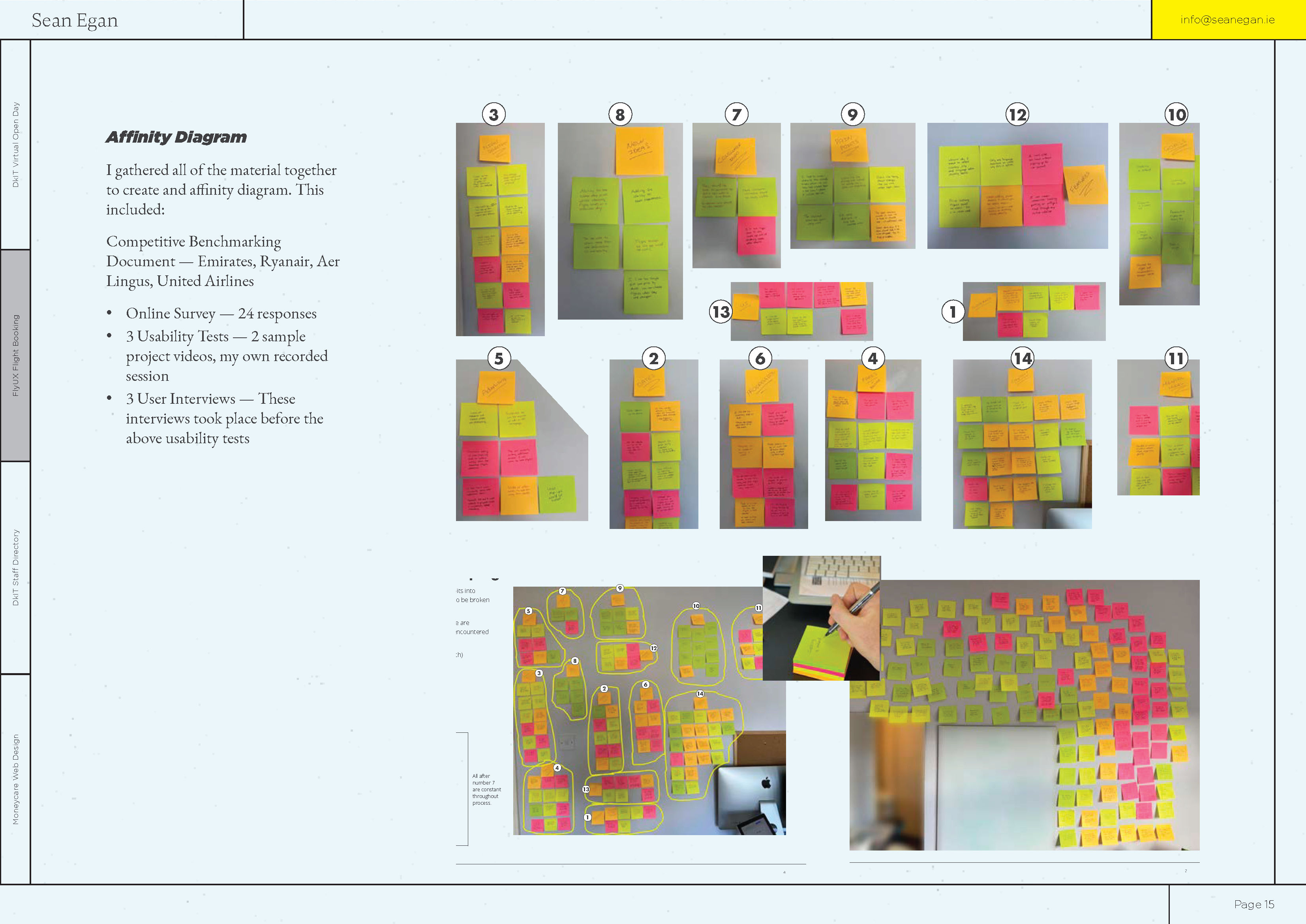
Sean’s case studies include detailed information about his design processes. This approach gives hiring managers an inside look into how you work and proves that you know how to approach different design problems.
© Sean Egan, Fair Use
Highlights from Sean’s portfolio:
A “What I’m listening to” section for podcasts. Personal touches like this stick in the minds of hiring managers and create talking points for interviews.
Each page has tabs on the left-hand side that indicate where you are in the portfolio. This element is helpful for navigation as the reader can quickly gauge where they are in the portfolio.
Detailed case studies of Sean’s design processes. A common mistake in portfolios is only to present the final product. Case studies should be as much about the journey as the final designs themselves.
Areas for improvement:
The text size in this portfolio is relatively small, and each page includes many images. As a result, the portfolio isn’t very mobile-friendly.
The table of contents and tabs lack interactivity. Links that allow the reader to navigate between sections would improve navigation.
Emery Tran – UX Designer
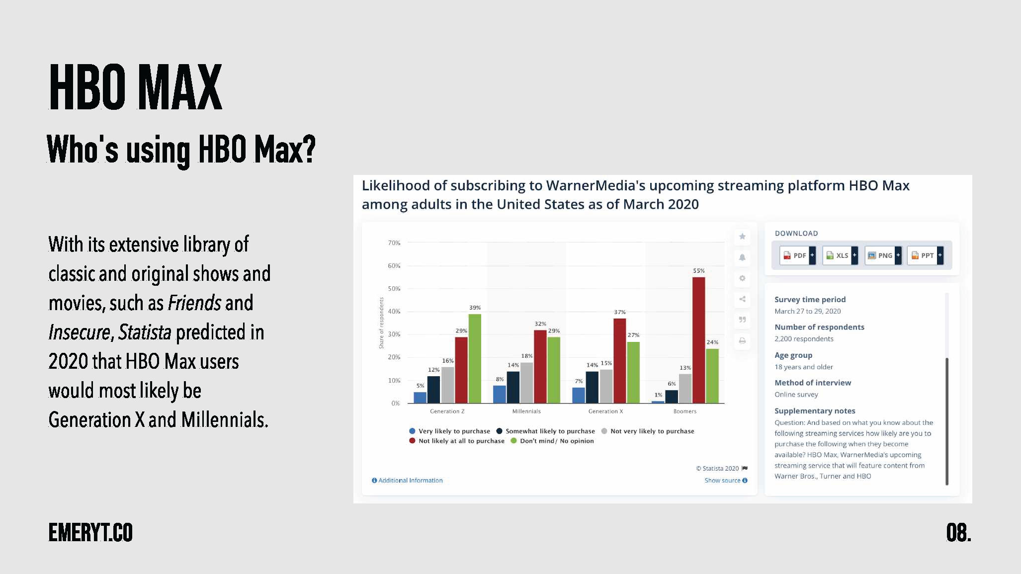
Emery's case studies include examples of research and highlight the conclusions reached. Evidence of data-driven design shows potential employers you base your design decisions on user needs. However, Emery’s table uses red and green in the table next to one another, which is not accessible for those with red-green color blindness.
© Emery Tran, Fair Use
Highlights from Emery’s portfolio:
There is an excellent level of detail, and each case study is broken into bite-sized chunks. This approach gives potential employers a deep look into Emery’s process but in an easy-to-understand way.
The case studies use storytelling to keep the reader engaged.
Areas for improvement:
The portfolio color scheme and design could benefit from more variety for engagement.
The colors in the tables do not adhere to accessibility standards.
Eureka Foong – UX Researcher
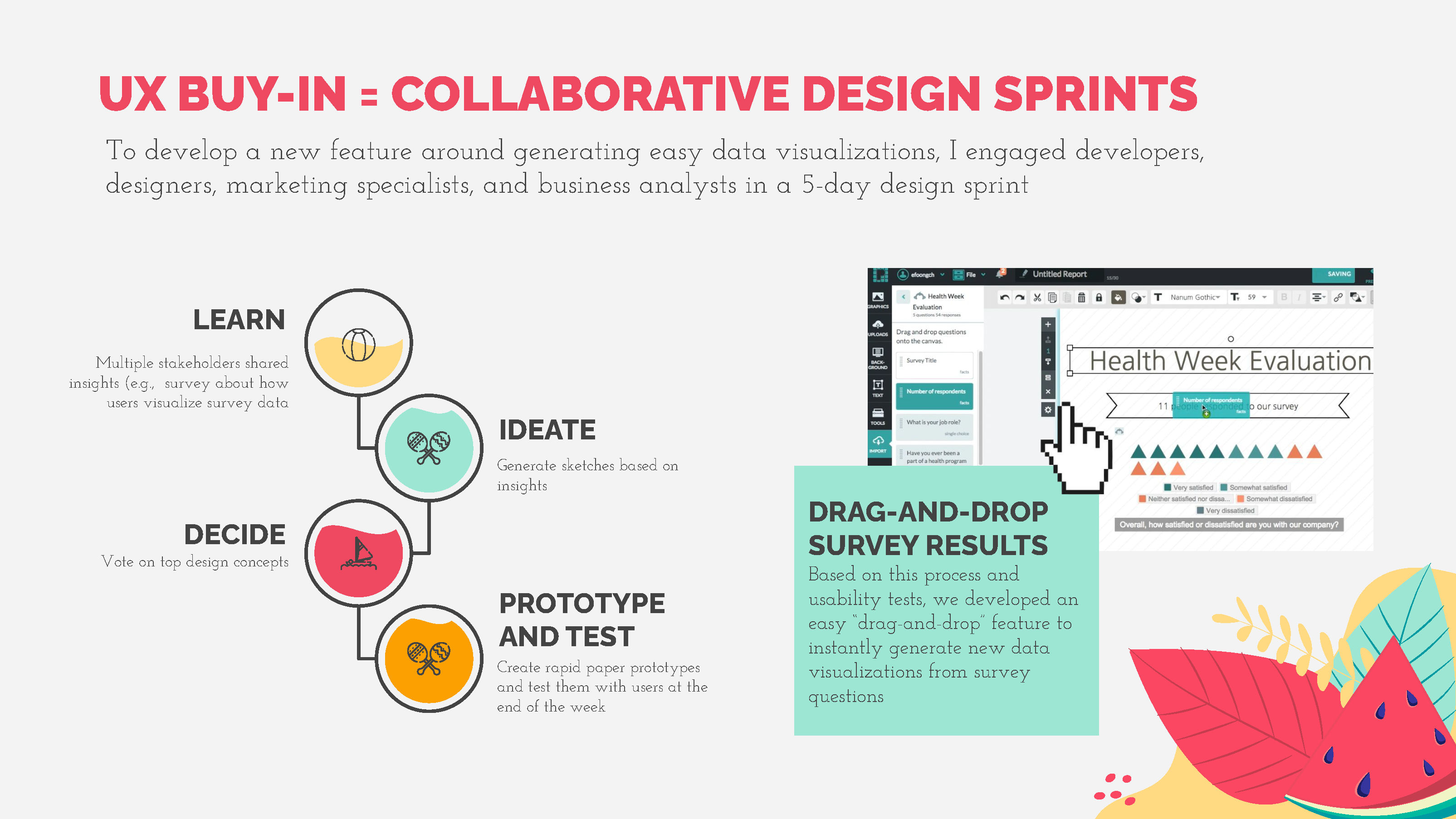
Eureka’s portfolio has a fun and engaging design. Variation in the design throughout this portfolio makes it dynamic and visually engaging, yet it maintains a professional feel.
© Eureka Foong, Fair Use
Highlights from Eureka’s portfolio:
An engaging and detailed design that immediately draws you in.
Very well-structured case studies with a good level of detail.
Eureka credits a slide template site at the end of her portfolio. This portfolio is an excellent example of how non-visual designers can create visually attractive portfolios.
Areas for improvement:
A few of the slides are text-heavy and could benefit from being split into multiple slides.
The portfolio uses a thin font, which can be challenging to read on small screens.
The Take Away
Your static PDF UX portfolio gives interested recruiters an in-depth look at how you solve design problems. To create your PDF UX portfolio, follow these steps:
Start with a tool you’re familiar with.
Write your UX portfolio—use our suggested skeleton outline as a reference.
Export to PDF and upload it somewhere accessible so that you can share a link to your PDF UX portfolio without much hassle.
Just like your online UX portfolio, there are essential design-related guidelines you should follow for the PDF version:
Tailor it to the job role you want to apply for.
Make it usable and accessible.
Make it visually pleasing and consistent.
Add interactivity.
Watch your file size.
References and Where to Learn More
Want to create a portfolio that gets you hired? Take our course, Build a Standout UX/UI Portfolio: Land Your Dream Job, and learn how to showcase your skills, tell compelling project stories, and impress employers.
Check the color contrast of your PDF portfolio’s text and graphics with WebAIM’s color contrast checker.
Find out how to optimize your PDFs in Adobe Acrobat.
Compress your images with TinyPNG and ImageOptim.
Discover methods and tips to optimize your portfolio with AI.
Learn How to Handle Non-Disclosure Agreements (NDAs) When You Write Your UX Case Study.
Images
Hero image: © Interaction Design Foundation, CC BY-SA 4.0


