In much of the world, particularly the developed world, there’s a growing ageing population. The days of a family consisting of 2.4 children are over. As people have more resources, they tend to have fewer children. Then there’s the fact that medical care is constantly improving too. Bloomberg estimates that by 2040 the number of people considered elderly, those over 65, will double globally from 7% of the population today to 14%. That’s an additional 700 million people!
The “grey dollar” is thus going to be a significant factor in the market for IT products. Yet, by and large the elderly are neglected when it comes to the design of products. There are significant challenges faced by an older generation when it comes to using IT, how can these be better addressed?
Sight and Hearing
You might be surprised to learn that our vision starts to go downhill from about the age of 40. The lens within the eye suffers from “presbyopia” (which means that the lens becomes harder and less pliable). This in turn makes it harder for us to read close up and to read smaller fonts.
It’s also true to say that colour vision is impaired as we get older. It becomes harder for people to distinguish different colours.
Hearing follows a similar path to sight and most people find that as they get older they suffer from hearing loss to a greater or lesser extent.
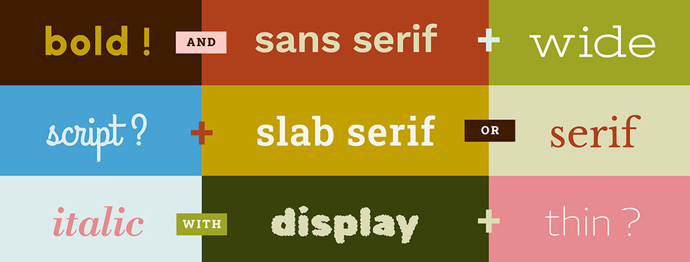
Making it easier for visually or hearing impaired folks to use products isn’t so hard. Try to test your products using screen readers – to see if they work well together. Use large fonts (16 pixels plus). Ensure that it’s easy for someone to adjust the text size on screen. Try to make certain that contrast between text and backgrounds is marked rather than subtle. You could also provide subtitles to critical video/audio elements of the product.
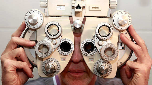
Author/Copyright holder: Unknown. Copyright terms and licence: Unknown
Motor Skills
Just like our eyes and ears, our muscle and motor control gently declines as we get older. That can make using mice or trackpads more difficult than using a touch screen. However, in order to make using a touch screen easier you need to try and make the best use of space. Things which are used in sequence should be close together but not too close (0.2 cm works well) and buttons for the very elderly should be spaced about 1 cm apart on the diagonal. If you can’t adapt for touch screen, give a little more room for using a mouse and try to make buttons a little larger.
Smartphones?
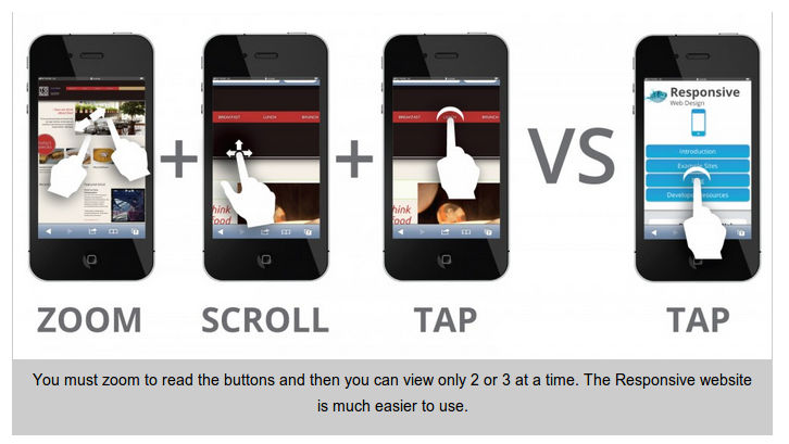
As you might have guessed from the two points above; smartphones aren’t the ideal platform for an elderly user. There’s not enough screen real estate for them to be easy to read or to work with fingers. That means the ideal platforms are going to be tablets or touch screen PCs. It is these environments that you should focus your efforts on when developing for the elderly.
Author/Copyright holder: I Stack. Copyright terms and licence: All rights reserved Img source
Social Media
It can be hard to get out and about when you get older. Yet, older people also report that they can be lonely and it’s understood that loneliness can have a negative impact on their health. This might be seen as an opportunity to help the elderly connect with each other. They aren’t likely to seek out 10,000 Facebook friends or need 2,000 Twitter followers but rather a smaller but more intimate community. Helping someone achieve connection to reduce their isolation whilst focusing on smaller groups might be a major opportunity for designers.
Author/Copyright holder: Interactive Middle East. Copyright terms and licence: All rights reserved Img source
Technological Ignorance?
It’s fair to say that many of today’s elderly have some (or a lot of) experience with technology but it’s also fair to say that many do not. When you look to design for usability you need to ensure that you’re not assuming experience without patronizing those who have it. You might also want to take a long hard look at the questions you ask; are they relevant to an older audience? You shouldn’t presume that people will remember their “first” of anything, for example.
In particular, take some time to explain how the interface works. It may not be obvious how to move between screens or around them. Icons that we assume are “common knowledge” may not be to an inexperienced user.
Do You Remember?
Memory, also takes a hit with age. Not all types of memory but some. This isn’t a function of Alzheimer’s, which is a common enough condition but one of ageing. Not everyone suffers from the same rate of deterioration or indeed of the same types of memory.
Short-term memory can be afflicted without any impact on long-term memory. This can make it difficult for people to acquire new skills easily when there’s a certain amount of complexity involved. Helping people overcome this can be as simple as offering a “reminder” button that provides walkthroughs when needed. It’s also best to keep a single activity on a single page wherever possible… the more complexity you add, the harder it is to remember the steps involved.
There’s also evidence to show that people often find it more difficult to remember to do things in the future – diaries, calendars, etc. become more important and these are normally written but there’s no reason that these functions can’t be built in well to the technology that older people use.
The Curse of Multi-Tasking is a Blessing in Disguise
As we get older it becomes harder to concentrate on many things at once. Multi-tasking goes downhill. But the flip side of that is that we find it easier to give one thing our undivided attention. Not only does that mean that elderly folks can make for excellent usability testers (they work methodically and don’t lose focus), it also means that the “Twitter” approach to content can be ignored and you can create longer, more in depth, more valuable content for this audience.
Summary
The market for the elderly will double in size in the next 25 years. Many of these people will have significant sums to spend and technology experience. Creating a great UX for this market offers significant commercial opportunities. It’s also not too difficult to cater for this market. Most of the ideas above are easy and relatively inexpensive to implement.
Hero Image: Author/Copyright holder: HP. Copyright terms and licence: All rights reserved. Img

