It is important to know that while neuroscience has progressed dramatically over the last decades; there is no complete understanding of how human memory works. We know, for example, that data in the brain is stored in clusters of neurons but we don’t know how, precisely, it is stored or even how it is encoded. Thus when it comes to understanding memory from a design perspective we will examine certain properties of human memory that are commonly understood to be correct.
Human memory doesn’t exist in isolation; the brain isn’t just responsible for memorizing things but also for processing the data and acting on that data. Much of our memory and much of the information we receive is visual and it is with visual memories that the designer is mainly concerned.
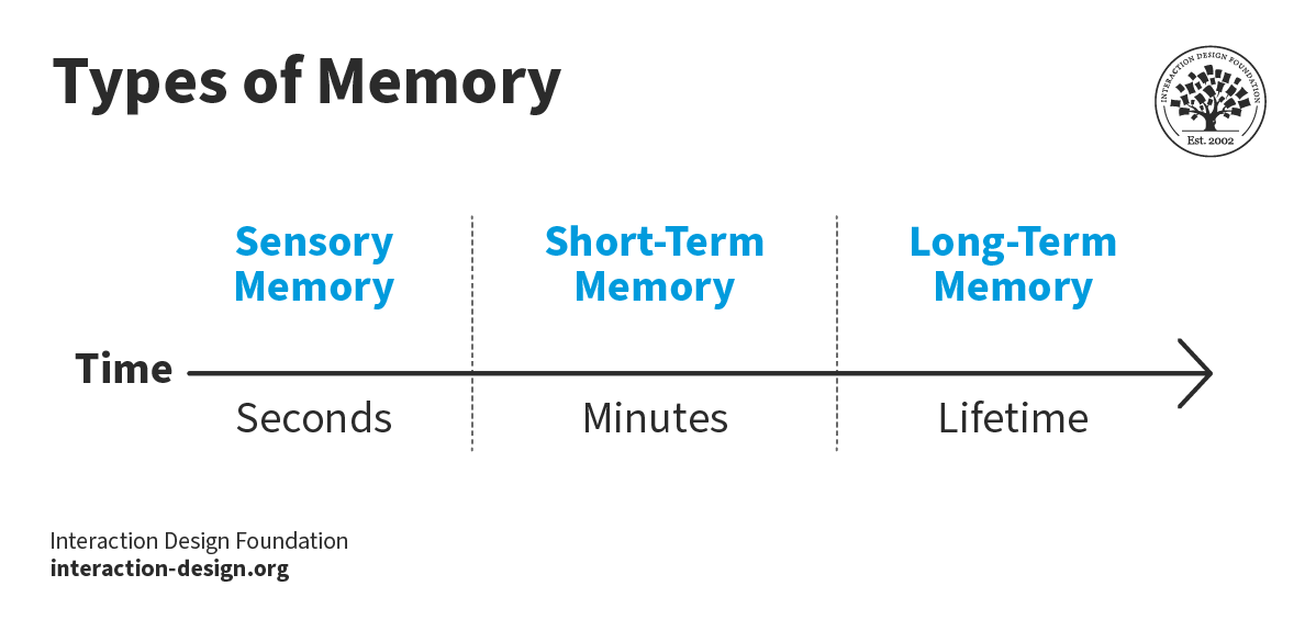
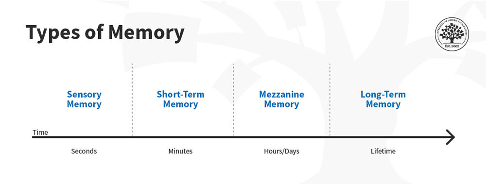
Three Types of Memory
There are three main types of memory that are processed in the brain:
Sensory Memories
Short-term Memories
Long-term Memories
![]()
Author/Copyright holder: JSpudeman. Copyright terms and licence: Public Domain.
Sensory Memories
Sensory memories are the memories which are stored for tiny time periods and which originate from our sensory organs (such as our eyes or our nose). They are typically retained for less than 500 milliseconds.
Visual sensory memory is often known as iconic memory. Sensory visual memories are the raw information that the brain receives (via the optic nerve) from the eye. We store and process sensory memories automatically – that is without any conscious effort to do so.
The processing of this information is called preattentive processing (e.g. it happens prior to our paying attention to the information). It is a limited form of processing which does not attempt to make sense of the whole image received but rather to a small set of features of the image – such as colors, shapes, tilt, curvature, contrast, etc.
![]()
Author/Copyright holder: Was a bee. Copyright terms and licence: CC BY-SA 2.5
It is sensory memory which draws your attention to the strawberries in this graphic.
Short-Term Memories
Short-term memory is used to process sensory memories which are of interest to us – for whatever reason. The sensory memory is transferred to the short-term memory where it may be processed for up to a minute (though if the memory is rehearsed – e.g. repeated – it may remain in short-term memory for a longer period up to a few hours in length).
Short-term memory is of limited capacity. Experiments conducted by, among others, George A Miller the psychologist, and reported in his paper “The Magical Number Seven, plus or minus two” suggest that we can store between 5 and 9 similar items in short-term memory at the most.
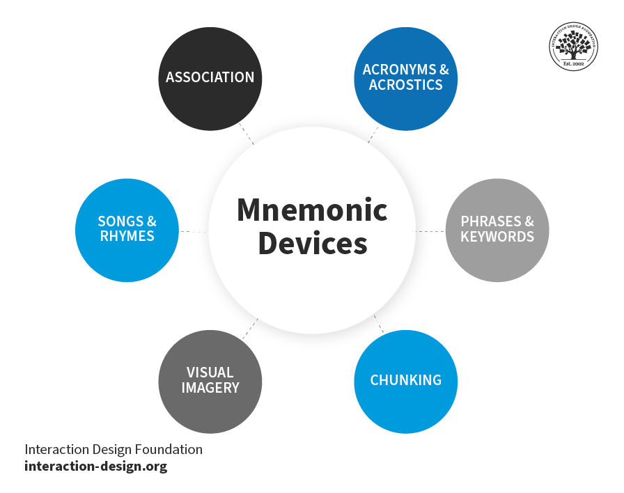
This capacity can be increased by a process known as “chunking”. This is where we group items to form larger items. So, for example, you can memorize a 12 digit phone number in short-term memory by taking digits in pairs (35) rather than singly (3 and 5) which gives you 6 chunks to remember (which falls between 5 and 9) rather than 12 digits (which exceeds the capacity of short-term memory).
Chunking can occur visually as well as through combination of numeric or alpha-numeric attributes. A common example of this would be in a bar chart where a single bar may represent a chunk of information.
This is useful to the visual designer because it allows a visual representation of information to be easily processed in short-term memory and for that representation to offer more complex insights than an initial examination of the capacity of short-term memory might allow.
![]()
Author/Copyright holder: Michaelchilliard. Copyright terms and licence: CC BY-SA 3.0
This graph, above, shows how information recall is limited from the short term memory and recall becomes worse when asked to recall a sequence backwards.
Long-Term Memories
In most instances the memories transferred to our short-term memories are quickly forgotten. This is, probably, a good thing. If we didn’t forget the huge volumes of information that we perceive on a daily basis we could well become overloaded with information and find processing it in a meaningful way soon became impossible.
In order for most memories to transfer from short-term to long-term memory – conscious effort must be made to effect the transfer. This is why students review for examinations; the repeated application of information or rehearsing of information enables the transfer of the material they are studying to long-term memory.
![]()
Author/Copyright holder: Omphalosskeptic. Copyright terms and licence: CC BY-SA 3.0
It is also possible for a long-term memory to evolve through a meaningful association in the brain. For example, we know that a static shock is painful even if we are only shocked once. It doesn’t take repeated shocks to memorize that. The meaningful connection between the pain and the shock allow us to process the memory long-term. In fact strong emotional or physical connections are often the easiest way for something to enter long-term memory.
The image above is of a Van de Graaf Generator which can be used to generate static electricity – you can then touch the generator and another person to give them a static shock. It’s worth remembering that they won’t come back for a 2nd attempt…
It is worth noting that majority of designs and in particular, information visualizations, will not be committed to long-term memory. It may be that the conclusions or understanding they bring will be transferred to long-term memory (usually through revision or application) but the design itself will not.
The vast majority of interaction between the user and an information visualization will occur in sensory and short-term memory.
The Take Away
The key link between design (and in particular information visualization design) and human memory is that interaction takes place in sensory and short-term memory for most users. This means paying careful attention to not providing more than 9 chunks of data in a visualization (and ideally no more than 5) and trying to ensure that you use a single visualization to convey the information because once someone’s attention moves from one image to another – the first is quickly forgotten.
Edward Tufte, the world’s leading authority in information visualization asks; “Can the same image prompt different stories and memories in different people? That’s a good test for a “super-graphic.” By better understanding memory, perhaps we can create super graphics more easily.
References & Where to Learn More:
Course: Information Visualization
George A. Miller. The magical number seven, plus or minus two. The Psychological Review, 63(2):81–97, 1956.
Hero Image: Author/Copyright holder: Henry Vandyke Carter. Copyright terms and licence: Public Domain.