Project Brief
Review the full project brief for MatchDog again.
You may draw ideas during this step from the examples in the book regarding MatchDog conceptual model options. The book intentionally scaffolds this project step with examples and discussion of various options. Two finished possibilities are captured in figure 17. However, you are the designer, and the CM should reflect your desired and optimized grammar and the supporting Information Architecture you choose to hold it. The semantic grid is a critical element in how your CM will be interpreted at first glance by the user.
Goal of This Exercise
In this exercise, you will investigate grid-to-grammar mapping alternatives to explore the possible ways to organize the content within an information architecture for MatchDog. You will also be able to compare the approximate screen count between the alternatives you explore before you are done.
Equipment You’ll Need in This Exercise
- A computer with wireframing / prototyping software, if you choose to sketch your grids digitally
- Pen and paper, if you choose to sketch your grids on paper
Sketch Grids and Grammar to Organize Content and Information Structure
Sketch out several variations of semantic grids to decide how you will organize the content within an information architecture for MatchDog. Two different examples are explained in figures 15–17. You can start with these or develop your own alternatives.
Note that you will need to do this step twice – one for the consumer web and again for the mobile variation. The difference in screen size alone can mandate alternative approaches, but the core grammar must remain the same. The user will likely be switching back and forth between mobile and web over the duration of the pet adoption process.
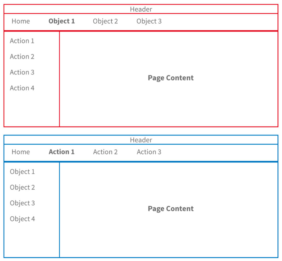
Figure 16 from UX Magic: Alternative mappings of the conceptual model
The main thing to define at this point is an IxD skeleton that can hold all your global actions and objects and create a navigation system around them in the fewest number of pages/screens for both web and mobile variations. When considering the mobile approach, you can either take into account the platform UI guidelines (iOS or Android app) or consider that this will be an HTML-based mobile experience. Avoid a hybrid mobile that can’t make up its mind if it is an app or webpage. This is not good in practice and also looks bad in a portfolio.
For the back-office administrative experience, you will need to consider that there are many more actions because the employee will need to be able to create, update and archive records of dogs, customers and adoptions.
You can do this exercise on paper or, if you like, wireframe the grid-to-grammar mapping in the prototyping tool you will later use for the interactive prototyping phase of the project.
Wrap up This Exercise
By creating several grid-to-grammar mappings, you have seen that there can be more than one effective and valid visualization foundation for your grammar. In particular, you have practiced applying the same conceptual model grammar across the web and mobile form factors to ensure optimal consistency in spite of the limitations that different devices introduce.

Author / Copyright holder: Teo Yu Siang and the Interaction Design Foundation. Copyright terms and license: CC BY-NC-SA 3.0

