The Grid System: Building a Solid Design Layout

- 1.2k shares
- 4 years ago
Grid systems are aids designers use to build designs, arrange information and make consistent user experiences. They include rule of thirds, golden section, single-column, multi-column, modular, baseline and responsive grid systems. For example, responsive adapts content to screen size and orientation, for consistency.
“One must learn how to use the grid; it is an art that requires practice.”
― Josef Müller-Brockmann, Graphic designer, author, educator and International Typographic Style pioneer
See why grid systems are invaluable aids.
For centuries, grids have played a vital role in displaying information optimally. From publishing to graphic design and UI design, grids remain extremely useful for helping organize design elements best. Low-tech and inexpensive, they’re also essential to keeping users happy and securing their trust for designers’ brands.
In visual design, a grid system helps you align screen elements based on sequenced columns and rows. Like making a map, you apply the column-based structure of a grid system to guide your design, structuring your text, images and functions consistently throughout it so they can appear instantly recognizable elsewhere. A reassuringly varied selection of grid systems exists. The key is to pick the right one for the right project.
© Daniel Skrok and Interaction Design Foundation, CC BY-SA 3.0
Pick from the most common grid systems, namely:
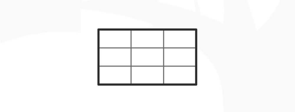
Rule of Thirds – This grid system splits content evenly into thirds, horizontally and vertically. You put your design elements at the intersection of those dividing lines or along one of the lines. Used effectively in (e.g.) cinema, it’s a tried-and-tested way to catch users’ eyes and access them in familiar visual terms.
© Daniel Skrok and Interaction Design Foundation, CC BY-SA 3.0
The Golden Section – Or The Golden Ratio, it’s a long-established mathematical ratio used by artists and architects for over 2,000 years. Its formula is: Side A is to side B as side B is to sides A+B, which equates to a ratio of 1:1.618. Featuring frequently in nature, the golden section can please users’ eyes with organic and natural-looking design compositions.
© Daniel Skrok and Interaction Design Foundation, CC BY-SA 3.0
Single-Column – The simplest grid, it comprises a single column of text surrounded by margins. It’s the default for new documents in page layout programs, and typically appears in books where single columns of text appear in spreads (facing pages).
© Daniel Skrok and Interaction Design Foundation, CC BY-SA 3.0
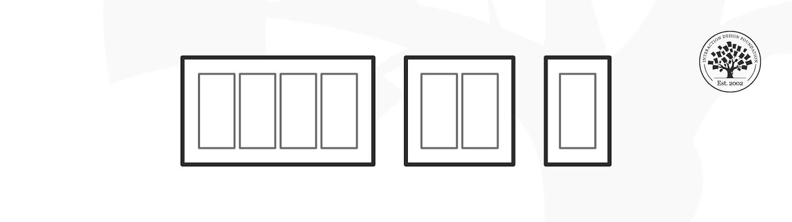
Multi-Column – These grids provide flexible formats for publications with a complex hierarchy or that integrate text and illustrations. The more columns you create, the more flexible your grid becomes. You can use the grid to articulate the hierarchy of the publication by creating zones for different kinds of content. A text or image can occupy a single column, or span several. Not all the space has to be filled.
© Daniel Skrok and Interaction Design Foundation, CC BY-SA 3.0
Modular – This type has consistent horizontal divisions from top to bottom as well as vertical divisions from left to right. These modules govern the placement and cropping of pictures and text. You split the page into several columns according to the content. Then, you divide the page from top to bottom in several rows. This combination assures continuity throughout the design. You can enhance the clarity of your message by how you place text on the grid. The modular grid offers infinite ways of doing this, although it takes some learning to use it best.
© Daniel Skrok and Interaction Design Foundation, CC BY-SA 3.0
Baseline – This grid system comprises horizontal guidelines that govern the entire document. Baseline grids help you anchor all (or nearly all) layout elements to a common rhythm. To make one, choose the type size and leading of your text: e.g., 10-pt Scala Pro with 12 pts leading (10/12). Avoid auto leading; you can work with whole numbers that multiply and divide cleanly, then. Use this line space increment to set the baseline grid in your document preferences.
© Daniel Skrok and Interaction Design Foundation, CC BY-SA 3.0
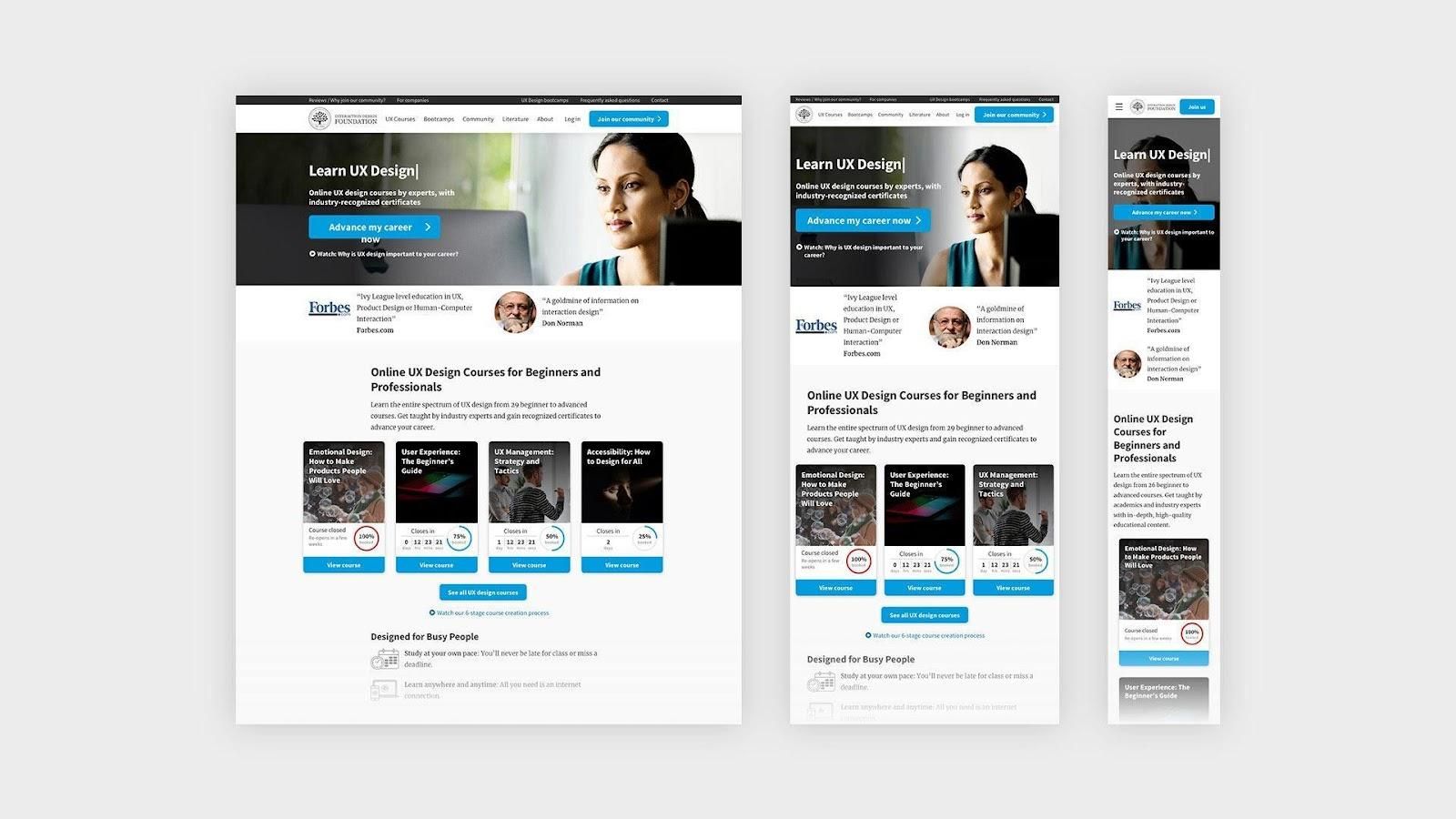
Responsive – This grid system adapts to screen size and orientation, ensuring consistency across layouts. Responsive grids typically comprise three elements: columns (areas that the content occupies), gutters (gaps between columns) and margins (spaces that add padding between the page contents and the viewport edges). The configuration of columns, gutters and margins changes depending on the screen’s width. A breakpoint is the range of predetermined screen sizes that have specific layout requirements. At a given breakpoint range, the layout adjusts to match the screen size and orientation. Each breakpoint range determines the number of columns, and recommended margins and gutters, for each screen size.
© Daniel Skrok and Interaction Design Foundation, CC BY-SA 3.0
Take our Visual Design course.
Read designer Nick Babich’s insightful advice on grid systems in this Smashing Magazine piece.
Find some helpful insights into using grids and examples of them in this WebFX piece.
Grid systems in graphic design align screen elements based on columns and rows. Designers use these to organize content on a page neatly. They create a consistent and harmonious user experience. These systems include various types like single-column, multi-column, and modular grids. Each type serves a different purpose.
For example, single-column grids are great for simple layouts, while multi-column ones handle complex designs. They help in aligning elements like text, images, and graphics. This makes the design more user-friendly and aesthetically pleasing.
You'll find grid systems helpful if you want to create professional and effective graphic designs.
The "Rule of Thirds" is an example of a grid system in graphic design and photography. This grid divides a layout into nine equal parts: two horizontal and two vertical lines. Designers and photographers place the most important elements at the intersections or along these lines. This positioning creates balance and interest in the composition.
© Interaction Design Foundation, CC BY-SA 3.0
The Rule of Thirds guides the viewer’s eye to key parts of the design or photo and makes it more engaging. It's a simple yet effective way to organize content. Designers use this method for its visual appeal and ease of application.
In layout design, a grid system provides a framework of intersecting vertical and horizontal lines. Designers use this framework to place and align text, images, and other elements. This system ensures proper alignment and a structured layout. It makes designs easy to navigate and visually appealing.
Grid systems vary in complexity. They range from simple single-column layouts to complex multi-column arrangements. Grids create a balanced and professional design appearance. They guide the placement of elements to create harmony and order in the overall design. This makes grid systems crucial in layout design.
Watch Michal Malewicz discuss the "red square method" to understand more about layout design principles. This concept emphasizes consistency in spacing between elements.
If you have spacings between elements, as you can see here, it's really good to have *the same space between similar types of elements*. So, if you're looking at it, if you remove the little red squares, you're going to instantly see that this all makes sense. But it's really easy to destroy this whole concept by just having random distances. And just those distances alone are something that makes or breaks a layout, because this is just looking a lot better.
And this comes from something called the *red square method*, and you can look it up online on your own as well. This is something that I use quite a lot to talk about grids and layouts because I think that this is one of the easier ways for people to actually get a grasp on the layout part. But consistency in space is also important between similar elements. So, if you have two columns of text and a photo, it's really good to have them have the same spacing all the time.
So, if it doesn't really jump all over the place, our brains are just going to be a lot happier about it. And what you can do to learn this better is to try and recreate some other designs by first *block-framing* them. And block-framing means adding just shapes on top of things. So, a font is a rectangle; a photo is like just a circle; a different photo or a title is another rectangle. And then try to *align just those rectangles* – not the fonts, not the photos, not the little icons – just the rectangles because
that's going to give you the understanding of what you're really dealing with. And, as you can see, we're coming back to the whole thing that design is just about moving rectangles around. Once you learn that everything is a rectangle – well, or a circle, but generally is a simple shape and you have to position them well in space that they have the proper spacing from each other, proper distance, proper hierarchy, then it's going to be a lot easier to just switch it over to the actual images.
This is something that is really important for the *hierarchy* and the *layout*. And if they are perfect, then people are going to forgive you for a lot. So, they're like the drum beat, basically, of your design if it was a song. If the drum beat is off, then everything just kind of falls apart.
Grids streamline the design process and improve the appearance and functionality of the final product. They play a vital role in layout design for several reasons:
Create balance: Grids allow designers to achieve a balanced look. They guide the placement of elements on vertical and horizontal lines. It creates an equilibrium without over-relying on symmetry.
Ensure cohesiveness: Grids help you coherently arrange various elements in a design for clear communication.
Enhance visual appeal: Grids offer a structured layout that helps guide viewers through the information hierarchy. This structure makes the design visually attractive and user-friendly. Consistent visual frameworks, like the ones described in UX design tutorials, reinforce this point. They emphasize the importance of visual hierarchy in creating a cohesive and engaging layout.
Hello and welcome to this UX Daily video in which we'll be discovering a design pattern that is very useful when you're creating the page structure for your project – the *visual framework*. My name is Priscilla Esser, and I will be discussing the tricks of the trade from WordPress template developers and other seasoned interface designers. And I will show you how they create consistency in page layouts. One of the essential elements of creating the best results for visual frameworks is something called *visual hierarchy*.
In this video, I will help you understand what visual hierarchy is and how to use that to create a proper visual framework. The visual framework is all about creating visual consistency throughout the user experience. To illustrate the importance of this consistency, just think about the simple task of finding your way back to the homepage of a website. We're all used to having the company logo in the top navigation bar to be the homepage link. Just have a look at this example from the Interaction Design Foundation website.
But what if you designed a website with multiple pages that all have this link at another location? How would it impact your experience if the logo was placed in the *footer* of the website, for example? Probably not that positive, right? You would have to scan each page separately for visual cues that indicate this functionality, adding to your mental burden. The solution is creating a consistent visual framework for all pages of your website or application. It's a framework of visual elements, colors and typography that forms a basic layout.
This layout gives you sufficient structure to create consistent pages. But it also offers enough flexibility to handle different content types. In this example, you can see how the two pages of the garden supply website are consistent in the placement of the logo, headers, menu items, and search boxes. At the same time, the pages differ in the type of content they provide. The page on the left is clearly intended to inspire people with a large image and top categories, whereas the page on the right is giving an overview of available products in the online store.
Notice how the consistent elements of the visual framework seem to be more in the *background* but the content itself appears to be more in the *foreground*. This is what a good visual framework can do for your design. It can help let your content stand out and shine. A great example of a visual framework in practice is a WordPress theme. These themes allow you to add any content you desire to create your own website based on the chosen visual framework. As most people aren't designers, this is a great way of making sure a website has good consistency
and visual appeal. But since you are a designer, we'll use this example to see how it's done. So, let's have a look at the WordPress theme we see in this example. The visual elements that have been predetermined by the theme developers are the header size, placement of menu items and search box. Also, the structure of the blog post has given us a three-column layout with white blocks on a grayish background. The typography is set, as is color use, the way images are shown, etc.
Naturally, everyone wants to personalize their website, so most elements are customizable. However, the theme developers do present a good visual framework that you can take as a starting point. Now, if we have a further look at this example, we see that the theme developers have also provided alternative ways to present different types of content while keeping the visual framework intact. The screenshot here shows how a side menu bar can be combined with a wider content block for blog posts. The user does not get confused by this change
as the visual framework ensures that the major elements can be found at the same place and the overall look and feel is consistent. To create a visual framework, these are the steps that you should take. First, determine what types of content you need to place on different pages of your interface and what tasks a user will most likely want to perform often. Then, based on type of content and task, determine what user interface design patterns will be present across all pages
– for example, a top-left navigation bar, a search box, a list or a dropdown menu of categories. Next, you should organize all returning visual elements on the page and indicate where content should go. Think about what element should go into the header area – most important – what, if anything, could be made accessible in sidebar, and what is more suitable for a footer area. Also, depending on the types of content, determine if you want to use multiple columns or not. Ensure that content has sufficient space to attract attention. When all elements have found a place on your page, you can decide on a more detailed level what colors and
fonts you want to use. This is where the framework becomes personalized to the brand or company you're designing for. You can have some fun here, but you can also use color and fonts to guide people in the right direction, as we will see in a few minutes when we dive into the topic of visual hierarchy. But let's first finish the topic of implementation of the visual framework. While you're taking the first couple of steps in creating this framework, it's very useful to make wireframes to position the various elements in a consistent layout.
Without emphasizing the visual appeal of color and images at first, it's much easier to shuffle design elements such as blocks of content and other design patterns around to create a good overview and focus on usability. In wireframes, you simply create placeholders for pieces of content and visual elements. It's a great way to do some early user testing by creating a paper prototype or creating a clickable prototype with wireframing software such as Balsamiq.
The example you see here is actually created in Balsamiq, but many other wireframing applications are available. Of course, you might just prefer the old-fashioned paper-and-pencil way to get the creative juices flowing, which is perfectly OK. After creating the wireframes in the first couple of steps of implementing a visual framework and focusing on more graphic design elements such as color and typography, you may want to consider creating a style guide to report the design decisions you made here. Style guides give all the visual elements and rules for implementing them. It increases the uniformity and consistency you're looking for with a visual framework,
but enables future extensions of your framework by others. This way, you ensure that when a client will not hire you five years from now to add to the website you designed for them, your efforts will not have been in vain and the new additions will remain consistent with your original intentions. As you can see here, major companies like Yelp provide their style guide as a resource for designers, product managers and developers. It serves as a common language to create brand consistency and a good user experience.
Now, the main problem with visual frameworks is that when the initial design isn't very good, it will continue to bite you in the behind throughout all of the pages. So, how do you get the initial framework just right? Let's start by deciding what we consider a good page layout. Here's what I think: First of all, a page should invite and enable the user to accomplish the task they want in a way that doesn't take too much effort. Secondly, it should allow the page owner to effectively communicate what they want
whether it is who they are or what the latest addition to the collection is. So, there's two sides of the coin, but they both revolve around seeing what you need to see to achieve a goal. Let's take a look at an example of a page that *doesn't* use visual hierarchy to achieve these results. It's actually a newspaper page from many years ago. Notice how all visual elements seem to be *equally important*. This was very common back in the day. But now, we're used to having things displayed in a much more *supportive* way.
Now, take this example. Here, some blocks of content instantly stand out to you and some seem to be more in the background. I imagine that if you're looking for a specific piece of information, this newspaper will help you do that much faster than the previous one. The designers of this page have played with visual elements to make some bits stand out more than others. Can you identify what design decisions they've made to achieve this? First, they've played with *size*.
Take a moment to see all of the different sizes they used to create hierarchy in the content. They also used *color* to make some text stand out more than others. Do you see how they did that? Let's have a closer look at how this works in the next slide. Visual hierarchy is all about *setting priorities*. What do you want people to see first, while they're merely glancing over your design? And then, when they *like* what they see, people will start *skimming*. This will make another level of the hierarchy stand out to them. This is often a bit smaller with less energizing colors or less contrast in the background
like the second line of gray text you see in this image. Only when people *consciously* take the time to start reading the text will text that is thinner, smaller and less contrasted be noticed. Now, where it becomes fun for you as a designer is when you start playing with these visual elements to attract attention to the right places. Using an *anomaly* to the standard visual hierarchy of a page layout, like the bullet text in this example, will give you control over the users' path of attention. It really draws the eye of the user to this text.
In this case, we say that the bold text has more *visual weight* than the regular text. Generally speaking, more visual weight attracts more attention when combined with less heavy elements. Let's have a look at some examples of visual frameworks to see if we can recognize how the designers have used visual hierarchy. Here, we're looking at a screenshot from the Dropbox website. Some visual hierarchy is achieved by making the heading bigger or bolder than the remaining text and by using blue as a contrast color. But all in all, I think this is rather a flat design without big differences in visual weight.
When we turn to this example, which is comparable in that it shows a pricing scheme for cloud-based storage subscriptions, we see that a stronger visual hierarchy is used. The most popular pricing option stands out more, not just because it's labeled "most popular", but also because the most popular option seems to burst out of the visual structure that the others abide by. To achieve this, the designs have used brighter colors and they allow the best option to take up more space in the layout of the page.
And as you can see, they do this *consistently* as it's not just the boxed area at the top of the page but also the features description which seems to grow heavier for each step it takes. The previous examples were both based on visual frameworks that depend heavily on a white background and fairly minimalist text options. Here, we take a different turn and show you an example that uses many more images and colors to present the content. A visual framework is implemented with a top navigation bar, a large area to showcase highlighted talks
and a row system with room for six talks per category. The visual hierarchy that is used to support this framework uses *size* – so, the biggest talk is perceived as the most important, especially since the title of this talk has the biggest font size – and *contrast*. The two other talks in the talk area really stand out from the background, making it look quite important as well. Since most users will visit this website to browse for interesting talks to watch and to get inspired, it's perfectly fine to have size and contrast *competing* with each other.
When users would visit a website with a *single purpose*, you might want to combine size and contrast to give a certain element *all* of the visual weight. Now, let's analyze this example together. Which element is the highest in the visual hierarchy and what stands out to you first? In this case, it's a combination of contrast and color. The block of content on the top-left side has the most visual weight. So, what is then the element *lowest* in the hierarchy in the screenshot and what has the lowest visual weight is in that respect the absolute opposite of the heavy black-and-yellow box
in my opinion is the category bar that says "Entertainment, Products, People, Fashion, Music" and so on. It has a small font size and is grey on a white background. It attracts the least attention. In this video, we had a look at a very powerful way to create consistency in your designs: the visual framework. We've seen that consistency helps users to find their way on a website or application and increases the usability. To create a good visual framework, you need to determine all of the elements that you need to place on the page and find the right location for them.
You can start out by drawing wireframes that focus on the placement before continuing with the style guide, which also describes the colors and fonts that need to be used consistently. When a visual framework is well documented, it helps future designers to continue the look and feel in new pages or products. A good visual framework also takes into account the visual hierarchy of a page. By using colors and sizes, you can give certain elements on a page more visual weight than others – which makes them attract more attention and appear more important.
The visual framework and visual hierarchy give you as a designer great input to play around and have some fun with visual elements while ensuring that you create high-quality designs.
Grids focus the viewer's attention and improve the user interface in design projects.
Designers use several types of grid systems in design. These include:
Single-Column Grid: It features one column of text, often used in books and simple layouts.
Multi-Column Grid: This grid includes multiple columns. You'll find it ideal for complex layouts in magazines and websites.
Modular Grid: It combines rows and columns to allow detailed control over text placement and images.
Baseline Grid: This grid aligns text across a page for consistent vertical spacing.
Rule of Thirds: Often used in photography, this grid divides the space into thirds, both horizontally and vertically, for balanced compositions.
Golden Section: This grid uses a mathematical ratio of 1:1.618 to create naturally appealing designs.
Responsive Grid: It adjusts the layout for different screen sizes and orientations.
These systems help designers organize content and create visually pleasing layouts.
A grid acts as a structure in design, consisting of intersecting vertical and horizontal lines. Designers use grids to organize text, images, and other elements. This structure ensures alignment and consistent placement across various parts of a layout.
Grids are essential in graphic design, web design, and other design fields. They help designers create balanced, organized, and visually appealing compositions. By employing a grid, designers simplify the design process and achieve a harmonious appearance in the final output.
For learning about grid systems in design, consider these two resources:
The article How To Use Grid Systems thoroughly examines different grid types. It includes advice from Massimo Vignelli, an Italian designer. You'll find this article helpful if you want to organize your work better.
Visual Design Course covers visual elements, color theory, and typography. It focuses on grid systems, and experts teach the course. They mix theory with practical tasks. You can take this course to improve your design skills and build a portfolio.
These resources offer a practical understanding and application of grid systems in the design work. You can apply this knowledge directly applied to your projects.
Do you want to improve your UX / UI Design skills? Join us now
You earned your gift with a perfect score! Let us send it to you.
We've emailed your gift to name@email.com.
Do you want to improve your UX / UI Design skills? Join us now
Here's the entire UX literature on Grid Systems by the Interaction Design Foundation, collated in one place:
Take a deep dive into Grid Systems with our course Visual Design: The Ultimate Guide .
In this course, you will gain a holistic understanding of visual design and increase your knowledge of visual principles, color theory, typography, grid systems and history. You’ll also learn why visual design is so important, how history influences the present, and practical applications to improve your own work. These insights will help you to achieve the best possible user experience.
In the first lesson, you’ll learn the difference between visual design elements and visual design principles. You’ll also learn how to effectively use visual design elements and principles by deconstructing several well-known designs.
In the second lesson, you’ll learn about the science and importance of color. You’ll gain a better understanding of color modes, color schemes and color systems. You’ll also learn how to confidently use color by understanding its cultural symbolism and context of use.
In the third lesson, you’ll learn best practices for designing with type and how to effectively use type for communication. We’ll provide you with a basic understanding of the anatomy of type, type classifications, type styles and typographic terms. You’ll also learn practical tips for selecting a typeface, when to mix typefaces and how to talk type with fellow designers.
In the final lesson, you’ll learn about grid systems and their importance in providing structure within design. You’ll also learn about the types of grid systems and how to effectively use grids to improve your work.
You’ll be taught by some of the world’s leading experts. The experts we’ve handpicked for you are the Vignelli Distinguished Professor of Design Emeritus at RIT R. Roger Remington, author of “American Modernism: Graphic Design, 1920 to 1960”; Co-founder of The Book Doctors Arielle Eckstut and leading color consultant Joann Eckstut, co-authors of “What Is Color?” and “The Secret Language of Color”; Award-winning designer and educator Mia Cinelli, TEDx speaker of “The Power of Typography”; Betty Cooke and William O. Steinmetz Design Chair at MICA Ellen Lupton, author of “Thinking with Type”; Chair of the Graphic + Interactive communication department at the Ringling School of Art and Design Kimberly Elam, author of "Grid Systems: Principles of Organizing Type.”
Throughout the course, we’ll supply you with lots of templates and step-by-step guides so you can go right out and use what you learn in your everyday practice.
In the “Build Your Portfolio Project: Redesign,” you’ll find a series of fun exercises that build upon one another and cover the visual design topics discussed. If you want to complete these optional exercises, you will get hands-on experience with the methods you learn and in the process you’ll create a case study for your portfolio which you can show your future employer or freelance customers.
You can also learn with your fellow course-takers and use the discussion forums to get feedback and inspire other people who are learning alongside you. You and your fellow course-takers have a huge knowledge and experience base between you, so we think you should take advantage of it whenever possible.
You earn a verifiable and industry-trusted Course Certificate once you’ve completed the course. You can highlight it on your resume, your LinkedIn profile or your website.
We believe in Open Access and the democratization of knowledge. Unfortunately, world-class educational materials such as this page are normally hidden behind paywalls or in expensive textbooks.
If you want this to change, , link to us, or join us to help us democratize design knowledge!