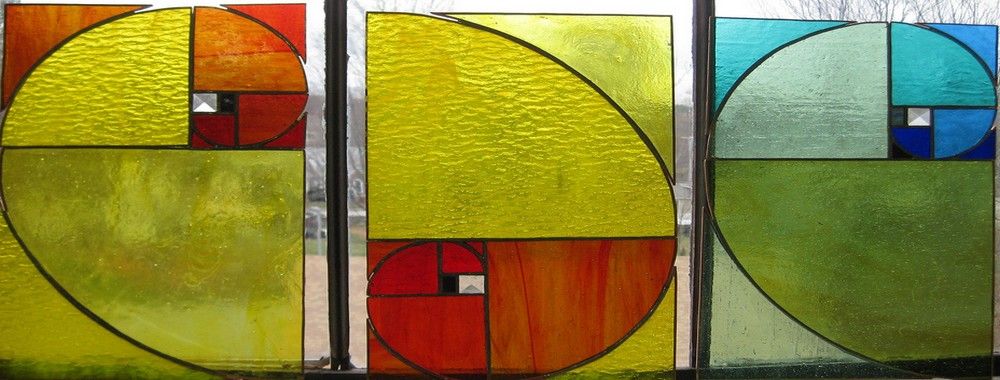
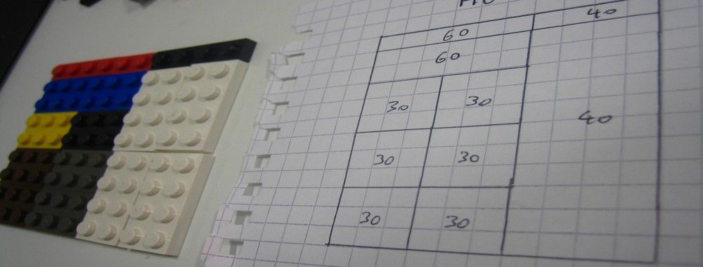
Now, we’re going to look at a subject that comes directly from mathematics and that we can also find all around us – the golden ratio. Don’t worry; we’re not going back into the classroom for long. We will examine what this concept is and exactly how much it is a fundamental part of making designs pleasing to the user’s eye.
The golden ratio’s story is the stuff of legend. With a history dating back almost to the time of Pi (another great mathematical formula, which is essential in understanding properties of circles), scholars, including Pythagoras and Euclid, have called it by many names, including the golden mean and the divine section.
What is the appeal of this ratio? For centuries, it has been thought that art, architecture and nature are more appealing to the eye when the proportions of designs and structures are based on the golden ratio. You can find examples of the golden ratio in human endeavors as far back as Ancient Greece. The Parthenon statues appear to show the golden ratio in their form, and some of Plato’s five solids (including the cube and the dodecahedron) are related to it, too. The golden ratio was popularized in the Renaissance era, and the artists of that period sought to ensure that it was used to deliver aesthetically pleasing works. Today, we can use the golden ratio in our web and app designs to improve the layout and appeal to the eye, placing full confidence in this time-honored fact.
What Is the Golden Ratio?
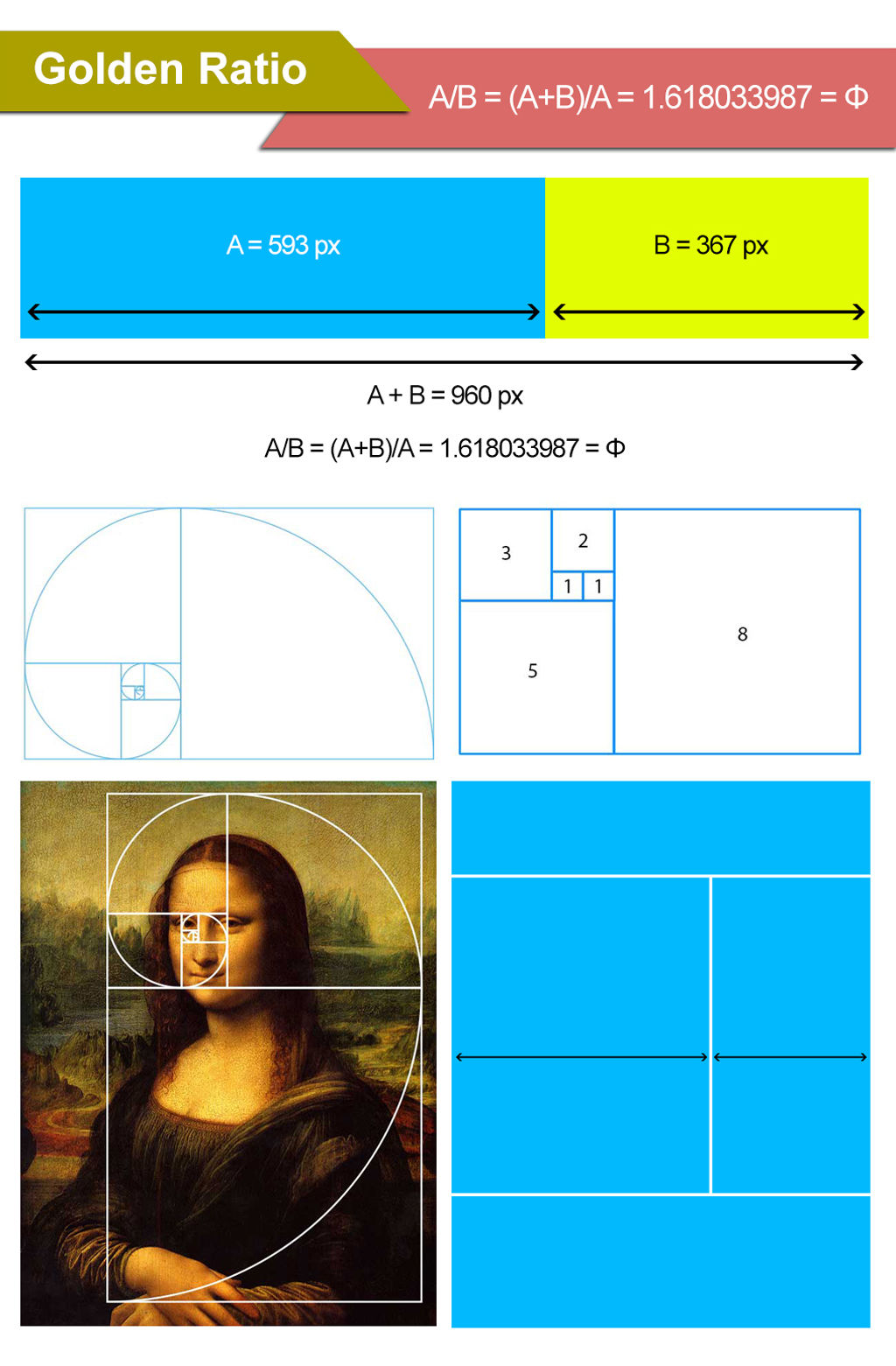
The Golden Ratio has been used throughout history to create visually appealing designs. In the Renaissance, it became a formalized part of design theory. Its frequent appearances in geometry (in such shapes as pentagons and pentagrams) drew the attention of ancient Greek mathematicians, who began studying it at least 2400 years ago. The ratio is based on the relationship between consecutive numbers in the Fibonacci sequence. Fibonacci was a medieval Italian mathematician; however, you don’t need to be a mathematician to understand this sequence, as it is so simple.
Each number in the Fibonacci sequence is simply the sum of the two numbers before it. It begins with 1, 1 (i.e., 1 + the unseen 0 = 1), and the first 10 members of the sequence are 1, 1, 2, 3, 5, 8, 13, 21, 34, 55. It continues infinitely. We can calculate the ratio using the formula above (we use the Greek letter Phi to represent the output). The ratio is approximately 1.618, although, like Pi, it has a long string of numbers after the decimal point. For our purposes, though, we don’t have to worry about going past 1.618.
How is the ratio used in design? Think of a rectangle, with a short side of length 1. To calculate the most aesthetically pleasing rectangle, you simply multiply the length of the short side by the golden ratio approximation of 1.618. So, the long side, in this instance, would have a length of 1.618.
If you have a pencil, paper and ruler handy, try drawing a rectangle of this scale. Or, if you can jump to another screen, create one in a drawing application. What you will see before you is not just any rectangle but the ideal rectangle!
We can find the golden ratio throughout the world of design. The architects of the day used it for the base and height of the Acropolis in Greece. It’s used to determine the format of the vast majority of books on your physical bookcase. It’s literally everywhere you look. Perhaps because we’re surrounded by figures and shapes derived from the golden ratio, we’ve grown especially used to it. As designers, we need to keep this concept of comfort and familiarity in mind for our users. The eyes of the world view this ratio favorably. Literally, in fact: the magazine National Geographic uses a yellow rectangle proportioned according to the golden ratio.
However, the golden ratio doesn’t help us just to make nice rectangles. You can also form a spiral using side lengths based on the decreasing order of the Fibonacci sequence. So, if we take a length 55 as our starting point, we can make our spiral by drawing it inwards so that when it passes that starting point, the new length is 34. We continue working inwards with lengths of 21, 13, 8, 5, etc. until we get to the middle (length = 1). This spiral is also based on the golden ratio and can be more interesting than an equally balanced spiral to the human eye. It is present in nature, ranging from plants to shellfish and mollusks. Even the specific proportions of many larger animals (including humans!) are often said to be proportioned according to the golden ratio. In that sense, it could be said that it’s a part of us. So, you as a designer can use this kind of spiral to catch the eyes of users from any part of the world and focus them on a particular point in your design. Research has shown that the human eye identifies (and the brain interprets and processes) images based on the golden ratio more quickly than it does images that do not incorporate the ratio.
We can also use the golden ratio to balance elements within other elements. The logos of Toyota and Pepsi make use of this fact. Toyota uses the ratio to balance the ovals within their logo, and Pepsi uses it to balance the circles in theirs. Can you think of any other brands that exploit this “magic” ratio? Perhaps it’s what can make logos truly iconic!
Calculating the Golden Ratio
Let’s briefly get down to some mathematics now. As with the image shown at the top of this lesson, the equation for calculating the ratio is simple. It is the relationship between two sides of a design (usually the horizontal and the vertical). It does not matter which side we choose as the longest (A) and which we choose as the shortest (B). (Although if you are trying to see whether the golden ratio has been used in another piece, you will need to follow which side is longest or shortest.)
The formula for this is:
A/B = (A+B)/A = 1.618033987 = Φ
Φ is the Greek letter Phi – how we represent the golden ratio. Why does A/B = (A+B)/A? It does because we are following the Fibonacci sequence and A and B (if expressed in whole numbers) are simply two consecutive numbers in that sequence. Fortunately, we can approximate this to 1.6 or 1.61 or 1.618 in designs without surrendering the aesthetic appeal of the golden ratio. Our eyes aren’t bothered with such slight deviations.
How to Use the Golden Ratio in Your Designs
You can use the golden ratio in your designs easily. Taking applications such as Adobe Photoshop and Adobe Illustrator, you can create guides or layers that will help you to design using the golden ratio.
If your software doesn’t calculate the golden ratio automatically, you can always use an online tool to help specify the ratio for side lengths. Here are three such tools:
The Take Away
The golden ratio, which philosophers, mathematicians, architects, artists, and designers have employed for over two thousand years, is fundamental to both designers and users. Designs such as the Pepsi logo and even natural formations carrying the proportions of the golden rule, such as a nautilus shell, surround us.
Because these forms are so prevalent, our eyes identify them quickly, and we tend to process these as familiar and pleasing. Although the golden ratio has been a subject of study for centuries and was known to the ancient Greeks, the medieval Italian mathematician Fibonacci determined his famous sequence. Using this (where a series of numbers, beginning with 1,1, is such that we add the preceding number to the one following it) is the key to understanding the golden ratio (which we represent with the Greek letter Phi).
We use the golden ratio widely in web and app design. In particular, it’s very easy to incorporate when building wireframes. You can ensure that the content you need is prioritized properly and that the aesthetic demands of the layout will be met without doing too much design work at first. Only when you, for instance, decide where you will place elements and features over this framework will the work become more involved.
In the top picture in the example above, the ratio between the content area and sidebar is equal to Phi (1.618). You can check this with the measurements below:
The total width of the fixed layout is 960 px. You divide this into a content area and a sidebar. The content area is the longer of the two areas.
If you divide the total width of 960 px by 1.618, you get 593 px. You then assign this length to the content area.
You assign the remaining 367 px to the sidebar.
As this is a ratio, it is flexible. This means that you can easily apply it to make many design layouts, as there’s no need to use fixed numbers. All you need to do is specify that the longer area is 1.618 times longer than the shorter one.
You can apply the golden ratio in any part of your page layout. For example, you could use the golden ratio within the header to grab the user’s attention and then repeat it within the body, too.
In the lower picture (above), we also see the spiral form that uses the golden ratio. Using the Fibonacci sequence in decreasing order to apply to the lengths of a spiral’s side, we can easily create spiral designs based on the golden ratio.
As designers, we find a wealth of software available that makes it easier for us to unleash the potential of the golden ratio in our creations and optimize the user experience. Adobe, with Photoshop and Illustrator, is such a company offering this great aid.
References & Where to Learn More
Hero Image: Author/Copyright holder: Matthew Oliphant. Copyright terms and licence: CC BY-ND 2.0
Friedman, V. (2008) Applying Divine Proportion to Your Web Designs. Smashing Magazine. [2014 Aug 1]
