Your constantly-updated definition of the Golden Ratio and
collection of videos and articles. Be a conversation starter: Share this page and inspire others!
88shares
What is the Golden Ratio?
The golden ratio—often symbolized as the Greek letter Phi (Φ)—is a mathematical constant approximately equal to 1.618033987. It exists in nature, architecture, art and design. It is a factor in producing aesthetically pleasing and balanced forms. Designers apply it to create harmonious screen compositions that draw users’ attention and evoke positive emotions.
ShowHide
video transcript
00:00:00 --> 00:00:33
The golden ratio, also known as The Golden section or Golden mean, is a mathematical ratio that is closely related to the Fibonacci sequence. It is commonly found in nature and when used in design, it fosters organic and natural looking compositions that are esthetically pleasing to the eye. The golden ratio has been employed for over 2000 years and is still fundamental to both designers and users. Because these forms are so prevalent, our eyes identify them quickly and we tend to process these as familiar and pleasing. You can find beautiful examples of the sequence throughout many
00:00:33 --> 00:01:01
natural elements ferns, flowers, seashells, even hurricanes. Although the golden ratio has been a subject of study for centuries, the medieval Italian mathematician Fibonacci popularized the sequence in which every number is simply the sum of the two numbers before it. The ratio between two consecutive Fibonacci numbers is approximately 1.618, also called Phi. Like Pi, it has a long string of numbers after the decimal point.
00:01:01 --> 00:01:31
Fortunately, we can approximate this to 1.6 or 1.61 or 1.618 in designs without surrounding the esthetic appeal of the golden ratio. But how is the ratio used in design? Think of a rectangle with a short side of length. One. To calculate the most esthetically pleasing rectangle, you simply multiply the length of the short side by the golden ratio approximation of 1.618. So the long side in this instance would have a length of 1.618.
00:01:31 --> 00:02:04
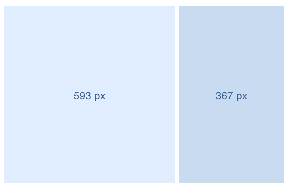
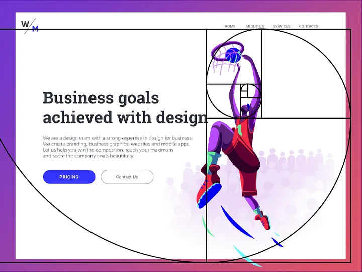
Today we use the golden ratio widely in graphics, websites and applications to create more esthetic designs. In particular, it is very easy to incorporate when building wireframes. You can show that the content you need is prioritized properly and that the esthetic demands of the layout will be met without doing too much design work at first. In this example, the ratio between the content area and sidebar is equal to Phi. If you divide the total width of 960 pixels by 1.618, you get 593 pixels.
00:02:04 --> 00:02:25
You then assign this width to the content area. You assign the remaining 367 pixels to the side bar. As this is a ratio, it is flexible. This means that you can easily apply to make many design layouts as there is no need to use fixed numbers. All you need to do is specify that one area is 1.618 times longer than the other.
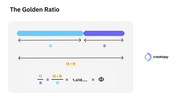
The golden ratio is also known as the “golden mean” and “golden rectangle.” It's an irrational number—and it comes from the Fibonacci sequence of numbers. There, each number after the first two is the sum of the two preceding ones (0, 1, 1, 2, 3, 5, 8, 13, 21, 34—and so on). The golden ratio reflects the ratio of two consecutive Fibonacci numbers calculated as the sequence progresses on and on towards infinity. So, 34 + 55 = 89 and 89/55 = 1.618, and 1.168 is the result for 144/89 (the next in line in the sequence of 34, 55, 89, 144).
However, the golden ratio has another unique characteristic. The ratio of the sum of the quantities to the larger quantity is the same as the ratio of the larger quantity to the smaller one. This simple—yet fascinating—relationship creates a unique sense of balance and proportion. It’s also aesthetically pleasing to the human eye. This visual phenomenon comes from the “golden” proportions of 1.618 to 1, or 1 to 0.618 (approximately). So, a screen with these respective lengths makes a “golden rectangle.”
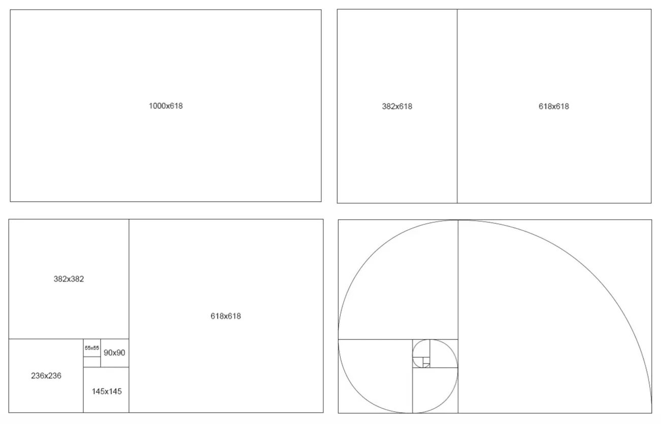
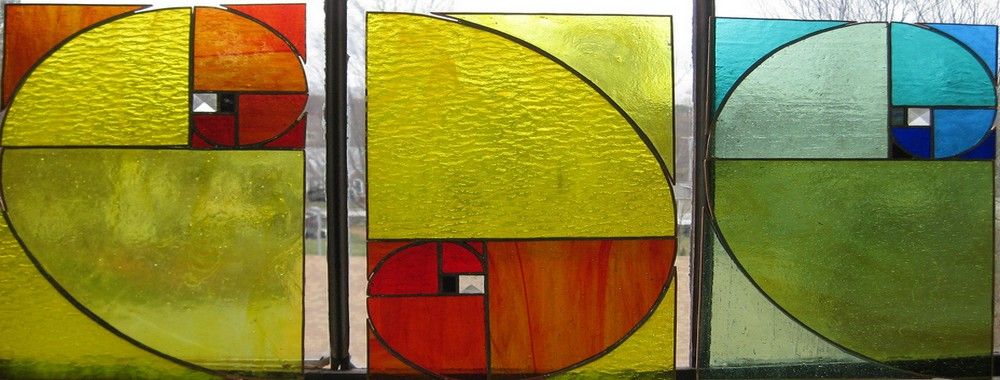
Another quirk of this unique visual relationship is that designers also apply it in slightly more complex ways. A common technique is to use it as a logarithmic spiral—or “golden spiral.” For instance, designers can take a length of 55 units as a starting point. Then, they can draw inwards to reach a length of 34 units when they pass that starting point. As they continue inwards and inwards with lengths of 21, 13, 8, 5, 3, 2 and then 1, a “golden spiral” is what appears. Such a spiral is more interesting to look at than one that's equally spaced. Yet, the phenomenon includes something else. Research has shown that the human eye also processes images constructed with the ratio more quickly.
Golden ratio rectangles, showing the properties of the golden proportions, including the golden spiral (bottom right).
The Golden Ratio in Nature, History, Art and Culture
Examples of the golden ratio exist in nature, and they turn up in many other parts of the physical or real world. Living things that exhibit it include pine cones—with their patterns—and nautilus shells’ spirals. Proportions of the human body can also show the ratio, and these idealized forms often appear in art.
Signs of the golden ratio abound in nature. In this flower example, the golden spiral is evident.
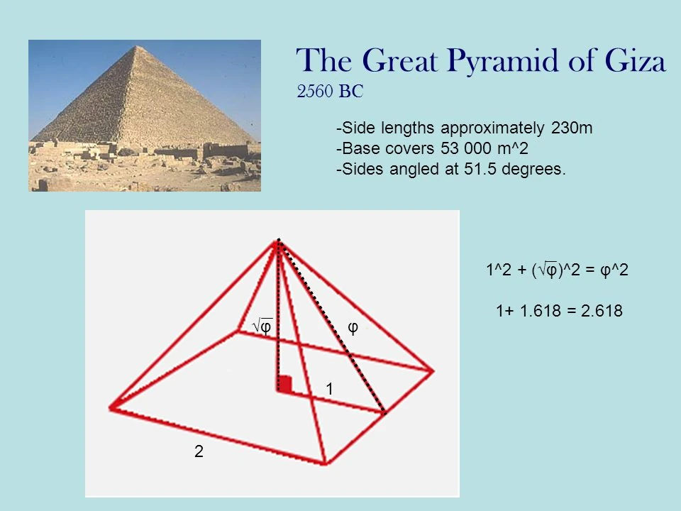
The golden ratio has been featuring in design and design elements for millennia. The Great Pyramids of Giza are among the earliest structures with proportions that reflect the golden ratio. Certainly, the ancient Greeks recognized its aesthetic appeal and showed their appreciation of it. They called it the "divine proportion"—and applied it in classical structures such as the Parthenon. As a principle, the ratio was familiar to philosophers and mathematicians—Pythagoras and Euclid, for example. Around 300 BCE, Euclid mentioned this principle in his Elements.
In the case of the Great Pyramid, the ratio of the slant height to half the base length is 1.6804, very close to the golden ratio.
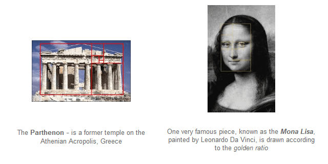
The Renaissance saw a resurgence in the use of the golden ratio—mathematician Luca Pacioli was at the forefront. Perhaps most notably, Leonardo da Vinci employed it to create balanced and harmonious works of art. This is evident in the Mona Lisa, for instance. Da Vinci referred to the golden ratio as the "sectio aurea" or the “golden section.”
The Parthenon and Mona Lisa – two very different expressions of art and culture emerging from different civilizations and eras, but both make use of the golden ratio.
The golden ratio remains one of the most fundamental principles of art. Vincent van Gogh and Salvador Dali were among the legions of artists to put it to use since da Vinci. Nonetheless, it has a proven track record in creating a sense of visual harmony for all types of viewers far beyond art galleries. What's more, it continues to influence a wide range of fields outside of painting and sculpture. These include architecture, photography—and, indeed, design. The golden ratio is synonymous with good design and the design industry in general. Among the many design areas where the ratio does feature (including gardening) are graphic design and user interface (UI) design.
How The Golden Ratio Features in User Interface Design
The field of user experience (UX) design reflects the world around the human viewers who live in it. For users to enjoy intuitive experiences with digital products, designers must mirror the patterns and dynamics which the people who use their products find familiar. That's to say, they must match the users’ mental models. Among the design principles they apply, the golden ratio stands out with its inherent sense of balance and harmony. Indeed, for web design and other user experience design aspects, it offers a time-tested formula. Designers apply it to help them create interfaces that are intuitive and engaging—and visually appealing.
However, these designs are more than technically well-formed with their well-proportioned, balanced compositions that maximize usability. When designers and web developers use the ratio well, they can draw viewers’ attention and instill positive, warm emotions in them. So, brands that feature such harmonious designs can cause these to resonate deeply with their users. This can happen on a uniquely subconscious level—one that earns trust while it pleases and helps users achieve their goals.
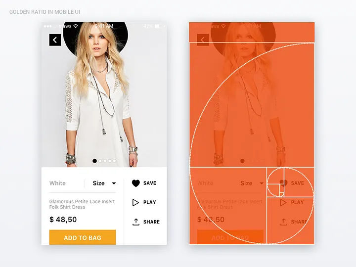
As a vital part of visual design, the golden ratio is a particularly helpful design aid in the “mobile first” era. More users access digital products on mobile devices than on desktops—and the trend continues. Especially when the screen real estate is small, the ratio provides a needed framework for guidance. With it, design professionals can create balanced and harmonious layouts, typography and images even on the smallest screens. Together, these visual elements work to enhance the overall user experience and keep users on board. On top of that, a layout with such “pleasant” proportions can go a long way to keeping users calm when they’re distracted. Even when they’re in potentially stressful conditions, users can appreciate the sense of order such designs give them.
The golden ratio at work in a mobile design; note the application of the golden spiral.
Designers can make the best of their designs particularly when they strive to:
Achieve Balance and Harmony
One of the key principles of the golden ratio is balance. When they follow the ratio's proportions, designers can ensure that their designs are indeed visually balanced. They set elements out in a way that feels natural and harmonious. This balance creates a sense of order and coherence for users. It makes it easier for them to navigate and understand the interface—even at a glance.
Create Visual Hierarchy
Visual hierarchy is an essential part of guiding users' attention and helping them prioritize information. A design can stand—or fall—on its information architecture. Designers use the golden ratio to help them establish visual hierarchies within the web pages and app screens they create. They do it from determining the relative sizes and positions of different elements. For instance, for typography, designers use the ratio to create a clear distinction between headers, subheadings and body text. This makes it easier for users to scan and understand the content.
This web template shows the golden spiral at work.
Aesthetics play a crucial role in user experience—by nature. Users are more likely to engage with a visually appealing interface. This phenomenon refers to the aesthetic usability effect. The effect states that users will typically perceive visuals that are well-structured as being more usable—no matter what. People like pretty things, which the golden ratio can help achieve. As they apply the ratio to the layout, typography and imagery, designers can cast a certain “magic.” This aesthetic appeal doesn't just attract users; it enhances their overall experience with the product or service as well. Plus, it can be a lasting part of their pleasurable memory of it—something that prompts them to return time and again to a clean, alluring digital product.
Co-founder of Hype4.com Michal Malewicz explains the aesthetic usability effect:
ShowHide
video transcript
00:00:00 --> 00:00:31
There is something called esthetic usability effect, which means that if something looks good, it's not really perceived by people as being more usable, even if it's not. So those visuals are important and we really, really need to keep that in mind. A lot of the users have now become very tech savvy. A lot of the people, you know, using apps and using websites have been using them for 15 or 20 years now, and they are very skilled.
00:00:31 --> 00:01:02
So they understand the typical patterns. They know that checkout icons should be in the top right corner. They know how a good logging and registration works. So all things like that are kind of predetermined and there's pretty little innovation here. So you can do research to test the viability of the product. There isn't really much way to innovate and user interface. The visuals can be the differentiator. And of course we can use a design system like material design, but that would be
00:01:02 --> 00:01:21
a horrible world to live in because those apps would be all looking boring and soulless and people want that design. That's why people buy Apple products, among other things, because they look good and they are different than everything else, at least sometimes. So people buy with their eyes and we really need to remember that.
Foster a Sense of Familiarity
The golden ratio is a part of the human experience that goes back through many centuries. As a result, it's become an ingrained part of how people perceive beauty and harmony. As they incorporate the golden ratio into their design work, UX designers tap into this sense of familiarity. They can make an interface feel more natural and intuitive to their users. So, users can feel more comfortable and confident when they're interacting with it. That speaks to trust on a level that's deep-rooted. It serves as a strong foundation for design teams to build towards compelling calls-to-action, easier conversions and—vitally—long-term customer loyalty.
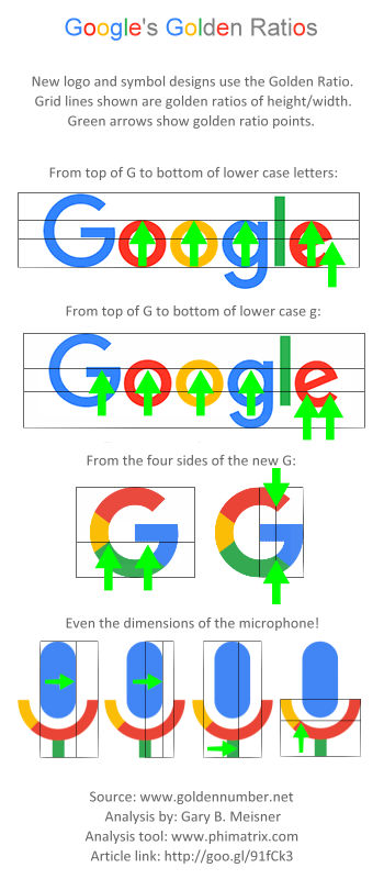
Google’s familiar look is a golden one, even if it is multicolored.
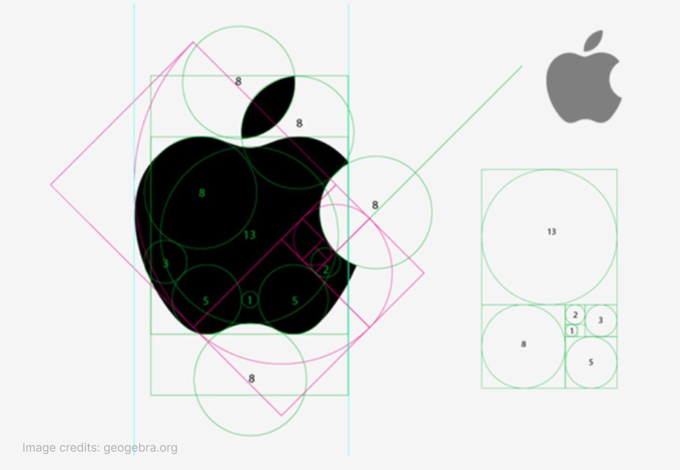
Logos and icons are integral parts of a brand's identity, and their design often involves the golden ratio. When they design logos or icons, designers should consider using the golden ratio to establish the proportions and shapes. If they make sure that elements of the logo or icon are in harmony, they can create winning, memorable designs. This can help welcome and maximize user interactivity—and promote iconic status.
Famous brand images often show the golden ratio at work in their iconic simplicity.
Geogebra.org, Fair Use
How to Apply the Golden Ratio in Design
Key parts of using the golden ratio to enhance the overall user experience include:
Layout design
This determines an interface’s overall structure and organization. The golden ratio helps make better compositions overall and interfaces that are pleasant, calming and easy for users to navigate.
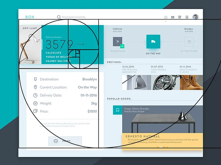
One common approach is to divide the layout into sections using the ratio. For example, a designer can divide a web page layout into a main content area and a sidebar. The main content area will be 1.618 times larger than the sidebar. This proportion creates a visually pleasing and balanced layout that guides users' attention to the most important content.
A simple approach to applying the golden ratio: to divide a layout width of 960 pixels by 1.168, gives 593 pixels – note the square (left section) making up the main part of the screen as a result.
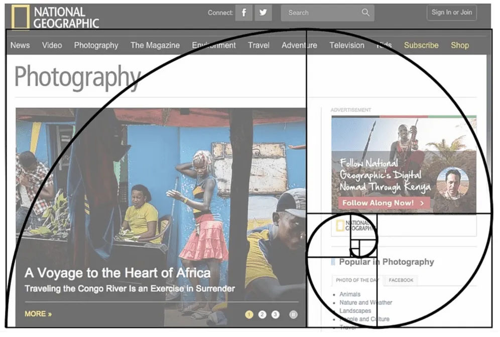
Brands tend to establish their signature use of design principles. For example, National Geographic’s web designs incorporate unique applications of the golden ratio.
Another example of National Geographic’s use of the principle.
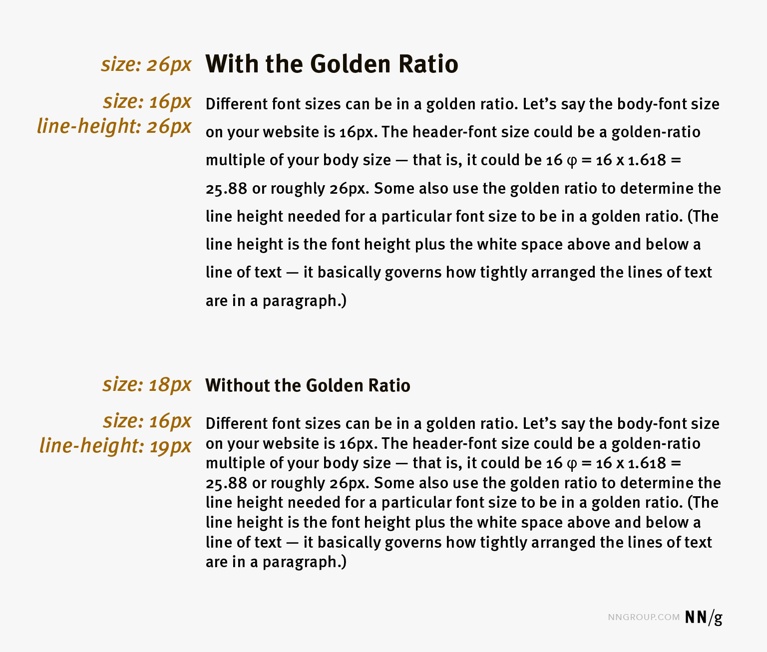
Good typography plays a crucial role in UX design. Wise choices help create visual hierarchy and improve readability. Designers can establish harmonious proportions between different typographic elements when they use this ratio. They can create a typographic hierarchy that’s balanced and pleasing to the eye. This hierarchy lets users easily distinguish different levels of information and notice important copy more easily.
For instance, imagine the body text has a setting of 10pt. Then, to apply the golden ratio (i.e., to multiply by 1.618), a designer would have a header text size of approximately 16pt. This creates a visually pleasant contrast and hierarchy between the header and body text.
The differences between text according to the principle and text without. Note the improved readability in the former.
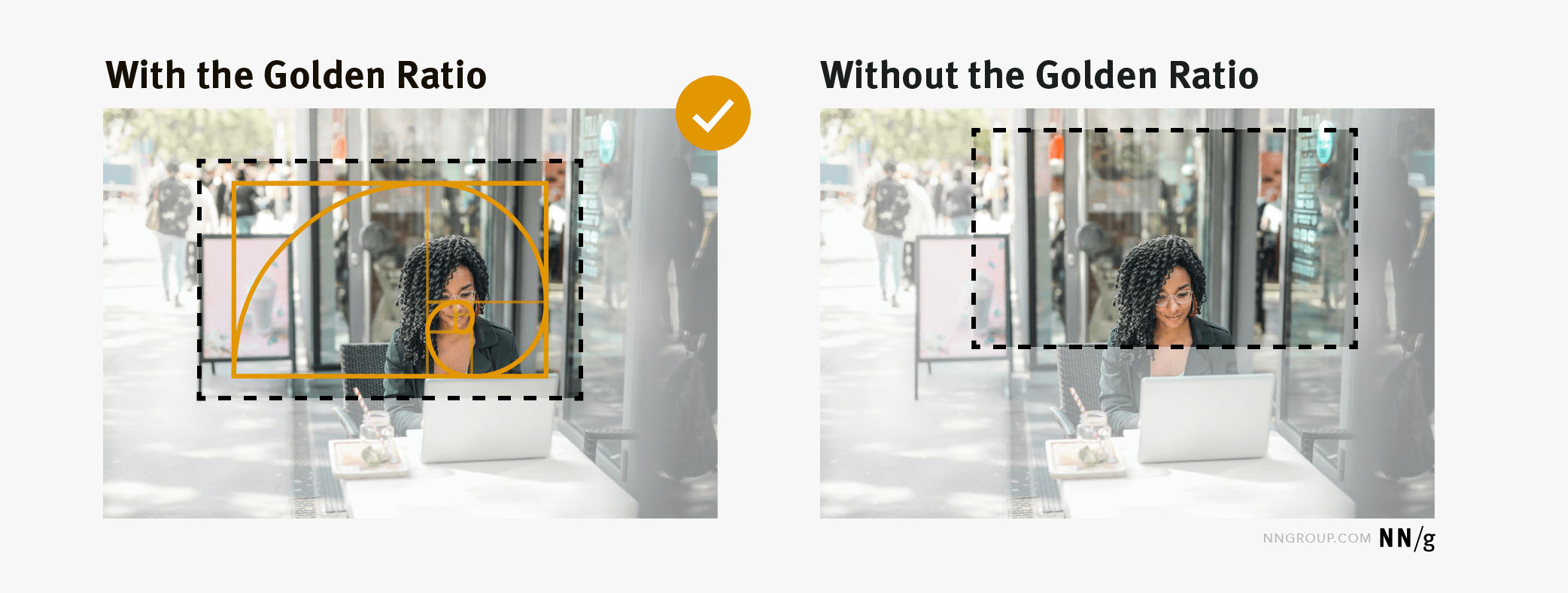
The golden ratio can help maintain the balance and focus of the composition whenever designers crop an image. As they use the ratio to determine the proportions of the cropped image, they can ensure that the result works best as an image.
To create visually appealing and balanced compositions, designers can overlay the golden spiral on an image. They can then determine the most effective cropping strategy to keep balance and focus on the image's key elements. The goal is to align the focal point or main subject of the image with the spiral's center. Designers can then make a composition that feels balanced—and grabs the viewer.
White Space
This is a vital part of any design. It helps to create balance and harmony between different elements on a page. It also gives much-needed “breathing space.” When a designer applies the golden ratio, it makes it easier to determine the ideal white space proportions for a design. For example, if one element is 8px (pixels), then the white space around it should be 13px (8 x 1.618). This ensures that there’s enough space between elements. The result is a strong sense of balance and unity in the overall design.
White space, another essential UI design ingredient, at work in this Digital Agency landing page.
Many online tools are available. These programs and services can help calculate the proportions and generate templates. They can also provide visual feedback to ensure that designers apply the golden ratio quickly and in the best way for them. What's more, they permit the input of measurements for elements like fonts, images and white space. As well as this, they'll tell the exact proportions needed for each element to ensure the design looks balanced and pleasant.
The following software examples are among popular choices that help designers achieve good-looking designs that can win their products' users over time and again:
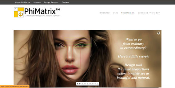
PhiMatrix: This software provides customizable grids and templates that designers can overlay on designs to make sure they apply the golden ratio accurately.
PhiMatrix is a popular and effective choice for applying the golden ratio.
Adobe Illustrator: A popular vector graphics editor—it lets users create designs and illustrations while it provides tools to calculate and apply the golden ratio.
Sketch: This digital design tool provides plugins and features that enable designers to leverage the golden ratio in their design work. It provides a free Sketch file that includes the golden spiral to use as a guide for image and layout composition.
Figma: This collaborative interface design tool offers plugins and features that let designers calculate and apply the golden ratio in their design projects.
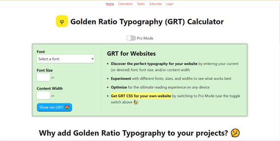
Golden Ratio Typography Calculator: This tool helps designers to determine the ideal typography sizes based on the golden ratio.
Golden Ratio Typography Calculator is another popular solution for applying the principle.
Overall, the golden ratio resonates with the human eye since it’s such an integral and time-tested principle. Designers who apply it accurately can help themselves and their brands to enjoy success with user interfaces that look great and work well—whatever the user scenario may be. The key part is that these designs are engaging and resonate with users on a subconscious level—one that builds trust and helps secure conversions. In any case, it’s essential for designers to treat the golden ratio wisely—as a tool in their design process, not a set-in-stone rule to follow regardless.
Is there any criticism or controversy surrounding the use of the golden ratio in design?
Critics argue that the golden ratio's effectiveness and universality in design are often overstated. They point out that its application can be forced or arbitrary—without any actual contribution to the user experience or functionality of the design. Another thing is that some studies suggest that the preference for the golden ratio isn't as universal as often claimed. This indicates that cultural and individual differences play a significant role in aesthetic preferences.
Nevertheless, many designers use the golden ratio as a tool in their work—appreciating its historical significance plus the structure it can provide in user interface (UI) design for a digital product or service. Still, it's essential to recognize that the golden ratio isn't a one-size-fits-all visual design solution. Effective user experience (UX) design and interaction design do require a balance between aesthetic principles and functionality. Designers need to consider the specific needs and preferences of the target audience. They also have to incorporate user research and user testing in product development so they consider choices and their potential impact—such as in terms of accessibility.
How does the golden ratio compare to the rule of thirds in composition and design?
The golden ratio and the rule of thirds are both compositional tools that professionals use in design and art to create visually pleasing and balanced layouts. While they share a similar purpose, they do differ in their approach and mathematical basis.
Golden Ratio:
● Mathematical basis: The golden ratio is approximately 1.618:1. It's derived from the Fibonacci sequence, and many people believe it's aesthetically pleasing due to its frequent occurrence in nature.
● Application: Designers create a golden rectangle, where the ratio of the longer side to the shorter side is 1.618. This rectangle can guide the overall layout of a design—and designers can proportion smaller elements according to the golden ratio.
● Versatility: The golden ratio applies to a wide range of design fields, and these include graphic design, UI/UX design and architecture. It does provide a harmonious and balanced structure to the design.
● Perception: It’s often considered more complex and mathematically driven. It appeals to designers who prefer precise and calculated composition methods.
Rule of Thirds:
● Mathematical basis: The rule of thirds is about dividing an image or design into nine equal parts with two equally spaced horizontal lines and two equally spaced vertical lines. Artists or designers place important compositional elements along these lines or their intersections.
● Application: It has common uses in photography, graphic design and painting.
How does the golden ratio apply to responsive web design?
The golden ratio applies to responsive web design as it's something that can help promote aesthetically pleasing and balanced layouts in web design and more.
When designers apply it to responsive web design, the golden ratio helps them structure content and design elements in a way that’s both visually pleasing and functional across different screen sizes. Designers might use the ratio to determine the width of sidebars, the spacing between text blocks or the size of images relative to the rest of the page. That way, they can ensure that these visual elements scale appropriately on different devices and optimize information architecture. This helps them make the best user experience (UX).
What's more, the golden ratio can influence the overall structure of a web page—and so aid in user interactions. For example, designers might position the most critical content or call-to-action buttons at a golden ratio point from the top of the page, as this is where users' attention naturally gravitates.
Watch CEO of Experience Dynamics, Frank Spillers explain 10 principles for web accessibility and mobile design, including points about responsive design:
ShowHide
video transcript
00:00:00 --> 00:00:30
So, let's look at the 10 principles of accessibility for both web and mobile design. The first principle is that blindness gets you 80% of accessibility issues. Now, there are four major types of disabilities: *blindness*, and that includes low vision and color blindness,
00:00:30 --> 00:01:01
*hearing*, *cognitive* and *motor impairments*. Now, blindness is actually across a spectrum; they're like 22 different types of blindness, but we basically differentiate between blind – and there are different levels; like I said, you can be on the *edge* of blindness – you can still be legally blind but you can still have some sight; and then you may require screen magnification, which would be low vision;
00:01:01 --> 00:01:35
so, basically your vision is impaired to whatever percent: 60, 70, 80, 90, 95%, 97% – you know – but then there's a little bit of magnification that can help. So, you'll have low vision users using screen magnifiers to, like, 300% or 400% magnification, and a lot of those tools, those magnifiers have a screen reader in them
00:01:35 --> 00:02:02
as well, so blind users will use just the screen reader. And just like we saw in that last example, the screen reader is, for example, VoiceOver on the iOS operating system, which talks – essentially reads to you; that's a screen reader. So, why blindness of all these different disabilities? You might think, "Oh! Accessibility – it's too difficult! There's so many different disabilities;
00:02:02 --> 00:02:35
how do you tackle the different ones?" Blindness helps you get almost the whole way there because of keyboard and the screen reader. So, blind users will use a keyboard so you can test keyboard access, which is what motor/mobility users. Hearing – so, deafness and hard of hearing is essentially a captioning thing. So, that's pretty straightforward. And then cognitive issues – they're a little bit more complex.
00:02:35 --> 00:03:00
They're a little bit more complex to test for. And there's such a difference – you know – so we're talking about dyslexia, ADD, Asperger's, things like that. And so, yeah, so blindness is, in terms of core accessibility, the way to get there, in terms of testing.
00:03:00 --> 00:03:30
So, for example, if you're testing with users, you can recruit – you know – 80% of your users can be blind and you'll be getting a really good understanding of accessibility. So, *alt-text* is classic on images – classic accessibility can be summarized with alt-text. Now, here's a little quick quiz for you: what alt-text would you give this image?
00:03:30 --> 00:04:00
Let's take a minute and play here. So, "ALT..." So, "Man looking at wall with complex graphics or infographics." What did you give it?
00:04:00 --> 00:04:35
So, the classic issues with alt-text: you want to describe, not the picture, but you want to describe the *information in the picture*. So, what's the man doing? Like the fact that he's wearing a suit or his age or the type of brick wall it is – it's not really important, the color of the wall. You know – "Man staring at wall." It might be a little non-descriptive; it really depends on what the *function* of the image is. If this is an image that's required for the user
00:04:35 --> 00:05:01
to understand the content on the page, then it's going to have to be a little bit more descriptive. So, my alt-text: "Man looking at wall with complex graphics or infographics." I think should cover it. If it's too short, like "Man looking at wall." – we talked about that, that might be a little – you know...
00:05:01 --> 00:05:30
If you add something like "Picture of man looking at wall." – you don't need that; you don't need the "picture". So, or "photo" or "image" – you don't need to say "image" – "Image of man looking at wall." You don't need to say that, either. So, yeah, *alt-text*. It's classic to accessibility because a lot of people forget it.
00:05:30 --> 00:06:01
They miss it; it's just classically overlooked. And alt-text is actually critical to SEO. So, it's really, really important that alt-text is addressed. Let's look at the third one, then, so classic on mobile is the *hamburger menu*, the hamburger menu being the three lines in the top left of the screen. The easy fix is to just properly tag it; so, typically those menus, the user,
00:06:01 --> 00:06:35
their screen reader just skips over them; users don't see them. They can't actually access them. So, the classic one for mobile there is tagging those mobile elements when they become responsive. And the fourth one here is *Content that gets placed "out of the way" might not be found on the screen." And so, what does "out of the way" mean? Well, think of this, the screen reader reading this screen – this is a map. So, you're looking for the location of this restaurant. This is from an actual usability or accessibility test,
00:06:35 --> 00:07:06
and I've included the kind of findings here; so, the screen reader doesn't see the location list. That's the important content. The map is not really important; it's a visual paradigm. Blind users are not going to see the map. This Google map's not going to be accessible. It's like a million images that are not tagged; it's just like a big soup. So, the important thing is the *list of locations that are on the screen* so that you know, "Oh yes, there's a restaurant near me."
00:07:06 --> 00:07:30
And the location list is after the map, and it should be *before the map* in the code. So, the way that the screen reader is – the screen reader is parsing, reading the code, and so this is what we mean by "out of the way content" – content that's hard to find.
00:07:30 --> 00:08:05
The fifth principle is that accessibility testing with users – so *actually testing with users* – can reveal huge gaps. Now, this is a huge revelation for accessibility, by the way, because a lot of people think they can handle it with checkers or with code reviews; I used to think that I could do that too. And I need to tell you after 17 years of practice of this in business with my company Experience Dynamics, we've come to the overwhelming *mandatory* recommendation, conclusion,
00:08:05 --> 00:08:31
revelation that *you have to accessibility test* – you have to test with actual users. It shouldn't be a surprise. In usability, you test with users. You don't just try and guess or follow a guideline. It's the same with accessibility testing; it's *even more important* I think because *accessibility is twice as risky as usability*. Here, you see a usability test on the left;
00:08:31 --> 00:09:00
and on the right, you see an accessibility test with blind users completing the same task. So, you see task 3 here and we have just – you know – it's almost three times as easy for users who are sighted than users who are blind to complete this task. The sixth principle is that *disabling zoom on mobile makes it inaccessible*.
00:09:00 --> 00:09:30
So, low vision users using screen magnifiers won't be able to actually do the zooming if you disable it. So, a lot of people will disable that on mobile, and it locks users out. This is an image of a 400 times magnification by a user with low vision, and that's literally how the screen is being digested.
00:09:30 --> 00:10:06
The seventh principle is that *accessibility is easily learned*. Remember that close to 20% of the US population and 10% of men are colorblind, by the way. So, clean coding can be learned with a little practice. Accessibility is actually cheaper if you do it upfront compared to if you try and do it later. So, it should be part of your coding, but also it should be part of your UX design strategy too. So, the next principle is *accessibility doesn't mean ugly*.
00:10:06 --> 00:10:31
It may require you to rethink kind of the layout – again, this is where UX design can be very helpful. But one of the things I've realized is that *visual bias is your worst enemy*; that because you're so familiar with seeing things and the layout of a screen – you know – the more creative you are, the more of a designer you are; the more creative designer, visual designer,
00:10:31 --> 00:11:05
the more biased you're going to be because you can *handle*, just like you can handle gray on gray and – you know – clean UIs that people that need very high contrast, very definite articulation of UI elements are requiring, and for you, it's fine if they're not there. The ninth one here is to *check mobile accessibility separately* – we've talked about a few mobile accessibility issues here. This is the same accessibility test where the link is underneath the map;
00:11:05 --> 00:11:33
for some reason, the responsive view pushes the search UI to a link underneath the map into a collapse, and then you're supposed to click on that link and open it up. Now, it's even hard to see for sighted users. Even when I was observing it, I barely noticed this link. What was happening with our blind users was it was skipping right past it; so, it was reading the screen – you know –
00:11:33 --> 00:12:05
so, it was like *search results, a map, edit search*, and then... and then it was continuing on. And it was just the fact that it said "edit search", here you're seeing the user was turning down her speaking rate because she thought – she went over it like five times and didn't catch it. It actually was there. I thought it wasn't there; I thought it wasn't being picked up, but it was there. When she turned down her speaking rate, you could hear it being said, but it was sort of mashed in.
00:12:05 --> 00:12:32
And the question was – this is like definitely a usability question and a responsive design decision is: *Why would you need to collapse it?* Why not just have the UI – you know – *above the map would be better*, so you have it where it was before? Even below – if it was there – the actual just UI as opposed to collapsing it and making it a link that said "edit search".
00:12:32 --> 00:13:01
So, you can see here really where usability in UX plays into accessibility when you're thinking about it. It actually requires you – in the same way that SEO responsive web design, accessibility requires you to be thinking about things the way a screen reader, the way a user accessing this website with a screen reader would think about it. And it's really tricky to think that way – I need to tell you this.
00:13:01 --> 00:13:30
It's super tricky to think that way, because you're *not used to it*. You know – you're used to your visual bias; you're like, "Well, I can see the link... what's the problem?" And so, this is where accessibility testing can help you get to that last mile of insight. So, the tenth principle here is *embrace the access attitude*. It's *People First* – design for differences.
00:13:30 --> 00:14:01
*Clear Purpose* – so, well-defined goals, and that means understanding your audience. So, we'll be talking about personas later on in this course. *Solid Structure* – so building to standards; there are great standards. Accessibility is based on good clean coding. So, just like alt-text, every image needs an alt tag – *every single image*. That's just part of clean coding, and it'll make things accessible and Googlebot will be happy as well.
00:14:01 --> 00:14:35
*Easy Interactions* – everything works across devices. Interoperability baked right in. *Helpful Wayfinding* – so, it's navigation: clear navigation. One of the things with accessibility is a lot of sites and web apps make it hard for users to navigate. So, just like we saw with that comparison of the usability test versus the accessibility test, it's like twice as hard / three times as hard to navigate a site if you're using a screen reader, for example.
00:14:35 --> 00:15:00
*Clean Presentation* – supporting meaning; that's a huge one: supporting meaning. *Plain Language* – plain language is really important, especially for the cognitive disabilities such as dyslexia or ADD or ADHD. And then, finally, *Accessible Media* – so, supporting all the senses. So, offering captioning for deaf and hard of hearing users,
00:15:00 --> 00:15:14
offering alternative formats – for example, if the media or if the image is too complex or the table is too complex, you'll need to offer a different way for users to get to it.
What challenges are involved in teaching AI to understand and apply the golden ratio in design projects?
Training AI to understand and apply the golden ratio in design projects does present a few challenges for UX designers, UI designers and other interactive product designers. Here are some:
● Deciphering Aesthetic Judgment: Designers face the challenge of how to decipher aesthetic judgment. The subjective and varied nature of aesthetic judgment complicates their task of teaching AI to make design decisions based on the golden ratio. Designers must guide AI to navigate the intricate human perceptions of beauty and balance—which don’t have universal definitions.
● Balancing Design Principles: Designers encounter the need to balance a broad spectrum of design principles—including the golden ratio, color theory and typography. They have to carefully calibrate the process of teaching AI to harmonize the golden ratio with other critical design principles.
● Grasping Contextual Nuance: Designers appreciate that successful design—as well as product development—goes beyond proportions and must understand the context and purpose it serves. They strive to teach AI how to apply the golden ratio in ways that support the overall design intent and enhance user experience goals. This demands a profound grasp of the specific design context.
● Overcoming Data Limitations: Designers confront the challenge of overcoming data limitations. They recognize that quality datasets—especially those illustrating the successful application of the golden ratio in design—are vital things for training AI with. The scarcity or complexity of curating such datasets poses major hurdles for them in effectively training AI.
● Adapting to User-Centered Design (UCD): Designers prioritize adapting to user-centered design—knowing that design transcends aesthetics to prioritize usability and user experience. They aim to teach AI to employ the golden ratio in ways that prioritize and enhance user interaction. This calls for an intricate understanding of user behaviors, needs and preferences.
This collection of 12 articles offers practical insights into user experience design, drawing from the author's real-world expertise as a UX designer. It's not focused on theory or methodology but on the author's experiences creating widely-used digital products. Highlighting a striking statistic—the book emphasizes the extensive time people spend interacting with digital devices. It underscores the UX designer's role in making these interactions as natural and human-like as they can. The articles aim to enrich designers' understanding of UX principles, and so can guide them to design more intuitive and user-friendly digital experiences.
This book has been influential due to its engaging narrative that explores the historical and cultural significance of the golden ratio. It offers a captivating account of the golden ratio's presence in art, architecture and nature—which makes it an accessible and informative resource for designers and enthusiasts who are interested in the broader impact of the golden ratio on human creativity and aesthetic perception.
Gary B. Meisner's 'The Golden Ratio: The Divine Beauty of Mathematics' captivatingly explores the golden ratio—a principle celebrated for its widespread presence in nature, art and architecture. This book delves into the mathematical elegance and diverse applications of the golden ratio, and it sheds light on its historical importance and modern-day relevance. The principles it unfolds can deeply influence digital designers. It reveals how employing the golden ratio can enhance the aesthetic balance and visual appeal of designs, and in so doing improve the user experience in digital products. The combination of mathematical theory, historical insights and practical implications in this book serves as an invaluable resource for designers who are eager to integrate the golden ratio into their creative work.
What are some highly cited scientific pieces of research about the golden ratio?
Here are some highly cited pieces of research on the golden ratio:
The golden ratio is widely used to enhance aesthetic appeal and visual harmony in various design contexts. Nevertheless, its application in user interface (UI) design—especially for mobile screen elements—is something that's been less explored. This study aimed to investigate the impact of implementing the golden ratio in UI design and its influence on user satisfaction. The findings—based on a sample of 114 participants—revealed a 7.5% coefficient through simple linear regression analysis, which indicates a positive relationship between the integration of the golden ratio and heightened user satisfaction. The study offers valuable insights for UI designers—particularly for designing mobile applications requiring expanded space, such as catalog apps. Nonetheless, further research is needed to explore the golden ratio's application in UI design for devices with smaller screens, like smartwatches or digital cameras.
Blom and Stenbäck's thesis critically examines the application and perception of the Golden Ratio in the realm of digital media, focusing on web design. It scrutinizes whether this mathematical proportion—traditionally seeing use in art and architecture for its visually pleasing qualities—still resonates with users in the digital age. Through semi-structured interviews, the study gauges users' reactions to web page layouts adhering to the Golden Ratio versus traditional designs. This research is influential as it bridges the gap between classic design principles and contemporary digital aesthetics, and so it provides insights into user experience and design effectiveness in the digital landscape.
Are there alternatives to the golden ratio that designers also use in their design work?
Yes, designers have a variety of alternatives to the golden ratio that they employ to achieve balance, harmony, and visual interest in their designs. Some of these alternatives include:
● Rule of Thirds
A widely used principle in photography and design—the rule of thirds involves dividing the composition into nine equal parts with two equally spaced horizontal lines and two equally spaced vertical lines. When designers place elements along these lines or their intersections, it creates a balanced and dynamic composition.
● Grid Systems
Grids provide a structural framework for designers. These offer a systematic way to lay out elements. Common grid systems include column grids, modular grids and hierarchical grids. They help in organizing content, guiding the eye through the design and maintaining consistency.
● Gestalt Principles
The Gestalt principles (such as similarity, proximity, continuation and closure) describe how the human mind perceives visual elements as organized patterns or wholes. Designers use these principles to create cohesive, unified designs that are both visually and psychologically satisfying.
Designers may choose one or a combination of these methods based on the project's requirements, the message they want to send, and their personal or brand style. The key is to use these principles not as strict rules but as tools to enhance the effectiveness and aesthetic quality of the visual design. It’s vital to conduct UX research and user testing in product development before you release a product or service such as a mobile app. For example, mobile UI design has certain considerations—such as accessibility on smaller devices—and that demands special focus.
Watch our video that explains the Gestalt principles.
ShowHide
video transcript
00:00:00 --> 00:00:32
Gestalt principles are principles of human perception that describe how we group similar elements, recognize patterns and simplify complex images when we perceive objects. - So, Gestalt principles — sometimes called Gestalt laws — are simply a way of thinking through Gestalt psychology — 'Gestalt' just meaning 'form', is how we're making sense of a visual field. These are ways of parsing out what things mean within a visual space. Gestalt relies first and foremost on the understanding of a visual field and the ability to create
00:00:32 --> 00:01:00
what are called *figure/ground relationships. So, figure/ground relationships are sometimes called 'positive space' and 'negative space'. So, I'm going to talk about them as figure/ground, because when we look at something like this visual field of rectangles, it all looks the same — that is right now our ground. But the first rule of figure/ground relationships is that discontinuity creates figure. So, by changing one thing here, by creating that discontinuity, that draws our attention,
00:01:00 --> 00:01:30
that becomes the thing in which we are focusing on, and that is really essential, because this can manifest through the Law of Similarity, by which visual similarities are read as being more related. And we can do this through color; we can do this through shape; we can do this through size. So, we read these things as being more of a group. Proximity works in a similar way wherein the actual visual or physical proximity of things relative to each other tells us that these are also read as a group.
00:01:30 --> 00:02:02
There's the Law of Continuation, by which our eye wants to follow a particular line. And so, when we read this visual, we don't read it as two lines which have met in the middle and made a hard turn. We read this as two lines flowing over each other, and that's because of continuation. And all of these things — Gestalt principles — influence hierarchy, informational grouping and readability, and they become essential for understanding both concept and content.
Can you provide a step-by-step guide to using the golden ratio in a design layout?
Here’s a step-by-step, suggested guide that designers might find useful if they want to apply the golden ratio in their design work:
a. Understand the golden ratio: Become familiar with its properties and how it's featured in art, architecture and design.
b. Calculate the golden ratio: Use the Golden Ratio to divide spaces or elements. For a given length A, the smaller part B should relate to A as A relates to the sum of A+B—which is approximately 1.618.
c. Create a golden rectangle: Design a rectangle where the ratio of the longer side to the shorter side is 1.618. This rectangle can guide the overall layout of the design.
d. Apply to layout components: Divide content areas, margins or other elements by using the golden ratio to make sure that each part of the design relates harmoniously to the others.
e. Use golden circles for logo design: If you're designing a logo or a similar element, use circles with diameters proportional to the Fibonacci sequence—which approximates the golden ratio—to make pleasing and dynamic compositions.
f. Implement the rule of thirds: Align key elements of a design along the lines that divide its layout into thirds, both horizontally and vertically. The intersecting points are strategic places to position the most important elements of the design.
g. Iterate and refine: Use the golden ratio as a starting point, but don't be afraid to adjust the design to better meet aesthetic or functional needs. The golden ratio should serve as a tool, not a strict rule.
In this course, you will gain a holistic understanding of visual design and increase your knowledge of visual principles, color theory, typography, grid systems and history. You’ll also learn why visual design is so important, how history influences the present, and practical applications to improve your own work. These insights will help you to achieve the best possible user experience.
In the first lesson, you’ll learn the difference between visual design elements and visual design principles. You’ll also learn how to effectively use visual design elements and principles by deconstructing several well-known designs.
In the second lesson, you’ll learn about the science and importance of color. You’ll gain a better understanding of color modes, color schemes and color systems. You’ll also learn how to confidently use color by understanding its cultural symbolism and context of use.
In the third lesson, you’ll learn best practices for designing with type and how to effectively use type for communication. We’ll provide you with a basic understanding of the anatomy of type, type classifications, type styles and typographic terms. You’ll also learn practical tips for selecting a typeface, when to mix typefaces and how to talk type with fellow designers.
In the final lesson, you’ll learn about grid systems and their importance in providing structure within design. You’ll also learn about the types of grid systems and how to effectively use grids to improve your work.
You’ll be taught by some of the world’s leading experts. The experts we’ve handpicked for you are the Vignelli Distinguished Professor of Design Emeritus at RIT R. Roger Remington, author of “American Modernism: Graphic Design, 1920 to 1960”; Co-founder of The Book Doctors Arielle Eckstut and leading color consultant Joann Eckstut, co-authors of “What Is Color?” and “The Secret Language of Color”; Award-winning designer and educator Mia Cinelli, TEDx speaker of “The Power of Typography”; Betty Cooke and William O. Steinmetz Design Chair at MICA Ellen Lupton, author of “Thinking with Type”; Chair of the Graphic + Interactive communication department at the Ringling School of Art and Design Kimberly Elam, author of "Grid Systems: Principles of Organizing Type.”
Throughout the course, we’ll supply you with lots of templates and step-by-step guides so you can go right out and use what you learn in your everyday practice.
In the “Build Your Portfolio Project: Redesign,” you’ll find a series of fun exercises that build upon one another and cover the visual design topics discussed. If you want to complete these optional exercises, you will get hands-on experience with the methods you learn and in the process you’ll create a case study for your portfolio which you can show your future employer or freelance customers.
You can also learn with your fellow course-takers and use the discussion forums to get feedback and inspire other people who are learning alongside you. You and your fellow course-takers have a huge knowledge and experience base between you, so we think you should take advantage of it whenever possible.
You earn a verifiable and industry-trusted Course Certificate once you’ve completed the course. You can highlight it on your resume, your LinkedIn profile or your website.
Now, we’re going to look at a subject that comes directly from mathematics and that we can also find all around us – the
1.1k shares
4 years ago
Open Access—Link to us!
We believe in Open Access and the democratization of knowledge. Unfortunately, world-class educational materials such as this page are normally hidden behind paywalls or in expensive textbooks.

