Whenever you’re working in user experience (UX) design, you’ve got to understand user expectations if you’re going to be able to group information effectively, and card sorting is a handy—and relatively simple—way to engage participants so they categorize topics in a way they find logical. This approach is an effective one to help you uncover user preferences for content arrangement to help create a coherent and user-friendly structure for websites or apps.
You’ve likely come across the concept of card sorting—whether or not you’re in UX—and researchers use the popular, low-tech research technique to organize data sets. What it’s especially useful for are information architecture, menu structures, workflows, and website navigation. You may find it easy to run a card sort, but—be that as it may—there’s an art to it and things that you’ll need to get right; let’s get into the do’s and don’ts of it now.
Table of contents
- What Is Card Sorting in UX Research?
- Why Do We Use Card Sorting?
- Advantages and Disadvantages of Card Sorting
- Types of Card Sorting
- Tree Testing vs Card Sorting: Which One Should You Prefer?
- What Tools Do You Need to Conduct a Card Sort?
- How to Run a Card Sort?
- Card Sorting Tips and Best Practices
- The Take Away
- References and Where to Learn More
What Is Card Sorting in UX Research?
When you do a card sort, you get users involved in organizing information and they’ll sort labeled cards into groups from what they understand about the relevant things. The purpose behind the process is it shows how users expect to find information on a website, and the insights you get from card sorting are—potentially—very powerful tools you can use to create intuitive and user-friendly website structures as a designer, structures that run in line with the users' mental models for seamless and efficient navigation.
Here’s a little example of how a card sorting session might go. Picture a group of user participants and you’re the researcher for a grocery store brand that’s creating a new website. You want to see how customers are going to approach the store—namely, what they’d put various items under in terms of categories. So, you deal out cards to the participants, cards with things like “Dairy,” “Bread,” “Fruits,” “Toothpaste,” “Deodorant,” “Eggs,” “Insect Repellent” and “Garbage Bags.” Now, the users put these into categories, like “Dairy” and “Bread” under “Daily Essentials,” “Toothpaste” and “Deodorant” under “Toiletries,” and “Garbage Bags” and “Insect Repellent” under “Sundries.” But some participants might consider, say, toothpaste a daily essential, for example. Even though they wouldn’t need to buy a whole tube of it more than once every two weeks, they might still term it a daily essential.
Welcome to the “magic” of card sorting, where logic can be subjective! In the above example, you’d be able to harvest—no pun intended—these insights to organize the website's menu and categories in the way that works best, and make it easy for shoppers to find what they need.
Watch as Design Consultant Donna Spencer provides an excellent example of a card sort in her IxDF Master Class, “How To Use Card Sorting For Better Information Architecture.”
Why Do We Use Card Sorting?
Card sorting helps you understand how people think—and that’s not just about items but about ideas and concepts, too—and when you’ve got a good idea of how users think about encountering a digital design, for instance, you’ll be able to arrange content in a way that makes sense to them when you are organizing a website's structure or navigation. A card sort can show how someone’s background and personal experience affect their thoughts and the way they envision things, and give you a handy vantage point to accommodate how they see their world and fine-tune your interface design to their way of seeing and grouping things.
When you’ve done a successful card sort, you’ll learn the following, too:
What goes together and why
Different ideas and methods of organizing content
If people think similarly or differently about something or things
While people use card sorting more often to create IAs, website navigation, and menu structures, the strength of card sorting is how it translates across the board, and you can also use it for internal communication and politics.
In this clip, Donna Spencer explains one of the less obvious uses of card sorting and what it can tell us.
You’ll find card sorting effective for enhancing your IA, sure, but don’t expect it to actually create the IA for you—and that’s because card sorting is qualitative and exploratory, and therefore often yields results that are inconsistent and renders it unreliable to create an information architecture from scratch. On a similar note, it can’t tell you whether your IA works, and even though the card sort will inform your IA, you won’t know if it’s any good. Donna Spencer suggests you use a tree test instead.
What’s more, card sorting isn’t suitable when you’re after the following:
Definitive, black and white answers
Quantitative, statistically valid data
Advantages and Disadvantages of Card Sorting
Advantages of Card Sorting
Simplicity: You’ll find that very few techniques are as easy as just handing someone a deck of cards and then asking them to sort them out—it’s so direct and basic.
Cost-effectiveness: You’re talking about some plain card and either printer ink or pen ink. You may also use some sticky notes or some Sellotape.
Speed: You can run this exercise quickly—and as many times as you have to until you get the data you need out of it.
User-centric: Card sorting focuses on user input—and that’s crucial for product success—and since it values user perspectives over assumptions, it can save many a design headache later.
Familiarity: It’s a technique that’s been around for hundreds of years and people—including your users—can “get” it easily and not need much explaining on how to do it.
Insightful: It isn’t the most in-depth approach, to be sure; still, card sorting does manage to provide valuable insights as regards how users categorize information—and they’re insights you can leverage well.
Disadvantages of Card Sorting
Task ignorance: Card sorting doesn't always consider exactly what you’re going to do with the insights that come from it—the practical application of data, in other words—so it pays to be cautious about how you’re going to translate those results into your product.
Inconsistency: Card sorting results can vary thanks to all those little individual differences in perception and categorization; you know, the little quirks and idiosyncrasies people have about how they see things in their world—or, maybe more apt here, their worlds, plural.
Time-consuming analysis: It’s quick to perform a card sort, sure, but to analyze card sorting results—that’s another matter, and it can translate to long treatment times, especially when you’ve got complex data sets at hand.
Surface-level insights: Some fundamental issues or context may be beyond the technique’s scope, since it can often only go so deep, and the top-level view a card sort might give you can have deeper, more intricate matters under it—matters which you might well need to look more closely into.
Types of Card Sorting
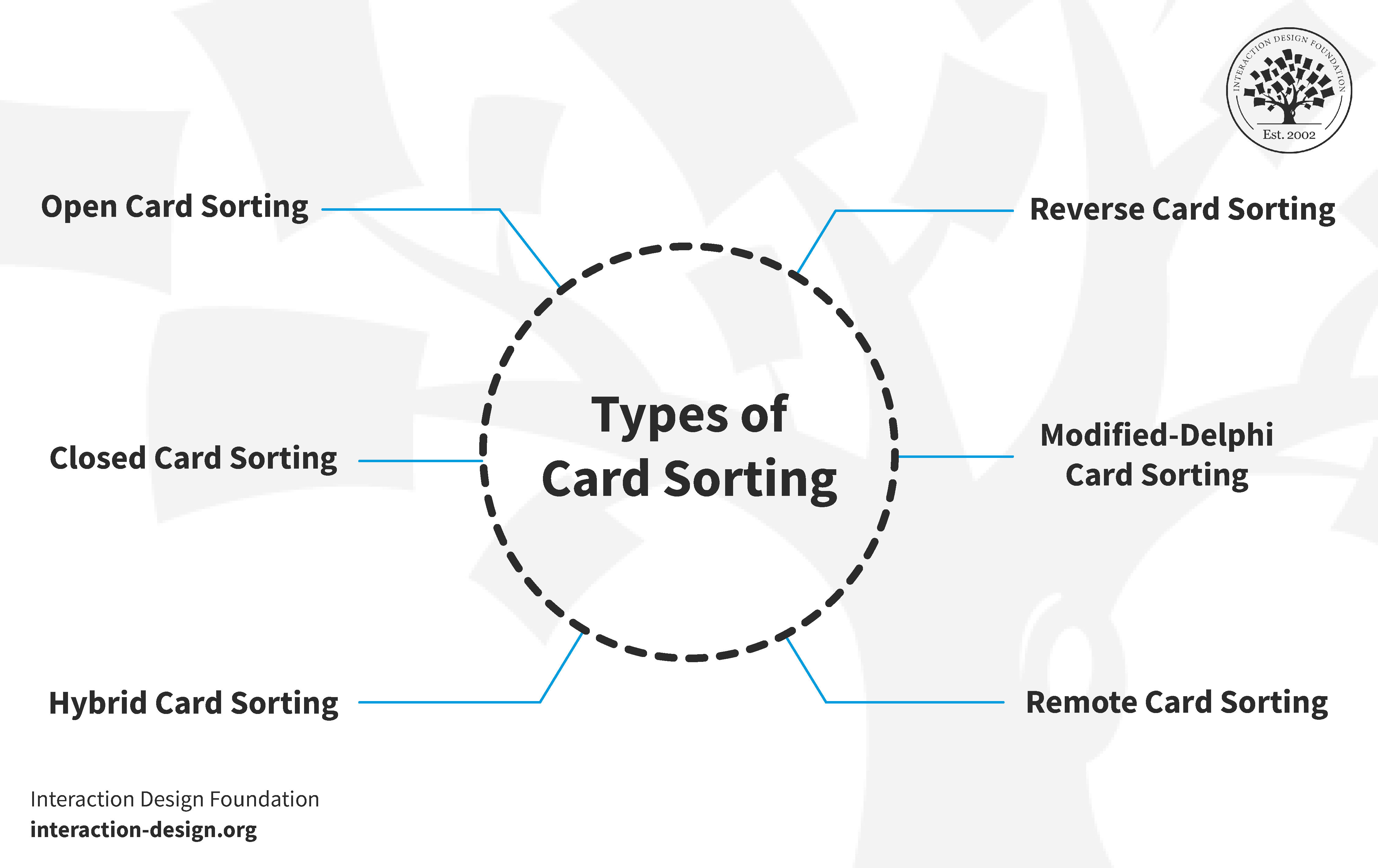
© Interaction Design Foundation, CC BY-SA 4.0
Card sorting is a versatile UX research technique and there are different types of it that can suit various needs, with each one offering unique insights—so, without further ado, let's explore these card sorting methods in detail, plus some examples.
1. Open Card Sorting
In this one, participants sort cards into categories which they make themselves, and that’s great if you want to know how users naturally group information and without preconceived categories of yours (or someone else’s) that may guide them away from how they’d see things otherwise.
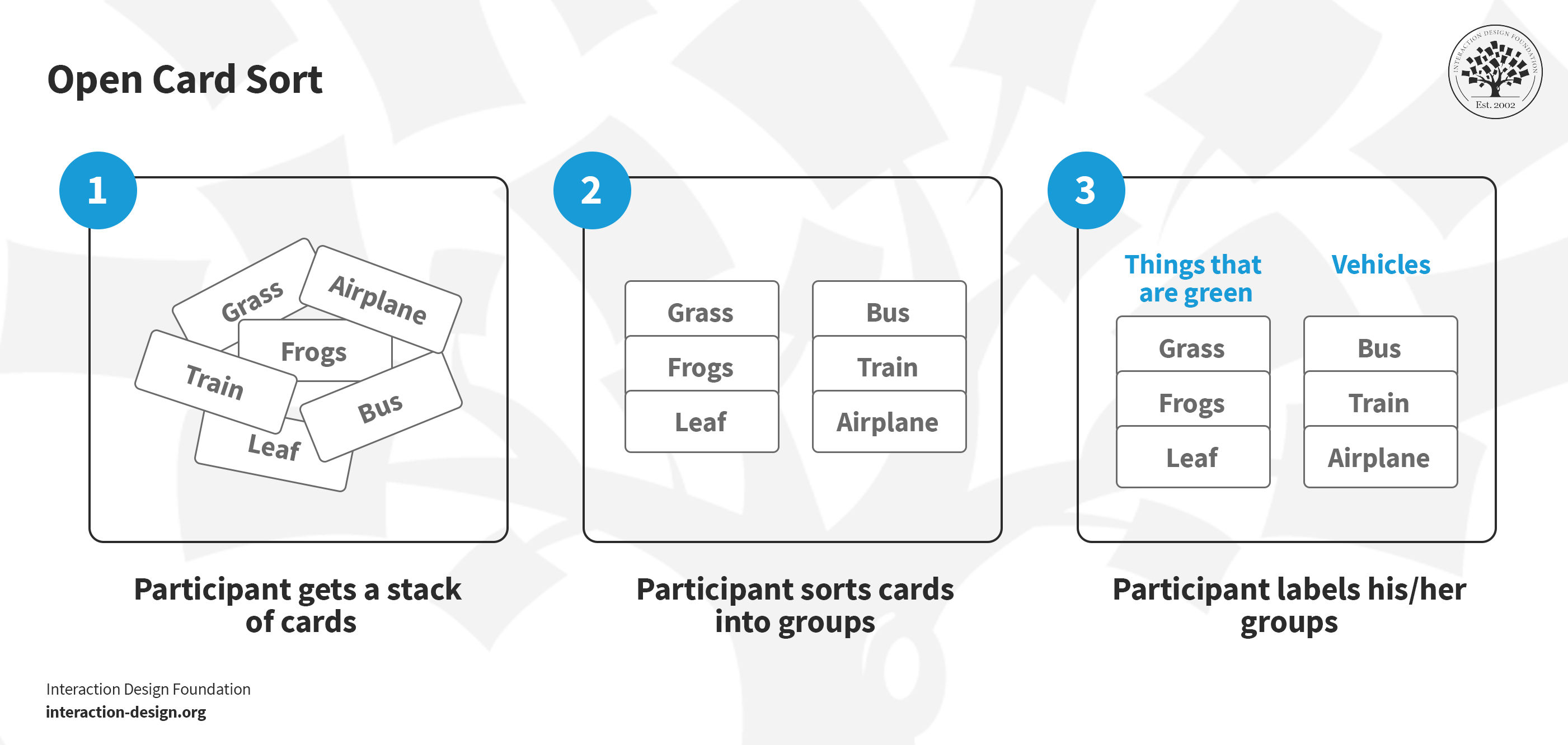
Say you get a stack of cards and you sort cards into groups and label these groups; that’s an open card sort.
© Interaction Design Foundation, CC BY-SA 4.0
2. Closed Card Sorting
Closed card sorting finds participants sorting cards into predefined categories, and it’s a method you’ll find useful whenever you want to test specific groupings or if you’ve got a basic structure.
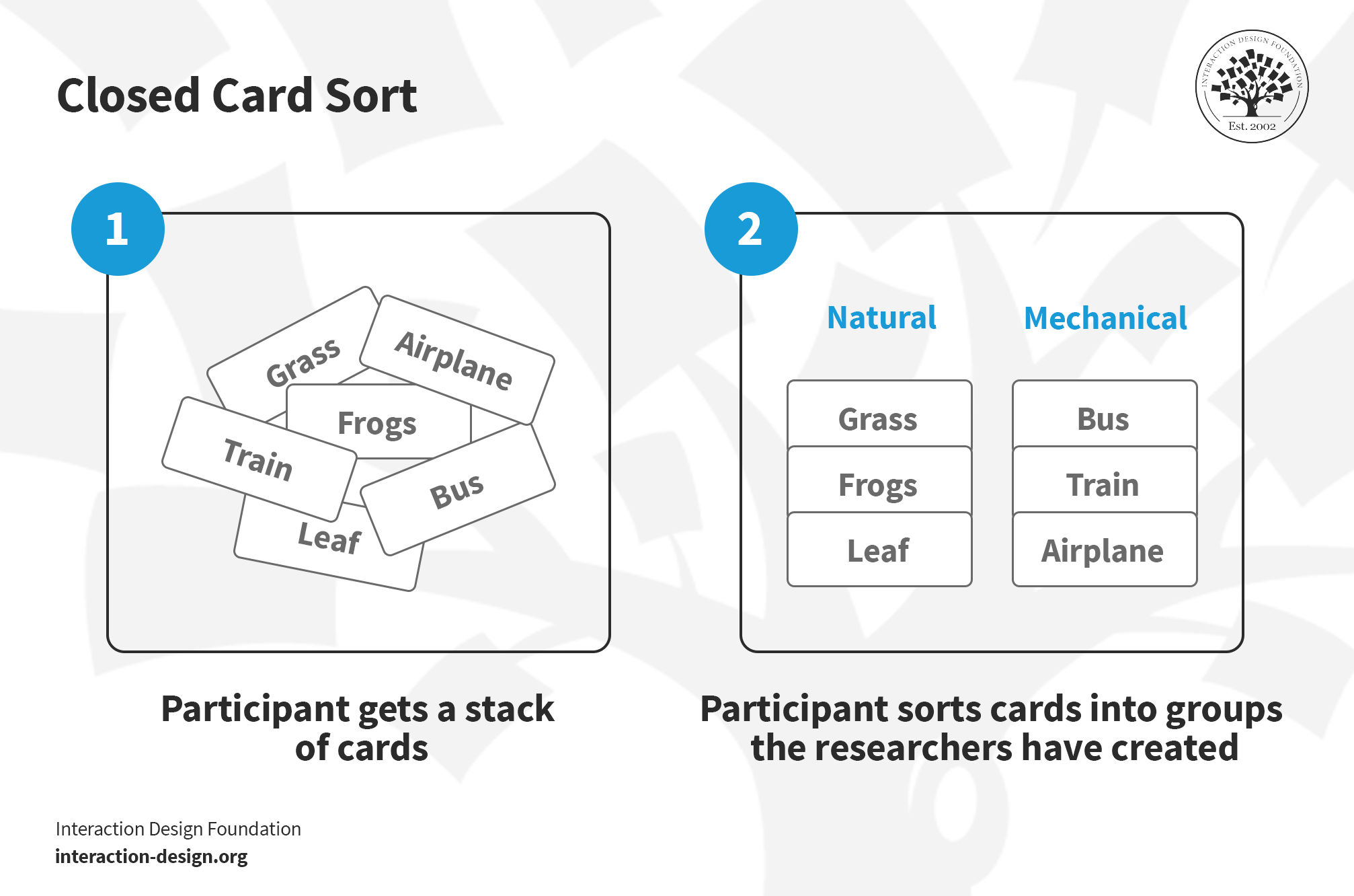
You get a stack of cards, and you’ve got to sort them based on groups the researchers have created—that’s a closed card sort.
© Interaction Design Foundation, CC BY-SA 4.0
3. Hybrid Card Sorting
Hybrid card sorting is a blend of open and closed card sorting where participants sort cards into provided categories but they can create new ones of their own, too, which means a good deal of flexibility for them and deeper insights into user preferences for you.
Example: Picture a website you might be building for a travel operator or brand that handles tourist resorts or the like. You’re doing a card sort where users can sort destinations and activities into different categories (e.g., Beaches, Mountains, and Cities). The beauty of this card sort, though, is that it’s a hybrid one and users aren’t restricted to the categories you’ve given them—in fact, they can make up totally new ones like “Adventure Travel,” “Historic Trails,” “Family-friendly” (the list can go on) and, from this, you’ll be able to get more nuanced insights.
4. Reverse Card Sorting
Reverse card sorting—or, tree testing—is a card sort that (you guessed it) works in reverse and users have got to work backwards. So, instead of actually sorting cards, they deduce where a card should go inside of an existing structure, and that’s a great way to test how intuitive a site’s navigation is. Then, at the end of a session, you can evaluate the results—compare how many users placed the item in the “right” category.
Example: Let’s imagine in a website that’s all about cookery (recipes and maybe some products and services, too) that you hand out a specific recipe card to users (say, “Vegetarian Lasagna”) and they’ve got to find where it fits inside of a pre-made set of categories. That way, you can test if the organization of the site really does make sense to each user.
5. Modified-Delphi Card Sorting
Modified-Delphi card sorting is a method that evolves with each participant, and it begins with the first participant’s conducting a complete card sort where they organize and arrange the items in a way that makes sense to them. That forms the baseline model, and then subsequent participants refine this model—each one builds on the previous person's work, and so the process continues.
Example: We’ve got a team working on designing a health app, and they categorize features like “Exercise Tracking,” “Diet Plans,” and “Mental Wellness.” Each one of the participants first sorts these features on their own; then, when they’re done, they discuss their choices collectively and that way can reach a consensus.
6. Remote Card Sorting
Remote card sorting—just as it sounds—lets participants sort cards through online tools, and it’s a handy and convenient way to reach a broader and more diverse audience.
Example: An e-commerce brand’s site might use an online tool to have users sort product categories like Electronics, Home Goods, and Fashion, and participants do the task on their computers instead of having to attend a formal session.
Tree Testing vs Card Sorting: Which One Should You Prefer?
First off, here’s a quick overview of both techniques:
In tree testing, users navigate through a simplified text version of the site's structure to find items—it’s something that reveals how easily they can locate information.
Card sorting helps you understand how users categorize information, and, there, participants organize topics or items into groups that make sense to them.
William Hudson, UX Designer and Author, discusses tree testing in more detail here, so watch this video to understand more about getting started with tree testing.
If you’re going to pick between these methods, it’ll depend on your project's stage and goals for which one’s best. If your current IA seems to be causing problems and you need to assess how effective it is, then do start with tree testing, as it’ll show you where users struggle to find information; what’s more, it’ll give you a clear picture of the areas that need improvement.
After you’ve grasped what’s wrong with your current IA through tree testing, then it’s time to go ahead with card sorting so you can get a helping hand at understanding how users think you should organize your content. An open card sort is what lets you capture your users' natural categorizations and terminologies—that’s a crucial ingredient for making an intuitive and user-friendly IA.
Last—but not least—do another tree test after you’ve reworked your IA based on card sorting insights. It’ll help you compare the new IA against the old one using similar tasks, and it’s a comparison that will highlight just how effective your changes actually are—plus, it’ll help you get your updated IA more in line with users’ expectations and behaviors.
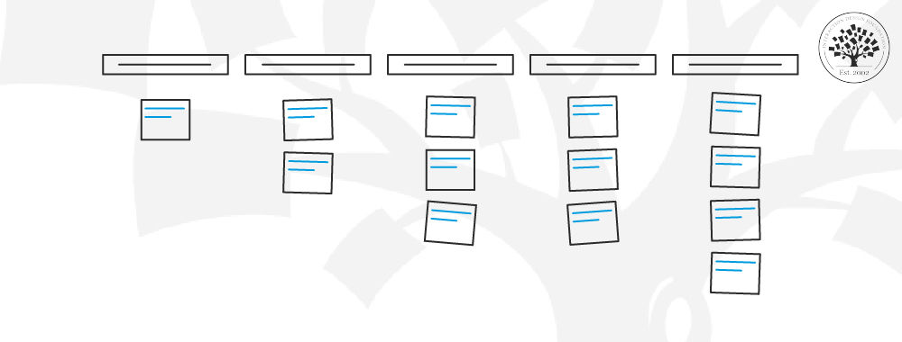
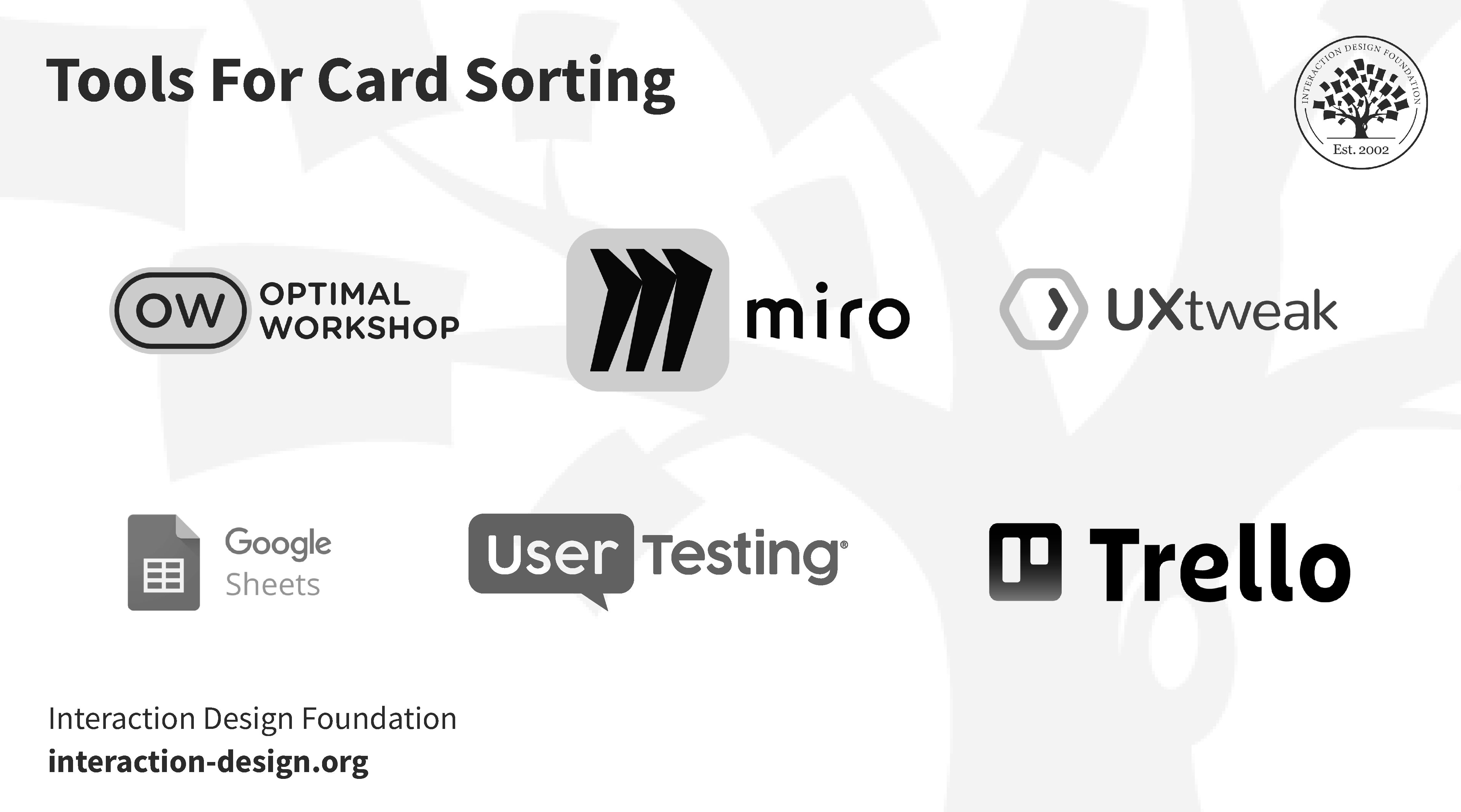
What Tools Do You Need to Conduct a Card Sort?
Card sorting doesn’t call for any fancy tools, and you can just use basic office supplies to sort with, say, index cards and markers. With that said, though, there are several digital tools you’ll find that can enhance the research process, and below we show six online tools that can help you streamline your card-sorting process.
© Interaction Design Foundation, CC BY-SA 4.0
Considerations for Choosing a Card Sorting Tool
You’ve got to consider several factors while you’re picking the right card-sorting tool for your project, so let’s see four important ones:
Study size: Tools vary in their capacity to handle different study sizes, so, for larger studies, go for tools that have got robust data-handling capabilities.
Study format: Decide if your study is to be a remote or an in-person one, and that’s because tools for remote sorting have got features like online collaboration, while in-person tools might focus more on physical interaction.
Analysis needs: Some tools come equipped with advanced analytics, which are ideal for detailed data interpretation—so, work out how deeply you’ll need the analysis to go.
Budget constraints: Be sure to balance the need for features with what you’re prepared to pay for.
How to Run a Card Sort?
© Interaction Design Foundation, CC BY-SA 4.0
1. Set Clear Objectives
Just like any other research methodology, you’ve got to work out exactly what it is that you want to learn and then—once you’ve done that—consider whether card sorting is actually the best way to learn it.
2. Select the Right Tools
You’ll need some cards, and plain index cards or Post-it notes work well for an in-person card sort. You can use anywhere from a handful to about 100—sometimes more, but it’ll depend on the project—but do try to limit the number of cards to 50 if you’re going to do a virtual card sort.
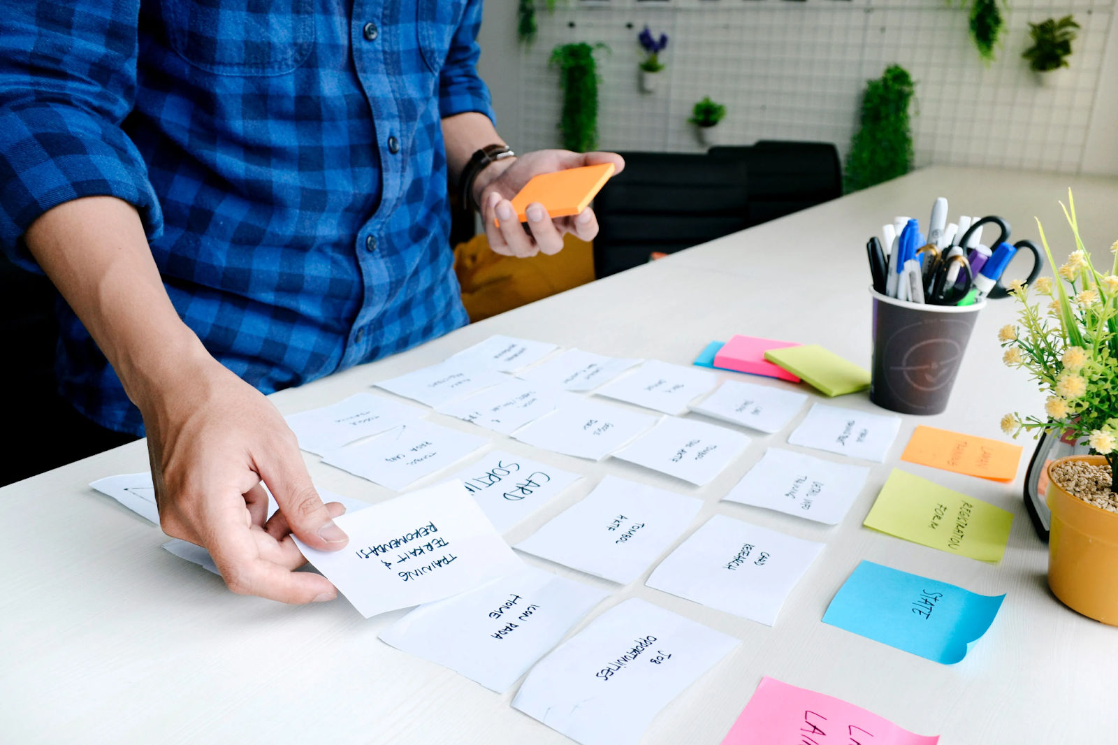
Index cards or Post-it notes work well for card sorting.
© UX Indonesia, Unsplash License
You can find several card sorting tools online—such as OptimalSort, but applications like Trello, Miro, or GitHub can work well, too. If you use a card sorting tool, it’ll offer you a great benefit, and that’s immediate availability for analysis on the computer and—what’s more and a happy little extra—you’ll be spared the tedious task of transferring results from physical cards to a spreadsheet.
3. Write Clear Instructions for Effective Participation
You’ve got to prepare your instructions before your card sort begins—and that’s no matter if it’s to be done physically or digitally—and they’ve got to be clear so your participants know what to do.
Think about the questions people may ask, and, if you’re conducting your card sort online, be sure to include the answers to those questions in your instructions so you’ll pre-empt them. If you’re going to be doing an in-person card sort, prepare your answers in advance.
Participants may ask questions like:
“This card fits with more than one group; can I put it in multiple places?”
“I don’t understand this card; can I exclude it?”
“There seems to be some content missing; can I add a card?”
Another important factor for you to consider before you start is your analysis, and it’s here where you’ve got to think about the optimal results you want; as in, you may wish to have only five people in your sample or as many as 25. If you do an in-person card sort, then it’s important that you figure out how to get your data from the physical world into the digital.
4. Organize the Content
Your content is one of the most critical parts of card sorting—if not the most—and your results will come from the content you give your participants; and that’s why you’ve got to evaluate them well.
Donna Spencer describes some of the elements and their significance of your card sorting content:
If you’ve got an extensive content set, it may be wise to split them into several card sorts so you get the desired results.
Steer clear of jargon. Avoiding technical terms like that is a vital thing, and that’s because if people can’t understand your content, they won’t be able to group the cards that well and it may affect your results and distort things. People tend to force associations and make connections that aren’t there when they don’t fully understand the information, and that’s why it’s so important to be sure you use clear and direct content; it’s one of the factors that your getting the best possible outcome depends on.
5. Choose the Participants
The people you select for your card sort are really important; Donna Spencer explains what you need to consider.
You might wonder about what the ideal number of participants is for your card sort. Sure, due to space and time constraints, you’ll find in-person card sorts easier to manage. For an online card sort, send the exercise to a small group first, as it’ll let you revise and adapt your card sort and, if you have to, you can always reach out to more people later.
6. Facilitate the Process
It’s best to start out with an introduction, give your participants a bit of context, and then go through the instructions. In a physical card sort, you can speak to your participants, but, if you do it remotely via Zoom or something similar, then you’ll have to write them for most virtual card sorts.
Don’t keep explaining or overhelp. One or some of your participants may likely look to you for guidance in the session; you can repeat the instructions, sure, but don’t go into more detail. You’ll get better results if they carry on without further assistance from you.
It’s better not to tell the people in your card sort that they’ll label the groups they create. Unfortunately, that’s not something you can do in a virtual card sort with an online tool. Language and labels will influence the categories—your participants are going to think more about the categories than the content that goes into them, and you’ll lose the fluidity of the card-sorting process.
Take notes during the card sorting process, and be sure to listen to what your participants say. Try not to hover, though, as this can get in the way of the organic conversation between the participants.
Offer incentives—they’re remarkably effective—and you’ll find this especially valuable in virtual settings where people commit less. Think about what might motivate your participants—such as a small gift, a discount voucher, or even a chance to win something bigger.
7. Analyze the Results
You'll find analysis tends to be easier with an online card sort, and that’s because it directly inputs results into your computer. For an in-person card sort, though, you can use numbers and a spreadsheet to simplify things, and number each card and put it into your spreadsheet, along with the card’s content; then, all you’ve got to do is input the numbers.
First, you want to get an overview. Donna Spencer shares how you do this:
Then, go into more depth, compare participants in detail, and see what the similarities and differences in their results are. And then look at what insights you can pull from the variations you find. For an IA, did they all make an “About Us” section? If they did, then what cards did they put into that group? Sometimes, people will create the same groupings but put different cards into the groupings. You can look at specific cards, too, and see where each person puts them.
Remember, it’s a qualitative research exercise, so you’re trying to get insights—and you want to discover what’s interesting or what stands out in your results. Review your user research objectives and what you wanted to learn from the card sort.
Learn more about quantitative and qualitative user research in this video.
Last—but not least—apply your findings to your project, and it’s best to combine them with other research methods.
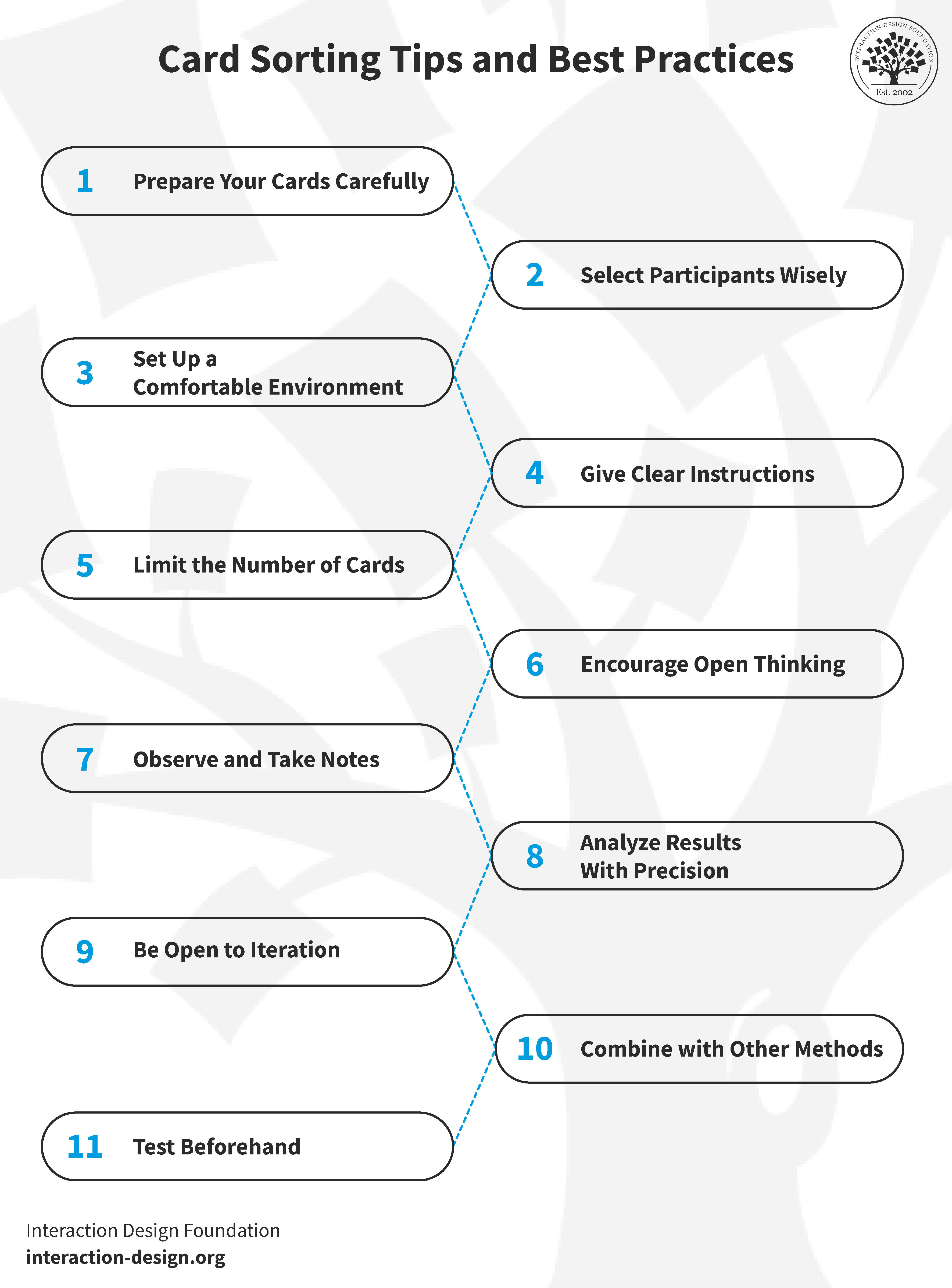
Card Sorting Tips and Best Practices
© Interaction Design Foundation, CC BY-SA 4.0
You can leverage card sorting as a powerful tool in user experience research, but its success really does hinge on how you conduct it. You can consider this method a vital step in designing intuitive interfaces.
With that said, though, you’ve got to stick to certain tips and best practices if you’re to fully capitalize on its benefits. Follow these guidelines (which are numbered to match the diagram above) as they’ll help you conduct productive card-sorting sessions that yield actionable results.
Use relevant and straightforward cards. Avoid jargon and complex terms—remember, the clarity of your cards can impact the quality of your results.
Choose a diverse group of participants who represent your target audience; diversity is a powerful engine that brings varied perspectives.
Whether it’s online or in-person, make sure you provide a user-friendly sorting environment for participants. For online sorts, pick a tool that's easy to navigate. For in-person ones, make sure there’s a comfortable and distraction-free space.
Give your participants concise, understandable instructions. Be sure to clarify any ambiguities and be ready to answer questions, remembering that good instructions lead to more accurate sorting.
Too many cards can swamp and overwhelm participants, so it’s best to aim for a balanced number that's comprehensive yet manageable, typically around 40-50 cards.
Encourage participants to think freely in open sorts, as that openness is what can lead to innovative categorizations and unexpected insights.
Observe things quietly during the sort, and make notes about how participants interact with the cards and listen to their comments. The user observations you make can end up being as valuable as the sort itself.
“Post-sort” (i.e. after the session), spend time analyzing the results. Look for patterns, outliers, and surprising groupings, and this detailed analysis is where the real value of card sorting lies.
Don't hesitate to run multiple card sorting sessions, and that’s because iterations can refine your understanding and lead to more robust conclusions.
Use card sorting with other research methods like surveys or user interviews—it’s wise as this multi-method approach will give you a more comprehensive view.
Test your method before using card sorting, and it’ll ensure that it’s not just effective but means it’s nice and tailorable for meaningful insights, too.
The Take Away
When you want to know how your users see and think about concepts and items you need to design for, then card sorting is a handy way to reveal patterns so you can organize websites, apps, and the like in a way that matches their mental models best. Key factors like approach (i.e., in-person or remote), objectives, tools, content, participants (including the number of them who are participating in the card sort) are things to bear in mind, although you’ll likely find the process straightforward—but you’ll need to consider each element with care.
To be sure, card sorting is one technique that can offer invaluable insights, but it’ll still call for you to be mindful that the results you get from it may not always be clear. That said, it’s still a handy go-to thanks to its low cost, simplicity, and low investment of effort—so try it, use it carefully, and you may come away with some of the most helpful insights you can hope for to guide how your website or app ends up looking and functioning successfully.
References and Where to Learn More
Dive deeper into card sorting with Donna Spencer’s Master Class, How To Use Card Sorting For Better Information Architecture
Learn how to run card sorts and what tools to use:
William Hudson explains How to Screen Research Participants