So much emphasis is placed on the basic principles of 'good' design, like visibility, findability, good conceptual models, clear affordances, and learnability that we sometimes forget about the pleasure users might get out of using our products. Sure, a minimalist user interface can help users zone in on the interactive elements and progress through their tasks quickly, but does this make for a fun journey through the website or application?
Author/Copyright holder: Pixeden. Copyright terms and licence: All rights reserved
For a lot of the products and services out there, users aren't looking to play games or to be amused; they just want to get in and get out as soon as they can. This might be the case, but there is still huge potential to improve user experiences without interrupting this flow. Take the Dutch house seller in the video below, for example; he has appreciated that people want to view his house, but he has enhanced the experience, and potentially increased his chances of selling the property, by giving the viewing experience quite some consideration (too much maybe? I will let you be the judge).
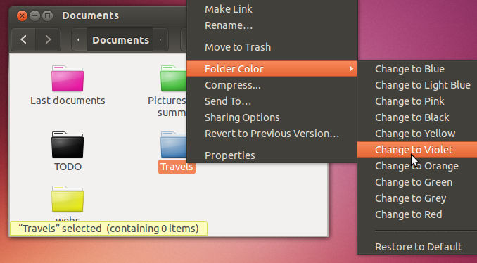
This isn't an attempt to get everyone to install rollercoasters in their houses (or maybe it is), but the extreme example just goes to show how a simple, usually straightforward experience, can be elevated. The passage through tasks, pages, screens, images, windows, panels, and all other elements of product and service experiences can be enhanced. There are hundreds of features now common to the ever-growing library of user interface design patterns that perform no real function, but they enhance the pleasurable aspects of navigating, selecting, and just interacting with the display.
Author/Copyright holder: Unknown. Copyright terms and licence: Unknown
Color choices, icon images, interactive styles, page layouts, backgrounds, cursor styles, feedback, text, these are just some of the things that can be tweaked ever so slightly just to make things that little bit more interesting and enjoyable. Obviously, there must be a sense of propriety; you probably shouldn't include a swanny whistle sound effect when someone logs into their online banking account (I would like it), and using a clown's face as the pointer on a school's website might not be the best idea (unless it is a prestigious, international clown school). However, what is recommended is to consider each of the elements in your designs to see how you could possibly enhance them to add to the experience, not just 'be there'.
In Summary
User Experience isn't just about rushing users to their desired end point; pleasure and fun should also be central to the UX designer's thinking. There are lots of opportunities to improve these dimensions of UX, but this isn't going to happen if we simply don't consider them at all.
Header Image: Author/Copyright holder: Rosenfeld Media. Copyright terms and licence: CC BY 2.0
Video source: Youtube User Stephen Kenny (link to video)

