Affordances and Design

- 788 shares
- 9 years ago
Affordances are the characteristics or properties of an object that suggest how it can be used. It shows a user that an object can be interacted with.
As such, an affordance is not a “property” of an object (like a physical object or a User Interface). Instead, an affordance is defined in the relation between the user and the object: A door affords opening if you can reach the handle. For a toddler, the door does not afford opening if she cannot reach the handle.
An affordance is, in essence, an action possibility in the relation between user and an object.
Sounds complex? Good news, we made a few videos for you with some examples to make it easy for you to understand.
Learn what affordances are through examples and see why affordances are key to users’ desired actions.
“When affordances are taken advantage of, the user knows what to do just by looking: no picture, label, or instruction needed.”
— Don Norman, Grand Old Man of User Experience
Psychologist James Gibson coined “affordance” in 1977, referring to all action possibilities with an object based on users’ physical capabilities. For instance, a chair affords sitting on, standing on, throwing, etc.
Don Norman later (1988) introduced the term to the design community modified the meaning slightly to make it more appropriate for use by designers. For example, Don Norman defined affordances as perceivable action possibilities – i.e., only actions which users consider possible. So, designers must create objects’ affordances to conform to users’ needs based on these users’ physical and perceptual capabilities, goals and past experiences. Clear affordances are vital to usability. Users will map the possibilities of what an object does according to their conceptual model of what that object should do (e.g., inserting fingers into scissor holes to cut things).
Don Norman also introduced the term “signifier”, which is elaborated greatly in his 2013 edition of The Design of Everyday Things.
Learn about signifiers and the critical role they play in design.
What is a signifier? Signifiers are one of the most important tools of a designer. Grand old man of UX design, Don Norman teaches us that signifiers are signals. Some signifiers are signs, labels and drawings placed in the world, such as a signs, labels, push, pull or exit on doors. Arrows and diagrams indicating what is to be acted upon
or in which direction to gesture or other instructions. If you fail to add signifiers, people struggle to understand how they can use your product or app. You put an unnecessary mental burden on them and you waste their precious time. People become frustrated and angry when they're unnecessarily slowed down in achieving their goals, such as paying a bill in their bank app or buying a ticket as a metro station.
Let's make the world less frustrating. Let's save valuable time. Let's solve this problem in a better way. Let's design smooth user experiences by designing signifiers which communicate clearly. The first step is to understand what signifiers are. What are signifiers. Signifier refers to an ID mark or sound, any perceivable
indicator that communicates appropriate behavior of a person. Don Norman. You design signifiers when you create visual and audio designs which indicate where and how people should interact with apps and websites, as well as with physical products such as stoves and speakers. More specifically, you design signifiers when you indicate where people can tap, slide sideways, scrolls sideways,
or scroll upwards on your app. You're creating signifiers when you indicate where people can turn. You're also designing signifiers when you indicate when people can start speaking to a voice controlled app. Here you hear and see a mix of audio and visual signifiers. These two signifiers support each other to help people who are either hearing or visually challenged, and it makes it safer for everyone to cross the street.
Similarly, you can combine audio and visual signifiers when you design digital products. Furthermore, signifiers can communicate which gesture or body motion should be done. Signifiers can appeal to all of our senses. The most common signifiers help us understand by appealing to these senses. The visual seeing sense, the auditory hearing sets
the signifiers most often appeal for us to act using these senses. The tactile touch sense, the vestibular movement and the proprioceptive body awareness sense. The visual seeing sense. Why are signifiers essential in good design? All digital and physical products need signifiers, otherwise people can't understand how and where they can interact with your product.
People need some way of understanding the product or service. Signifiers help people perceive the affordances and A.I. affordances. Affordances determine what actions are possible. Signifiers communicate where the action should take place. We need both done normally. The affordances of touching exists on the entire screen. The signifier communicates where and how people should touch to interact with the product.
Best practice design signifiers which communicates clearly Best practice. The role of the signifier is to clearly communicate the purpose, structure and operation of the device so people can understand and how to use it. It is the sign that is important to anything that might signify meaningful information. Don't know if people clues and signs that help them understand how they can use the product, where they can interact, what is happening,
and what alternative actions they can perform. You can use these insights when you design apps, websites, services, household machines, or whatever you're designing. Sign up for courses. Learn from top design specialists. Get your certificate. It's industry recognized. Interaction Design Foundation.
A "signifier" is some sort of perceivable cue about the affordance. Don Norman introduced the term to make a clear distinction between the signal an affordance might provide to a person, which is entirely in the perceptible part of an affordance, and the actual affordance itself. Signifiers can exist on their own. Just as affordances can exist without any signifier - the signifier part of an affordance may be invisible (or misleading).
Explore how you can make invisible affordances visible.
The reason Don Norman introduced the term “signifier” was that many people were misusing the concept of affordance after it had been introduced to the design community in the 1988 edition of The Design of Everyday Things. By introducing the distinction between signifier and affordance into two more distinct components, it became clear that much of design has nothing to do with affordances, but with signifiers.
Learn more about the differences between affordances, perceived affordances and signifiers.
For example, a painted zebra stripe in the side of a road is a signifier, a signal about where to walk. It is telling you where it is safe to walk. However, you can walk anywhere on the road - there are no affordances stopping you. A fence by the side of the road would stop you since it has a physical affordance. Unless you are able to climb over the fence, of course.
In 1991, William Gaver, another notable designer, defined three types of affordances:
Perceptible – Perceptual characteristics of the object itself indicate what action possibilities are available and desired – e.g., a door handle. These obvious properties prompt users to use the affordance in an intended way.
Hidden – In user interfaces without obvious affordances, users often must rely on experience and/or trial and error to determine possible actions – e.g., they hover/click on suspected drop-down menus.
False – An object’s characteristics suggest users can do something they can’t – e.g., underlined text that isn’t a link.
In 2001, Human-computer interaction (HCI) expert Rex Hartson defined four additional types:
Physical – The perceptual characteristics show users what to do – e.g., a large, highly visible “Add to cart” button. (Whenever text appears on affordances such as buttons, they’re called explicit affordances.)
Cognitive –Design features that help users notice or know about things – e.g., clearly labelled text to announce what will happen if users press a certain key.
Sensory – Design features that help users sense something – e.g., clear “pinging” feedback to indicate an available update.
Functional – Design features that help users achieve goals – e.g., an item appears in a shopping cart after a user clicks “Add to cart”.
In user interface (UI) design, other main affordances include:
Pattern – You follow conventions to prompt users to take actions – e.g., hamburger icons indicate menus.
Negative – You block users from proceeding towards a goal when they must provide more data – e.g., a greyed-out “Create account” button remains until users complete the form.

The Interaction Design Foundation homepage is loaded with affordances – e.g., the shadows and the shape make the blue rectangles stand out as buttons.
You want to minimize or prevent user errors and cognitive friction. User errors occur when users fail to map between the actions they perceive they can take with an object and the actions it allows. Cognitive friction results from unexpected system actions after a user attempts a task. So, correct clues and immediate, effective feedback are essential. You should:
Understand your users best through UX research – especially how they’ll anticipate affordances in the unique settings/context of encountering your design. Leverage these insights to provide the best clues to users, who will expect to find obvious cues to perform tasks.
Use design principles to create logically arranged, clear affordances without clutter – so users can intuit what functions of your graphic user interface (GUI) each affordance controls.
Use signifiers to direct users to affordances – Wherever you can’t make affordances obvious due to color constraints, etc., mark the affordance (e.g., highlight, shadow) or write text on or near it to guide users as to what they should do.
Follow conventions so users recognize affordances – E.g., “Search” in search boxes.
Apply Fitts’ Law to help guide users’ judgments and actions – Since this law establishes that users make more mistakes when moving quickly at smaller targets that are farther apart, help users by (e.g.) making large command buttons to show them priorities.
Exploit Material Design – With Google’s Android-oriented design language, you can leverage cue-rich features and natural motions to support onscreen touch experiences. Customize icons to meet users’ expectations best as you present your brand.
If designing for augmented reality or virtual reality, you have the advantage of reflecting real-world behaviors and physics in your affordances. In any case, the fine details—including a thoughtful application of color theory—can help give users the conceptual model and hints they need. When users know what to do without having to explore your product, they’ll get tasks done faster and make far fewer mistakes.
Take our course exploring affordances: https://www.interaction-design.org/courses/affordances-designing-intuitive-user-interfaces
Here’s a piece featuring in-depth insights and examples of affordances: https://www.smashingmagazine.com/2014/06/affordance-most-underrated-word-in-web-design/
See additional considerations about affordances here: https://uxplanet.org/ux-design-glossary-how-to-use-affordances-in-user-interfaces-393c8e9686e4
Affordances in psychology refer to the potential actions individuals perceive when interacting with objects in their environment. They highlight how design features can suggest their intended function to users. For instance, a flat surface may afford sitting, while a button might afford pushing. The term has been pivotal in Human-Computer Interaction, especially when designing intuitive user interfaces. For an in-depth understanding, refer to the book chapter on Affordances in The Glossary of Human-Computer Interaction at Interaction Design Foundation.
An example of an affordance is a ladder. To a grown-up, a ladder affords climbing due to its rungs and height, suggesting its primary function. However, for a baby, the same ladder does not present the same affordance because the baby lacks the capability to climb it safely. This highlights that affordances are relational, depending on both the object and the user. For a visual illustration of this example, watch our video on affordances where we delve into the ladder's varying affordance for different users.
For more on how to use affordances in design, take this advanced course on the Interaction Design Foundation, Affordances: Designing Intuitive User Interfaces.
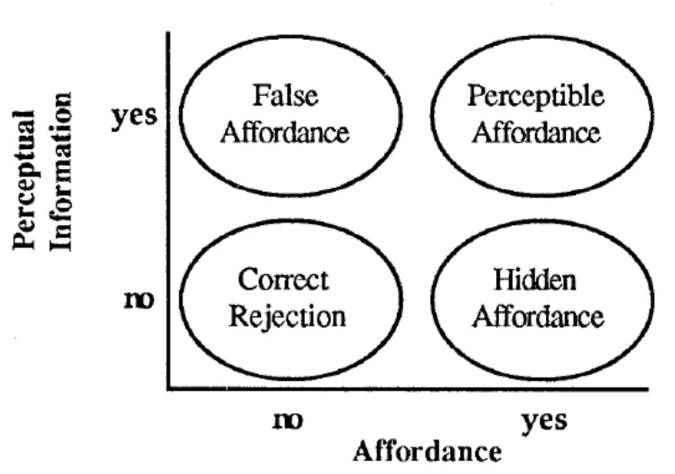
Industry professionals have identified different types of affordances based on differing criteria. Here is William Gaver’s systematic analysis of affordances in the context of HCI. He identifies four combinations of the presence or absence of affordances, on the one hand, and the presence or absence of information about affordances, on the other hand: perceptible affordances, false affordances, hidden affordances, and correct rejection.

© William Gaver, All Rights Reserved. Reproduced with permission.
Perceptible Affordance: These are clear and visible objects' properties that suggest how somebody should use them. For instance, a door handle offers pulling or pushing.
Hidden Affordance: While the object can be used a certain way, this function is only sometimes obvious. For example, touch gestures on modern smartphones might be rare.
False Affordance: This is when an object appears to be used in a particular way, but in reality, it cannot. An example would be a button that doesn't press.
Correct Rejection: This denotes situations where it neither looks nor acts as though it has a particular function.
For more examples and a comprehensive understanding of affordances, refer to this video.
Affordance, as detailed in our video on Norman doors, isn't intrinsically good or bad.
It represents the possible actions an object can offer to a user. An affordance's effectiveness hinges on context and design intentions. A correctly implemented affordance naturally guides users, improving usability. Conversely, a misleading affordance can confuse. As the video highlights, Norman doors are classic examples of poor affordances, leading to user frustration. Designers must aim to make affordances evident, discoverable, and congruent with user expectations to ensure an optimal user experience.
Affordances, as elucidated in our video on signifiers, are pivotal for intuitive design.
Affordances indicate the potential interactions between a user and an object. When clear, they facilitate a seamless user experience, reducing errors and frustrations. On the other hand, vague or incorrect affordances can mislead users, leading to confusion. Signifiers, discussed in the video, amplify the visibility of these affordances, guiding user actions more effectively. Understanding and leveraging affordances in design ensures products are user-friendly and intuitive.
A good affordance, as highlighted in our article on affordances and design, clearly communicates how an object should be used without ambiguity. It aligns with users' expectations and experiences, allowing for intuitive interactions. Appropriate signifiers often support practical affordances, making them easily discernible. They reduce the need for instructions and minimize user errors, ensuring a smooth and efficient user experience. A good affordance seamlessly bridges the gap between user intentions and design functionalities.
Learn how to affordances in design in the course, Affordances: Designing Intuitive User Interfaces.
Affordances in communication refer to the potential actions or interactions enabled by communication tools or mediums. Just as a door handle suggests pulling or turning, communication tools provide cues on how to share or receive information. For instance, a microphone's design indicates an amplifying voice, while an email's 'reply' button suggests a direct response. Understanding affordances in communication tools ensures clarity, reduces miscommunication, and enhances effective information exchange.
A social affordance guides interactions within a social context. For instance, a 'like' button on social media platforms offers an immediate, non-verbal way to express approval or support. This simple feature enables users to engage, show appreciation, or align with particular views, fostering community bonding and interaction. Such features capitalize on human social behaviors, making digital interactions more intuitive and meaningful.
To dive deeper into affordances and their impact on intuitive design, consider enrolling in our course Affordances: Designing Intuitive User Interfaces. This comprehensive course explores the nuances of affordances, ensuring designers create user-friendly interfaces. It's the ideal resource for those eager to master the art of leveraging affordances in design.
Remember, the more you learn about design, the more you make yourself valuable.
Improve your UX / UI Design skills and grow your career! Join IxDF now!
You earned your gift with a perfect score! Let us send it to you.
We've emailed your gift to name@email.com.
Improve your UX / UI Design skills and grow your career! Join IxDF now!
Here's the entire UX literature on Affordances by the Interaction Design Foundation, collated in one place:
Take a deep dive into Affordances with our course Affordances: Designing Intuitive User Interfaces .
Affordances are a key concept for designers. If you want to build products that are intuitive and easy to use, fully understanding the relationship between the human mind and technology is crucial. An “affordance” refers to the possibility of an action on an object; for instance, we say that an elevator button affords being pressed, and a chair affords being sat on. The concept was popularized by HCI (human-computer interaction) expert Don Norman in the late 1980s, and it has since played an essential role for user experience professionals and researchers. Understanding this term is essential for anyone who wants to get a deeper appreciation of what it means for a product to be “intuitive.”
Taking this course will teach you both the theory of affordances and also how to build instantly perceptible affordances into your own designs. Your users should be able to identify the actions afforded by a design with speed and accuracy. Thus, the better you can make your affordances, the more likely you will prevent the user from becoming frustrated (which can happen very quickly). In order to achieve this, you as a designer must appreciate how users perceive the world and how experience, context, culture, constraints and other factors affect our ability to detect the possibilities of actions on offer. This is at the heart of why those interested in a design career and established designers alike must gain a firm grounding in the meaning and potential application of affordances as a designer’s tool.
Throughout the course, we identify the major milestones in the evolution of the term “affordance” and outline how it applies to practical user experience (UX) design. Along the way, we look at the affordances of objects in the real world and screen-based interfaces so as to reinforce the concepts and principles covered in each lesson. You will soon realize how vital a solid grasp of affordances is—the name of the game is to make designs that users can take to naturally and without having to hesitate to ask themselves, “What happens if I do this?”.


We believe in Open Access and the democratization of knowledge. Unfortunately, world-class educational materials such as this page are normally hidden behind paywalls or in expensive textbooks.
If you want this to change, , link to us, or join us to help us democratize design knowledge!
