User research is an essential part of UX design. Unless we understand who we are designing for and why, how can we even know what to create or where to begin? Depending on your project, requirements and constraints, you can choose different types of research methods, from surveys and tests to interviews and the most common method — usability testing. Here, we’ll look at what user research is, and the three most common reasons for doing user research — namely, to create designs that are truly relevant, to create designs that are easy and pleasurable to use, and to understand the return on investment of your user experience (UX) design.
What is User Research?
User research, or “design research,” as it’s sometimes called, covers a wide range of methods. It can mean anything from doing ethnographic interviews with your target group, to classical usability studies, to quantitative measurements of return on investment (ROI) on your user experience design. What all user research has in common is that it helps place people at the center of your design process and your products. You use user research to inspire your design, to evaluate your solutions, and to measure your impact. User research (and other kinds of research) is often divided into quantitative and qualitative methods.
Surveys and formal experiments such as A/B testing and tree testing are examples of quantitative research tools. Quantitative user research methods seek to measure user behavior in a way that can be quantified and used for statistical analysis.
Interviews and (to some degree) usability tests are examples of qualitative research tools. These are often more exploratory and seek to get an in-depth understanding of the experiences and everyday lives of individual users or user groups.
Each research method has benefits and drawbacks. As such, each can be used for achieving different goals. Which method you choose depends on what you want to achieve as well as a number of practical concerns, such as what type of project you are working on, your budget and your time constraints. With that in mind, let’s look at some different reasons for why you should involve users in your design process.
Three Good Reasons for Doing User Research
“Empathy is at the heart of design. Without the understanding of what others see, feel, and experience, design is a pointless task.”
— Tim Brown, CEO of the innovation and design firm IDEO
The type of user research you should do depends on your work process as well as your reason for doing user research in the first place. Here are three excellent reasons for doing user research:
1. To Create Designs That are Truly Relevant
If you understand your users, you can make designs that are relevant for them. If you don’t have a clear understanding of your users, you have no way of knowing whether your design will be relevant. A design that is not relevant to its target audience will never be a success.
The first step and core of the design thinking process is to empathize with your users. User research is one of the best ways to do that. Conducting different types of interviews and observing people in the contexts where they will use your design is a common method of doing this type of user research. We often place this type of research at the very beginning of a project to ensure that the overall direction for the project is relevant to potential customers and users. In order to ensure that your design continues to be relevant as your project progresses, validating your ideas with prospective users on a continuous basis is a vital habit to stick to. Talk to them about how they perceive your design and how they could imagine using it, or involve them directly in your design process, to ensure that you are still on the right track.
Let’s look at an example: In 2005, Korean consumer electronics giant Samsung did a number of ethnographic user studies that completely changed the way it thought about designing TVs. Together with the innovation and strategy consultancy ReD Associates, Samsung representatives visited people in different countries to observe how they live and to talk to them about their homes and the TV’s role in their homes. What they found surprised them. At the time, Samsung and most other TV manufacturers primarily designed their TVs with technical specs such as high-quality picture and sound in mind. The TVs were designed to show off their technical capabilities, but what Samsung found when visiting people was that they viewed a TV more like a piece of furniture. As a TV is turned off most of the time, people do not want it to dominate their living room. So, rather than show off their expensive TV with all its technological capabilities, they tried to hide it away as much as possible.
Following this insight, Samsung changed its design strategy radically, moving the inbuilt speakers to make the TV slimmer and creating a subtler, minimalistic design that would fit more seamlessly into people’s living rooms. Technical capabilities were still important, but they had to be balanced with design choices that made the TVs fit into people’s homes. “Home” was the watchword here, and Samsung got hard to work on the transformation. The challenge involved getting away from treating a living room like a showroom or sports bar, and going for “harmony” instead. By 2007, Samsung had doubled its share in the global TV market because it had proven to understand how to make its TVs relevant to its customers.
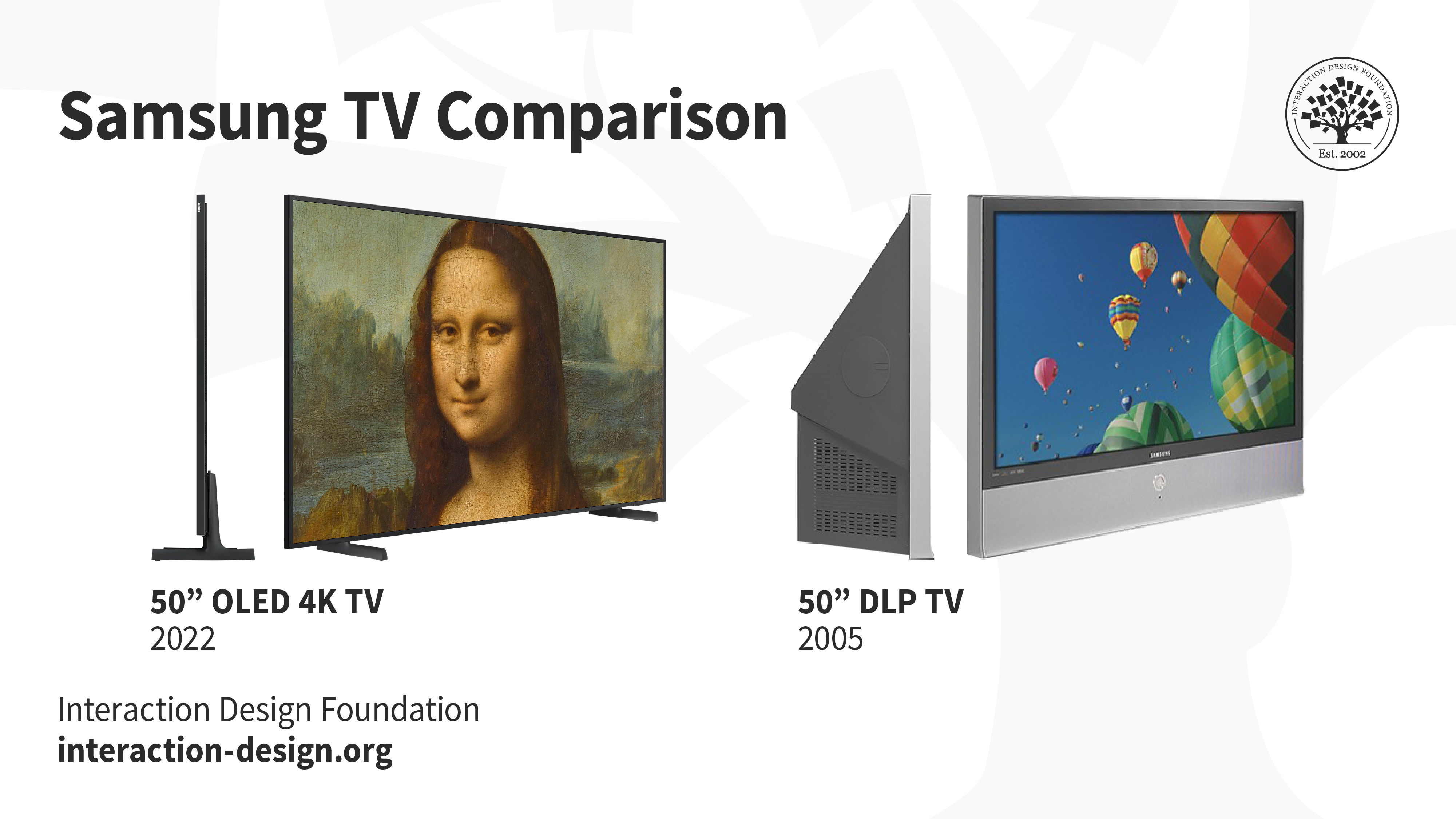
User research made Samsung change its TV design strategy to focus on making more minimalistic designs that fit into the customer’s home. Although TVs have not become smaller, everything extraneous has been removed. As we see here, the TV functions as a gallery-sized moving picture — with all the “bells and whistles” discreetly housed — light-years away from the old notion of “peacocking” its technical prowess as if it were a James Bond gadget.
2. To Create Designs That are Easy and Pleasurable to Use
“If the user is having a problem, it’s our problem.”
— Steve Jobs, co-founder of Apple Computers
All products should have a high level of usability (i.e., be easy to use), and usability tests can be a big help in achieving that. The days when programmed technology was a tool only to be used by experts are long gone. People expect products to be easy to learn and easy to use. They expect to pick them up and do things with them while only thinking about what they hope to achieve, not having to think about the products themselves. If your user experience is not good, chances are that people will move on to another product. Unless you work in a field with no competitors, a high level of usability (and a matching high-quality user experience) is essential in making any product a commercial success. Not to mention that your users will love you for creating a great user experience. Even if you are designing products for — e.g. — a highly specialized work environment where the users have no alternatives, products with a high level of usability will make work processes faster, safer and more efficient.
Wikiwand is a good example of a company that operates solely on providing a great user experience. Their product is a browser plugin which changes the design of Wikipedia articles to make them more appealing and user-friendly. Wikiwand does not provide different content from the classic Wikipedia webpage, but the company has thousands of users who praise it for the awesome user experience it delivers.
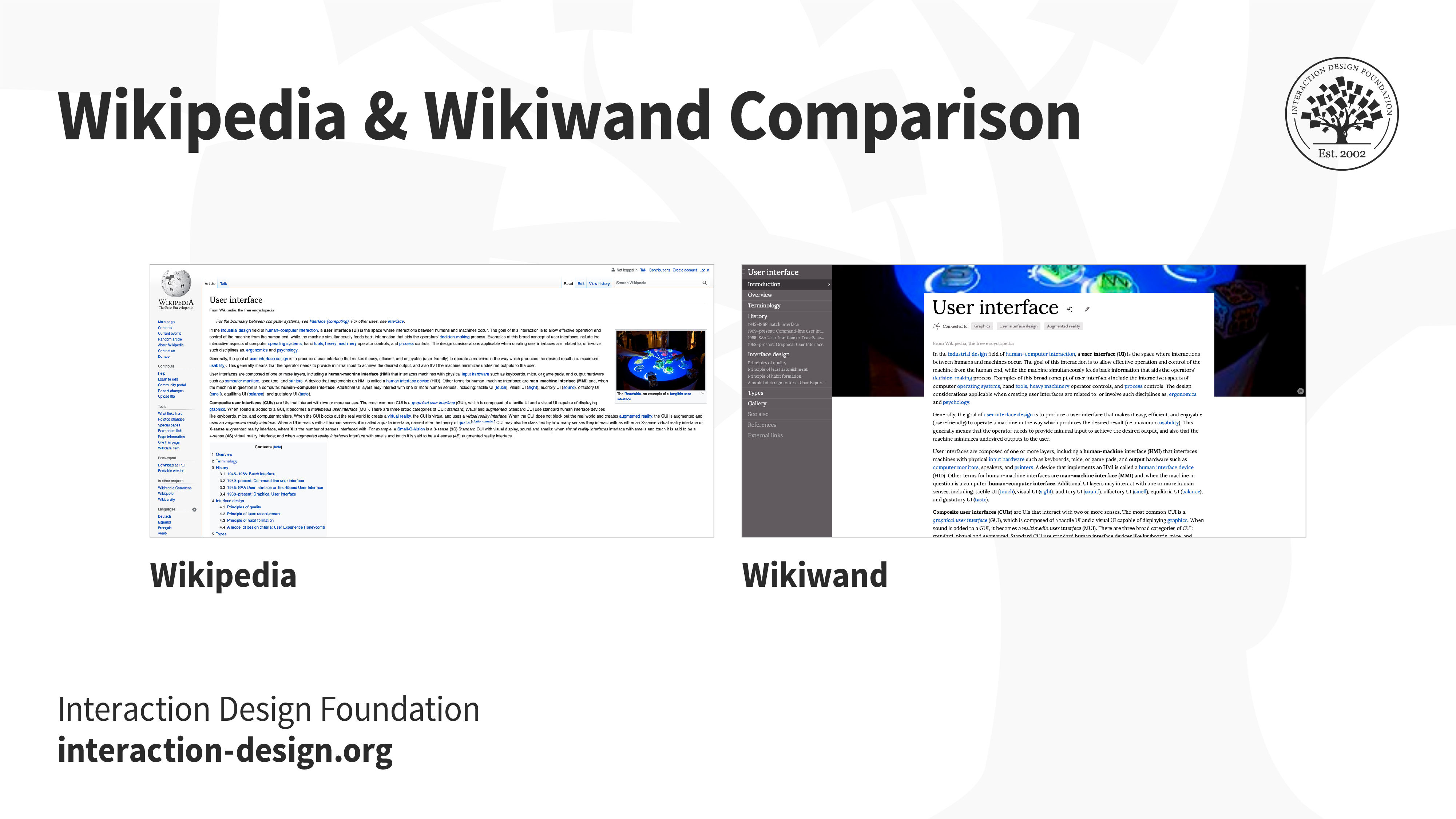
To the left is the classic Wikipedia interface; to the right is the Wikiwand version of the same article. The content is the same, but the experience is different.
When you are designing or developing a product, you become the primary expert on how to use it and what functionalities it has. Because you know your own product so well, however, you can become blind to functionality in your product that is difficult to use. As designers, we need that level of understanding of our products, but it also means that we can all too easily shift far away from the same perspective as our users. The author has personally participated in many projects where the designers know the ideas behind the interface and functionality of a product so well that separating the understandable from the not-so understandable is really difficult for them. This tendency of seeing things from the point of view of one’s profession — what we call “déformation professionnelle” — and not stepping back to catch the reality of what’s going on from a fresh, generalist angle is a natural one, incidentally.
Happily, though, you can avoid a lot of usability issues by following various guidelines and rules of thumb, but there will always be situations that the guidelines don’t cover, or where different guidelines tell you different things. You might also be designing for a target group such as seniors or children where the regular guidelines do not apply. That means testing the user experience of your product is always a good idea. Usability tests work best when they are an integrated part of your work process so that you test your product iteratively and from an early stage of development onward. Early tests are what we can do on primitive prototypes — e.g., using paper; from there, we progress to more refined prototypes until we have something that resembles the final product. If you only start testing when you have an almost-finished product, you run a very serious risk in that your findings might come too late for you to make larger changes to the product. For instance, if all the software is done or if you can’t push your release date, you’ll have your back against the wall. So, stay fluid with your design until the very end of the process — it’s amazing what insights can come from an eleventh-hour test of the ‘last’ version you have planned for rollout.
3. To Understand the Return on Investment of Your UX Design
Although the importance of good design has become widely recognized, UX designers and researchers still experience having to fight for resources to enable them to do their work. Executives and shareholders sometimes fail to see the value in investing in user research and UX design. UX design and user research is not as tangible as new features or fixing software bugs; so, overlooking their value can happen all the more easily. If resources become scarce, UX is also often one of the first areas to experience cuts; the reason is that consequences are not as immediately felt as when you save on development or similar areas. If you make cuts in say, software development, you can immediately see that the consequences involve cutting back on features or having buggy software; however, if you make cuts in UX, you don’t experience the consequences until your product reaches your users, and when your competitors attract your users towards them.
We can easily argue for the value of great UX; it is much more effective if we can show it. This is where studies to show the return on investment (ROI) on UX efforts are worth their weight in gold (or the weight, at least, of the printouts). If you can show that the changes you made in the design generated more sales, resulted in a larger number of customers, or made work processes more efficient, you have a much stronger case for investing in UX. User studies to measure the effect of your design are mostly quantitative and can take different forms. You can do A/B tests during development that compare different versions of your design, or you can do studies after your product is released to measure differences in use patterns. With apps and webpages, you often build in different types of analytics to inform you of different user patterns.
The global online marketplace Etsy is a good example of a company that has built its success on a focus on customer experience throughout the entire customer journey and that continuously measures the user experience.
For example, Etsy routinely tests different versions of user interfaces to constantly improve the platform’s usability as well as business metrics. Etsy's continued position as one of the largest online marketplaces is a result of its rigorous focus on usability, research and testing.
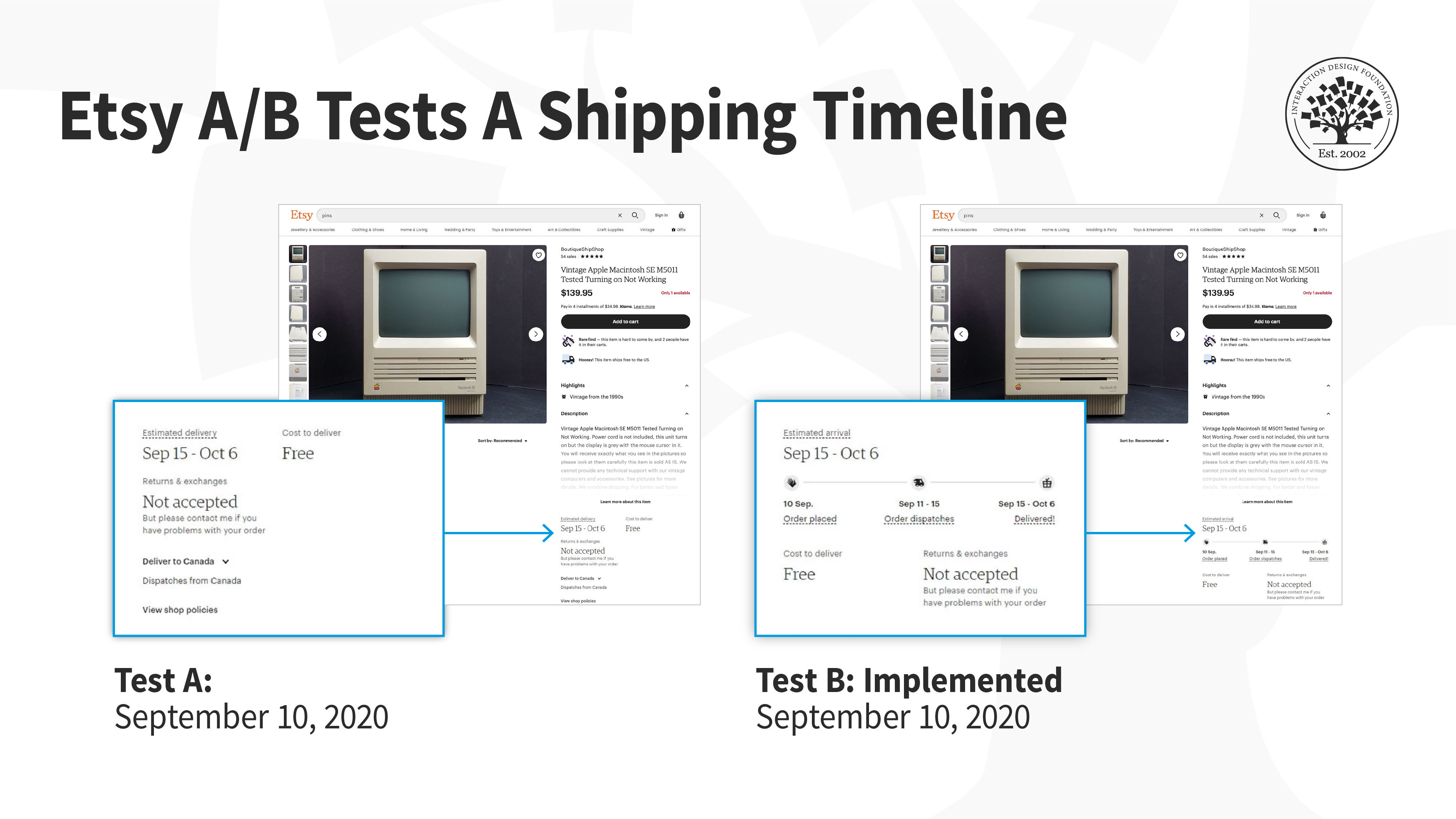
The world’s most successful companies continually test and iterate their products, as is evident in their A/B tests. Here is one of several that GoodUI has been tracking. You can see more such “leaked” tests from AirBnb, Amazon, Booking, Netflix and others on their website.
The Take Away
Here, we have shown three good reasons for doing user research and we have touched on when in your design process you can integrate user research. Here are the three reasons again:
Do user research to ensure that you create products that are truly relevant to your target group.
Do user research to ensure that your products deliver a great user experience.
Do user research to show the ROI of your design efforts.
You can — and should — do user studies at all stages of the design process. You do studies before you start designing so as to get an understanding of what your target group needs; you carry out iterative tests during development to ensure that the user experience is on track, and you can measure the effect of your design after your product is released. This “holy trinity” approach can keep you three steps ahead as every dimension of your release will have been considered, analyzed, and tested before you sit down to see the results of the ultimate test (the ROI), more confident that you’ve got a winning design.
References and Where to Learn More
For an in-depth coverage of different user research methods, take the following courses:
User Research – Methods and Best Practices
Data-Driven Design: Quantitative Research for UX
Images
© Interaction Design Foundation, CC BY-SA 4.0


