Five types of web fonts

Web Fonts: Definition and 10 Recommendations

by Mads Soegaard | | 66 min read
571 shares

Web fonts bring digital content to life. They enhance readability, set the tone, and ensure consistency across various platforms—all vital ingredients. When you understand web fonts and their impact, it can help you with effective website creation—and greatly so. We’ll provide a comprehensive overview of web fonts, including types, best practices for selection, and top recommendations for different website genres.

Have you ever wondered why some websites just 'feel right' while others feel like a jumbled mess? The secret often lies in the font!

Web fonts give a boost to your website's appearance and user experience. They’re things that make your content visually appealing and easy to read. Effective web fonts can reflect your brand's personality, and they’re something that can help you communicate your message in a clear and engaging manner.

In this piece, we’re going to talk about web fonts and we’ll present 10 key recommendations—along with tips on how to select and use them well. Discover methods to make your website readable and memorable. It’s a big deal, and the appropriate font can convert visitors into loyal fans.

Table of contents

What Are Web Fonts?

Web fonts are styles of typography that websites use. Unlike standard fonts, web fonts load directly from the internet, and it’s something that allows web designers to use a wide range of fonts. These fonts go beyond the limitations of those installed on a user's computer—and web fonts enhance a website's visual appeal. They make sure of consistency across different devices and browsers, and his uniformity improves the user experience.

Web fonts offer creative freedom, and—what’s more—designers can match the font style to the website's theme and brand identity. They’re essential tools for modern web design, in fact, and they’re valuable assets that’ll help you create a unique and engaging online presence when you pick the right type of font for your brand.

How to Install a Web Font

The way you install a web font varies. You can use various methods that include:

  • For Wordpress, a plugin like Use Any Font

  • Adobe Fonts via Creative Cloud

  • Other services like Google Fonts

  • Direct integration with @font-face in your website's stylesheet.

Each method requires some CSS knowledge.
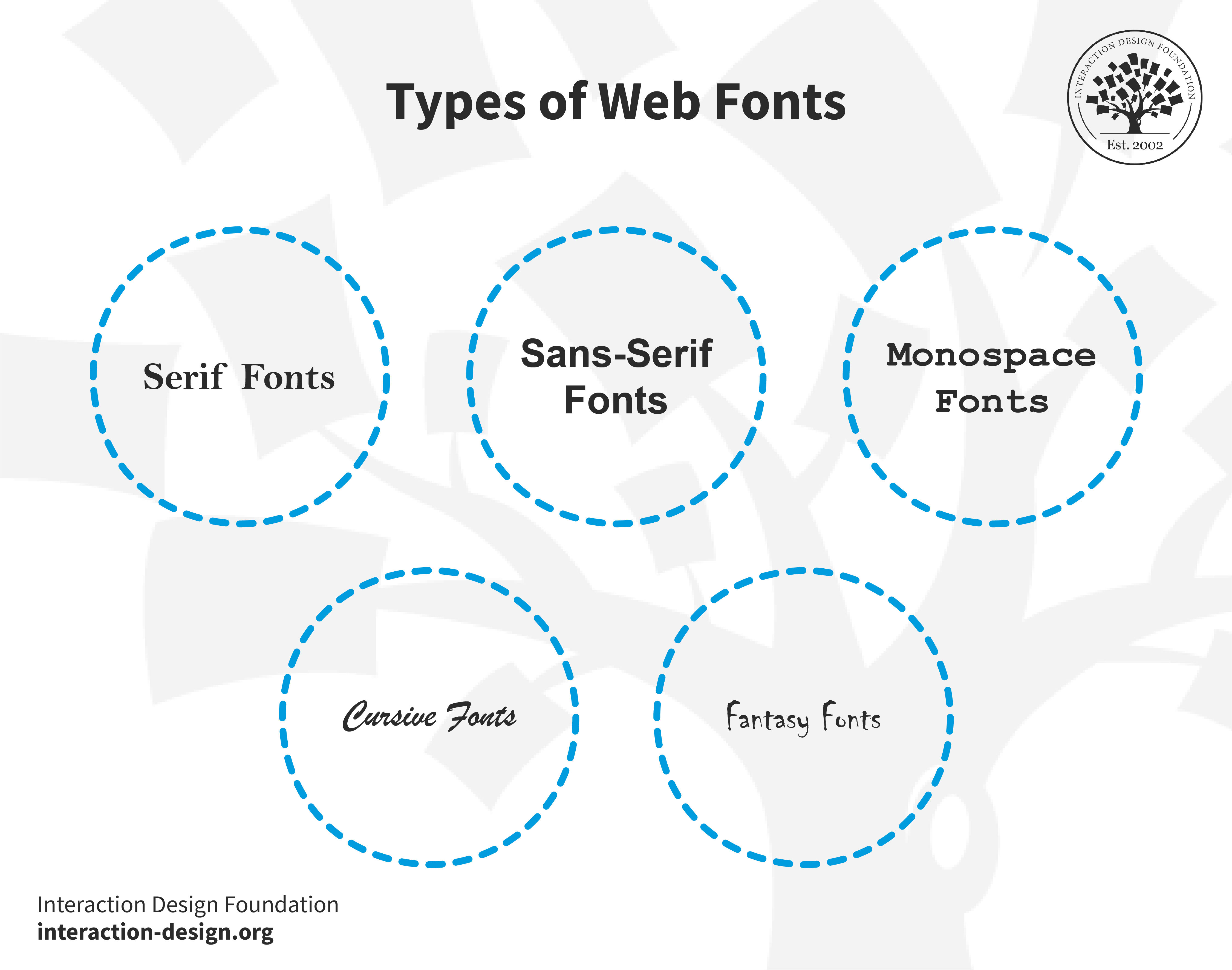
Types of Web Fonts

Web fonts fall into distinct categories, each with unique characteristics.

© Interaction Design Foundation, CC BY-SA 4.0

  1. Serif fonts: These fonts feature small lines or strokes attached to the ends of their letters. Serifs guide the eye along the text for better readability—a point that means this feature makes them a favorite for printed material. An example is Times New Roman. The serifs can cause legibility problems at smaller font sizes or on low-resolution screens, though.

  2. Sans-serif fonts: Sans-serif means "without serifs." These fonts lack the decorative strokes found in serif fonts. They’re clearer on digital screens—a reason for their prevalence in web design. Arial is a classic sans-serif font.

  3. Monospace fonts: Each character in monospace fonts takes up the same horizontal space and this even spacing reminds us of old typewriters. Developers favor monospace fonts in coding environments for both their clarity and their alignment. Courier is one well-known monospace font. An important point is that monospaced fonts can be serif (like Courier) or sans-serif (like Consolas).

  4. Cursive fonts: Cursive fonts mimic human handwriting, and they’ve often got connected letters. What they do in particular is they add a personal, artistic touch to digital content—and so deliver a human feel. Brush Script MT exemplifies a cursive font. Cursive fonts are what individuals generally use for special effects; that’s because they can be challenging to read.

  5. Fantasy fonts: People use these decorative fonts for artistic and unique design elements. As for cursive, they grab attention—but they can cause problems for extended reading. Luminari is an example of a fantasy font.

One important thing to point out here is that each font type does serve a specific purpose in web design. More traditional—or formal—websites often use serif fonts; sans-serif fonts, meanwhile, suit modern, minimalistic designs. Monospace fonts are ideal for technical sites, while cursive’s great for artistic or personal pages, and fantasy fonts are really helpful for creative, standout designs.

Why Is It Important to Choose a Good Web Font?

A good font is one that’s appropriate for your site, and there are a few reasons. It:

  1. Enhances readability: A good font ensures that your content is easy to read—and so is a vital ingredient. It helps users understand your message quickly and without strain.

  1. Sets the tone: It’s important to be aware of how fonts carry emotional connotations, and the right font can convey professionalism, creativity, or playfulness—whatever it needs to, to align with your brand's tone.

  1. Improves user experience: Comfortable reading leads to a better user experience, and users really do stay longer on your site when the text's legible and appealing.

  1. Ensures consistency: A consistent font use across your channels solidifies your brand identity, and it’s something that makes your site more memorable and recognizable—not to mention the point that consistency is vital for users to build trust in your brand.

  1. Adapts to different devices: A well-chosen font displays well on various screens—and that’s an extremely important factor for meeting users on whatever they’re viewing it on. It nicely maintains quality and readability on desktops, tablets, and smartphones.

  1. Reflects modern trends: If you use contemporary fonts, it keeps your website looking fresh. It shows that you update yourself with modern design trends—in step with the times.

  1. Supports global use: Good fonts support multiple languages and special characters. This factor nicely translates to the point that your website is available to a diverse audience.

What Are the Best Fonts for Websites?

Top 10 web fonts.

© Interaction Design Foundation, CC BY-SA 4.0

It’s impossible to overstate just how important font selection is in the world of web design. So, in this section, we’re going to discuss the top 10 fonts that boost website design, readability, and—of course—overall impact. These fonts really stand out for their versatility and effectiveness in how they get diverse messages and tones across.

Font 1: Roboto

Examples of Roboto font

© Google Fonts, Fair Use

Roboto—a neo-grotesque sans-serif font—combines a mechanical skeleton with geometric forms. What’s more, it features friendly, open curves.

Roboto maintains natural letter widths—unlike some grotesques (part of sans-serif typefaces) that distort letterforms for a rigid rhythm. This approach creates a natural reading rhythm, one that’s similar to that in humanist (part of serif) and serif types.

Fonts and typefaces may seem similar, but they do serve distinct roles in visual communication and design. Mia Cinelli, Assistant Professor, explains the difference between fonts and typefaces in this video.

Show Hide video transcript
  1. 00:00:00 --> 00:00:31

    My name is Mia Cinelli, and I'm an Assistant Professor of Art Studio and Digital Design at the University of Kentucky in Lexington, Kentucky. I teach in the School of Art and Visual Studies, in the College of Fine Arts, and I teach courses in graphic design and typography, which is really exciting! So, I have a background in graphic design, in typography and in kind of multi-disciplinary design.

  2. 00:00:31 --> 00:01:03

    So, I have a practice that is typographic in nature, but not exclusively. So, my work is conceptual products and sculpture and installation and very strange things. And so, I think of myself truly as a designer of experiences and interactions. And how those experiences and interactions come to be really varies. So, that's a little bit about me and my practice. The difference between a font and a typeface is that one makes up the other.

  3. 00:01:03 --> 00:01:31

    So, a typeface is composed of fonts in the same way that an album is composed of tracks or a book is composed of chapters. And so, the font is really the *delivery mechanism*. So, you *choose* a typeface. You *use* a font. And so, we might say Georgia is our typeface – designed by Matthew Carter – but say Georgia Bold, Georgia Italic – those are going to be our fonts; that's what we're choosing, and that's what we're using.

  4. 00:01:31 --> 00:02:04

    So, a font family would be, or a typeface family refers to a series of weights or variations on a typeface that all live within the same stylistic or aesthetic kind of realm. So, we might think about something like Futura, for instance. There are many weights and varieties of Futura – there's a whole bunch of them. But we all know them as Futura. They all have similar qualities; they all belong together; we all know  them as existing within that particular family.

  5. 00:02:04 --> 00:02:33

    And so, that's the way we know what a  font family or a typeface family is. A serif typeface has little flanges or feet. And a sans serif does not, so something like Futura or Helvetica is a sans serif. We also have things like script typefaces, which mimic cursive. So, script typefaces exist with these really lovely tails, say, at the end so that they create the illusion of cursive when they live together on a page

  6. 00:02:33 --> 00:02:42

    or on-screen — they all visually connect as one word or phrase. And so, those are kind of the big three  that I would use to categorize typefaces.

Video copyright info


Copyright holder:
Mia Cinelli

Mackinac 1895, Bags to Riches, The Landscape of Love, What's Past is Prologue, Pandemic Parade Banners

Hide Content

Until 2021, Android used Roboto as the default system font. Various Google services also used it since 2013. These include Google Play, YouTube, Google Maps, and Google Images.

Pros: Highly legible, versatile, works well for print and digital media.

Cons: May appear too commonplace—and that’s due to widespread use.

Ideal websites: It’s suitable for business, technology, and modern educational websites thanks to its clarity and modern aesthetic.

Font 2: Open Sans

Examples of Open Sans font

© Google Fonts, Fair Use

Steve Matteson created Open Sans—a sans-serif font that’s renowned for its modern, clean design, and its readability and versatility contribute to why it’s so highly popular. Open Sans is free for personal and commercial use as a Google font, and it stands out for its neutral—yet friendly—appearance.

Open Sans enjoys widespread web use for its excellent legibility—readability and text clarity. Its strong letterforms—which an extensive font library supports—position it as a robust alternative to default sans-serif fonts.

Pros: Excellent readability, simple and unassuming style.

Cons: Popularity might limit uniqueness in design.

Ideal websites: It’s ideal for corporate websites, digital platforms, and mobile applications that are after readability and a modern look.

Font 3: Raleway

Examples of Raleway font

© Google Fonts, Fair Use

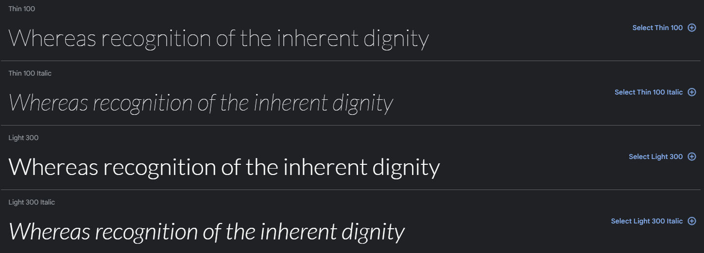
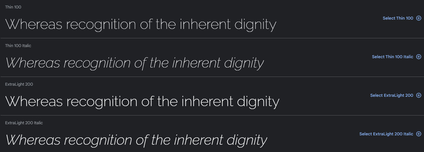
Raleway stands out as a sans-serif font, and that’s thanks to its clean and elegant design. It was—initially—a single-weight font, but now it encompasses a nine-weight family that ranges from thin to black. The font features wonderfully stylish uppercase letters and numbers—and it’s perfect for headings and display uses.

Thanks to its versatility, designers frequently choose Raleway for digital and print media, and its open, airy letterforms make sure that there’s excellent readability on screens. Raleway seamlessly blends modern aesthetics with practical functionality, and this makes it a suitable asset for a broad range of design projects.

Available on Google Fonts, it simplifies web design without licensing or download issues.

Pros: Offers excellent screen readability with diverse design options.

Cons: Less ideal for formal or traditional designs due to its modern appearance.

Ideal websites: Perfect for modern websites like digital magazines, creative portfolios, and user-friendly e-commerce sites. Its easy integration with Webflow nicely makes it highly favorable for web designers.

Font 4: Times New Roman
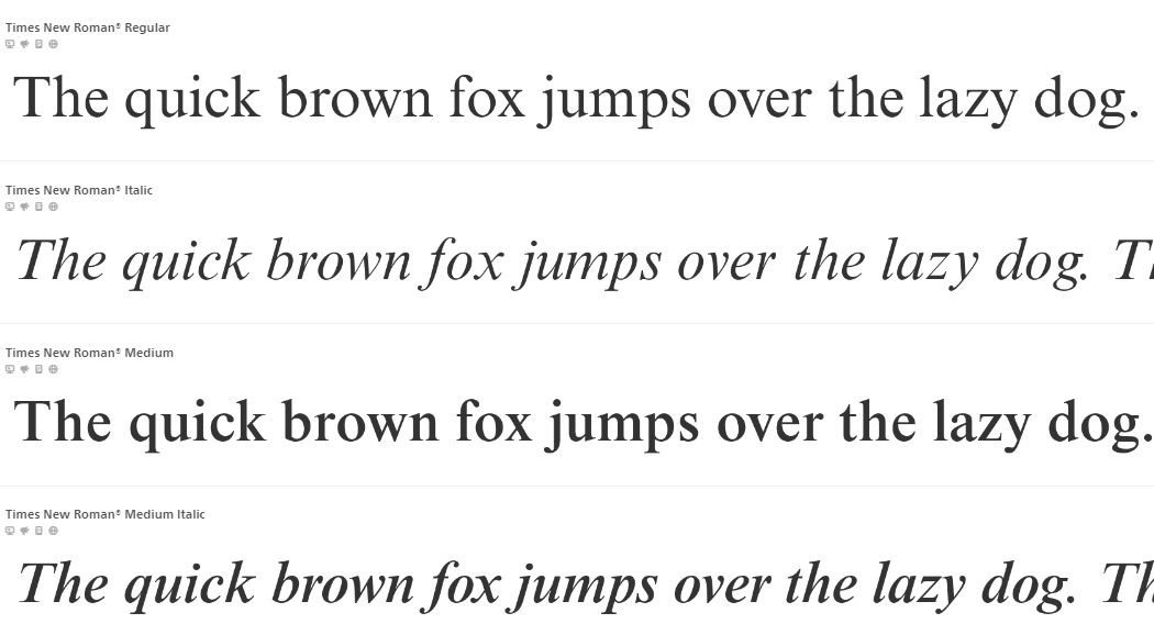
Examples of Times New Roman font

© Fonts, Fair Use

Times New Roman—and it’s a classic, widely used serif font—originated in 1932 for The Times newspaper, and its professional, formal style makes it a popular choice both in academic and in business documents. Its clear, distinct characters ensure readability, and it’s suitable for not just printed text but on-screen display, too.

Though it’s often viewed as a default or conservative choice, Times New Roman has a versatility and timeless design that keeps it relevant in various design contexts—and that spans from official reports to creative projects.

Pros: Exceptional readability in print and digital formats, distinctly clear even in small sizes.

Cons: May seem overly traditional or mundane due to frequent use; less suitable for creative branding.

Ideal websites: Ideal for academic publications, professional blogs, legal sites, and any platform emphasizing formal content.

Font 5: Merriweather

Examples of Merriweather font

© Google Fonts, Fair Use

Merriweather—which is an open-source serif font—excels in on-screen reading, and it’s designed for text-heavy layouts. Its tall x-height and compact letterforms are ingredients that make sure of superior readability across various screen sizes—without using extra horizontal space, which is a big plus.

The font family offers light, regular, and bold weights, and it provides stylistic versatility, and it blends classic elegance with modern simplicity. Merriweather delivers warmth and credibility, and—what’s more—it’s effective at large and small sizes.

Pros: Outstanding on-screen readability, maintains clarity even at small sizes.

Cons: Might occupy more space, potentially less formal in appearance.

Ideal websites: It’s great for educational platforms, blogs, and sites heavily accessed on mobile devices.

Font 6: Georgia

Georgia font example

© Freefonts, Fair Use

Georgia—designed as an elegant yet legible serif font—excels in small print and low-resolution screens. This transitional serif typeface reflects early 19th-century 'rational' serif characteristics, and it features alternating thick and thin strokes, ball terminals, and a vertical axis.

Pros: Excellent legibility on screens and small sizes, ideal for extensive text.

Cons: Can appear overly formal. It may not fit modern or minimalist designs.

Ideal websites: It’s a perfect pick for news portals, educational content, and corporate sites where you’ve got to have clarity and a formal tone. You’ll find it helpful, especially on devices that have got varying screen resolutions.

Font 7: Source Sans Pro

Examples of Source Sans Pro font

© Google Fonts, Fair Use

Source Sans Pro—and it’s an open-source sans-serif font—is an easy-to-read font, and its range of weights is something that makes sure that readability at all sizes is a reality. This font provides clear headers and readable body text, and its design draws inspiration from twentieth-century American gothic styles. A great touch is how the font's slender, open letters offer a clean, friendly look.

It performs well across browsers and devices. Source Sans Pro supports multiple languages and alphabets—and these include Western, European, Vietnamese, Pinyin, and Navajo.

Pros: High readability in UIs, versatile across various weights.

Cons: The simplicity might not suit projects requiring a more distinctive or classic style.

Ideal websites: It’s suitable for versatile web applications, and they include professional business sites, educational platforms, and multilingual portals. Its clarity and simplicity make it a really excellent choice for user interfaces and digital reading material both.

Font 8: Lato

Examples of Lato font

© Google Fonts, Fair Use

Łukasz Dziedzic created Lato—a sans-serif typeface—in 2010, and designers know it and like it for its readability and extensive character set. Lato blends classic style with modern elements, and it’s got semi-rounded letter details and a strong structure. It’s a handy plus—and it’s one that makes it very readable and perfect for print and digital media.

Pros: Easy to read, has a friendly look, and works well in many situations.

Cons: Its wide use might make designs look less unique.

Ideal websites: It’s best for business and personal sites, online platforms, and apps that need a modern, easy-to-read style.

Font 9: Poppins

Examples of Poppins font

© Google Fonts, Fair Use

Poppins is a sans-serif font great for global use, and it works well with Latin and Devanagari scripts. This makes it a top choice for worldwide projects. The Sprkl Webflow & Figma Wireframe Kit uses Poppins for its eye-catching headlines and buttons, and its design makes the text easy to read, even in small sizes.

Poppins looks great on big screens and mobiles, too, and it's perfect for websites and apps that look good and are easy to read. Poppins has got special features for cool text designs, too, like combining letters creatively, and it’s a point that keeps the text easy to read on different browsers and devices.

Pros: Works with many scripts, easy to read, good for creative designs.

Cons: Not the best for very formal or traditional styles.

Ideal websites: It’s great for global sites, apps, and projects that need to look modern and clear. Its flexibility and cool features really make it a favorite for creative web design.

Font 10: Arial

Examples of Arial font

© Fonts, Fair Use

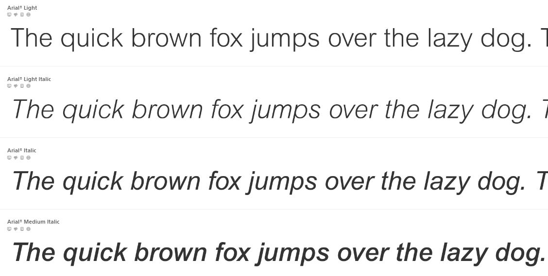
Arial—and it’s a widely recognized sans-serif font—emerged in 1982, and its design closely resembles Helvetica, which is another popular font. It stands out for its clean, simple lines that make it easy to read, and this font works really well both on screens and in print.

Arial's versatility is a fact that enables its use in diverse contexts—and these range from corporate documents to web design—and, what’s more, it supports a wide range of characters, so it’s suitable for many languages.

Arial qualifies as a web-safe font, and it’s a point that means it’s available and consistent across various operating systems and web browsers. Designers choose web-safe fonts for their broad support, and it makes sure that fonts appear consistently on different devices and platforms.

Pros: Works with many scripts, easy to read, good for creative designs.

Cons: Not the best for very formal or traditional styles.

Ideal websites: It’s great for global sites, apps, and projects that need to look modern and clear. Its flexibility and cool features make it a favorite for creative web design.

These fonts offer a great range of styles and functionalities, and it’s something that makes them versatile choices for various types of websites. A suitable font should be in line with the website's theme, content nature, and target audience—so, be sure to do that and it’ll ensure both aesthetic appeal and functional readability for what you apply it to.

How to Choose the Best Website Font? The Ultimate Guide

Guide to selecting the best website font.

© Interaction Design Foundation, CC BY-SA 4.0

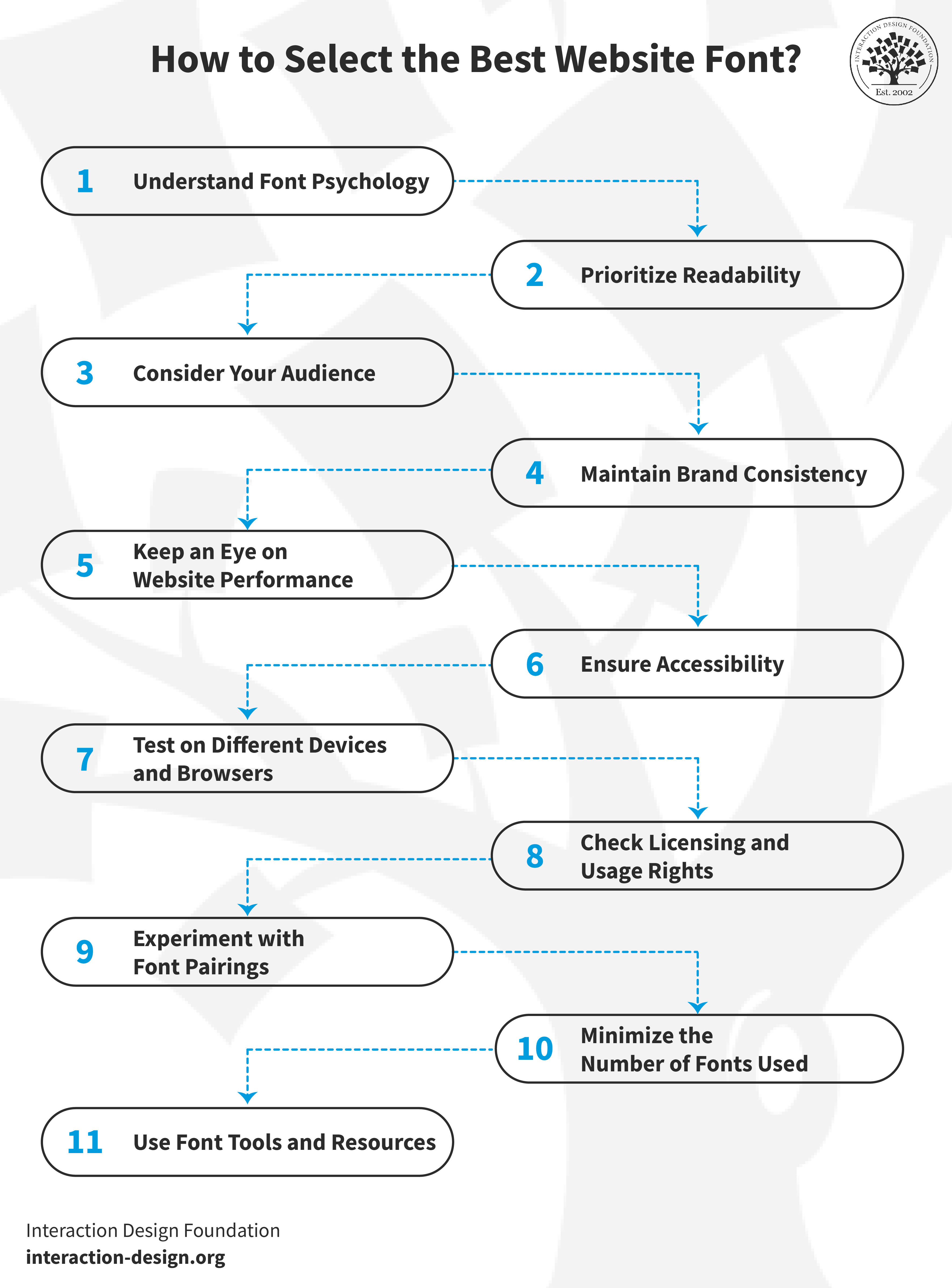
If you’re going to pick the best website font, it’ll involve several key factors. In this guide, we’ll take you through the steps you’ll need to make sure that your font choice enhances your website's effectiveness and its user experience, too.

1. Understand Font Psychology

Fonts communicate different emotions and messages.

  • Serif fonts—like Times New Roman—often give a sense of tradition and reliability, and they’re suitable for formal websites.

  • Sans-serif fonts—like Arial—offer a modern and clean appearance, and this makes them ideal for contemporary sites.

Remember, your font should reflect the emotion and message you want to convey through your brand.

2. Prioritize Readability

The main function of your website's text is to be legible—and it’s impossible to overstate how important this is. So, go for fonts that are easy to read—especially on smaller screens—and sans-serif fonts are generally more readable on digital screens. That’s why it’s so important to pay attention to your fonts' size, spacing, and color contrast to ensure legibility under various conditions is a reality.

3. Consider Your Audience

The font choice should align with your target audience's preferences. Younger audiences may resonate with modern and bold fonts—a more mature audience, though, might appreciate traditional and straightforward fonts.

Use user interviews to uncover valuable insights and better understand your target audience. Watch Ann Blandford, Professor of Human-computer Interaction at University College London, discuss the pros and cons of user interviews.

Show Hide video transcript
  1. 00:00:00 --> 00:00:35

    So, semi-structured interviews – well, any  interview, semi-structured or not, gets at people's perceptions, their values, their experiences as they see it, their explanations about why they do the things that they do, why they hold the attitudes that they do. And so, they're really good at getting at  the *why* of what people do,

  2. 00:00:35 --> 00:01:02

    but not the *what* of what people do. That's much better addressed with *observations* or *combined methods* such as contextual inquiry  where you both observe people working and also interview them, perhaps in an interleaved way about why they're doing the things that they're doing or getting them to explain more about how things work and what they're trying to achieve.

  3. 00:01:02 --> 00:01:32

    So, what are they *not* good for? Well, they're not good for the kinds of questions where people have difficulty recalling or where people might have  some strong motivation for saying something that perhaps isn't accurate. I think of those two concerns, the first is probably the bigger in HCI

  4. 00:01:32 --> 00:02:00

    – that... where things are unremarkable, people are often *not aware* of what they do; they have a lot of *tacit knowledge*. If you ask somebody how long something took, what you'll get is their *subjective impression* of that, which probably bears very little relation to the actual time something took, for example. I certainly remember doing a set of interviews some years ago

  5. 00:02:00 --> 00:02:32

    where we were asking people about how they performed a task. And they told us that it was  like a three- or four-step task. And then, when we got them to show us how they did it, it actually had about 20, 25 steps to it. And the rest of the steps they just completely took for granted; you know – they were: 'Of course we do that! Of course we—' – you know – 'Of course that's the way it works! Of course we have to turn it on!' And they just took that so much for granted that *it would never have come out in an interview*.

  6. 00:02:32 --> 00:03:11

    I mean, I literally can't imagine the interview that would really have got that full task sequence. And there are lots of things that people do or things that they assume that the interviewer knows about, that they just won't say and won't  express at all. So, interviews are not good for those things; you really need to *observe* people to get that kind of data. So, it's good to be aware of what interviews are good for and also what they're less well-suited for. That's another good example of a kind of  question that people are really bad at answering,

  7. 00:03:11 --> 00:03:31

    not because they're intentionally deceiving usually, but because we're *not* very good at *anticipating what we might do in the future*, or indeed our *attitudes to future products*, unless you can give somebody a very faithful kind of mock-up

  8. 00:03:31 --> 00:03:56

    and help them to really  imagine the scenario in which they might use it. And then you might get slightly more reliable  information. But that's not information I would ever really rely on, which is why *anticipating future product design is such a challenge* and interviewing isn't the best way  of getting that information.

4. Maintain Brand Consistency

The font on your website should match your overall brand identity—it’s an important point for consistency and trust—and if your brand uses a specific font in its marketing materials, think about using the same or a similar font on your website so it can reinforce your brand identity.

5. Keep an Eye on Website Performance

Some fonts can slow down your website, and that’s a serious point to bear in mind—it can affect user experience and search engine rankings. So, be sure to choose web-optimized fonts and think about what their impact on loading times is.

6. Ensure Accessibility

Your font choice should be accessible to all users—as in, all of them, including those with disabilities—so, steer clear of overly decorative fonts that readers may find hard to read. Accessibility is an exceptionally big deal, so make sure your font adheres to accessibility standards and do right by your users.

7. Test on Different Devices and Browsers

Fonts often appear differently across various devices and browsers—and that’s a big reason to conduct thorough testing on multiple platforms. Do this and it’ll make sure that your chosen fonts display consistently and function effectively everywhere. Be sure to check on smartphones, tablets, and different web browsers for universal readability.

8. Check Licensing and Usage Rights

Many fonts—especially for commercial use—require specific licenses. So, it’s vital to—and be sure to do this always—confirm a font's licensing and usage rights before you integrate it into your website. In fact, so utterly crucial is this step that it prevents legal issues from arising and ensures compliance with the font creator's guidelines.

9. Experiment with Font Pairings

Combine two or three different fonts and you’ll be able to enhance your site's visual appeal nicely. And, whenever you’re in the process of selecting font pairings, it’s best to aim for complementary styles that contribute to a unified design theme. Go for balance—the fonts really need to work together to support readability and aesthetic harmony. Don’t use fonts that clash or make your content difficult to read.

Fonts shape a site's readability and aesthetic so that you can create an effective visual design. Watch Dr. Priscilla Esser, Ph.D., discuss how to make the best use of fonts in this video about visual frameworks.

Show Hide video transcript
  1. 00:00:00 --> 00:00:34

    Hello and welcome to this UX Daily video in which we'll be discovering a design pattern that is very useful when you're creating the page structure for your project – the *visual framework*. My name is Priscilla Esser, and I will be discussing the tricks of the trade from WordPress template developers and other seasoned interface designers. And I will show you how they create consistency in page layouts. One of the essential elements of creating the best results for visual frameworks is something called *visual hierarchy*.

  2. 00:00:34 --> 00:01:01

    In this video, I will help you understand what visual hierarchy is and how to use that to create a proper visual framework. The visual framework is all about creating visual consistency throughout the user experience. To illustrate the importance of this consistency, just think about the simple task of finding your way back to the homepage of a website. We're all used to having the company logo in the top navigation bar to be the homepage link. Just have a look at this example from the Interaction Design Foundation website.

  3. 00:01:01 --> 00:01:32

    But what if you designed a website with multiple pages that all have this link at another location? How would it impact your experience if the logo was placed in the *footer* of the website, for example? Probably not that positive, right? You would have to scan each page separately for visual cues that indicate this functionality, adding to your mental burden. The solution is creating a consistent visual framework for all pages of your website or application. It's a framework of visual elements, colors and typography that forms a basic layout.

  4. 00:01:32 --> 00:02:03

    This layout gives you sufficient structure to create consistent pages. But it also offers enough flexibility to handle different content types. In this example, you can see how the two pages of the garden supply website are consistent in the placement of the logo, headers, menu items, and search boxes. At the same time, the pages differ in the type of content they provide. The page on the left is clearly intended to inspire people with a large image and top categories, whereas the page on the right is giving an overview of available products in the online store.

  5. 00:02:03 --> 00:02:34

    Notice how the consistent elements of the visual framework seem to be more in the *background* but the content itself appears to be more in the *foreground*. This is what a good visual framework can do for your design. It can help let your content stand out and shine. A great example of a visual framework in practice is a WordPress theme. These themes allow you to add any content you desire to create your own website based on the chosen visual framework. As most people aren't designers, this is a great way of making sure a website has good consistency

  6. 00:02:34 --> 00:03:04

    and visual appeal. But since you are a designer, we'll use this example to see how it's done. So, let's have a look at the WordPress theme we see in this example. The visual elements that have been predetermined by the theme developers are the header size, placement of menu items and search box. Also, the structure of the blog post has given us a three-column layout with white blocks on a grayish background. The typography is set, as is color use, the way images are shown, etc.

  7. 00:03:04 --> 00:03:32

    Naturally, everyone wants to personalize their website, so most elements are customizable. However, the theme developers do present a good visual framework that you can take as a starting point. Now, if we have a further look at this example, we see that the theme developers have also provided alternative ways to present different types of content while keeping the visual framework intact. The screenshot here shows how a side menu bar can be combined with a wider content block for blog posts. The user does not get confused by this change

  8. 00:03:32 --> 00:04:01

    as the visual framework ensures that the major elements can be found at the same place and the overall look and feel is consistent. To create a visual framework, these are the steps that you should take. First, determine what types of content you need to place on different pages of your interface and what tasks a user will most likely want to perform often. Then, based on type of content and task, determine what user interface design patterns will be present across all pages

  9. 00:04:01 --> 00:04:33

    – for example, a top-left navigation bar, a search box, a list or a dropdown menu of categories. Next, you should organize all returning visual elements on the page and indicate where content should go. Think about what element should go into the header area – most important – what, if anything, could be made accessible in sidebar, and what is more suitable for a footer area. Also, depending on the types of content, determine if you want to use multiple columns or not. Ensure that content has sufficient space to attract attention. When all elements have found a place on your page, you can decide on a more detailed level what colors and

  10. 00:04:33 --> 00:05:04

    fonts you want to use. This is where the framework becomes personalized to the brand or company you're designing for. You can have some fun here, but you can also use color and fonts to guide people in the right direction, as we will see in a few minutes when we dive into the topic of visual hierarchy. But let's first finish the topic of implementation of the visual framework. While you're taking the first couple of steps in creating this framework, it's very useful to make wireframes to position the various elements in a consistent layout.

  11. 00:05:04 --> 00:05:31

    Without emphasizing the visual appeal of color and images at first, it's much easier to shuffle design elements such as blocks of content and other design patterns around to create a good overview and focus on usability. In wireframes, you simply create placeholders for pieces of content and visual elements. It's a great way to do some early user testing by creating a paper prototype or creating a clickable prototype with wireframing software such as Balsamiq.

  12. 00:05:31 --> 00:06:03

    The example you see here is actually created in Balsamiq, but many other wireframing applications are available. Of course, you might just prefer the old-fashioned paper-and-pencil way to get the creative juices flowing, which is perfectly OK. After creating the wireframes in the first couple of steps of implementing a visual framework and focusing on more graphic design elements such as color and typography, you may want to consider creating a style guide to report the design decisions you made here. Style guides give all the visual elements and rules for implementing them. It increases the uniformity and consistency you're looking for with a visual framework,

  13. 00:06:03 --> 00:06:36

    but enables future extensions of your framework by others. This way, you ensure that when a client will not hire you five years from now to add to the website you designed for them, your efforts will not have been in vain and the new additions will remain consistent with your original intentions. As you can see here, major companies like Yelp provide their style guide as a resource for designers, product managers and developers. It serves as a common language to create brand consistency and a good user experience.

  14. 00:06:36 --> 00:07:03

    Now, the main problem with visual frameworks is that when the initial design isn't very good, it will continue to bite you in the behind throughout all of the pages. So, how do you get the initial framework just right? Let's start by deciding what we consider a good page layout. Here's what I think: First of all, a page should invite and enable the user to accomplish the task they want in a way that doesn't take too much effort. Secondly, it should allow the page owner to effectively communicate what they want

  15. 00:07:03 --> 00:07:31

    whether it is who they are or what the latest addition to the collection is. So, there's two sides of the coin, but they both revolve around seeing what you need to see to achieve a goal. Let's take a look at an example of a page that *doesn't* use visual hierarchy to achieve these results. It's actually a newspaper page from many years ago. Notice how all visual elements seem to be *equally important*. This was very common back in the day. But now, we're used to having things displayed in a much more *supportive* way.

  16. 00:07:31 --> 00:08:01

    Now, take this example. Here, some blocks of content instantly stand out to you and some seem to be more in the background. I imagine that if you're looking for a specific piece of information, this newspaper will help you do that much faster than the previous one. The designers of this page have played with visual elements to make some bits stand out more than others. Can you identify what design decisions they've made to achieve this? First, they've played with *size*.

  17. 00:08:01 --> 00:08:33

    Take a moment to see all of the different sizes they used to create hierarchy in the content. They also used *color* to make some text stand out more than others. Do you see how they did that? Let's have a closer look at how this works in the next slide. Visual hierarchy is all about *setting priorities*. What do you want people to see first, while they're merely glancing over your design? And then, when they *like* what they see, people will start *skimming*. This will make another level of the hierarchy stand out to them. This is often a bit smaller with less energizing colors or less contrast in the background

  18. 00:08:33 --> 00:09:01

    like the second line of gray text you see in this image. Only when people *consciously* take the time to start reading the text will text that is thinner, smaller and less contrasted be noticed. Now, where it becomes fun for you as a designer is when you start playing with these visual elements to attract attention to the right places. Using an *anomaly* to the standard visual hierarchy of a page layout, like the bullet text in this example, will give you control over the users' path of attention. It really draws the eye of the user to this text.

  19. 00:09:01 --> 00:09:36

    In this case, we say that the bold text has more *visual weight* than the regular text. Generally speaking, more visual weight attracts more attention when combined with less heavy elements. Let's have a look at some examples of visual frameworks to see if we can recognize how the designers have used visual hierarchy. Here, we're looking at a screenshot from the Dropbox website. Some visual hierarchy is achieved by making the heading bigger or bolder than the remaining text and by using blue as a contrast color. But all in all, I think this is rather a flat design without big differences in visual weight.

  20. 00:09:36 --> 00:10:00

    When we turn to this example, which is comparable in that it shows a pricing scheme for cloud-based storage subscriptions, we see that a stronger visual hierarchy is used. The most popular pricing option stands out more, not just because it's labeled "most popular", but also because the most popular option seems to burst out of the visual structure that the others abide by. To achieve this, the designs have used brighter colors and they allow the best option to take up more space in the layout of the page.

  21. 00:10:00 --> 00:10:30

    And as you can see, they do this *consistently* as it's not just the boxed area at the top of the page but also the features description which seems to grow heavier for each step it takes. The previous examples were both based on visual frameworks that depend heavily on a white background and fairly minimalist text options. Here, we take a different turn and show you an example that uses many more images and colors to present the content. A visual framework is implemented with a top navigation bar, a large area to showcase highlighted talks

  22. 00:10:30 --> 00:11:02

    and a row system with room for six talks per category. The visual hierarchy that is used to support this framework uses *size* – so, the biggest talk is perceived as the most important, especially since the title of this talk has the biggest font size – and *contrast*. The two other talks in the talk area really stand out from the background, making it look quite important as well. Since most users will visit this website to browse for interesting talks to watch and to get inspired, it's perfectly fine to have size and contrast *competing* with each other.

  23. 00:11:02 --> 00:11:33

    When users would visit a website with a *single purpose*, you might want to combine size and contrast to give a certain element *all* of the visual weight. Now, let's analyze this example together. Which element is the highest in the visual hierarchy and what stands out to you first? In this case, it's a combination of contrast and color. The block of content on the top-left side has the most visual weight. So, what is then the element *lowest* in the hierarchy in the screenshot and what has the lowest visual weight is in that respect the absolute opposite of the heavy black-and-yellow box

  24. 00:11:33 --> 00:12:01

    in my opinion is the category bar that says "Entertainment, Products, People, Fashion, Music" and so on. It has a small font size and is grey on a white background. It attracts the least attention. In this video, we had a look at a very powerful way to create consistency in your designs: the visual framework. We've seen that consistency helps users to find their way on a website or application and increases the usability. To create a good visual framework, you need to determine all of the elements that you need to place on the page and find the right location for them.

  25. 00:12:01 --> 00:12:32

    You can start out by drawing wireframes that focus on the placement before continuing with the style guide, which also describes the colors and fonts that need to be used consistently. When a visual framework is well documented, it helps future designers to continue the look and feel in new pages or products. A good visual framework also takes into account the visual hierarchy of a page. By using colors and sizes, you can give certain elements on a page more visual weight than others – which makes them attract more attention and appear more important.

  26. 00:12:32 --> 00:12:45

    The visual framework and visual hierarchy give you as a designer great input to play around and have some fun with visual elements while ensuring that you create high-quality designs.

10. Minimize the Number of Fonts Used

It’s smart to use one or two font families for a clean, professional look—just one or a couple. Since excess fonts can make a website appear cluttered, be sure to stick to consistent fonts across your site. Pick ones that match in style and size—and it’ll ensure a really harmonious and attractive design.

11. Use Font Tools and Resources

Platforms like Google Fonts, Adobe Fonts, and Font Squirrel offer a variety of web-optimized fonts, and they’re tools that can help you find the perfect font for your website—the perfect one. What’s more, they offer insights into font pairing, licensing, and usage, too.

The Take Away

And that's it—you’ve got the know-how here to get fonts working well for your brand’s digital products and good ideas about how to choose the right font for your brand and make things easier to read for users. You can see just how important web font selection is, and that goes both for user experience and for brand identity. The font choice is a massive thing—so big that it can impact a website's aesthetics and functionality to a large degree and determine what users make of it all within seconds. Through this discussion here, we can conclude that it’s best to:

  • Select fonts that mirror your brand's message and tone.

  • Prioritize readability in font choice for better accessibility and clarity as vital factors.

  • Boost your website's visual appeal and user engagement with the right font.

  • Make sure there’s consistency in brand identity across all platforms whenever you choose fonts.

References and Where to Learn More

Find more in-depth insights in our UX Designer’s Guide to Typography.

Find additional helpful considerations in this article, Typography in Design: Why Every Design Should Master Fonts and Styles.

Read Hubspot’s take on web-safe fonts.

Get Weekly Design Insights

Join 315,888 designers who get useful UX / UI Design tips from our newsletter.
A valid email address is required.
571 shares

Open Access—Link to us!

We believe in Open Access and the democratization of knowledge. Unfortunately, world-class educational materials such as this page are normally hidden behind paywalls or in expensive textbooks.

If you want this to change, , link to us, or join us to help us democratize design knowledge!

Share Knowledge, Get Respect!

Share on:

or copy link

Cite according to academic standards

Simply copy and paste the text below into your bibliographic reference list, onto your blog, or anywhere else. You can also just hyperlink to this article.

Soegaard, M. (2024, February 26). Web Fonts: Definition and 10 Recommendations. Interaction Design Foundation - IxDF.

New to UX Design? We're Giving You a Free eBook!

The Basics of User Experience Design

Download our free ebook “The Basics of User Experience Design” to learn about core concepts of UX design.

In 9 chapters, we'll cover: conducting user interviews, design thinking, interaction design, mobile UX design, usability, UX research, and many more!

A valid email address is required.
315,888 designers enjoy our newsletter—sure you don't want to receive it?