Web fonts bring digital content to life. They enhance readability, set the tone, and ensure consistency across various platforms—all vital ingredients. When you understand web fonts and their impact, it can help you with effective website creation—and greatly so. We’ll provide a comprehensive overview of web fonts, including types, best practices for selection, and top recommendations for different website genres.
Have you ever wondered why some websites just 'feel right' while others feel like a jumbled mess? The secret often lies in the font!
Web fonts give a boost to your website's appearance and user experience. They’re things that make your content visually appealing and easy to read. Effective web fonts can reflect your brand's personality, and they’re something that can help you communicate your message in a clear and engaging manner.
In this piece, we’re going to talk about web fonts and we’ll present 10 key recommendations—along with tips on how to select and use them well. Discover methods to make your website readable and memorable. It’s a big deal, and the appropriate font can convert visitors into loyal fans.
Table of contents
- What Are Web Fonts?
- What Are the Best Fonts for Websites?
- How to Choose the Best Website Font? The Ultimate Guide
- 1. Understand Font Psychology
- 2. Prioritize Readability
- 3. Consider Your Audience
- 4. Maintain Brand Consistency
- 5. Keep an Eye on Website Performance
- 6. Ensure Accessibility
- 7. Test on Different Devices and Browsers
- 8. Check Licensing and Usage Rights
- 9. Experiment with Font Pairings
- 10. Minimize the Number of Fonts Used
- 11. Use Font Tools and Resources
- The Take Away
- References and Where to Learn More
What Are Web Fonts?
Web fonts are styles of typography that websites use. Unlike standard fonts, web fonts load directly from the internet, and it’s something that allows web designers to use a wide range of fonts. These fonts go beyond the limitations of those installed on a user's computer—and web fonts enhance a website's visual appeal. They make sure of consistency across different devices and browsers, and his uniformity improves the user experience.
Web fonts offer creative freedom, and—what’s more—designers can match the font style to the website's theme and brand identity. They’re essential tools for modern web design, in fact, and they’re valuable assets that’ll help you create a unique and engaging online presence when you pick the right type of font for your brand.
How to Install a Web Font
The way you install a web font varies. You can use various methods that include:
For Wordpress, a plugin like Use Any Font
Adobe Fonts via Creative Cloud
Other services like Google Fonts
Direct integration with @font-face in your website's stylesheet.
Each method requires some CSS knowledge.
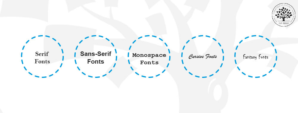
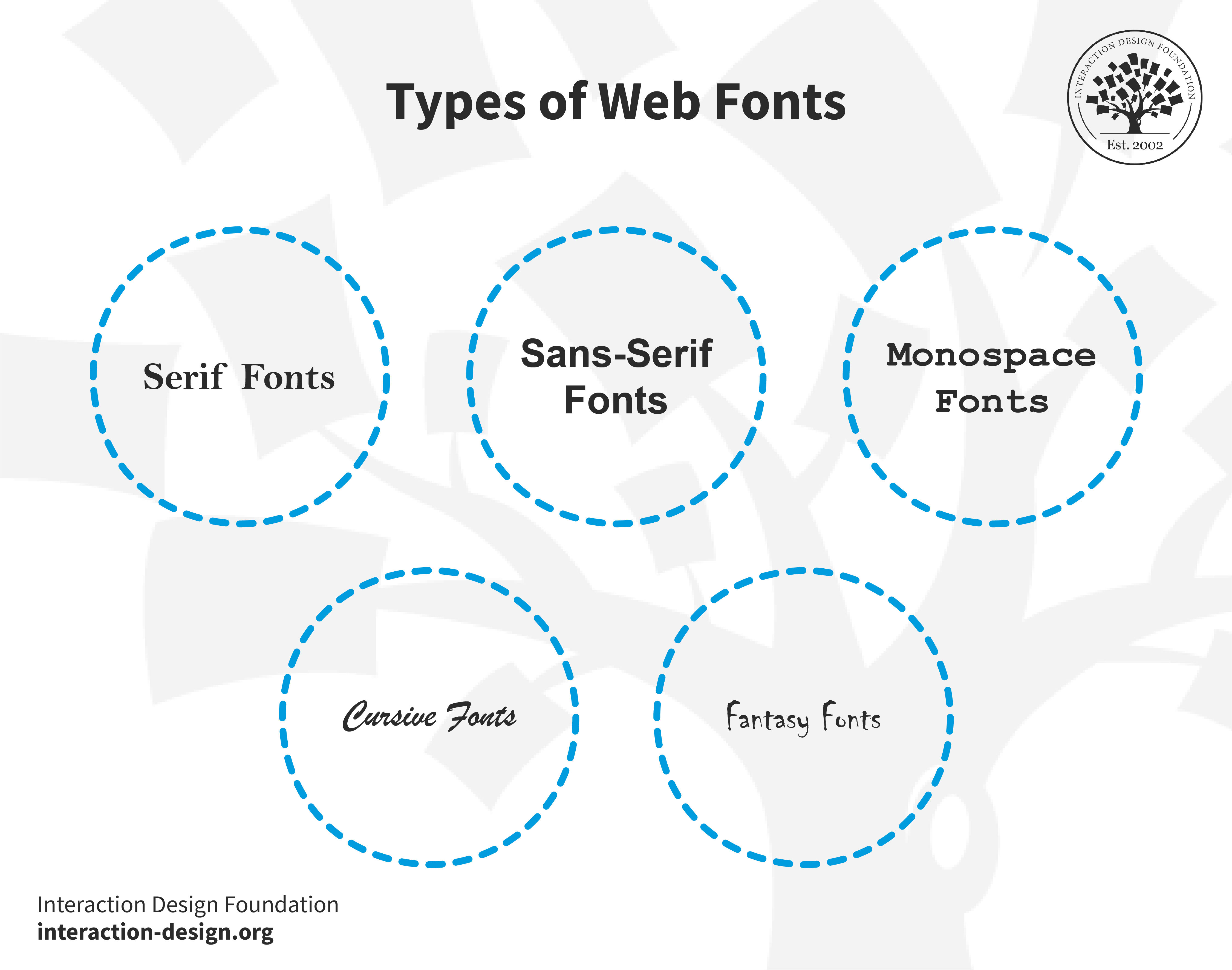
Types of Web Fonts
© Interaction Design Foundation, CC BY-SA 4.0
Serif fonts: These fonts feature small lines or strokes attached to the ends of their letters. Serifs guide the eye along the text for better readability—a point that means this feature makes them a favorite for printed material. An example is Times New Roman. The serifs can cause legibility problems at smaller font sizes or on low-resolution screens, though.
Sans-serif fonts: Sans-serif means "without serifs." These fonts lack the decorative strokes found in serif fonts. They’re clearer on digital screens—a reason for their prevalence in web design. Arial is a classic sans-serif font.
Monospace fonts: Each character in monospace fonts takes up the same horizontal space and this even spacing reminds us of old typewriters. Developers favor monospace fonts in coding environments for both their clarity and their alignment. Courier is one well-known monospace font. An important point is that monospaced fonts can be serif (like Courier) or sans-serif (like Consolas).
Cursive fonts: Cursive fonts mimic human handwriting, and they’ve often got connected letters. What they do in particular is they add a personal, artistic touch to digital content—and so deliver a human feel. Brush Script MT exemplifies a cursive font. Cursive fonts are what individuals generally use for special effects; that’s because they can be challenging to read.
Fantasy fonts: People use these decorative fonts for artistic and unique design elements. As for cursive, they grab attention—but they can cause problems for extended reading. Luminari is an example of a fantasy font.
One important thing to point out here is that each font type does serve a specific purpose in web design. More traditional—or formal—websites often use serif fonts; sans-serif fonts, meanwhile, suit modern, minimalistic designs. Monospace fonts are ideal for technical sites, while cursive’s great for artistic or personal pages, and fantasy fonts are really helpful for creative, standout designs.
Why Is It Important to Choose a Good Web Font?
A good font is one that’s appropriate for your site, and there are a few reasons. It:
Enhances readability: A good font ensures that your content is easy to read—and so is a vital ingredient. It helps users understand your message quickly and without strain.
Sets the tone: It’s important to be aware of how fonts carry emotional connotations, and the right font can convey professionalism, creativity, or playfulness—whatever it needs to, to align with your brand's tone.
Improves user experience: Comfortable reading leads to a better user experience, and users really do stay longer on your site when the text's legible and appealing.
Ensures consistency: A consistent font use across your channels solidifies your brand identity, and it’s something that makes your site more memorable and recognizable—not to mention the point that consistency is vital for users to build trust in your brand.
Adapts to different devices: A well-chosen font displays well on various screens—and that’s an extremely important factor for meeting users on whatever they’re viewing it on. It nicely maintains quality and readability on desktops, tablets, and smartphones.
Reflects modern trends: If you use contemporary fonts, it keeps your website looking fresh. It shows that you update yourself with modern design trends—in step with the times.
Supports global use: Good fonts support multiple languages and special characters. This factor nicely translates to the point that your website is available to a diverse audience.
What Are the Best Fonts for Websites?
© Interaction Design Foundation, CC BY-SA 4.0
It’s impossible to overstate just how important font selection is in the world of web design. So, in this section, we’re going to discuss the top 10 fonts that boost website design, readability, and—of course—overall impact. These fonts really stand out for their versatility and effectiveness in how they get diverse messages and tones across.
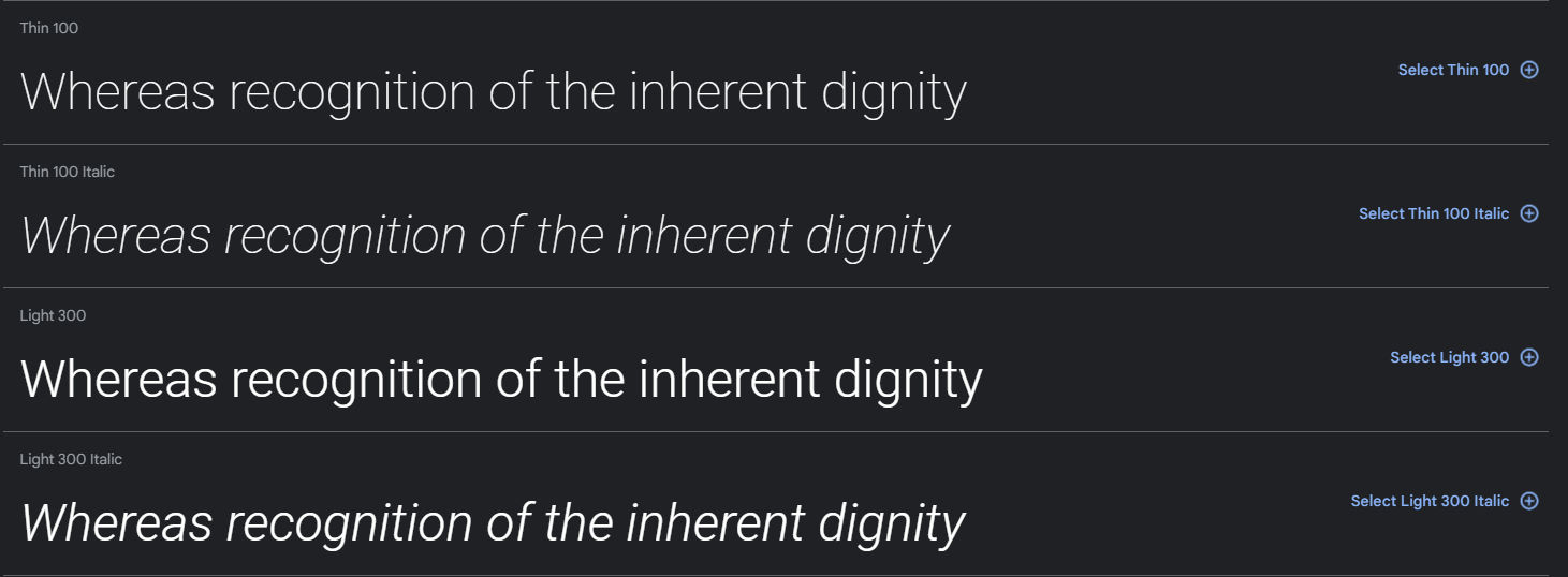
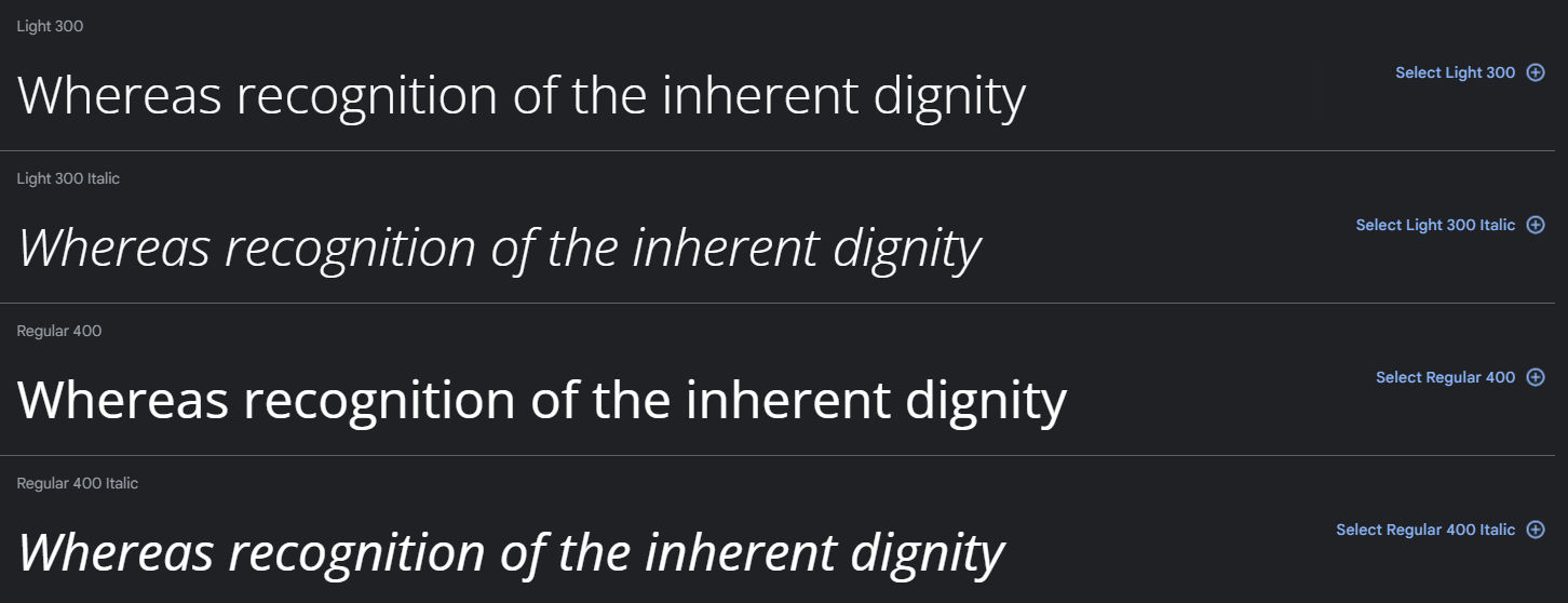
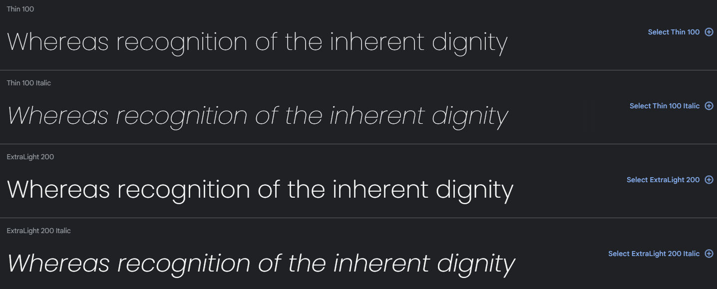
Font 1: Roboto
© Google Fonts, Fair Use
Roboto—a neo-grotesque sans-serif font—combines a mechanical skeleton with geometric forms. What’s more, it features friendly, open curves.
Roboto maintains natural letter widths—unlike some grotesques (part of sans-serif typefaces) that distort letterforms for a rigid rhythm. This approach creates a natural reading rhythm, one that’s similar to that in humanist (part of serif) and serif types.
Fonts and typefaces may seem similar, but they do serve distinct roles in visual communication and design. Mia Cinelli, Assistant Professor, explains the difference between fonts and typefaces in this video.
Video copyright info
Copyright holder: Mia Cinelli
Mackinac 1895, Bags to Riches, The Landscape of Love, What's Past is Prologue, Pandemic Parade Banners
Hide Content
Until 2021, Android used Roboto as the default system font. Various Google services also used it since 2013. These include Google Play, YouTube, Google Maps, and Google Images.
Pros: Highly legible, versatile, works well for print and digital media.
Cons: May appear too commonplace—and that’s due to widespread use.
Ideal websites: It’s suitable for business, technology, and modern educational websites thanks to its clarity and modern aesthetic.
Font 2: Open Sans
© Google Fonts, Fair Use
Steve Matteson created Open Sans—a sans-serif font that’s renowned for its modern, clean design, and its readability and versatility contribute to why it’s so highly popular. Open Sans is free for personal and commercial use as a Google font, and it stands out for its neutral—yet friendly—appearance.
Open Sans enjoys widespread web use for its excellent legibility—readability and text clarity. Its strong letterforms—which an extensive font library supports—position it as a robust alternative to default sans-serif fonts.
Pros: Excellent readability, simple and unassuming style.
Cons: Popularity might limit uniqueness in design.
Ideal websites: It’s ideal for corporate websites, digital platforms, and mobile applications that are after readability and a modern look.
Font 3: Raleway
© Google Fonts, Fair Use
Raleway stands out as a sans-serif font, and that’s thanks to its clean and elegant design. It was—initially—a single-weight font, but now it encompasses a nine-weight family that ranges from thin to black. The font features wonderfully stylish uppercase letters and numbers—and it’s perfect for headings and display uses.
Thanks to its versatility, designers frequently choose Raleway for digital and print media, and its open, airy letterforms make sure that there’s excellent readability on screens. Raleway seamlessly blends modern aesthetics with practical functionality, and this makes it a suitable asset for a broad range of design projects.
Available on Google Fonts, it simplifies web design without licensing or download issues.
Pros: Offers excellent screen readability with diverse design options.
Cons: Less ideal for formal or traditional designs due to its modern appearance.
Ideal websites: Perfect for modern websites like digital magazines, creative portfolios, and user-friendly e-commerce sites. Its easy integration with Webflow nicely makes it highly favorable for web designers.
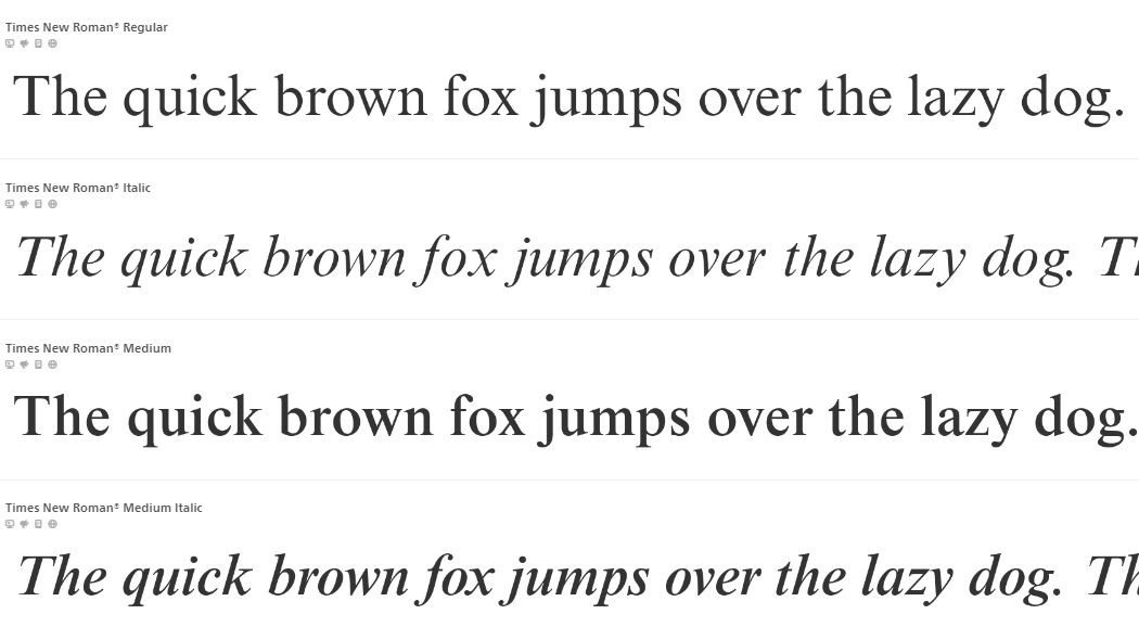
Font 4: Times New Roman
© Fonts, Fair Use
Times New Roman—and it’s a classic, widely used serif font—originated in 1932 for The Times newspaper, and its professional, formal style makes it a popular choice both in academic and in business documents. Its clear, distinct characters ensure readability, and it’s suitable for not just printed text but on-screen display, too.
Though it’s often viewed as a default or conservative choice, Times New Roman has a versatility and timeless design that keeps it relevant in various design contexts—and that spans from official reports to creative projects.
Pros: Exceptional readability in print and digital formats, distinctly clear even in small sizes.
Cons: May seem overly traditional or mundane due to frequent use; less suitable for creative branding.
Ideal websites: Ideal for academic publications, professional blogs, legal sites, and any platform emphasizing formal content.
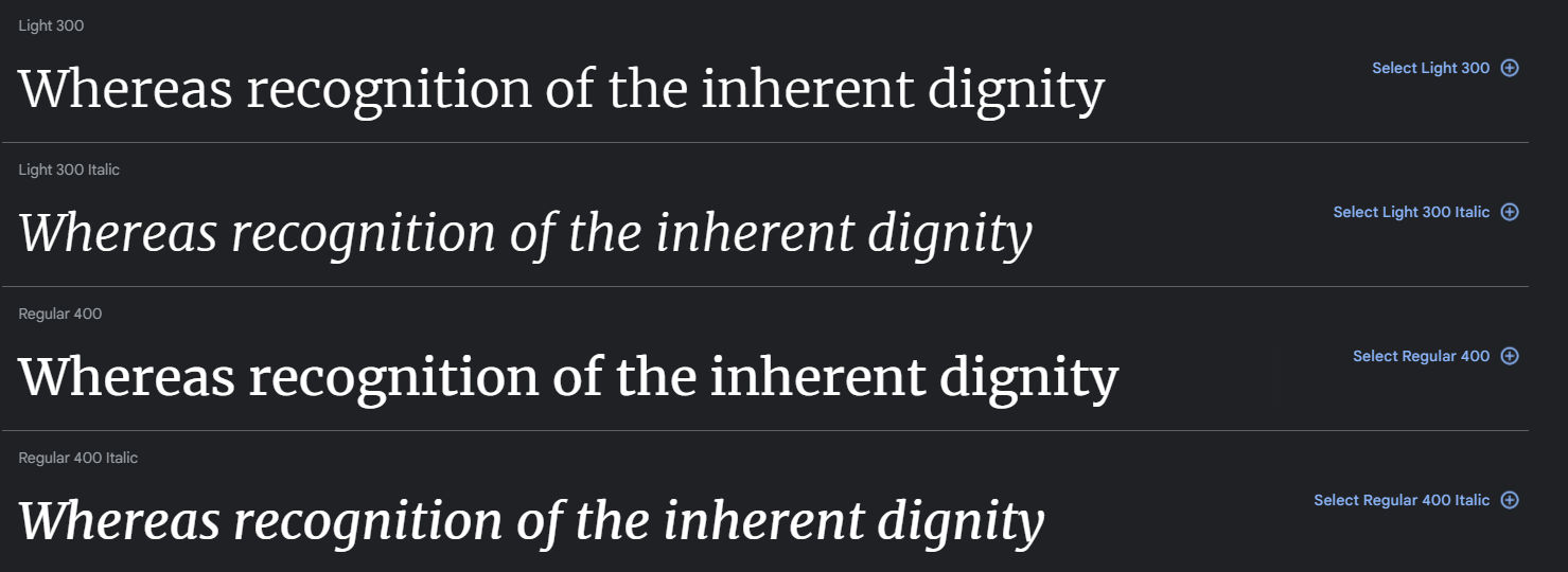
Font 5: Merriweather
© Google Fonts, Fair Use
Merriweather—which is an open-source serif font—excels in on-screen reading, and it’s designed for text-heavy layouts. Its tall x-height and compact letterforms are ingredients that make sure of superior readability across various screen sizes—without using extra horizontal space, which is a big plus.
The font family offers light, regular, and bold weights, and it provides stylistic versatility, and it blends classic elegance with modern simplicity. Merriweather delivers warmth and credibility, and—what’s more—it’s effective at large and small sizes.
Pros: Outstanding on-screen readability, maintains clarity even at small sizes.
Cons: Might occupy more space, potentially less formal in appearance.
Ideal websites: It’s great for educational platforms, blogs, and sites heavily accessed on mobile devices.
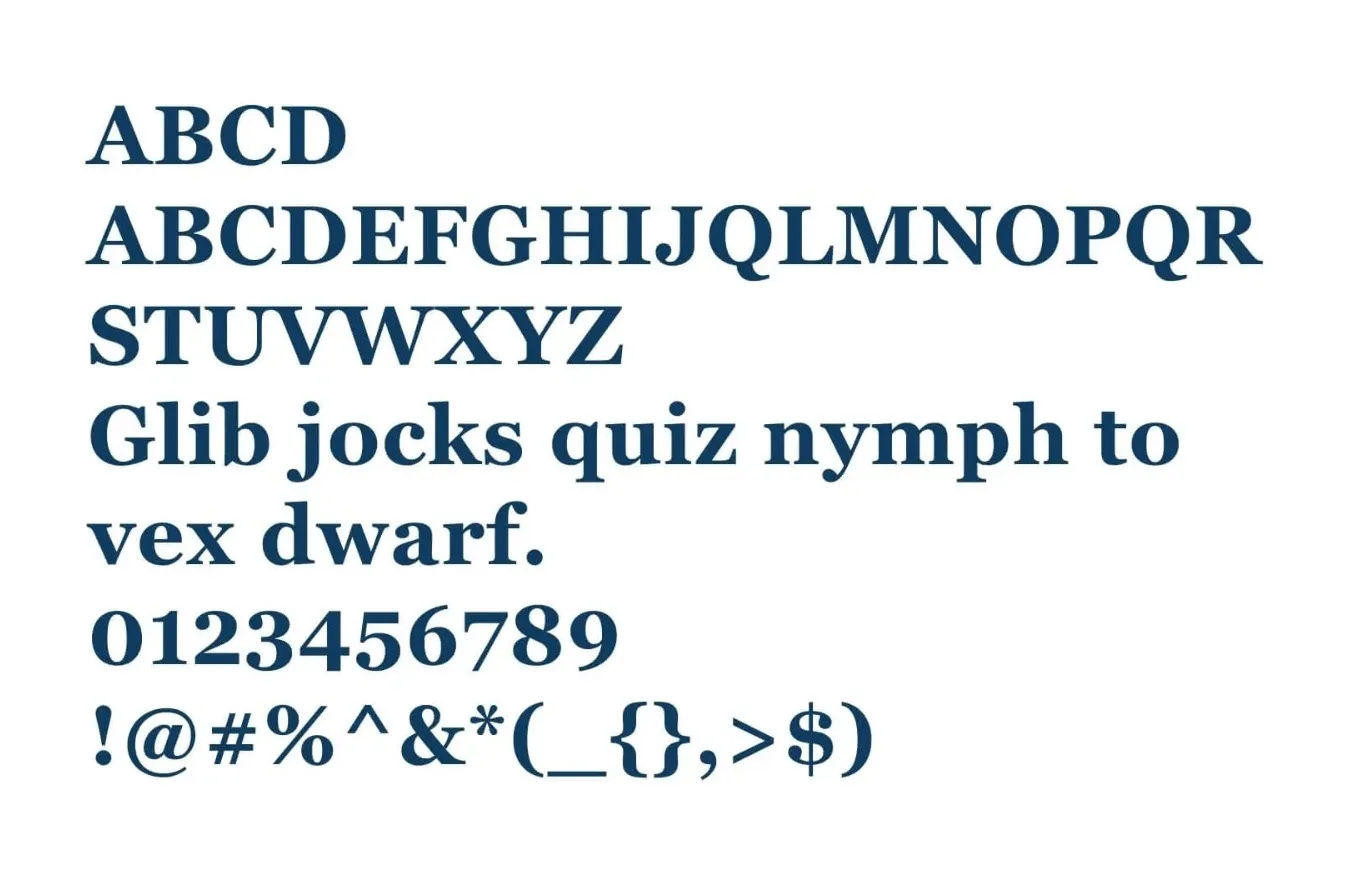
Font 6: Georgia
© Freefonts, Fair Use
Georgia—designed as an elegant yet legible serif font—excels in small print and low-resolution screens. This transitional serif typeface reflects early 19th-century 'rational' serif characteristics, and it features alternating thick and thin strokes, ball terminals, and a vertical axis.
Pros: Excellent legibility on screens and small sizes, ideal for extensive text.
Cons: Can appear overly formal. It may not fit modern or minimalist designs.
Ideal websites: It’s a perfect pick for news portals, educational content, and corporate sites where you’ve got to have clarity and a formal tone. You’ll find it helpful, especially on devices that have got varying screen resolutions.
Font 7: Source Sans Pro
© Google Fonts, Fair Use
Source Sans Pro—and it’s an open-source sans-serif font—is an easy-to-read font, and its range of weights is something that makes sure that readability at all sizes is a reality. This font provides clear headers and readable body text, and its design draws inspiration from twentieth-century American gothic styles. A great touch is how the font's slender, open letters offer a clean, friendly look.
It performs well across browsers and devices. Source Sans Pro supports multiple languages and alphabets—and these include Western, European, Vietnamese, Pinyin, and Navajo.
Pros: High readability in UIs, versatile across various weights.
Cons: The simplicity might not suit projects requiring a more distinctive or classic style.
Ideal websites: It’s suitable for versatile web applications, and they include professional business sites, educational platforms, and multilingual portals. Its clarity and simplicity make it a really excellent choice for user interfaces and digital reading material both.
Font 8: Lato
© Google Fonts, Fair Use
Łukasz Dziedzic created Lato—a sans-serif typeface—in 2010, and designers know it and like it for its readability and extensive character set. Lato blends classic style with modern elements, and it’s got semi-rounded letter details and a strong structure. It’s a handy plus—and it’s one that makes it very readable and perfect for print and digital media.
Pros: Easy to read, has a friendly look, and works well in many situations.
Cons: Its wide use might make designs look less unique.
Ideal websites: It’s best for business and personal sites, online platforms, and apps that need a modern, easy-to-read style.
Font 9: Poppins
© Google Fonts, Fair Use
Poppins is a sans-serif font great for global use, and it works well with Latin and Devanagari scripts. This makes it a top choice for worldwide projects. The Sprkl Webflow & Figma Wireframe Kit uses Poppins for its eye-catching headlines and buttons, and its design makes the text easy to read, even in small sizes.
Poppins looks great on big screens and mobiles, too, and it's perfect for websites and apps that look good and are easy to read. Poppins has got special features for cool text designs, too, like combining letters creatively, and it’s a point that keeps the text easy to read on different browsers and devices.
Pros: Works with many scripts, easy to read, good for creative designs.
Cons: Not the best for very formal or traditional styles.
Ideal websites: It’s great for global sites, apps, and projects that need to look modern and clear. Its flexibility and cool features really make it a favorite for creative web design.
Font 10: Arial
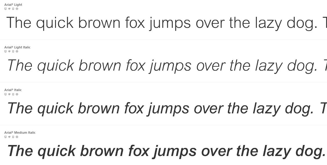
© Fonts, Fair Use
Arial—and it’s a widely recognized sans-serif font—emerged in 1982, and its design closely resembles Helvetica, which is another popular font. It stands out for its clean, simple lines that make it easy to read, and this font works really well both on screens and in print.
Arial's versatility is a fact that enables its use in diverse contexts—and these range from corporate documents to web design—and, what’s more, it supports a wide range of characters, so it’s suitable for many languages.
Arial qualifies as a web-safe font, and it’s a point that means it’s available and consistent across various operating systems and web browsers. Designers choose web-safe fonts for their broad support, and it makes sure that fonts appear consistently on different devices and platforms.
Pros: Works with many scripts, easy to read, good for creative designs.
Cons: Not the best for very formal or traditional styles.
Ideal websites: It’s great for global sites, apps, and projects that need to look modern and clear. Its flexibility and cool features make it a favorite for creative web design.
These fonts offer a great range of styles and functionalities, and it’s something that makes them versatile choices for various types of websites. A suitable font should be in line with the website's theme, content nature, and target audience—so, be sure to do that and it’ll ensure both aesthetic appeal and functional readability for what you apply it to.
How to Choose the Best Website Font? The Ultimate Guide
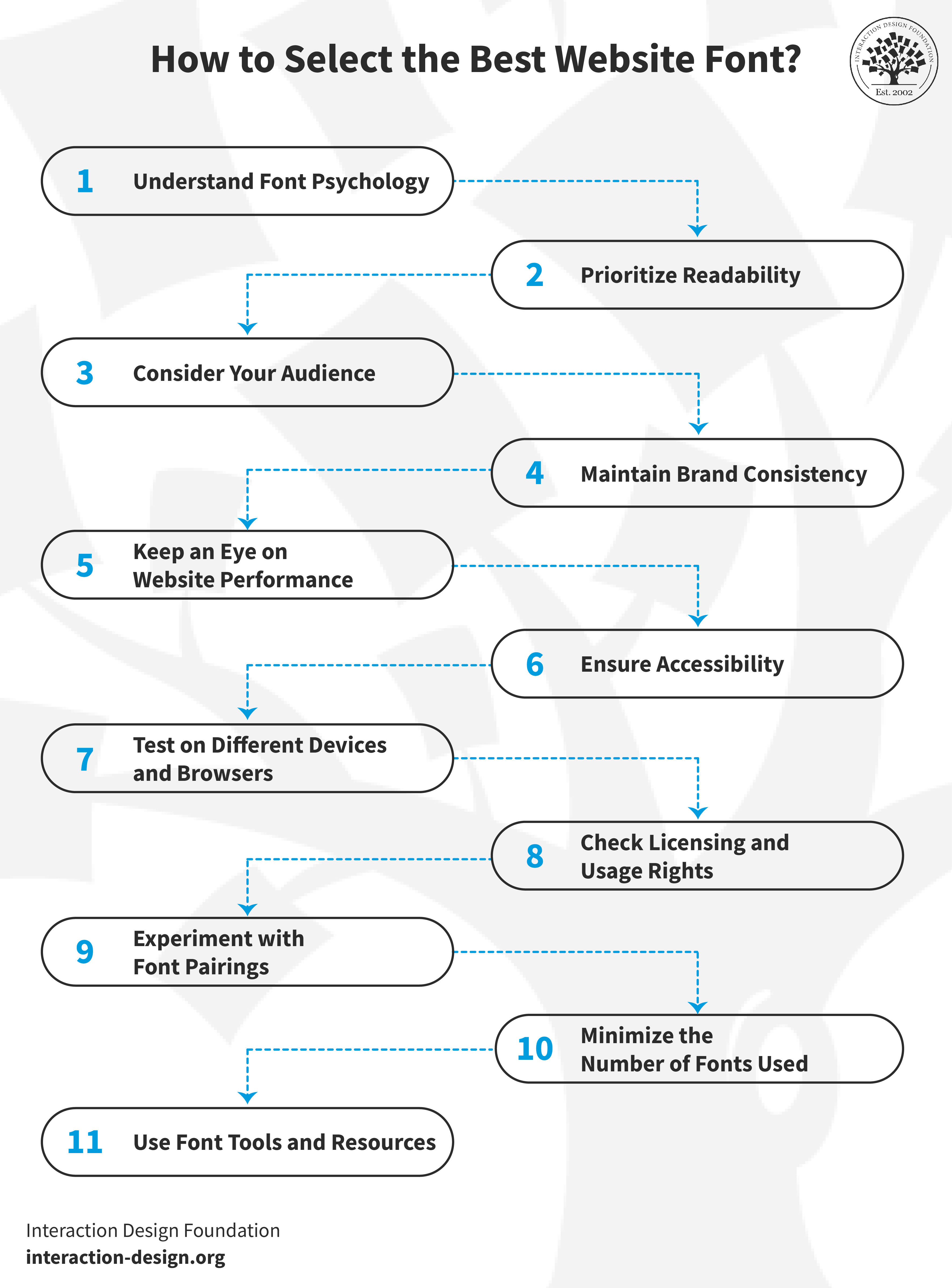
© Interaction Design Foundation, CC BY-SA 4.0
If you’re going to pick the best website font, it’ll involve several key factors. In this guide, we’ll take you through the steps you’ll need to make sure that your font choice enhances your website's effectiveness and its user experience, too.
1. Understand Font Psychology
Fonts communicate different emotions and messages.
Serif fonts—like Times New Roman—often give a sense of tradition and reliability, and they’re suitable for formal websites.
Sans-serif fonts—like Arial—offer a modern and clean appearance, and this makes them ideal for contemporary sites.
Remember, your font should reflect the emotion and message you want to convey through your brand.
2. Prioritize Readability
The main function of your website's text is to be legible—and it’s impossible to overstate how important this is. So, go for fonts that are easy to read—especially on smaller screens—and sans-serif fonts are generally more readable on digital screens. That’s why it’s so important to pay attention to your fonts' size, spacing, and color contrast to ensure legibility under various conditions is a reality.
3. Consider Your Audience
The font choice should align with your target audience's preferences. Younger audiences may resonate with modern and bold fonts—a more mature audience, though, might appreciate traditional and straightforward fonts.
Use user interviews to uncover valuable insights and better understand your target audience. Watch Ann Blandford, Professor of Human-computer Interaction at University College London, discuss the pros and cons of user interviews.
4. Maintain Brand Consistency
The font on your website should match your overall brand identity—it’s an important point for consistency and trust—and if your brand uses a specific font in its marketing materials, think about using the same or a similar font on your website so it can reinforce your brand identity.
5. Keep an Eye on Website Performance
Some fonts can slow down your website, and that’s a serious point to bear in mind—it can affect user experience and search engine rankings. So, be sure to choose web-optimized fonts and think about what their impact on loading times is.
6. Ensure Accessibility
Your font choice should be accessible to all users—as in, all of them, including those with disabilities—so, steer clear of overly decorative fonts that readers may find hard to read. Accessibility is an exceptionally big deal, so make sure your font adheres to accessibility standards and do right by your users.
7. Test on Different Devices and Browsers
Fonts often appear differently across various devices and browsers—and that’s a big reason to conduct thorough testing on multiple platforms. Do this and it’ll make sure that your chosen fonts display consistently and function effectively everywhere. Be sure to check on smartphones, tablets, and different web browsers for universal readability.
8. Check Licensing and Usage Rights
Many fonts—especially for commercial use—require specific licenses. So, it’s vital to—and be sure to do this always—confirm a font's licensing and usage rights before you integrate it into your website. In fact, so utterly crucial is this step that it prevents legal issues from arising and ensures compliance with the font creator's guidelines.
9. Experiment with Font Pairings
Combine two or three different fonts and you’ll be able to enhance your site's visual appeal nicely. And, whenever you’re in the process of selecting font pairings, it’s best to aim for complementary styles that contribute to a unified design theme. Go for balance—the fonts really need to work together to support readability and aesthetic harmony. Don’t use fonts that clash or make your content difficult to read.
Fonts shape a site's readability and aesthetic so that you can create an effective visual design. Watch Dr. Priscilla Esser, Ph.D., discuss how to make the best use of fonts in this video about visual frameworks.
10. Minimize the Number of Fonts Used
It’s smart to use one or two font families for a clean, professional look—just one or a couple. Since excess fonts can make a website appear cluttered, be sure to stick to consistent fonts across your site. Pick ones that match in style and size—and it’ll ensure a really harmonious and attractive design.
11. Use Font Tools and Resources
Platforms like Google Fonts, Adobe Fonts, and Font Squirrel offer a variety of web-optimized fonts, and they’re tools that can help you find the perfect font for your website—the perfect one. What’s more, they offer insights into font pairing, licensing, and usage, too.
The Take Away
And that's it—you’ve got the know-how here to get fonts working well for your brand’s digital products and good ideas about how to choose the right font for your brand and make things easier to read for users. You can see just how important web font selection is, and that goes both for user experience and for brand identity. The font choice is a massive thing—so big that it can impact a website's aesthetics and functionality to a large degree and determine what users make of it all within seconds. Through this discussion here, we can conclude that it’s best to:
Select fonts that mirror your brand's message and tone.
Prioritize readability in font choice for better accessibility and clarity as vital factors.
Boost your website's visual appeal and user engagement with the right font.
Make sure there’s consistency in brand identity across all platforms whenever you choose fonts.
References and Where to Learn More
Find more in-depth insights in our UX Designer’s Guide to Typography.
Find additional helpful considerations in this article, Typography in Design: Why Every Design Should Master Fonts and Styles.
Read Hubspot’s take on web-safe fonts.