Choosing the best combination of colors for an interactive design layout is not, as it may appear, a guessing game. Knowing which ones to use will save you time (and headaches). Getting it right will also keep your users connected.
Since the early days of art and design, the use of color has followed many rules and guidelines, which are collectively known as color theory.
A color scheme is one of the first elements to communicate the message behind the design on both visual and psychological levels. In fact, the color scheme is one of the most important elements; this is because, when used correctly, color can reflect the niche and even the overall business marketing strategy.
In this article, we will briefly review different color classifications to refresh your memory about those graphic design classes you took at University. We’re sure that the content will both ring a bell and inspire your creativity.
The Color Wheel
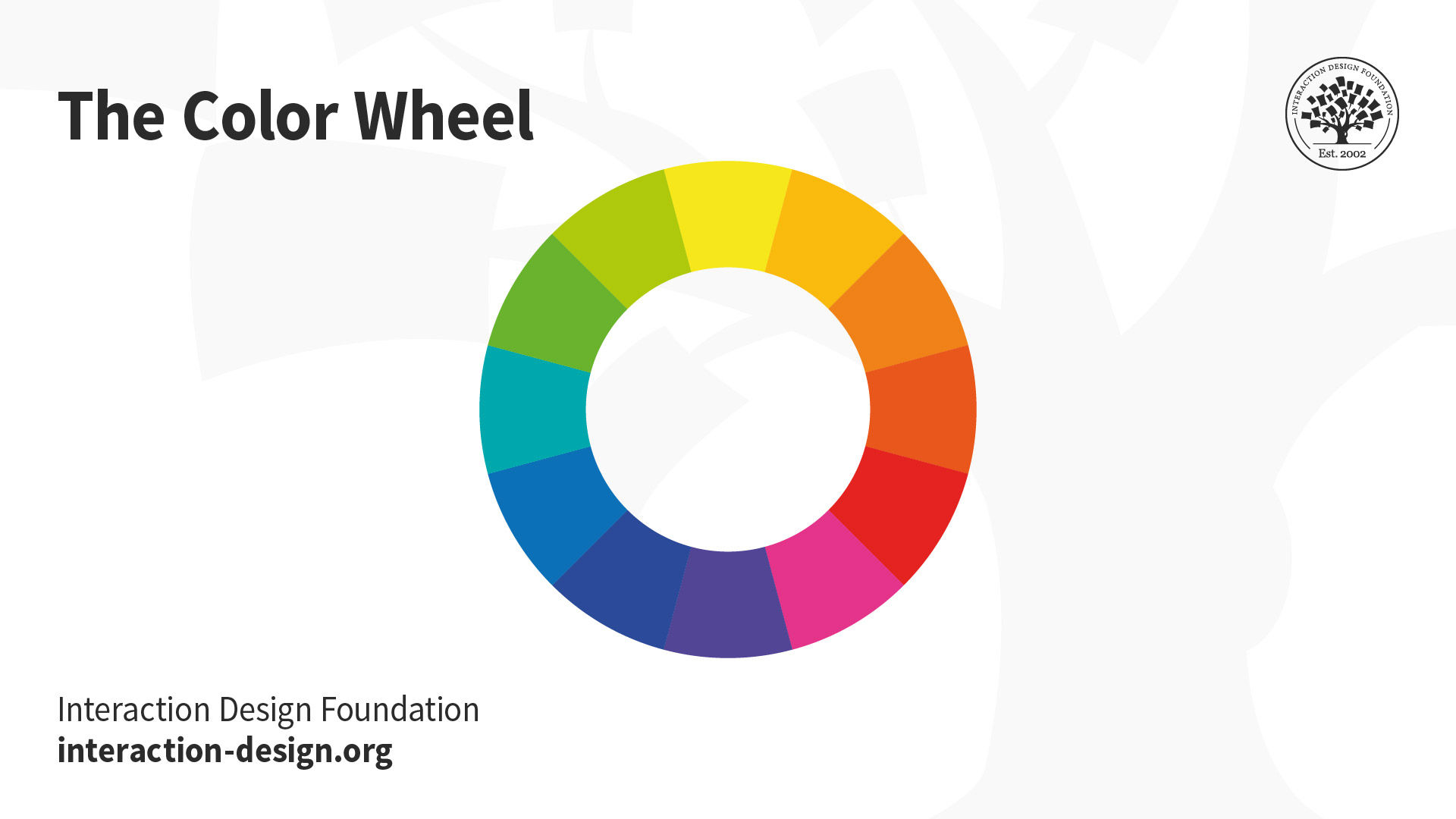
The relationship between colors can be shown through use of the color wheel.
The color wheel shows links between different colors based on the red, yellow, and blue content of each color. It was first developed by Sir Isaac Newton in 1666.
![]()
Author/Copyright holder: Maximkaaa. Copyright terms and licence: Public Domain
The color wheel’s most useful and most commonly used variant is shown in the image above, which includes red, red-orange, orange, orange-yellow, yellow, yellow-green, green, green-blue, blue, blue-purple, purple, and purple-red combinations. (Stone, 2008).
Bleicher (2011) stated that the color wheel can be categorized into three main types of colors based on the combination of base colors used to create the final color, as follows:
Primary colors - yellow, red, and blue. These are basic colors that cannot be broken down into any simpler colors.
Secondary colors - these are created by mixing two primary colors. The secondary colors are orange, green, and purple. Mixing yellow and red creates orange; mixing blue and yellow creates green, and mixing blue and red creates purple.
Intermediate or tertiary colors are created by mixing both primary and secondary colors to form a hybrid, such as yellow-orange, red-orange, red-purple, blue-purple, blue-green, and yellow-green. On a larger color wheel than the one shown above, a mix between intermediate, secondary, and primary colors would create quaternary colors.
A thorough understanding of the color wheel and the relationship between colors enables designers to understand color better and know how to choose colors for their designs. We’ll come to this shortly.
Achieving Harmony in Color
Colors should be chosen to deliver an enhanced aesthetic appeal and a better user experience. That means it’s a good idea to think about what color scheme you will use at the start of the design process. The way that colors are combined can either add to the look and feel or detract from it.
![]()
Author/Copyright holder: Unknown. Copyright terms and licence: Unknown
According to Bleicher (2011), there are five main color schemes (and some combinations and variants of these schemes) that allow designers to achieve harmony in their designs:
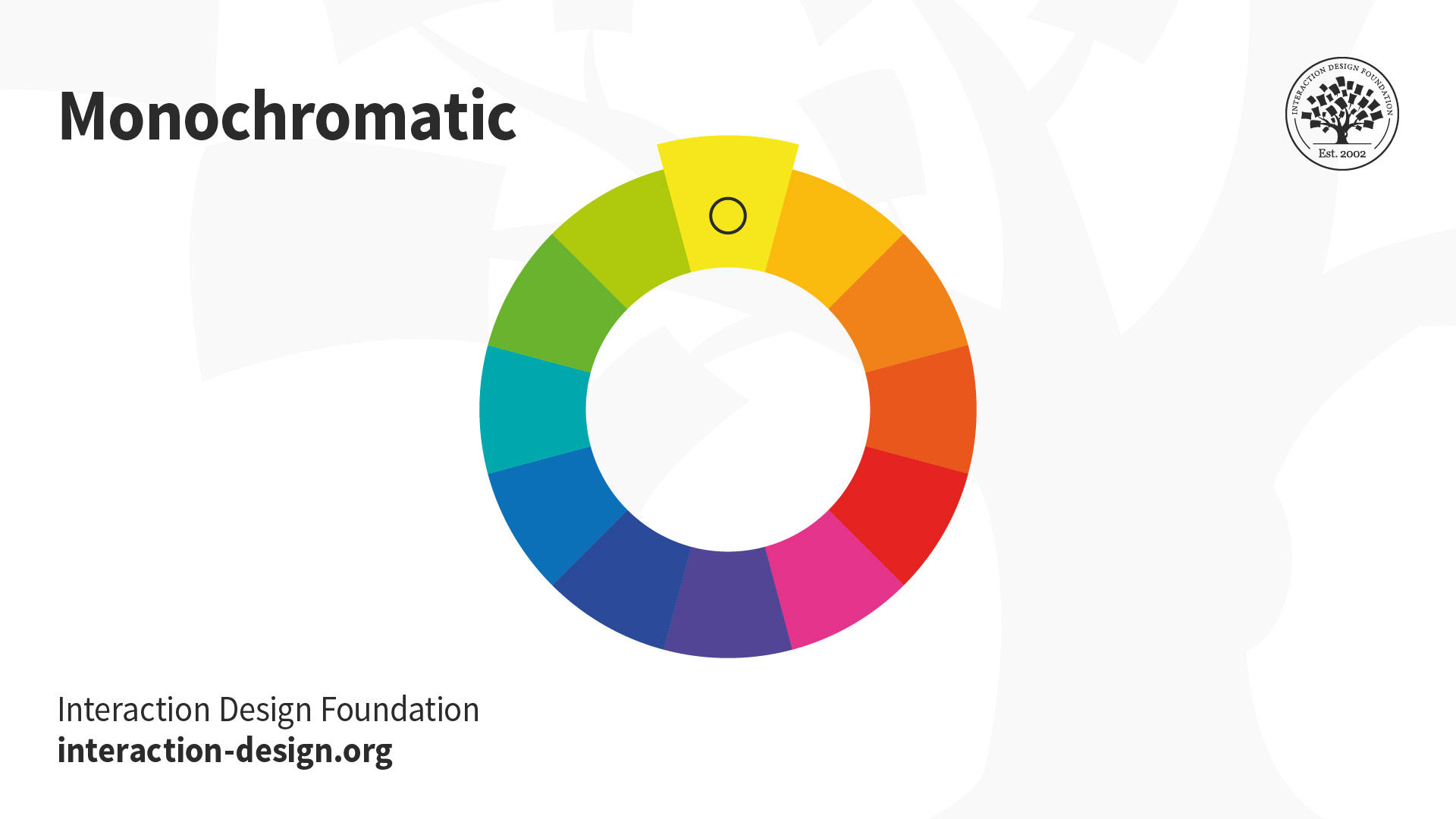
Monochromatic Scheme
The monochromatic scheme is based on the colors created from different tints (created by adding black or white to the original color), tones, and shades of one hue. In theory, it’s the simplest of all the schemes. A monochromatic scheme is commonly used in minimal designs because one hue should result in a less distracting layout.
On the other hand, this scheme means that you cannot use multiple colors to help with visualizing information in the User Interface (UI). That is the only price of simplicity.
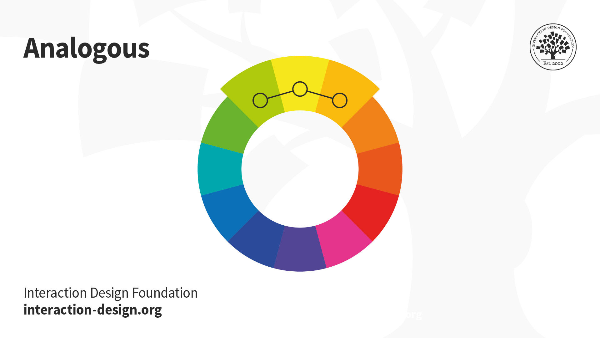
Analogous Color Scheme
The analogous scheme is based on three colors located next to each other on the color wheel (e.g., red, red-orange, and red-violet). This scheme can easily be found in nature – just think of trees in the autumn as the leaves change color.
There is a variant on this scheme, the “high-key” analogous color scheme. It’s achieved by mixing your analogous shades with white. This version is commonly found in impressionist art – particularly early impressionist art. The effect achieved is one where the colors seem to “shimmer” and “blur” into each other – when viewed from a distance, it can create the illusion that only a single color is in use.
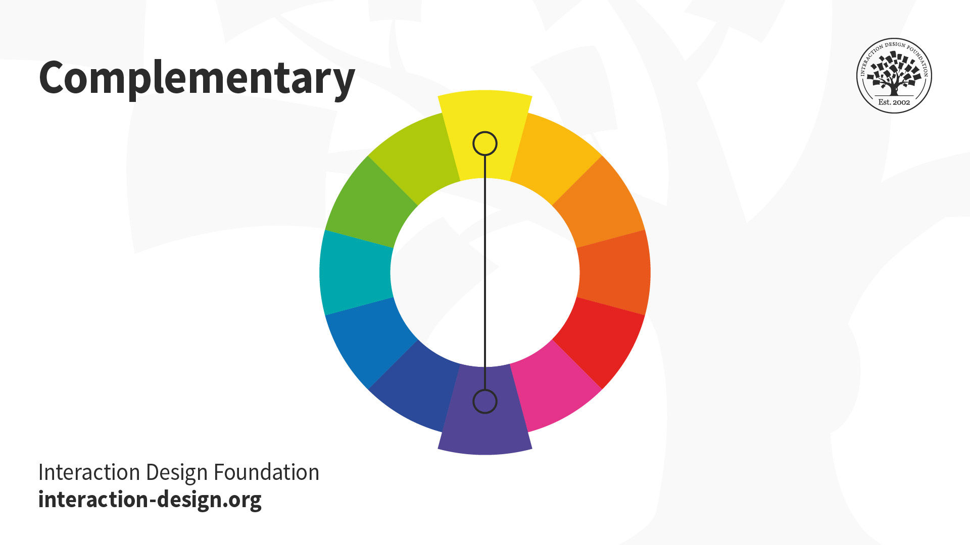
Complementary Schemes
Complementary color schemes use one (or more) pairs of colors that, when combined, “cancel each other out”. For example, when you combine the two colors, they produce white or black (or something very similar from the gray-scale). For that reason, this scheme is also known as the “opposite color” scheme.
When you put two complementary colors next to each other, they show the greatest contrast. In modern color theory, the pairs are red/cyan, green/magenta, and blue/yellow.
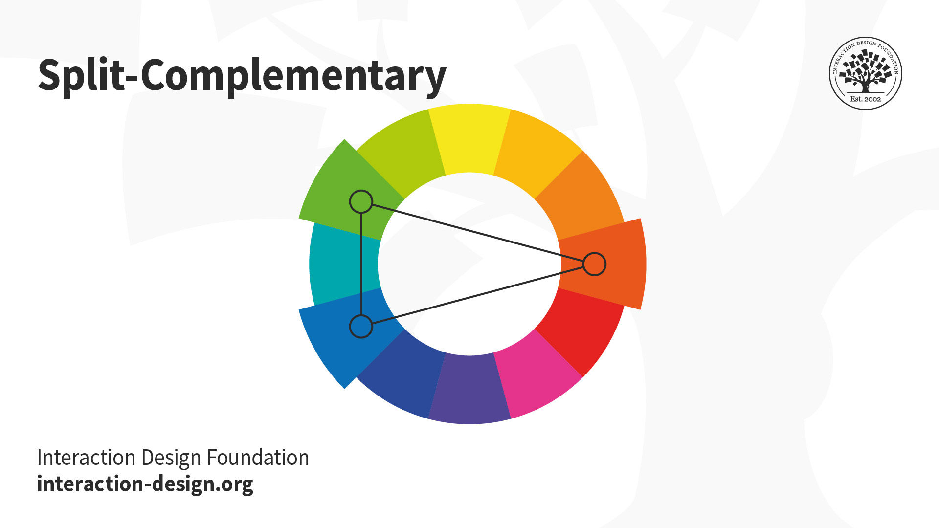
Split-Complementary (occasionally “Compound Harmony”) Scheme
This is a combination of using the complementary color scheme and the analogous color scheme. In essence, complementary colors are chosen and then the colors on either side of them on the color wheel are also used in the design. It’s considered to soften the impact of a complementary color scheme, which can, in some situations, be too bold or too harsh on the viewer’s eye.
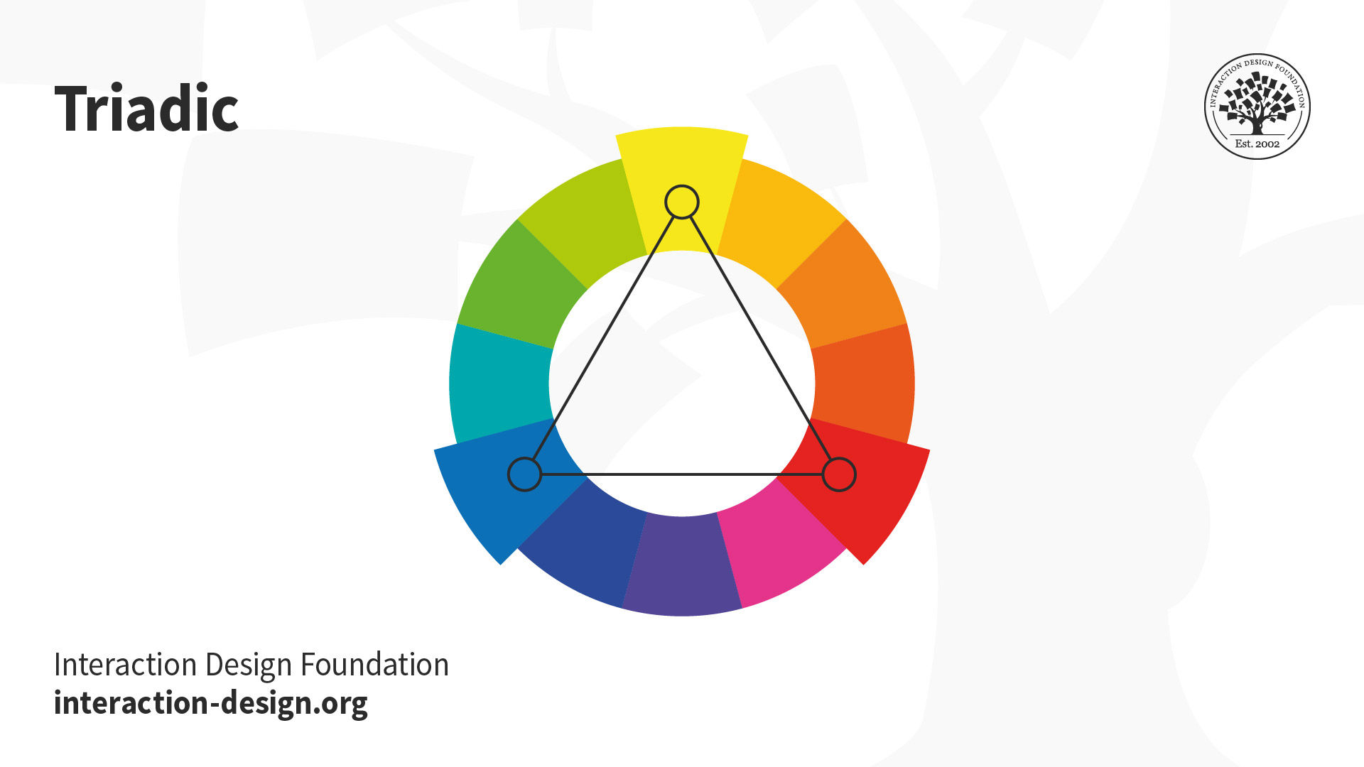
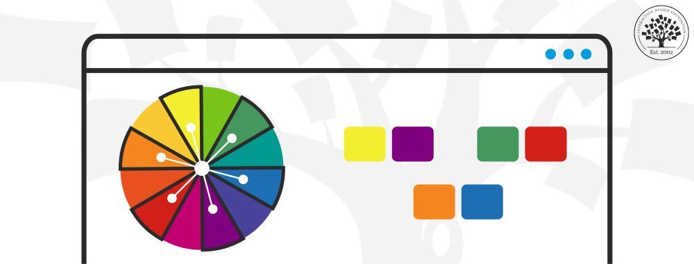
Triadic
The triadic scheme is based on using three colors at equal distances from each other on the color wheel. The easiest way to find a triadic scheme is to put an equilateral triangle on the wheel so that each corner touches one color. The three colors will be exactly 120° from each other.
These schemes are considered to be vibrant (even when the hues themselves are not) – they keep the harmony but deliver a high level of visual contrast. You can find triadic schemes in a lot of art as it’s easier to deliver a pleasing visual result with a triadic scheme than when using a complementary scheme.
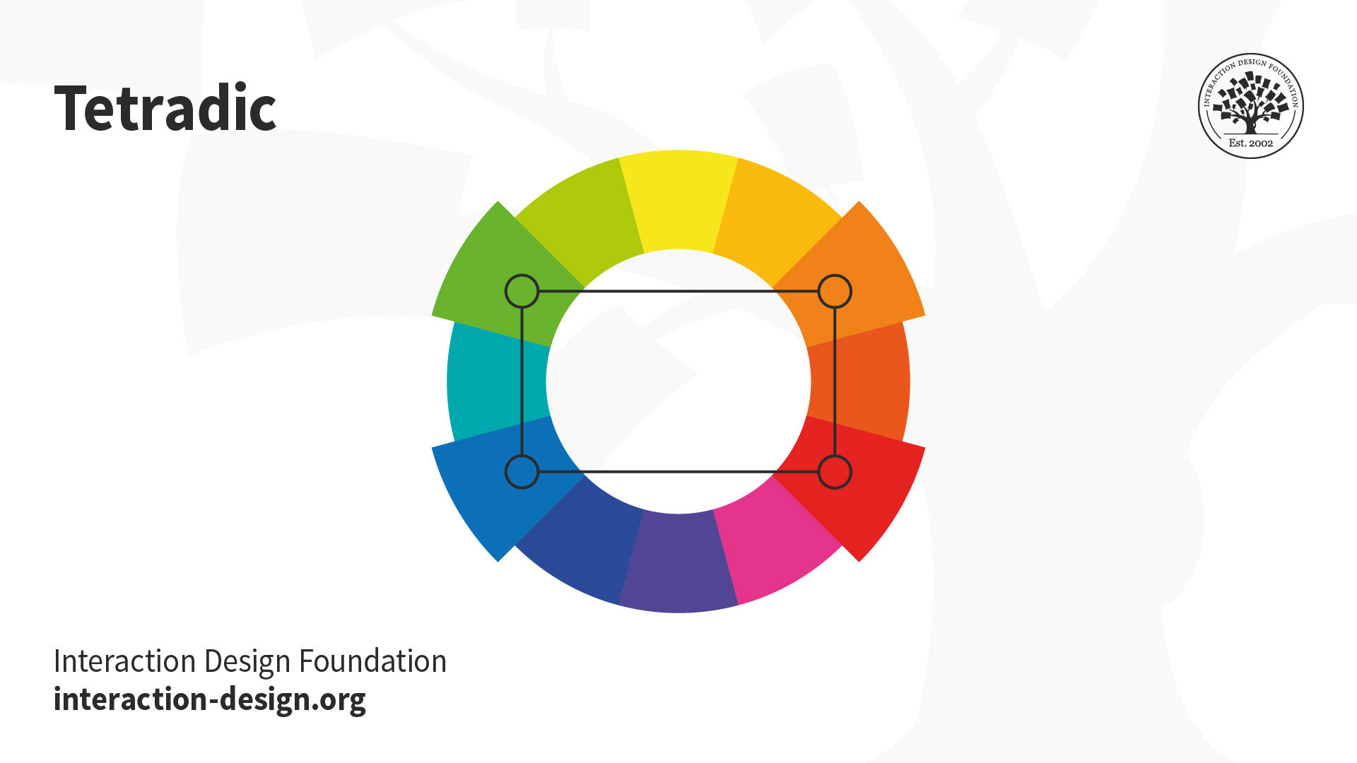
Tetradic
Tetradic schemes utilize two sets of complementary pairs: four colors. These can create very interesting visual experiences, but they are hard to keep in balance. Why? It’s because one color of a tetradic scheme needs to dominate the other colors without completely overwhelming them. An equal amount of each color often leads to a very awkward look, the last thing you want your users to see.
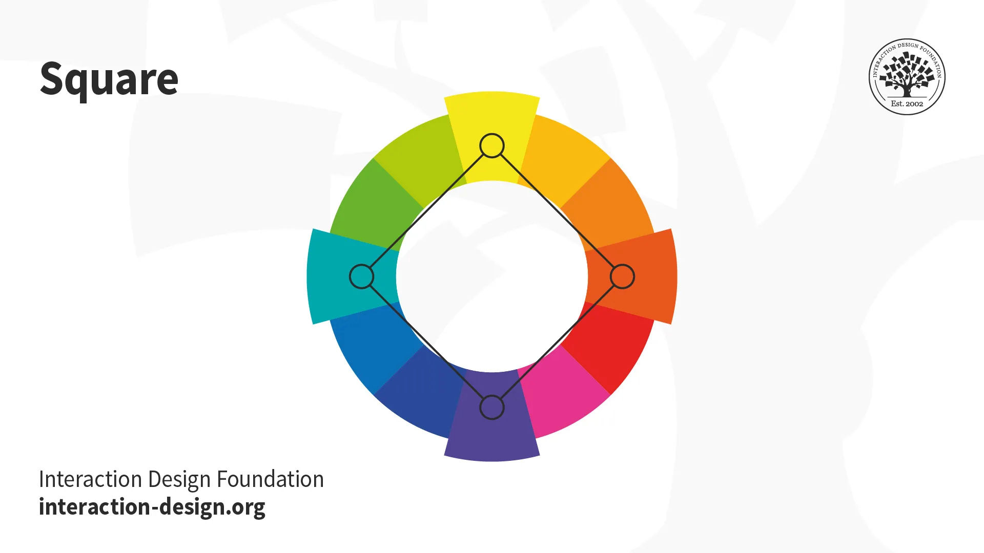
Square (A Variant of Tetradic)
The square scheme is a variant of the tetradic scheme. Instead of choosing two complementary pairs, you place a square on the color wheel and choose the colors that lie on its corners. Therefore, you’ll find four colors that are evenly spaced at 90° from each other. Unlike the tetradic color scheme, this approach often works best when all the colors are evenly used throughout the design.
Color Temperature
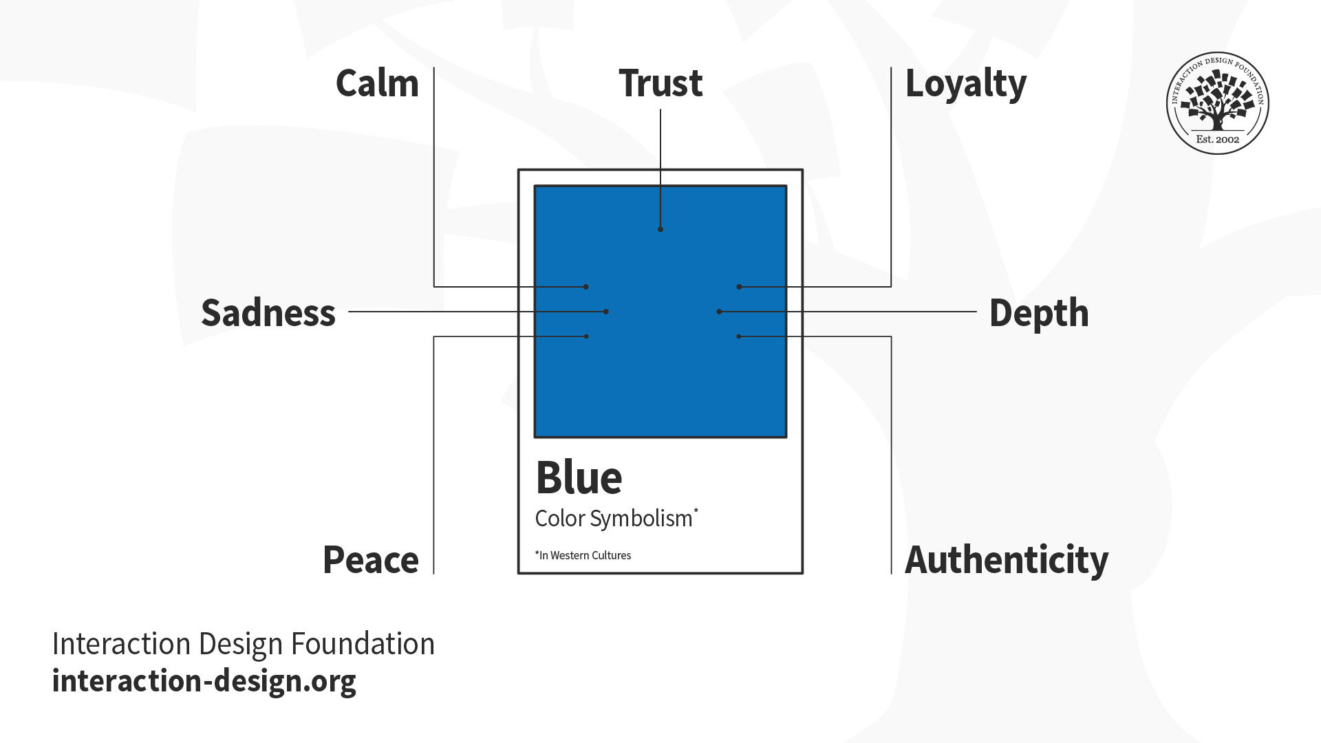
Colors can be used to convey emotive content as well as assist with the look and feel of your website. We’re talking about moving people now, evoking passions and feelings in our users. It’s worth noting at this point that people’s culture, gender, experiences, etc. will also affect the way that colors resonate with them and that user research is a better indicator of emotional response to color than the following guidelines based on the color wheel. For instance, did you know that, in China, red is common because it represents happiness and prosperity, but white is considered funerary or representing misfortune? Also, Chinese culture has a unique color – qing – which is a sort of bluish-green gray, or “grue”. In Greece, yellow conveys notions of sadness, while red conveys such notions in South Africa. Color is a big issue in how people from different parts of the world will interpret your design. A little research goes a long way.
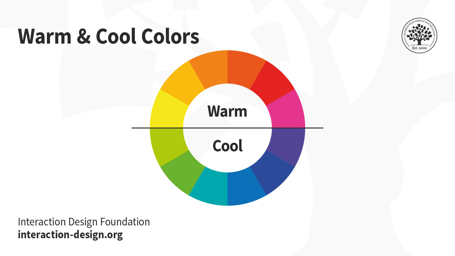
However, if you want to follow the color wheel approach, there are three indicators of color temperature: “warm” and “cool” and “neutral”:
Warm colors–These are colors located on the half of the color wheel that includes yellow, orange, and red. These colors are said to reflect feelings such as passion, power, happiness, and energy.
Cool colors– These are colors located on the other side of the color wheel, including green, blue, and purple. Cool colors are said to reflect calmness, meditation, and soothing impressions.
Neutral Colors – These are not said to reflect any particular emotions. These colors include gray, brown, white, and black.
Your choice of color categories will depend on what you are trying to achieve with your website. You should always, wherever possible, test your color palettes with your users to be sure that the choices you have made reflect their realities. It’s almost always easier to set and test a color palette early in the development process than at the end. Apart from anything else, it can save you valuable time.
The Take Away
Color is clearly an important part of a design’s aesthetic appeal. Basing your color palette on one of the existing color schemes can make it easier to strike the right balance from the start.
The Color Wheel is a fundamental tool, created by Sir Isaac Newton in 1666. In it, we find:
We should aim to fine-tune our choice of colors to create maximum harmony, considering the following at the same time in order to pick the most appropriate scheme:
Color Temperature is another vital consideration; it’s the part that can strike chords in people and make them passionate about our work. You should always do user testing of color schemes, if possible, and ideally at the start of the design process. Also, always keep in mind that colors have many cultural connotations, so make sure that you’re aware of them!
On the other hand, remember that you should not convey meaning only with color. About 8% of people – mostly men –are color blind, and color is not always accessible. Even so, color is a tool that can enhance the other elements of your design. Consider it a large ingredient that can bring your work to life and engage your users, making them care more about your product, service or message.
Where To Learn More
Reference
Hero Image: Author/Copyright holder: George Field. Copyright terms and licence: Public Domain.