Your constantly-updated definition of Illusions in UX/UI Design and
collection of videos and articles. Be a conversation starter: Share this page and inspire others!
288shares
What are Illusions in UX/UI Design?
Illusions—namely optical or visual illusions—are perceptual phenomena that influence the mind to perceive something either that is not there or differently from how it is. They occur due to how the brain processes visual information, often via Gestalt laws. Designers use illusions to guide users' attention, create a sense of depth and hierarchy and ultimately enhance the overall user experience.
Author and Human-Computer Interaction Expert, Alan Dix explains sensation and perception—axes around which reality revolves for the human mind.
ShowHide
video transcript
Transcript loading…
How do Designers Use Illusions to Help Users?
In user experience (UX) design and particularly user interface (UI) design, designers use techniques to leverage users’ perceptions and create engaging and memorable experiences. Designers apply principles from psychology and visual perception, especially the Gestalt laws or principles—also common in graphic design. When designers do this, they can influence how the users of their digital products perceive and interact with these interfaces. Optical illusions involve various visual cues and tricks to create effects that captivate and engage users on web pages, mobile apps and more.
Designers typically incorporate illusions into their design work with several purposes in mind. They can guide users' attention to desired features, enhance visual hierarchy, provide visual feedback and communicate information in ways that can grab users’ attention more profoundly. When designers work illusions appropriately into their designs, they can create interfaces that aren’t just functional but visually delightful and immersive, too.
Designers frequently tend to rely on Gestalt laws to help with illusions. Gestalt psychology has a focus on how humans perceive—and interpret or make sense of—visual information as a whole rather than as individual elements. Gestalt psychology puts emphasis on the idea that the mind organizes visual stimuli into meaningful patterns and structures—and does so automatically. So, when designers create objects in visual design, they can cast powerful messages to their target audience at a glance. What’s more, when designers work with Gestalt laws such as closure, figure-ground, proximity, similarity and continuity, they can strengthen their brand’s presence—plus build trust with the users of their products or services. Such optical tricks are more than the sum of their parts.
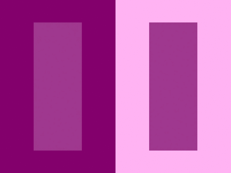
The Gestalt law of figure-ground in three forms, from left to right: stable (it’s clear what’s in the foreground), reversible (foreground and background are interchangeable) and ambiguous (elements can seem to be both figure and ground at the same time, leaving it up to the viewer how to approach the image).
What’s more, designers can use illusions to enhance visual feedback and give a sense—or a greater sense—of interactivity. For example, they can incorporate animations that simulate movement or depth. In this way, designers can create the illusion of elements responding to user feedback and actions, and so enhance the overall user experience.
Here are some ways Designers apply illusions in UX design:
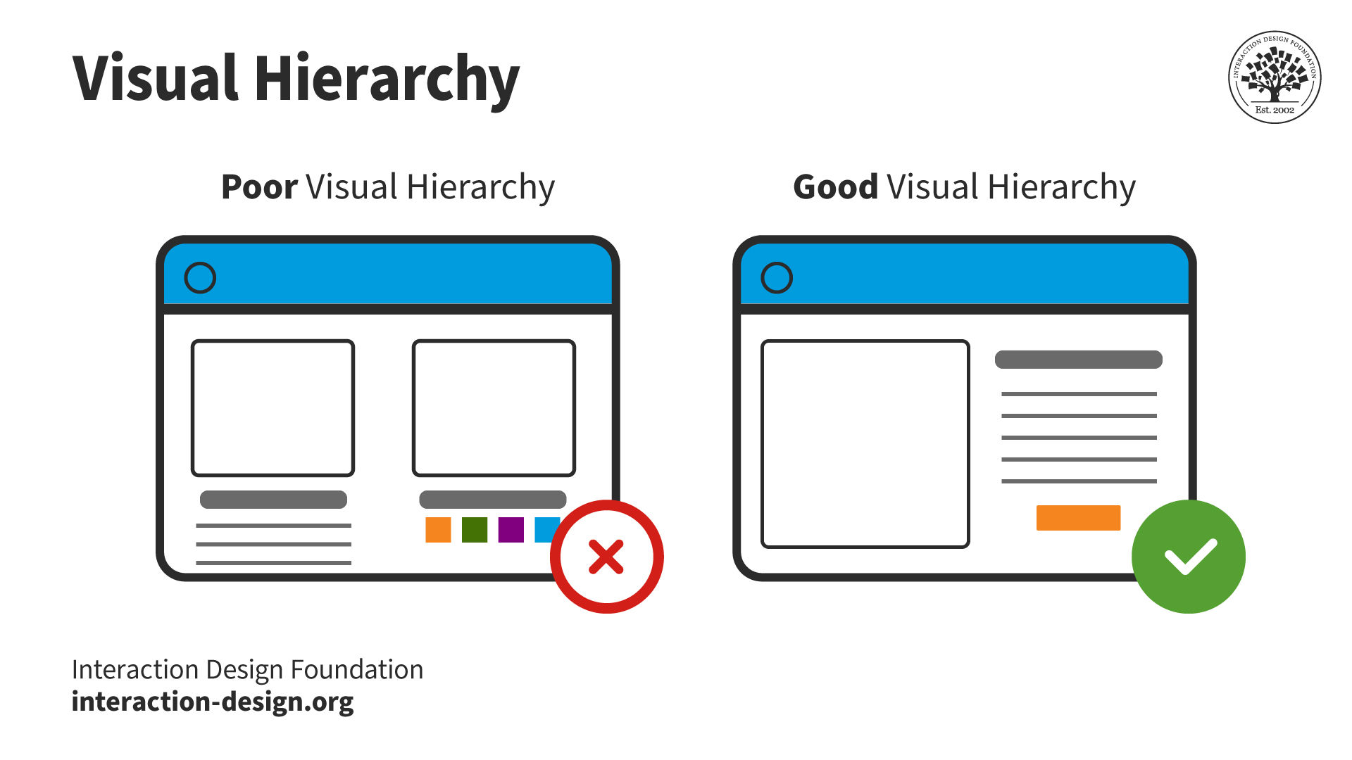
1.Visual Hierarchy
Designers use size, color, contrast and positioning to create a visual hierarchy that guides users' attention to the most important elements on a page, as explained in this video.
ShowHide
video transcript
Transcript loading…
For design projects, it’s important to establish a strong hierarchy and information architecture so users can recognize at a glance what they need to do to solve their problems and achieve desired goals.
When designers create products, they need to leverage visual design principles to establish a clear hierarchy, so users know what’s a priority and what to do.
When they create the illusion of depth through shadows, gradients and overlapping elements, designers can make the interface more engaging and easier to navigate. For example, raised elements with shadows make great signifiers for interactive buttons. Meanwhile, sunken or hollow elements can indicate input fields—particularly user-friendly and handy for mobile devices. Also, shadow effects such as inner shadow can give the illusion of response to a finger pressing on a screen.
Note the shadowing around the button on the right, and how it lends itself more to the suggestion of pushing.
Animated transitions, micro-interactions and parallax scrolling are items that can provide a sense of movement and depth—and can make the interface more dynamic and engaging. What’s more, they can provide much-needed feedback to users. When designers get to work with techniques like the phi phenomenon or the wagon-wheel effect, they can make the illusion of movement—and that’s something that can be particularly effective to guide users' attention—or give feedback on certain actions. For example, a loading animation that gives the illusion of continuous rotation can make users get a sense of progress, and this holds true even if the actual loading time is longer.
The Phi phenomenon gives the illusion of movement—in this loading spinner, for example—to inform users of system feedback.
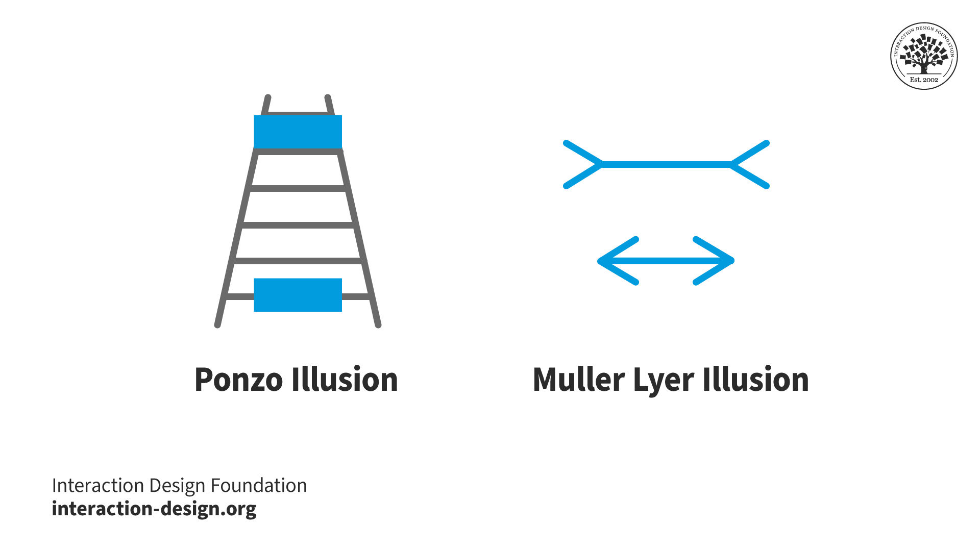
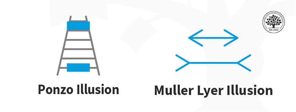
The perception of size and proportions isn’t always reliable. Designers can apply optical illusions to manipulate these perceptions in user interfaces. And if they bring things like the Ponzo illusion or the Muller-Lyer illusion into the picture, they can make elements look larger or smaller than they are in reality. That’s something that can put emphasis on certain elements, give a good sense of balance—or guide users' attention to specific areas on the interface. For instance, when designers use converging lines to create the Ponzo illusion, they can make an element appear larger than it really is—and that’s due to the perceived distance.
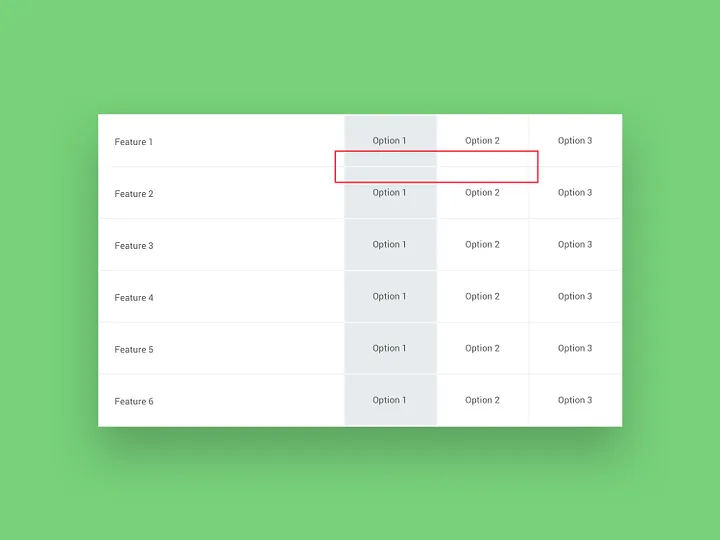
Designers can use these types of illusions to guide users’ eyes to specific areas of the interface and establish hierarchy, depth and perspective. For example, in the illusion on the right, the horizontal lines are the same length.
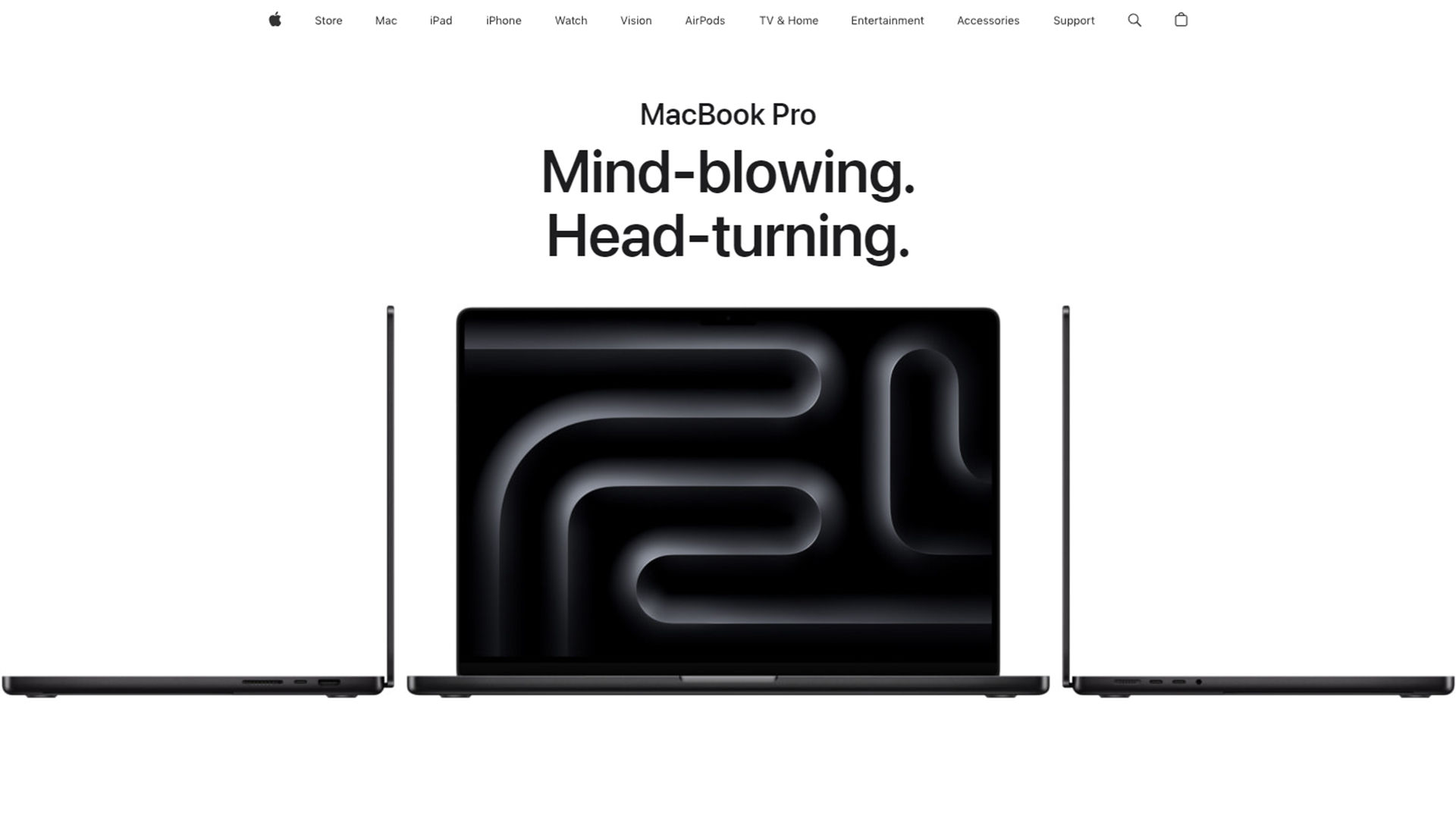
When designers strategically use negative space, they can create the illusion of simplicity, elegance and clarity. This lets users really focus on the interface’s essential elements. The effect can help lighten the users’ cognitive load and improve their overall experience. What’s more, when designers cast a sense of simplicity and minimalism in user interfaces, they can signal a high-quality brand image—doing that through an uncluttered, clean and elegant look. For instance, when they use enough white space around elements, they can infuse their design with a sense of elegance and simplicity. This lets users really focus on the essential content.
Apple's clean, lean look leverages white space to help achieve its iconic appearance.
When designers manipulate color and contrast, they can influence users' perceptions, draw attention to specific elements and create visual interest. Through their skillful use of color theory, designers can make helpful design decisions—decisions based on:
a. Color Gradients:
Apply color gradients to carry a sense of depth and dimension—and so give a boost to the interface’s visual appeal.
b. Contrast:
Use contrast strategically to put emphasis on important elements and give a sense of depth within the design.
An example of simultaneous contrast—note how the moving rectangles seem to be different colors when they move over their respective backgrounds.
To get the power of optical illusions working so they can create visually engaging interfaces, designers should:
1. Understand the Principles of Perception
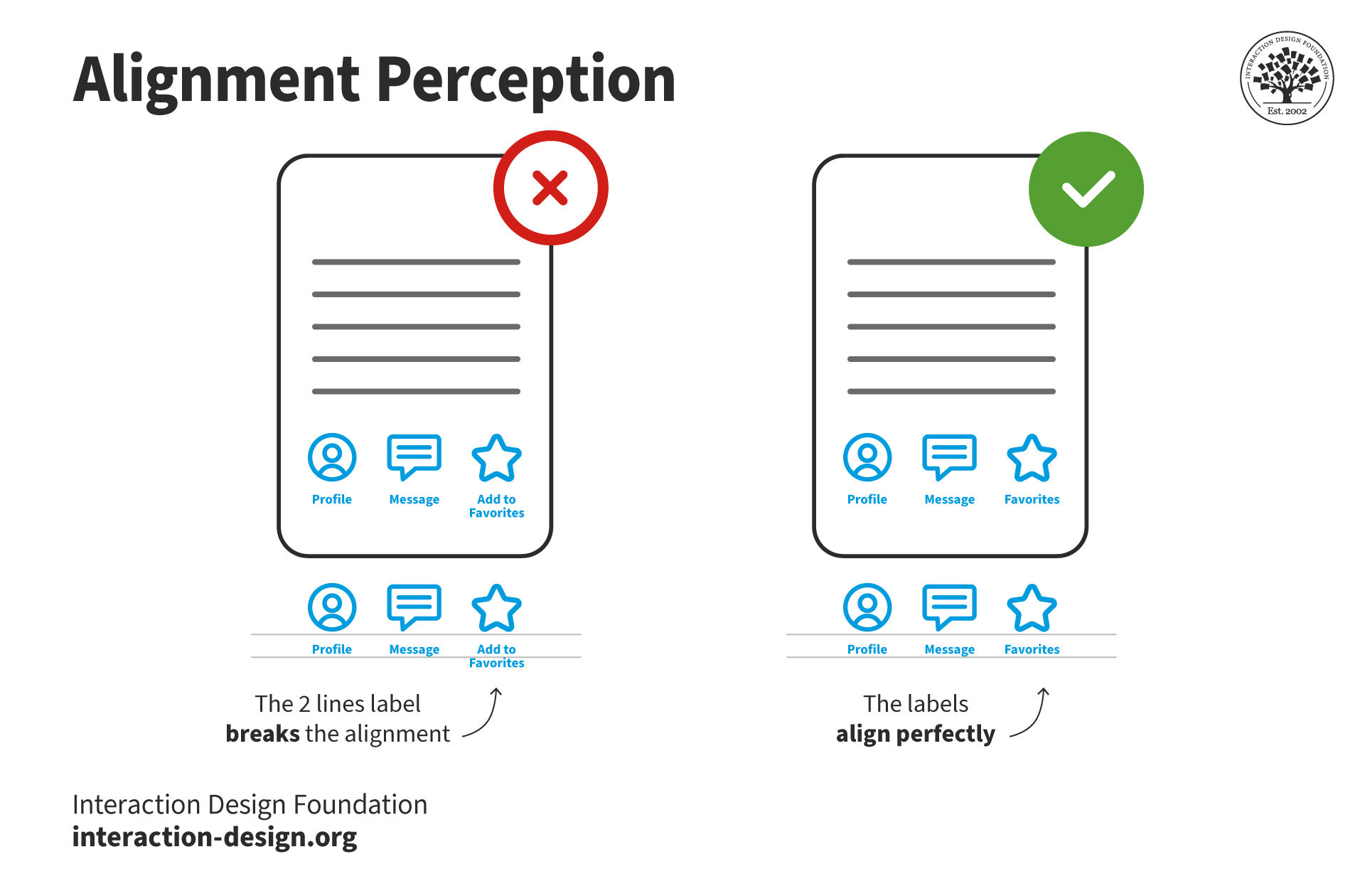
A strong understanding of the principles of perception—for instance, Gestalt psychology—is vital. So, designers should add concepts like visual hierarchy, proximity, similarity and closure to their design tools. That’s because of how these principles play such a crucial role—and a time-tested one—when it comes to creating illusions that are meaningful and have impact. It’s really important to appreciate the subtle points of alignment—and how users’ eyes are used to seeing certain patterns and forms on screens, too.
Note the subtle difference in label alignment—a small point, but important for users’ perception.
When designers work optical illusions into their designs, it’s a must to use them with a clear intention. So, think about what the specific goals and objectives of the interface are—and design the illusions according to those. Don’t use illusions for the sake of visual flair on its own. Focus—instead—on how they can enhance the user experience, and so get the desired message across to users. Make sure that the effects really do run in line with the user's goals and improve how they make sense of and understand the interface. Illusions shouldn’t confuse or mislead users—designers need to earn their users’ trust, fast.
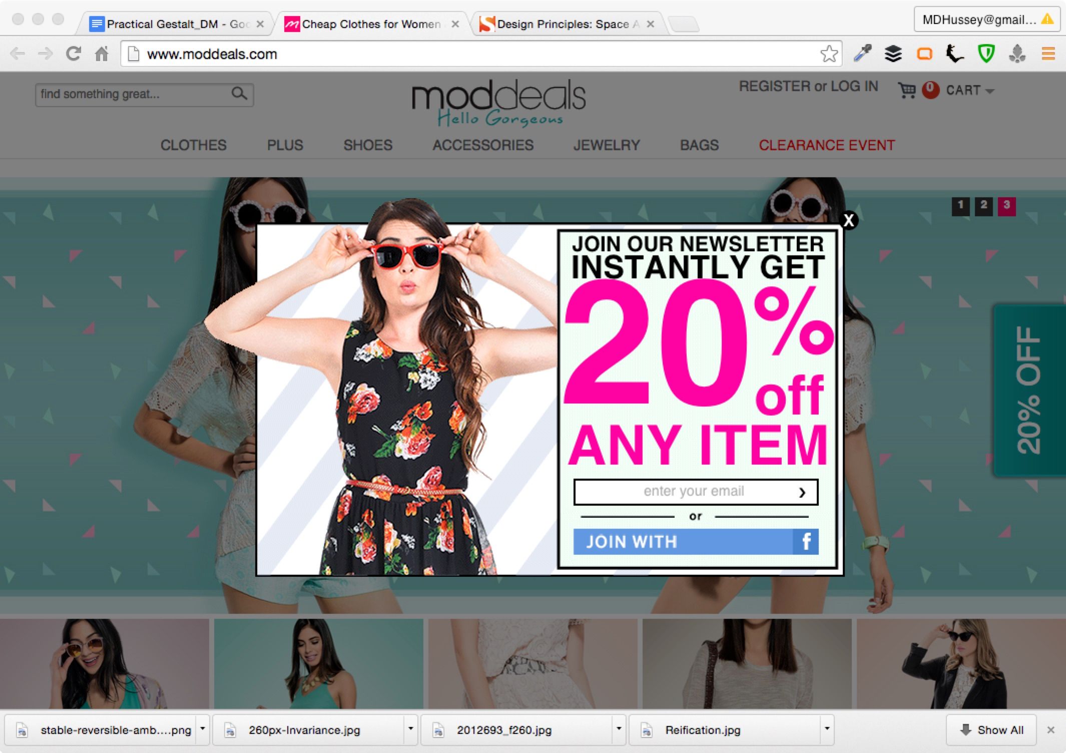
Moddeals’ pattern here leverages the Gestalt figure-ground relationship. The newsletter ad appears, and the rest of the page darkens, going into the background—which the user can still scroll.
While optical illusions can be visually engaging, enticing and helpful, it’s crucial to strike a balance between aesthetics and usability. Be totally sure that the illusions don’t get in the way of usability—or even confuse users. Another point—and one that’s extremely important here—is to design with accessibility firmly in mind—so be sure to think about factors like color contrast and readability. That’s how to make sure that the illusions can actually be accessible—to all users. Usability testing is especially helpful here. It can show up many pain points, and so can help with boosting user-centered design.
It’s also a vital thing to do to keep the effects subtle. So, don’t overwhelm users with excessive illusions—or ones that are distracting. Another point here is to always remember to stick to those established design principles and patterns. For example, most users may be used to shadow effects as feedback to screen presses. It’s a vital point to enhance the user experience without overshadowing the content or functionality of the interface.
Mach bands—there aren’t really any shadows in the above; it’s an illusion.
Now it’s time to validate how effective the illusions are—through user testing—and to get in feedback to refine and improve the design. Users' perceptions and interpretations may vary, and by quite a bit. So, it’s a crucial point for designers to collect insights from a diverse user base. And—as with any design element—be sure to test and iterate on optical illusions. Do solid user testing to get feedback on how users perceive and interact with these. Then, make adjustments based on those insights—to be sure that what users see effectively serves the intended purpose.
In this example of the Hermann grid, viewers can note how phantom grey dots show up at the white intersections whenever they look at the pictured rectangles—but vanish when they look directly at those intersections.
Risks and Considerations for Illusions in UX Design
Illusions can indeed be a powerful tool in UX design. Even so, there are some essential points to keep in mind:
1. Misinterpretation: Illusions can be subjective—and users may interpret them differently. Plus, another very important thing to be mindful of is how the users’ culture can influence how they perceive—or don’t perceive—intended effects. So, designers should do their user research—and thoroughly—to understand the target audience and how users interact with visual design elements. It’s vital for users to quickly “get” the intended message or action and sense the helpfulness it’s supposed to convey.
2. Cognitive load: Complex or overly stimulating illusions can drive up the level of cognitive load and keep users back from being able to understand and interact with the interface. So, think carefully about the complexity and what the impact of illusions is on user cognition. It’s also a vital point to keep the effects well in line with the brand message. So, do UX research early and use methods like card sorting, focus groups—among others—to tailor the right effects to users’ needs.
3. Compatibility: Illusions may not be compatible with all devices, platforms or screen sizes—so, make sure that the illusion functions and scales appropriately across different devices and platforms. That’s how to see that it will provide a consistent user experience. Apply responsive design to help provide users with a seamless experience every time.
4. Accessibility: Accessible design is serious business—and often a mandatory consideration by law—and here especially deserves a second mention. Some users with visual impairments or cognitive disabilities may not perceive or interpret illusions in the same way as others. For example, if the visual effects rely on colors and contrast, it’ll very likely exclude users with eyesight disabilities—like color blindness. So, do think about using alternative means of communication or interaction to make sure that inclusivity is indeed very much a part of your design.
The Munker-White illusion—clearly laid-out information where the grey lines of the grid appear darker in front of a light background and light in front of a darker background.
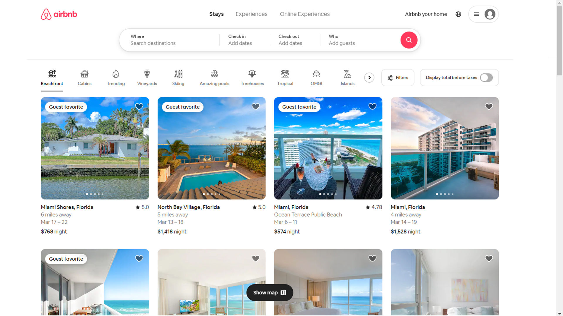
5. The illusion of completeness: Especially when designers create for mobile screens, it’s important to cue users that important information may lie below the fold. So, designers should be mindful if they decide to apply huge hero images or videos that can get in the way and deceive users that there’s nothing else below the apparent bottom or off to the side of the screen. If they leave clear hints such as the tops of elements or apply carousels, they can clue their users up on the full extent of the screen real estate on offer.
Airbnb’s site gives a clear hint that there are more than four properties here—via the scroll bar.
6. The illusion of control: One aspect of illusions in UX design is the illusion of control—which refers to users' perception of having more control or influence over an interface than they actually do. So, it’s a vital thing for designers to remember to be very careful about this—and that they don’t mislead users into thinking that they’ve got more control or options than they actually have.
It’s important to keep that illusion of control well in check—and to make sure that the interface does indeed give feedback that’s clear and accurate. What’s more, be sure that it clearly states limitations or constraints—and that it keeps a very high level of transparency about what the user's actual level of control is. When designers set realistic expectations—and give users clear guidance—they can keep users from feeling frustrated or, worse, deceived.
7. The illusion of (false) help: Beware of tricking users with features like those found in dark patterns. For example, if users of an app need to exit quickly, show empathy. Don’t try to deceive them into opting into something—just help them on their way in their user journeys.
Overall, illusions in UX design can elevate user experiences, engage users' attention and create memorable interactions for them. If designers work principles from psychology and visual perception properly into their designs, they can strategically guide users’ attention—and enhance usability and communicate information effectively. These tricks are items—or tools—that should treat users well, and help them.
What are examples of common illusions that designers use?
Designers frequently use illusions to boost user experience, manipulate perception and create visuals that are memorable. Here are some common illusions that feature in design:
Gestalt principles: These principles—like similarity, proximity, closure and continuity—play with how people tend to see objects as part of a greater whole. For example, the use of closure—the law of closure—lets viewers fill in incomplete shapes, and so engages them more deeply with the design.
Isomorphic correspondence: Familiar shapes and symbols help get information across quickly—and intuitively. Designers might use icons that mimic real-world objects to help users understand functionality faster.
The Müller-Lyer illusion: Here, two lines that are the same length seem to be different lengths—and that’s because of the orientation of the arrowheads at their ends. It’s useful to subtly influence the perception of space and size.
The Kanizsa triangle: It’s a famous example of using negative space to create an illusion—in this case of an object that doesn't really exist. A triangle appears, thanks to the arrangement of strategically placed circular forms at its “points.” Designers can use this illusion to create interest and give a sense of depth in a design.
Motion parallax: In web and app design, different elements move at different speeds during scrolling—so creating a depth illusion. This technique often turns up in parallax scrolling websites to add a layer of immersion.
Color illusions: Designers can manipulate colors to make objects seem closer, further away—or even change size. Warm colors tend to advance—meanwhile, cool colors recede. That’s a factor that influences how users perceive elements in relation to each other.
Ambiguous images: Designs that users can interpret in more than one way can be captivating to look at—and the classic "vase or faces" illusion is an example here—something that encourages users to look deeper and engage more with the content.
How do illusions contribute to the aesthetic appeal of a design?
Illusions do this since they manipulate perception, add depth and create intrigue. They engage viewers—and encourage interaction and closer examination. Techniques like the use of Gestalt principles, color illusions and ambiguous images make designs more dynamic and memorable. Illusions can transform flat visuals into really immersive experiences—and it’s something that makes them vital tools for grabbing and retaining user attention.
How do cultural differences affect the perception of illusions in design?
Cultural differences deeply influence how users perceive illusions in design. That’s because of variations in visual processing, symbolism and contextual understanding. Cultures shape the way people interpret images, colors and spatial relationships. And it’s a factor that leads to diverse reactions to the same design elements. For example, the direction of reading (left-to-right versus right-to-left) can affect the way users understand visual sequences. That’s something that can alter their perception of motion or progress in an illusion. Color symbolism varies greatly across cultures—where a color that represents happiness in one culture might well symbolize mourning in another. Another point is that certain shapes and patterns may carry specific meanings or associations in different cultures, and influence how an illusion is received. That’s a variation that calls for designers to take an approach that’s really culturally aware. And that’s especially so whenever they’re creating designs for a global audience. From understanding and respecting these differences, designers can create more inclusive and effective designs—ones that resonate with a wider range of viewers. They can make sure the intended message or effect of an illusion really gets successfully communicated across cultural boundaries.
Watch Author and Expert in Human-Computer Interaction, Alan Dix explain how to design with culture in mind:
ShowHide
video transcript
Transcript loading…
Video copyright info
Copyright holder: Tommi Vainikainen _ Appearance time: 2:56 - 3:03 Copyright license and terms: Public domain, via Wikimedia Commons
Copyright holder: Maik Meid _ Appearance time: 2:56 - 3:03 Copyright license and terms: CC BY 2.0, via Wikimedia Commons _ Link: https://commons.wikimedia.org/wiki/File:Norge_93.jpg
Copyright holder: Paju _ Appearance time: 2:56 - 3:03 Copyright license and terms: CC BY-SA 3.0, via Wikimedia Commons _ Link: https://commons.wikimedia.org/wiki/File:Kaivokselan_kaivokset_kyltti.jpg
Copyright holder: Tiia Monto _ Appearance time: 2:56 - 3:03 Copyright license and terms: CC BY-SA 3.0, via Wikimedia Commons _ Link: https://commons.wikimedia.org/wiki/File:Turku_-_harbour_sign.jpg
Can the use of illusions make interfaces more intuitive?
Yes, the use of illusions can make interfaces more intuitive. By playing with visual perceptions, designers can guide users naturally through a layout, emphasize important elements and simplify complex information. For example, depth illusions can create a sense of hierarchy, and make it easier for users to navigate. Color and contrast illusions can highlight interactive components like buttons—so enhancing usability. What’s more, illusions like the Gestalt principles help users perceive the interface as organized and coherent, lightening cognitive load and making the experience more intuitive.
Watch Author, Designer and Educator, Mia Cinelli explain how the Gestalt principles work in design:
ShowHide
video transcript
Transcript loading…
Can illusions be accessibility-friendly in design?
Yes, designers can create illusions that are accessibility-friendly. They need to carefully integrate these with the principles of inclusive design. From considering the needs of all users—including those with visual impairments, color blindness or other disabilities—designers can use illusions to boost usability and not compromise accessibility. They can make sure there’s enough contrast, use texture instead of color alone for differentiation and avoid designs that rely on fine-grained color distinctions to make illusions accessible. Another thing is that designers provide alternative text descriptions—and make sure that interactive elements are easily navigable, with keyboard controls to help users.
Watch our topic video on accessibility to appreciate the need to design with accessibility in mind.
ShowHide
video transcript
Transcript loading…
How are emerging technologies like VR and AR utilizing illusions?
Emerging technologies like Virtual Reality (VR) and Augmented Reality (AR) actively use illusions to create immersive experiences. VR technology can be very exciting—and it immerses users in virtual environments that mimic real-life settings. Designers use depth and spatial illusions. For example, flight training simulations in VR convincingly recreate the experience of flying—and it’s something that lets pilots practice safely. AR technology overlays digital information onto the real world—and so it augments reality with digital enhancements. The IKEA Place app—for instance—lets users see how furniture would look in their homes by superimposing digital images onto their current environment. It creates a realistic view of the furniture for them, in their space. These technologies are items that really leverage the brain's perception to blend digital content with the physical world. They open new possibilities across various fields like gaming, education, healthcare and retail.
How do motion illusions work in digital interfaces?
Motion illusions in digital interfaces use animation and dynamic visual effects to influence user perception and behavior. For example, when a menu smoothly transitions onto the screen, it creates the illusion of spatial movement—and so guides the user's attention and improving navigation. For another example—think about the use of parallax scrolling. There, background images move slower than what’s in the foreground—something that creates an illusion of depth that makes the interface feel more immersive. These illusions don’t just enhance the aesthetic appeal of a design; they make interfaces more intuitive by visually indicating how to interact with them, too.
What tools and software do designers commonly use to create design illusions?
Designers use a variety of tools and software to make illusions happen in their design work—including Adobe Photoshop for detailed image manipulation and creating visual illusions, Adobe Illustrator for vector-based illusions that scale without losing quality, and After Effects for motion illusions in video and animation. What’s more, 3D modeling software like Blender and SketchUp can create depth and spatial illusions. Meanwhile, web development tools such as CSS and JavaScript libraries facilitate interactive and dynamic illusions in digital interfaces.
Watch our Master Class How To Build Your UX Toolbox with Chief Behavioral Scientist and CEO, The Team W, Inc., Susan Weinschenk and COO, The Team W, Inc., Guthrie Weinschenk for more on UX tools.
How do you test the effectiveness of illusions in design?
To test the effectiveness of design illusions, start by running usability tests where people interact with the design. Watch how they respond to the illusions. Use eye-tracking tools to see where they look—showing how illusions draw their attention. Ask for their thoughts—through surveys or interviews—to understand their experience. Try A/B testing by comparing versions with and without illusions to see which one performs better. Finally, look at data like time spent on the page and user actions to measure success.
What are the ethical considerations of using illusions in design?
When designers use illusions in their design work, it’s vital to keep ethical considerations like transparency, user consent and the avoidance of manipulation front of mind. Ethics are ultra-important to prove in good design—and, here, it's especially important to make sure that illusions don’t deceive users or lead them into making decisions they didn’t intend to. Designs should enhance user experience—without compromising clarity or fairness. They should certainly respect users' autonomy and trust.
Product Design Lead at Netflix, Nival Sheikh explains the dimension of ethics as it applies to artificial intelligence (AI).
ShowHide
video transcript
Transcript loading…
What are highly cited scientific articles on the subject of illusions?
This publication—by Michael Bach—gives a retrospective analysis of how visual illusions have been presented on the internet over a 15-year span. It highlights the evolution of technology and user behavior. The paper discusses the methodologies used to create interactive visual experiments online—with a focus on aspects such as wide accessibility across different browsers and platforms, the development of capable and elegant graphic user interfaces, computational power, ease of development—and the ability to future-proof these experiments in a rapidly changing online landscape. What’s more, the paper delves into user behavior patterns—such as the temporal changes in website visitation, noting an increase in traffic during office hours. This publication’s been influential in understanding the intersection of visual perception research and user experience design. It gives valuable insights into how users interact with visual content online—and how technological advancements have shaped the presentation and consumption of visual illusions on the web.
Parastoo Abtahi's work—presented in the proceedings of the 34th Annual ACM Symposium on User Interface Software and Technology—addresses the limitations of current virtual reality (VR) experiences and explores how to enhance VR interactions by leveraging the medium's unique affordances. The author's dissertation research focuses on two main questions—how to use VR's capabilities to overcome existing technological constraints, and how to design mixed reality interactions that extend beyond the replication of real-world experiences. Abtahi approaches VR interactions from a sensorimotor control perspective—considering human perception's plasticity and limits. The work includes the exploration of visuo-haptic illusions to surpass the limitations of haptic devices and the development of tools for designing and evaluating novel mixed reality interactions that don’t have real-world analogs. This publication is influential because it contributes to the advancement of VR technology by proposing innovative ways to create more immersive and interactive virtual environments.
What are some highly regarded books about illusions?
This book intriguingly merges the fields of visual illusions and programming, presenting an accessible introduction to creating illusions with Python and PsychoPy. It doesn't require prior programming knowledge, making it a valuable resource for both enthusiasts of visual illusions and beginners in programming. By exploring historical backgrounds, theoretical foundations and practical examples, the book empowers readers to experiment with their own illusions, offering a hands-on approach to understanding visual perception and computational design.
Earn a Gift, Answer a Short Quiz!
Question 1
Question 2
Question 3
Get Your Gift
Try Again! IxDF Cheers For You!
0 out of 3 questions answered correctly
Remember, the more you learn about design, the more you make yourself valuable.
Learn the Role of Perception and Memory in HCI and UX
Have you ever wondered how your brain makes sense of the world? It's a fascinating process! If you want to design helpfu
631 shares
11 mths ago
Open Access—Link to us!
We believe in Open Access and the democratization of knowledge. Unfortunately, world-class educational materials such as this page are normally hidden behind paywalls or in expensive textbooks.