Dark Mode

Your constantly-updated definition of Dark Mode and collection of videos and articles. Be a conversation starter: Share this page and inspire others!
88 shares

What is Dark Mode?

Dark mode is a feature that changes the color scheme of an application or website from light to dark. It's a popular option for those who prefer a less bright and more subdued interface.

With dark mode, the background is typically black or dark gray, and the text and icons are white or light. This can reduce eye strain, especially in low-light environments. Additionally, some people find it more aesthetically pleasing and easier to read.

© Apple, Fair Use.

Table of contents

Benefits of Dark Mode on Different Devices and Platforms

Dark mode is available on various devices and platforms, including smartphones, laptops, desktops, and web browsers. Here are some benefits of using dark mode on different devices:

  • On smartphones, dark mode can help save battery life as the display consumes less power to produce black pixels.

  • On laptops, dark mode can help reduce eye strain when using your computer in low-light conditions or at night. This is because it reduces the amount of blue light emitted from the screen, which can also be particularly beneficial if you work long hours on your computer.

  • For users with OLED screens, dark mode can extend the lifespan of their displays by reducing the amount of power used to light up individual pixels.

Accessibility Benefits of Dark Mode

In addition to reducing eye strain and improving the aesthetics of an interface, dark mode can also have significant accessibility benefits, for example:

  • Reduced Glare: Bright white backgrounds can cause glare, making it difficult for some users to read text or view images. On the other hand, dark mode reduces glare and makes it easier for these users to interact with an application or website.

  • Improved Contrast: For users with low vision or color blindness, high contrast between text and background is essential for readability. Dark mode often provides better contrast than light mode due to lighter text on a darker background.

  • Better Visibility in Low-Light Environments: Users with sensitivity to bright light may find it uncomfortable or even painful to view a bright white screen in low-light environments. Dark mode reduces the amount of light emitted from the screen and can make it more comfortable for these users to use an application or website.

When Not to Use Dark Mode

While dark mode has many benefits, there are also some potential drawbacks. For example, dark colors can evoke negative emotions associated with mourning or depression. Moreover, using dark mode in brightly-lit conditions may increase eye strain. Individuals with myopia or astigmatism may also experience halation, making text less readable. Dark mode may also lower reading comprehension and focus for some users. Finally, it's worth noting that dark mode does not necessarily improve battery life on older devices without OLED screens.

How to Design User Interfaces That Support Dark Mode

Keep in mind the increasing popularity of dark mode and ensure that your design is compatible with this feature. Here are some best practices for designing UIs that work well in both light and dark modes:

  • Use high-contrast colors: UI elements, such as buttons or text, need to have high-contrast colors that are easily distinguishable from each other. This is especially important in dark mode, where the color palette is limited, and low contrast can make it difficult to read or navigate. Remember that images and icons will appear on a darker background in dark mode. So, ensure they remain visible and don't blend into the background by using colors that provide enough contrast.

  • Avoid pure black backgrounds: While pure black backgrounds may seem like a good fit for dark mode, they can be too harsh on the eyes. Instead, consider using a very dark gray or navy blue background, which provides enough contrast but is easier on the eyes.

  • Test your design in both light and dark modes: Test your design thoroughly to ensure it works well in both light and dark modes. This will give you an idea of how your design looks and feels in different lighting conditions.

  • Provide an option to switch between modes: Not all users prefer one mode over the other, so make sure to provide an option to switch between light and dark modes. You can achieve this through a simple toggle switch or syncing with the device's system settings.

  • Avoid High Saturation: Colors with high saturation can appear too bright or overpowering in dark mode. To avoid this issue, consider using less saturated colors or adjusting the saturation levels of your existing colors.

  • Test Your Designs in Both Modes: As with any aspect of UI design, it's essential to test your icons and images in light and dark modes to ensure they look great in all lighting conditions. This will help you identify any issues with visibility or contrast before releasing your product.

Learn More about Dark Mode

Take our Mobile UI Design course.

Read this informative article on dark mode and whether or not it is worth it.

Do you love dark mode? Learn why it is so captivating

Check out these guidelines for dark mode from Google Material.

When should I offer a dark mode option in my product?

Offer a dark mode option when your users spend a lot of time in your product or use it in different lighting environments. If your app or site involves reading, browsing, or working for long stretches—like messaging platforms, dashboards, or creative tools—dark mode can help reduce eye strain and make the experience feel more comfortable.

If your product runs on mobile or OLED screens, it's smart to add dark mode, too. It can help save battery life and appeal to users who care about performance.

Most importantly, give users the choice. Let them switch between light and dark modes or follow their system preferences. That flexibility shows you care about accessibility and personal comfort, which builds trust.

In short, add dark mode when comfort, usability, and visual preference matter—and make sure it’s easy to turn on and off.

Take our Mobile UI Design course.

Watch as Author and Human-Computer Interaction (HCI) Expert, Professor Alan Dix explains important points about the context of use—helpful here as users may prefer dark mode due to their situations:

Show Hide video transcript
  1. 00:00:00 --> 00:00:30

    One of the things that can be quite hard to remember during design is to keep in mind that you're in a bigger context. It's easy to get focused on the device you're  designing for or a particular screen. This isn't helped by the tools you use. Typically, when somebody presents a design, what you see nowadays for a digital design,

  2. 00:00:30 --> 00:01:03

    whether it's for a phone-based application or web-based application, is a wireframe. And there are so many tools that help you generate these. But of course, what that does is it focuses you on the screen, on the page, not on the wider context in which it's based. So, how can you try and focus on this? There's a lot more things in this context than the screen. There's the things that happened before. So, if you recall the scenario of Betty in the warehouse,

  3. 00:01:03 --> 00:01:30

    the consignment arrived late; she'd had a bad night. These all contribute to the context the person's in; so, all the things that have happened in the past. And there's other people around. There's Betty's children, particularly the child who woke in the night. There's Tony, who works in the warehouse as well, who noticed there was a problem. Emma, who's on the night shift, who prepared the crib sheets. So, a lot of other people around

  4. 00:01:30 --> 00:02:02

    – some of those are about interactions that are  happening at the moment; some of those connected past events. Some of those might influence it. For instance, the boss or the client, perhaps Betty has to engage with other people; if there's a problem with a consignment, perhaps the delivery folks who provided it. So, there's lots and lots of people involved as well. The body – we are physically-embodied people;  we're not sort of eyes and fingers to use a computer system; we're a whole person.

  5. 00:02:02 --> 00:02:33

    So, again, recall that Betty is supporting this gear thing on a balance between her hip and a slightly weak hand. That does suggest, even without going... you can probably picture this, somehow or other there's a computer screen, but without anywhere to put things out. So, perhaps there are other... understanding a body might suggest ways you redesign the space. But clearly, there's issues about the body of the person involved, which influences things.

  6. 00:02:33 --> 00:03:03

    Does somebody have to stretch a long way? That can make you think about things. There's the physical environment as well. So, it was interesting. Betty had to take the gear thing and bring it to the computer. There were distances involved, and a warehouse is a big place. If you're designing an office system, then you might not have to think about great distances. But in a warehouse or an outside task there might be big distances involved. Does somebody have to carry things like the way that Betty did? Would it be better then, once you start  thinking about that,

  7. 00:03:03 --> 00:03:33

    to have some sort of system where she might have something handheld to take to the part? Not necessarily all of the system, but they might be doing just  something enabling them to scan what the part was and then go back and have a look  at things, rather than have to carry it over. Is it noisy or quiet? Is it hot or cold? I mean, I'm guessing a warehouse might be on the chilly side, but then there's lots of people and lots of activities, so maybe not. Maybe – thinking of the body, maybe it gets hot. And certainly it could be quite a noisy environment with forklift trucks around.

  8. 00:03:33 --> 00:03:55

    So, again, you might think "Oh, we'll have a hands-free system and make it voice-operated." But that's not going to work if there's a forklift truck driving behind the back of you in the middle of trying to do the interaction. So, you have to keep this in mind, the whole  context. Otherwise, the system you design that might look great in a wireframe doesn't actually contribute and fit into the bigger picture.

Why do so many users prefer dark mode?

Many users prefer dark mode because it feels easier on the eyes, especially in low-light settings. Bright screens can cause glare or eye strain. Darker backgrounds offer a more comfortable viewing experience—especially for people who use screens for hours at a time.

Dark mode also saves battery life on OLED screens. It uses less power to display black pixels. That’s a bonus for mobile users who want longer battery life without sacrificing function.

Some people simply like the sleek, modern look. It can feel calmer or more focused, especially when reading or working with content-heavy apps. For others, it’s about choice—they appreciate being able to switch modes based on their environment or mood.

Designers who offer dark mode show they understand different user needs and preferences. That flexibility builds trust and helps create a more personalized, user-friendly experience.

Watch as Author and Human-Computer Interaction (HCI) Expert, Professor Alan Dix explains important points about the context of use—helpful here as users may prefer dark mode due to their situations:

Show Hide video transcript
  1. 00:00:00 --> 00:00:30

    One of the things that can be quite hard to remember during design is to keep in mind that you're in a bigger context. It's easy to get focused on the device you're  designing for or a particular screen. This isn't helped by the tools you use. Typically, when somebody presents a design, what you see nowadays for a digital design,

  2. 00:00:30 --> 00:01:03

    whether it's for a phone-based application or web-based application, is a wireframe. And there are so many tools that help you generate these. But of course, what that does is it focuses you on the screen, on the page, not on the wider context in which it's based. So, how can you try and focus on this? There's a lot more things in this context than the screen. There's the things that happened before. So, if you recall the scenario of Betty in the warehouse,

  3. 00:01:03 --> 00:01:30

    the consignment arrived late; she'd had a bad night. These all contribute to the context the person's in; so, all the things that have happened in the past. And there's other people around. There's Betty's children, particularly the child who woke in the night. There's Tony, who works in the warehouse as well, who noticed there was a problem. Emma, who's on the night shift, who prepared the crib sheets. So, a lot of other people around

  4. 00:01:30 --> 00:02:02

    – some of those are about interactions that are  happening at the moment; some of those connected past events. Some of those might influence it. For instance, the boss or the client, perhaps Betty has to engage with other people; if there's a problem with a consignment, perhaps the delivery folks who provided it. So, there's lots and lots of people involved as well. The body – we are physically-embodied people;  we're not sort of eyes and fingers to use a computer system; we're a whole person.

  5. 00:02:02 --> 00:02:33

    So, again, recall that Betty is supporting this gear thing on a balance between her hip and a slightly weak hand. That does suggest, even without going... you can probably picture this, somehow or other there's a computer screen, but without anywhere to put things out. So, perhaps there are other... understanding a body might suggest ways you redesign the space. But clearly, there's issues about the body of the person involved, which influences things.

  6. 00:02:33 --> 00:03:03

    Does somebody have to stretch a long way? That can make you think about things. There's the physical environment as well. So, it was interesting. Betty had to take the gear thing and bring it to the computer. There were distances involved, and a warehouse is a big place. If you're designing an office system, then you might not have to think about great distances. But in a warehouse or an outside task there might be big distances involved. Does somebody have to carry things like the way that Betty did? Would it be better then, once you start  thinking about that,

  7. 00:03:03 --> 00:03:33

    to have some sort of system where she might have something handheld to take to the part? Not necessarily all of the system, but they might be doing just  something enabling them to scan what the part was and then go back and have a look  at things, rather than have to carry it over. Is it noisy or quiet? Is it hot or cold? I mean, I'm guessing a warehouse might be on the chilly side, but then there's lots of people and lots of activities, so maybe not. Maybe – thinking of the body, maybe it gets hot. And certainly it could be quite a noisy environment with forklift trucks around.

  8. 00:03:33 --> 00:03:55

    So, again, you might think "Oh, we'll have a hands-free system and make it voice-operated." But that's not going to work if there's a forklift truck driving behind the back of you in the middle of trying to do the interaction. So, you have to keep this in mind, the whole  context. Otherwise, the system you design that might look great in a wireframe doesn't actually contribute and fit into the bigger picture.

Take our Mobile UI Design course.

What’s the difference between dark mode and night mode?

Dark mode and night mode might sound similar, but they serve different purposes. Dark mode changes the interface colors—usually swapping light backgrounds for dark ones. It’s a visual preference that reduces glare and can help with eye strain, especially in low-light environments. Many people just like how it looks.

Night mode, on the other hand, shifts the screen’s color temperature. It adds a warm, amber tint to reduce blue light, which can affect sleep patterns. Night mode kicks in at specific times—such as after dusk—to help the brain wind down.

So, while dark mode focuses on aesthetics and contrast, night mode targets eye comfort and sleep health. Some apps and devices let you use both at once—giving you a dark interface and less blue light at night. That combo can make screen time easier on your eyes and your sleep.

Watch as Author and Human-Computer Interaction (HCI) Expert, Professor Alan Dix explains important points about the context of use—helpful here as users may prefer dark mode due to their situations:

Show Hide video transcript
  1. 00:00:00 --> 00:00:30

    One of the things that can be quite hard to remember during design is to keep in mind that you're in a bigger context. It's easy to get focused on the device you're  designing for or a particular screen. This isn't helped by the tools you use. Typically, when somebody presents a design, what you see nowadays for a digital design,

  2. 00:00:30 --> 00:01:03

    whether it's for a phone-based application or web-based application, is a wireframe. And there are so many tools that help you generate these. But of course, what that does is it focuses you on the screen, on the page, not on the wider context in which it's based. So, how can you try and focus on this? There's a lot more things in this context than the screen. There's the things that happened before. So, if you recall the scenario of Betty in the warehouse,

  3. 00:01:03 --> 00:01:30

    the consignment arrived late; she'd had a bad night. These all contribute to the context the person's in; so, all the things that have happened in the past. And there's other people around. There's Betty's children, particularly the child who woke in the night. There's Tony, who works in the warehouse as well, who noticed there was a problem. Emma, who's on the night shift, who prepared the crib sheets. So, a lot of other people around

  4. 00:01:30 --> 00:02:02

    – some of those are about interactions that are  happening at the moment; some of those connected past events. Some of those might influence it. For instance, the boss or the client, perhaps Betty has to engage with other people; if there's a problem with a consignment, perhaps the delivery folks who provided it. So, there's lots and lots of people involved as well. The body – we are physically-embodied people;  we're not sort of eyes and fingers to use a computer system; we're a whole person.

  5. 00:02:02 --> 00:02:33

    So, again, recall that Betty is supporting this gear thing on a balance between her hip and a slightly weak hand. That does suggest, even without going... you can probably picture this, somehow or other there's a computer screen, but without anywhere to put things out. So, perhaps there are other... understanding a body might suggest ways you redesign the space. But clearly, there's issues about the body of the person involved, which influences things.

  6. 00:02:33 --> 00:03:03

    Does somebody have to stretch a long way? That can make you think about things. There's the physical environment as well. So, it was interesting. Betty had to take the gear thing and bring it to the computer. There were distances involved, and a warehouse is a big place. If you're designing an office system, then you might not have to think about great distances. But in a warehouse or an outside task there might be big distances involved. Does somebody have to carry things like the way that Betty did? Would it be better then, once you start  thinking about that,

  7. 00:03:03 --> 00:03:33

    to have some sort of system where she might have something handheld to take to the part? Not necessarily all of the system, but they might be doing just  something enabling them to scan what the part was and then go back and have a look  at things, rather than have to carry it over. Is it noisy or quiet? Is it hot or cold? I mean, I'm guessing a warehouse might be on the chilly side, but then there's lots of people and lots of activities, so maybe not. Maybe – thinking of the body, maybe it gets hot. And certainly it could be quite a noisy environment with forklift trucks around.

  8. 00:03:33 --> 00:03:55

    So, again, you might think "Oh, we'll have a hands-free system and make it voice-operated." But that's not going to work if there's a forklift truck driving behind the back of you in the middle of trying to do the interaction. So, you have to keep this in mind, the whole  context. Otherwise, the system you design that might look great in a wireframe doesn't actually contribute and fit into the bigger picture.

Take our Mobile UI Design course.

How do users perceive trust and professionalism in dark mode?

Users often see dark mode as sleek, modern, and tech-savvy—but whether they trust it depends on context. In creative apps, finance tools, or developer platforms, dark mode can signal professionalism and focus. It feels polished and intentional, especially when paired with clear typography and thoughtful contrast.

However, if dark mode looks rushed—poor color choices, low contrast, or hard-to-read text—it can come off as unfinished or gimmicky. That can hurt trust fast. Users expect consistency, readability, and attention to detail—regardless of the theme.

For brands in healthcare, legal, or other high-trust fields, dark mode needs extra care. It must still feel clean and reliable. Designers should use calm colors, readable fonts, and make sure key actions stand out.

Done right, dark mode can support a strong, professional feel while reducing strain and respecting user preferences. It’s all about execution.

Watch as Author and Human-Computer Interaction (HCI) Expert, Professor Alan Dix explains important points about the context of use—helpful here as users may prefer dark mode due to their situations:

Show Hide video transcript
  1. 00:00:00 --> 00:00:30

    One of the things that can be quite hard to remember during design is to keep in mind that you're in a bigger context. It's easy to get focused on the device you're  designing for or a particular screen. This isn't helped by the tools you use. Typically, when somebody presents a design, what you see nowadays for a digital design,

  2. 00:00:30 --> 00:01:03

    whether it's for a phone-based application or web-based application, is a wireframe. And there are so many tools that help you generate these. But of course, what that does is it focuses you on the screen, on the page, not on the wider context in which it's based. So, how can you try and focus on this? There's a lot more things in this context than the screen. There's the things that happened before. So, if you recall the scenario of Betty in the warehouse,

  3. 00:01:03 --> 00:01:30

    the consignment arrived late; she'd had a bad night. These all contribute to the context the person's in; so, all the things that have happened in the past. And there's other people around. There's Betty's children, particularly the child who woke in the night. There's Tony, who works in the warehouse as well, who noticed there was a problem. Emma, who's on the night shift, who prepared the crib sheets. So, a lot of other people around

  4. 00:01:30 --> 00:02:02

    – some of those are about interactions that are  happening at the moment; some of those connected past events. Some of those might influence it. For instance, the boss or the client, perhaps Betty has to engage with other people; if there's a problem with a consignment, perhaps the delivery folks who provided it. So, there's lots and lots of people involved as well. The body – we are physically-embodied people;  we're not sort of eyes and fingers to use a computer system; we're a whole person.

  5. 00:02:02 --> 00:02:33

    So, again, recall that Betty is supporting this gear thing on a balance between her hip and a slightly weak hand. That does suggest, even without going... you can probably picture this, somehow or other there's a computer screen, but without anywhere to put things out. So, perhaps there are other... understanding a body might suggest ways you redesign the space. But clearly, there's issues about the body of the person involved, which influences things.

  6. 00:02:33 --> 00:03:03

    Does somebody have to stretch a long way? That can make you think about things. There's the physical environment as well. So, it was interesting. Betty had to take the gear thing and bring it to the computer. There were distances involved, and a warehouse is a big place. If you're designing an office system, then you might not have to think about great distances. But in a warehouse or an outside task there might be big distances involved. Does somebody have to carry things like the way that Betty did? Would it be better then, once you start  thinking about that,

  7. 00:03:03 --> 00:03:33

    to have some sort of system where she might have something handheld to take to the part? Not necessarily all of the system, but they might be doing just  something enabling them to scan what the part was and then go back and have a look  at things, rather than have to carry it over. Is it noisy or quiet? Is it hot or cold? I mean, I'm guessing a warehouse might be on the chilly side, but then there's lots of people and lots of activities, so maybe not. Maybe – thinking of the body, maybe it gets hot. And certainly it could be quite a noisy environment with forklift trucks around.

  8. 00:03:33 --> 00:03:55

    So, again, you might think "Oh, we'll have a hands-free system and make it voice-operated." But that's not going to work if there's a forklift truck driving behind the back of you in the middle of trying to do the interaction. So, you have to keep this in mind, the whole  context. Otherwise, the system you design that might look great in a wireframe doesn't actually contribute and fit into the bigger picture.

Take our Mobile UI Design course.

Does dark mode really reduce eye fatigue?

Yes, dark mode can help reduce eye fatigue—but it depends on how and when people use it. In low-light settings, dark mode cuts down on glare and makes screens more comfortable to look at. That’s why so many users prefer it at night or in dim rooms.

However, in bright environments, dark text on a light background is usually easier to read. That’s because the eye doesn’t need to work as hard to focus. So, while dark mode helps in some situations, it’s not always better for long reading sessions or daylight use.

The key is giving users control. Let them choose based on their lighting, tasks, and comfort. And make sure your dark mode keeps good contrast and clear typography—otherwise it can cause just as much strain as light mode.

When designers apply dark mode well, it offers needed relief—just not a one-size-fits-all solution.

Watch as Author and Human-Computer Interaction (HCI) Expert, Professor Alan Dix explains important points about the context of use—helpful here as users may prefer dark mode due to their situations:

Show Hide video transcript
  1. 00:00:00 --> 00:00:30

    One of the things that can be quite hard to remember during design is to keep in mind that you're in a bigger context. It's easy to get focused on the device you're  designing for or a particular screen. This isn't helped by the tools you use. Typically, when somebody presents a design, what you see nowadays for a digital design,

  2. 00:00:30 --> 00:01:03

    whether it's for a phone-based application or web-based application, is a wireframe. And there are so many tools that help you generate these. But of course, what that does is it focuses you on the screen, on the page, not on the wider context in which it's based. So, how can you try and focus on this? There's a lot more things in this context than the screen. There's the things that happened before. So, if you recall the scenario of Betty in the warehouse,

  3. 00:01:03 --> 00:01:30

    the consignment arrived late; she'd had a bad night. These all contribute to the context the person's in; so, all the things that have happened in the past. And there's other people around. There's Betty's children, particularly the child who woke in the night. There's Tony, who works in the warehouse as well, who noticed there was a problem. Emma, who's on the night shift, who prepared the crib sheets. So, a lot of other people around

  4. 00:01:30 --> 00:02:02

    – some of those are about interactions that are  happening at the moment; some of those connected past events. Some of those might influence it. For instance, the boss or the client, perhaps Betty has to engage with other people; if there's a problem with a consignment, perhaps the delivery folks who provided it. So, there's lots and lots of people involved as well. The body – we are physically-embodied people;  we're not sort of eyes and fingers to use a computer system; we're a whole person.

  5. 00:02:02 --> 00:02:33

    So, again, recall that Betty is supporting this gear thing on a balance between her hip and a slightly weak hand. That does suggest, even without going... you can probably picture this, somehow or other there's a computer screen, but without anywhere to put things out. So, perhaps there are other... understanding a body might suggest ways you redesign the space. But clearly, there's issues about the body of the person involved, which influences things.

  6. 00:02:33 --> 00:03:03

    Does somebody have to stretch a long way? That can make you think about things. There's the physical environment as well. So, it was interesting. Betty had to take the gear thing and bring it to the computer. There were distances involved, and a warehouse is a big place. If you're designing an office system, then you might not have to think about great distances. But in a warehouse or an outside task there might be big distances involved. Does somebody have to carry things like the way that Betty did? Would it be better then, once you start  thinking about that,

  7. 00:03:03 --> 00:03:33

    to have some sort of system where she might have something handheld to take to the part? Not necessarily all of the system, but they might be doing just  something enabling them to scan what the part was and then go back and have a look  at things, rather than have to carry it over. Is it noisy or quiet? Is it hot or cold? I mean, I'm guessing a warehouse might be on the chilly side, but then there's lots of people and lots of activities, so maybe not. Maybe – thinking of the body, maybe it gets hot. And certainly it could be quite a noisy environment with forklift trucks around.

  8. 00:03:33 --> 00:03:55

    So, again, you might think "Oh, we'll have a hands-free system and make it voice-operated." But that's not going to work if there's a forklift truck driving behind the back of you in the middle of trying to do the interaction. So, you have to keep this in mind, the whole  context. Otherwise, the system you design that might look great in a wireframe doesn't actually contribute and fit into the bigger picture.

Take our Mobile UI Design course.

What mistakes should I avoid when designing for dark mode?

When designing for dark mode, don’t use pure black and pure white—these extremes create harsh contrast and can strain the eyes. Instead, go for dark grays and soft off-whites—they feel smoother and easier to read.

Don’t just invert your light mode colors. That often leads to broken contrast, unreadable text, or washed-out buttons. Design dark mode as its own experience, not a quick color flip.

Watch out for low contrast. Some colors that look fine in light mode lose clarity on dark backgrounds. Test your text, icons, and UI elements to ensure they stay sharp and easy to see.

Don’t neglect brand identity. A dark interface should still feel like your product, with consistent fonts, icons, and voice.

In short: don’t rush it. Design dark mode with intention, test it for legibility, and keep the experience as polished and usable as your default theme.

Take our Mobile UI Design course.

Enjoy our Master Class How to Get Started with Usability Testing with Cory Lebson, Principal and Owner – Lebsontech LLC.

How do I handle images and icons in dark mode?

When switching to dark mode, handle images and icons with care. Bright images can look too harsh against a dark background. Meanwhile, dark images might disappear entirely. Use images with transparent or adaptable backgrounds, or create separate versions optimized for dark mode.

For icons, don’t use solid black or deep shadows—they might blend in or look muddy. Instead, use lighter shades or outline styles that stand out clearly. Keep contrast strong enough to ensure visibility without overpowering the rest of the UI.

If your product includes illustrations or branded visuals, make sure they still feel consistent in both themes. Sometimes that means adjusting colors or using subtle glows or borders to help them pop on dark backgrounds.

Always test your visuals across both light and dark modes. What works in one won’t always work in the other. The goal is clarity, balance, and visual harmony—either way.

Enjoy our Master Class How to Get Started with Usability Testing with Cory Lebson, Principal and Owner – Lebsontech LLC.

Take our Mobile UI Design course.

Should I design for dark mode first or light mode first?

Start with light mode. Most users still default to light mode, and it often exposes design issues more clearly—like spacing, layout, and content flow. It’s also easier to spot low contrast or readability problems in bright themes.

Once your light mode feels solid, use it as a base to build your dark mode. That way, you can adjust colors and contrast intentionally, instead of just flipping the palette. Dark mode brings its own challenges—like preserving clarity and avoiding eye strain—so treat it as a separate design task, not just a setting.

However, always test both early in the process. And if your audience skews toward developers, gamers, or night users, you might flip the order. Still, in general, light mode gives you a clearer starting point—and it makes it easier to ensure both themes look great and work well.

Enjoy our Master Class How to Get Started with Usability Testing with Cory Lebson, Principal and Owner – Lebsontech LLC.

Take our Mobile UI Design course.

What are some highly cited scientific articles about dark mode?

Maixner, G., & Smith, A. (2023). Designing and implementing a dark mode for a library website. Weave: Journal of Library User Experience, 6(2).

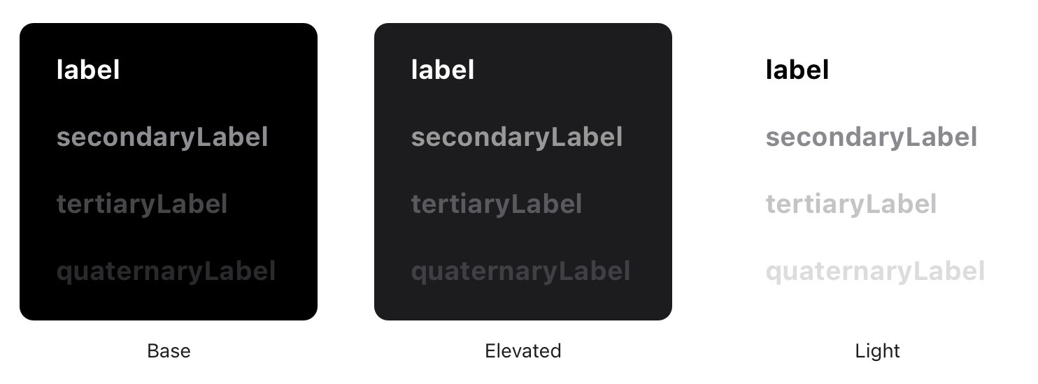
This study outlines the design and implementation of a dark mode interface for the Indiana University–Purdue University Indianapolis (IUPUI) University Library website. The authors detail the design challenges, including accessibility compliance, institutional color restrictions, and visual hierarchy through depth simulation. They also describe technical implementations using cookies, media queries, and CSS to offer both user-selected and system-preferred modes. The paper serves as a valuable guide for institutions considering dark mode, emphasizing aesthetic refinement, user comfort, and inclusivity. Its significance lies in combining design principles with practical coding strategies to support modern, accessible web experiences in academic environments.

Pedersen, L. A., Einarsson, S. S., Rikheim, F. A., & Sandnes, F. E. (2020). User interfaces in dark mode during daytime – Improved productivity or just cool-looking? In M. Antona & C. Stephanidis (Eds.), Universal Access in Human-Computer Interaction. Design Approaches and Supporting Technologies (pp. 178–187). Springer.

This study investigates whether dark mode interfaces lead to improved productivity and reduced errors compared to light mode when used during daytime in well-lit environments. The authors conducted a controlled experiment involving a visually intensive text entry task using a virtual keyboard with an unfamiliar layout. The results revealed no significant differences between dark and light modes in terms of productivity or error rates. The significance of this study lies in its challenge to common assumptions about dark mode's functional benefits, emphasizing that its popularity may be driven more by aesthetics and personal preference than measurable performance improvements, particularly in non-dim conditions.

What are some popular and respected books about dark mode?

Earn a Gift, Answer a Short Quiz!

  1. Question 1
  2. Question 2
  3. Question 3
  4. Get Your Gift

Question 1

What best defines dark mode in digital applications?

1 point towards your gift

Literature on Dark Mode

Here's the entire UX literature on Dark Mode by the Interaction Design Foundation, collated in one place:

Learn more about Dark Mode

Take a deep dive into Dark Mode with our course Mobile UI Design .

In the “Build Your Portfolio” project, you’ll find a series of practical exercises that will give you first-hand experience of the methods we cover. You will build on your project in each lesson so once you have completed the course you will have a thorough case study for your portfolio.

Mobile User Experience Design: UI Design is built on evidence-based research and practice. Your expert facilitator is Frank Spillers, CEO of ExperienceDynamics.com, author, speaker and internationally respected Senior Usability practitioner.

All open-source articles on Dark Mode

Please check the value and try again.

Open Access—Link to us!

We believe in Open Access and the democratization of knowledge. Unfortunately, world-class educational materials such as this page are normally hidden behind paywalls or in expensive textbooks.

If you want this to change, , link to us, or join us to help us democratize design knowledge!

Privacy Settings
By using this site, you accept our Cookie Policy and Terms of Use.

Share Knowledge, Get Respect!

Share on:

or copy link

Cite according to academic standards

Simply copy and paste the text below into your bibliographic reference list, onto your blog, or anywhere else. You can also just hyperlink to this page.

Interaction Design Foundation - IxDF. (2021, December 9). What is Dark Mode?. Interaction Design Foundation - IxDF.