Your constantly-updated definition of Bias in UX/UI Design and
collection of videos and articles. Be a conversation starter: Share this page and inspire others!
88shares
What is Bias in UX/UI Design?
Bias is the way humans interpret and evaluate the context and information about something according to how these are presented or how they perceive these through the lens of their values and beliefs. Bias can impair judgment and decision-making, so designers work to overcome insight problems by taking fresh approaches.
Learn about bias and how it affects design.
ShowHide
video transcript
00:00:00 --> 00:00:32
We have tendencies to see things in one way or another. And that's about all sorts of things. That can be about serious personal issues; it can be about trivial things. Often the way in which *something is framed to us can actually create a bias* as well. A classic example, and there are various ways you can do this, is what's called *anchoring*. So, if we're asked something and given something that *suggests a value*,
00:00:32 --> 00:01:01
even if it's told that it's just there for guesswork purposes or something, it tends to hold us and move where we see our estimate. So, you ask somebody, "How high is the Eiffel Tower?" You might have a vague idea that it's big, but you probably don't know exactly how high. You might ask one set of people and give them a scale and say, "Put it on this scale; just draw a cross where you think on this scale from 250 meters high to 2,500 meters high.
00:01:01 --> 00:01:36
How high on that scale?" And people put crosses on the scale – you can see where they were, or put a number. But alternatively, you might give people – instead of having a scale of 250 meters to 2,500 meters, you might give them a scale between 50 meters and 500 meters. Now, actually, the Eiffel Tower falls on *both* of those scales; the actual height is around 300 meters. But what you find is people don't know the answer; given the larger, higher scale, they will tend to put something that is larger and higher,
00:01:36 --> 00:02:04
even though they're told it's just a scale. And actually, on the larger scale, it should be right at the bottom. Here, it should be about two-thirds of the way up the scale. But what happens is you, by framing it with big numbers, people tend to guess a bigger number. If you frame it with smaller numbers, people guess a smaller number. They're anchored by the nature of the way the question is posed. So, how might you get away from some of this fixation? We'll talk about some other things later,
00:02:04 --> 00:02:31
other ways later. But one of the ways to actually *break* some of this bias and this fixation is to *deliberately mix things up*. So, what you might do is, say, you're given the problem of *building* the Eiffel Tower. And the Eiffel Tower I said is about 300 meters tall, so about 1,000 feet tall. So, you might think, "Oh crumbs, how are we going to build this?" So, one thing you might do is say, "Imagine instead of being
00:02:31 --> 00:03:02
300 meters tall, it was just 3 meters tall. How would I go about building it, then?" And you might think, "Well, I'd build a big, perhaps a scaffolding, or 30 meters tall – I might build a scaffolding and just hoist things up to the top." So, then you say, "Well, OK, can I build a scaffolding at 300 meters; does that make sense?" Alternatively, you might say, "Perhaps it's 300,000 *miles* tall, basically reaching as high as the Moon. How might I build it, then?" Well, there's no way you're going to hoist things up a scaffold.
00:03:02 --> 00:03:34
All the workers at the top would have no oxygen because they'd be up above the atmosphere. So, you might then think about hoisting it up from the bottom, building the top first, hoisting the whole thing up; building the next layer; hoisting the whole thing up; building the next layer – you know – like jacking a car and then sticking bits underneath. So, by just thinking of a *completely different* scale, you start to think of different kinds of solutions. It forces you out of that fixation. You might just swap things around. I mean, this works quite well if you're worried
00:03:34 --> 00:04:01
that you're using some sort of racial or gender bias; you just swap the genders of the people involved in the story or swap their ethnic background, and often the way you look at the story differently might tell you something about some of the biases you bring to it. In politics, if you hear a statement from a politician and you either react positively or negatively to it, it might be worth just thinking what you'd imagine if that statement
00:04:01 --> 00:04:24
came from the mouth of another politician, that was of a different persuasion; how would you read it then? And it's not that you change your views drastically by doing this, but it helps you to perhaps expose why you view these things differently. And some of that might be valid reasons; sometimes, you might think, "Actually, I need to rethink some of the ways I'm working."
“The world is full of people who have never, since childhood, met an open doorway with an open mind.”
— E. B. White, Author of popular children’s fiction such as “Charlotte’s Web”
In a far more immediately dangerous world, prehistoric humans learned to quickly frame situations to help them react with lightning-fast decisions. Millennia later, bias has the more negative associations of social prejudice, disadvantage and otherness. Still, it’s part of the human condition, complexly intertwined with instinct but at odds with rationality. For example, bias can let us accept words from some people (e.g., politicians who represent our values) which we’d reject from others. Nevertheless, if we don’t check our biased assumptions, they can cause false predictions and bad judgments.
Bias—like the umbrella term cognitive biases—is a barrier to ideation, especially from an organizational standpoint. It also arises in designers, simply because all humans are subject to some form of unconscious bias, and it’s far easier to detect bias in others than within ourselves. We have blind spots to how we perceive the world. In everyday linear thinking, the apparently logical steps we take to find solutions to problems sometimes depend on the biases we have. Moreover, even as processes such as design thinking prompt us to think more openly, the first obstacle is often the same bias that colors our views elsewhere. And as we push to explore the edges of the design space and think outside the box, it can become harder to notice how far we shift from rational objectivity as we go along with our own, subjective “realities”.
Anchoring: When you frame your questions in a certain way, you can influence the responses: e.g., asking users “Using 1–5 stars, how would you rate this design?” versus “How flawed would you say the design is: 70%? 30%?”.
Bandwagon: It’s easier to go along with the majority’s view than derail a discussion by countering with opposing ideas. Also called groupthink, this is a particular risk in ideation sessions.
Confirmation: We typically prefer looking for evidence to support our hypotheses or existing views of things. This leads to foregone conclusions. So, even if conflicting data arises (e.g., “35% of users dislike this feature”), it’s more comfortable if we downplay/overlook its value.
To help improve your ideation efforts, design’s success and more, here are some tips:
Define your problem accurately so you can start to understand it fully. When starting your project, mind how you word the problem – the terms you frame it with can create bias. That’s why design thinking is so helpful, as you can begin to empathize with your users. And the personas you make can help wrench away assumptions to reveal how users from other backgrounds might truly experience things.
Swap in other actors in user stories (when you use storytelling). This can help if you’re concerned about accidentally making assumptions about your users regarding their gender, ethnicity, etc. By changing the actors and background in the story, you can spot if your view had distorted the previous version. Then, you can ask yourself why you made those assumptions about (e.g.) elderly users.
Look past “logical” norms (e.g., when you notice yourself thinking “This solution won’t work because the world doesn’t work that way!”). Your team may unconsciously act on preconceived generalizations about (e.g.) users’ socio-economic status or accessibility needs. For example, “Users with disabilities won’t need this high-intensity fitness app!” is a rotten foundation.
Get disruptive and suggest different (even unrealistic) scales to a problem. Challenge yourself to challenge the notion that a single approach is “the done thing”. Because bias can have outrageous effects, try to be outrageous and go for (e.g.) bad ideas to get a new perspective. This can break your bias and fixation on “the way to do it” – and help expose other ways of seeing the problem and different kinds of solutions. If you were to (e.g.) create a smartphone that was the size of a football field, what would that take? How would you have to adapt to the problem?
Use Six Thinking Hats. This method helps you adopt alternative viewpoints. You examine problems from six perspectives, one at a time (e.g., red hat = focusing on knee-jerk reactions/feelings; black hat = focusing on potentially negative outcomes), and so can achieve a tighter grasp of what your problem truly demands.
Overall, remember that bias is natural but—as it can slant your view of even the most innocent aspects of your users, etc.—is something to keep in check throughout your design process.
Do you all have those moments when you know you need a spark of creativity? You know... "I want my wonderful bright idea!" — — Nothing comes. I'm not going to try and give you a creativity machine; so, what I'm going to try to do is give you *techniques* and *mechanisms*. I hope that wasn't too shocking for you, seeing me waking up in the morning!
00:00:39 --> 00:01:01
You notice what I'm trying to do here is to make the *maximum* use of the *fluid* creative thinking and yet also then translate that and make it into something that's more structured. And this is true whether it's producing a piece of writing, producing a presentation or video or producing some software.
What are the most common types of bias in UX design?
The most common biases in UX design include confirmation bias, recency bias, affinity bias, and anchoring bias.
Confirmation bias occurs when designers look for feedback that supports their ideas, ignoring evidence that suggests changes.
Recency bias emphasizes the latest information or user feedback, which might overshadow broader trends.
Affinity bias happens when designers favor feedback from users who share similar characteristics, backgrounds, or perspectives, potentially overlooking diverse or conflicting opinions.
Anchoring bias involves over-relying on initial concepts or feedback, making it hard to adapt as the project evolves.
To counter these biases, a diverse group of users should be involved in testing, conflicting feedback should be actively sought out, and early design choices should be revisited regularly. These practices help ensure a design meets the needs of a wider audience.
Watch as Author and Human-Computer Interaction (HCI) Expert, Professor Alan Dix explains anchoring bias:
ShowHide
video transcript
00:00:00 --> 00:00:32
We have tendencies to see things in one way or another. And that's about all sorts of things. That can be about serious personal issues; it can be about trivial things. Often the way in which *something is framed to us can actually create a bias* as well. A classic example, and there are various ways you can do this, is what's called *anchoring*. So, if we're asked something and given something that *suggests a value*,
00:00:32 --> 00:01:01
even if it's told that it's just there for guesswork purposes or something, it tends to hold us and move where we see our estimate. So, you ask somebody, "How high is the Eiffel Tower?" You might have a vague idea that it's big, but you probably don't know exactly how high. You might ask one set of people and give them a scale and say, "Put it on this scale; just draw a cross where you think on this scale from 250 meters high to 2,500 meters high.
00:01:01 --> 00:01:36
How high on that scale?" And people put crosses on the scale – you can see where they were, or put a number. But alternatively, you might give people – instead of having a scale of 250 meters to 2,500 meters, you might give them a scale between 50 meters and 500 meters. Now, actually, the Eiffel Tower falls on *both* of those scales; the actual height is around 300 meters. But what you find is people don't know the answer; given the larger, higher scale, they will tend to put something that is larger and higher,
00:01:36 --> 00:02:04
even though they're told it's just a scale. And actually, on the larger scale, it should be right at the bottom. Here, it should be about two-thirds of the way up the scale. But what happens is you, by framing it with big numbers, people tend to guess a bigger number. If you frame it with smaller numbers, people guess a smaller number. They're anchored by the nature of the way the question is posed. So, how might you get away from some of this fixation? We'll talk about some other things later,
00:02:04 --> 00:02:31
other ways later. But one of the ways to actually *break* some of this bias and this fixation is to *deliberately mix things up*. So, what you might do is, say, you're given the problem of *building* the Eiffel Tower. And the Eiffel Tower I said is about 300 meters tall, so about 1,000 feet tall. So, you might think, "Oh crumbs, how are we going to build this?" So, one thing you might do is say, "Imagine instead of being
00:02:31 --> 00:03:02
300 meters tall, it was just 3 meters tall. How would I go about building it, then?" And you might think, "Well, I'd build a big, perhaps a scaffolding, or 30 meters tall – I might build a scaffolding and just hoist things up to the top." So, then you say, "Well, OK, can I build a scaffolding at 300 meters; does that make sense?" Alternatively, you might say, "Perhaps it's 300,000 *miles* tall, basically reaching as high as the Moon. How might I build it, then?" Well, there's no way you're going to hoist things up a scaffold.
00:03:02 --> 00:03:34
All the workers at the top would have no oxygen because they'd be up above the atmosphere. So, you might then think about hoisting it up from the bottom, building the top first, hoisting the whole thing up; building the next layer; hoisting the whole thing up; building the next layer – you know – like jacking a car and then sticking bits underneath. So, by just thinking of a *completely different* scale, you start to think of different kinds of solutions. It forces you out of that fixation. You might just swap things around. I mean, this works quite well if you're worried
00:03:34 --> 00:04:01
that you're using some sort of racial or gender bias; you just swap the genders of the people involved in the story or swap their ethnic background, and often the way you look at the story differently might tell you something about some of the biases you bring to it. In politics, if you hear a statement from a politician and you either react positively or negatively to it, it might be worth just thinking what you'd imagine if that statement
00:04:01 --> 00:04:24
came from the mouth of another politician, that was of a different persuasion; how would you read it then? And it's not that you change your views drastically by doing this, but it helps you to perhaps expose why you view these things differently. And some of that might be valid reasons; sometimes, you might think, "Actually, I need to rethink some of the ways I'm working."
How do cognitive biases influence user research and testing?
Cognitive biases can heavily influence user research and testing by skewing how designers interpret user feedback and make decisions. Confirmation bias, for example, may cause researchers to focus only on feedback that supports their original ideas, ignoring contrary insights. Recency bias might lead them to weigh recent feedback more heavily than older data, missing important trends from previous users.
Another bias, the halo effect, occurs when positive impressions of one feature affect how other aspects are judged, leading to an overly favorable view. Anchoring bias also impacts testing, as early feedback or prototypes can set expectations that are hard to shake.
To counter these biases, researchers can seek diverse user opinions, review data from multiple angles, and involve neutral team members to provide fresh perspectives.
User Experience Strategist and Founder of Syntagm Ltd, William Hudson explains what goes into user research:
ShowHide
video transcript
00:00:00 --> 00:00:30
User research is a crucial part of the design process. It helps to bridge the gap between what we think users need and what users actually need. User research is a systematic process of gathering and analyzing information about the target audience or users of a product, service or system. Researchers use a variety of methods to understand users, including surveys, interviews, observational studies, usability testing, contextual inquiry, card sorting and tree testing, eye tracking
00:00:30 --> 00:01:02
studies, A-B testing, ethnographic research and diary studies. By doing user research from the start, we get a much better product, a product that is useful and sells better. In the product development cycle, at each stage, you’ll different answers from user research. Let's go through the main points. What should we build? Before you even begin to design you need to validate your product idea. Will my users need this? Will they want to use it? If not this, what else should we build?
00:01:02 --> 00:01:31
To answer these basic questions, you need to understand your users everyday lives, their motivations, habits, and environment. That way your design a product relevant to them. The best methods for this stage are qualitative interviews and observations. Your visit users at their homes at work, wherever you plan for them to use your product. Sometimes this stage reveals opportunities no one in the design team would ever have imagined. How should we build this further in the design process?
00:01:31 --> 00:02:00
You will test the usability of your design. Is it easy to use and what can you do to improve it? Is it intuitive or do people struggle to achieve basic tasks? At this stage you'll get to observe people using your product, even if it is still a crude prototype. Start doing this early so your users don't get distracted by the esthetics. Focus on functionality and usability. Did we succeed? Finally, after the product is released, you can evaluate the impact of the design.
00:02:00 --> 00:02:15
How much does it improve the efficiency of your users work? How well does the product sell? Do people like to use it? As you can see, user research is something that design teams must do all the time to create useful, usable and delightful products.
What steps can designers take to reduce bias in user personas?
To reduce bias in user personas—fictitious representations of real users—designers can follow a few key steps. First, gather data from diverse sources to ensure that personas represent a broad user base. Instead of relying on assumptions, use real data from surveys, interviews, and user feedback to build accurate profiles.
Next, involve a diverse team in the persona creation process. Different perspectives help spot potential biases and ensure the personas feel inclusive and realistic.
Additionally, designers should avoid stereotypes by focusing on user goals, behaviors, and challenges rather than demographic traits alone. This approach keeps personas relevant without pigeonholing users into narrow categories.
Finally, update personas regularly as new insights come in. Continuous refinement helps designers stay aligned with the evolving needs of real users, reducing the risk of outdated or biased personas.
Watch as Author and Human-Computer Interaction (HCI) Expert, Professor Alan Dix explains important points about personas:
ShowHide
video transcript
00:00:00 --> 00:00:34
Personas are one of these things that gets used in very, very many ways during design. A persona is a rich description or description of a user. It's similar in some sense, to an example user, somebody that you're going to talk about. But it usually is not a particular person. And that's for sometimes reasons of confidentiality.
00:00:34 --> 00:01:02
Sometimes it's you want to capture about something slightly more generic than the actual user you talked to, that in some ways represents the group, but is still particular enough that you can think about it. Typically, not one persona, you usually have several personas. We'll come back to that. You use this persona description, it's a description of the example user, in many ways during design. You can ask questions like "What would Betty think?"
00:01:02 --> 00:01:35
You've got a persona called / about Betty, "what would Betty think" or "how would Betty feel about using this aspect of the system? Would Betty understand this? Would Betty be able to do this?" So we can ask questions by letting those personas seed our understanding, seed our imagination. Crucially, the details matter here. You want to make the persona real. So what we want to do is take this persona, an image of this example user, and to be able to ask those questions: will this user..., what will this user feel about
00:01:35 --> 00:02:01
this feature? How will this user use this system in order to be able to answer those questions? It needs to seed your imagination well enough. It has to feel realistic enough to be able to do that. Just like when you read that book and you think, no, that person would never do that. You've understood them well enough that certain things they do feel out of character. You need to understand the character of your persona.
00:02:01 --> 00:02:30
For different purposes actually, different levels of detail are useful. So I'm going to sort of start off with the least and go to the ones which I think are actually seeding that rich understanding. So at one level, you can just look at your demographics. You're going to design for warehouse managers, maybe. For a new system that goes into warehouses. So you look at the demographics, you might have looked at their age. It might be that on the whole that they're older. Because they're managers, the older end. So there's only a small number under 35. The majority
00:02:30 --> 00:03:01
are over 35, about 50:50 between those who are in the sort of slightly more in the older group. So that's about 40 percent of them in the 35 to 50 age group, and about half of them are older than 50. So on the whole list, sort of towards the older end group. About two thirds are male, a third are female. Education wise, the vast majority have not got any sort of further education beyond school. About 57 percent we've got here are school.
00:03:01 --> 00:03:34
We've got a certain number that have done basic college level education and a small percentage of warehouse managers have had a university education. That's some sense of things. These are invented, by the way, I should say, not real demographics. Did have children at home. The people, you might have got this from some big survey or from existing knowledge of the world, or by asking the employer that you're dealing with to give you the statistics. So perhaps about a third of them have got children at home, but two thirds of them haven't.
00:03:34 --> 00:04:05
And what about disability? About three quarters of them have no disability whatsoever. About one quarter do. Actually, in society it's surprising. You might... if you think of disability in terms of major disability, perhaps having a missing limb or being completely blind or completely deaf. Then you start relatively small numbers. But if you include a wider range of disabilities, typically it gets bigger. And in fact can become
00:04:05 --> 00:04:32
very, very large. If you include, for instance, using corrective vision with glasses, then actually these numbers will start to look quite small. Within this, in whatever definition they've used, they've got up to about 17 percent with the minor disability and about eight percent with a major disability. So far, so good. So now, can you design for a warehouse manager given this? Well,
00:04:32 --> 00:05:01
you might start to fill in examples for yourself. So you might sort of almost like start to create the next stage. But it's hard. So let's look at a particular user profile. Again, this could be a real user, but let's imagine this as a typical user in a way. So here's Betty Wilcox. So she's here as a typical user. And in fact, actually, if you look at her, she's on the younger end. She's not necessarily the only one, you usually have several of these. And she's female as well. Notice only up to a third of our warehouse ones are female. So
00:05:01 --> 00:05:31
she's not necessarily the center one. We'll come back to this in a moment, but she is an example user. One example user. This might have been based on somebody you've talked to, and then you're sort of abstracting in a way. So, Betty Wilcox. Thirty-seven, female, college education. She's got children at home, one's seven, one's 15. And she does have a minor disability, which is in her left hand. And it's there's slight problem in her left hand.
00:05:31 --> 00:06:00
Can you design, can you ask, what would Betty think? You're probably doing a bit better at this now. You start to picture her a bit. And you've probably got almost like an image in your head as we talk about Betty. So it's getting better. So now let's go to a different one. You know, this is now Betty. Betty is 37 years old. She's been a warehouse manager for five years and worked for Simpkins Brothers Engineering for 12 years. She didn't go to university, but has studied in her evenings for a business diploma.
00:06:00 --> 00:06:31
That was her college education. She has two children aged 15 and seven and does not like to work late. Presumably because we put it here, because of the children. But she did part of an introductory in-house computer course some years ago. But it was interrupted when she was promoted, and she can no longer afford to take the time. Her vision is perfect, but a left hand movement, remember from the description a moment ago, is slightly restricted because of an industrial accident three years ago.
00:06:31 --> 00:07:04
She's enthusiastic about her work and is happy to delegate responsibility and to take suggestions from the staff. Actually, we're seeing somebody who is confident in her overall abilities, otherwise she wouldn't be somebody happy to take suggestions. If you're not competent, you don't. We sort of see that, we start to see a picture of her. However, she does feel threatened – simply, she is confident in general – but she does feel threatened by the introduction of yet another computer system. The third since she's been working at Simpkins Brothers. So now, when we think about that, do you have a better vision of Betty?
00:07:04 --> 00:07:32
Do you feel you might be in a position to start talking about..."Yeah, if I design this sort of feature, is this something that's going to work with Betty? Or not"? By having a rich description, she becomes a person. Not just a set of demographics. But then you can start to think about the person, design for the person and use that rich human understanding you have in order to create a better design.
00:07:32 --> 00:08:06
So it's an example of a user, as I said not necessarily a real one. You're going to use this as a surrogate and these details really, really matter. You want Betty to be real to you as a designer, real to your clients as you talk to them. Real to your fellow designers as you talk to them. To the developers around you, to different people. Crucially, though, I've already said this, there's not just one. You usually want several different personas because the users you deal with are all different.
00:08:06 --> 00:08:30
You know, we're all different. And the user group – it's warehouse managers – it's quite a relatively narrow and constrained set of users, will all be different. Now, you can't have one persona for every user, but you can try and spread. You can look at the range of users. So now that demographics picture I gave, we actually said, what's their level of education? That's one way to look at that range. You can think of it as a broad range of users.
00:08:30 --> 00:09:02
The obvious thing to do is to have the absolute average user. So you almost look for them: "What's the typical thing? Yes, okay." In my original demographics the majority have no college education, they were school educated only. We said that was your education one, two thirds of them male – I'd have gone for somebody else who was male. Go down the list, bang in the centre. Now it's useful to have that center one, but if that's the only person you deal with, you're not thinking about the range. But certainly you want people who in some sense
00:09:02 --> 00:09:24
cover the range, that give you a sense of the different kinds of people. And hopefully also by having several, reminds you constantly that they are a range and have a different set of characteristics, that there are different people, not just a generic user.
How does bias affect the usability and accessibility of digital products?
Bias can strongly impact the usability and accessibility of digital products by limiting how well they serve all users. When designers bring confirmation bias into a project, they may design features that only fit certain user preferences, ignoring diverse needs. Cultural bias can lead to language or visuals that some users don’t understand or find off-putting, reducing usability for those outside the designer’s background.
Accessibility suffers when affinity bias—favoring users similar to the designers—leaves out people with disabilities. If products aren’t tested with diverse users, critical accessibility features might be missing, making the product hard to use for those with different abilities.
To improve usability and accessibility, designers should actively seek feedback from a broad user base and test features with people of all abilities and backgrounds.
Watch our video to understand important points about accessibility and why it’s vital in design:
ShowHide
video transcript
00:00:00 --> 00:00:30
Accessibility ensures that digital products, websites, applications, services and other interactive interfaces are designed and developed to be easy to use and understand by people with disabilities. 1.85 billion folks around the world who live with a disability or might live with more than one and are navigating the world through assistive technology or other augmentations to kind of assist with that with your interactions with the world around you. Meaning folks who live with disability, but also their caretakers,
00:00:30 --> 00:01:01
their loved ones, their friends. All of this relates to the purchasing power of this community. Disability isn't a stagnant thing. We all have our life cycle. As you age, things change, your eyesight adjusts. All of these relate to disability. Designing accessibility is also designing for your future self. People with disabilities want beautiful designs as well. They want a slick interface. They want it to be smooth and an enjoyable experience. And so if you feel like
00:01:01 --> 00:01:30
your design has gotten worse after you've included accessibility, it's time to start actually iterating and think, How do I actually make this an enjoyable interface to interact with while also making sure it's sets expectations and it actually gives people the amount of information they need. And in a way that they can digest it just as everyone else wants to digest that information for screen reader users a lot of it boils down to making sure you're always labeling
00:01:30 --> 00:02:02
your interactive elements, whether it be buttons, links, slider components. Just making sure that you're giving enough information that people know how to interact with your website, with your design, with whatever that interaction looks like. Also, dark mode is something that came out of this community. So if you're someone who leverages that quite frequently. Font is a huge kind of aspect to think about in your design. A thin font that meets color contrast
00:02:02 --> 00:02:20
can still be a really poor readability experience because of that pixelation aspect or because of how your eye actually perceives the text. What are some tangible things you can start doing to help this user group? Create inclusive and user-friendly experiences for all individuals.
How does confirmation bias impact design decisions?
Confirmation bias impacts design decisions by causing designers to focus on ideas that match their beliefs and ignore information that challenges them. When designers want a specific design choice to work, they may pay more attention to user feedback that supports it and overlook any that doesn’t. This bias can be a big hindrance by limiting innovation, as it pushes designers to stick with familiar ideas instead of exploring new approaches.
In user testing, confirmation bias can influence how results are interpreted or how questions are proposed. Designers might unintentionally suggest leading questions, but it’s the responsibility of the test facilitator to ensure that phrasing remains neutral and unbiased. If bias isn’t addressed, it can lead to overlooking real user needs or misinterpreting feedback. To counter this, teams should seek diverse input, invite differing viewpoints, and involve colleagues with varied perspectives throughout the process.
Watch as User Experience Strategist and Founder of Syntagm Ltd, William Hudson explains the benefits of data-driven design:
ShowHide
video transcript
00:00:00 --> 00:00:30
The big question – *why design with data?* There are a number of benefits, though, to quantitative methods. We can get a better understanding of our design issues because it's a different way of looking at the issues. So, different perspectives often lead to better understanding. If you're working in project teams or within organizations who really don't have
00:00:30 --> 00:01:06
a good understanding of *qualitative methods*, being able to supplement those with quantitative research is very important. You might be in a big organization that's very technology-focused. You might just be in a little team that's technology-focused, or you might just be working with a developer who just doesn't get qualitative research. So, in all of these cases, big, small and in between, having different tools in your bag is going to be really, really important. We can get greater confidence in our design decisions.
00:01:06 --> 00:01:13
Overall, that means that we are making much more *persuasive justifications* for design choices.
Take our Creativity course, including discussions about bias and how to overcome it.
How can UX researchers avoid leading questions during interviews?
UX researchers can avoid leading questions by asking questions in a way that doesn’t suggest a "correct" answer (framing bias). To start, researchers should use open-ended questions like "How do you feel about this feature?" instead of "Do you like this feature?" Open-ended questions allow users to express their opinions without pressure.
Researchers should also avoid adding personal opinions to their questions. For example, instead of asking, "This feature is easy to use, right?" ask, "How would you describe using this feature?" Neutral wording helps prevent bias and allows honest feedback.
Finally, refrain from interrupting or guiding users’ answers. Listen fully, give them time to respond, and follow up with clarifying questions if needed. By creating a neutral environment, researchers can gather more authentic insights that reflect true user experiences.
User Experience Strategist and Founder of Syntagm Ltd, William Hudson explains what goes into user research:
ShowHide
video transcript
00:00:00 --> 00:00:30
User research is a crucial part of the design process. It helps to bridge the gap between what we think users need and what users actually need. User research is a systematic process of gathering and analyzing information about the target audience or users of a product, service or system. Researchers use a variety of methods to understand users, including surveys, interviews, observational studies, usability testing, contextual inquiry, card sorting and tree testing, eye tracking
00:00:30 --> 00:01:02
studies, A-B testing, ethnographic research and diary studies. By doing user research from the start, we get a much better product, a product that is useful and sells better. In the product development cycle, at each stage, you’ll different answers from user research. Let's go through the main points. What should we build? Before you even begin to design you need to validate your product idea. Will my users need this? Will they want to use it? If not this, what else should we build?
00:01:02 --> 00:01:31
To answer these basic questions, you need to understand your users everyday lives, their motivations, habits, and environment. That way your design a product relevant to them. The best methods for this stage are qualitative interviews and observations. Your visit users at their homes at work, wherever you plan for them to use your product. Sometimes this stage reveals opportunities no one in the design team would ever have imagined. How should we build this further in the design process?
00:01:31 --> 00:02:00
You will test the usability of your design. Is it easy to use and what can you do to improve it? Is it intuitive or do people struggle to achieve basic tasks? At this stage you'll get to observe people using your product, even if it is still a crude prototype. Start doing this early so your users don't get distracted by the esthetics. Focus on functionality and usability. Did we succeed? Finally, after the product is released, you can evaluate the impact of the design.
00:02:00 --> 00:02:15
How much does it improve the efficiency of your users work? How well does the product sell? Do people like to use it? As you can see, user research is something that design teams must do all the time to create useful, usable and delightful products.
How can designers challenge assumptions to create more inclusive designs?
Designers can challenge assumptions to create more inclusive designs by actively questioning their own perspectives and gathering input from diverse user groups. Start by recognizing that personal experiences and preferences might not represent all users’ needs. By broadening user research to include people with different backgrounds, abilities, and preferences, designers can get a fuller picture of how users interact with a product.
Another effective approach is to test designs in varied real-life scenarios. This helps identify features that may not work for all users, like unclear navigation for screen readers or color schemes that don’t accommodate colorblind users. Designers can also involve a diverse team in the design process, allowing multiple viewpoints to shape decisions and spot potential biases early. These strategies help ensure designs feel accessible and valuable to a broader audience.
UX Content Strategist Katrin Suetterlin explains the nature of inclusive design:
ShowHide
video transcript
00:00:00 --> 00:00:31
Universal design is a design practice that is generally considered to be a design that has gone through all the design processes while hoping to take everyone into consideration. You just would have to design it in a way that everyone can use it. The *problem* with the approach of universal design is, though, that *you cannot really design for everyone*.
00:00:31 --> 00:01:02
To design with 8 billion people in mind is strictly impossible: a design that is utopian or more academic or more a discourse subject rather than something that we can really and truly design. But you can do *inclusive design* as a part of design practices that strive for inclusion. The difference is that inclusive design is the umbrella above,
00:01:02 --> 00:01:31
for example, accessible design because accessibility is an accommodation. It is checking boxes whether your design is truly accessible. And if it serves the purpose for your audiences. Inclusive design is the same umbrella. Universal design is more of a juxtaposition, but it's more battling against inclusive design because if you think of everyone, you think of no one.
00:01:31 --> 00:02:01
And in this inclusive way, we can look towards architecture, we can look towards city planning and also how buildings are built in the past decades because they have taken aboard the inclusive approach. They do all the accommodations they can think of – for example, no stairs, ride towards those who have to take a wheelchair. Or it could be beneficial to people with a trolley or with something heavy that they have to carry.
00:02:01 --> 00:02:30
So, thinking of this benefits everyone. And now imagine the internet being a public space, and how we can learn from city planning and architecture and interior design, that we are *accommodating those who need accommodation*. And that's what the inclusive approach is about. So, to sum this up, your research cannot be universal, because you cannot serve that, but it can be personalized and it can be also tailored to the needs of the audience you are serving.
How can I design products that avoid cultural bias?
To design products that avoid cultural bias, start with inclusive research. Include people from different cultures, languages, and backgrounds in your interviews, usability tests, and persona development. It will help uncover assumptions rooted in your own culture.
Avoid symbols, colors, gestures, and metaphors that may have different meanings across cultures. For example, red signals danger in Western cultures but prosperity in others, and a thumbs-up sign can be taken in offence in the Middle East. What’s more, design for localization early—this includes text expansion, date formats, and reading directions.
Use culturally neutral visuals and allow users to customize their experience where possible. And test in multiple regions, not just your home market.
Companies like Google and Airbnb run local usability tests to ensure global users feel seen and respected. Empathy at a global scale means designing beyond borders.
Watch as Author and Human-Computer Interaction Expert, Professor Alan Dix explains important points about designing for culture:
ShowHide
video transcript
00:00:00 --> 00:00:32
As you're designing, it's so easy just to design for the people that you know and for the culture that you know. However, cultures differ. Now, that's true of many aspects of the interface; no[t] least, though, the visual layout of an interface and the the visual elements. Some aspects are quite easy just to realize like language, others much, much more subtle.
00:00:32 --> 00:01:04
You might have come across, there's two... well, actually there's three terms because some of these are almost the same thing, but two terms are particularly distinguished. One is localization and globalization. And you hear them used almost interchangeably and probably also with slight differences because different authors and people will use them slightly differently. So one thing is localization or internationalization. Although the latter probably only used in that sense. So localization is about taking an interface and making it appropriate
00:01:04 --> 00:01:31
for a particular place. So you might change the interface style slightly. You certainly might change the language for it; whereas global – being globalized – is about saying, "Can I make something that works for everybody everywhere?" The latter sounds almost bound to fail and often does. But obviously, if you're trying to create something that's used across the whole global market, you have to try and do that. And typically you're doing a bit of each in each space.
00:01:31 --> 00:02:02
You're both trying to design as many elements as possible so that they are globally relevant. They mean the same everywhere, or at least are understood everywhere. And some elements where you do localization, you will try and change them to make them more specific for the place. There's usually elements of both. But remembering that distinction, you need to think about both of those. The most obvious thing to think about here is just changing language. I mean, that's a fairly obvious thing and there's lots of tools to make that easy.
00:02:02 --> 00:02:31
So if you have... whether it's menu names or labels, you might find this at the design stage or in the implementation technique, there's ways of creating effectively look-up tables that says this menu item instead of being just a name in the implementation, effectively has an idea or a way of representing it. And that can be looked up so that your menus change, your text changes and everything. Now that sounds like, "Yay, that's it!"
00:02:31 --> 00:03:00
So what it is, is that it's not the end of the story, even for text. That's not the end of the story. Visit Finland sometime. If you've never visited Finland, it's a wonderful place to go. The signs are typically in Finnish and in Swedish. Both languages are used. I think almost equal amounts of people using both languages, their first language, and most will know both. But because of this, if you look at those lines, they're in two languages.
00:03:00 --> 00:03:31
The Finnish line is usually about twice as large as the Swedish piece of text. Because Finnish uses a lot of double letters to represent quite subtle differences in sound. Vowels get lengthened by doubling them. Consonants get separated. So I'll probably pronounce this wrong. But R-I-T-T-A, is not "Rita" which would be R-I-T-A . But "Reet-ta". Actually, I overemphasized that, but "Reetta". There's a bit of a stop.
00:03:31 --> 00:04:02
And I said I won't be doing it right. Talk to a Finnish person, they will help put you right on this. But because of this, the text is twice as long. But of course, suddenly the text isn't going to fit in. So it's going to overlap with icons. It's going to scroll when it shouldn't scroll. So even something like the size of the field becomes something that can change. And then, of course, there's things like left-to-right order. Finnish and Swedish both are left-to-right languages. But if you were going to have, switch something say to an Arabic script from a European script,
00:04:02 --> 00:04:31
then you would end up with things going the other way round. So it's more than just changing the names. You have to think much more deeply than that. But again, it's more than the language. There are all sorts of cultural assumptions that we build into things. The majority of interfaces are built... actually the majority are built not even in just one part of the world, but in one country, you know the dominance... I'm not sure what percentage,
00:04:31 --> 00:05:02
but a vast proportion will be built, not just in the USA, but in the West Coast of the USA. Certainly there is a European/US/American centeredness to the way in which things are designed. It's so easy to design things caught in those cultures without realizing that there are other ways of seeing the world. That changes the assumptions, the sort of values that are built into an interaction.
00:05:02 --> 00:05:35
The meanings of symbols, so ticks and crosses, mostly will get understood and I do continue to use them. However, certainly in the UK, but even not universally across Europe. But in the UK, a tick is a positive symbol, means "this is good". A cross is a "blah, that's bad". However, there are lots of parts of the world where both mean the same. They're both a check. And in fact, weirdly, if I vote in the UK,
00:05:35 --> 00:06:02
I put a cross, not against the candidate I don't want but against the candidate I do want. So even in the UK a cross can mean the same as a tick. You know – and colors, I said I do redundantly code often my crosses with red and my ticks with green because red in my culture is negative; I mean, it's not negative; I like red (inaudible) – but it has that sense of being a red mark is a bad mark.
00:06:02 --> 00:06:33
There are many cultures where red is the positive color. And actually it is a positive color in other ways in Western culture. But particularly that idea of the red cross that you get on your schoolwork; this is not the same everywhere. So, you really have to have quite a subtle understanding of these things. Now, the thing is, you probably won't. And so, this is where if you are taking something into a different culture, you almost certainly will need somebody who quite richly understands that culture.
00:06:33 --> 00:06:43
So you design things so that they are possible for somebody to come in and do those adjustments because you probably may well not be in the position to be able to do that yourself.
Video copyright info
Copyright holder: Tommi Vainikainen _ Appearance time: 2:56 - 3:03 Copyright license and terms: Public domain, via Wikimedia Commons
Copyright holder: Maik Meid _ Appearance time: 2:56 - 3:03 Copyright license and terms: CC BY 2.0, via Wikimedia Commons _ Link: https://commons.wikimedia.org/wiki/File:Norge_93.jpg
Copyright holder: Paju _ Appearance time: 2:56 - 3:03 Copyright license and terms: CC BY-SA 3.0, via Wikimedia Commons _ Link: https://commons.wikimedia.org/wiki/File:Kaivokselan_kaivokset_kyltti.jpg
Copyright holder: Tiia Monto _ Appearance time: 2:56 - 3:03 Copyright license and terms: CC BY-SA 3.0, via Wikimedia Commons _ Link: https://commons.wikimedia.org/wiki/File:Turku_-_harbour_sign.jpg
Invisible Women by Caroline Criado Perez exposes the “gender data gap”—a pervasive absence of female-specific data across various sectors, including design, health, technology, and urban planning. Through compelling case studies and global research, Perez demonstrates how this gap results in systems and products that systematically disadvantage women. The book reveals how design and decision-making processes often assume a default male perspective, leading to invisible biases with serious real-world consequences. For UX designers, this book is a powerful call to action, urging inclusive, data-informed design practices. It’s essential reading for anyone committed to equity in user experience and systemic design reform.
What are some highly cited scientific articles about bias in UX design?
While not specific to UX design, this comprehensive review of confirmation bias has been influential across many fields, including UX. It explores how people tend to search for, interpret, favor, and recall information in a way that confirms their preexisting beliefs. In UX design, this work has informed approaches to user research and testing, highlighting the importance of unbiased data collection and interpretation.
Earn a Gift, Answer a Short Quiz!
Question 1
Question 2
Question 3
Get Your Gift
Try Again! IxDF Cheers For You!
0 out of 3 questions answered correctly
Remember, the more you learn about design, the more you make yourself valuable.
The overall goal of this course is to help you design better products, services and experiences by helping you and your team develop innovative and useful solutions. You’ll learn a human-focused, creative design process.
We’re going to show you what creativity is as well as a wealth of ideation methods―both for generating new ideas and for developing your ideas further. You’ll learn skills and step-by-step methods you can use throughout the entire creative process. We’ll supply you with lots of templates and guides so by the end of the course you’ll have lots of hands-on methods you can use for your and your team’s ideation sessions. You’re also going to learn how to plan and time-manage a creative process effectively.
Most of us need to be creative in our work regardless of if we design user interfaces, write content for a website, work out appropriate workflows for an organization or program new algorithms for system backend. However, we all get those times when the creative step, which we so desperately need, simply does not come. That can seem scary—but trust us when we say that anyone can learn how to be creative on demand.This course will teach you ways to break the impasse of the empty page. We'll teach you methods which will help you find novel and useful solutions to a particular problem, be it in interaction design, graphics, code or something completely different. It’s not a magic creativity machine, but when you learn to put yourself in this creative mental state, new and exciting things will happen.
In the “Build Your Portfolio: Ideation Project”, you’ll find a series of practical exerciseswhich together form a complete ideation project so you can get your hands dirty right away. If you want to complete these optional exercises, you will get hands-on experience with the methods you learn and in the processyou’ll create a case study for your portfolio which you can show your future employer or freelance customers.
Your instructor is Alan Dix. He’s a creativity expert, professor and co-author of the most popular and impactful textbook in the field of Human-Computer Interaction. Alan has worked with creativity for the last 30+ years, and he’ll teach you his favorite techniques as well as show you how to make room for creativity in your everyday work and life.
You earn a verifiable and industry-trusted Course Certificate once you’ve completed the course. You can highlight it on your resume, your LinkedIn profile or your website.
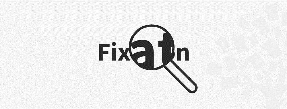
How to overcome Fixation and Bias in Creative Problem Solving
[[video:112]]
Sometimes, you get stuck when you’ve been working and working on a problem. Perhaps it’s a crossword or a
447 shares
4 years ago
Open Access—Link to us!
We believe in Open Access and the democratization of knowledge. Unfortunately, world-class educational materials such as this page are normally hidden behind paywalls or in expensive textbooks.