Your constantly-updated definition of Innovation in UX/UI Design and
collection of videos and articles. Be a conversation starter: Share this page and inspire others!
613shares
What is Innovation in UX/UI Design?
Innovation is the lifeblood of user experience (UX) design. As technological advancements continue to shape the digital world, designers aim to push boundaries to meet evolving user needs and expectations. To be innovative, designers rethink established norms, embrace new technologies and find creative solutions to complex problems.
UX Designer and Author of Build Better Products and UX for Lean Startups, Laura Klein explains important points about innovation:
ShowHide
video transcript
00:00:00 --> 00:00:31
Let's talk about the difference between big, innovative changes to our product and small, incremental improvements, and the kinds of research that you might need in order to make these changes. We'll start with the incremental improvements because that's really the most frequent kinds of changes that we make as designers and researchers. While we all like to talk about designing things from scratch or making huge, sweeping changes,
00:00:31 --> 00:01:00
the vast majority of people spend a lot of their time working on existing products and making them a little bit better every day. So, imagine you're building your new job marketplace to connect job seekers with potential employers. The product works. It's out in the real world being used by folks to find jobs every day. It's great! You made a thing that people are using, for money. Now, your product manager is looking at the metrics and they notice that a bunch of people are signing up and looking at jobs but they're not applying for anything.
00:01:00 --> 00:01:33
Your job is to figure out why. So, what do you do? You can go ahead and pause the video and think about it for a minute if you want. There are a lot of different options you could go with here, but at the very least you're going to want to figure out the following things: Where are people stopping in the process and why are they stopping there? You'll probably want to dig into metrics a bit and figure out if folks do anything besides just look at jobs. Do they fill out their profile? Do they look at job details? Do they click the Apply button? And then do they give up at that point? Or do they never actually even get to that point?
00:01:33 --> 00:02:02
Once you know where they're giving up, you'll probably do some simple observational testing of actual users to see what's happening when they do drop out. You'll probably also want to talk to them about why they're not applying. Maybe you'll find out that they get frustrated because they can't find jobs in their area. Well, that'd be great because that's really easy to fix; if that's the problem, maybe you can try letting them search for jobs near them. That's an *incremental change*. Now, what do we mean by that? It doesn't necessarily mean that it doesn't have a big impact on metrics.
00:02:02 --> 00:02:30
Things like this can be hugely important for your metrics. If you manage to get lots more qualified candidates to apply to jobs, that's a huge win for the employers who are looking for great employees and it doesn't matter that it was just a simple button that you added. But it's not a wildly innovative change. In fact, it's a pretty standard feature on most job boards, and it's a very small improvement in terms of engineering effort, or at least it should be. If it isn't, there may be something wrong with your engineering department... which is a totally different course.
00:02:30 --> 00:03:03
This change is *improving an existing flow*, rather than completely changing how something is done or adding a brand-new feature. OK, now, imagine that you're doing some observational research with your job applicants and you learn that for whatever reason they really don't have very much access to computers or they're not used to typing on a keyboard. This might lead to a very different sort of change than just searching for jobs in their area. Rather than making a small, incremental improvement to a search page, you might have to come up with an entirely different way for candidates to apply for jobs.
00:03:03 --> 00:03:31
Maybe they need to film themselves using their phone cameras. This is a much larger change; it's *less incremental* since you're probably going to have to change or at least add a major feature to the entire job application process. You'll probably have to change how job seekers get reviewed by potential employers as well since they'll be reviewing videos rather than text resumes – which they might not be used to. This is a big change, but it's still incremental because it's not really changing what the product does.
00:03:31 --> 00:04:06
It's just finding a new way to do the thing that it already did. OK, now, let's say that you have the option to do some really deep ethnographic research with some of your potential job applicants. You run some contextual inquiry sessions with them or maybe you run a diary study to understand all of the different jobs that they look at and learn why they are or aren't applying. Maybe in these deeper, more open-ended research sessions, you start to learn that the reason that a lot of potential job applicants drop out is because they just don't have the skills for the necessary jobs.
00:04:06 --> 00:04:30
But what could *you* do about that? Well... our only options are either to find different applicants, find more suitable jobs or create some way to train our users in the skills that they need for the kinds of jobs that are available. All of those are really pretty big, risky ventures, but they just might be what we need to do to get more applicants into jobs. These are very big, and a couple of them are fairly innovative changes.
00:04:30 --> 00:05:05
If the company pivots into, say, trainings and certifications or assessments, that definitely qualifies as innovation, at least for your product, but *how* does the research change for *finding* each of these sorts of things? Couldn't you have found out that applicants aren't qualified with the same types of research that you used to learn that they wanted to search by location? Maybe. Sometimes we find all sorts of things in very lightweight usability-type testing, but *more often* we find bigger, more disruptive things in deeper kinds of research – things like contextual inquiry, diary studies or longer-term relationships that we build with our customers.
00:05:05 --> 00:05:30
Also, bigger, more disruptive changes often require us to do more in-depth research just to make sure that we're going in the right direction because the bigger it is the more risky it is. Let's say we ran some simple usability testing on the application process. That would mean we'd give applicants a task to perform, like find a job and apply to it. What might we learn from that? Well, that's the place where we'd learn if there were any bugs or confusing
00:05:30 --> 00:06:04
parts of the system – basically, *can* somebody apply for a job? It takes more of a real conversation with a real user or a potential user to learn why they're not applying for jobs. It's not that one kind of testing is better than the other; it's that you can learn very different things with the different types of testing. Some types of research tend to deliver more in-depth learnings that can lead to big breakthrough changes, while other types of research tend to lead to smaller, more incremental but still quite useful and impactful changes. Both are extremely useful on agile teams, but you may find that the latter is more common just because many
00:06:04 --> 00:06:15
agile teams don't really know how to schedule those big longer-term types of research studies, while running quick usability testing on existing software is quite easy and can even often be automated.
What makes the most popular digital products like mobile apps so successful? Is it that they solve problems in the most intuitive ways? Is it because they’re visually appealing with appropriate brand or industry colors and a minimalist look? Or maybe it’s because the brands’ user and market research departments zeroed in on the right parts of the customer experience—the ones they would need to create products that meet target users’ needs in full, and even dazzle them.
How a user interface (UI) guides users, the aspects of its visual design and how well it meets user needs are certainly vital factors—but one point in particular stands out for them as existing products. Before they went into product development, professionals had to work hard at generating ideas that found their way to the surface in what would become innovative solutions.
Household name Google's iconic, minimalist UI was once an innovation—and it remains popular because it stays relevant as a go-to for users around the world.
It might sound like a truism to state that design without innovation would be an oxymoron. However, if product design and innovation were not to connect, the results would include many bland retreads of a few original themes. There would be a near-total stagnation, with little choice and nothing substantial to differentiate brands in the marketplace. Fortunately, it’s human nature to advance—and UX design and innovation are synonymous. Designers and brands who aim to create successful design solutions for target audiences know that for successful service and product design, innovation—and the ability to remain innovative—is key.
Airbnb’s concept remains an innovation that rethinks accommodation and empowers users around the world to sample richer aspects of their hosts’ services.
The digital landscape of the 21st century has delivered many innovations that users quickly take for granted as they absorb them into everyday life. Examples include increasingly sophisticated micro-interactions and micro-animations like swiping a touchscreen or a celebratory animation for completing a task. This landscape presents UX designers with a continuum of ongoing challenges and opportunities to shape the future of design. It’s a continuum that is constantly evolving—perhaps not so much like the frontier of a territory as it might be more like a winding road in an impossibly large forest, with many hidden caves and cavern systems, awaiting discovery. Many of these undiscovered areas will be loaded with treasures to deliver to users and profits to brands.
However, with innovation comes risk. Consider the conveniences of innovations like biometric technologies such as facial recognition and fingerprint scanning—and the potential challenges to users’ privacy they might present. As technology progresses further into different spheres of human life, there may even be some unforeseen risks that will take maturity in the industry—and experience with the technology involved—to identify in full. What’s more, a technology itself is not what appears in the marketplace: Products that innovatively tap technology do. Plus, how users receive a new product or service—and ideally adopt it—takes a design team’s careful consideration to plan for and accommodate.
CEO of Experience Dynamics, Frank Spillers explains user adoption:
ShowHide
video transcript
00:00:00 --> 00:00:32
So, this user adoption lifecycle is something that we found to be true based on about a dozen years of analyzing our client app projects at Experience Dynamics, my UX consulting firm. And just so you understand what's happening is that with websites users judge a website; they visually judge it;
00:00:32 --> 00:01:02
it's actually like a very precognitive – they're not even aware; it's a 50-millisecond kind of snap decision, and they look at a site and if it's beautiful they say, 'Oh, that must be easy to use.' But mobile apps don't get that kind of luxury, because it's – you know – you're downloading, installing something; you don't go into the App Store or Google Play Store and look at the look and feel of an app. It's more like what it'll do for you, and you're usually driven to it by a task such as... 'learn yoga' or 'discover somebody near me'
00:01:02 --> 00:01:31
or 'install a VPN' or whatever the thing might be that you're using the App Store for. So, the next one on this kind of curve – so let's assume *visual judgment* is gone in mobile. *Cognitive judgment* is kind of the thinking. It's when I'm thinking like, 'Oh, what do I do? Where do I go?' And web apps are classic for falling into this kind of poor ease of use trap. Web applications you log in and it's like: 'Where's my tasks?
00:01:31 --> 00:02:01
What do I do?' It's just classic with web applications – it seems like, anyway, or at least they started out that way. They've gotten better over the years and gotten more task-oriented. But the context there is that it's not like a consumer, like a website typically. With a web app, it is a B2B user – most likely it's a B2B user – or if it is a consumer, they're logging into their bank account or whatever, they're not there to look at the branding and the visuals. It's very much like 'I need to get my stuff done.'
00:02:01 --> 00:02:31
So, that's what I mean by cognitive judgment. So, with mobile we don't really have that, because there isn't really the time to sort of even stop to think. It's much quicker, and that's why you have such a high uninstall ratio with apps. So, I like to say that this lifecycle sort of starts – I mean, it includes, of course it touches I guess very briefly on these other ones, but really starts with *emotional judgment*. And emotional judgment is – you know – 'Does this have what I need?
00:02:31 --> 00:03:02
Is this going to do what I need it to do, like quickly?' So, you might try it; you might turn on the VPN; you might try chatting with someone, or you might begin searching and then find 'Ah – there's nothing here! Oh it's not connect— it's not fast! I'm not really sure if it's connecting! I'm not sure what's going on!' And that's the emotional judgment of that kind of unfulfilled desire, and of course you want it to look good; so, good visual judgment. Of course you want tasks to be apparent, so good cognitive judgment. But really the party with mobile starts on emotional judgment. So, it's like
00:03:02 --> 00:03:31
make sure that you have a *very strong value proposition*, a *very strongly differentiated experience* where it's like, 'Oh, yeah, it looks great. I know exactly what to do, and it's got what I need.' If you get that established, then you can go to the sweet spot, which is this intention to return or intention to keep the app. And after that, after that trust is built and that reflection, which is,
00:03:31 --> 00:04:01
Don Norman in his Emotional Design model talks about reflection as kind of like a 'Hmm, would I keep that? Would I recommend it to a friend? I like that app. I'm not going to uninstall it.' I almost think of it like the test is like, you could ask a user this as well: If you had to delete 10 apps, which of these 10 apps would you delete and see if yours is in that list? So, if the app is so important it's fulfilling a really important role, the user will keep it and try and keep it no matter what.
00:04:01 --> 00:04:26
So, starting with that kind of sense of mobile is highly emotional, that you want users to stick with your app to keep it there, knowing that that's your design goal and that you want to kind of hit that triangle and make sure you don't lose your users, otherwise they'll leave or defect – that's really what user adoption for mobile is all about.
Another aspect of the place of innovation in design in this sense is the balance between a reliance on UI design patterns—established design norms that assure the designers who apply them well of reasonable chances of success for their brands—and pushing at the edges of what’s possible. The latter takes sparks of creativity—often generated during ideation sessions. It can lead a design team to adapt or rethink conventional approaches to digital products. Alternatively, they might inventively disrupt the status quo altogether and turn the usual ways of doing things upside down.
Watch our short video to understand more about UI design patterns:
ShowHide
video transcript
00:00:00 --> 00:00:33
User Interface Design Patterns are recurring components which designers use to solve common problems in interfaces. like, for example, when we think about those regular things that often are repeating themselves to kind of appear in, you know, in complex environments We need to show things that matter to people when they matter and nothing else. Right. it's just really sad what we see. Like, for example, if you look at Sears, right? Sears is just one of the many e-commerce sites, you know, nothing groundbreaking here. So you click on one of the filters and then the entire interface freezes
00:00:33 --> 00:01:00
and then there is a refresh and you're being scrolled up. And I always ask myself, is this really the best we can do? Is really the best kind of interface for filtering that we can come up with, or can we do it a bit better? Because we can do it a bit better. So this is a great example where you have galaxies and then galaxies, you have all this filters which are in rows. Sometimes they take three rows, sometimes four or sometimes five rows. That's okay. Show people filters, show people buttons if they important show them.
00:01:00 --> 00:01:32
Right. But what's important here, what I really like is we do not automatically refresh. Instead, we go ahead and say, "Hey, choose asmany filters as you like", right? And then whenever you click on show results, it's only then when you actually get an update coming up in the back. Which I think is perfectly fine. You don't need to auto update all the time. And that's especially critical when you're actually talking about the mobile view. The filter. Sure, why not? Slide in, slide out, although I probably prefer accordions instead.
00:01:32 --> 00:02:01
And you just click on show products and it's only then when you return back to the other selection of filters and only when you click okay, show all products, then you actually get to load all the products, right? Designing good UI patterns is important because it leads to a better user experience, reduces usability issues, and ultimately contributes to the success of a product or application. It's a critical aspect of user centered design and product development.
Designers typically have a choice as to how much they can—or should—push at the edges of the established patterns and ways of doing things. Under the right conditions, they can showcase their expertise through design patterns that become truly their own. From there, they can score resounding wins for the brands they work for, the users they serve—and their own UX portfolios as examples of their creativity. They can include the evidence of how they came to access such imaginative heights in embracing new technologies and finding such creative solutions to complex problems through—for example—out-of-the-box thinking.
You've probably all heard that phrase 'thinking out of the box'. Everyone tells you, 'Think out of the box.' And it sounds so easy, and yet it's so difficult. If we're talking about theory and creativity, then we've got to think about *de Bono and lateral thinking*. So, if you're thinking out of the box, then lateral thinking is almost, not quite but almost, the same thing in different words.
00:00:34 --> 00:01:04
And this idea of doing things that are breaking the mold, that are not following a line obviously covers a lot of creativity techniques, but particularly lateral thinking, de Bono's lateral thinking. The idea there is you've got, wherever you are, you've got your problem; you've got your start point. *Linear thinking*, in de Bono's terms, is very much about trying to follow the standard path, going along. So, if you're doing mathematics, you might pull the standard techniques off the shelf.
00:01:04 --> 00:01:31
If you're writing a poem, you might be thinking line by line and thinking how each line fits and rhymes with the one before – if you're doing rhyming poetry, that is. So, it's all about following the same path of reasoning going on and on. *Lateral thinking is about trying to expand.* So, instead of following the same path of reasoning, are there *different places to start*? You know – are there different ways of thinking from the way where you are?
00:01:31 --> 00:02:02
So, it's about trying to expand your idea of where you are outwards. So, that might be thinking of different solution strategies, so it might be thinking of different ways to start. Crucially, though, if you want to see out of the box or get out of the box, you actually often need to *see the box*. If you're literally in a cardboard box, you know you're in it. But mental boxes – you don't actually know you're in them. It's not that there's a cardboard wall and you don't go beyond it.
00:02:02 --> 00:02:31
It's more like a hall of mirrors, so you never realize there's anything outside at all. Sometimes, *unusual examples* can help you see that. And that's, again, part of the reason for the bad ideas method, like *random metaphors* – things that, as soon as you've got something that *isn't in the box*, even if it's not a very good thing, it helps you to realize because you say, 'Well, *why* isn't this a good solution? Why doesn't it *work* as a solution?'
00:02:31 --> 00:03:00
And as you answer that question about why, what you're doing is you're *naming that cardboard wall*. And once you've named the cardboard wall and you know it's there, you can start to think of what might be outside of that box but perhaps is a better solution. If you think about some of the analytic method— combining those, those are about building a map of the territory, which is very much about naming the box, naming the walls, naming the boundaries, and by naming them, by seeing from a distance what is there,
00:03:00 --> 00:03:29
being able to then think of alternative solutions that are completely different. So, both alternative solutions help you to see the territory, help you to see the box. Of course, by seeing the box, that gives you the potential to have alternative solutions and actually you can iterate back and forth between those and hopefully build a better understanding of what is there and what is constraining you. If you understand what's constraining you, then you can start to break those constraints.
Innovation is both a process and a reward in a self-perpetuating system. Clients with ideas for new products and services—or exciting new variations on existing ones—seek designers who can mirror their passion and vision, and translate it to workable and bankable marketplace wins. In any case, the natural flow of—and need for—technological advancement reflects the nature of human users. What’s new and exciting in the marketplace needs to stay as novel and as exciting as it can—and needed and desired—long into the future. Design history features many examples of innovations that have fared differently over time, with technology such as MiniDisc players, Google Glasses and smartphones, and brands such as Apple, BlackBerry and Nokia.
Innovative UX design examples include Apple’s iPhone. This UX design innovation remains popular and exciting—Apple have their finger on the pulse of what smartphone users desire and know how to more than live up to the expectations of a loyal user base.
Perhaps a better way to frame that question at first would be to ask what the risks are of not being innovative.
“Most innovations fail. And companies that don't innovate die.”
—Henry Chesbrough, Innovation Thought Leader who launched the "Open Innovation" paradigm
In the dynamic reality of modern design, brands know that it takes a unique approach just to survive in the market—let alone conquer a substantial share of it. The rise of the smartphone has offered a kind of stable playing field for UX and UI designers. Nevertheless, technology continues to evolve, and no brand can afford to be complacent in any case. Designers need to keep advancing so that they can:
1. Examine The Most Avenues in Their Design Process
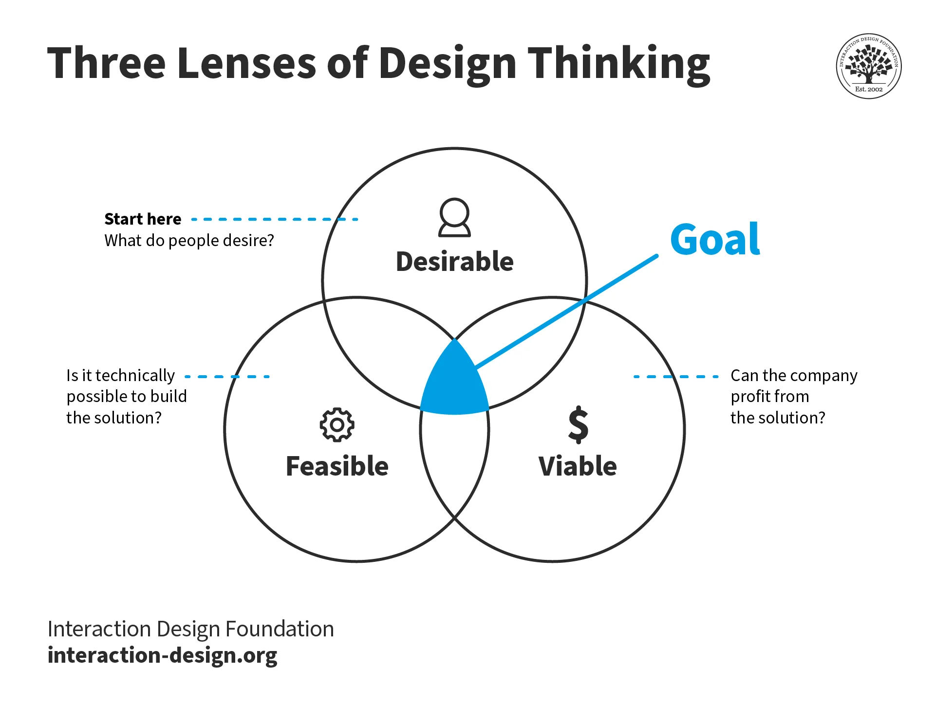
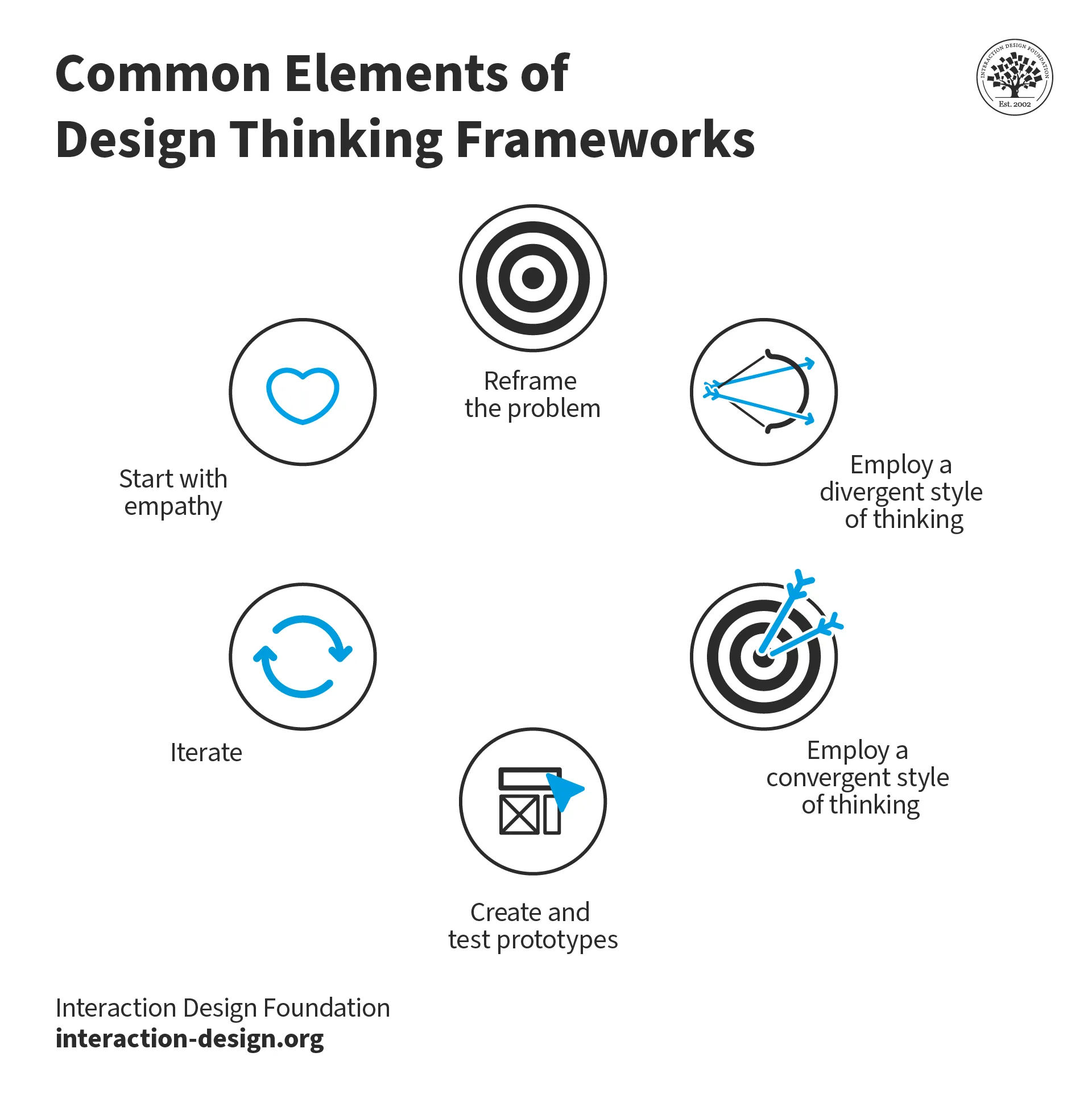
The design thinking innovation process empowers designers and design teams to work out what and where the goal is.
For true innovation, a UX design process such as design thinking is ideal. Since the design thinking process encourages such a vast exploration of the problem space and solution space, designers—and the team members they have ideation sessions with—can stand back and reapproach and reframe—and even radically depart from traditional ways of assessing—design problems and users’ needs and scenarios.
UX Strategist and Consultant, William Hudson explains important points about design thinking in this video:
ShowHide
video transcript
00:00:00 --> 00:00:33
Design thinking is a non-linear, iterative process that teams use to understand users, challenge assumptions, redefine problems, and create innovative solutions to prototype and test. It is most useful to tackle problems that are ill defined or unknown. In a rapidly changing world, organizations must be able to adapt and innovate quickly to survive. Design thinking is a powerful tool that can help organizations to do just that. By focusing on the user and their needs, he can help teams to develop creative solutions
00:00:33 --> 00:01:00
that meet the real needs of the people they serve. The end goal of a design thinking process is to create a solution that is desirable, feasible and viable. This means that your product should satisfy the needs of a user, be feasible to implement and have a financial model as well. During the bulk of your design thinking process, you'll focus on desirability as you are concerned with testing your ideas and validating your hypothesis about your users.
00:01:00 --> 00:01:08
Towards the end of your project, however, you should bring the focus to feasibility and viability so that your solution can be sustainable.
Divergent thinking techniques such as out-of-the-box thinking and bad ideas offer valuable leeway for design teams to get the distance to look at problems and contexts from new and unimagined perspectives. Once they access these new angles, team members can sift and sort the ideas they generate via convergent thinking and then weave workable insights into prototypes they can test.
Professor Alan Dix explains divergent and convergent thinking:
ShowHide
video transcript
00:00:00 --> 00:00:28
What I want to do now is talk about a few other kinds of divergent techniques. Creativity has two sides to it. There's being *novel* and being *useful*. There's a *divergent* side that's having lots and lots of bright ideas and a *convergent* side that tries to turn those ideas into something that's more useful and buildable.
2. Drive User Engagement
Another component in the calculus of design innovation is the often-elusive goal of not just to attract users with a new design, but to keep them actively involved, interested and satisfied with a product that’s new, exciting and truly “different” to distinguish the brand that users will be loyal to. Designers therefore need a clear idea of the user journeys on which the people who will encounter new products or services will find themselves:
Frank Spillers explains key points about user journeys:
ShowHide
video transcript
00:00:00 --> 00:00:31
I wanted to just spend a little bit of time on the *user journey*. So, we can see how important user research is to creating really compelling value propositions and creating value for organizations that are trying to use service design to innovate, improve, streamline and smooth out. Well, there's nothing better to tackle that with than the user journey.
00:00:31 --> 00:01:00
I wanted to just spend a little bit of time on this technique in case you didn't have that much experience with it or maybe you were doing journeys in a way that was different to the way I'm going to present to you. At least, I just wanted to share a template with you that can give you better access to what you're looking for. For me, now, a journey is something that you *build on*. So, first off it's your *customer journey*.
00:01:00 --> 00:01:31
And on that is your service blueprint. And remember that the journey is going to reveal those cross-channel like, say, *breakpoints*, *pain points*, *disconnects* that you can map in the different *swim lane diagrams* – is the official term for a journey map. So, it comes from that – these swim lanes. And so, you'll have like maybe your channels here – you know – you'll have your user tasks here, pains and gains, or you can just have positive (+) or negative (-).
00:01:31 --> 00:02:01
And I tend to change my user journeys, try and improve them, try and improve them. One of the problems that I find with journey maps – and they became very popular, I think around 2010, maybe, was the heyday of user journeys – 2010 / 2012, maybe. It was all about this beautiful big visualization. Let's be clear: A customer journey map is *not* about impressing your team
00:02:01 --> 00:02:30
with really cool, big swim diagram visualizations with tons of little icons. It's a document like all deliverables in a human-centered design perspective. It should work for the internal teams that are using it as a decision-making document *as well*. The thing about the journey map that's particularly of value to the service designer is that it's happening across time
00:02:30 --> 00:03:03
or across stages or across goals. So, the stages of, say, the life cycle – you know – you might have Research, Compare, Purchase, then the Return shopping. In other words, it's not just the purchase. A lot of conversion optimization and approaches to selling online just focus on this part here: the compare and purchase, or the funnel – if you will – the purchase funnel. And I think it's important to have the acquisition as much as the retention.
00:03:03 --> 00:03:31
This is the conversion here. So, these two steps are the conversion steps. It's important to have *all* those steps represented. *Happy / sad moments* – you can have a little smiley face; *disconnects and breaks* – you know – so that you're like: "Ah! This is a break right here. They're on their phone, and they're researching, but the site's not responsive or it's *partially* responsive. And then, compare – when they go to compare, it only allows three items. So, it's like "Ohh!" – and then we have a quote from the user going:
00:03:31 --> 00:04:00
"Why does this only allow (imitated mumbling)?!" – you know – something communicating the pain point. The other thing it's going to have is your reflections from your ethnography, from your personas. It's going to have those real-world contexts, basically. Instead of basically making it up and doing it internally, you're going to base it on user data. You'll also want to have *recommendations*. So, down here at the bottom you can have a list of recommendations
00:04:00 --> 00:04:30
as well. This is an example of a journey map we created. And you can see the touch points we've added along the way. So, we have these different stages. We've got this – as the user walks through. So, we have Pre-apply, Apply, Post-apply. This is an online application journey. And we have the various channels that are occurring there. We've got the pain points represented. And the steps are:
00:04:30 --> 00:04:57
Discover, Research, Apply, Manage and Dream. Discover was important because a lot of people didn't know that the offers were there. This is for getting an account. And basically the value proposition is you're going to have these offers – targeted offers – sent to you. So, the key is to find out how people are currently applying and at what stage makes sense to offer them these upsells, basically. And that's the value add that's being offered here.
User engagement is a key metric for understanding how users interact with a product or service and whether they find it valuable. Innovative UX design plays a vital role in this formula, as designers work to:
Improve usability: Innovative products should be easy to navigate and use effectively. They should have intuitive qualities that users can take to without detailed instruction.
Increase satisfaction: Users are more likely to come back to and recommend products that have innovative designs. They’re a sign of a forward-thinking company that looks to both the future and their users’ futures.
Boost the chances of success: Innovative UX design helps products fly high to reach solid goals, with more sales and strengthened customer loyalty.
Incorporate AI-driven personalization and real-time optimization: With advances in AI, designers can integrate it inventively into UIs and further boost user engagement—and their brands’ conversion rates.
Product Design Lead at Netflix, Nival Sheikh explains vital aspects about ethical AI:
ShowHide
video transcript
00:00:00 --> 00:00:33
Let's start with a definition about what ethical AI is. What ethical AI does is it seeks to promote fairness, minimize harm and align AI with human values and well-being. And if I'm a designer and I'm working in ethical AI, one of the questions that I really want to ask is how do I design artificially intelligent systems that follow ethical principles and society. When we think about the practice of building AI systems,
00:00:33 --> 00:01:01
ethical AI is that practice that follows ethical and moral standards in society. But it is dynamic, right? As AI changes, ethical AI must change to keep momentum and to keep pace with the advent of AI technology. So one of the big questions that ethical AI asks as a bird's eye perspective of what AI is is what are the legitimate and illegitimate uses of A.I.?
00:01:01 --> 00:01:30
One of the things that we talk about a lot in ethical AI is transparency which basically sounds is exactly what it sounds like. You're allowing users to understand how decisions are made in the AI systems that they're using. So, this and this really what it does is it builds trust with the user and it builds that relationship where it enables the user to really assess how the system behavior (It has a behavior for bias and fairness).
00:01:30 --> 00:02:01
And it really allows them to see, you know, like what's going on in the background when they're using these AI systems. There’s accountability, which is basically that the designers, the developers, the organizations, basically every stakeholder that has some sort of stake in the matter, whether and even users, they should be held accountable for the impact and consequences of AI systems. So this means things like ease of troubleshooting,
00:02:01 --> 00:02:30
ease of understanding, maybe for errors are there how to address those errors. Like those mechanisms should all be included within the system, within the AI system that they're using. And then there's fairness. So, outcomes should be fair and equitable for users. And by mitigating bias and addressing disparities in AI outcomes, this can be achieved. Definitely, easier said than done, as we'll see in a bit.
00:02:30 --> 00:03:00
But this is the whole concept of just making sure that things are equitable and that outcomes aren't biased or favored towards one demographic or one region or one area or person or industry based off of another. or one region or one area or person or industry based off of another. And privacy. So, individuals have rights on their privacy and data, right? Especially we've been through a lot of like consumer data laws. So, the whole concept is built upon like these systems have to be built
00:03:00 --> 00:03:34
to handle user privacy and data in a secure and ethical manner. And information should definitely be obtained consensually, which not only means that, like me, as a user, I'm giving my data and consenting to my data being given. But I also understand what it means to permission a system to to have my data. Like are they going to sell it? What are they going to do with it? I should, as a user, should have a very thorough understanding of that. And so that understanding should be accessible amongst everyone.
00:03:34 --> 00:03:37
That's basically the idea of privacy and ethical AI.
3. Stay Competitive in the Digital Landscape
Innovation is a pressing need for the survival and sustainable growth of companies, and innovative UX design helps organizations:
Stand out in a competitive market: A brand that can offer exceptional and user-centered experiences can enjoy sustainable advantages over competitors.
Attract new clients: For agencies and designers, it’s a massive asset to have original design patterns to showcase to potential clients. The evidence of this expertise can lead them to work on more exciting projects with brands that seek to differentiate themselves.
Reflect company values: Innovative products often call for equally innovative digital properties to support them. That makes designers who create innovative designs more attractive to forward-thinking companies. One of the most vital values a brand can exhibit—and an aspect that designers mustn’t forget as they innovate—is a commitment to accessibility and inclusive design.
Watch our video to understand the vital nature of accessibility in design:
ShowHide
video transcript
00:00:00 --> 00:00:30
Accessibility ensures that digital products, websites, applications, services and other interactive interfaces are designed and developed to be easy to use and understand by people with disabilities. 1.85 billion folks around the world who live with a disability or might live with more than one and are navigating the world through assistive technology or other augmentations to kind of assist with that with your interactions with the world around you. Meaning folks who live with disability, but also their caretakers,
00:00:30 --> 00:01:01
their loved ones, their friends. All of this relates to the purchasing power of this community. Disability isn't a stagnant thing. We all have our life cycle. As you age, things change, your eyesight adjusts. All of these relate to disability. Designing accessibility is also designing for your future self. People with disabilities want beautiful designs as well. They want a slick interface. They want it to be smooth and an enjoyable experience. And so if you feel like
00:01:01 --> 00:01:30
your design has gotten worse after you've included accessibility, it's time to start actually iterating and think, How do I actually make this an enjoyable interface to interact with while also making sure it's sets expectations and it actually gives people the amount of information they need. And in a way that they can digest it just as everyone else wants to digest that information for screen reader users a lot of it boils down to making sure you're always labeling
00:01:30 --> 00:02:02
your interactive elements, whether it be buttons, links, slider components. Just making sure that you're giving enough information that people know how to interact with your website, with your design, with whatever that interaction looks like. Also, dark mode is something that came out of this community. So if you're someone who leverages that quite frequently. Font is a huge kind of aspect to think about in your design. A thin font that meets color contrast
00:02:02 --> 00:02:20
can still be a really poor readability experience because of that pixelation aspect or because of how your eye actually perceives the text. What are some tangible things you can start doing to help this user group? Create inclusive and user-friendly experiences for all individuals.
4. Meet Evolving User Expectations
User preferences and expectations are constantly changing. Innovative UX and UI designs help meet these evolving needs since they can:
Adapt to technological changes: Most people quickly adapt to technological advancements, making them more open to innovations that positively contribute to their lives.
Create intuitive interfaces: Innovations like kebab menus have long since become established web design patterns—to simplify and declutter interfaces, especially on mobile sites.
Embrace emerging technologies: Technologies like artificial intelligence (AI), voice interfaces, blockchain, IoT and wearables offer new ways to enhance user experiences and meet changing expectations.
When a brand’s design team applies this framework well, it can afford to consider innovation as a learning process embedding design thinking—and take the time to arrive at the best solutions.
Artificial intelligence and machine learning (ML) have become essential tools in UX design. They’ve revolutionized the way designers create, personalize and optimize user experiences. AI and ML algorithms can:
Analyze large volumes of user data to identify patterns and insights.
Predict user behavior and anticipate needs and preferences.
Optimize the user journey for a more intuitive experience with tailored content.
When mindful and innovative designers integrate AI into UIs, they can greatly boost user engagement and conversion rates through personalization and real-time optimization. AI-powered tools also automate tedious tasks and let designers focus on more creative and strategic work from higher altitudes.
The potential for AI in innovative design is immense—and calls for responsible and ethical study and application.
Voice and gesture-based interfaces have evolved to highly sophisticated levels. Smartphone screens and Alexa devices are prime examples of how embedded these technologies are as staples of design and household names. What’s more, the advent of AI and machine learning has taken these interfaces to new heights, and made them increasingly sophisticated and user-friendly.
Key considerations for designing voice- and gesture-based interfaces include:
Natural language processing and speech recognition for voice interfaces.
Context-appropriate design based on the user's environment and tasks.
Intuitive and easy-to-perform gestures for gesture-based interfaces.
These interfaces offer many benefits that modern users have become used to—and that users expect to develop further and in new ways for their use—such as hands-free interaction and improved accessibility for users with disabilities. However, designers must be mindful of potential challenges such as providing adequate feedback, establishing good user experiences and addressing privacy concerns.
3. Augmented and Virtual Reality Experiences
Augmented reality (AR) and virtual reality (VR) are continuing to transform UX design and users’ lives. From their early days as novelty experiences, for example, innovative AR and VR designs have grown to become ingrained in the popular psyche. Immersive and interactive experiences integrate digital data with the user's environment in real-time, allowing for more natural and intuitive interactions.
Watch Frank Spillers explain fascinating points about AR and its importance in the modern design world:
ShowHide
video transcript
00:00:00 --> 00:00:32
What is AR? Well, the old definition is that, you know, you see a visualization with an iPad or a phone and it kind of something just pops up, a static visualization. The new definition of AR utilizes technologies that embody spatial mapping that actually map out the room and uses headsets more like this headset where you're looking around and you're have more contact than just through your phone.
00:00:32 --> 00:01:03
So you have holograms and stories or narratives that actually merge with the actual environment, and that's the exciting potential of AR designing for augmented reality. It's about deepening the meaning of real and augmented objects and contexts that is playful and helps guide your discovery that you can visualize and have intuitive discovery and manipulation of objects or content,
00:01:03 --> 00:01:29
and but that it allows you to extend your cognitive abilities to think, to decide, to imagine. It couples with reality to create more meaning. And finally, that is collaborative. And the question is, what's the difference between VR? VR you wear a headset and you're fully underneath that head mounted display, whereas AR your have something that keeps you in contact with the real world.
Key aspects of AR and VR for designers to keep innovating include in how they can:
Create tridimensional interfaces for more natural interactions.
Develop virtual prototypes for early user feedback and testing.
AR and VR technologies can also leverage sensors and AI to collect data about user behavior and preferences, which can enable highly personalized experiences. These immersive technologies continue to open up new possibilities for data visualization, accessibility and gesture-based interactions. So, they’re prime areas of attention for designers to focus pushing at the boundaries of—and help users emerge into powerfully helpful new conveniences that may become staples in everyday life.
Author and UX Pioneer, known as the Father of UX Design, Don Norman explains important points about the future of AR and VR in design:
ShowHide
video transcript
00:00:00 --> 00:00:34
Well, I'm a fan of both – basically VR and AR are the two major categories, and the rest are specializations. I'm a fan of both. I think living in an artificial world is really engaging. I've been doing it for 20 years. Let me explain that. I have been seeing this in research laboratories for about 20 years and experiencing it in wonderful, wonderful experiences. And it isn't yet up for real time; it's just getting there, just beginning;
00:00:34 --> 00:01:01
it's got a few more years to go, but I believe that's going to be very important. It's already important for *training* people. It's already used in medicine, for example. And it's already used in repair – learning how to repair things. *Augmented* is also very very valuable because with virtual reality, it's your *own new world* with augmented, I'm *the real world* but I have things, so augmented is really great for people trying to repair something
00:01:01 --> 00:01:24
because I go to the thing that is broken and there on top of it I can see instructions or arrows pointing to what I should look at next and so on. But again it's just – at Apple, when I was at Apple 20 years ago, we were doing this; we were already trying to do this, but the technology wasn't good enough. And I think that it's going to be very powerful.
How to Overcome Barriers to UX Innovation?
Designers encounter the professional face of innovation in many aspects of their lives, and it’s here where they can flex their imaginations and stoke powerful engines of creativity:
Author and Human-Computer Interaction Expert, Professor Alan Dix explains important points about the nature of creativity:
ShowHide
video transcript
00:00:00 --> 00:00:30
What is creativity? Is it something that you just sort of *wait for* to fall on you from above? Or is it something you *work at*? Do you all have those moments when you you know you need a spark of creativity? You're in the midst of designing something; you're trying to make a new website; you're trying to make a new application; you're trying to work out how to evaluate something
00:00:30 --> 00:01:02
that's hard to evaluate – perhaps the way people feel or something like this. And you want that *moment of inspiration*, and does it come when you need it? Of course it doesn't! The model we have of creativity tends to be about these moments of genius. And you already heard about, I think, the 3M story, the Post-it Notes. You know – imagine if you'd had that idea to use this sort of magic glue on the back to create Post-it Notes; how much money there has been on Post-it Notes. Or Philippe Starck and the – well, we all know the lemon juicer is not perhaps all it's cooked up to be,
00:01:02 --> 00:01:30
that it dribbles all over your fingers and stuff, but boy is it iconic! And everybody who's anybody in design would like one of those lemon squeezers sitting on their kitchen worktop! We have this idea of creativity as a genius activity. It might be Steve Jobs in Apple or some of these designers we're looking at here, perhaps Einstein. But is that the full story? Certainly that's the sort of way it seems if you look at sort of
00:01:30 --> 00:02:01
Western traditions of thinking about these things. Going way back to the Greeks, you've got the Muses, the different arts, and the idea that somehow or other this inspiration comes from the Muses up in Olympus and gives you these bright ideas, whether it's poetry or whether it's music ... or web design! So, is that the real story? Let's look a little bit back at these two we've been looking at. First of all, let's look back at the Post-it Notes.
00:02:01 --> 00:02:34
The story is a little bit more complicated; it's not just – you probably know a little bit about this; it wasn't just a moment of inspiration. The guy who was trying to design these things – well, he *wasn't* trying to design these things; the guy was called Spencer Silver; 1968, and he's trying to design a really good glue. And he makes his glue, and he puts it on the back of some paper, and he sticks it to something, and it just... pulls straight off again. Whatever he sticks it to, it's rubbish.
00:02:34 --> 00:03:06
Now, I don't know if you've done this. You've been scribbling away at something; you've got lots of ideas, perhaps on your napkin... and you're about to throw it away. When you're about to do that, when you're about to throw it in the bin, pull it out again, have another peek because you never know when you might have a *moment of genius*. Spencer Silver was like this, but he knew there was something about this.
00:03:06 --> 00:03:31
There was something about this he felt could be useful. He spent five years going around 3M talking to people, giving seminars and talks and talking about this solution in need of a problem. And then, in 1974, a guy called Arthur Fry was in one of these talks and came back to Spencer and said, 'I have an idea.'
00:03:31 --> 00:04:01
Five years, two people, and an idea that could have been.... And that would throw the whole lot away in the bin before it ever started. Okay, let's look at the lemon squeezer now. So, Philippe Starck – I think it was in Italy, but he's in a restaurant somewhere. And the story is he's thinking about lemon squeezers; he has this sort of inspiration of a squid,
00:04:01 --> 00:04:33
and hence we get the iconic lemon squeezer. But of course, first of all that's not built just on that meal time. He knows about lemon squeezers; he's seen lots of lemon squeezers, lemon squeezers which have some of the suggestions – especially if you look at those kind that you do this to – of the one on the bottom, or be it the other way around; maybe it would work better if you have the sharp end up. But even that – it's not as simple as that. He wrote down on, perhaps it was a tablecloth – certainly in some of these Italian restaurants you get paper tablecloths
00:04:33 --> 00:05:02
that get taken away, thrown away at the end. But this tablecloth has been preserved, or this napkin has been preserved. And when you look at that, you see things, images, some of them which look pretty much like standard lemon squeezers, and gradually shifting. The order is not so clear. But it looks pretty much like actually the squid came quite late in the day. So, when he tells the story, of course the squid is hot in his imagination, but when you actually look at the trace of the design,
00:05:02 --> 00:05:30
there were a lot of stages, goodness knows how many sketches, on this very small piece of paper that eventually came up with this idea. So, even something that took quite a short amount of time, unlike the 3M Post-it Notes, which took five years to gestate, this happened quite quickly. But even, so there was quite an *evolutionary process* in actually coming up with the idea. So, the question is – can we have *techniques* to help us do this kind of thing?
00:05:30 --> 00:05:39
Not necessarily to turn us into immediate magic geniuses, but to actually get reasonable creative ideas when we need them.
At the same time, the workplace is the main area for designers to explore and tap innovative insights. So, it’s vital to:
1. Nurture a Culture of Creativity
Designers and the teams they ideate and iterate with need an environment that’s conducive to creativity—one that doesn’t stifle wild-sounding notions with judgments. This involves thinking outside the box and developing exciting ideas for user interfaces that offer exceptional experiences. To encourage new and even seemingly crazy ideas among team members can lead to innovative breakthroughs. It's important to remember that great ideas often sound unconventional at first.
To stimulate creativity, designers can:
Use design thinking exercises to encourage collaboration and facilitate problem-solving.
Employ structured but open-ended frameworks that foster creativity.
Challenge assumptions and explore diverse perspectives.
Treat uncertainty as an opportunity for meaningful and creative solutions.
Professor Alan Dix explains the bad ideas approach to innovation:
ShowHide
video transcript
00:00:00 --> 00:00:34
In this video, I'm going to give you an exercise to do. It's going to be an exercise in *bad ideas*. This is where I tip your brain towards madness. But, hopefully – the boundary between creativity and genius and total madness is often said to be a thin one; so, by pushing you a little towards madness, I hope to also push you a little towards creativity.
00:00:34 --> 00:01:06
And hopefully, you can control the madness that comes there. But we'll see as it goes along. So, what I want you to do is – you know how hard it is to think of good ideas; everybody says, "Ah! Let's have a brainstorming session and have lots of ideas!" and (sound effect), right? So, if it's so hard to think of good ideas, why not think of a *bad idea*? So, what I'd like you to do as an exercise is just to think of a bad idea or a silly idea, a completely crazy idea.
00:01:06 --> 00:01:31
Now, it might be about something that you're doing at the moment. Or it might be a particular problem you've got. And so, what would be a really bad idea... for sending notifications to people about something you want to get them engaged in? Perhaps you could send them an email every three seconds or something like that! So, it could be that kind of bad idea, or it could be just an idea from the world.
00:01:31 --> 00:02:03
And it could be a Heath Robinson sort of bad idea – something that's complex and arcane and that. Or perhaps – and this is probably a good one to start with – just an *oxymoron*. So, something like a chocolate teapot, so something that appears to be really crazy, really silly; a car without an engine – I remember once in a session we had this – that doesn't seem like a good idea. So, you've got your bad idea – it may be a chocolate teapot
00:02:03 --> 00:02:32
or it may be the car with no engine or something like that. What I want you to do now is – I'm going to take you through some prompt questions. First of all, this was a bad idea – the reason you chose it was because it was a bad idea. So, what I want you to do is say to yourself, "What is bad about this idea?" So, think of the car without an engine. What's bad about a car without an engine? Well, it doesn't have an engine; it's obvious, right?
00:02:32 --> 00:03:04
So, you start off with that. Now, you might think a bit more. But then I want you to dig and say, "Well, *why* is that a bad idea?" Well, it's not got an engine – it can't go anywhere. Then dig a bit back further; so, are there things that you can think of that are like that, that have that property? So, for instance, a car without an engine can't go anywhere. Are there things that can't go anywhere that's actually a good idea? Well...
00:03:04 --> 00:03:31
a garden shed: a garden shed doesn't go anywhere, but that's not a bad idea. And, in fact... you might want to have something that can't be stolen; you don't want that to go anywhere. So, that's not a bad idea. So, if you can think of things that appear to share the bad thing but actually aren't bad, what's the difference? Why is not having an engine, why is not being able to go anywhere bad for the car but not bad for the garden shed?
00:03:31 --> 00:04:00
And as you dig into this, hopefully you start to understand better these things. You can also go the other way around. So, you *know* this is a bad idea, but maybe there's something good about it. It hasn't got an engine; it's not polluting. Wow, we've got a green car! It will be green because all the moss will grow on it because it doesn't drive anywhere, but – you know – "This is good, surely?!"
00:04:00 --> 00:04:30
So, then you can think, "Well, okay, if this is a good thing" – you can do the same sort of thing: "Why is that a good thing?" Well, it doesn't choke you with its pollution. If you're finding this difficult – and particularly this is true about the bad idea bit – you want to say... with the bad idea, you want to change that bad thing into a good thing; so, this is whether you want to find a good thing in the bad idea or you want to find a good use for the thing you've identified that's bad – you might try a *different context*; so...
00:04:30 --> 00:05:00
if you take the car off the road and put it perhaps into something where it's moved along by something else – perhaps sitting on the back of a lorry... why, you might want that – well, you might want it so you can easily move your car. You might put it onto something that's dragged along. So, you sometimes change the context and suddenly something that seemed bad suddenly is not so bad. So, the final thing you can do with your bad idea is *turn it into a good idea*.
00:05:00 --> 00:05:31
Now, you might have already done this as part of that process. So, what's *good*? When you've identified something that's good about it, like the car, that it wasn't polluting, try to hold on to that – try to keep that and retain that good feature. But where you found the things and you really dug down to *why something's bad*, not just the superficial – you know – it doesn't have an engine; well, that's not bad in itself,
00:05:31 --> 00:06:05
but the fact that means you can't drive anywhere in it; okay, that's bad. So, can you change that badness but still retain the non-pollutingness? So, perhaps we're going to have a truly green car. Perhaps we're going to have roads with sort of little wires you connect into and – you know – a bit like Scalextric cars, so you can drag the cars along so they don't have an engine and they're being powered elsewhere. You may, I said, *change the context entirely* – so, instead of it being a car for driving around in
00:06:05 --> 00:06:30
– well, I've already mentioned this one – stick your chickens in it and it suddenly becomes a hen coop. And I think if you go around the the world, you'll find a lot of old cars usually actually with their engines still sitting in them that are being used as hen coops. If you had a *complex idea* – and this is true, it could be for a simple idea, but in doing your thinking, there might be just something about it, something small;
00:06:30 --> 00:07:01
it wasn't necessarily the whole thing. So, actually – you know – the idea of the gap in the engine; perhaps you decided that would be really good actually having the engine not there because you could put things in the front, and for whatever reason, you think it's easier to put things in the front than the back. So, perhaps that becomes your idea – that actually, you'd quite like to be able to put your luggage in the front of the car; you'd like more room in the car for luggage. And then perhaps you'll put an engine back in the car, but thinking about
00:07:01 --> 00:07:33
how you actually improve access for luggage. If you've had one of those Heath Robinson complex ideas, Wallace and Gromit-like ideas, then actually you may not be trying to make the whole thing into a good idea; but within it, some little bit of that complex mechanism might be something that you've thought about; you've realized and suddenly think, "Ahh!" and do something just with that. And I'll leave you with a glass hammer!
2. Embrace User-Centered Design
User-centered design (UCD) is crucial for creating valuable and innovative products or services. To practice it, designers put their users’ needs and wants first, make data-driven decisions and create intuitive designs that satisfy—and, ideally, exceed—user needs. So, designers should:
Conduct thorough user research to gain insights into users' core needs.
Observe users in their natural environments, to understand their preferences and values.
William Hudson explains essential points about user research:
ShowHide
video transcript
00:00:00 --> 00:00:30
User research is a crucial part of the design process. It helps to bridge the gap between what we think users need and what users actually need. User research is a systematic process of gathering and analyzing information about the target audience or users of a product, service or system. Researchers use a variety of methods to understand users, including surveys, interviews, observational studies, usability testing, contextual inquiry, card sorting and tree testing, eye tracking
00:00:30 --> 00:01:02
studies, A-B testing, ethnographic research and diary studies. By doing user research from the start, we get a much better product, a product that is useful and sells better. In the product development cycle, at each stage, you’ll different answers from user research. Let's go through the main points. What should we build? Before you even begin to design you need to validate your product idea. Will my users need this? Will they want to use it? If not this, what else should we build?
00:01:02 --> 00:01:31
To answer these basic questions, you need to understand your users everyday lives, their motivations, habits, and environment. That way your design a product relevant to them. The best methods for this stage are qualitative interviews and observations. Your visit users at their homes at work, wherever you plan for them to use your product. Sometimes this stage reveals opportunities no one in the design team would ever have imagined. How should we build this further in the design process?
00:01:31 --> 00:02:00
You will test the usability of your design. Is it easy to use and what can you do to improve it? Is it intuitive or do people struggle to achieve basic tasks? At this stage you'll get to observe people using your product, even if it is still a crude prototype. Start doing this early so your users don't get distracted by the esthetics. Focus on functionality and usability. Did we succeed? Finally, after the product is released, you can evaluate the impact of the design.
00:02:00 --> 00:02:15
How much does it improve the efficiency of your users work? How well does the product sell? Do people like to use it? As you can see, user research is something that design teams must do all the time to create useful, usable and delightful products.
Create personas that represent principal user groups to provide a shared understanding among team members.
Professor Alan Dix explains important points about personas:
ShowHide
video transcript
00:00:00 --> 00:00:34
Personas are one of these things that gets used in very, very many ways during design. A persona is a rich description or description of a user. It's similar in some sense, to an example user, somebody that you're going to talk about. But it usually is not a particular person. And that's for sometimes reasons of confidentiality.
00:00:34 --> 00:01:02
Sometimes it's you want to capture about something slightly more generic than the actual user you talked to, that in some ways represents the group, but is still particular enough that you can think about it. Typically, not one persona, you usually have several personas. We'll come back to that. You use this persona description, it's a description of the example user, in many ways during design. You can ask questions like "What would Betty think?"
00:01:02 --> 00:01:35
You've got a persona called / about Betty, "what would Betty think" or "how would Betty feel about using this aspect of the system? Would Betty understand this? Would Betty be able to do this?" So we can ask questions by letting those personas seed our understanding, seed our imagination. Crucially, the details matter here. You want to make the persona real. So what we want to do is take this persona, an image of this example user, and to be able to ask those questions: will this user..., what will this user feel about
00:01:35 --> 00:02:01
this feature? How will this user use this system in order to be able to answer those questions? It needs to seed your imagination well enough. It has to feel realistic enough to be able to do that. Just like when you read that book and you think, no, that person would never do that. You've understood them well enough that certain things they do feel out of character. You need to understand the character of your persona.
00:02:01 --> 00:02:30
For different purposes actually, different levels of detail are useful. So I'm going to sort of start off with the least and go to the ones which I think are actually seeding that rich understanding. So at one level, you can just look at your demographics. You're going to design for warehouse managers, maybe. For a new system that goes into warehouses. So you look at the demographics, you might have looked at their age. It might be that on the whole that they're older. Because they're managers, the older end. So there's only a small number under 35. The majority
00:02:30 --> 00:03:01
are over 35, about 50:50 between those who are in the sort of slightly more in the older group. So that's about 40 percent of them in the 35 to 50 age group, and about half of them are older than 50. So on the whole list, sort of towards the older end group. About two thirds are male, a third are female. Education wise, the vast majority have not got any sort of further education beyond school. About 57 percent we've got here are school.
00:03:01 --> 00:03:34
We've got a certain number that have done basic college level education and a small percentage of warehouse managers have had a university education. That's some sense of things. These are invented, by the way, I should say, not real demographics. Did have children at home. The people, you might have got this from some big survey or from existing knowledge of the world, or by asking the employer that you're dealing with to give you the statistics. So perhaps about a third of them have got children at home, but two thirds of them haven't.
00:03:34 --> 00:04:05
And what about disability? About three quarters of them have no disability whatsoever. About one quarter do. Actually, in society it's surprising. You might... if you think of disability in terms of major disability, perhaps having a missing limb or being completely blind or completely deaf. Then you start relatively small numbers. But if you include a wider range of disabilities, typically it gets bigger. And in fact can become
00:04:05 --> 00:04:32
very, very large. If you include, for instance, using corrective vision with glasses, then actually these numbers will start to look quite small. Within this, in whatever definition they've used, they've got up to about 17 percent with the minor disability and about eight percent with a major disability. So far, so good. So now, can you design for a warehouse manager given this? Well,
00:04:32 --> 00:05:01
you might start to fill in examples for yourself. So you might sort of almost like start to create the next stage. But it's hard. So let's look at a particular user profile. Again, this could be a real user, but let's imagine this as a typical user in a way. So here's Betty Wilcox. So she's here as a typical user. And in fact, actually, if you look at her, she's on the younger end. She's not necessarily the only one, you usually have several of these. And she's female as well. Notice only up to a third of our warehouse ones are female. So
00:05:01 --> 00:05:31
she's not necessarily the center one. We'll come back to this in a moment, but she is an example user. One example user. This might have been based on somebody you've talked to, and then you're sort of abstracting in a way. So, Betty Wilcox. Thirty-seven, female, college education. She's got children at home, one's seven, one's 15. And she does have a minor disability, which is in her left hand. And it's there's slight problem in her left hand.
00:05:31 --> 00:06:00
Can you design, can you ask, what would Betty think? You're probably doing a bit better at this now. You start to picture her a bit. And you've probably got almost like an image in your head as we talk about Betty. So it's getting better. So now let's go to a different one. You know, this is now Betty. Betty is 37 years old. She's been a warehouse manager for five years and worked for Simpkins Brothers Engineering for 12 years. She didn't go to university, but has studied in her evenings for a business diploma.
00:06:00 --> 00:06:31
That was her college education. She has two children aged 15 and seven and does not like to work late. Presumably because we put it here, because of the children. But she did part of an introductory in-house computer course some years ago. But it was interrupted when she was promoted, and she can no longer afford to take the time. Her vision is perfect, but a left hand movement, remember from the description a moment ago, is slightly restricted because of an industrial accident three years ago.
00:06:31 --> 00:07:04
She's enthusiastic about her work and is happy to delegate responsibility and to take suggestions from the staff. Actually, we're seeing somebody who is confident in her overall abilities, otherwise she wouldn't be somebody happy to take suggestions. If you're not competent, you don't. We sort of see that, we start to see a picture of her. However, she does feel threatened – simply, she is confident in general – but she does feel threatened by the introduction of yet another computer system. The third since she's been working at Simpkins Brothers. So now, when we think about that, do you have a better vision of Betty?
00:07:04 --> 00:07:32
Do you feel you might be in a position to start talking about..."Yeah, if I design this sort of feature, is this something that's going to work with Betty? Or not"? By having a rich description, she becomes a person. Not just a set of demographics. But then you can start to think about the person, design for the person and use that rich human understanding you have in order to create a better design.
00:07:32 --> 00:08:06
So it's an example of a user, as I said not necessarily a real one. You're going to use this as a surrogate and these details really, really matter. You want Betty to be real to you as a designer, real to your clients as you talk to them. Real to your fellow designers as you talk to them. To the developers around you, to different people. Crucially, though, I've already said this, there's not just one. You usually want several different personas because the users you deal with are all different.
00:08:06 --> 00:08:30
You know, we're all different. And the user group – it's warehouse managers – it's quite a relatively narrow and constrained set of users, will all be different. Now, you can't have one persona for every user, but you can try and spread. You can look at the range of users. So now that demographics picture I gave, we actually said, what's their level of education? That's one way to look at that range. You can think of it as a broad range of users.
00:08:30 --> 00:09:02
The obvious thing to do is to have the absolute average user. So you almost look for them: "What's the typical thing? Yes, okay." In my original demographics the majority have no college education, they were school educated only. We said that was your education one, two thirds of them male – I'd have gone for somebody else who was male. Go down the list, bang in the centre. Now it's useful to have that center one, but if that's the only person you deal with, you're not thinking about the range. But certainly you want people who in some sense
00:09:02 --> 00:09:24
cover the range, that give you a sense of the different kinds of people. And hopefully also by having several, reminds you constantly that they are a range and have a different set of characteristics, that there are different people, not just a generic user.
Start early in the design processwith wireframes, prototyping andusability testing to keep a valuable user experience core at the heart of all that they design.
Watch as Alan Dix explains prototyping and why it’s important:
ShowHide
video transcript
00:00:00 --> 00:00:31
So, why do you need prototyping? Well, we never get things right first time. It's about getting things *better* when they're not perfect and also *starting in a good place*. Maybe if I'm going to make a wall for a house, I know exactly how big the wall should be. I can work out how many bricks I need. I can make it exactly the right size.
00:00:31 --> 00:01:00
So, I can get it right first time. It's important to. I don't want to knock the wall down and retry it several times. However, there I have a very clear idea of what I'm actually creating. With people involved, when you're designing something for people, people are not quite as predictable as brick walls. So, we *don't* get things right first time. So, there's a sort of classic cycle – you design something, you prototype it,
00:01:00 --> 00:01:31
and that prototyping might be, you might sort of get a pad of paper out and start to sketch your design of what your interface is going to be like and talk through it with somebody. That might be your prototype. It might be making something out of blue foam or out of cardboard. Or it might be actually creating something on a device that isn't the final system but is a "make-do" version, something that will help people understand.
00:01:31 --> 00:02:03
But, anyway, you make some sort of prototype. You give it to real users. You talk to the real users who are likely to be using that about it. You evaluate that prototype. You find out what's wrong. You redesign it. You fix the bugs. You fix the problems. You mend the prototype, or you make a different prototype. Perhaps you make a better prototype, a higher-fidelity prototype – one that's closer to the real thing. You test it again, evaluate it with people, round and round and round. Eventually, you decide it's good enough. "Good enough" probably doesn't mean "perfect", because we're not going to get things perfect, ever.
00:02:03 --> 00:02:33
But "good enough" – and then you decide you're going to ship it. That's the story. In certain cases in web interfaces, you might actually release what in the past might have been thought of as "a prototype" because you know you can fix it, and there might not be an end point to this. So, you might in delivering something – and this is true of any product, actually – when you've "finished" it, you haven't really finished, because you'll see other problems with it, and you might update it
00:02:33 --> 00:03:02
and create new versions and create updates. So, in some sense, this process never stops. In one way, it's easy to get so caught up with this *iteration* – that is an essential thing – that you can forget about actually designing it well in the first place. Now, that seems like a silly thing to say, but it is easy to do that. You know you're going to iterate anyhow. So, you try something – and there are sometimes good reasons for doing this –
00:03:02 --> 00:03:32
you might have *so little* understanding of a domain that you try something out to start with. However, then what you're doing is creating a *technology probe*. You're doing something in order to find out. Of course, what's easy then to think about is to treat that as if it was your first prototype – to try and make it better and better and better. The trouble is – if it didn't start good, it might not end up very good at the end, despite iteration. And the reason for that is a phenomenon that's called *local maxima*.
00:03:32 --> 00:04:02
So, what I've got here is a picture. You can imagine this is a sort of terrain somewhere. And one way to get to somewhere high if you're dumped in the middle of a mountainous place – if you just keep walking uphill, you'll end up somewhere high. And, actually, you can do the opposite as well. If you're stuck in the mountains and you want to get down, the obvious thing is to walk downhill. And sometimes that works, and sometimes you get stuck in a gully somewhere. So, imagine we're starting at this position over on the left. You start to walk uphill and you walk uphill and you walk uphill.
00:04:02 --> 00:04:31
And, eventually, you get onto the top of that little knoll there. It wasn't very high. Now, of course, if you'd started on the right of this picture, near the *big* mountain, and you go uphill and you go uphill and you go uphill and you get uphill, you eventually end up at the top of the big mountain. Now, that's true of mountains – that's fairly obvious. It's also true of user interfaces. *If you start off* with a really dreadful design and you fix the obvious errors,
00:04:31 --> 00:05:00
*then you end up* with something that's probably still pretty dreadful. If you start off with something that's in the right area to start with, you do better. So, the example I've put on the slide is the Malverns. The Malverns are a set of hills in the middle of the UK – somewhere to the southwest of Birmingham. And the highest point in these hills is about 900 feet. But there's nothing higher than that for miles and miles and miles and miles.
00:05:00 --> 00:05:30
So, it is the highest point, but it's not *the* highest point, certainly in Britain, let alone the world. If you want to go really high, you want to go to Switzerland and climb up the Matterhorn or to Tibet and go up Mount Everest, up in the Himalayas, you'll start somewhere better, right? So, if you start – or on the island I live on, on Tiree, the highest point is 120 meters. So, if you start on Tiree and keep on walking upwards, you don't get very high.
00:05:30 --> 00:06:04
You need to start in the *right* sort of area, and similarly with a user interface, you need to start with the *right* kind of system. So, there are two things you need for an iterative process. You need a *very good starting point*. It doesn't have to be the best interface to start with, but it has to be in the right area. It has to be something that when you improve it, it will get really good. And also – and this is sort of obvious but actually is easy to get wrong – you need to understand *what's wrong*. So, when you evaluate something, you really need to understand the problem.
00:06:04 --> 00:06:31
Otherwise, what you do is you just try something to "fix the obvious problem" and end up maybe not even fixing the problem but certainly potentially breaking other things as well, making it worse. So, just like if you're trying to climb mountains, you need to start off in a good area. Start off in the Himalayas, not on Tiree. You also need to know which direction is up.
00:06:31 --> 00:07:03
If you just walk in random directions, you won't end up in a very high place. If you keep walking uphill, you will. So, you need to *understand where to start* and *understand which way is up*. For prototyping your user interface, you need a *really rich understanding* of *your users*, of the nature of *design*, of the nature of the *technology* you're using, in order to start in a good place. Then, when you evaluate things with people,
00:07:03 --> 00:07:30
you need to try and *really deeply* understand what's going on with them in order to actually *make things better* and possibly even to get to a point where you stand back and think: "Actually, all these little changes I'm making are not making really a sufficient difference at all. I'm going around in circles." Sometimes, you have to stand right back and make a *radical change* to your design. That's a bit like I'm climbing up a mountain
00:07:30 --> 00:08:00
and I've suddenly realized that I've got stuck up a little peak. And I look out over there, and there's a bigger place. And I might have to go downhill and start again somewhere else. So, iteration is absolutely crucial. You won't get things right first time. You *alway*s need to iterate. So, prototyping – all sorts of prototypes, from paper prototypes to really running code – is very, very important. However, *crucial to design is having a deep and thorough understanding of your users*,
00:08:00 --> 00:08:05
*a deep and thorough understanding of your technology and how you put them together*.
Constantly seek feedback from users and revise products accordingly. It’s impossible to understate how the continuous nature of this is vital—only when brands keep a finger on the pulse of their user base can they prevent themselves from becoming blindsided by complacency and hard-to-notice marketplace threats.
Watch as William Hudson explains some vital dimensions of user testing:
ShowHide
video transcript
00:00:00 --> 00:00:32
If you just focus on the evaluation activity typically with usability testing, you're actually doing *nothing* to improve the usability of your process. You are still creating bad designs. And just filtering them out is going to be fantastically wasteful in terms of the amount of effort. So, you know, if you think about it as a production line, we have that manufacturing analogy and talk about screws. If you decide that your products aren't really good enough
00:00:32 --> 00:01:02
for whatever reason – they're not consistent or they break easily or any number of potential problems – and all you do to *improve* the quality of your product is to up the quality checking at the end of the assembly line, then guess what? You just end up with a lot of waste because you're still producing a large number of faulty screws. And if you do nothing to improve the actual process in the manufacturing of the screws, then just tightening the evaluation process
00:01:02 --> 00:01:17
– raising the hurdle, effectively – is really not the way to go. Usability evaluations are a *very* important tool. Usability testing, in particular, is a very important tool in our toolbox. But really it cannot be the only one.
3. Leverage Data-Driven Insights
To practice data-driven design, UX researchers and designers use data from quantitative research and qualitative research to inform and shape design decisions. To find their ways to more effective and user-centric solutions—and leverage data-driven insights—designers can:
Use analytics tools to gather quantitative data on user behavior, demographics and engagement.
Conduct user surveys and interviews to collect qualitative data on user opinions, preferences and motivations.
Alan Dix explains the difference between quantitative and qualitive research:
ShowHide
video transcript
00:00:00 --> 00:00:32
Ah, well – it's a lovely day here in Tiree. I'm looking out the window again. But how do we know it's a lovely day? Well, I could – I won't turn the camera around to show you, because I'll probably never get it pointing back again. But I can tell you the Sun's shining. It's a blue sky. I could go and measure the temperature. It's probably not that warm, because it's not early in the year. But there's a number of metrics or measures I could use. Or perhaps I should go out and talk to people and see if there's people sitting out and saying how lovely it is
00:00:32 --> 00:01:01
or if they're all huddled inside. Now, for me, this sunny day seems like a good day. But last week, it was the Tiree Wave Classic. And there were people windsurfing. The best day for them was not a sunny day. It was actually quite a dull day, quite a cold day. But it was the day with the best wind. They didn't care about the Sun; they cared about the wind. So, if I'd asked them, I might have gotten a very different answer than if I'd asked a different visitor to the island
00:01:01 --> 00:01:31
or if you'd asked me about it. And it can be almost a conflict between people within HCI. It's between those who are more *quantitative*. So, when I was talking about the sunny day, I could go and measure the temperature. I could measure the wind speed if I was a surfer – a whole lot of *numbers* about it – as opposed to those who want to take a more *qualitative* approach. So, instead of measuring the temperature, those are the people who'd want to talk to people to find out more about what *it means* to be a good day.
00:01:31 --> 00:02:02
And we could do the same for an interface. I can look at a phone and say, "Okay, how long did it take me to make a phone call?" Or I could ask somebody whether they're happy with it: What does the phone make them feel about? – different kinds of questions to ask. Also, you might ask those questions – and you can ask this in both a qualitative and quantitative way – in a sealed setting. You might take somebody into a room, give them perhaps a new interface to play with. You might – so, take the computer, give them a set of tasks to do and see how long they take to do it. Or what you might do is go out and watch
00:02:02 --> 00:02:30
people in their real lives using some piece of – it might be existing software; it might be new software, or just actually observing how they do things. There's a bit of overlap here – I should have mentioned at the beginning – between *evaluation techniques* and *empirical studies*. And you might do empirical studies very, very early on. And they share a lot of features with evaluation. They're much more likely to be wild studies. And there are advantages to each. In a laboratory situation, when you've brought people in,
00:02:30 --> 00:03:00
you can control what they're doing, you can guide them in particular ways. However, that tends to make it both more – shall we say – *robust* that you know what's going on but less about the real situation. In the real world, it's what people often call "ecologically valid" – it's about what they *really* are up to. But it is much less controlled, harder to measure – all sorts of things. Very often – I mean, it's rare or it's rarer to find more quantitative in-the-wild studies, but you can find both.
00:03:00 --> 00:03:34
You can both go out and perhaps do a measure of people outside. You might – you know – well, go out on a sunny day and see how many people are smiling. Count the number of smiling people each day and use that as your measure – a very quantitative measure that's in the wild. More often, you might in the wild just go and ask people. It's a more qualitative thing. Similarly, in the lab, you might do a quantitative thing – some sort of measurement – or you might ask something more qualitative – more open-ended. Particularly quantitative and qualitative methods,
00:03:34 --> 00:04:01
which are often seen as very, very different, and people will tend to focus on one *or* the other. *Personally*, I find that they fit together. *Quantitative* methods tend to tell me whether something happens and how common it is to happen, whether it's something I actually expect to see in practice commonly. *Qualitative* methods – the ones which are more about asking people open-ended questions – either to both tell me *new* things that I didn't think about before,
00:04:01 --> 00:04:32
but also give me the *why* answers if I'm trying to understand *why* it is I'm seeing a phenomenon. So, the quantitative things – the measurements – say, "Yeah, there's something happening. People are finding this feature difficult." The qualitative thing helps me understand what it is about it that's difficult and helps me to solve it. So, I find they give you *complementary things* – they work together. The other thing you have to think about when choosing methods is about *what's appropriate for the particular situation*. And these things don't always work.
00:04:32 --> 00:05:00
Sometimes, you can't do an in-the-wild experiment. If it's about, for instance, systems for people in outer space, you're going to have to do it in a laboratory. You're not going to go up there and experiment while people are flying around the planet. So, sometimes you can't do one thing or the other. It doesn't make sense. Similarly, with users – if you're designing something for chief executives of Fortune 100 companies, you're not going to get 20 of them in a room and do a user study with them.
00:05:00 --> 00:05:07
That's not practical. So, you have to understand what's practical, what's reasonable and choose your methods accordingly.
Use A/B testing so they can compare design variants and determine which performs better with users.
William Hudson explains A/B testing and why it’s helpful:
ShowHide
video transcript
00:00:00 --> 00:00:32
A/B testing is all about changes in behavior. We present people with alternative designs and we look to see how much that alters their subsequent response. So in the simple A/B case, we show them design A, we show them design B, and we measure typically a completion goal, which a lot of subject areas in user experience we refer to as conversions.
00:00:32 --> 00:01:04
So signing up to a newsletter, adding an item to a shopping basket, making a donation to a charity. These are all things that are important to their respective organizations. And typically for the interactive technology that we're working on. So websites and and apps, for example. So these are the things often that we're measuring, but they're not the only things that we can measure. We can measure really straightforward stuff like time spent on page, time spent in the site and also bounce rates.
00:01:04 --> 00:01:33
For example, we'll be looking at some of those a bit later on. Just a reminder that because A/B testing is done very late in the day with live sites and large numbers of users, you really want to make sure that your solution is sound before you get this far. You're not going to be able to test everything that is possibly worrying you or possibly causing problems to users. It's just too long involved and potentially expensive in terms
00:01:33 --> 00:02:00
of user loyalty and also the amount of effort you'd have to put into it. So we are looking at using A/B testing to basically polish the solution rather than to rework it. Bear that in mind and make sure that you've done adequate testing up to this point. Also, bear in mind that A/B testing tends to be focused on individual pages, so it is possible to have multi-page tests, but
00:02:00 --> 00:02:30
it's a more complex area than we're going to be looking at in this lesson. So experiments have research questions that basically the things that you're trying to answer and because A/B testing focuses on changes in behavior, the research questions are going to be centered on defined goals. And as I've mentioned already, typically conversions. So will as an example, moving the add button above the fold improve sales conversions? I would imagine it would actually do something. I always find people
00:02:30 --> 00:03:01
are making the mistake of getting too talkative on the first screen of the page and the actual “buy this” or “add to basket” button gets pushed further and further down until users actually don't even see it. Will a more clearly worded charitable purpose increase donations? If people have a better understanding of what your charity's about or where this money is going, would that improve conversions for those users? So both of these can be A/B tested by using goals that you almost
00:03:01 --> 00:03:30
certainly have already defined in your analytic solution. So these are very good candidates for A/B and multivariate testing. But I'll give you some examples of bad questions too. So obviously I will repeat the words “don't ask this” when I've mentioned them because they're not meant as examples that you should be taking away. Conversely, research questions that are not directly related to improved goal completions tend not to be suitable for AB testing.
00:03:30 --> 00:04:02
And a kind of vague question like “will better product photos reduce questions to customer service?”, don't ask this, is the sort of thing that you simply cannot effectively test in A/B testing. And the reason is that there are all kinds of channels to customer service and only some of them are through the website and only some of them can be effectively measured as goals. So it's just not a suitable scenario for A/B testing. There is a related question you could ask though,
00:04:02 --> 00:04:30
which might be just as good, although not exactly equivalent, and that would be: “Will better product photos improve sales conversions?” Because if it reduces queries to customer service, it's almost certain that people are going to be much more confident about placing orders, adding those things to their basket. So that is a very easily measured outcome in terms of A/B testing, and that is the kind of question that A/B testing is very good at.
00:04:30 --> 00:04:43
So simply rewording or rethinking the question in terms of defined user and business goals is one way of getting to a satisfactory conclusion, even if you have a slightly squiffy question to start with.
Harness heatmaps and click-tracking tools to visually represent user interactions and identify popular elements or areas where users struggle.
How to Measure the Impact of Innovative UX Design?
Designers and businesses need to track various metrics and collect feedback to assess how well their innovative designs are performing in the marketplace. The only way to see how well they’re doing “in the wild” is to look at:
1. Key Performance Indicators
To gauge the success of innovative UX designs, designers and businesses can track several key performance indicators (KPIs). These metrics provide insights into user behavior and engagement:
User engagement: Measure time users spent on the platform, number of interactions and frequency of visits.
Conversion rates: Track how many users complete desired actions, such as making purchases or signing up for newsletters.
Task completion rates: Assess how efficiently users can accomplish specific tasks within the interface.
CEO of Experience Dynamics, Frank Spillers explains vital points about task analysis, and why it’s so valuable:
ShowHide
video transcript
00:00:00 --> 00:00:30
So, task analysis is an extremely important technique. And, to be clear, you can do your task analysis when you do your regular user research and interview observation; that's the observation side. That's where you ask a user, "Hey can you show me how you do it today?" Now, don't worry about the technology; don't worry about any tools they may be using
00:00:30 --> 00:01:00
– you know – existing applications or whatever. Just have them go through what they normally do. It's even great in task analysis to see things in the absence of some technology like your design or whatever. So, if they want to show you how they normally do it, then you'll get to see their kind of workarounds, their patterns, their shadow spreadsheets – you know – ways of coping, their hacks and their adjustments, things they've done to make it work.
00:01:00 --> 00:01:32
And that stuff is just beautiful. But having them step through their problem solving step by step, kind of 'teach me how you do it' – that's the basis of task analysis. If you're doing *ethnography*, which is similar to interview observation – you're essentially looking for a few more cultural cues with ethnography; you're looking for things of cultural significance, and it might just be user culture. It might be in that region of the country you're learning about the users.
00:01:32 --> 00:02:02
Or it might be at a national level or international level if you're doing localization or cross-cultural research. It might even be the culture of an underrepresented group if you're doing inclusive research and inclusive design, trying to understand the experience of that community, their history, their lived experience as it relates to the problem they're trying to solve or how they approach it. So, task analysis is definitely one of these things that you want to build into your tool set.
00:02:02 --> 00:02:32
And essentially what you're going to do is take those observations from your research and you're going to map them out and kind of flow chart them, flow diagram them and see how you can take that structure and map it to your design kind of like as the user goes from here to here to here, how can my screen support this thing that they do here with this tool or this feature? Kind of see how you can make it flow much more intuitively
00:02:32 --> 00:02:36
so it feels good and makes sense to your users.
Error rates: Monitor how frequently user errors crop up, to find areas for improvement.
2. User Feedback and Testing
User feedback is critical to the success of any design, let alone the real-world impact of innovative UX designs. Designers can collect valuable insights in various ways, including:
User surveys: Conduct surveys to gather qualitative feedback on user satisfaction and preferences.
UX Strategist and Consultant, William Hudson explains important aspects of surveys:
ShowHide
video transcript
00:00:00 --> 00:00:31
Looking at when to use surveys relative to the product or service lifecycle? Well, you might have an existing solution and for that you may well want to consider a survey after every *major release*; or perhaps on a *calendar basis*, every quarter you might run a customer satisfaction or a user satisfaction survey. And that allows you to keep a pulse on things to know how your offerings are faring
00:00:31 --> 00:01:01
in your users' or customers' eyes. If you have specific ideas for improvements, you can also ask users about that, ask customers to tell you the sorts of things your competitors are doing that they like or perhaps ask them about *sticking points* in your current solutions: what is it that they find problematic, where would they like to see improvements? And, of course, in those kinds of areas, you are talking more about open-ended. But certainly, if you've got a list of things that your competitors are doing, it's very easy to ask people
00:01:01 --> 00:01:33
whether they would be interested or would find those particular features useful. For new solutions, you often end up using quantitative research, which is what a survey is, to what we call "triangulate" – get extra data about – back up – qualitative research that you've done. So, you might have gone out and done some contextual inquiry and you might have some really exciting ideas about new product directions, and you want to make sure that that makes sense for the majority of your customer base.
00:01:33 --> 00:02:01
You wouldn't just go out on the strength of a dozen interviews and launch a new product or major revisions to a product or service. So, the use of a survey is really almost essential in those kinds of cases. *Alternatives* – I mentioned contextual inquiry. The great thing about contextual inquiry is that it's grounded. We go out and speak to real people about real situations in a fairly – what's called – *ethnographic way*.
00:02:01 --> 00:02:30
So, we're trying to do it in their own settings, where they would be using this product or service. And a contextual inquiry is *extremely exploratory*. So, if you start hearing about certain ideas on a regular basis, you can start asking *more* about that and try to expand the scope of your inquiries to cover these new concepts and find out a lot more about the product or service that you should be providing, as opposed to the one that you perhaps currently are or were planning to.
00:02:30 --> 00:03:00
*Semi-structured interviews* – well, these are a really important part of most qualitative research and, in fact, is used in contextual inquiry as well, but they aren't necessarily as well grounded. We don't necessarily go out into the user's environment to do those, but one of the attractions there is that we can start off in both of these examples – contextual inquiry and semi-structured interviews – start off with a collection of initial questions and then explore from those.
00:03:00 --> 00:03:30
So, we might have only a short list of topics that we definitely wanted to cover and we'll let the conversation ramble into interesting connected areas – not just ramble in general, by the way; "interesting connected areas" is an important part of that. You want to make sure that you're still within the focus of your inquiry, of your research. *Card sorting* – it's really good for early research for finding the relationships between concepts. We've got concepts on cards, and we ask people to sort those cards
00:03:30 --> 00:04:04
into groups, either of their own creation, so they're allowed to make the groups up themselves – that's called an *open sort* – or a *closed sort*, where we provide the groups and we want to see if people agree with where they're putting things; and in between, of course, those two is something that I call a *hybrid sort*. It has different names. And there are other early-testing tools, which we do talk about elsewhere. Those are, I should say, *tree sorting* or *tree testing* and *first-click testing*, where we're trying out very specific things; we give users a goal, and we try to see how they
00:04:04 --> 00:04:31
address that goal with the solutions that we're thinking of providing. So, in the case of tree sorting, it's actually *menu testing*. So, the tree is the menu, and we say, "Where would you find this?" / "How would you do this on this site?" and you show them the menus a step at a time. And there is no site yet. There's just a listing of the menu items in a step-by-step progression. So, they're shown the top-level menus, they're shown the second-level menus, etc., as they navigate through.
00:04:31 --> 00:05:01
So, it's really easy to do and you get some really good hard data out of that. And, similarly, with first-click testing, you might have just wireframes or really early prototypes; it can even be sketchings and you ask people to try to achieve a goal with these designs. You record where they click and how they try to achieve that. So, it's actually first-click testing is the most interesting part of that: Where do they focus their attention initially when trying to achieve those goals? So, these are all alternatives to asking people about things.
00:05:01 --> 00:05:32
And, of course, in these latter cases we're talking about seeing people do things rather than asking them their opinions, which is a much more reliable way of getting data – not that surveys are entirely unreliable; that's not the case – but first-hand information about what people do rather than what they talk about doing is much safer. And this is a pretty typical field-working experience. The guy on the right has a PDA or phone.
00:05:32 --> 00:05:51
Hopefully, it's a multiple-choice questionnaire he's asking because it's really very hard to make notes on a device like that, but this is the kind of situation where you can direct the questioning according to how the participant is answering. So, this is an alternative to surveys.
Usability testing: Observe users interacting with the design to identify pain points and areas for improvement.
A/B testing: Compare different design variations to determine which performs better with users.
Heat maps, eye tracking and click tracking: Analyze user behavior patterns to optimize layout and content placement.
3. Long-Term Business Outcomes
The ultimate measure of innovative UX design's impact lies in its long-term effects on business outcomes. So, how do changes or innovations match the business goals? Here are areas to examine:
Customer retention: Track how many users continue to engage with the product or service over time.
Brand loyalty: Measure customer satisfaction and likelihood to recommend the product to others.
Revenue growth: Analyze how innovative UX design contributes to increased sales and overall business growth.
Market share: Find out how the improved user experience affects the company's position in the market.
Whatever the business goals, it’s vital to keep a sharp focus on the people who will—ideally—come to love an innovative design solution. Personas are valuable UX deliverables to constantly refer to and examine.
What are Risks to Consider with Innovation in UX Design?
By its nature, innovation comes with risk. The greatest risk of all is to innovate for the sake of innovation. There must be at least one solid—and bankable—reason for an innovation to shake up the marketplace as a game-changer.
The judgments of the brands and the designers are critical to weigh up the potential consequences of rolling out a product that few, if any, are ready to experience or if the ways of achieving goals are already the best. When the discerning designer considers an innovative new product or service—or innovative changes to an established one—they should ask:
1. Could It Improve The Users’ Experience?
The users come first—and always will. Their needs define their expectations, which in turn determine how much a truly innovative product—or service—might be able to delight them in their numerous user contexts. This is where it’s important to consider the various scenarios in which users might access and use a new product or service:
Professor Alan Dix explains scenarios and why they’re important stories for design:
ShowHide
video transcript
00:00:00 --> 00:00:30
Personas capture what your users are like. They're a way of representing to you and to those you work with, who your users are. Scenarios do the same job but are about *how* people do things. Scenarios are *stories* for design. They're ways you can use your understanding you've gained
00:00:30 --> 00:01:03
from talking or observing users, to others. To capture it for yourself, to retain it yourself, but also to communicate with others. They can also be used to validate other kinds of models. So, if you're doing a detailed task analysis or perhaps doing a walk-through, a cognitive walk-through for evaluation later, they're a way of validating that. You can say "Does this actually agree with these scenarios, these scenarios that have come from my experience of users? Do the way in which we play these out in more detailed forms actually accord to it?"
00:01:03 --> 00:01:31
They also help you to understand the dynamics of design. So, it's very easy to think about static images or static states of a system. Scenarios are about helping you understand the dynamics, the way something moves from point to point. They have limitations; they are linear. They capture just one view through. But they are very, very rich. So, what will your users want to do? These are questions that scenarios are going to help you do.
00:01:31 --> 00:02:00
How do you do this? You create a step-by-step walk-through. What can I see? If I'm a user using a new piece of technology, what am I seeing? What am I hearing at this point? What's the immediate perception? What can I do with what I've got with me? So, again, what are the steps? Is somebody going to pick something up? Are they going to press something? Are they going to say something? What's their potential actions? What are they thinking? What's going on in their head?
00:02:00 --> 00:02:26
So, can you capture these, within a story? If you do a sketch on a system, that captures one point of time, but this is about looking... and that perhaps might help you answer the "what can they see?" question, but of course not "what can they do, what are they thinking?". The scenario's about capturing this rich view of what users are doing or could do or might want to do.
What’s more, a conscientious designer must determine the value proposition on offer to users, and they must prove their empathy with users:
See why empathy is vital fuel for innovative designs:
ShowHide
video transcript
00:00:00 --> 00:00:31
Do you know this feeling? You have a plane to catch. You arrive at the airport. Well in advance. But you still get stressed. Why is that? Designed with empathy. Bad design versus good design. Let's look into an example of bad design. We can learn from one small screen.
00:00:31 --> 00:01:00
Yes, it's easy to get an overview of one screen, but look close. The screen only shows one out of three schools. That means that the passengers have to wait for up to 4 minutes to find out where to check in. The airport has many small screenings, but they all show the same small bits of information. This is all because of a lack of empathy. Now, let's empathize with all users airport passengers,
00:01:00 --> 00:01:32
their overall need to reach their destination. Their goal? Catch their plane in time. Do they have lots of time when they have a plane to catch? Can they get a quick overview of their flights? Do they feel calm and relaxed while waiting for the information which is relevant to them? And by the way, do they all speak Italian? You guessed it, No. Okay. This may sound hilarious to you, but some designers
00:01:32 --> 00:02:01
actually designed it. Galileo Galilei, because it is the main airport in Tuscany, Italy. They designed an airport where it's difficult to achieve the goal to catch your planes. And it's a stressful experience, isn't it? By default. Stressful to board a plane? No. As a designer, you can empathize with your users needs and the context they're in.
00:02:01 --> 00:02:33
Empathize to understand which goals they want to achieve. Help them achieve them in the best way by using the insights you've gained through empathy. That means that you can help your users airport passengers fulfill their need to travel to their desired destination, obtain their goal to catch their plane on time. They have a lot of steps to go through in order to catch that plane. Design the experience so each step is as quick and smooth as possible
00:02:33 --> 00:03:03
so the passengers stay all become calm and relaxed. The well, the designers did their job in Dubai International Airport, despite being the world's busiest airport. The passenger experience here is miles better than in Galileo Galilei. One big screen gives the passengers instant access to the information they need. Passengers can continue to check in right away. This process is fast and creates a calm experience,
00:03:03 --> 00:03:31
well-organized queues help passengers stay calm and once. Let's see how poorly they designed queues. It's. Dubai airport is efficient and stress free. But can you, as a designer, make it fun and relaxing as well? Yes.
00:03:31 --> 00:04:02
In cheerful airport in Amsterdam, the designers turned parts of the airport into a relaxing living room with sofas and big piano chairs. The designers help passengers attain a calm and happy feeling by adding elements from nature. They give kids the opportunity to play. Adults can get some revitalizing massage. You can go outside to enjoy a bit of real nature.
00:04:02 --> 00:04:30
You can help create green energy while you walk out the door. Charge your mobile, buy your own human power while getting some exercise. Use empathy in your design process to see the world through other people's eyes. To see what they see, feel what they feel and experience things as they do. This is not only about airport design. You can use these insights when you design
Designers should also see if someone else tried that “innovative” or “new” idea in another form elsewhere, and failed. If so, what lessons are there to learn? If not, then it’s a good idea to start prototyping to validate the innovative design.
2. Is The Market Ready For It?
This ties in closely with the first question, but deserves its own consideration. For example, a designer of a wealth-management app might have novel ideas about how to make it easier for elderly users to access their banking details, investment portfolios and more. However, the ingenuity of an easy new way to do so might put these users—who are likely to be more wary of new technology—on their guard.
3. Would It Be Feasible And Viable?
If the design seems promising—and can delight users—what about the realities of developing and carrying it to market? Brands need to carefully examine the development costs of proposed digital products or services and releasing them to the mass market or niche ones. Again, how helpful, usable and delightful a product is is a vital determinant in its success.
However, there are the potentially harsh realities of how to support a product in the marketplace and ensure its sustainability with a strong return on investment (ROI). For example, an app may seem intuitive and have strong signifiers that label the functionality on every screen—but some users will still need technical support. There may be bugs. There may be compatibility issues across operating systems (OS). These dimensions all require careful thought, long before the innovation reaches the users in its mass-release form. There is value, therefore, in also examining the potential of a minimum viable product (MVP).
UX Designer and Author of Build Better Products and UX for Lean Startups, Laura Klein explains essential points about MVPs:
ShowHide
video transcript
00:00:00 --> 00:00:31
One of the key ways of designing for experimentation is to build an MVP, or Minimum Viable Product. This is a concept that was first introduced by Frank Robinson back in 2001 and was popularized by Eric Ries and Steve Blank. It's now heavily associated with The Lean Startup methodology, and it's obviously probably one of the most misunderstood concepts that is also wildly popular, which is impressive because there's actually a lot of competition in that category. People seem to have misunderstood what a minimum viable product is
00:00:31 --> 00:01:04
in about as many ways as you can do it, but the most common misunderstanding is that you can just cut as much stuff out of a feature or product and then ship it and then – I don't know – learn something, I guess. But the thing is, you *can't learn something from a really bad product*. You just learn that nobody likes really bad things, which is something that we already know. Instead, what we should be doing is designing and building something that *we can actually learn something from*. Specifically, what we normally want to learn from building an MVP is whether the proposed feature or product *solves a real problem* for a specific type of user.
00:01:04 --> 00:01:33
The idea is, if the users we've identified really have a problem that they want solved and they try out our *small* version of the product, that they'll overlook some simple missing features or some small problems because getting that problem solved in this way is so important. The great thing is, if we combine this technique with the one where we share our work with a small group of early users, we can end up getting really good data on the exact things that we're missing. This can sometimes mean that we end up building something far smaller than we thought we'd need in the first place.
4. What Does The Evidence Point To?
This question is more suitable for designers with case studies in their portfolios. The most vital aspect of showcasing innovation in a portfolio is to show every step of the journey that led to the realization of an innovation. Prospective employers and clients want to see the reasoning behind the decisions that brought about the change—or changes.
If you want to innovate in your future job, make sure your portfolio is innovative, too. This works like a job offers magnet!
Innovative design is a path of discoveries, often failures, many iterations and then—eventually—the first recognizable form of a product or service whose time has come, or whose time is fast approaching. The designers who can prove the value of their innovations most clearly—and in carefully selected case studies—will be the ones who are more likely to see those innovations bear fruit when they work with the brands who nurture their ideas and mirror their passion to drive positive change. A consideration that’s related to this is who owns the innovations. That’s a matter for designers and brands to take up in non-disclosure agreements (NDAs) and the like.
Design Director at Societe Generale CIB, Morgane Peng offers precious tips on what a designer’s portfolio should contain:
ShowHide
video transcript
00:00:00 --> 00:00:34
Everyone makes mistakes. We are humans, after all. But as a mentor and hiring manager, I see recurring patterns of things people tend to do with their portfolios that are not efficient or sometimes counterproductive. So I made a list here. Not managing time strategically. I know it's very tempting to procrastinate two weeks on designing your perfect personal logo, but logos are not compulsory for portfolios. I'd rather have my students spend time on writing good case
00:00:34 --> 00:01:00
studies, refine them, test them because that's the reason I hire people, not for their logos. So make sure that you invest your time strategically. Going for quantity over quality. I get it, you want to show that you've done a ton, that you spent a lot of time on all these projects, but let me tell you that I don't know anyone, any hiring managers, who read every single case study on people's
00:01:00 --> 00:01:30
portfolios. We simply don't have time for that. So don't let us pick something that you're not proud of. Lacking curation. Curate your work. Don't just list every task that you've done on a project if there's no clear contribution towards the final outcome. Your projects also have to align with what you look for. For example, if you want a job in UX or product design, you may not want to show all the magazine covers that you designed in the last decade.
00:01:30 --> 00:02:03
Lack of care. This one is hard because sometimes we spend so much time on a portfolio that we stop seeing the details: the typos, the grammar errors, the misalignments, etc. Or maybe you don't care at all. But either way, if you can't prove that you can design your portfolio right, why would a hiring manager trust that you can do it for their products? Lack of personalization. It's tempting to reuse a popular template, but if it's popular, that means a lot of other people are using it too. And
00:02:03 --> 00:02:30
trust me, the initial wow effect fades away very quickly when you're the fiftieth person who has an identical portfolio style or uses the same intro. Lack of self-reflection. In the design field, self-reflection is an important part of the process. Writing about it, writing about what you learned, that you have those skills to be able to problem solve a situation,
00:02:30 --> 00:03:00
is very important. By evaluating your own work, you show that you are capable of critical thinking. That is not just about using a tool or methodology. Not following the standards of the tool. Portfolios can be done using many tools, but no matter which one you use, you need to show that you understand the standards of this tool. For example, if you make a web portfolio, then it must be responsive and pass accessibility criteria. If you make a Figma portfolio,
00:03:00 --> 00:03:21
then it must be correctly organized in frames and other layouts. If you make a PDF portfolio, then it must have a standard ratio, a table of contents, and pagination. Try to keep all this in mind, but don't be too harsh on yourself. Making a portfolio requires a lot of work and iteration.
Overall, innovation is a natural driving force in any industry—and especially so in the UX design world. What’s state of the art now will quickly become the norm. Designers face perhaps their greatest challenge in how to think creatively so they can work strands of new tech into novel and exciting designs for users with ever-higher expectations. Two considerations should stay top of mind. One is the fickle nature of consumer culture; users can quickly adapt to new ways, patterns and interfaces, become used to them—and then forget what excited them in the first place. The second is that the need for intuitive interfaces will always exist, and that users are real people, who experience real contexts with real-time needs, emotions and reactions.
Truly innovative designs aren’t about enthralling the public with a kind of magic. To become bankable solutions, they need to be extremely usable and useful. For the brands behind these solutions to stay bankable, they need designers who can seize on the right angle of an existing concept to lift it up into a new light so users and customers can see how it can improve their lives in the form of enjoyable experiences and ultra-helpful conveniences. The most important aspect of innovation, then, lies in the meaningfulness of what designers do to be innovative—and how that must mirror the meaningful contexts of the lives of the users they seek to help.
“Nothing else in the world... not all the armies... is so powerful as an idea whose time has come.”
—Victor Hugo, Poet, Author and Dramatist
Learn More about Innovation in UX Design
Our course, Build a Standout UX/UI Portfolio: Land Your Dream Job with Design Director at Societe Generale CIB, Morgane Peng offers vast funds of insights into how to advance in design careers through powerful portfolios that prove innovative design.
Watch our Master Class How to Innovate with XR with Michael Nebeling, Associate Professor, University of Michigan, for insights into this exciting realm of design.
Innovation comes in various forms—each driving progress and change. Main ones include:
Product innovation: This involves creating new products or improving existing ones. Apple’s iPhone is a prime example.
Process innovation: This focuses on improving manufacturing and delivery processes. Toyota’s lean manufacturing revolutionized the automotive industry.
Business model innovation: This changes how companies create, deliver and capture value. For instance, Netflix shifted from DVD rentals to a streaming service.
Service innovation: This enhances the value of services offered. Amazon Prime's fast shipping and added benefits transformed online shopping.
CEO of Experience Dynamics, Frank Spillers explains important points about service design—so you can leverage innovation in services:
ShowHide
video transcript
00:00:00 --> 00:00:32
Let's take a brief look at where service design came from. I think it's important to understand a little bit about its origins and so you can wrap your arms around – you know – what it is as a skill that you can build out and develop on your own. This quick definition here from Louise Downe, who's the head of design for the UK Government Cabinet Office and Digital Services.
00:00:32 --> 00:01:05
And she reinforced here that it's – you're basically figuring out what all the pieces are of an activity and then bringing those together around a user's need and kind of building them from the ground up. And that may mean new systems. It may mean a new app; it may mean a new brochure or a new loyalty program or whatever that new system to support the experience is going to be. Now, service design actually was first mentioned in the early '80s
00:01:05 --> 00:01:30
by Lynn Shostack. And her whole contribution was that we need to look at that kind of "behind the stage". You know, we can see what customer service looks like and how services are delivered and products are delivered. But we need to spend more time and take more care with how the organization and how all the different employees are lined up in order to make a service happen.
00:01:30 --> 00:02:01
Sarah Gibbons also adds that the responsibility of everybody in the organization is really necessary. It's not just something that can be left to management like it used to be. Now, I think of service design as something that is the culmination
00:02:01 --> 00:02:30
and the bringing together of UX design, human-centered or user-centered design and design thinking, which is essentially an application of human-centered design. And then, as we've been talking about, this omni-channel or cross-channel environment; and this kind of merging of product and service together and ways to contact, for example, is very omni-channel. You might use a a chatbot. You might use a form on a website.
00:02:30 --> 00:03:00
You might pick up the phone, or you may use a softphone like a Skype phone or web audio in order to reach out. So, I think we've come from this kind of desktop where we're sitting at computers – at least with the digital delivery and – you know – filling in forms and doing things online – to kind of getting up and moving around and being able to pull up those forms and being able to chat online right from our mobile phones. So, here our mobile phones take us out into these different physical environments,
00:03:00 --> 00:03:31
these different service environments, and they bring that social context in to the design problem. So, on top of that, of course, we add business processes, procedures, operations logistics, workflows. And that's what really makes up service design and differentiates it from UX design. And the goals of service design are to transform this service delivery experience. So, it's not just the user's experience.
00:03:31 --> 00:04:02
That's important – that user customer experience. But it's also the organization and all the actors that are involved in delivering that experience. It's taking something that's *digital*, *physical* and *social* for sure – right – because a customer's interaction with a customer service rep is a social experience; walking into a physical space is a social experience – and mixing that with human-centered design and design thinking approaches to service delivery.
00:04:02 --> 00:04:32
And that's really where we're at with defining service design. Why service design? It's really about reducing complexity of these kind of complex systems and thinking about this *over time* – you know – the relationship with the customer; their pain as they're problem-solving throughout the lifetime of their – you know – maybe their actual life, but their lifetime as a customer; and *holistically* taking it from a big, big, wider systems perspective.
00:04:32 --> 00:05:05
For service designers, service design's goal is really to align and take advantage of the *resources* you have in your organization; the *user's needs* – the understanding of user needs and empathy; and the *outcomes* that your organization is trying to get. It might be a conversion rate. It might be a signup. It might be getting someone to complete something on time – for example, a tax return or IPO filing and bringing that alignment to the customer, to the service provider
00:05:05 --> 00:05:31
and the stakeholders that you're working with as a service designer in your organization. So, for me, what it takes to get service design right is you've got to keep your eye on the backstage as well as the frontstage and the systems and processes that connect it – so, almost like that *middle-stage* in between, that invisible line that crosses over.
00:05:31 --> 00:06:01
And you want to also avoid missing details on the frontstage, at the interface side. So, that's where a grounding in user experience or experience design can be very helpful. It's important to *have your teams engaged*. There's a real emphasis in service design on *stakeholder engagement* and having what I call working towards a *total experience delivery* – a TED, if you will. So, a couple of acronyms there:
00:06:01 --> 00:06:30
Total Experience Delivery – you know – that you're thinking about *all the moving parts and pieces* and you're *actually delivering them*. You're not just drawing it out or recommending it and then – like you might do with UX. Teams converting from UX to service design is definitely a challenge. But I think doing it right means that you're not just clear about UX but you've got the service design competency built on there.
00:06:30 --> 00:06:55
And that means *specialist knowledge*. We've talked about systems thinking, the whole picture or the holistic thinking and then FTP – or "Framing the Total Problem" as I call it – FTP and TED. So, Total Experience Delivery; Framing the Total Problem. Those are two things that are really important in terms of getting service design done right.
Author and Human-Computer Interaction Expert, Professor Alan Dix explains some ideation methods to help with innovation:
ShowHide
video transcript
00:00:00 --> 00:00:30
What I want to do now is talk about a few other kinds of divergent techniques. Creativity has two sides to it. There's being *novel* and being *useful*. There's a *divergent side* – that's having lots and lots of bright ideas – and a *convergent* side – that tries to turn those ideas into something that's more useful and buildable. So, first of all, I want to talk about *oxymorons*.
00:00:30 --> 00:01:01
If you want to use this in a more directed way, actually as perhaps a way of helping you to ideate about your problem, you want to focus on something specific. One way to do that is just to look at something and think, 'What do I normally think of as an essential characteristic of this thing?' And think of a *concrete feature*. It's hard to think nicely abstractly; think concrete. And then just in some way negate it or remove it. So, I've got a couple of examples here. You might think of the word processor with no cursor.
00:01:01 --> 00:01:30
If there's no cursor, how do you know where you're going to type? Well, maybe that's part of the fun of it, and, in fact, if you've got a touchpad, I accidentally keep touching my touchpad and the cursor jumps all over the place; actually, that's annoying. But are there some advantages of that? You know – perhaps it helps create juxtapositions that you haven't thought of before (perhaps a good creativity technique)? Could you have a word processor with no cursor? One that you perhaps when you type the text always appeared in a sort of fixed area and then you dragged it to where you wanted it?
00:01:30 --> 00:02:00
So, certainly it forces you to think like that. You might have PowerPoint with no projector, but then you might think, 'Well, if I had no projector, would I still find my PowerPoint useful? Well, perhaps it would help me to guide what I'm talking about.' So, just like here, I'm talking to video, but I also have slides. And they're probably going to end up being edited to different slides by the time you see them. But they're still doing a job for me. So, that's a bit about oxymorons. Let's move on to a different divergent technique – *random metaphors*.
00:02:00 --> 00:02:30
So, the idea here is you think about something; and my window is closed, so I'm not getting too much direct light, but I'm just glancing around the room. I have here a little bag that I put things in that goes into my suitcase when I travel. And it's got things like, I think, a little hard disk drive in and plenty of teabags because I like lots of teabags. So, random metaphor:
00:02:30 --> 00:03:05
A word processor is like a bag that goes into my suitcase, or a word processor is like a teabag. So, I usually find it, if I want to think of a random metaphor, if you're not careful, 'I think, "A word processor is like..." and then I go for a quill pen'? You know – because – you know – I'm not being that random, so I usually try and really make it random, or... reach for your dictionary! A word processor is like a fingertip, or the word above 'fingertip' was 'fingerprint'.
00:03:05 --> 00:03:31
So, random metaphors. In fact, the first time I articulated random metaphors was one of two times in my life I can remember getting a spontaneous round of applause from an undergraduate lecture. Now, it is quite tough getting applause from an undergraduate lecture. And I won't act it with quite the vigor I did for the lecture, because I'm going to knock the camera over if I do. But the idea is:
00:03:31 --> 00:04:02
There was Professor Schwartz. And Professor Schwartz is getting on a bit, and he's at this networking conference, a big international networking conference. And he's been around for years, and often behind the scenes – he's the man who was behind the internet – you know. You know about ARPANET and how it all started, but he was one of the key figures. Wi-Fi – you know – again started in the Xerox (inaudible), but Professor Schwartz was the person they always talked to and
00:04:02 --> 00:04:31
really a lot of the ideas came from. And Professor Schwartz is at the desk, at the lectern in front, and he's talking, he's looking up and he said, 'Ah...' – you know – and he's giving the major keynote for this conference. And he's getting on a bit, so maybe it's the last time he'll give a keynote. And he's giving this keynote at this conference, and he does it with the vigor and commitment that he always does. And he said, 'The metaphor, the image, the idea of networking in the next century is...'
00:04:31 --> 00:05:03
(coughing) And he obviously has a little bit of a problem (inaud.); he's getting on a bit, so you expect this. (Coughing) He sorts himself out, perhaps takes a quick drink of water. Okay, and he continues. 'The image –' (coughing) 'The image of networking for the next century –' (coughing) 'is... The image of networking for the next century is spaghetti bolognese.'
00:05:03 --> 00:05:31
(coughing) He's getting a bit red in the face by this point, and to be honest, the audience are getting a little worried. But, anyway, he continues. (coughing) 'The image of networking for the next century is spaghetti bologn—' (coughing) 'spaghetti bolognese with parmesan on top.' And with that, he falls to the ground.
00:05:31 --> 00:06:03
Now, to this day, I'm never sure whether the spontaneous applause was because of the skill of my acting at that point or was because they thought I'd actually died and were glad that the lecture had ended. However, I'll let you make your own decisions on that one. The crucial thing is, imagine this conference happened. Everybody goes home afterwards and they think – well, first of all, they mourn the passing of Professor Schwartz because he was such a figure in their area. But then they start to think – now, I don't know
00:06:03 --> 00:06:32
if you know any networking people; networking people do *layers* a lot; they talk about layers. So, if it had been lasagna, they'd have understood. But it was spaghetti bolognese. And this parmesan cheese was clearly critical – you know – he *died* getting those words out. What did it mean? Can you imagine the creativity of the ideas as all those people went back to laboratories and said, 'What was it he meant? What could be the meaning behind this?'
00:06:32 --> 00:07:00
Whether any of them would be the meaning that Schwartz had in his head, who knows? But so much creativity. So, Choose your random metaphor; take it from the dictionary. Glance around your room. But imagine you've been given that metaphor by the ultimate person in your discipline. What does it mean? Play with it. Live with it. And see if you get some ideas.
00:07:00 --> 00:07:30
Okay, let's move on; more – oh, more brilliant, so we've had the genius in your field; now we have the brilliant designer... *of awful things*. So, one of the reasons you might come to a design is because there's something existing and it doesn't work very well. So, either you're going to completely redesign it; you're going to do a new word processor, for instance, or you're just going to fix some feature that's wrong with it. And there are things about it you *hate*.
00:07:30 --> 00:08:01
They're really bad, and the users hate them as well – really bad. Imagine that actually you know the person who designed it was an absolutely brilliant designer in their area. Now, obviously they made a bit of a hash up because things are going wrong. But that feature that's causing problems – imagine it was done *for a reason*. So, and I hadn't thought of examples before then,
00:08:01 --> 00:08:33
but I was mentioning actually with touchpads when the way my finger touches it and the text goes all over the place. That's a terrible thing to happen, but does that make me think about my writing more? I mean, actually, I think it doesn't. But never mind; let's imagine – what are the positive things behind the fact that when my thumb touches the touchpad, my cursor jumps all over the place? If you can imagine that there was a really good reason for that, even though it doesn't work for other purposes, one is you start to have new ideas, but the other thing is
00:08:33 --> 00:09:01
if that reason actually is an advantage, it's happening for people, if you change it without being aware of that, if you edit and change the software, you might get rid of the problem that people are having, but you also might lose that advantage. So, by understanding the advantages of the thing that you're going to deal with, then you can start to change it in a way that preserves those strengths as you get rid of the weaknesses. So, this is a bit like bad ideas – analyzing those bad ideas.
00:09:01 --> 00:09:30
And, in fact, the prompts that I gave you for the bad ideas you can apply to the software. You know – what is *good* about it? What's *really bad* about it? Not just the surface thing that's bad about it? You know – so the fact that my thumb when it touches the touchpad makes the cursor jump, in itself that's not a bad thing. The problem is that as I type, my typing goes into a random place. So, what's really deep? What's not just the surface thing that's wrong? What are the deep things that are wrong? But also, what's good? What's positive?
00:09:30 --> 00:10:02
Okay, and last on these, this series of divergent techniques, I want to talk about *arbitrary constraints*. Now, in one sense, you'd think being divergent is about breaking boundaries, living without constraints, opening up. Weirdly – and this is something that's been found again and again in the creativity literature – is: *sometimes adding constraints can help people be more creative*. So, when you start with that blank piece of paper,
00:10:02 --> 00:10:31
it can be hard, can't it? The tabula rasa. '...Ah!' – you know. I want my wonderful bright idea.... Nothing comes. What happens often is if there is a constraint, so 'I'm going to design a new word processor, but it has to look exactly like the existing spreadsheet,' or 'I'm going to design a new mobile phone, but it has to
00:10:31 --> 00:11:02
work when somebody's holding it in their left hand while bicycling.' You put a very strong constraint on it – you know. 'I'm going to design a chair, but it's going to be a metal chair, not a random chair – it's going to be made of metal, or papier-mâché.' You put a constraint. When you do that, people are forced – one is it makes it more concrete; so, it's in some sense easier, but you're also forced to be creative about that process, about pushing those constraints together. In reality, we always work within constraints, but sometimes adding constraints
00:11:02 --> 00:11:32
– now, they could be silly constraints or they could be just more fixed ones that make sense but aren't necessarily really given by the problem. Now, you might later on remove the constraint. But *adding the constraint helps you to think more clearly and more concretely*, and *often more creatively*. So, you can do that with *materials*. Another way you often do that is with *time*. I don't know if you've noticed it – if there's a hard deadline,
00:11:32 --> 00:11:56
have you noticed the way you just, you think you're going to work hard on it, and you do, and... Not a lot happens. And then, suddenly, as the deadline approaches... and all sorts of stuff happens. So, sometimes, not having much of something or having been forced to do something is better than having complete freedom, even if you want to think out of the box and creatively.
What tools can help with innovation in design?
Several tools can be helpful:
Brainstorming tools: Use platforms like Miro or MindMeister to organize and visualize ideas during brainstorming sessions.
Prototyping tools: Tools like Sketch and Figma help create and test design prototypes quickly and efficiently.
Collaboration tools: Slack and Microsoft Teams enable seamless communication and collaboration within your team.
User research tools: Tools like UserTesting and SurveyMonkey gather valuable user feedback to inform your design process.
Project management tools: Trello and Asana keep your projects organized and on track, ensuring smooth workflow.
Watch UX Strategist and Consultant, William Hudson explain important points about brainstorming:
ShowHide
video transcript
00:00:00 --> 00:00:30
User research is a crucial part of the design process. It helps to bridge the gap between what we think users need and what users actually need. User research is a systematic process of gathering and analyzing information about the target audience or users of a product, service or system. Researchers use a variety of methods to understand users, including surveys, interviews, observational studies, usability testing, contextual inquiry, card sorting and tree testing, eye tracking
00:00:30 --> 00:01:02
studies, A-B testing, ethnographic research and diary studies. By doing user research from the start, we get a much better product, a product that is useful and sells better. In the product development cycle, at each stage, you’ll different answers from user research. Let's go through the main points. What should we build? Before you even begin to design you need to validate your product idea. Will my users need this? Will they want to use it? If not this, what else should we build?
00:01:02 --> 00:01:31
To answer these basic questions, you need to understand your users everyday lives, their motivations, habits, and environment. That way your design a product relevant to them. The best methods for this stage are qualitative interviews and observations. Your visit users at their homes at work, wherever you plan for them to use your product. Sometimes this stage reveals opportunities no one in the design team would ever have imagined. How should we build this further in the design process?
00:01:31 --> 00:02:00
You will test the usability of your design. Is it easy to use and what can you do to improve it? Is it intuitive or do people struggle to achieve basic tasks? At this stage you'll get to observe people using your product, even if it is still a crude prototype. Start doing this early so your users don't get distracted by the esthetics. Focus on functionality and usability. Did we succeed? Finally, after the product is released, you can evaluate the impact of the design.
00:02:00 --> 00:02:15
How much does it improve the efficiency of your users work? How well does the product sell? Do people like to use it? As you can see, user research is something that design teams must do all the time to create useful, usable and delightful products.
How do I balance creativity and practicality in innovation?
Try these steps:
Set clear goals: Define what you want to achieve. Clear objectives will help guide creative efforts within practical boundaries.
Encourage divergent thinking: Allow your team to explore a wide range of ideas. This fosters creativity without any immediate restrictions getting in the way.
Evaluate feasibility: Look at the practicality of ideas early on. Think about factors like cost, time and resources—are the ideas achievable?
Iterate and refine: Develop prototypes and test them. Use feedback to refine ideas and blend creative concepts with practical solutions.
Nurture open communication channels: Create an environment where team members can discuss and challenge ideas constructively, without fear of judgment.
Our course, Build a Standout UX/UI Portfolio: Land Your Dream Job with Design Director at Societe Generale CIB, Morgane Peng offers vast funds of insights into how to advance in design careers through powerful portfolios that prove innovative design.
What are common barriers to innovation?
Common ones include:
Lack of resources: Insufficient budget, time or tools can hinder innovation efforts.
Fear of failure: Team members may avoid risk-taking because they’re scared of making mistakes or facing criticism.
Resistance to change: Organizations often resist new ideas—preferring to stick with familiar or “safe” methods.
Poor communication: Ineffective communication within teams leads to misunderstandings—and missed opportunities.
Rigid hierarchies: Strict organizational structures can stifle creativity and limit the flow of innovative ideas.
To overcome these barriers, it takes a supportive environment, with open communication and a culture that embraces change and risk-taking.
This new narrative starts with *identifying your audience and intent*. The way you pitch an idea to a client, peer or executive requires an *adjustment to your language and approach*. Client – they're more of an occasional traveler. They don't know the system; they don't know the ins and outs. They're less likely to share your language. I mean, you're probably speaking design. They speak business and outcomes and results. So, you may need to establish a basic level of understanding.
00:00:32 --> 00:01:04
Clients and executives are also less patient and don't want to waste 20 minutes going through every single detail just to get to the answer. Karen's what you would call an occasional traveler. She expected high-fidelity visual comps and just had a bottom-liner approach. Karen's one of these busy executives. She doesn't have time for – nor does she need to or want to hear – all the details. She just needs to know *why she should care*, *why it matters to her line of business*,
00:01:04 --> 00:01:30
and then she can decide to support your proposal ...or not. Now, the last time the team had presented to Karen, they spent the *entire 60-minute meeting* walking her through *their process* and *justifying their decisions*. If you know anything about executives – a 60-minute meeting; *not* a good idea. Here's the rub. They never addressed the value of the business, and the team didn't come in with a clear ask.
00:01:30 --> 00:02:02
In the own words of the team, it was the most grueling 60 minutes of their entire careers at this company. So, what do we do? Well, this time around, we started with audience and intent. We changed the story and wrote a new narrative and developed a new plan. We started with the *intended outcome* with Karen, shared a few *stories* and then highlighted the *value* that our approach would bring to her business – and quickly gained approval from her. And I'll never forget the moment; it was like eight minutes into my presentation.
00:02:02 --> 00:02:22
I actually looked down at my watch to check, when Karen interrupted me mid-sentence and said, 'Okay, Todd – I get it. You've done your homework; you've clearly shown how the solution solves the problem and how it's better than my original idea. What do we need to do to move forward? What do you need from *me* to deliver this?'
What are some successful examples of innovation in design?
Successful examples of innovation in design include:
Apple iPhone: Apple revolutionized the smartphone industry with the iPhone. Its intuitive design and functionality set new standards.
Tesla Electric Cars: Tesla's electric cars combined sustainability with high performance. Their innovative design and technology changed the automotive market.
Dyson Vacuum Cleaners: Dyson introduced bagless vacuum cleaners with powerful suction and sleek design. This innovation transformed household cleaning.
IKEA Flat-Pack Furniture: IKEA's flat-pack furniture made stylish home furnishings affordable and easy to transport. This approach disrupted the furniture industry.
Airbnb: Airbnb's platform allowed people to rent out their homes, offering unique travel experiences. Its user-friendly design facilitated this new market.
Watch as CEO of Experience Dynamics, Frank Spillers examines aspects of the Apple Watch:
ShowHide
video transcript
00:00:00 --> 00:00:31
It's important to think about like an ecosystem of where your app lives. You know, a mobile app is not just an island; it's not on its own. It's in a *product-service system*. It's in a trigger point for launching, for example, services. And service design is a really, really wonderful UX approach to understanding,
00:00:31 --> 00:01:01
to backing off the mobile device itself and looking at the entire ecosystem. It might include Internet of Things – IoT; it might include other devices and other services that are there. So, really being sensitive to that is is really important. In this story, I'd like to tell you about how I did a study of Apple Watch users. And I want to just break down what we did. This is the fastest, leanest,
00:01:01 --> 00:01:33
most agile approach I think that you can come up with. By Sunday, we had started the recruiting, so we leveraged my company's participant database. It's good to have a participant database so that you can tap into users as needed. You can also buy responses and so forth. By Sunday night, we had already done three or four interviews. Essentially recruited folks, and then they said, "Well, hey, I'm available now," so it was like OK, get to meet on Zoom. Prior to this, we had created a discussion guide
00:01:33 --> 00:02:02
of the kind of things that we were interested in observing. And on the Sunday night we started gathering data. So, there were four of us; there were four different people that were moderating. And the moderation is really critical with a diary study because you have to keep in touch with users. You have to look at their data, look at their engagement: are they still filling stuff out? Are they sending stuff back to you? So, we'd start with a 30-minute interview. This is a very important course correction to diary technique,
00:02:02 --> 00:02:33
that diary technique is a self-report technique, so they get some questions; they're essentially recording their experience for you. To balance that self-report, you also do an interview, and by doing the interview you can learn a lot about that person; so, even just a 30-minute contextual interview with that person online. By Tuesday, because there were four of us, we were able to complete all the initial interviews and deploy the diaries. And we had 15 users in this study.
00:02:33 --> 00:03:02
And then over a two-week period we sent them a series of diaries every two or three days with open-ended questions, and these diaries ask them about their further experience. Now one thing that I discovered with diaries – and I said I've been doing it ever since I discovered it – I can't believe I didn't even think of it. It's a little bit stressful because you have to sort of construct the diary like the night before, like last minute. In the beginning, you start with a *general set of questions* that you're looking for.
00:03:02 --> 00:03:32
What you do is after the first diary you *shape the questions in the second diary* based on what you've learned from the first diary and that initial interview. So, that second diary is constructed real time by the researcher. And then you do the same thing for the next diary and however long. It might be a week; it might be two weeks. The longest diary study I've done is four weeks. But more typical is one week or two weeks, and you can start to see how the mobile device fits in with the fitness tracker,
00:03:32 --> 00:04:00
which is really a biofeedback device; that's what an Apple Watch is. It's a very sophisticated biofeedback device. But also with other services like Fitness Plus, which is Apple's add-on, ten dollars a month you get content delivered to you. And then the *ecosystem* that that watch or the phone and the watch, because they really go together, is that the ecosystem of apps and content and services that can be installed are very interesting. So, kind of looking at the overall ecosystem
00:04:00 --> 00:04:14
– the service side as well as the product side, as well as the mobile app and the device itself and how the two talk to each other and how they dance together. I think that's part of the interesting piece in this particular study.
How can I manage innovation-related risks?
Try these steps:
Conduct thorough research: Understand the market, customer needs, and potential challenges. This reduces uncertainty and informs better decisions.
Create a risk-management plan: Identify possible risks and develop strategies to mitigate them. This prepares your team for unexpected issues.
Test and prototype: Develop prototypes and conduct small-scale tests. This helps find and resolve problems early.
Encourage open communication: Encourage and nurture an environment where team members share concerns and insights. Open dialogue helps address risks proactively, where everyone feels safe to speak up in the name of safety and other factors.
Monitor progress: Regularly review project milestones and performance. This ensures timely adjustments and keeps risks under control.
UX Strategist and Consultant, William Hudson explains important points about user research:
ShowHide
video transcript
00:00:00 --> 00:00:30
User research is a crucial part of the design process. It helps to bridge the gap between what we think users need and what users actually need. User research is a systematic process of gathering and analyzing information about the target audience or users of a product, service or system. Researchers use a variety of methods to understand users, including surveys, interviews, observational studies, usability testing, contextual inquiry, card sorting and tree testing, eye tracking
00:00:30 --> 00:01:02
studies, A-B testing, ethnographic research and diary studies. By doing user research from the start, we get a much better product, a product that is useful and sells better. In the product development cycle, at each stage, you’ll different answers from user research. Let's go through the main points. What should we build? Before you even begin to design you need to validate your product idea. Will my users need this? Will they want to use it? If not this, what else should we build?
00:01:02 --> 00:01:31
To answer these basic questions, you need to understand your users everyday lives, their motivations, habits, and environment. That way your design a product relevant to them. The best methods for this stage are qualitative interviews and observations. Your visit users at their homes at work, wherever you plan for them to use your product. Sometimes this stage reveals opportunities no one in the design team would ever have imagined. How should we build this further in the design process?
00:01:31 --> 00:02:00
You will test the usability of your design. Is it easy to use and what can you do to improve it? Is it intuitive or do people struggle to achieve basic tasks? At this stage you'll get to observe people using your product, even if it is still a crude prototype. Start doing this early so your users don't get distracted by the esthetics. Focus on functionality and usability. Did we succeed? Finally, after the product is released, you can evaluate the impact of the design.
00:02:00 --> 00:02:15
How much does it improve the efficiency of your users work? How well does the product sell? Do people like to use it? As you can see, user research is something that design teams must do all the time to create useful, usable and delightful products.
Stay curious: Always seek new knowledge and explore different fields. This broadens your perspective and fuels creativity.
Learn continuously: Take courses, attend workshops and read extensively about innovation and related topics—knowledge builds your innovation toolkit.
Embrace failure: View failures as learning opportunities. Analyze mistakes and you’ll help yourself improve and innovate more effectively.
Practice brainstorming: Regularly brainstorm new ideas and solutions. This strengthens your creative thinking.
Collaborate with others: Work with diverse teams to gain new insights and approaches. Collaboration sparks innovation.
Experiment often: Test new ideas and approaches. Hands-on experience is crucial for developing practical innovation skills.
Professor Alan Dix explains helpful ways to develop a creative mindset:
ShowHide
video transcript
00:00:00 --> 00:00:34
You've probably all heard that phrase 'thinking out of the box'. Everyone tells you, 'Think out of the box.' And it sounds so easy, and yet it's so difficult. If we're talking about theory and creativity, then we've got to think about *de Bono and lateral thinking*. So, if you're thinking out of the box, then lateral thinking is almost, not quite but almost, the same thing in different words.
00:00:34 --> 00:01:04
And this idea of doing things that are breaking the mold, that are not following a line obviously covers a lot of creativity techniques, but particularly lateral thinking, de Bono's lateral thinking. The idea there is you've got, wherever you are, you've got your problem; you've got your start point. *Linear thinking*, in de Bono's terms, is very much about trying to follow the standard path, going along. So, if you're doing mathematics, you might pull the standard techniques off the shelf.
00:01:04 --> 00:01:31
If you're writing a poem, you might be thinking line by line and thinking how each line fits and rhymes with the one before – if you're doing rhyming poetry, that is. So, it's all about following the same path of reasoning going on and on. *Lateral thinking is about trying to expand.* So, instead of following the same path of reasoning, are there *different places to start*? You know – are there different ways of thinking from the way where you are?
00:01:31 --> 00:02:02
So, it's about trying to expand your idea of where you are outwards. So, that might be thinking of different solution strategies, so it might be thinking of different ways to start. Crucially, though, if you want to see out of the box or get out of the box, you actually often need to *see the box*. If you're literally in a cardboard box, you know you're in it. But mental boxes – you don't actually know you're in them. It's not that there's a cardboard wall and you don't go beyond it.
00:02:02 --> 00:02:31
It's more like a hall of mirrors, so you never realize there's anything outside at all. Sometimes, *unusual examples* can help you see that. And that's, again, part of the reason for the bad ideas method, like *random metaphors* – things that, as soon as you've got something that *isn't in the box*, even if it's not a very good thing, it helps you to realize because you say, 'Well, *why* isn't this a good solution? Why doesn't it *work* as a solution?'
00:02:31 --> 00:03:00
And as you answer that question about why, what you're doing is you're *naming that cardboard wall*. And once you've named the cardboard wall and you know it's there, you can start to think of what might be outside of that box but perhaps is a better solution. If you think about some of the analytic method— combining those, those are about building a map of the territory, which is very much about naming the box, naming the walls, naming the boundaries, and by naming them, by seeing from a distance what is there,
00:03:00 --> 00:03:29
being able to then think of alternative solutions that are completely different. So, both alternative solutions help you to see the territory, help you to see the box. Of course, by seeing the box, that gives you the potential to have alternative solutions and actually you can iterate back and forth between those and hopefully build a better understanding of what is there and what is constraining you. If you understand what's constraining you, then you can start to break those constraints.
Technology greatly impacts innovation; it enables new possibilities and efficiencies:
Enhanced creativity: Tools like virtual reality (VR) and augmented reality (AR) allow designers to create and visualize complex designs in immersive environments.
Improved collaboration: Platforms such as Slack, Trello, and Zoom enable seamless communication and collaboration among design teams, regardless of location.
Faster prototyping: Software like Sketch and Figma speed up the prototyping process, allowing quick iterations and feedback.
Data-driven insights: Analytics tools provide valuable user data, helping designers make informed decisions and create user-centric designs.
Automation: AI and machine learning automate repetitive tasks, freeing designers to focus on more creative aspects of their work.
When designers leverage technology well and insightfully, they can innovate more effectively and come up with cutting-edge and user-friendly products.
Watch as the Father of UX Design, Don Norman explains important points about technology in design:
ShowHide
video transcript
00:00:00 --> 00:00:32
We live in an age of rapidly changing technology, and there are three different components that are very important for the design profession. First of all, we have the technologies of *communication*. The biggest advances actually came from the pandemic of COVID, not because the epidemic caused the innovation, but because we had to find new ways to work; we were stuck at home; we couldn't
00:00:32 --> 00:01:00
come into the workplace where everybody would be together – we had to be isolated. And so, the use of video conferencing and other kinds of communication tools that made it easier for people to send messages back and forth without the tedium and overhead of email made it easier to talk to people, made it easier to communicate all across the world, *change the nature of work*. We realized that we could work at home just as effectively as in the office – for some tasks, not for all.
00:01:00 --> 00:01:33
We realized it was a different mix of things. And in many cases we were actually more effective with the new technologies than we were beforehand. Second, we're starting to *develop very intelligent technologies* – what's called *generative design*, generative technologies, technologies that can generate pictures, movies, images of people talking, behaving and the text, the things that people say. I've seen technologies that create interesting poetry.
00:01:33 --> 00:02:03
This is the technology that's in its youth; it's not really well established; it's still developing, and so it's going to get more and more powerful. And many people are concerned that it may take away their jobs. Well, the history of technology has been that people have worried all the time about this. There's a well-known group of people in England, the Luddites, who are – today, we think of a Luddite as somebody who's against technology. But that's not true. The Luddites were a group of weavers,
00:02:03 --> 00:02:31
and they were afraid the new technology coming into the clothing factories, if you will, weaving factories, would displace them and take away their jobs. And that's why they destroyed the factory and they destroyed the equipment, not because they were against technology but because they were against losing their jobs. And they were right. They did lose their jobs. Now, overall, the introduction of all this technology increased the number of jobs in the world and did a lot of good,
00:02:31 --> 00:03:01
but people still did lose jobs and the ones who lost jobs didn't necessarily get new ones. So, how do we deal with that problem today? Where we're taking away jobs – say – from creative designers? This leads us to the *third* problem: how do we design things so that they become collaborators and tools to make our lives better? So, let me talk about calculators. The introduction of calculators did not take away the need for statisticians
00:03:01 --> 00:03:34
or accountants or mathematicians. No. What they did is they took away the dull-tedium nature of adding, subtracting, multiplying, dividing or doing statistics or even solving differential equations. The machines can do it all, just better than we can because, for example, me – whenever I do these kinds of problems, I make mistakes along the way; but the world of mathematics and creativity is not adding, subtracting or solving differential equations. The creativity comes in
00:03:34 --> 00:04:04
asking the right question and knowing what calculation needs to be done to solve it; let the machine do the solving. I've already used some of these technologies to draw pictures for me to illustrate the books and talks I'm giving. And I discovered that it takes almost as long to do it this way as for me to draw it myself, although the end result is better because I have to be able to phrase the question and describe the problem that I'm doing in a way that the machine can modify its behavior.
00:04:04 --> 00:04:33
Well, what you did is, fine, put more people in it; show two or three people who are sort of annoyed; show this, show that, so it becomes a joint effort, and that's how we have to design. We have to design so that we take account of the capabilities of people and the weaknesses of people. Most people hate the dull tedious (inaudible) if you're drawing, making a drawing, and then you have to do this shading, ah, the machine can put the shading in better than I can.
00:04:33 --> 00:05:00
But it can't conceive of the drawing in the first place. There's a whole different dimension for the future of technology which is new advanced materials, and these materials are going to be very, very important because we need new materials that do not destroy the environment in the mining, in the making and in the disposal. We're starting to do biomimicry; we're starting to use biological materials. And these require new technologies and new ways of doing things,
00:05:00 --> 00:05:34
and actually some of the powerful intelligent tools will be useful, because, for example, we have systems for 3D printing where we could say – this is the story of the airline – "I want a divider between first class and tourist class, and people put their feet up on it and they kick it, but it has to be strong, but it has to be very lightweight because it's in the airplane; how could we design it? 3D printing allows us to print things that are stronger and lighter than ever before. And the technologies can figure out how best to do this:
00:05:34 --> 00:05:47
what kind of cavities to leave inside the material. So, the combination of new materials and powerful intelligent machines is going to lead to many advances in our designs.
What are some highly cited scientific articles about innovation in UX design?
This publication presents a design-driven approach to innovating system interfaces, focusing on a collaboration between academia and industry to design an indoor video intercom. The research, conducted by the EDME Laboratory, emphasizes user-centered design principles and involves desk research, surveys, and user testing. The study demonstrates how university-industry partnerships can drive innovation in both human relations and business dimensions. It highlights the role of designers in bridging technological development with user needs, providing a replicable model for design-driven innovation applicable to various business contexts. The paper offers valuable insights for researchers, designers, and industry professionals seeking to enhance user experiences through collaborative, research-based design approaches.
This publication explores UX design for virtual reality (VR) and augmented reality (AR) applications. It covers key principles like immersion and spatial awareness, challenges such as motion sickness, and best practices including user-centered design and iterative prototyping. The paper presents case studies in gaming, industrial training, and other fields, demonstrating practical applications of UX design in VR/AR. It also discusses future trends and ethical considerations, emphasizing the importance of UX design in creating immersive, intuitive experiences in these emerging technologies.
What are some popular books about innovation in UX design?
This book covers the principles and practices of interaction design, with a focus on creating innovative applications and devices. Saffer's work has been influential in shaping the field of interaction design and is widely used as a reference by designers.
Don Norman's classic book has been a cornerstone in UX design, emphasizing the importance of user-centered design. It explains how good design can make products intuitive and easy to use, and it has influenced countless designers to prioritize usability and user experience in their work.
“Your portfolio is your best advocate in showing your work, your skills and your personality. It also shows not only the final outcomes but the process you took to get there and how you aligned your design decisions with the business and user needs.”
— Morgane Peng, Design Director, Societe Generale CIB
In many industries, your education, certifications and previous job roles help you get a foot in the door in the hiring process. However, in the design world, this is often not the case. Potential employers and clients want to see evidence of your skills and work and assess if they fit the job or design project in question. This is where portfolios come in.
Your portfolio is your first impression, your foot in the door—it must engage your audience and stand out against the hundreds of others they might be reviewing. Join us as we equip you with the skills and knowledge to create a portfolio that takes you one step closer to your dream career.
The Build a Standout UX/UI Portfolio: Land Your Dream Job courseis taught by Morgane Peng, a designer, speaker, mentor and writer who serves as Director of Experience Design at Societe Generale CIB. With over 12 years of experience in management roles, she has reviewed thousands of design portfolios and conducted hundreds of interviews with designers. She has collated her extensive real-world knowledge into this course to teach you how to build a compelling portfolio that hiring managers will want to explore.
In lesson 1, you’ll learn the importance of portfolios and which type of portfolio you should create based on your career stage and background. You’ll discover the most significant mistakes designers make in their portfolios, the importance of content over aesthetics and why today is the best day to start documenting your design processes. This knowledge will serve as your foundation as you build your portfolio.
In lesson 2, you’ll grasp the importance of hooks in your portfolio, how to write them, and the best practices based on your career stage and target audience. You’ll learn how and why to balance your professional and personal biographies in your about me section, how to talk about your life before design and how to use tools and resources in conjunction with your creativity to create a unique and distinctive portfolio.
In lesson 3, you’ll dive into case studies—the backbone of your portfolio. You’ll learn how to plan your case studies for success and hook your reader in to learn more about your design research, sketches, prototypes and outcomes. An attractive and attention-grabbing portfolio is nothing without solid and engaging case studies that effectively communicate who you are as a designer and why employers and clients should hire you.
In lesson 4, you’ll understand the industry expectations for your portfolio and how to apply the finishing touches that illustrate your attention to detail. You’ll explore how visual design, menus and structure, landing pages, visualizations and interactive elements make your portfolio accessible, engaging and compelling. Finally, you’ll learn the tips and best practices to follow when you convert your portfolio into a presentation for interviews and pitches.
Throughout the course, you'll get practical tips to apply to your portfolio. In the "Build Your Portfolio" project, you'll create your portfolio strategy, write and test your hook, build a case study and prepare your portfolio presentation. You’ll be able to share your progress, tips and reflections with your coursemates, gain insights from the community and elevate each other’s portfolios.
All open-source articles on Innovation in UX/UI Design
Almost 30 years ago, researchers began a systematic study of innovation by end users and user firms. At that time, the p
Book chapter
Open Access—Link to us!
We believe in Open Access and the democratization of knowledge. Unfortunately, world-class educational materials such as this page are normally hidden behind paywalls or in expensive textbooks.