This subject may seem incredibly “big” for a single article, but it’s about the specific nature of usability that we often overlook or confuse. With this appreciation, you’ll be able to design more effectively, and your website’s users will be able to grow, too.
Usability replaced the outmoded label “user-friendly” in the early 1990s. “Usability” has had trouble finding the definition we use now. Different approaches to what made a product “usable” splintered between looking at it with the view of the product in mind (i.e., the ergonomic design, such as a curved keyboard); looking at it from the point of view of the user (how much work and satisfaction/frustration he/she experiences using it); and the view of the user’s performance, which involves how easy the product is to use if it’s to be used in the real world.
![]()
“Usability” refers to the ease of access and/or use of a product or website. It’s a sub-discipline of user experience design. Although user experience design (UX Design) and usability were once used interchangeably, we must now understand that usability provides an important contribution to UX; however, it’s not the whole of the experience. We can accurately measure usability.
A design is not usable or unusable per se; its features, together with the user, what the user wants to do with it, and the user’s environment in performing tasks, determine its level of usability. A usable interface has three main outcomes:
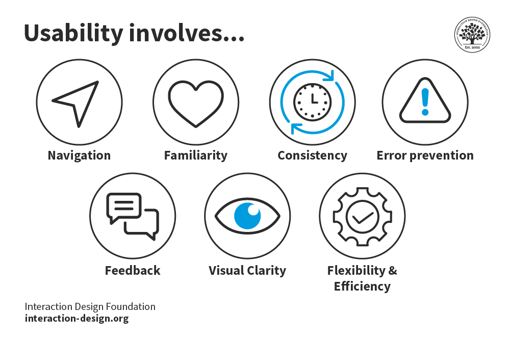
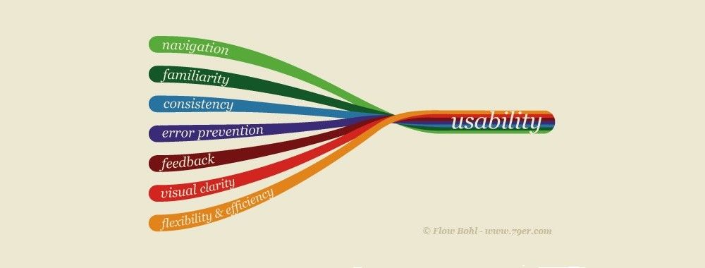
It should be easy for the user to become familiar with and competent in using the user interface on the first contact with the website. If we take a travel agent’s website that a designer has made well, the user should be able to move through the sequence of actions to book a ticket quickly.
It should be easy for users to achieve their objective through using the website. If a user has the goal of booking a flight, a good design will guide him/her through the easiest process to purchase that ticket.
It should be easy to recall the user interface and how to use it on subsequent visits. So, a good design on the travel agent’s site means the user should learn from the first time and book a second ticket just as easily.
This isn’t the only set of requirements for usability. For example, a usable interface will be relatively error-free when used.
We can measure usability throughout the development process, from wireframes to prototypes to the final deliverable. Testing can be done with paper and pencil but also remotely when we have higher-fidelity prototypes.
It’s important to analyze the users’ performance and concerns with a web design as early as possible. From there, we can apply a set of guidelines with a grain of salt; because they tend to be general, we need to adapt them to our specific area. Guidelines show a product’s features proven to improve usability. We can fine-tune design revisions according to these guidelines, as long as we look at all the dimensions. Sometimes, it might just involve tweaking a menu layout; or, it might involve looking much higher.
We have to consider the user at all points when determining usability. If our designs are to be “usable”, they have to pass the test with a minimum number of criteria. If our product were a mouse and not a website, we’d have to ensure that it conformed to standards (to receive that all-important “CE” imprint). For a website, it might be easier to explore how our design ranks alongside a competitor’s. Let’s go back to the travel agents and see where we might improve our design.
Our design
Users can navigate to “buy” button in 294 seconds, on average.
Returning users navigate to “buy” button in 209 seconds, on average.
18% of users bought a ticket on finding landing page.
42% of users went no further than the landing page.
Happy Huzzah’s Getcha There, Inc.
Users can navigate to “buy” button in 198 seconds, on average.
Returning users navigate to “buy” button in 135 seconds, on average.
32% of users bought a ticket on finding landing page.
12% of users went no further than the landing page.
Glancing at these metrics tells us something. We need to check out what “Happy Huzzah’s Getcha There, Inc.” is doing because something’s certainly working there!
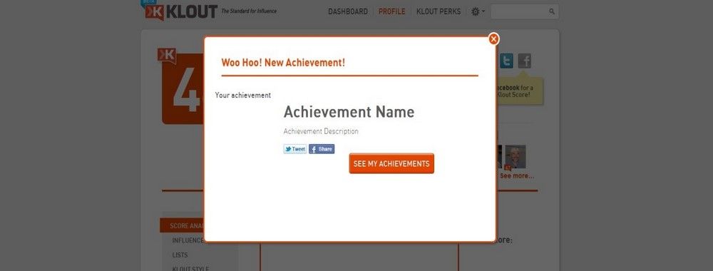
Usability Elements
![]() Author/Copyright holder: yukti.io Copyright terms and license: CC BY-SA 3.0
Author/Copyright holder: yukti.io Copyright terms and license: CC BY-SA 3.0
In addition to content, we have web development and design considerations for usability. These are (mainly) outlined as follows:
Server
Servers used to host websites are a usability consideration. Two major factors to consider when selecting servers are:
Speed - Google ranks by usability to some extent. How quickly your page loads is one of the ranking factors — so, speed to load is also a Search Engine Optimization (SEO) concern. A website that’s slow to load and slow to respond turns users off. Servers influence how fast a page will load depending on their capacity, specialization, etc. Naturally, it’s not just servers that influence the speed of a page — the web designer has a lot of influence over this in the way he/she serves images, graphics, etc., too.
Downtime - During downtime, a website is completely inaccessible. It’s fair to say that most websites will experience the occasional moment of downtime when a server falls offline. However, some suffer more than most; choosing a reliable server enables the delivery of a better user experience. One bad experience might have a user shrug and come back later. But more than one bad experience and that user may go somewhere else.
HTML
Focus the HTML you use on delivering a better user experience. While, to date, only mobile websites benefit from user experience ranking on Google, it’s probably fair to infer that in the future this will also be true on all platforms. Some key considerations for your HTML include:
Use ALT tags - ALT tags are used in conjunction with images; they let you convey additional information about the image that isn’t displayed as part of the main text. ALT tags assist with indexing in search engines (they let you tell the search engine about the content of the image). They also help with screen-reader narration for visually impaired users.
404 Not Found Page - Broken links happen, particularly on large websites. While ideally, you should test all links on a regular basis and repair any broken ones, it’s a good idea to have a plan for when users encounter a broken link. That plan is the “404 Not Found Page” — a well-designed 404 page will try to assist the user in returning to a positive experience. The default 404 page isn’t helpful in this respect. Clunky and primitive, it gives users the impression that they’ve come to the end of an escalator that isn’t attached to a floor. They don’t want to fall off and land on an archaic message. As a designer, never lose sight of that. That little courtesy goes a long way.
Visual Factors
The visual factors that impact the overall user experience are the factors where, normally, you the designer have the most control. That means paying careful attention to:
Font Size and Color - Choose fonts that are easy to read. That means high levels of contrast with the background and font sizes large enough for users to read easily. If some of your user base is elderly or visually impaired, make fonts larger.
Branding - Branding, in particular the company logo, helps users know where they are online. Based on eye movement patterns, the ideal place for the logo is the top-left corner of the screen. This is where users who read from left to right are most likely to look when first arriving on the site.
Layout Colors - Colors need to be consistent in order to convey branding and also to develop an aesthetic appeal. In addition, they must deliver readability. Often, they need to convey a hierarchy of information, too.
Navigation - For users to get the most from a website, they need to get from point A (the entry point) to point B (where they want to be) as quickly and easily as possible. That means providing useful navigation systems, including (for larger websites) search functions, to facilitate that transition.
Content - The web designer may or may not be responsible for creating the website copy, but there are design elements in the way you display that copy for user experiences:
- Headings - Organize content into manageable chunks through the use of headings, sub-headings, etc. This means developing a scheme for consistent display of each type of heading throughout the website, ensuring a consistent experience as users navigate around the site.
- Paragraphs - Make paragraphs clear and easily recognizable to help prevent the user from being overwhelmed by a “wall of text”. You can also apply Gestalt principles to paragraphs to help better illustrate the relationships between blocks of content.
Website Usability Tools
Testing your website is easy, thanks to a lot of tools. Many are free; some are freemium, others premium. Get one that works for your website, then let it gather the data about usability. Many let you test on your existing users; you can tell from the data what they’re experiencing, what’s going right and not-so-right. Here’s a list of some:
Usabilla is a usability testing tool that can provide information based on the actual usage of your current site.
WebPage FX is a tool for testing the readability of content on a website.
Pingdom offers an insight into the speed of response from your website.
An Element of User Experience
![]()
Author/Copyright holder: visualpun.ch. Copyright terms and license: CC BY-SA 2.0
It would be wonderful if we could draw the borders of user experience as if it were a country on a map. Unfortunately, the reality is fuzzier. As much as we like making sense of phenomena and applying frameworks, we must remember that users are people. As such, they make decisions steered by logic and emotions.
As we saw above, many designers get confused at the difference between usability and the larger branch of user experience. Core areas of the user experience include (Usability, 2014):
Usability: A measure of a user’s ability to arrive on a site, use it easily, and complete the desired task. Remember, we’re designing websites, where there is flow, rather than focusing on page design and assuming everything will flow later.
Useful content: The website should include enough information in an easily digestible format that users can make informed decisions. Keep Hick’s Law in mind here: streamline your design to be simple. Use restraint.
Desirable/Pleasurable Content: The best user experiences come when the user can form an emotional bond with the product or website. That means moving beyond usable and useful and on to developing content that creates that bond. Emotional design is a huge part of the user experience. An English grammar website that offers daily tips might prove itself useful. But if that tip is funny, users won’t only remember the rule; they may return for more!
Accessibility: For people with different levels of disability, online experiences can be deeply frustrating. There are a set of accessibility standards with which sites should conform to assist the visually impaired, the hearing impaired, the motion impaired, etc. Content for the learning disabled needs careful consideration in order to provide a more complete user experience, too.
Credibility: The trust that your website engenders in your users also plays a part in the user experience. One of the biggest concerns users have online is security (in many cases, they worry about privacy, too). Addressing these concerns through your design, for example by showing security features and having easily accessible policies regarding these concerns, can help create a sense of credibility for the user.
Naturally, the usability of a design is important. However, we need to consider usability alongside these other concerns to create a great user experience. The UX comes as much from graphical design, interactive design, content, etc. as it does from usability alone.
The Take Away
Usability refers to how easily a user interacts with a website or product. It comes under the heading of UX design but is not the whole story of user experience design. In usability, we designers have to focus on three aspects in particular:
Users should find it easy and become proficient when using a design interface.
They should be able to achieve their goal easily through using that design.
They should be able to learn the interface easily, so that return visits are just as, if not more, easy.
We should analyze our web design when determining usability, taking into account everything from accessibility and usefulness of content to credibility and designing content users will enjoy. That means thinking ahead. Who are your users? Might they have trouble reading your text? Can you make them smile or laugh by adopting a fun tone (e.g., edutainment—entertainment and education—is useful when teaching)? Users will want to feel reassured that they are navigating securely. Make them feel so.
You also should consider the realities of the web. Finding a reliable server for your site that loads quickly is crucial. At the HTML level, you should use ALT tags and design a helpful catch page in case a link is broken.
Visual factors, including layout colors and content formatting, are important, too. Having a good-looking site is all very well, but can users navigate easily?
Finally, test, test, and test. A plethora of website usability tools exist. Never underestimate the value of testing from an early stage. By working out where users click, for example, you’ll be well on track to learning their ways and how usable your site is.
Where To Learn More
Course: The Practical Guide to Usability
Leavitt, M. O., &Shneiderman, B. (2006): Research-based Web Design &Usability Guidelines. US Department of Health and Human Services.
Alscher, D. (2019). Color Contrast: For the Sake of Aesthetic and Accessibility.
Bevan, N. (1992). “What is Usability”. Proceedings of the 4th International Conference on HCI, Stuttgart, September 1991.
The Smashing Editorial (2012). “Usability and User Experience”. Smashing Magazine.
Chapman, C. (2011). “Comprehensive Review of Usability And User Experience Testing Tools”. Smashing Magazine.
Reference
Hero Image: Author/Copyright holder: Peter Morville. Copyright terms and license: CC BY-NC 2.0