Ergonomics in UX/UI Design
What is Ergonomics in UX/UI Design?
Ergonomics is a scientific discipline that addresses the effective design of products, work environments and more. In user experience (UX) design, it refers to how designers streamline digital products to minimize effort, movement and cognitive loads for users, so lessening their fatigue while improving productivity and—by association—a product’s desirability.
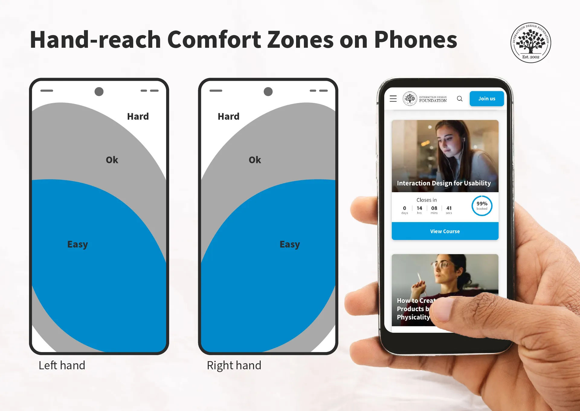
Just one dimension of ergonomics—hand-reach comfort zones.
© Interaction Design Foundation, CC BY-SA 4.0
Why is Ergonomics Important in Design?
Ergonomics has for long been at the forefront as a consideration for designers to improve products—as well as working environments, among other areas—for consumers and users. So, good ergonomics—and ergonomy, which is the discipline behind it—is a central part of human-centered design. The principles of ergonomics govern aspects of human-to-product or human-in-environment functionality, mainly to optimize conditions for individuals so that they:
Have a safeguard when they use products or work at workstations, from risks of injuries—such as from accidents and repetitive strain injuries (RSI)—and fatigue.
Can maximize their productivity levels, since the devices or environments they work with and within are optimally tailored to their needs.
Can enjoy peace of mind that the organizations behind these devices and environments subscribe to a spirit of health and safety—and so it bolsters the brand’s reputation as being one that truly cares about people.
Given its existing background in physical products—ranging from keyboards and chairs, to work benches, car production lines and far beyond—ergonomics translates naturally to the world of UX design. UX ergonomics encompasses two main areas for UX and user interface (UI) designers to consider carefully when they apply design principles to account best for their users’ needs and how designs work to satisfy—and exceed—these needs and expectations:
1. Physical Ergonomics
To design best for users in the physical sense, designers have to tailor their brand’s products in several ways. First, there are the devices themselves—hardware such as smartphones and tablets. The companies that create these products account for the comfort of their human users in terms of grip, position of camera lens and other factors.
For UI designers—as well as designers involved in augmented reality (AR) and virtual reality (VR) experiences—ergonomics extends to design considerations such as to create the best buttons in the most accessible areas of a smartphone touchscreen. An example is the need to design experiences for users who can complete tasks with one hand. Especially in the era of mobile-first design, it’s vital to tailor UIs that are fat-finger friendly and that can maintain the “magic” of a seamless experience. For example, if a user tries to order a product while holding on to a railing on public transport, a considerate design would facilitate their being able to get through the checkout process with minimal typing. Designers therefore need to consider the users’ scenarios and design accordingly.
Author and Human-Computer Interaction Expert, Professor Alan Dix explains user scenarios in this video—and why they’re so helpful for designers:
Show
Hide
video transcript
- Transcript loading…
In AR and VR design, physical ergonomics plays perhaps an even more important role in safeguarding users from potential harm and fatigue—while offering them maximum comfort and encouragement to continue their experiences safely. Systems that respond to hand and head movements, for example, need to factor in which ones are most comfortable for users. At the same time, they’ve also got to account for the need to prevent accidental system responses because equipment or apps misinterpret those more subtle movements that users didn’t intend as gesture commands.
CEO of Experience Dynamics, Frank Spillers explains additional important points about safety in AR experiences:
Show
Hide
video transcript
- Transcript loading…
Video copyright info
Copyright holder: Resolution Games Appearance time: 0:35 - 0:47 Copyright license and terms: All Rights Reserved BY Link: https://www.youtube.com/watch?v=hWQKD9TKWsU&ab_channel=ResolutionGames
Copyright holder: The Holo Herald Appearance time: 3:12 - 3:25 Copyright license and terms: CC BY Link: https://www.youtube.com/watch?v=6kVe00UUdBA&t=297s&ab_channel=TheHoloHerald
Copyright holder: Dylan Fox Appearance time: 3:35 - 3:37 Copyright license and terms: CC BY Link: https://www.youtube.com/watch?v=SPnoeb0zqRs&ab_channel=DylanFox
Designers also have a massive design consideration in the form of accessibility and inclusive design. Accessibility is a legal requirement in many jurisdictions—and can carry stiff penalties for brands that ignore the needs of users with disabilities. Fortunately, accessible design is an asset for brands, anyway, since it helps all users and provides several ways to access design solutions. For example, features such as Alt text for screen readers and optimal color contrasts are well worth the effort, especially for a brand’s reputation and credibility.
Watch our video about accessibility for key points regarding this vital design consideration:
Show
Hide
video transcript
- Transcript loading…
An important factor to consider about ergonomics is how it relates to efficiency as well as comfort. That’s why, for physical ergonomics, Fitts’ law is a valuable one to know. It states that how much time it takes a person to move a pointer—like a mouse cursor—to a target area is a function of the distance to the target divided by the size of the target. So, the longer the distance and the smaller the target’s size, the longer it takes.
© Interaction Design Foundation, CC BY-SA 4.0
2. Cognitive Ergonomics
The second sphere of ergonomics is equally important in UX design. Designers need to also appreciate their users’ cognitive abilities in the context of use. Principally, this has a direct bearing on users with cognitive disabilities—or neurodiverse users. For example, for designers to include these users, they need to tailor digital solutions that don’t present difficulties for users to understand instructions, system responses and more.
Much like optimal design for physical accessibility, to design with cognitive ergonomics in mind also helps all users. For example, even the most “able” users will find themselves in situations from time to time where they can easily become confused. Consider a user, for example, who urgently needs to purchase flight tickets at the last minute, owing to a family emergency. Their stress levels alone will affect their threshold for understanding a system’s responses to their requests. So, all users—regardless of ability levels—can run into scenarios where they face limitations in their ability to work with a digital solution and get what they need or want without delay.

Spotify’s car mode shows how the brand considered their users’ safety and comfort as they tailored the ability to play music on the road.
© 9to5Google, Fair Use
This is where designers can come to the rescue with products that are simple, clear and easy to use—whatever the scenario or whoever the user. They strive to make digital designs that feature the best principles of visual design for all screen sizes and so users can enjoy—and easily and efficiently use—brands’ products or services. So, by association, the brands that afford these helpful design features prove that they care—and that they’re considerate, trustworthy and have the users’ best interests at heart.
Much like Fitts’ law applies to the physical side of ergonomics, Hick’s law is an essential consideration for designers when it comes to cognitive ergonomics. This law states that the more choices a person has to think about, the longer it will take them to make a decision. When users access a brand’s UI, they might already have a good idea of what they want. However, there’s always the chance that the presence of many options can delay them, or make them hold off from picking a selection altogether—and they might even leave the interface without converting.
UI design patterns help users get what—and to where—they desire via a digital solution.
© Interaction Design Foundation, CC BY-SA 4.0
How to Design with Ergonomics in Mind?
1. Design for Human Users in the Context
What are the users’ needs, abilities and potential risks in the context? When they do solid UX research, designers need to focus on:
Fast learnability and the user’s context: How can the user begin to use the solution with minimum onboarding? Plus, it’s vital to factor in what issues can arise to cause disappointment, discomfort and even potential harm. For example, for a driving app, users need to keep their eyes on the road and hands on the wheel.
Clear affordances and signifiers: Give strong cues—like buttons and labels—so users can know right away how to do what they want and achieve goals. Affordances are everywhere in the real world—such as doors with push plates—and so are signifiers, such as “PUSH” etched into a door’s push plate. A lean, clean, minimalist interface can greatly help users to perform tasks efficiently and with a minimum risk of confusion.
Watch our video on affordances for important details about what they do in—and for—designs:
Show
Hide
video transcript
- Transcript loading…
Clear and immediate feedback: Users need to know if they’re on the right track with what they intend to do. In the driving example, sound feedback should give users plenty of advance notice regarding directions, potential road hazards and more. As user groups, vehicle drivers require particular care and attention in ergonomic design—they, and the people who share the road with them, can’t afford distractions.
2. Consistency and Predictability
For a user-friendly environment, it’s essential that digital interfaces keep consistency and predictability strong across all elements. That includes uniformity in behaviors, terminology, icons and color schemes across different screens. This will lighten the cognitive load and minimize the learning curve. Users can then navigate and interact with a digital interface in a way that feels intuitive and familiar.
The design should be consistent across different operating systems and devices. This is why responsive design is so important and helpful.
Frank Spillers explains important points about responsive design so designs look great, consistently from device to device:
Show
Hide
video transcript
- Transcript loading…
Consistency is also a vital ingredient for users’ trust in a brand. For example, consistent cues and navigation help users understand their current location within a website or the stage of the operation they’re engaged in. Reliable design patterns are therefore extremely helpful here—while introducing a fresh brand personality.
Watch our video on User Interface (UI) Design Patterns to appreciate more about what works best for human users:
Show
Hide
video transcript
- Transcript loading…
3. Flexibility, Redundancy and Customization
Another important aspect of ergonomic design is to empower users to adjust interfaces to how they can use them best—and most efficiently. This takes a solid understanding of how new users need to intuit their way around a UI, while more experienced or power users might prefer a “fast track” or to have advanced options easily findable and usable.
So, designers should allow users to find their own most efficient ways to work on interfaces. For example, it’s best to give them numerous approaches to play a song or movie, move a file or make a purchase. This redundancy of some command features lets individual users find ways to use it that they’re most content with. When they do so, they’ll not just enjoy better efficiency—they’ll enjoy a better user experience from feeling that it’s a product that’s made “just” for them, and that the brand truly knows their needs and desires and hence values them greatly as individual people.
4. Accessibility and Inclusivity
Accessibility in ergonomic UX design calls for designers to create digital products that accommodate users with a wide range of abilities. That includes those with physical, cognitive or sensory impairments. So, designers should make sure that every interactive element on a page is something that users can navigate using assistive technologies such as keyboard-only navigation and screen readers—among other accessibility tools.
Designers should also consider how they can cater to users’ neurodiversity—and bolster the user-friendliness and efficiency of their design solutions so everyone can benefit from designs that are truly inclusive.
Watch as UX Content Strategist, Architect and Consultant, Katrin Suetterlin explains important points about inclusive design:
Show
Hide
video transcript
- Transcript loading…
5. Minimalism and Good Aesthetics
Another integral part of ergonomic UX and UI design is that the interface must cater to the main target actions users will have on a given page. So, each screen needs to be simple and uncluttered—so users can quickly intuit their way to complete a task. For example, to check out and purchase goods, users will want to make sure—at a glance—that they have the desired quantity of items, that their delivery address is correct and that all the relevant options are as they want them, for example. So, hide or remove elements that might confuse users or make them hesitate.
Negative space—or white space—is a greatly helpful ally in minimalist UIs. It doesn’t just calm an interface down; it can draw users’ attention to the elements it frames, too—like a bulls-eye effect. What’s more, it can make for more attractive designs overall.

Google’s famously minimalist design—a unique blend of clean aesthetics and user-friendly, efficient interface engineering—helps users comfortably and quickly get to where they want.
© Google, Fair Use
Designers should proceed to prototyping as early as possible to see how ergonomically designed their proposed solutions are—data that can surface even in the earliest usability tests.
Professor Alan Dix explains important points about prototyping:
Show
Hide
video transcript
- Transcript loading…
Spotlight on Ergonomic Mobile App Design
Mobile UX design involves unique benefits and challenges for designers, and this applies to ergonomics as well. For example, the screen real estate, physiological limitations of users’ fingertips and the need to consider their contexts in more potentially hazardous settings have a massive bearing on how designers should apply good ergonomic UI design. Users “on the go” often have to think on their feet and don’t have the luxury of sitting in a comfortable space to reflect on potential options and decisions at their leisure.
Airbnb’s highly user-friendly design represents careful consideration for comfort and efficiency on mobile screens.
© Airbnb, Fair Use
For a practical view on how to leverage ergonomics well in UX design, consider mobile applications in particular, where designers focus on:
The users’ needs and contexts: Designers tailor the app for the ease of interaction between user and interface in these scenarios. A well-designed app considers the user's perspective from the outset, and proves that the designer has identified the key actions and necessary information throughout the overall structure and flow of the application.
Intuitive navigation: The app should guide the user effortlessly through its features, with intuitive navigation that feels as natural as swimming. So, critical elements are within easy reach—often referred to as the “thumb zone”—and all navigational buttons are visible and easily accessible.
Simplified user interaction: The application must minimize the number of steps in the registration or transaction processes. So, when designers suggest default values and reduce the need for data entry, it can greatly lower the chances of user friction—and boost users’ overall experience.
Optimized information architecture: The structure of the app should be logical and straightforward—where the users’ needs obviously come first. So, designers need to prioritize those key features that are in line with the target audience’s goals and simplify the content hierarchy.
Usability enhancements: The design should make it easy for users to understand and interact with the app. Clear and concise microcopy that guides the user through their interactions helps tremendously with this—as do clear and actionable call-to-action buttons.
Author, Speaker and UX Writer at Google, Torrey Podmajersky explains important points about UX writing and microcopy:
Show
Hide
video transcript
- Transcript loading…
Overall, effective ergonomic designs are ones that translate to exceedingly smooth and highly enjoyable user experiences for every user, no matter the target audience involved. When designers mindfully apply the best design patterns and tailor their UIs to help users in their many contexts, the results can spell success long term for their brands.
How comfortably users can enjoy the digital solution, how effectively and efficiently they can get and do what they want, and how much—or how little—they have to think about the design of the UI itself are factors that will translate to how well they enjoy a seamless experience with the brands whose products they choose to use and stay with as loyal customers. So, designers have much to consider on the road to not just keep users safe, comfortable and unconfused—but to meet them with a unique brand identity, too. The ultimate goal is to make the tasks so intuitive and easy that the user senses a direct interaction with the brand—comfortably and securely—and forgets that there’s a device’s screen in the way.
Learn More about Ergonomics
For valuable information and tips, watch our Master Class Accessible and Inclusive Design Patterns with Vitaly Friedman, Senior UX Consultant, European Parliament, and Creative Lead, Smashing Magazine.
For a deep dive into the exciting realm of designing for real users, take our course User Experience: The Beginner’s Guide.
Go to What Are Principles of Ergonomics in UI Design? by Flowmapp for many helpful insights.
Read Designing for Human Performance and Well-being: The Importance of Ergonomics in UI Design by Arzath Areeff for further valuable details.
Check out Ergonomics and UX Research by Florine Auffrait for additional helpful details.
Questions about Ergonomics
What are the main principles of ergonomic design?
Key principles of how to design to maximize users’ comfort and efficiency include:
User-centered design: Prioritize user needs, preferences and limitations so you make a comfortable and efficient environment.
Adjustability: Make sure that tools and equipment can adapt to various user sizes, postures and preferences—to reduce strain and discomfort.
Neutral postures: Design products that let users keep natural, comfortable postures and that minimize stress on muscles and joints, including in the fingers and neck.
Repetition reduction: Minimize repetitive tasks; it will lower the risk of strain injuries.
Environment optimization: Consider the user’s lighting, noise levels and climate so they can use the digital product in a comfortable workspace.
Safety: Last—but not least—always incorporate safety features to prevent accidents and injuries. That’s especially vital in high-risk user environments such as roads and public transport settings.
Watch our video on User Interface (UI) Design Patterns to appreciate more about what works best for human users:
Show
Hide
video transcript
- Transcript loading…
For valuable information and tips, watch our Master Class Accessible and Inclusive Design Patterns with Vitaly Friedman, Senior UX Consultant, European Parliament, and Creative Lead, Smashing Magazine.
How do you balance aesthetics and ergonomics in design?
Follow these key steps:
Understand user needs: Do your user research thoroughly to determine what users need for comfort and functionality. This will help make sure that your design supports ergonomic principles without compromising on visual appeal.
Prioritize comfort: Ensure that ergonomic features like adjustable elements and proper support come first and foremost. Comfort is essential for user satisfaction—and that includes cognitive as well as physical comfort.
Integrate style: Once you’ve set the ergonomic base, add aesthetic elements. Use colors, textures and shapes that enhance the visual appeal but that don’t dilute or distort the functionality.
Test prototypes: Create and test prototypes with real users—and collect feedback to refine both the ergonomic and aesthetic aspects.
Iterate and improve: Continuously iterate the design to improve the balance—and use feedback to boost both the usability and visual elements.
Watch our video on User Interface (UI) Design Patterns to appreciate more about what works best for human users:
Show
Hide
video transcript
- Transcript loading…
For valuable information and tips, watch our Master Class Accessible and Inclusive Design Patterns with Vitaly Friedman, Senior UX Consultant, European Parliament, and Creative Lead, Smashing Magazine.
How can I make sure my design is ergonomically friendly?
Try these steps:
Study user needs: Understand the physical needs—and limitations—of your users in their contexts. Conduct user research and collect valuable feedback to know what works best for them.
Prioritize comfort: Design with user comfort in mind—and choose proven design patterns that support cognitive and physical ergonomics.
Make sure there’s good adjustability and personalization: Create designs that users can adjust to fit their preferences—so they can achieve tasks in the best ways for them.
Promote natural postures: Design tools and interfaces that allow users to maintain natural and neutral postures—particularly important in augmented reality (AR) and virtual reality (VR) designs. This helps prevent discomfort and injury.
Test and iterate: Test your design with real users. Use their feedback to make necessary adjustments and improvements.
Watch as CEO of Experience Dynamics, Frank Spillers explains important points about Augmented Reality (AR):
Show
Hide
video transcript
- Transcript loading…
For valuable information and tips, watch our Master Class Accessible and Inclusive Design Patterns with Vitaly Friedman, Senior UX Consultant, European Parliament, and Creative Lead, Smashing Magazine.
What are some common ergonomic mistakes in UI design?
Here are some common ergonomic UI design mistakes:
Small click targets: Designers often make buttons and links too small, causing users to struggle with precision—so, make sure click targets are large enough for easy interaction for users. Use at least 44x44 pixels for clickable areas.
Poor contrast: Low contrast between text and background strains users’ eyes. Use high contrast to optimize your design’s readability.
Crowded interfaces: Don’t overload the interface with too many elements—it can overwhelm users. Keep the design clean and simple.
Inconsistent navigation: Don’t place navigation elements inconsistently—it confuses users and slows their progress.
Lack of feedback: Keep users constantly in the loop with immediate—visual or auditory—feedback on user actions, and especially offer clear feedback to confirm actions.
For a deep dive into the exciting realm of how to design for real users, take our course User Experience: The Beginner’s Guide.
What tools can I use to ensure ergonomic design?
Consider these tools:
Platforms like UserTesting and Lookback allow you to observe real users interacting with your design and gather feedback.
Anthropometric Data Tools: Resources like Human Factors and Ergonomics Society databases provide data on human body measurements to guide your design.
Virtual Reality (VR) Tools: VR tools like Unity and Unreal Engine offer immersive environments to test ergonomic aspects before finalizing the design.
UX Strategist and Consultant, William Hudson explains important points about user testing:
Show
Hide
video transcript
- Transcript loading…
For a deep dive into the exciting realm of how to design for real users, take our course User Experience: The Beginner’s Guide.
What ergonomic considerations should I make for users with disabilities?
Accessibility: Make sure your design complies with accessibility standards like WCAG. Provide alternatives for visual, auditory and motor impairments. What’s more, use high contrast and large fonts for better readability. Also, include voice control options for users with limited hand mobility. Think ahead to anticipate all users’ needs, including those with disabilities.
Adjustability: Create designs that users can easily adjust—and, where applicable, allow customization for height, size and input methods to accommodate different needs.
Clear navigation: Simplify navigation and make it intuitive. Use large buttons, clear labels and logical layouts to help users with cognitive disabilities—and so help users in all contexts that much more. Apply high contrast and large fonts for better readability.
Assistive technologies: Integrate with assistive devices like screen readers, voice recognition and alternative input devices.
Comfort and safety: Make sure all users can interact comfortably and safely.
See why accessibility is such a vital concern in design:
Show
Hide
video transcript
- Transcript loading…
Read our Topic Definition of Inclusive Design to understand critical points about this equally important dimension of design.
How can I design ergonomic navigation menus?
What role do colors play in ergonomic design?
Colors play a crucial role in ergonomic design—in that they enhance usability and comfort. Colors should guide and help users understand what’s in front of them. In this sense, ergonomics applies even to the simplest graphic designs, since good ergonomics means viewers can quickly make sense of what they’re looking at. Here are key points to consider for UI design:
Visibility and readability: Use high-contrast color combinations to make text and important elements stand out. This reduces eye strain and improves readability, especially for users with visual impairments.
Guidance and navigation: Employ colors to guide users through the interface. Consistent use of specific colors for buttons or links helps users to quickly find interactive elements.
User comfort: Choose colors that reduce eye fatigue. Softer, neutral tones create a calming environment—while overly bright colors can cause discomfort. Use a color palette that balances aesthetics with functionality.
Accessibility: Ensure color choices meet accessibility standards. Don’t rely on color alone to convey information, as colorblind users may miss important cues. Use tools like contrast checkers to verify color accessibility.
Test your design with users to collect feedback on the color choices, too.
For great points about how to make the most of color in your design solutions, watch our Master Class How To Use Color Theory To Enhance Your Designs with Arielle Eckstut and Joann Eckstut, Leading Color Consultants and Authors, who are among the most definitive authorities on color in the United States.
Watch as UX Strategist and Consultant, William Hudson explains important points about user testing:
Show
Hide
video transcript
- Transcript loading…
How can I design ergonomic touch interfaces?
Follow these key steps:
Optimize touch targets: Ensure buttons and interactive elements are large enough for easy tapping. A minimum size of 44x44 pixels works well.
Space elements appropriately: Place touch targets with enough space between them to prevent accidental taps—it will lessen the chances that users get frustrated.
Consider hand positions: Design for various hand positions and grips. Place frequently used elements within easy reach to minimize hand strain. Position primary actions within the thumb's natural range for one-handed use.
Provide visual feedback: Offer immediate visual feedback when users tap an element. This confirms their actions and improves the user experience.
Make sure the design has good consistency: Keep a consistent layout and design language throughout the interface—to help users navigate smoothly.
Also, use mockups to test touch target sizes with real users. Regularly collect feedback so you get insights that will help you refine your design.
Watch as CEO of Experience Dynamics, Frank Spillers explains important points about UI patterns for mobile:
Show
Hide
video transcript
- Transcript loading…
Watch our Master Class Boost Mobile UX with UX Design Principles and Best Practices with Miklos Philips, Lead UX Designer/Product Designer.
What are ergonomic considerations for gesture-based interactions?
Consider the following:
Simplicity: Use simple gestures that feel natural and intuitive. Complex gestures can cause confusion and strain.
Comfortable range: Make sure gestures fall within a comfortable range of motion. Don’t make users stretch or make awkward movements. Design gestures that users can perform with minimal effort and movement. Likewise, consider the setting—users in AR or VR experiences might injure themselves or others if they make certain movements.
Consistency: Keep gesture controls consistent across the interface—this helps users learn and remember them easily.
Feedback: Provide immediate feedback for gestures to confirm actions and reduce errors. Visual or haptic feedback works well for that.
Customization: Let users customize gesture controls to fit their preferences and physical capabilities.
What’s more, test gestures with a diverse group of users to find the most intuitive and comfortable ones. Also, use clear visual cues to guide users in performing gestures correctly.
Watch as Frank Spillers explains how to design gestures for Augmented Reality (AR) and Virtual Reality (VR) experiences:
Show
Hide
video transcript
- Transcript loading…
Watch our Master Class Boost Mobile UX with UX Design Principles and Best Practices with Miklos Philips, Lead UX Designer/Product Designer.
What are some highly cited scientific articles about ergonomics?
Chen, Z. (2023). Research on the application of ergonomics in UI interface design. Applied Mathematics and Nonlinear Sciences, 8(2), 1-10.
This publication has been influential in bridging the gap between ergonomics and user interface (UI) design—and it offers a comprehensive approach to creating more user-friendly digital interfaces. The paper explores how ergonomic principles are applicable to UI design—and emphasizes the importance of considering human factors in the design process.
Earn a Gift, Answer a Short Quiz!
- Question 1
- Question 2
- Question 3
- Get Your Gift
Try Again! IxDF Cheers For You!
Remember, the more you learn about design, the more you make yourself valuable.
Improve your UX / UI Design skills and grow your career! Join IxDF now!
- Question 1
- Question 2
- Question 3
- Get Your Gift
Congratulations! You Did Amazing
You earned your gift with a perfect score! Let us send it to you.
Check Your Inbox
We've emailed your gift to name@email.com.
Improve your UX / UI Design skills and grow your career! Join IxDF now!
Literature on Ergonomics in UX/UI Design
Here's the entire UX literature on Ergonomics in UX/UI Design by the Interaction Design Foundation, collated in one place:
Open Access—Link to us!
We believe in Open Access and the democratization of knowledge. Unfortunately, world-class educational materials such as this page are normally hidden behind paywalls or in expensive textbooks.
If you want this to change, , link to us, or join us to help us democratize design knowledge!