Your constantly-updated definition of Visual Perception and
collection of videos and articles. Be a conversation starter: Share this page and inspire others!
352shares
What is Visual Perception?
Visual perception refers to the ability to interpret and make sense of visual information from the environment through the process of sight. This complex process involves several steps, beginning with the detection of light by the eyes and ending with the interpretation of visual stimuli by the brain. Visual perception allows individuals to understand and interact with their surroundings by recognizing, organizing, and interpreting shapes, colors, spatial relationships, movement, and other visual attributes.
In this video, HCI Expert and Author, Alan Dix discusses the difference between sensation and perception:
ShowHide
video transcript
00:00:00 --> 00:00:33
I'd like now to distinguish two words, which sometimes you'll probably hear me use interchangeably, but actually have a subtle difference: sensation and perception. In one sense, there's the things that we really hear, and shall we say, the immediate senses. This is what in psychology is called sensation. So with your eye, the photons actually come into the back of your eye,
00:00:33 --> 00:01:00
hitting your retina and the nerve cells, noticing those and creating a signal. When you hear, little hairs in your ear are getting wiggled by the sound and then passing that into your brain. So that is the raw sensation. That's the absolute raw sense of what's there. However, our brains do lots of work with that.
00:01:00 --> 00:01:30
They process what are those raw sensations in order to give that sense of that feeling of actually what's there. There's a couple of examples of this you can think of. So, for instance, if you... Looking at your room, just glance at the room you're in, you'll have a sense that you can see it all, but actually your eyes dance around and builds it up slowly. So that raw sensation at any one moment is probably that
00:01:30 --> 00:02:05
everything in the periphery is fuzzy. But you don't see that. What you believe you see is something that's sharp everywhere. Because if you ever need to know about a bit of the room your eye will glance to it and it will become sharp at that moment. So your perception of the room and your visual perception is that it's large, it's everywhere, and you can see it all. Your actual sensation is much, much tighter than you can see clearly. Because these differ and because they are about the meaning of the world...
00:02:05 --> 00:02:36
We are *meaning-giving creatures*; we're trying to find meaning and sense in this world. You can sometimes use this creatively to create effects, but you could also sometimes get, shall we say mistaken effects because of this. And optical illusions use this very much in order to fool your eyes because your eyes are trying to create sense of the world and you can sometimes fool them. So here's two optical illusions, both of which are based on linear perspective.
00:02:36 --> 00:03:00
There's the Ponzo one. So if you look at that picture, it's a ladder with two blocks, and it will look as if the block at the top is bigger than the block at the bottom. The reason for that is your meaning bit of your brain is saying, "It's doing, the ladder's doing this," so it's probably sloping away from you. If it's sloping away from you, then something that takes the same amount of visual space
00:03:00 --> 00:03:34
further away must be bigger. On the right is the Müller-Lyer illusion. So the Müller-Lyer illusion is two lat[eral] lines and then two arrowheads and one has got arrowheads going in and one's got arrowheads going out. And if you look at it, you probably will see the one with the arrowheads going out as being a longer line than the one at the bottom. In fact, they're absolutely the same size and the same length. However, your eye sees the one at the top longer because it looks a bit like the back
00:03:34 --> 00:04:03
edge of a box – so, again, in terms of perspective, if the line's going... It's like looking at the back of the box whereas the ones at the front is more like if you're seeing the front end of the box. And of course, again, your eye is saying that probably means the one on top is further away. Although it takes the same amount of distance on the back of your eye, that probably means it's actually larger. Now all that's happened, when I say "probably", you're not reasoning this out. This is all happening tacitly, unconsciously. You've got no idea it's going on.
00:04:03 --> 00:04:32
And it's very hard, even though you know those two are the same length to actually be able to see that. Perception is based partly on – shall we say – built-in parts of your brain. But also the culture in which you live changes the relationship between raw sensation and perception. So, you know, optical illusions can fool you. However, actually, if you think about it...
00:04:32 --> 00:05:03
So there's the kind of optical illusion like Müller-Lyer, but also you've probably seen those trick photographs where you think something's bigger than it is or you see something and it says, what's this? And you've got no idea. And then there's some small tweak and it's zoomed out and "aha, of course". Now the interesting things about those is partly it's a perception thing that your eye can get fooled. But they're often deliberately chosen at a very unusual eye position. So you may take a photograph of something so that certain things line up,
00:05:03 --> 00:05:30
that then make it confusingly look like something else. And you only have to perhaps move your head a little bit. You know, if it was a real thing that you were looking at, you would move it, you would move your head. And suddenly it would all make sense. Our perception systems are designed for the real world. They're not designed for static images on screens. We've learned to deal with them – I said culture comes in here. So our brain is trying to make sense of this all the time.
00:05:30 --> 00:05:47
And that can sometimes mean you can get these optical illusions that can be confusing. But also that can work to our advantage because we're trying to make sense. So this is something you can think about in design, both things that can go wrong, but also things that can go right.
Physiologically, visual perception happens when the eye focuses light on the retina. Within the retina, there is a layer of photoreceptor (light-receiving) cells which are designed to change light into a series of electrochemical signals to be transmitted to the brain. Visual perception occurs in the brain’s cerebral cortex; the electrochemical signals get there by traveling through the optic nerve and the thalamus. The process can take a mere 13 milliseconds, according to a 2017 study at MIT in the United States.
The visual perception of colors, patterns, and structures has been of particular interest in relation to graphical user interfaces (GUIs) because these are perceived exclusively through vision. An understanding of visual perception therefore enables designers to create more effective user interfaces.
Visual perception plays a crucial role in user experience (UX) design as it fundamentally influences how users understand and interact with digital products. It encompasses the way our brain interprets visual information from the environment, which impacts decision-making, usability, and overall satisfaction with a product. Here's how visual perception impacts UX design:
1. First Impressions and Aesthetics
Visual perception shapes the first impressions users have of a product. Attractive designs are perceived as more usable and trustworthy. This aesthetic-usability effect means that visually appealing interfaces can positively influence user satisfaction and loyalty from the moment they encounter the product.
Since its launch in 2007, The Apple iPhone's sleek design, intuitive interface, and overall aesthetic appeal significantly influenced its market success. Consumers perceived it as not only a symbol of innovation but also as a highly usable and trustworthy device, which contributed to strong user satisfaction and brand loyalty. This demonstrates how first impressions based on visual perception can have a lasting impact on product success.
Through the use of visual hierarchy, designers can guide users' attention to important elements first. Size, color, contrast, and placement all play roles in how users perceive the importance of various elements on a page. This helps to create a structure that aligns with users’ natural scanning patterns, such as the F-pattern or Z-pattern, improving the effectiveness of information presentation and navigation.
Google’s search engine uses size, color, contrast, and placement strategically to differentiate between types of results (e.g., ads, organic results, featured snippets) and to highlight key information. The design ensures users quickly see the most relevant results and additional helpful features like questions related to their search. This structure aligns with natural scanning patterns, which enhances the user's ability to find information efficiently and navigate the page effectively.
Visual perception underlines the importance of simplicity in design. Overly complex or cluttered interfaces can overwhelm users, which leads to confusion and frustration. Designers can create clear and concise interfaces that communicate more with less when they leverage users' visual perception which enhances usability and reduces cognitive load.
WhatsApp's design avoids clutter by using a clean layout, straightforward navigation, and intuitive icons, which makes it easy for users of all ages and tech-savviness to communicate effectively. This simplicity ensures users can focus on their primary task—messaging—without unnecessary distractions or complications. This demonstrates how leveraging visual perception to create clear and concise interfaces can significantly enhance usability and user satisfaction.
4. Consistency and Familiarity
Consistent visual elements across a product, such as color schemes, typography, and iconography, leverage users' visual memory and perception, making interfaces more intuitive and learnable. Familiar design patterns and conventions, like the placement of a logo at the top left corner or navigation menus at the top of a webpage, play into users' pre-existing visual perceptions, facilitating smoother interactions.
Google's suite of products, including Gmail, Google Drive, and Google Docs are consistent and familiar. Google maintains a consistent color scheme, typography, and iconography across these services, which leverages users' visual memory to make navigation and interaction more intuitive. Additionally, the familiar placement of key elements, such as the app launcher icon in the top right corner and the search bar prominently displayed at the top, aligns with users' expectations based on prior web experiences, facilitating smoother and more efficient interactions across different Google products.
Several of Google’s product icons—the consistency of their visual design help make them recognizable.
Colors have psychological effects that can influence how users feel and behave. For example, blue can convey trust and security, while orange might be used for calls to action due to its high visibility and association with action. Additionally, understanding visual perception is crucial for designing accessible interfaces, ensuring that color choices and contrasts accommodate users with visual impairments, such as color blindness.
Bank of America’s online platform predominantly uses blue hues throughout its interface, leveraging the color's association with trust, security, and stability, which are crucial in the context of financial transactions. For calls to action, such as submitting forms or proceeding to the next step in a transaction, the platform often employs colors like green or orange, which are visible and convey a sense of progress or action. Furthermore, Bank of America's online platform is designed with accessibility in mind, offering high contrast options and color schemes that are considerate of users with color vision deficiencies to ensure that all users can navigate and use the services effectively, regardless of their visual abilities.
6. Motion and Interaction
Visual perception influences how users perceive and react to motion within an interface. Well-designed animations can direct attention, indicate actions, and provide feedback, enhancing the interactive experience. However, it's important to use motion thoughtfully to avoid distracting or disorienting users.
Slack incorporates thoughtful animations and transitions for activities such as switching between different chat channels, sending messages, and receiving notifications. For instance, when a message is sent, users see a smooth transition that visually confirms the message's delivery, and notification animations are designed to catch the user's attention without being intrusive. These subtle motions help in making the digital workspace feel more dynamic and responsive, fostering a more engaging and intuitive user experience.
How Does Visual Perception Relate to the Gestalt Principles?
Different attributes of visual perception are widely used in GUI design. Visual perception is deeply intertwined with the Gestalt principles, a set of theories that describe how people tend to organize visual elements into groups or unified wholes when certain principles are applied.
In this video, Mia Cinelli, Associate Professor of Art Studio and Digital Design at the University of Kentucky explains what the Gestalt principles are and how they relate to visual perception.
ShowHide
video transcript
00:00:00 --> 00:00:32
Gestalt principles are principles of human perception that describe how we group similar elements, recognize patterns and simplify complex images when we perceive objects. - So, Gestalt principles — sometimes called Gestalt laws — are simply a way of thinking through Gestalt psychology — 'Gestalt' just meaning 'form', is how we're making sense of a visual field. These are ways of parsing out what things mean within a visual space. Gestalt relies first and foremost on the understanding of a visual field and the ability to create
00:00:32 --> 00:01:00
what are called *figure/ground relationships. So, figure/ground relationships are sometimes called 'positive space' and 'negative space'. So, I'm going to talk about them as figure/ground, because when we look at something like this visual field of rectangles, it all looks the same — that is right now our ground. But the first rule of figure/ground relationships is that discontinuity creates figure. So, by changing one thing here, by creating that discontinuity, that draws our attention,
00:01:00 --> 00:01:30
that becomes the thing in which we are focusing on, and that is really essential, because this can manifest through the Law of Similarity, by which visual similarities are read as being more related. And we can do this through color; we can do this through shape; we can do this through size. So, we read these things as being more of a group. Proximity works in a similar way wherein the actual visual or physical proximity of things relative to each other tells us that these are also read as a group.
00:01:30 --> 00:02:02
There's the Law of Continuation, by which our eye wants to follow a particular line. And so, when we read this visual, we don't read it as two lines which have met in the middle and made a hard turn. We read this as two lines flowing over each other, and that's because of continuation. And all of these things — Gestalt principles — influence hierarchy, informational grouping and readability, and they become essential for understanding both concept and content.
Gestalt principles emerged from the Gestalt psychology movement in the early 20th century and are fundamental in understanding how users perceive and make sense of visual information in design in general and UX design. Here’s how visual perception relates to the Gestalt principles:
1. Proximity
The Law of Proximity states that objects that are close to each other tend to be perceived as a group. In UX design, designers use proximity to indicate relationships between items, grouping related elements together to simplify information processing and navigation for the user.
2. Similarity
According to the Law of Similarity, elements that are similar in appearance (color, shape, size, etc.) are perceived to be more related than elements that are dissimilar. Designers leverage this to create visual hierarchies and categorizations within interfaces to guide users' attention to important features or grouping similar items.
3. Closure
The Law of Closure suggests that people tend to see complete figures even when part of the information is missing. In UX design, this can be used to create icons or interactive elements that are not fully drawn out but that users can still recognize and understand, which reduces visual clutter while maintaining usability.
4. Figure-Ground
The Law of Figure or Figure-ground involves the perception of objects (the figure) as being distinct from the background (the ground). Effective UX design uses this principle to direct focus to actionable items or important information by making them stand out against their background which enhances user interface clarity and navigability.
5. Continuity
The Law of Continuity posits that elements arranged on a line or curve are perceived to be more related than elements not on the line or curve. Designers apply this principle to guide the user's eye through a flow of information or actions to create a visual narrative that is easy to follow.
6. Common Fate
The Law of Common Fate states that elements that move in the same direction are perceived as part of a single group. In interactive design, animations or elements that change in response to user interaction can reinforce the perception of relatedness or guide the user through a series of steps or actions.
Why should managers understand how visual perception may be biased?
Managers should grasp how biases in visual perception impact data interpretation, as outlined in the book chapter on Data Visualization for Human Perception. Understanding these biases is crucial for accurately analyzing visual data and avoiding misinterpretations that could lead to poor decisions and strategies. Managers can improve communication, align team understanding, and drive practical decision-making by acknowledging how visuals can skew perception. This ensures organizational goals are met efficiently with data-driven decisions.
How does spatial organization affect visual perception?
Spatial organization critically shapes visual perception by determining how we interpret and engage with visual elements, as discussed in this article on visual perception challenges. A well-structured spatial layout allows for recognition of patterns and relationships between elements, enabling users to locate and assimilate information efficiently. Conversely, inadequate spatial organization can lead to misunderstandings and hinder the user’s ability to interpret visual information accurately, impacting the quality of the user experience and effectiveness of the visual communication.
What is a top-down approach to visual perception?
A top-down approach to visual perception is the process of using your prior knowledge, expectations, and context to interpret the sensory information that you receive from the environment. In this video, expert Alan Dix discusses the distinction between sensation, the raw data received by our senses, and perception, the interpretation of that data.
ShowHide
video transcript
00:00:00 --> 00:00:32
I'd like now to distinguish two words, which sometimes you'll probably hear me use interchangeably, but actually have a subtle difference: sensation and perception. In one sense, there's the things that we really hear, and shall we say, the immediate senses. This is what in psychology is called sensation.
00:00:32 --> 00:01:00
So with your eye, the photons actually come into the back of your eye, hitting your retina and the nerve cells, noticing those and creating a signal. When you hear, little hairs in your ear are getting wiggled by the sound and then passing that into your brain. So that is the raw sensation. That's the absolute raw sense of what's there.
00:01:00 --> 00:01:30
However, our brains do lots of work with that. They process what are those raw sensations in order to give that sense of that feeling of actually what's there. There's a couple of examples of this you can think of. So, for instance, if you... Looking at your room, just glance at the room you're in, you'll have a sense that you can see it all, but actually your eyes dance around and builds it up slowly.
00:01:30 --> 00:02:03
So that raw sensation at any one moment is probably that everything in the periphery is fuzzy. But you don't see that. What you believe you see is something that's sharp everywhere. Because if you ever need to know about a bit of the room your eye will glance to it and it will become sharp at that moment. So your perception of the room and your visual perception is that it's large, it's everywhere, and you can see it all. Your actual sensation is much, much tighter than you can see clearly.
00:02:03 --> 00:02:33
Because these differ and because they are about the meaning of the world... We are *meaning-giving creatures*; we're trying to find meaning and sense in this world. You can sometimes use this creatively to create effects, but you could also sometimes get, shall we say mistaken effects because of this. And optical illusions use this very much in order to fool your eyes because your eyes are trying to create sense of the world and you can sometimes fool them.
00:02:33 --> 00:03:04
So here's two optical illusions, both of which are based on linear perspective. There's the Ponzo one. So if you look at that picture, it's a ladder with two blocks, and it will look as if the block at the top is bigger than the block at the bottom. The reason for that is your meaning bit of your brain is saying, "It's doing, the ladder's doing this," so it's probably sloping away from you. If it's sloping away from you, then something that takes the same amount of visual space
00:03:04 --> 00:03:33
further away must be bigger. On the right is the Müller-Lyer illusion. So the Müller-Lyer illusion is two lat[eral] lines and then two arrowheads and one has got arrowheads going in and one's got arrowheads going out. And if you look at it, you probably will see the one with the arrowheads going out as being a longer line than the one at the bottom. In fact, they're absolutely the same size and the same length.
00:03:33 --> 00:04:02
However, your eye sees the one at the top longer because it looks a bit like the back edge of a box – so, again, in terms of perspective, if the line's going... It's like looking at the back of the box whereas the ones at the front is more like if you're seeing the front end of the box. And of course, again, your eye is saying that probably means the one on top is further away. Although it takes the same amount of distance on the back of your eye, that probably means it's actually larger. Now all that's happened, when I say "probably", you're not reasoning this out.
00:04:02 --> 00:04:30
This is all happening tacitly, unconsciously. You've got no idea it's going on. And it's very hard, even though you know those two are the same length to actually be able to see that. Now, it was thought for a long time that a lot of us... and some of these illusions really are very basic; they're built into our – shall we say – our most primitive base being, the things that we've had for, you know, 10-20 thousand years,
00:04:30 --> 00:05:06
probably longer as part of the way we see the world. And it was thought in particular the Müller-Lyer illusion was one of these. Something that's very, very basic. I know I found problems with this for many years because linear perspective, it's actually hard to think, shall we say, what in the wild corresponds to linear perspective. And sure enough actually, what's been realized relatively recently is that most subjects of psychological experiments are what's been called WEIRD.
00:05:06 --> 00:05:30
By "WEIRD", it's White, Educated, Industrialized, Rich and Democratic. So basically, think of US psychology students as subjects of most psychology experiments – or British ones for that matter. So you actually end up with a very select set of people
00:05:30 --> 00:06:01
for which we believe everything is true of. And of course, actually that turns out not to be true. Crucially, an awful lot of things which appear to be very fundamental psychological effects turn out to be *cultural*. And crucially, this thing about the Müller-Lyer illusion is one of the ones that is not the same. So if you have a... there is a relatively small number of experiments where this is the case, but there are some experiments that have been done with people who have been brought up in
00:06:01 --> 00:06:32
the middle of forest jungle environments, but without built straight lines, concrete and brick structures. And when that's the case, the Müller-Lyer illusion doesn't work. They see the two lines as the same length. This is a learned effect that's happened from childhood, where because you live in a built environment, you end up with particular illusions. So these are partly about sensory perception, but perception is based partly on
00:06:32 --> 00:07:00
– shall we say – built-in parts of your brain. But also the culture in which you live changes the relationship between raw sensation and perception. So, you know, optical illusions can fool you. However, actually, if you think about it... So there's the kind of optical illusion like Müller-Lyer, but also you've probably seen those trick photographs where you think something's bigger than it is
00:07:00 --> 00:07:30
or you see something and it says, what's this? And you've got no idea. And then there's some small tweak and it's zoomed out and "aha, of course". Now the interesting things about those is partly it's a perception thing that your eye can get fooled. But they're often deliberately chosen at a very unusual eye position. So you may take a photograph of something so that certain things line up, that then make it confusingly look like something else. And you only have to perhaps move your head a little bit.
00:07:30 --> 00:08:00
You know, if it was a real thing that you were looking at, you would move it, you would move your head. And suddenly it would all make sense. Our perception systems are designed for the real world. They're not designed for static images on screens. We've learned to deal with them – I said culture comes in here. So our brain is trying to make sense of this all the time. And that can sometimes mean you can get these optical illusions that can be confusing. But also that can work to our advantage because we're trying to make sense.
00:08:00 --> 00:08:07
So this is something you can think about in design, both things that can go wrong, but also things that can go right.
He elaborates on how our brains process raw sensations, emphasizing the role of meaning and the search for coherence in visual perception. For instance, optical illusions demonstrate how our perceptions can be biased, providing insights valuable for design, where exploiting such biases can lead to mistaken interpretations or creative effects.
What is visual perception in psychology?
In psychology, visual perception refers to the brain's ability to interpret and make sense of visual information received from our eyes. It involves recognizing shapes, colors, depth and interpreting spatial relationships between objects. Visual perception is crucial for understanding our surroundings and interacting with the environment effectively. To explore visual perception and its complexities in depth, refer to this comprehensive article on vision and visual perception challenges.
What is an example of visual perception?
We can illustrate visual perception through optical illusions, a phenomenon in which our brains process visual stimuli to create a perceived reality that might not exist. Alan Dix, a HCI expert, discusses this concept through the Müller-Lyer illusion, where two lines appear to be of different lengths due to the placement of arrowheads at their ends but are, in reality, the same length.
ShowHide
video transcript
00:00:00 --> 00:00:32
I'd like now to distinguish two words, which sometimes you'll probably hear me use interchangeably, but actually have a subtle difference: sensation and perception. In one sense, there's the things that we really hear, and shall we say, the immediate senses. This is what in psychology is called sensation.
00:00:32 --> 00:01:00
So with your eye, the photons actually come into the back of your eye, hitting your retina and the nerve cells, noticing those and creating a signal. When you hear, little hairs in your ear are getting wiggled by the sound and then passing that into your brain. So that is the raw sensation. That's the absolute raw sense of what's there.
00:01:00 --> 00:01:30
However, our brains do lots of work with that. They process what are those raw sensations in order to give that sense of that feeling of actually what's there. There's a couple of examples of this you can think of. So, for instance, if you... Looking at your room, just glance at the room you're in, you'll have a sense that you can see it all, but actually your eyes dance around and builds it up slowly.
00:01:30 --> 00:02:03
So that raw sensation at any one moment is probably that everything in the periphery is fuzzy. But you don't see that. What you believe you see is something that's sharp everywhere. Because if you ever need to know about a bit of the room your eye will glance to it and it will become sharp at that moment. So your perception of the room and your visual perception is that it's large, it's everywhere, and you can see it all. Your actual sensation is much, much tighter than you can see clearly.
00:02:03 --> 00:02:33
Because these differ and because they are about the meaning of the world... We are *meaning-giving creatures*; we're trying to find meaning and sense in this world. You can sometimes use this creatively to create effects, but you could also sometimes get, shall we say mistaken effects because of this. And optical illusions use this very much in order to fool your eyes because your eyes are trying to create sense of the world and you can sometimes fool them.
00:02:33 --> 00:03:04
So here's two optical illusions, both of which are based on linear perspective. There's the Ponzo one. So if you look at that picture, it's a ladder with two blocks, and it will look as if the block at the top is bigger than the block at the bottom. The reason for that is your meaning bit of your brain is saying, "It's doing, the ladder's doing this," so it's probably sloping away from you. If it's sloping away from you, then something that takes the same amount of visual space
00:03:04 --> 00:03:33
further away must be bigger. On the right is the Müller-Lyer illusion. So the Müller-Lyer illusion is two lat[eral] lines and then two arrowheads and one has got arrowheads going in and one's got arrowheads going out. And if you look at it, you probably will see the one with the arrowheads going out as being a longer line than the one at the bottom. In fact, they're absolutely the same size and the same length.
00:03:33 --> 00:04:02
However, your eye sees the one at the top longer because it looks a bit like the back edge of a box – so, again, in terms of perspective, if the line's going... It's like looking at the back of the box whereas the ones at the front is more like if you're seeing the front end of the box. And of course, again, your eye is saying that probably means the one on top is further away. Although it takes the same amount of distance on the back of your eye, that probably means it's actually larger. Now all that's happened, when I say "probably", you're not reasoning this out.
00:04:02 --> 00:04:30
This is all happening tacitly, unconsciously. You've got no idea it's going on. And it's very hard, even though you know those two are the same length to actually be able to see that. Now, it was thought for a long time that a lot of us... and some of these illusions really are very basic; they're built into our – shall we say – our most primitive base being, the things that we've had for, you know, 10-20 thousand years,
00:04:30 --> 00:05:06
probably longer as part of the way we see the world. And it was thought in particular the Müller-Lyer illusion was one of these. Something that's very, very basic. I know I found problems with this for many years because linear perspective, it's actually hard to think, shall we say, what in the wild corresponds to linear perspective. And sure enough actually, what's been realized relatively recently is that most subjects of psychological experiments are what's been called WEIRD.
00:05:06 --> 00:05:30
By "WEIRD", it's White, Educated, Industrialized, Rich and Democratic. So basically, think of US psychology students as subjects of most psychology experiments – or British ones for that matter. So you actually end up with a very select set of people
00:05:30 --> 00:06:01
for which we believe everything is true of. And of course, actually that turns out not to be true. Crucially, an awful lot of things which appear to be very fundamental psychological effects turn out to be *cultural*. And crucially, this thing about the Müller-Lyer illusion is one of the ones that is not the same. So if you have a... there is a relatively small number of experiments where this is the case, but there are some experiments that have been done with people who have been brought up in
00:06:01 --> 00:06:32
the middle of forest jungle environments, but without built straight lines, concrete and brick structures. And when that's the case, the Müller-Lyer illusion doesn't work. They see the two lines as the same length. This is a learned effect that's happened from childhood, where because you live in a built environment, you end up with particular illusions. So these are partly about sensory perception, but perception is based partly on
00:06:32 --> 00:07:00
– shall we say – built-in parts of your brain. But also the culture in which you live changes the relationship between raw sensation and perception. So, you know, optical illusions can fool you. However, actually, if you think about it... So there's the kind of optical illusion like Müller-Lyer, but also you've probably seen those trick photographs where you think something's bigger than it is
00:07:00 --> 00:07:30
or you see something and it says, what's this? And you've got no idea. And then there's some small tweak and it's zoomed out and "aha, of course". Now the interesting things about those is partly it's a perception thing that your eye can get fooled. But they're often deliberately chosen at a very unusual eye position. So you may take a photograph of something so that certain things line up, that then make it confusingly look like something else. And you only have to perhaps move your head a little bit.
00:07:30 --> 00:08:00
You know, if it was a real thing that you were looking at, you would move it, you would move your head. And suddenly it would all make sense. Our perception systems are designed for the real world. They're not designed for static images on screens. We've learned to deal with them – I said culture comes in here. So our brain is trying to make sense of this all the time. And that can sometimes mean you can get these optical illusions that can be confusing. But also that can work to our advantage because we're trying to make sense.
00:08:00 --> 00:08:07
So this is something you can think about in design, both things that can go wrong, but also things that can go right.
This illusion demonstrates that our perception can manipulate and challenge our interpretation of what we see, highlighting the distinction between raw sensation and perception.
What are the two types of visual perception?
Visual perception primarily falls into two categories: direct and indirect perception. Direct perception states that the information in our sensory receptors is sufficient to perceive the environment, supporting a 'seeing is believing' stance. Conversely, indirect perception proposes that perception results from the brain's interpretation of sensory information, emphasizing the role of past experiences, memory, and other cognitive processes in how we perceive our surroundings. Balancing these perceptions is crucial in fields like design, where interpreting visual elements accurately shapes user experience.
What does poor visual perception mean?
Poor visual perception refers to the inability to interpret or give meaning to information the eyes collect. This challenge can lead to difficulty recognizing shapes, patterns, and objects, impacting everyday activities and environmental interactions. It is crucial to understand and address issues related to poor visual perception to enhance user interactions with designs, as discussed in detail in this article on visual perception challenges.
What causes visual perception problems?
Visual perception problems arise due to issues in the brain's ability to process visual information, even when visual acuity is normal. Causes include neurological disorders, developmental issues, brain injuries, and cognitive deficits. These problems can impact the understanding of spatial relationships, recognition of patterns, and differentiation between shapes and colors, as elaborated in our article on visual perception challenges.
Is visual perception a learning disability?
Visual perception issues themselves are not classified as a learning disability, but they can contribute to learning challenges. Problems in visual perception can hinder one's ability to make sense of information taken in through the eyes, impacting learning processes and tasks such as reading and writing. Explore more about the complexities and challenges of visual perception in our comprehensive article.
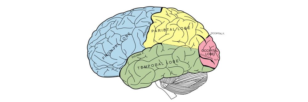
What part of the brain controls visual perception?
The part of the brain that controls visual perception is the occipital lobe, located at the back of the brain. It is primarily responsible for interpreting visual information from the eyes, enabling us to understand and interact with the world. To better understand how the brain processes visual stimuli, refer to our Vision and Visual Perception Challenges article.
Where to learn about visual perception?
To expand your knowledge of visual perception, consider enrolling in the Ultimate Guide to Visual Perception and Design course or exploring the HCI: Perception and Memory course offered by the Interaction Design Foundation. These courses provide comprehensive insights and are created carefully to help you understand the crucial elements of visual perception and its relevance in design.
ShowHide
video transcript
00:00:00 --> 00:00:06
If we want to design effectively for humans working with computers, clearly we need to understand humans.
Earn a Gift, Answer a Short Quiz!
Question 1
Question 2
Question 3
Get Your Gift
Try Again! IxDF Cheers For You!
0 out of 3 questions answered correctly
Remember, the more you learn about design, the more you make yourself valuable.
Human vision is an amazing ability; we are capable of interpreting our surroundings so as to interact safely and accurately with little conscious effort. However, we are well attuned to nature and things that occur naturally in our environment, which has significant implications for design. Unless man-made products are attuned to, and support, human visual perception, the viewing experience suffers and there is significant potential that users will be unable to use your products quickly, safely, or without error. For this reason, it is essential that we investigate how we see the world and why we see things in the way we do in order to know what we can do to ensure our products provide the best viewing experience possible. This is why we have developed “The Ultimate Guide to Visual Perception and Design,” and why it is such an important topic for designers to master.
For those of us who are blessed with good eyesight, we seldom consider it. That’s why going off to investigate the whys and hows involved is a little like trying to get behind the wind for the sake of finding the exact spot where it comes from. Happily, getting to the bottom of the phenomena involved in visual perception is a lot less laborious, and perhaps infinitely more fascinating. During the course, we will first cover the basic anatomy of the human eye so as to understand how vision is formed. We will then look at lots of different designs, evaluating each one according to specific aspects of the human visual experience. We will also identify how we can improve designs to support human vision better and improve usability as a direct result. Using the knowledge it imparts earlier on, this course will then analyze the design of icons in screen-based interfaces.
Data visualization is the graphical display of abstract information for two purposes: sense-making (also called data ana
Book chapter
Open Access—Link to us!
We believe in Open Access and the democratization of knowledge. Unfortunately, world-class educational materials such as this page are normally hidden behind paywalls or in expensive textbooks.